How do you write a landing page that converts?
The Gemeos Webflow agency shares its techniques for optimizing the copy on your landing pages in Webflow. Techniques you can easily put into action to increase conversions in your next campaigns.

article summary
- An effective Webflow landing page presents a clear promise and an understandable benefit above the fold.
- The structure should follow the prospect’s reasoning through the problem, solution, proof, objections, and call to action.
- Design, visual hierarchy, and loading speed reduce friction and make the page easier to read.
- Forms and CTAs should be simple, specific, and matched to the expected level of commitment.
- Performance should be measured and improved using data, A/B testing, and visitor behavior analysis.
Want to take it further? Ask:
Step 1: Target Your Message
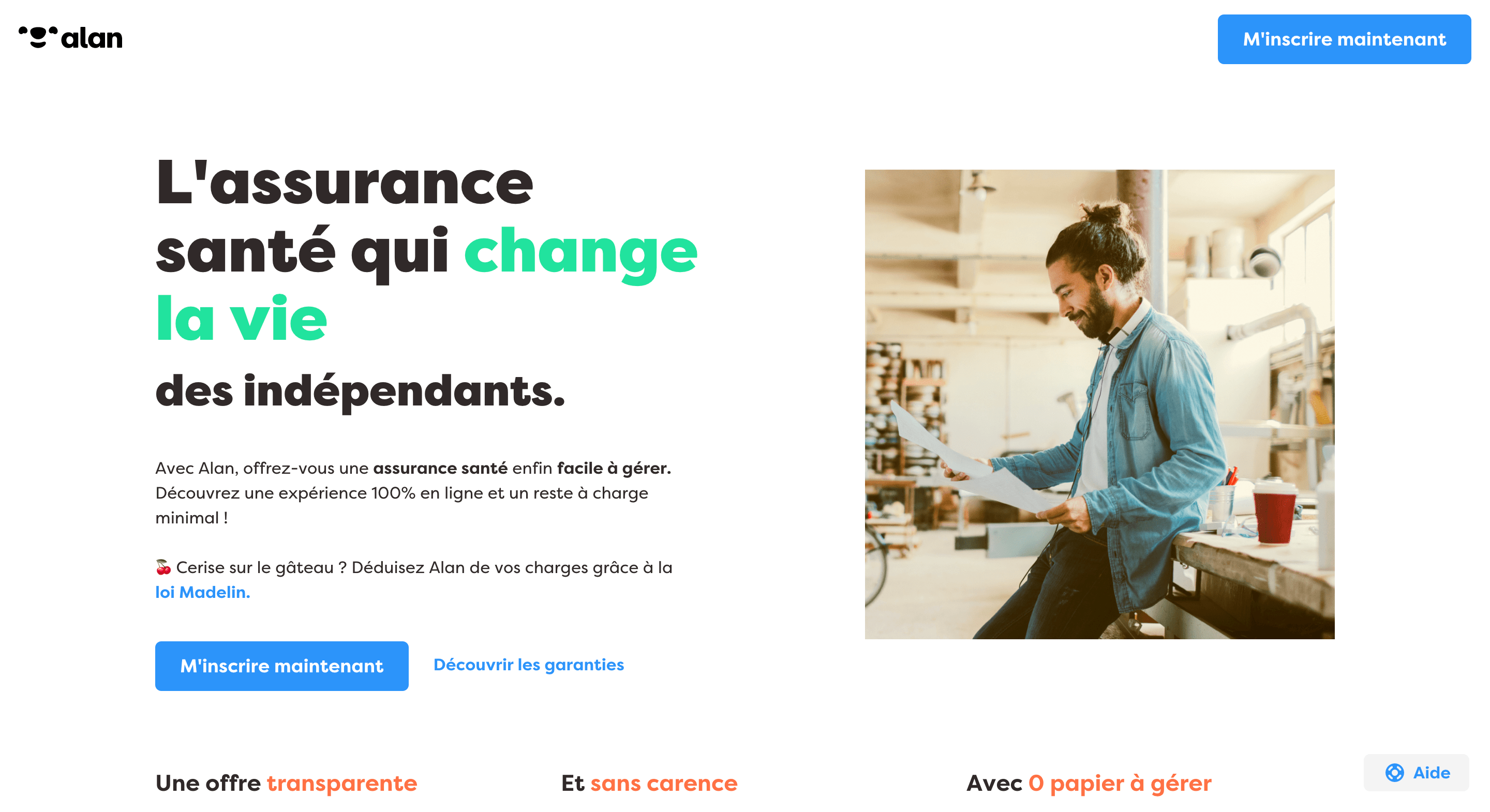
Don’t speak to the crowd. “Hey everyone!” When you write like that, each person feels invisible, unheard, and ignored. Instead, write directly to one person in the crowd. “Hey, you.” That way, every customer feels like the center of the universe.
Alan speaks directly to freelancers on its landing page here
Step 2: The Importance of the Headline
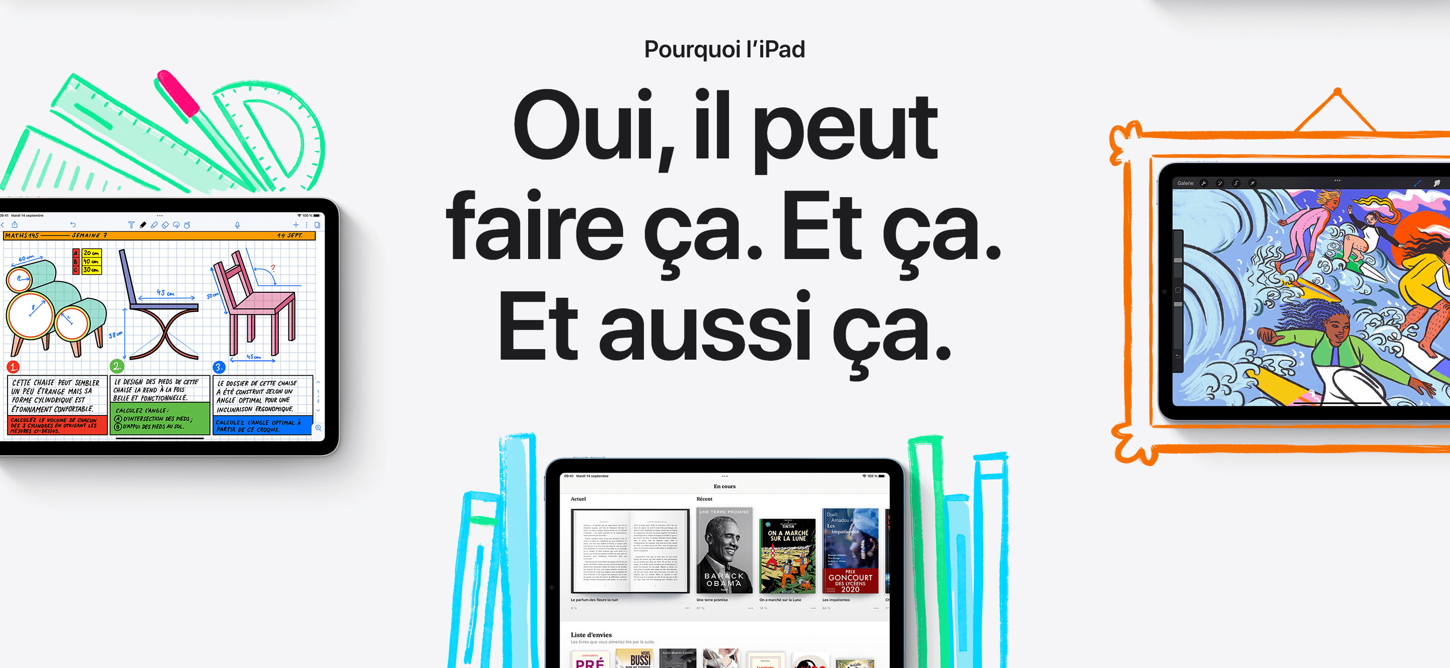
Be punchy! 5 times more people read the headline than the rest of the page.
Your headline should be:
- Short
- Punchy
- Attention-grabbing
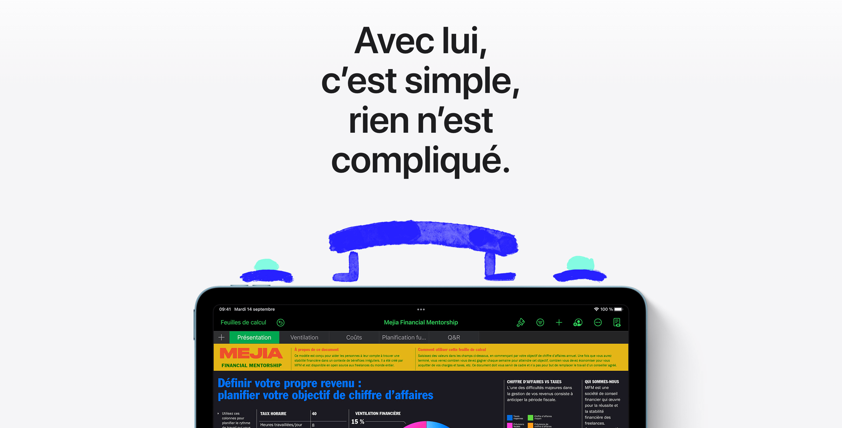
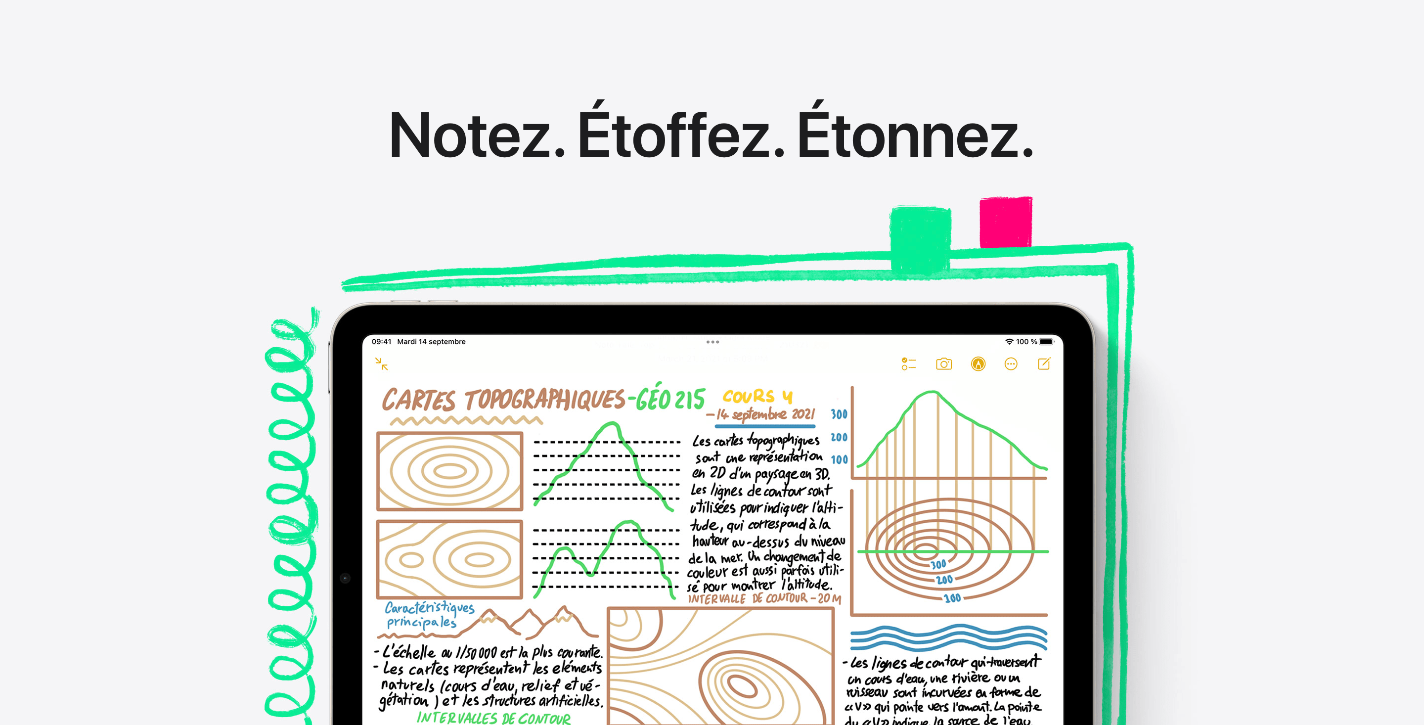
Apple is the benchmark here. In this example, you can clearly see how it uses this technique to highlight its new iPad.
Also remember to include your business keywords in the headline and in the meta data (Title tag and Meta Description) of your landing pages. Here’s an article to learn the steps to optimize your Webflow site for SEO
Step 3: Break Down Objections
People don’t want to spend money. They already have a list of objections in their heads before they buy. Identify those objections and address them one by one.
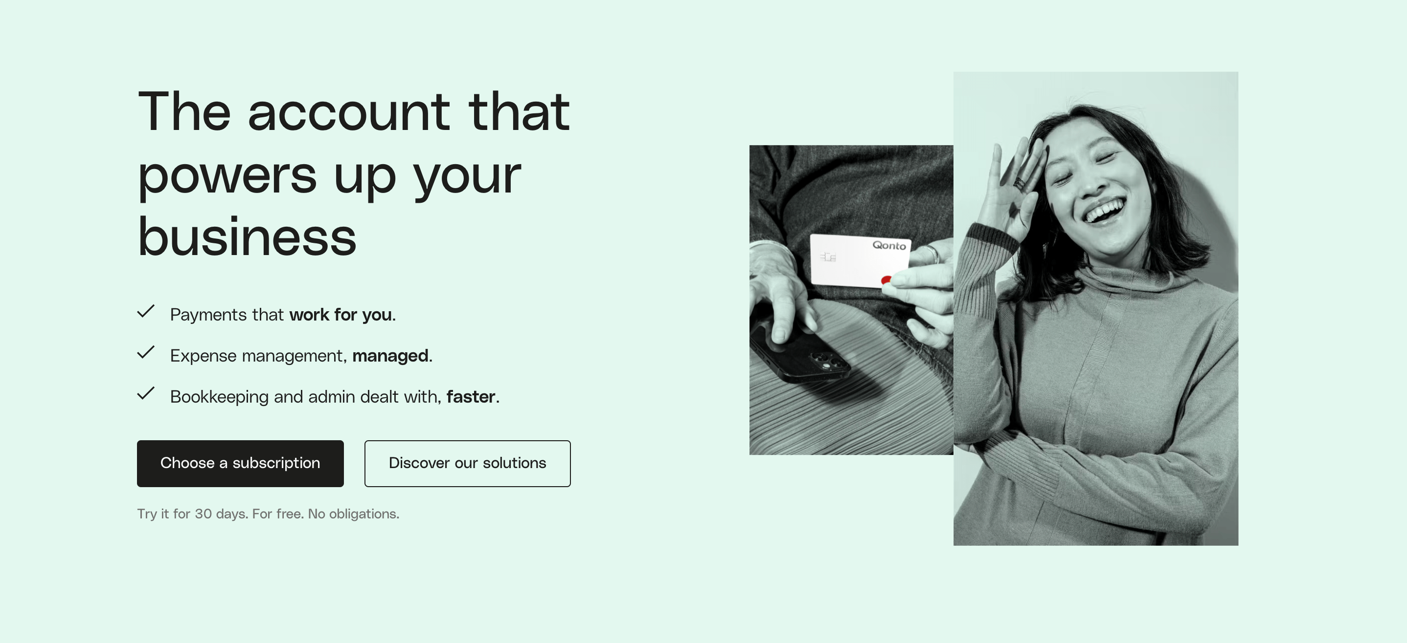
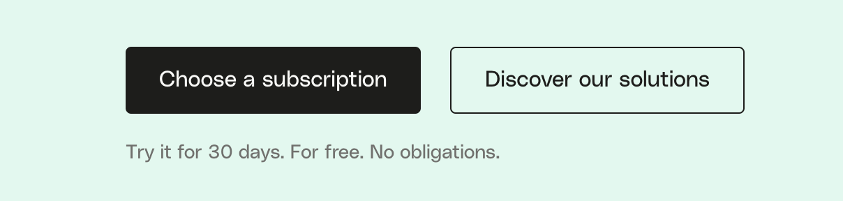
With this reassurance — “Try it for 30 days. For free. No obligations” — Qonto breaks down readers’ objections and increases engagement.
Step 4: Results → Features
Sell outcomes, not features: your prospects don’t care about your product’s features. They care about the problems your product will solve for them. Instead of showing them features, show them what success looks like.
Apple doesn’t sell a camera. It sells the quality of the shot.

Nike doesn’t sell tennis. It sells greatness!

Step 5: Drive Action
Don’t just get them to read. Get them to take the next step. Use words that push people to act. Good copy starts by persuading the reader... and ends with the reader taking action. Don’t use just any generic CTA. Use a CTA that aligns with the next step you want the reader to take.
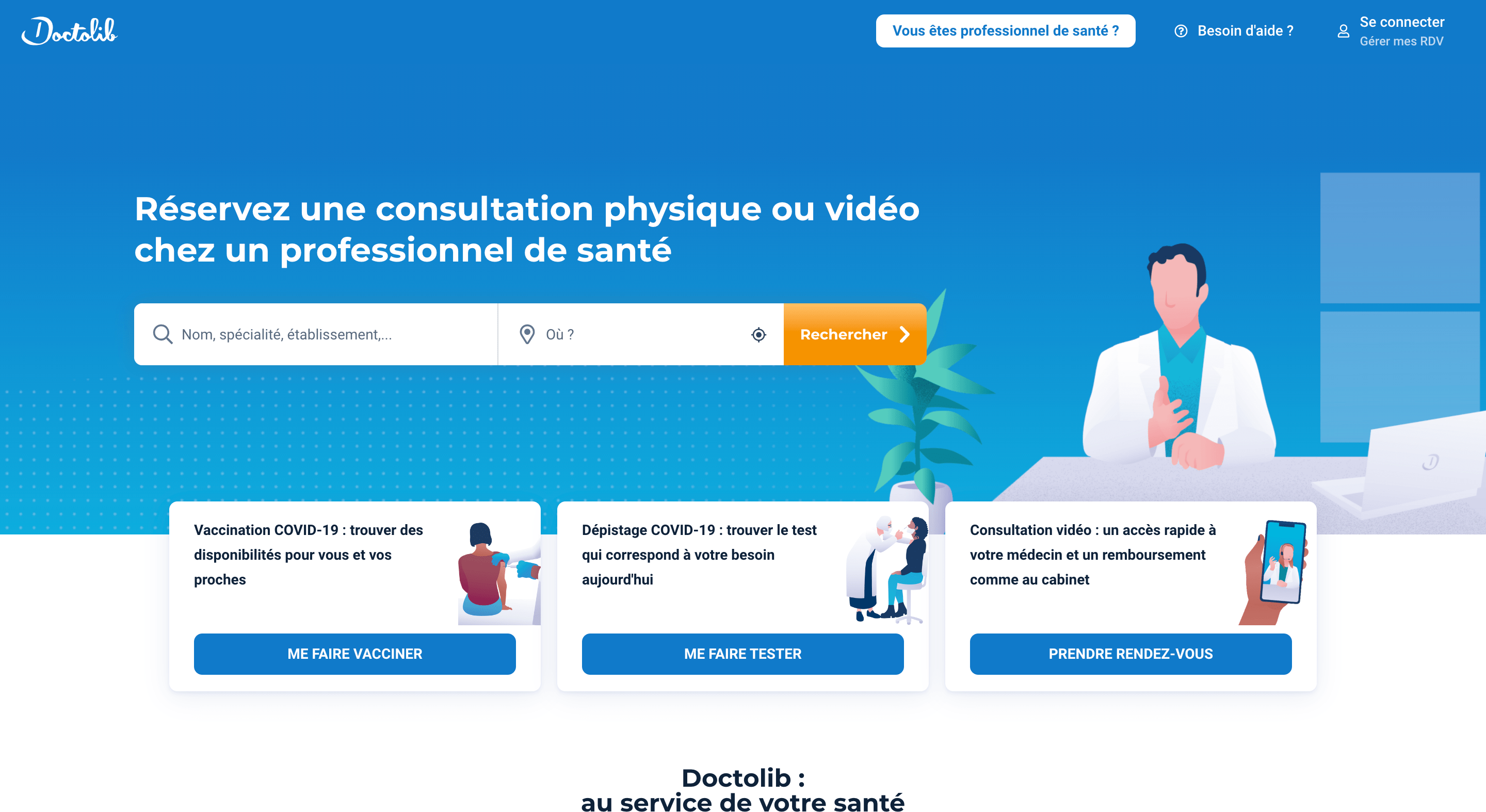
With its very clear, specific CTAs, Doctolib encourages readers to click.
{cta}
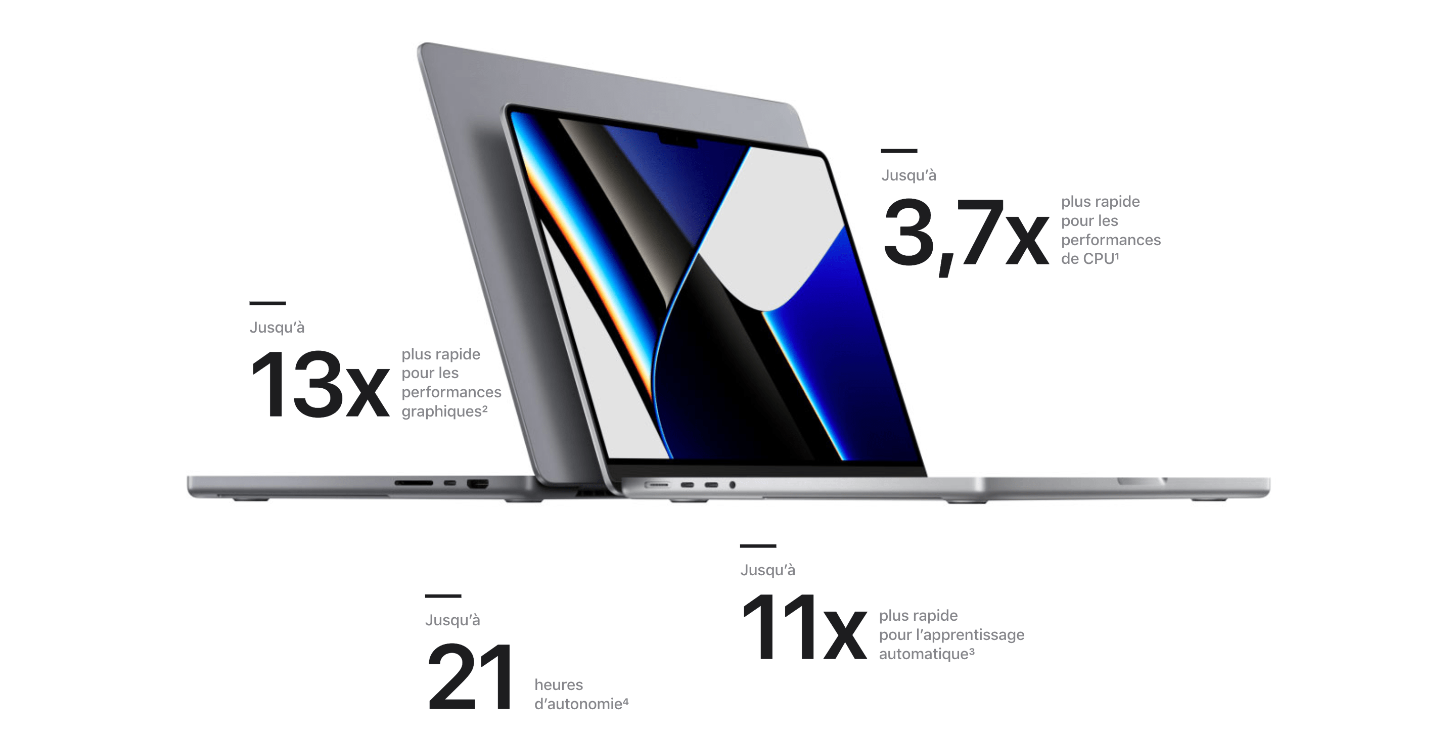
Use Numbers. Be Precise. Be Specific
Don’t just tell them you do better. Tell them exactly how much better you are.
Use Social Proof
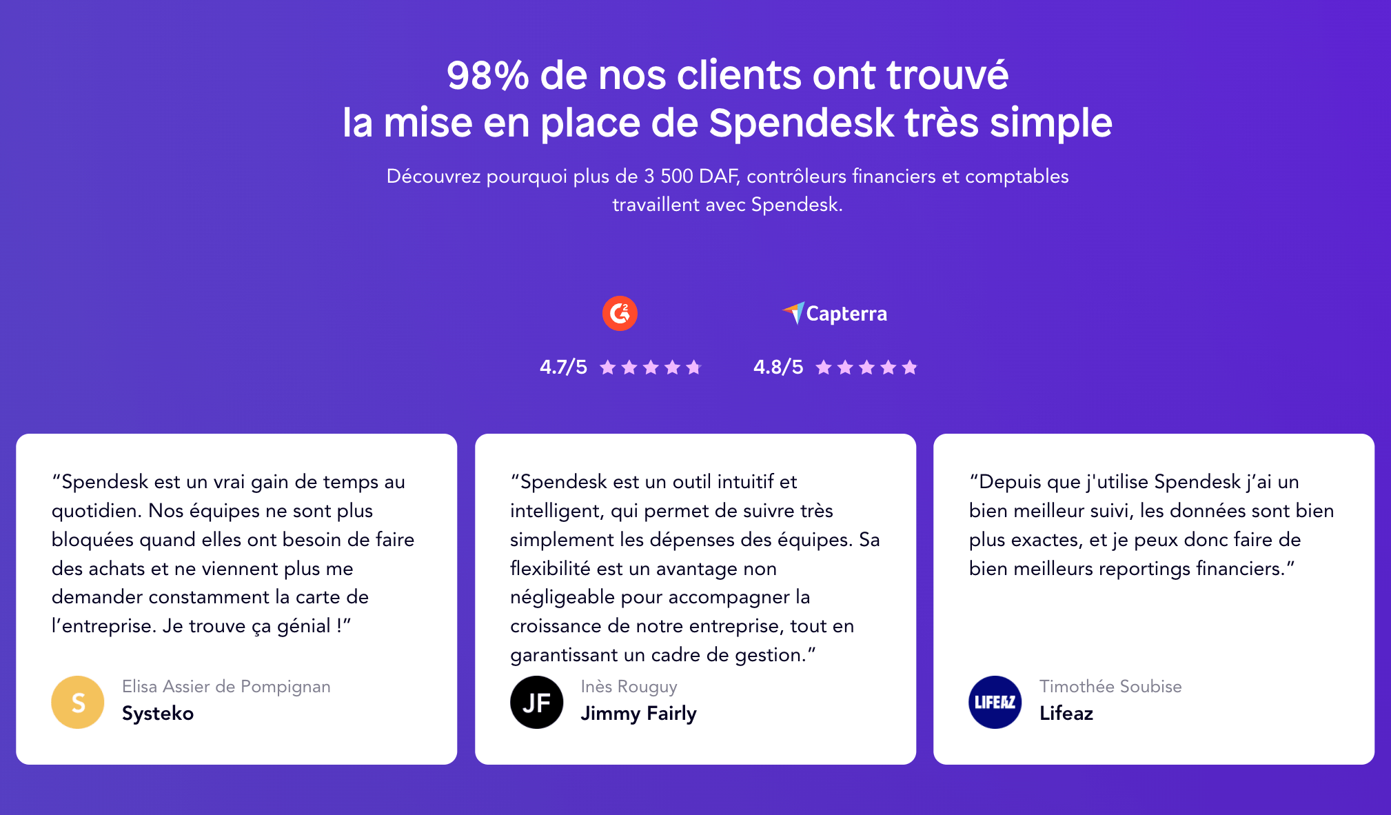
People often hesitate before making a purchase. Overcome that hesitation with social proof: show readers that other people in their community love your product.
Spendesk uses verified reviews from G2 and Capterra to strengthen its credibility. It highlights its customer type so readers can relate, and emphasizes how easy it is to get started to push them even further toward action.
How Do You Create a Webflow Landing Page That Converts?
Creating a landing page that converts comes down to several key elements designed to grab attention, build trust, and push visitors to act. Here’s a recap of the essential steps to optimize your page.
1. Define a Clear Goal
- An effective landing page should have one goal only (sign-up, download, purchase, contact request, etc.).
- Remove any distractions (menu, unnecessary links) to keep visitors focused on the desired action.
2. Build a Strong Visual Hierarchy
- An attention-grabbing headline (H1) that immediately sums up the value of your offer.
- A subheadline (H2) that adds clarity and reassures the user.
- A high-impact visual (image, video, or mockup) that showcases your product/service.
3. Use a Strong Call to Action (CTA)
- A clearly visible CTA button with a strong action verb (e.g., “Try for free,” “Download now,” “Book your call”).
- Use a contrasting color for the CTA so it stands out.
- Place the CTA above the fold and repeat it further down the page.
4. Highlight Benefits, Not Just Features
- Present the problems your solution solves instead of only listing its features.
- Use short, impactful, user-focused sentences (e.g., “Save 30% of your time on project management”).
5. Add Social Proof and Reassurance
- Customer testimonials (with photos and names for more credibility).
- Reviews and ratings (Trustpilot, Google Reviews, etc.).
- Logos of well-known clients or partners to reassure visitors.
- Key numbers that strengthen credibility (“Already 5,000+ satisfied users”).
6. Optimize the Form to Maximize Conversions
- Ask only for the essential information (first name, email, phone if needed).
- Display trust indicators (“Your data is secure”).
- Add a clear message after submission to explain the next step.
7. Focus on Speed and Mobile Compatibility
- Make sure the page loads in under 3 seconds.
- Optimize your mobile UX (visible CTAs, readable text, accessible buttons).
- Test the page on different devices and browsers.
8. Test and Improve Continuously (A/B Testing)
- Try several versions of your headline, CTA, and visuals to see what works best.
- Analyze performance with Google Analytics, Webflow Insights, or Hotjar to understand where visitors drop off.
By applying these principles, you maximize your chances of turning visitors into customers. If you want to go further, our Webflow SEO agency is here to support you in creating high-performing, well-ranked landing pages.
Creating a Landing Page on Webflow - What You Need to Remember
Good to know
Heading
Lorem ipsum dolor sit amet, consectetur adipiscing elit. Suspendisse varius enim in eros elementum tristique. Duis cursus, mi quis viverra ornare, eros dolor interdum nulla, ut commodo diam libero vitae erat. Aenean faucibus nibh et justo cursus id rutrum lorem imperdiet. Nunc ut sem vitae risus tristique posuere.

.avif)


Lorem ipsum
Lorem ipsum dolor sit amet, consectetur adipiscing elit, sed do eiusmod tempor incididunt ut labore et dolore magna aliqua. Ut enim ad minim veniam, quis nostrud exercitation ullamco laboris nisi ut aliquip ex ea commodo consequat. Duis aute irure dolor in reprehenderit in voluptate velit esse cillum dolore eu fugiat nulla pariatur.