Good to know

Heading

Lorem ipsum dolor sit amet, consectetur adipiscing elit. Suspendisse varius enim in eros elementum tristique. Duis cursus, mi quis viverra ornare, eros dolor interdum nulla, ut commodo diam libero vitae erat. Aenean faucibus nibh et justo cursus id rutrum lorem imperdiet. Nunc ut sem vitae risus tristique posuere.

Lorem ipsum dolor sit amet consectetur.

Lorem ipsum dolor sit amet consectetur. Aliquam orci sagittis dignissim sapien praesent donec.

Lorem ipsum

Lorem ipsum dolor sit amet, consectetur adipiscing elit, sed do eiusmod tempor incididunt ut labore et dolore magna aliqua. Ut enim ad minim veniam, quis nostrud exercitation ullamco laboris nisi ut aliquip ex ea commodo consequat. Duis aute irure dolor in reprehenderit in voluptate velit esse cillum dolore eu fugiat nulla pariatur.

Add

Lorem ipsum

Lorem ipsum

AssessFirst x Gemeos

Discover how Gemeos designed and built AssessFirst’s new Webflow site: art direction, UI design, product design, multi-language development, and SEO.

A
A
A

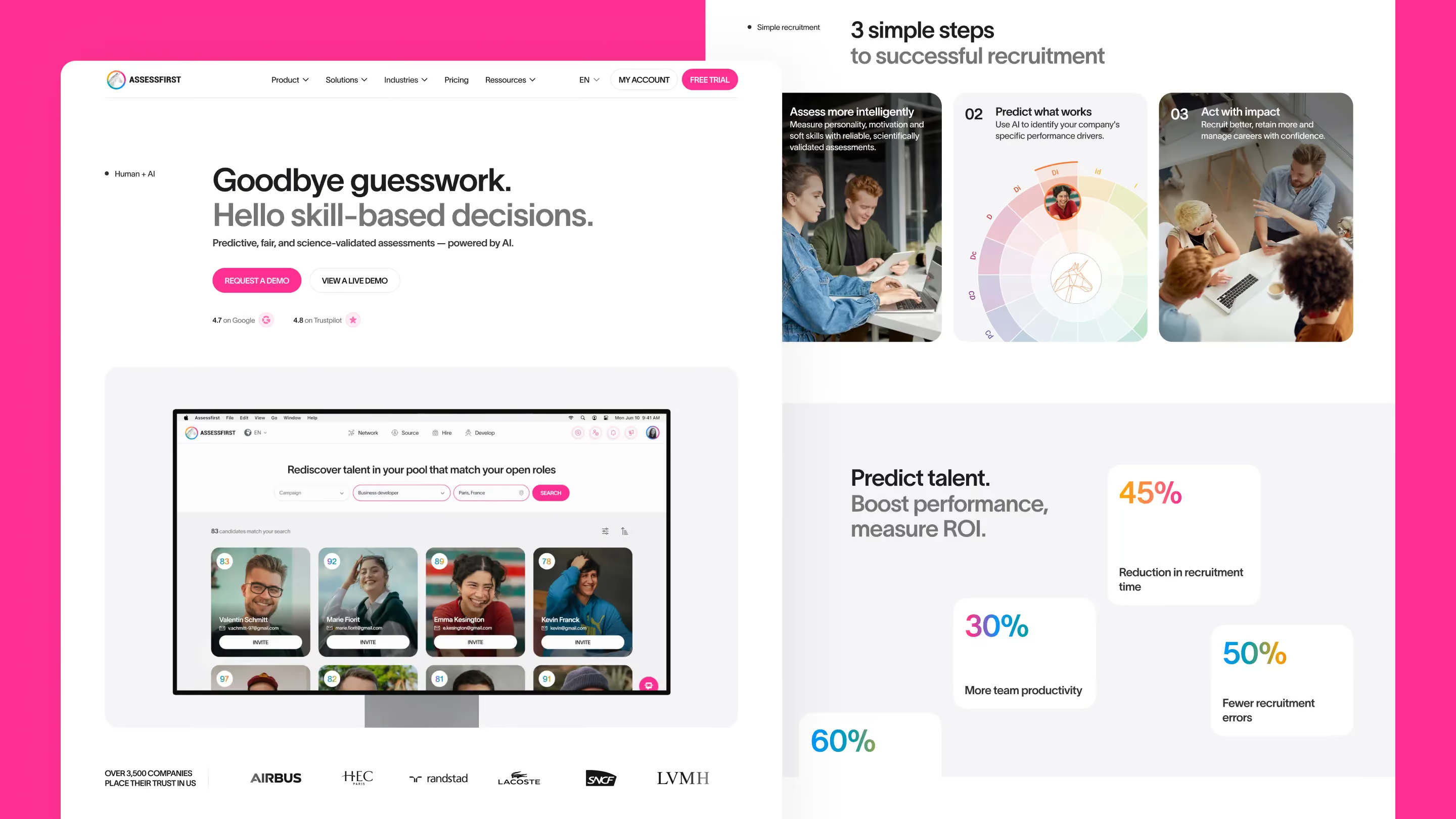
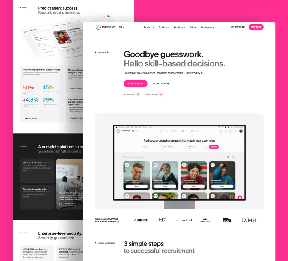
The predictive skills-based hiring platform, designed by Gemeos

AssessFirst helps companies hire smarter with predictive AI and behavioral science.

Gemeos reimagined their entire web presence — from art direction to multilingual Webflow development, plus product design and SEO strategy.

Industry

Services

A
A
A

Art Direction

A visual identity that blends science and boldness

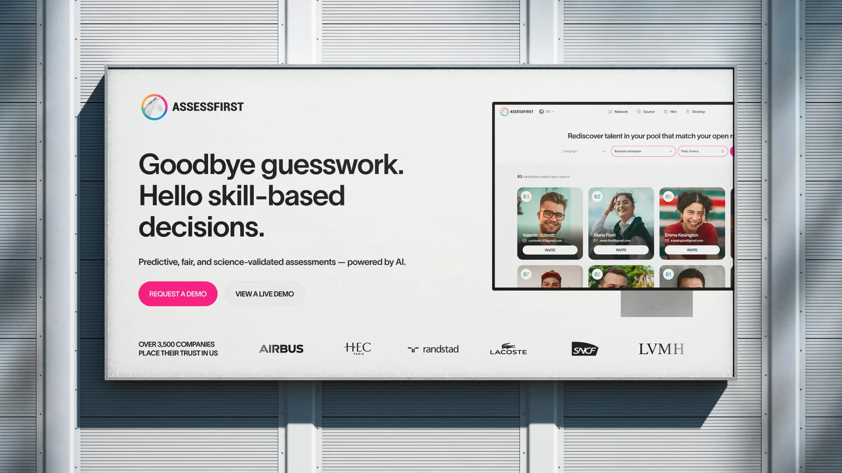
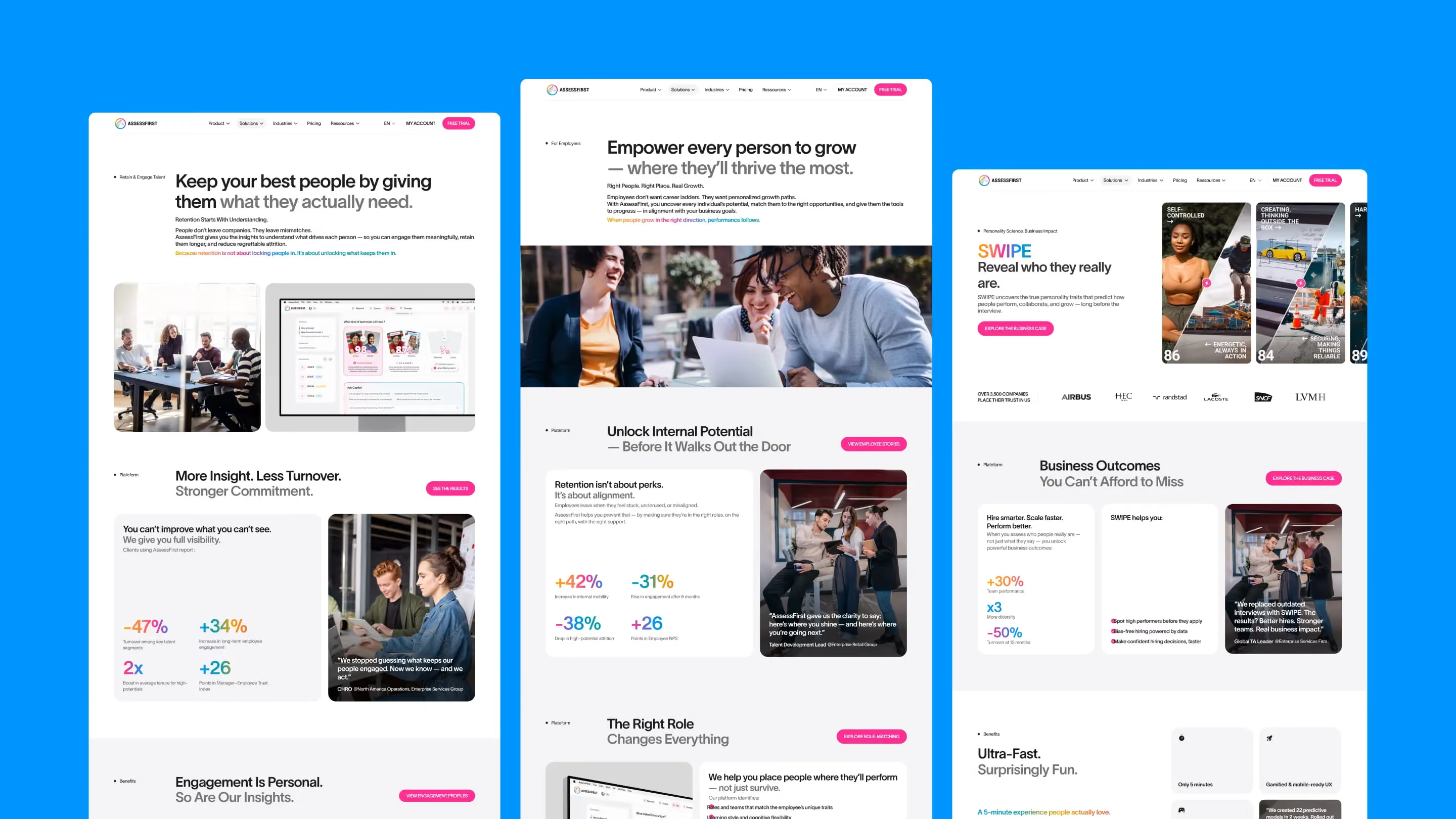
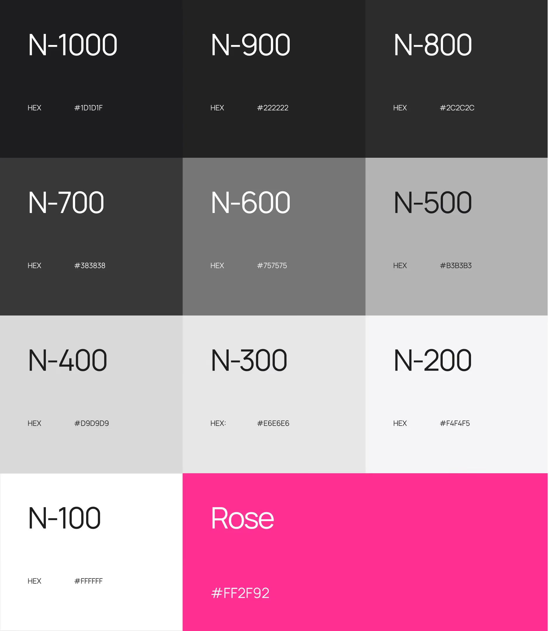
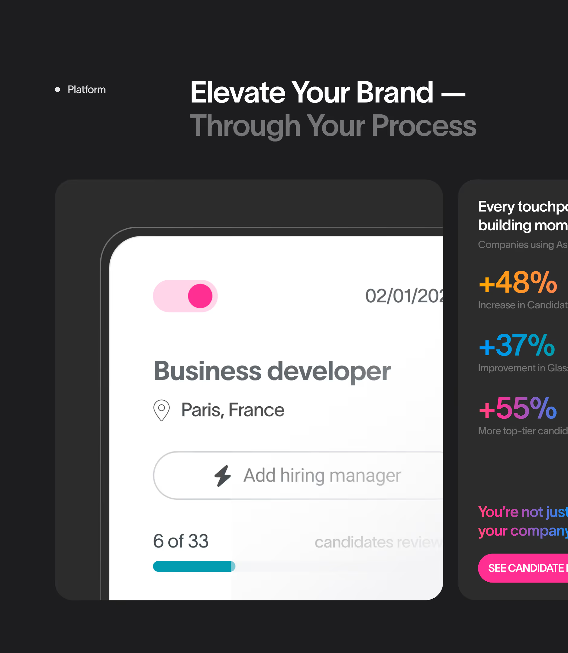
The art direction for the AssessFirst site strikes a balance between scientific credibility and visual energy. The palette pairs a deep blue (#0B1B3F) with magenta and bright pink accents used on CTAs and key hooks, creating a sharp contrast that pulls the eye toward action.

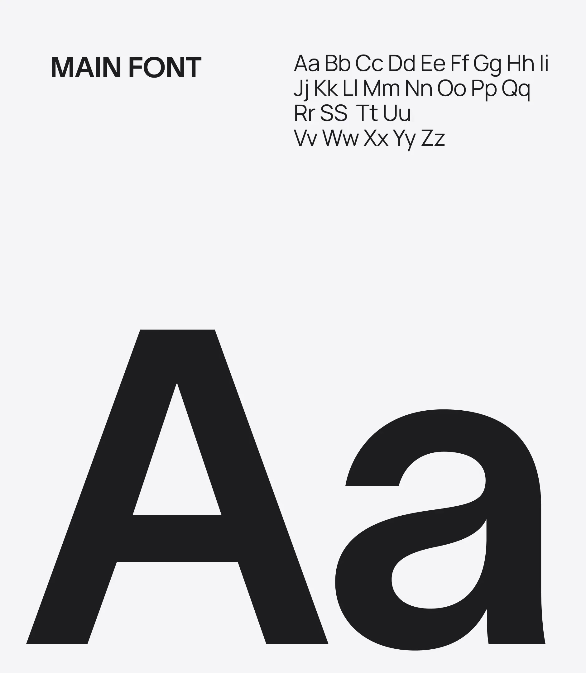
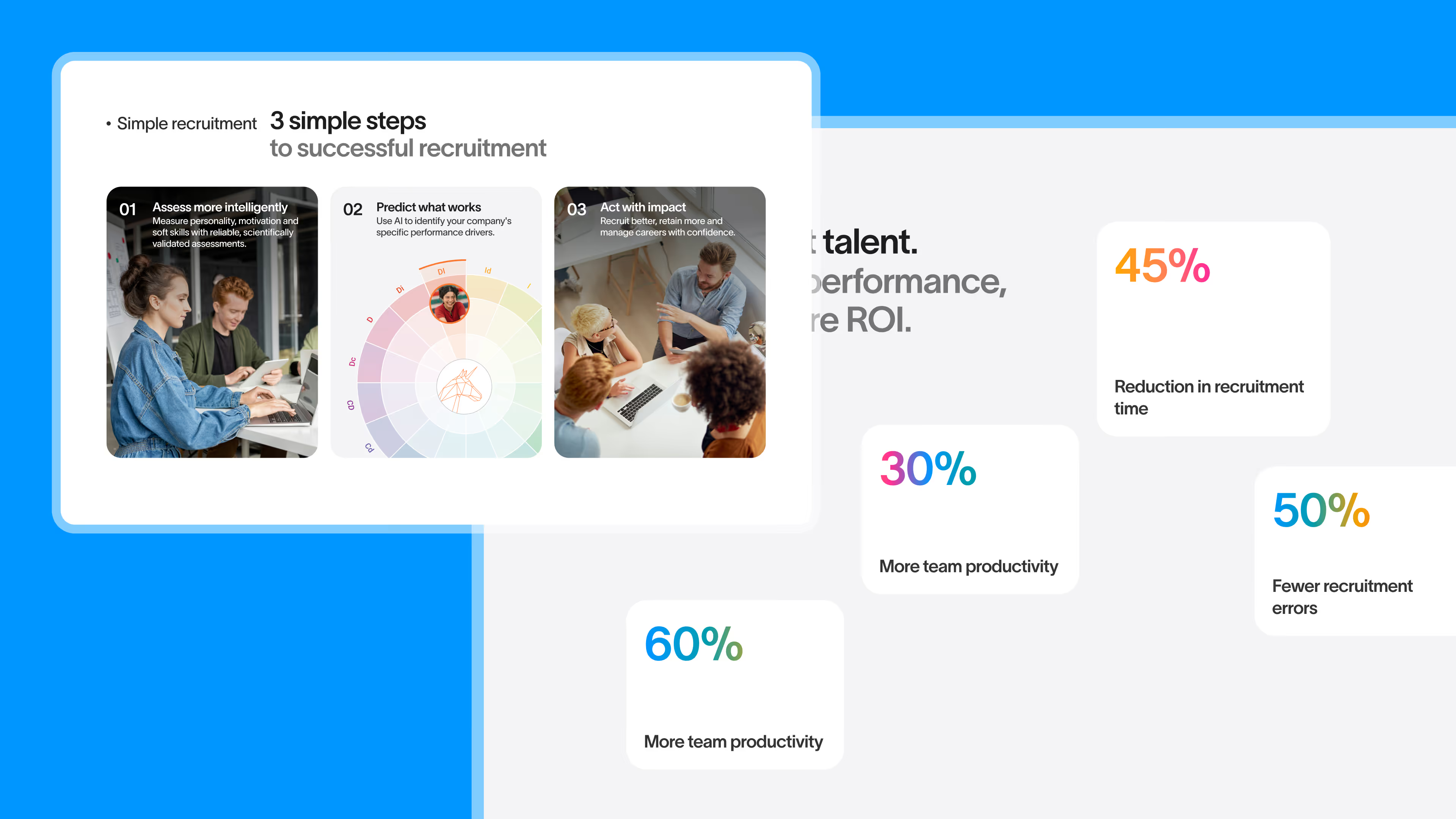
Typography plays a central role. Bold, rounded headlines set an approachable tone, while the body copy stays clean and easy to read. Key stats ("+30% performance," "5M+ profiles analyzed") stand out through multicolor gradients applied directly to the text — a choice that boosts impact without cluttering the layout.

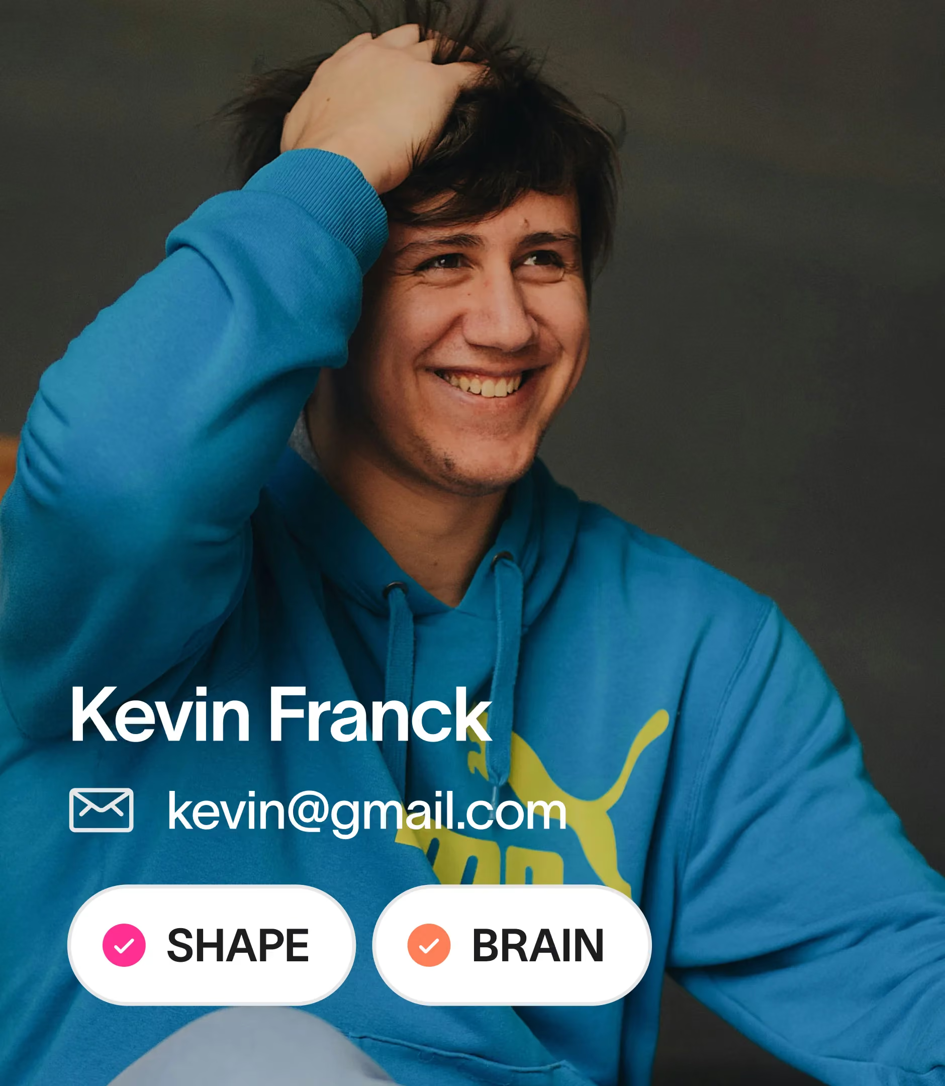
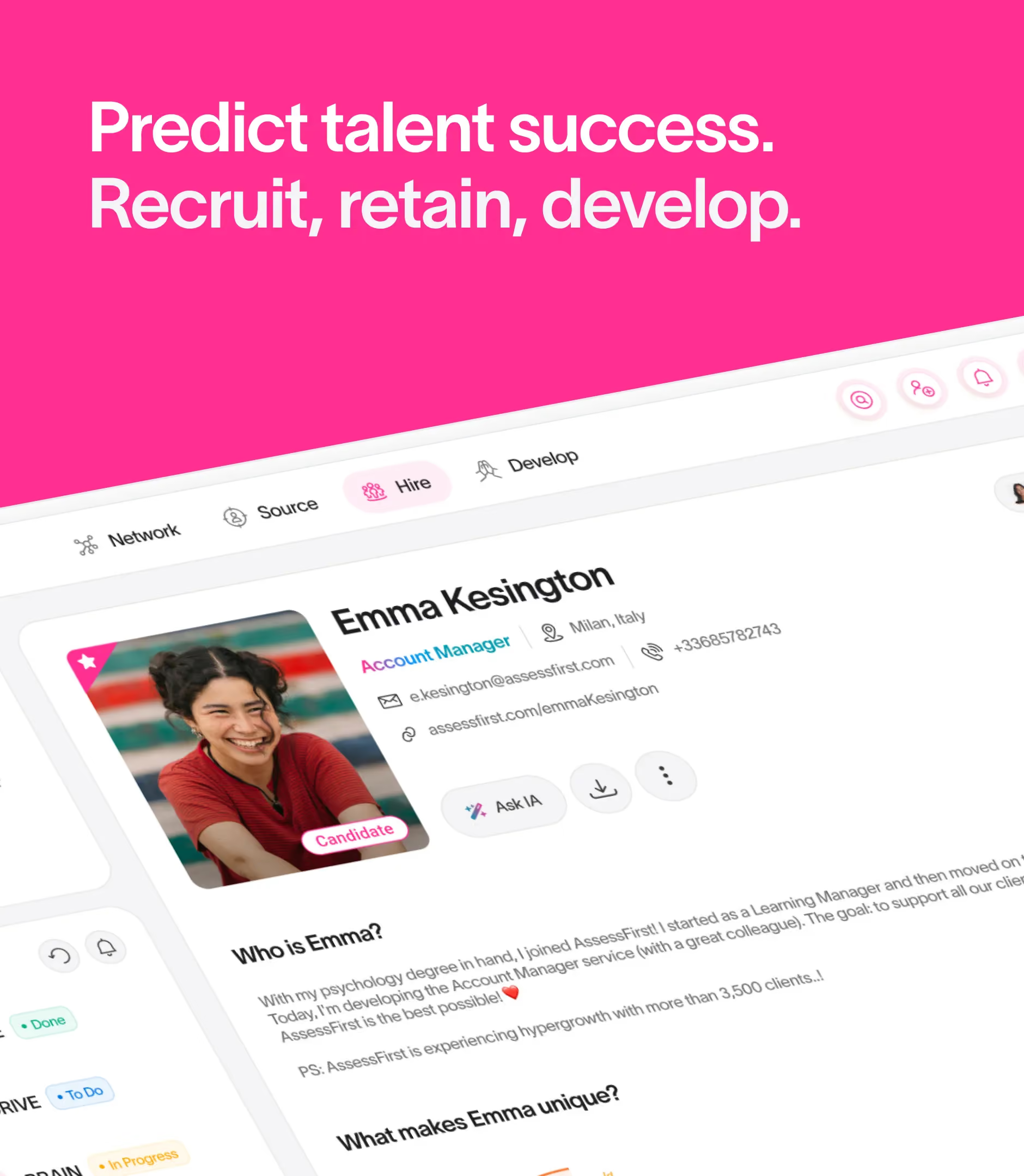
The leadership team photos use a distinctive treatment: a rainbow gradient border that echoes the range of behavioral profiles analyzed by the platform. Emma, the mascot featured across the product pages, brings a human touch to a technical topic — predictive AI — by embodying the ideal candidate in a warm, illustrative style.

Concept 1 - Premium & AI

Color palette: The design draws inspiration from X-ray and ultrasound imagery, symbolizing AssessFirst’s ability to “read” candidates. This approach creates a direct link between the logo colors and this visual direction. Gradients and blue tones reinforce the idea of deep, precise analysis. Typography: The Roobert typeface brings a modern, professional feel with a distinctly tech-forward edge. A monospace font adds a more technical layer while keeping the overall tone warm. Design style: Icons and cards use rounded shapes, a nod to the logo’s soft curves. Offset sections in certain blocks echo file folders, reinforcing the connection to recruiting. Buttons and graphic elements in the headlines echo the logo’s rounded forms, creating a cohesive visual system throughout.

Concept 2 - Human and Excellence

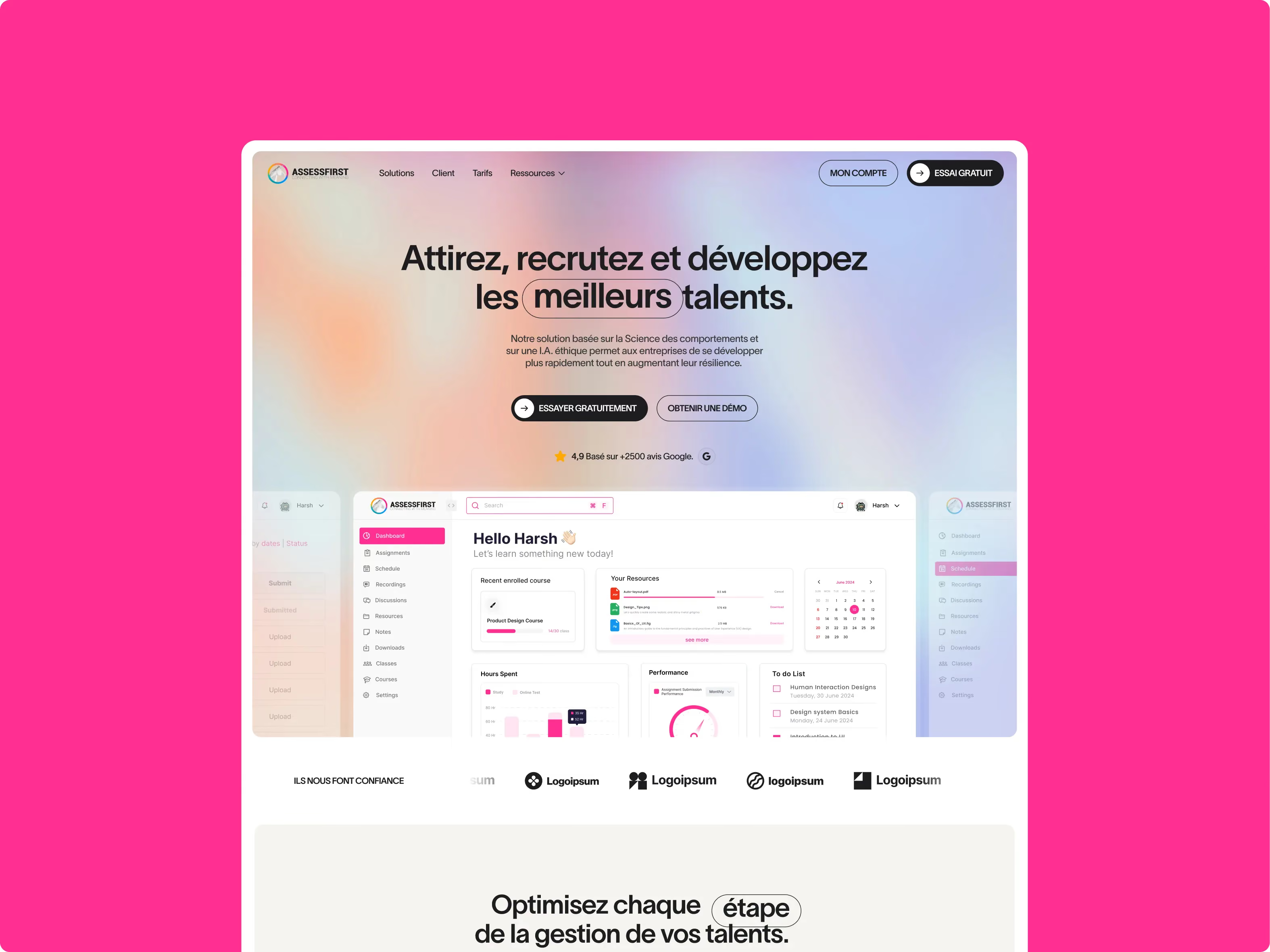
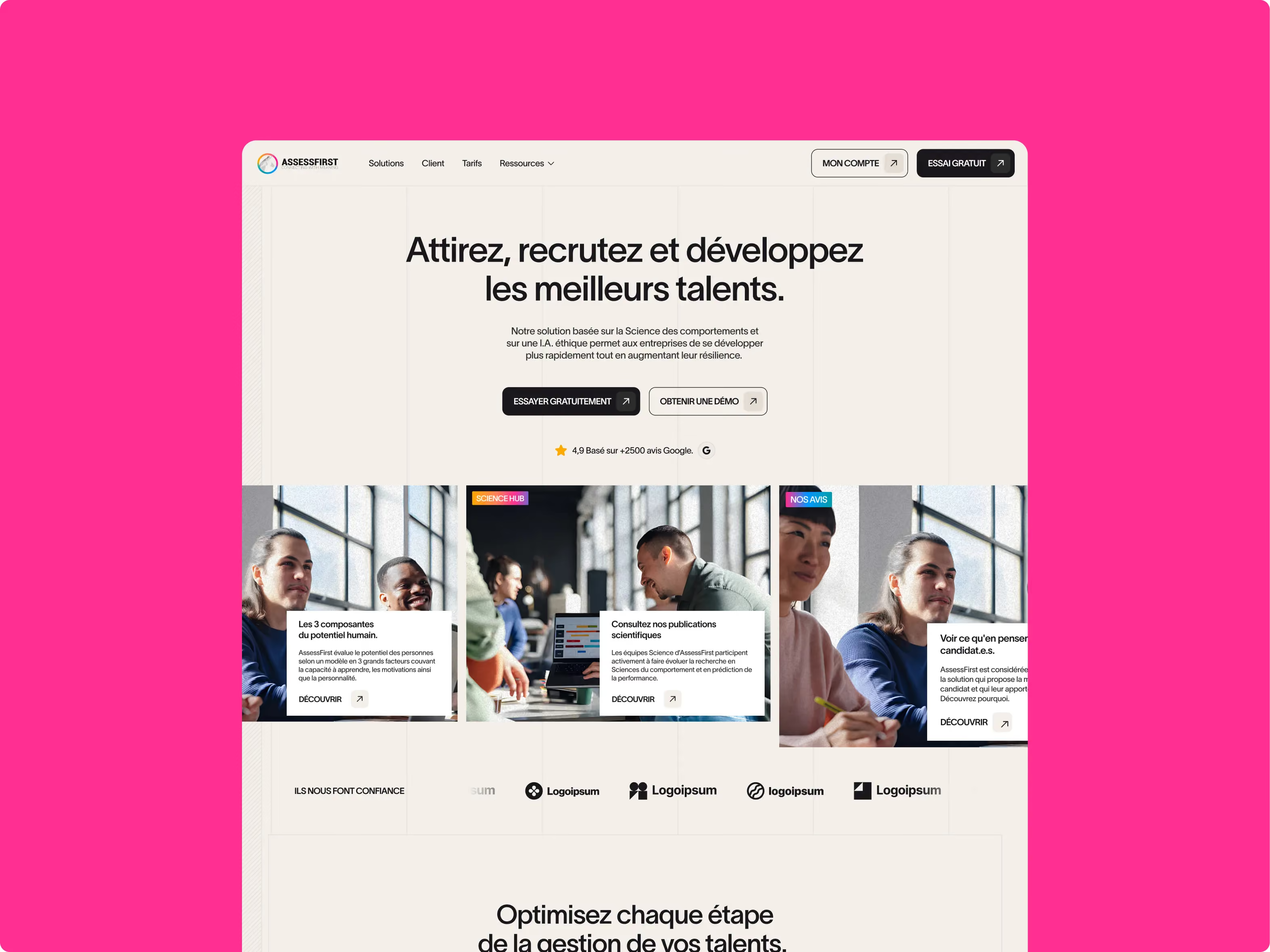
Color palette: A palette dominated by a light neutral background in beige tones, lifted by subtle orange-pink-blue gradients on the title keywords. These color accents draw the eye strategically while adding warmth and energy. Pink shows up throughout the platform’s UI, creating a cohesive, modern visual identity. Typography: A dual type system with an elegant serif font for headlines, bringing a human feel and a premium edge. That’s contrasted with a functional sans-serif for body copy, improving readability while preserving the brand’s personality. Weight and size variations create a clear visual hierarchy. Design style: An approach that humanizes technology by combining structural rigor with a warm, human touch. Grain-textured photography adds authenticity and emotion, while the strict grid signals AI. Rounded elements, like squircle icons, soften the whole system. This duality strikes the right balance between the human side of recruiting and the analytical power of AI, perfectly reflecting the product’s positioning.

Concept 3 — “Brave” and Innovation

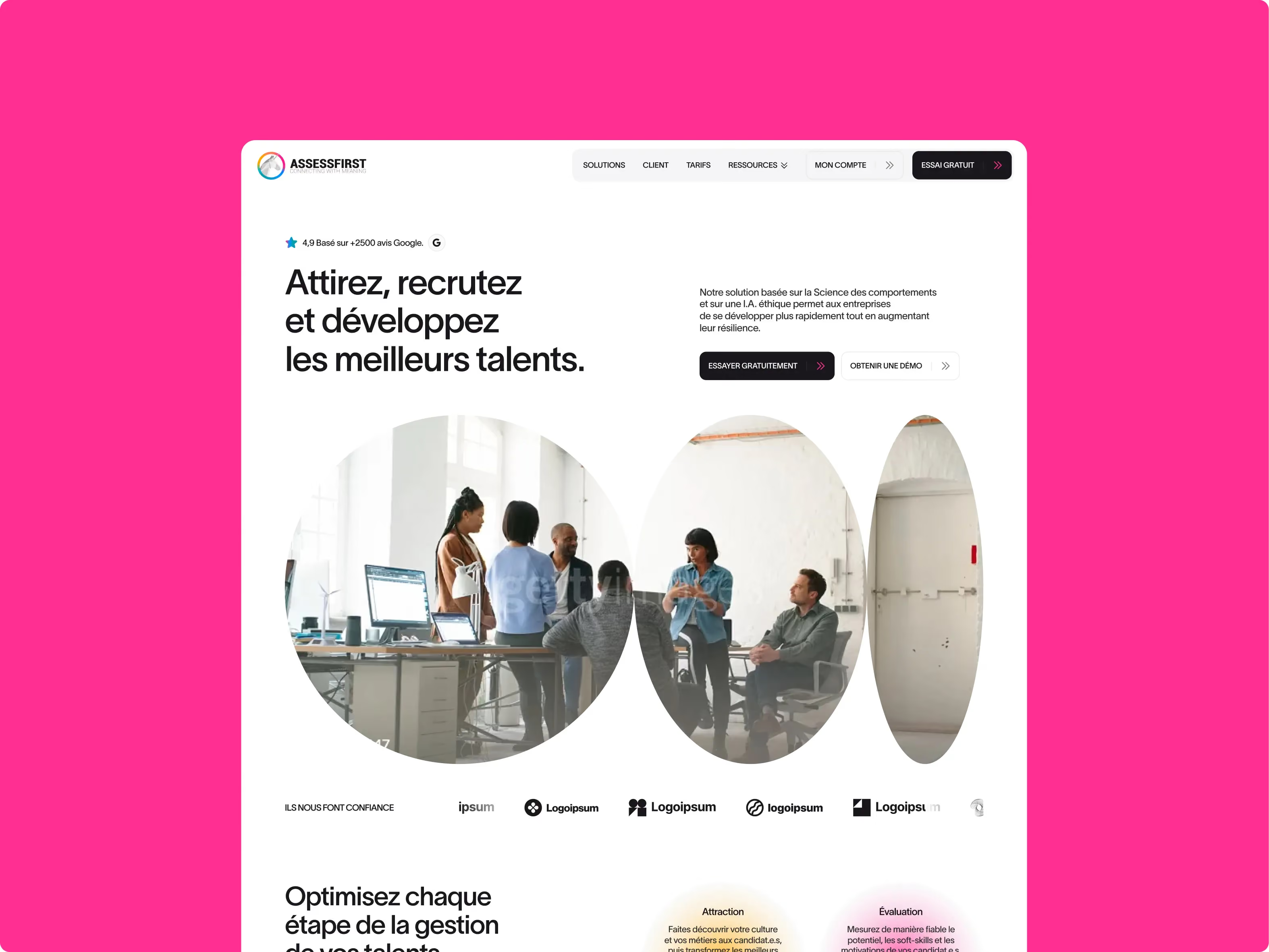
Color palette: A more subtle palette, where colorful gradients are softened by gray tones, creating a balance between technology and the human side of the brand. This less aggressive approach to color hints at AI while staying approachable. Pink touches and colorful accents on interface elements bring energy and freshness, while the clean, light background keeps everything highly readable. Typography: Alliance No.2, a typeface that clearly evokes technology and the SaaS world with its sharp, contemporary lines. This typographic choice reinforces the solution’s innovative positioning while staying perfectly legible. Design style: A bold design that breaks away from traditional recruiting norms through the daring use of circular shapes, creating a distinctive visual pattern. These circles symbolize the different stages of recruitment or the many facets of candidates. The balance between geometric elements, representing technology, and human content — especially the video in the hero — perfectly captures the duality of the offering.

Look&Feel

Summary

We entrusted Gemeos with a full website redesign and migration, and everything went incredibly smoothly. What stood out most to us was the quality of the art direction: a truly premium, cohesive visual direction, with a clear visual identity and highly polished choices throughout — typography, colors, iconography, pacing, hierarchy, and more. You can tell they have great taste, and above all, a real eye for detail on every screen. On top of that, the team is incredibly responsive and very experienced: they know both design and the technical side inside out. I’d recommend them without hesitation.

David BERNARD

CEO & Founder @AssessFirst

A
A
A

Web Design

User journeys designed to convert, not just impress

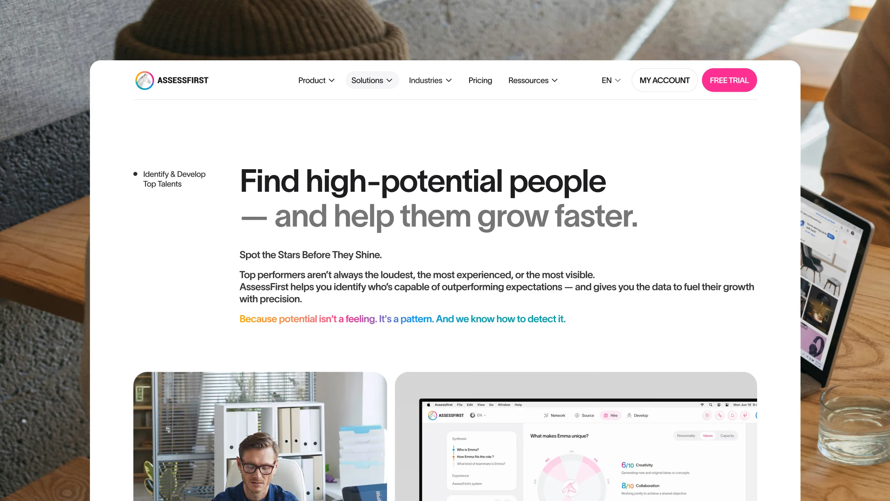
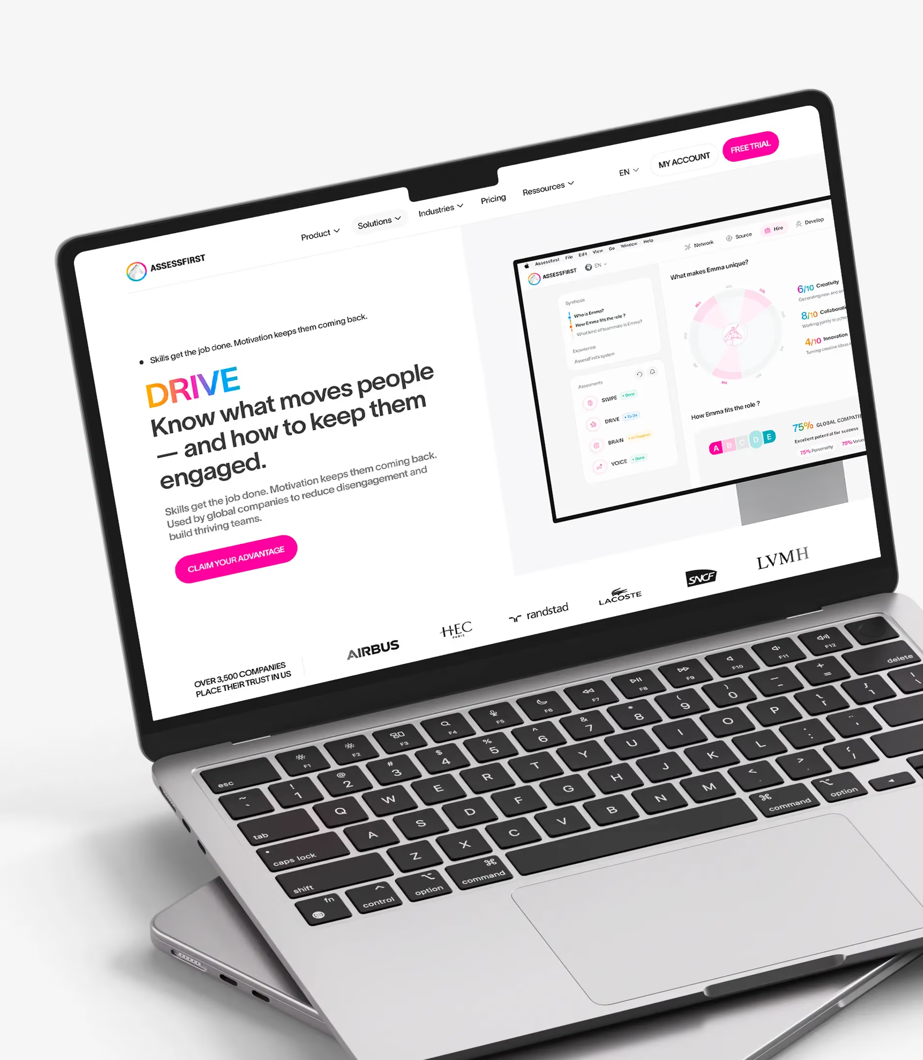
The AssessFirst website interface is built to turn visitors into users. The hover mega-menu, structured into two to three columns, organizes a dense offer — six products, multiple use cases, resources — without creating friction. Every entry gets a clear visual hierarchy with icons and short descriptions.

Pink/magenta CTAs show up everywhere, and they stay consistent across the site: "Book a demo," "Free trial." Their placement follows a repeatable logic — hero section, end of a persuasive block, footer — to multiply entry points into the conversion funnel.

The persistent iClosed widget at the bottom of the page shows David Bernard’s photo (CEO) with direct access to scheduling a meeting. This subtle social proof — a CEO available for a demo — shortens the perceived distance between the visitor and the decision.

Customer testimonial blocks (logos + quotes) appear in context, inside the use case pages instead of on a dedicated page, strengthening social proof where it matters most. The stats sections use bullet-prefixed labels and gradient-colored numbers to create a visual hierarchy that’s easy to read and hard to forget.

Summary

We entrusted Gemeos with a full website redesign and migration, and everything went incredibly smoothly. What stood out most to us was the quality of the art direction: a truly premium, cohesive visual direction, with a clear visual identity and highly polished choices throughout — typography, colors, iconography, pacing, hierarchy, and more. You can tell they have great taste, and above all, a real eye for detail on every screen. On top of that, the team is incredibly responsive and very experienced: they know both design and the technical side inside out. I’d recommend them without hesitation.

David BERNARD

CEO & Founder @AssessFirst

A
A
A

Product Design

Turning a complex AI product into a clear, readable experience

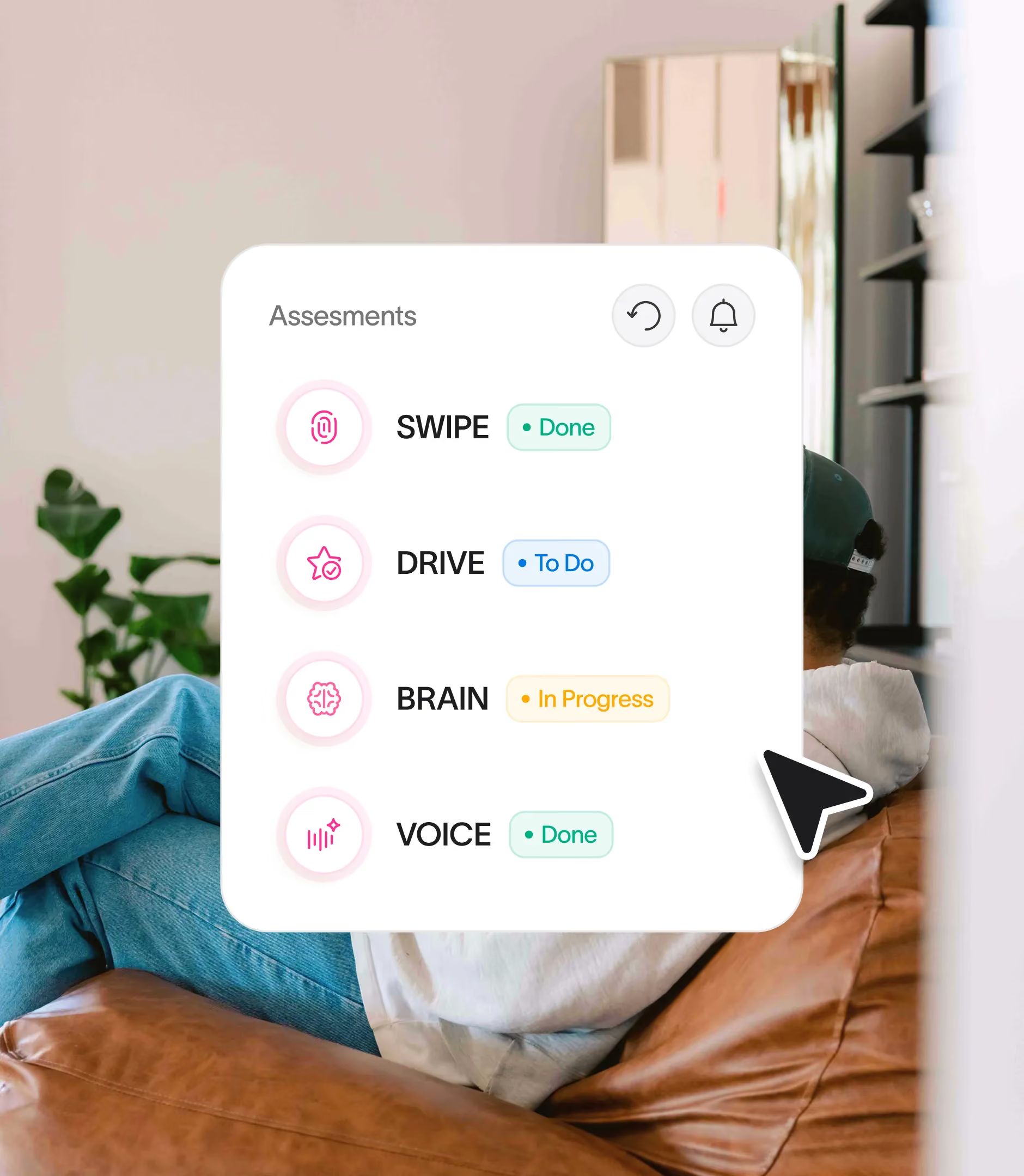
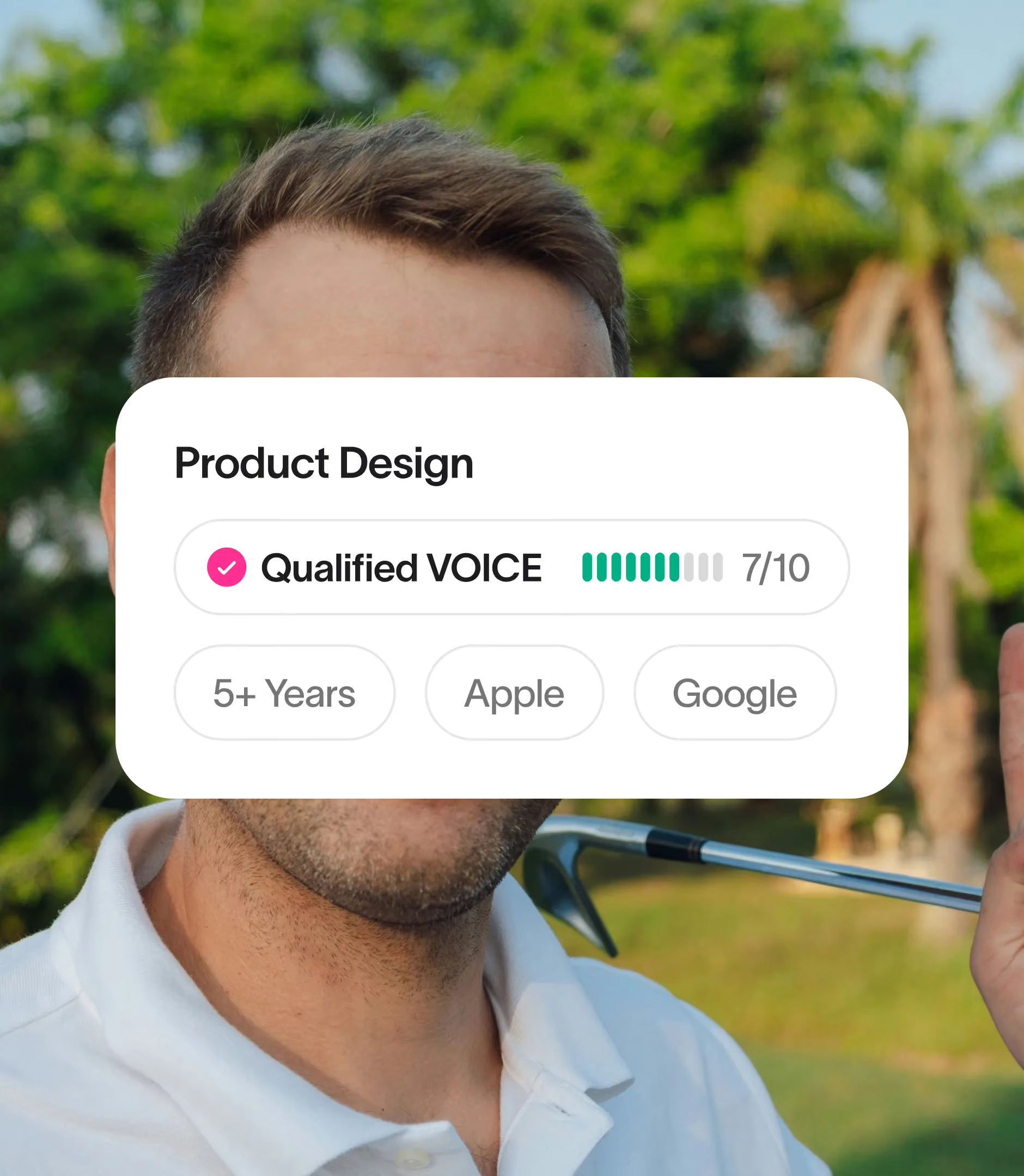
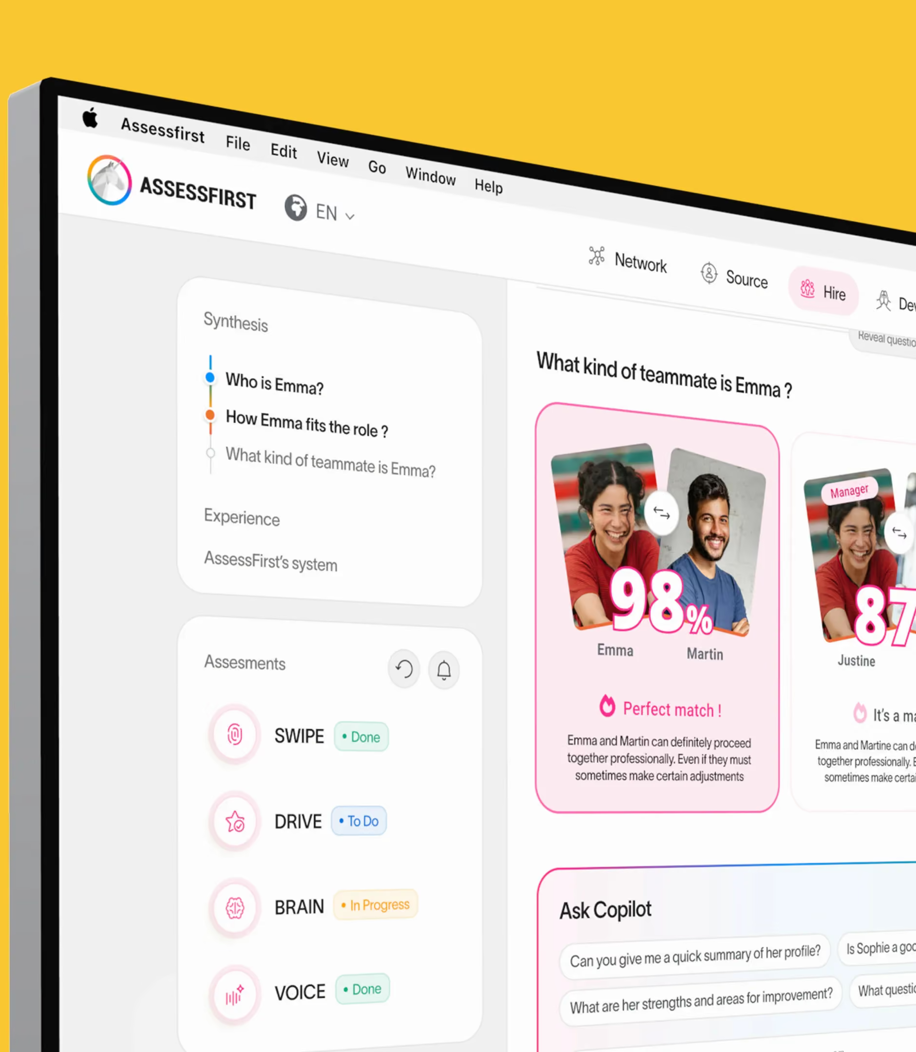
AssessFirst offers a suite of six products (SWIPE, DRIVE, BRAIN, VOICE, COPILOT, SCAN) that cover the full talent management cycle. The product design challenge: make each one easy to understand on its own while showing how they work together.

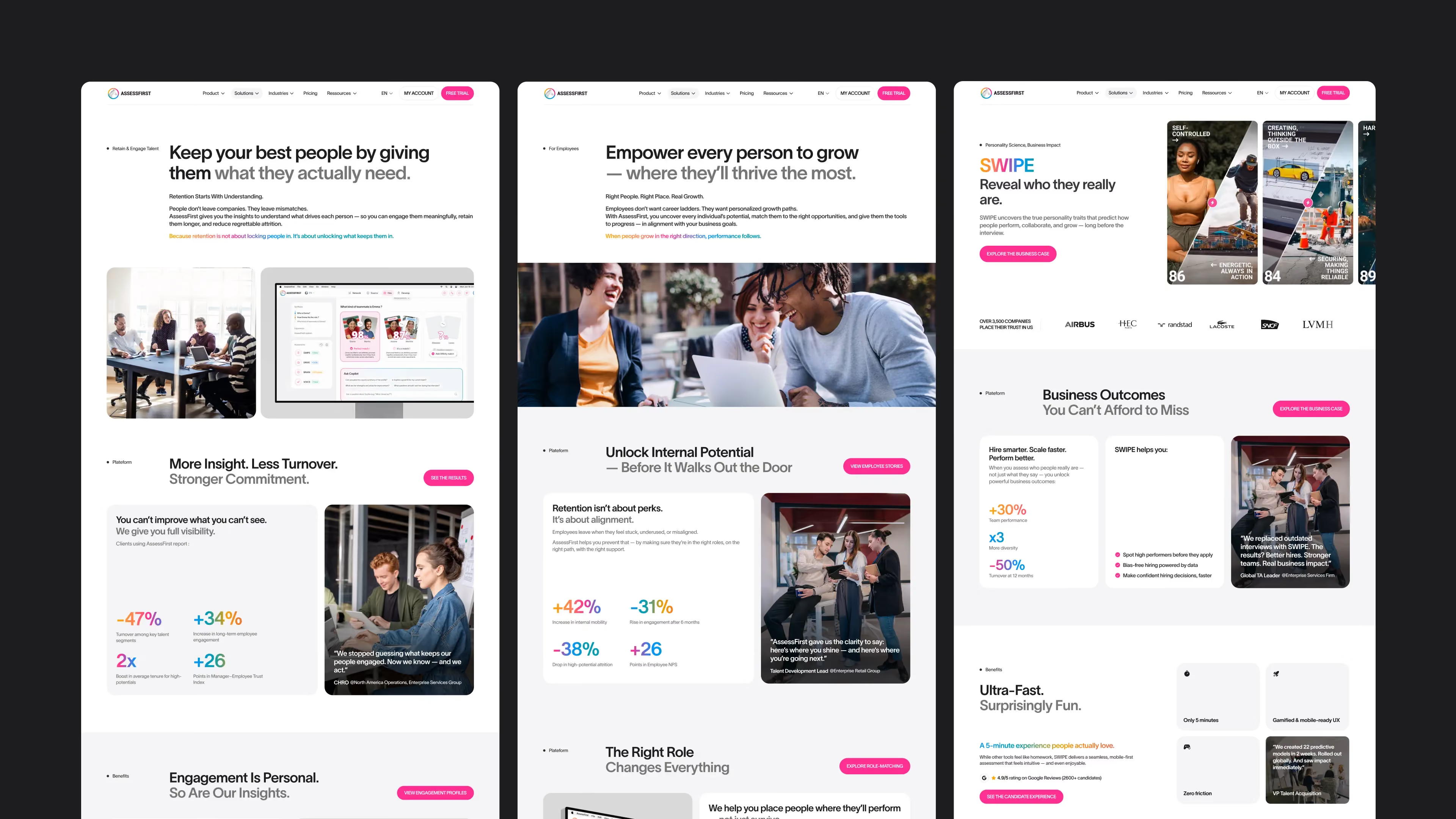
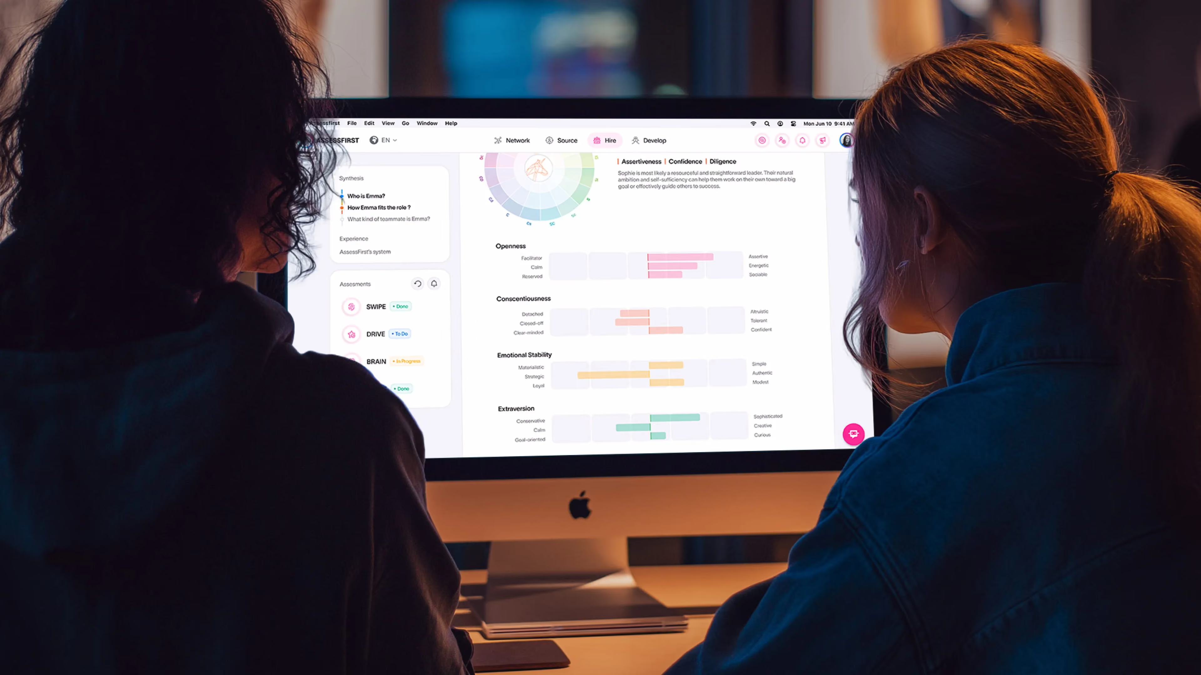
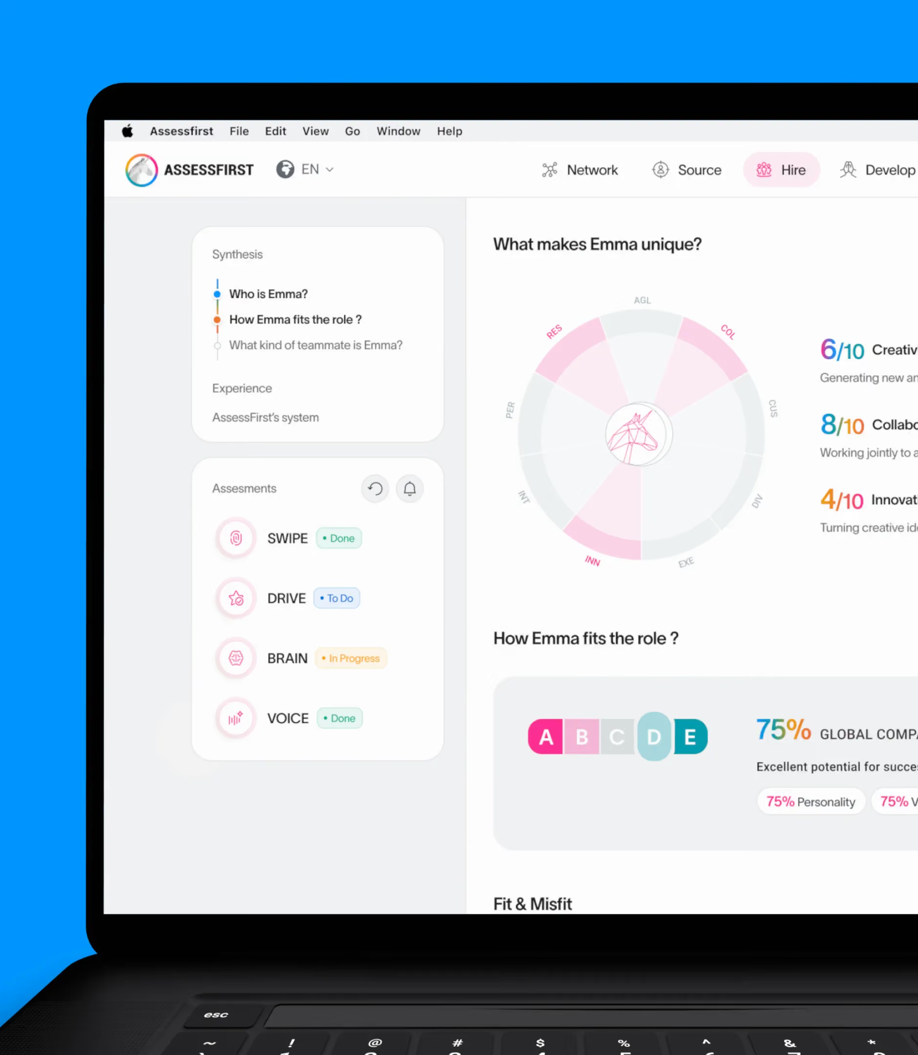
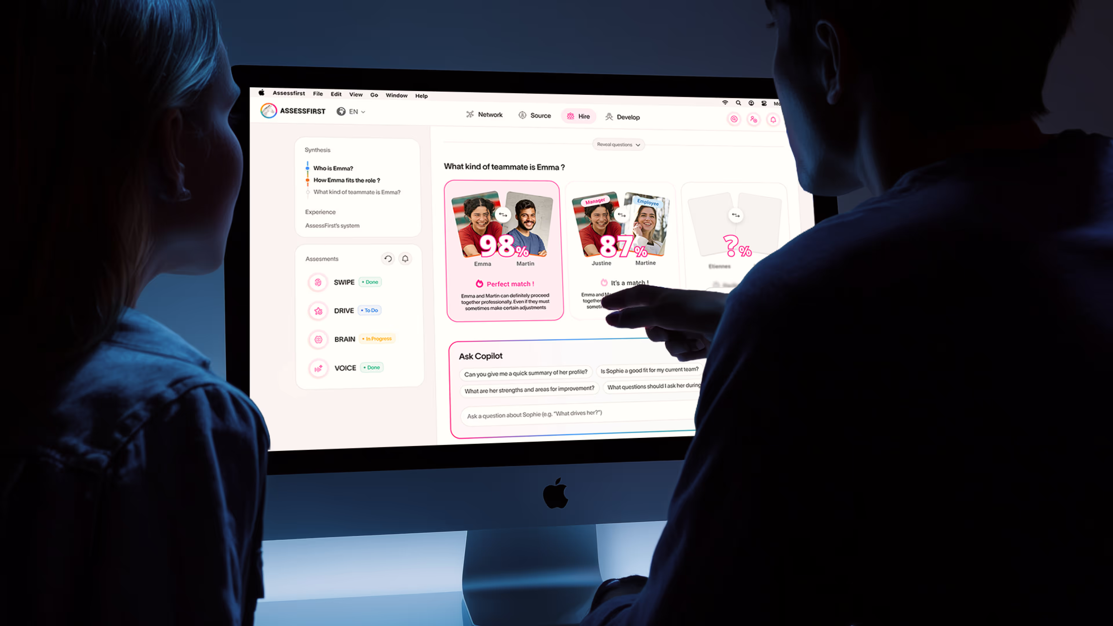
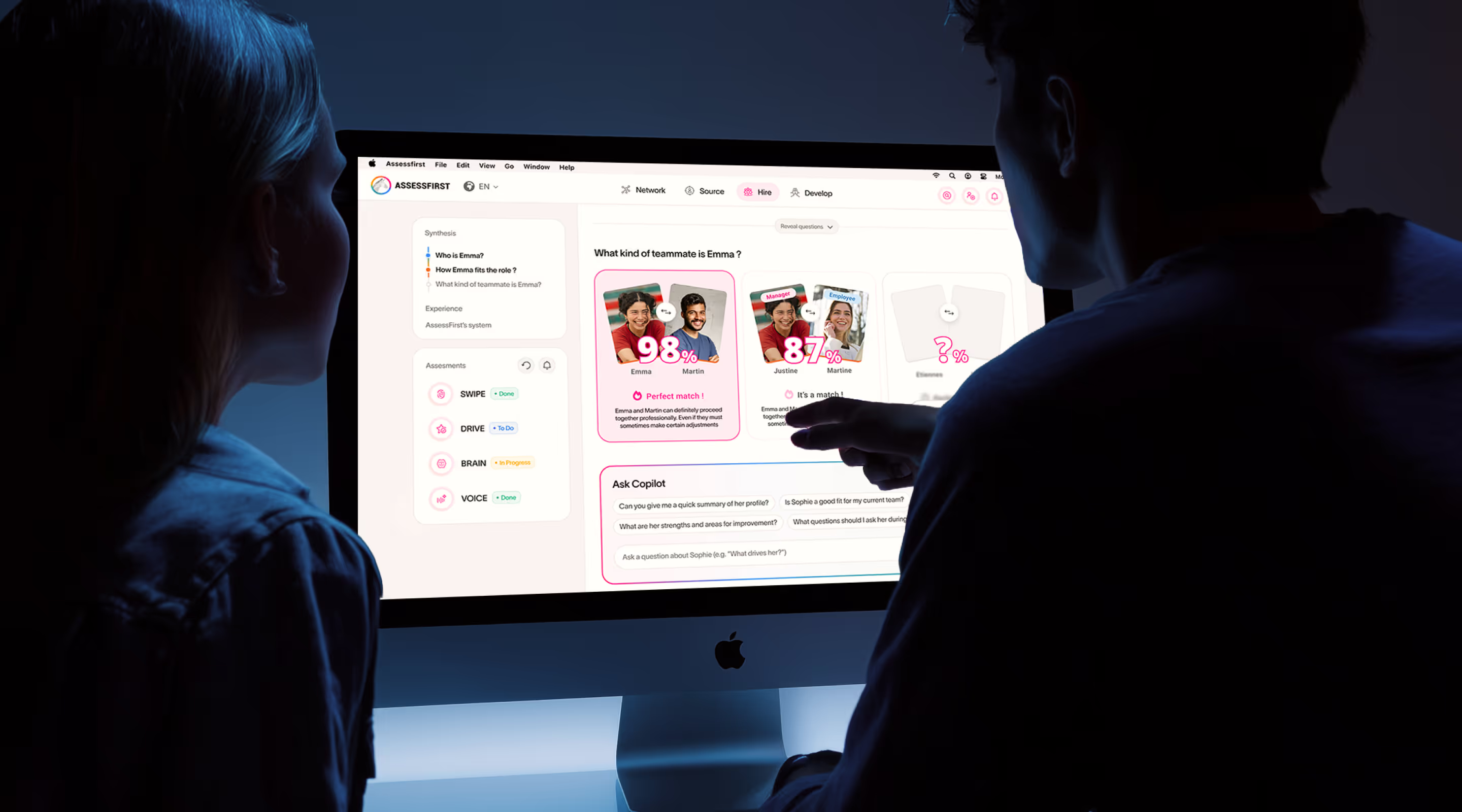
Each product page follows a recurring structure: a hero section with the module name and its promise, feature blocks illustrated with real interface screenshots, and a clear path to the related use cases. The Emma mascot acts as the through-line — she appears in matching, scoring, and assessment demos, creating a consistent narrative across every module.

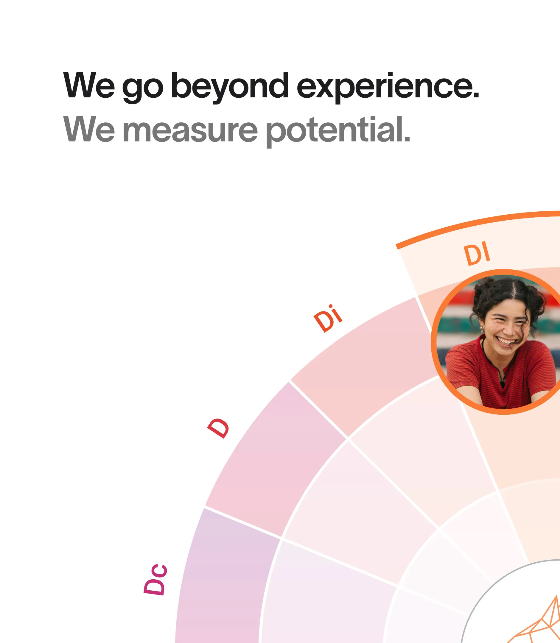
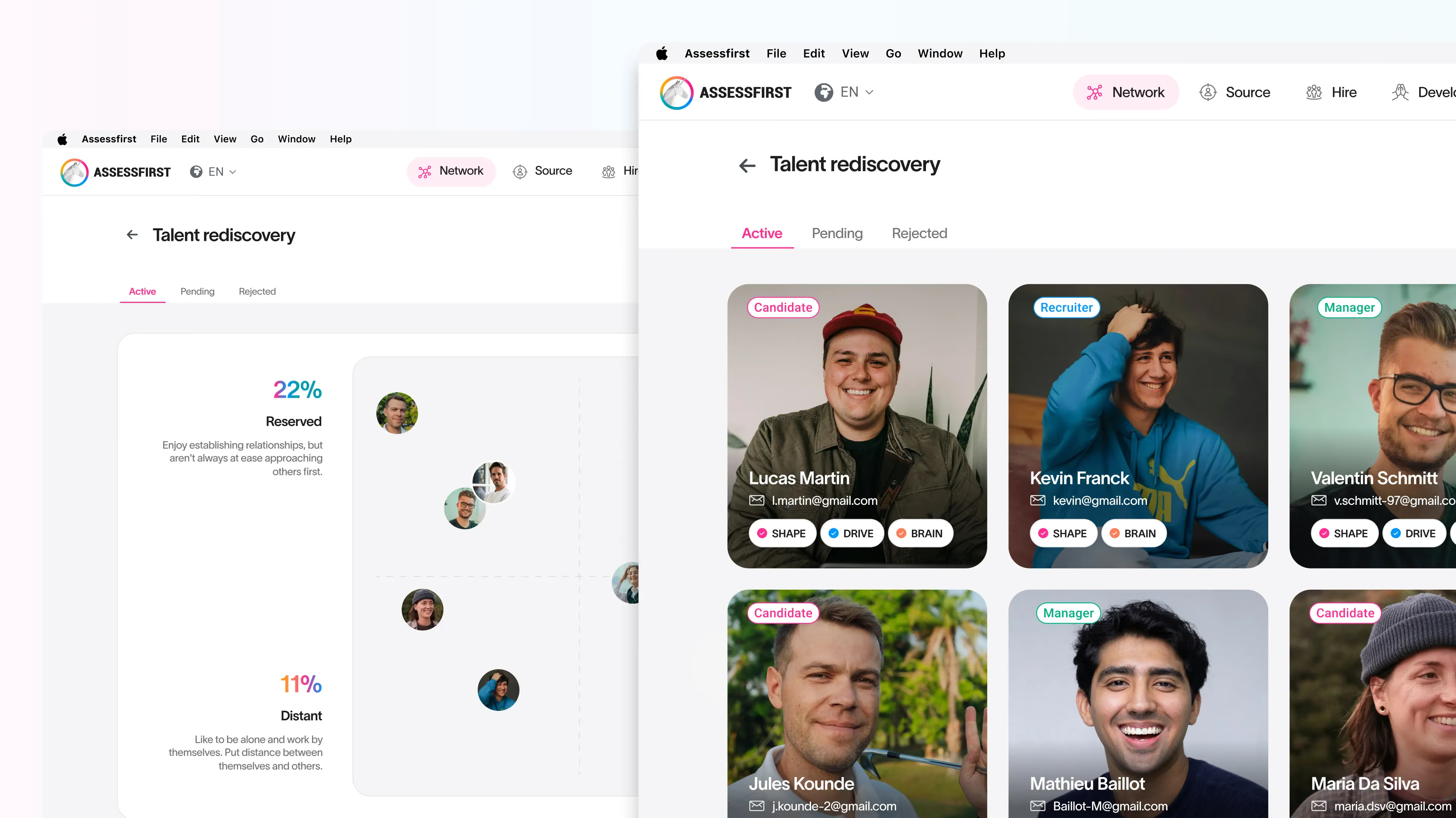
The compatibility scoring system (letters A to E with color coding) is presented visually and intuitively: visitors understand how predictive matching works at a glance. Personality radars, which map soft skills across multiple axes, turn complex behavioral data into accessible charts.

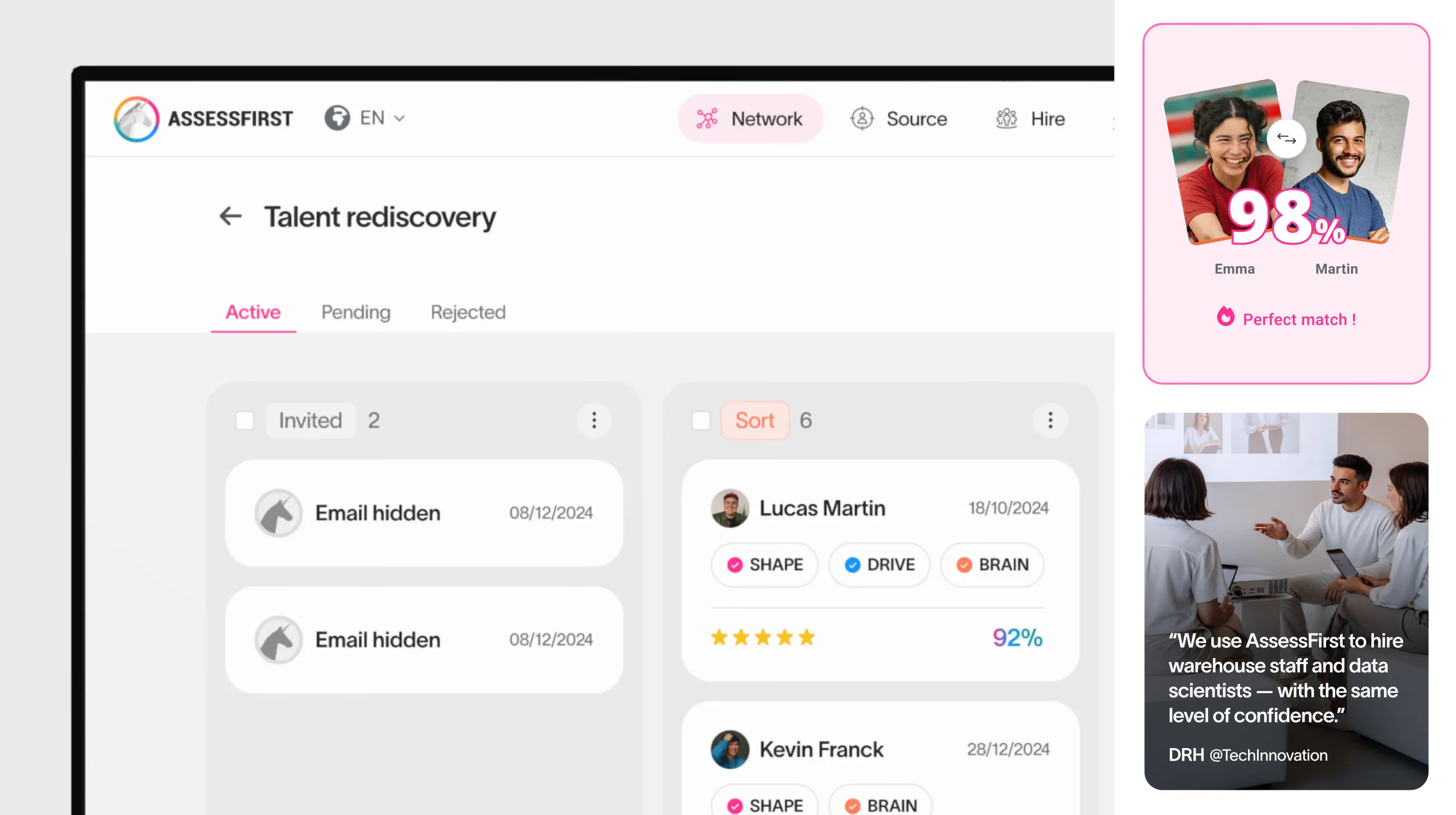
The use case pages (recruiting, internal mobility, engagement, scale) integrate concrete metrics pulled from client data: +30% performance, -50% turnover, 3x diversity, 80 days saved per recruiter per year. These numbers are positioned as tangible proof, not marketing promises. The talent rediscovery feature — finding already assessed profiles for new roles — is highlighted as a product differentiator, with a dedicated journey.

No items found.

Summary

We entrusted Gemeos with a full website redesign and migration, and everything went incredibly smoothly. What stood out most to us was the quality of the art direction: a truly premium, cohesive visual direction, with a clear visual identity and highly polished choices throughout — typography, colors, iconography, pacing, hierarchy, and more. You can tell they have great taste, and above all, a real eye for detail on every screen. On top of that, the team is incredibly responsive and very experienced: they know both design and the technical side inside out. I’d recommend them without hesitation.

David BERNARD

CEO & Founder @AssessFirst

A
A
A

Webflow Development

A multi-locale site built to perform at scale

Building the AssessFirst site in Webflow was a major technical undertaking.

The site spans five locales — FR, EN, DE, AR, and RU — while staying within the limits of Webflow’s standard plan. It uses a clean URL structure for each language, plus redirects for locales that aren’t natively supported (Arabic and Russian) to protect both the user experience and SEO.

The technical integration involved multiple external layers. Cloudflare, used as a proxy/CDN, required custom configuration to fix 500 errors that appeared during development. A classic clash between proxy cache and the Webflow staging environment.

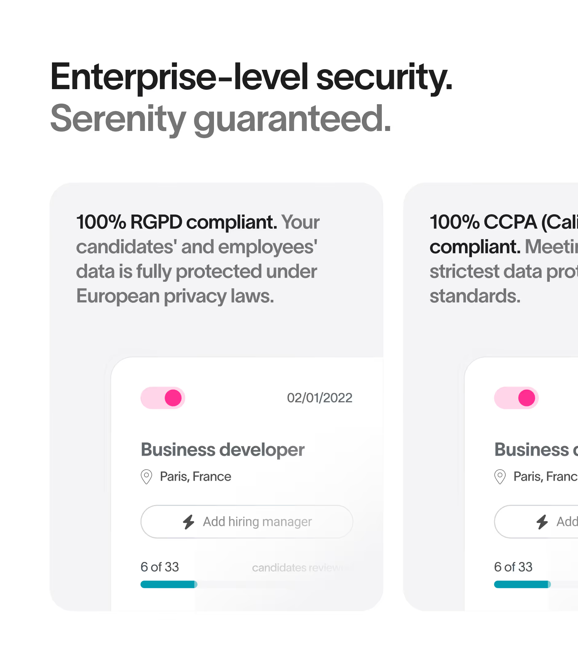
Cookie consent runs through Axeptio, natively integrated into the site to stay GDPR-compliant across every locale.

On the component side, the hover mega-menu with two or three columns is one of the most refined technical elements on the site. It organizes a dense navigation system — solutions, products, resources — while staying smooth and intuitive. The iClosed widget, persistent across the entire site, lets visitors book time with David Bernard (CEO) without leaving the browsing flow.

The blog includes an automatic article summary system powered by an LLM API (Gemini, after initial tests with Mistral). Multi-language article imports were structured to automatically map EN and DE content to each other, keeping editorial consistency across locales.

The entire development workflow relied on Flowmapp for sitemap mapping, and Markup.io for QA cycles between the dev and design teams, making it possible to leave contextual feedback directly on pages in progress.

Summary

We entrusted Gemeos with a full website redesign and migration, and everything went incredibly smoothly. What stood out most to us was the quality of the art direction: a truly premium, cohesive visual direction, with a clear visual identity and highly polished choices throughout — typography, colors, iconography, pacing, hierarchy, and more. You can tell they have great taste, and above all, a real eye for detail on every screen. On top of that, the team is incredibly responsive and very experienced: they know both design and the technical side inside out. I’d recommend them without hesitation.

David BERNARD

CEO & Founder @AssessFirst

A
A
A

SEO/GEO

A technical SEO strategy built in from the very first line of code

The AssessFirst site’s SEO goes far beyond optimized content. It’s built into the site’s very architecture.

Every key page ships with structured data in JSON-LD format (schema.org): AboutPage for the team page with leadership markup for the CEO, Chief Scientist, and COO; Organization for corporate positioning; and schemas tailored to product pages and use cases.

The internal linking structure was designed to make crawling smoother and distribute authority across strategic pages. The product pages — SWIPE, DRIVE, BRAIN, VOICE, COPILOT, SCAN — connect to the matching use cases (recruitment, internal mobility, engagement), creating a coherent semantic network. A crawl audit in Screaming Frog validated the structure and surfaced opportunities for improvement.
The URL architecture is clean and localized. Each locale has its own prefix (/fr/, /en/, /de/) with translated, consistent slugs. 301 redirects cover legacy URLs and locales not natively supported in Webflow, like Arabic and Russian, preventing any traffic loss during the migration.

The blog, a true pillar of the content strategy, benefits from EN↔DE multilingual mapping for hreflang tags, ensuring Google indexes the right language version for every market.

AI-powered article summaries with Gemini boost useful content density from the very first lines, helping featured snippets and improving organic click-through rates.

SEO ElementImplementation
Structured dataJSON-LD / schema.org (AboutPage, Organization, Person)
URL architectureLocalized with language prefixes + translated slugs
Redirects301s for legacy URLs + unsupported locales
Internal linkingProducts ↔ use cases ↔ blog network
HreflangAutomated EN↔DE multilingual mapping
Crawl auditScreaming Frog — structure validation + errors
AI contentAutomatic summaries via Gemini API

Summary

We entrusted Gemeos with a full website redesign and migration, and everything went incredibly smoothly. What stood out most to us was the quality of the art direction: a truly premium, cohesive visual direction, with a clear visual identity and highly polished choices throughout — typography, colors, iconography, pacing, hierarchy, and more. You can tell they have great taste, and above all, a real eye for detail on every screen. On top of that, the team is incredibly responsive and very experienced: they know both design and the technical side inside out. I’d recommend them without hesitation.

David BERNARD

CEO & Founder @AssessFirst

OUR latest projects

+240 companies
supported

Websites designed and developed with 

Let’s f*****G GO !!

Ready to launch
Your business?

Alexandre

Max

Enora

Bryan

Cannelle

Tiphaine

You'll :heart: our collaboration...