Art Direction
A human, uncompromising Enterprise visual identity
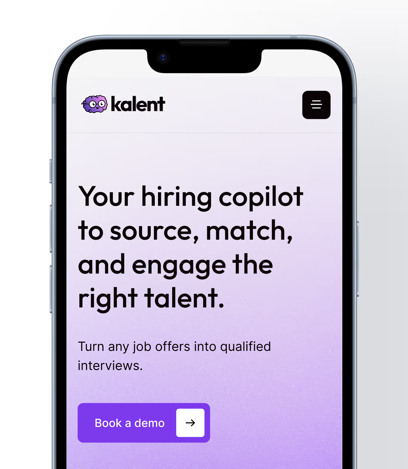
The initial brief was clear: break away from the "data-heavy" visual codes often tied to HR tools, and establish an Enterprise/Mid-market position while staying approachable and human. Kalent wanted to keep its purple, its logo — built around the co-pilot concept — and its signature pastel color.
For everything else, Gemeos had free rein.
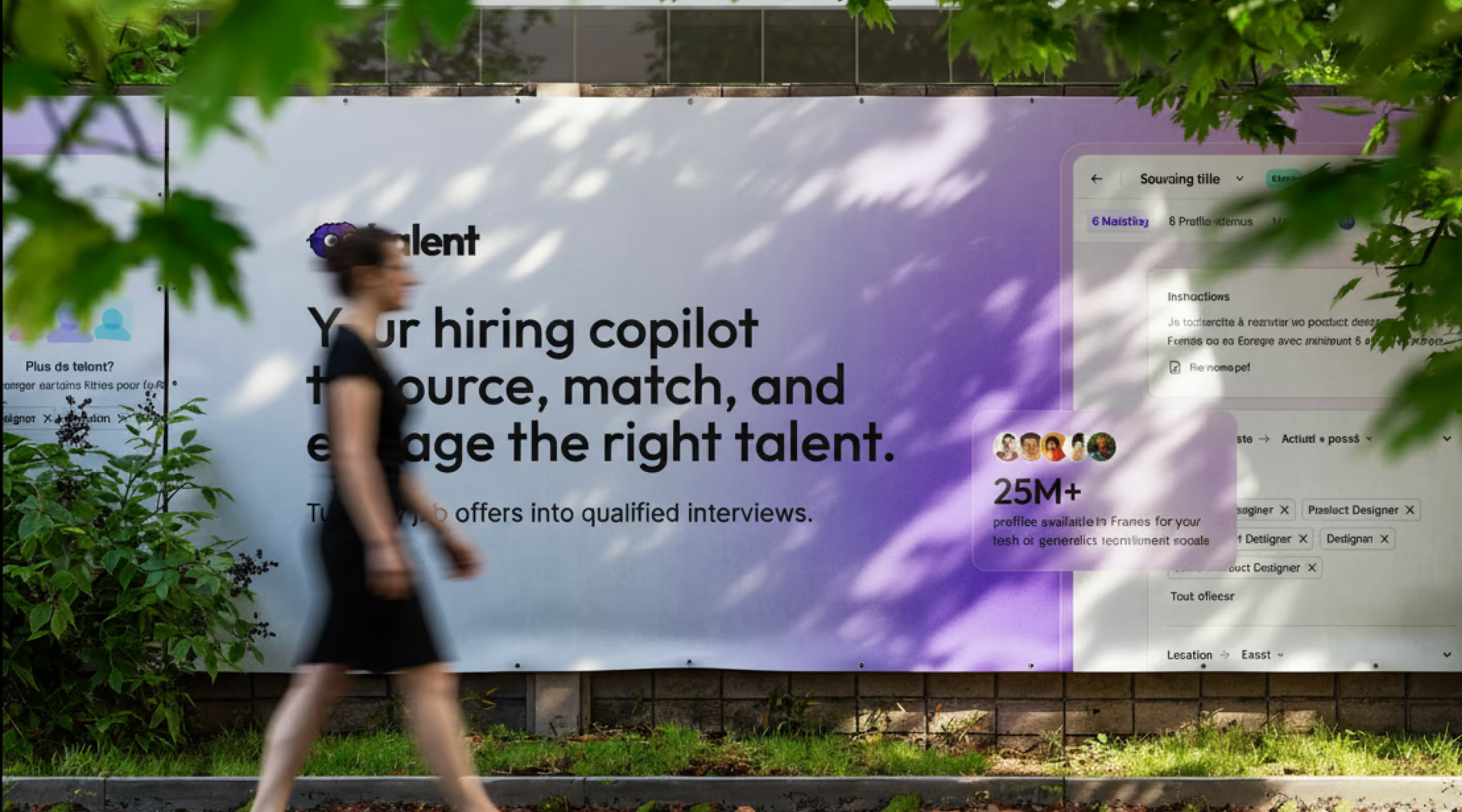
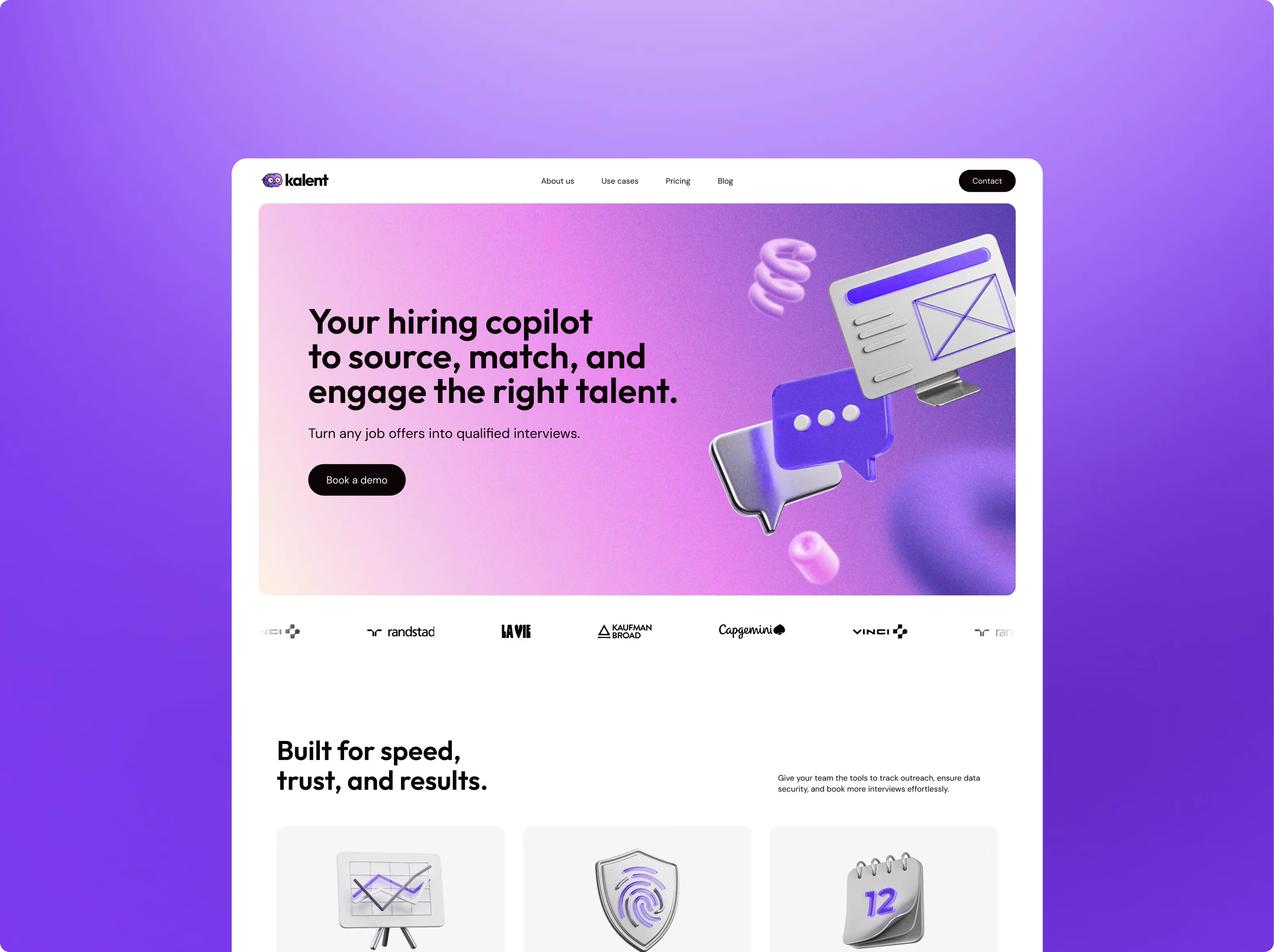
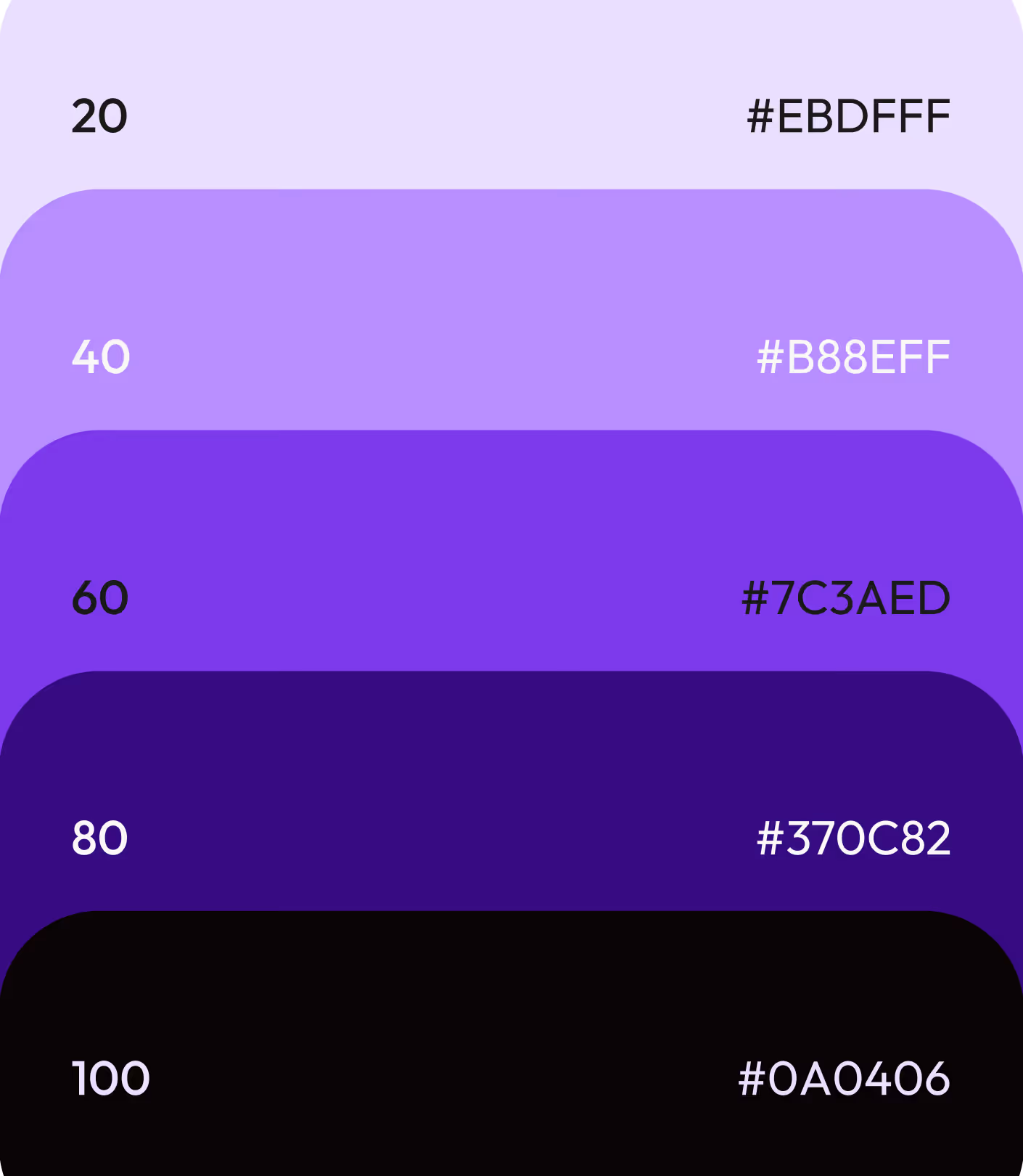
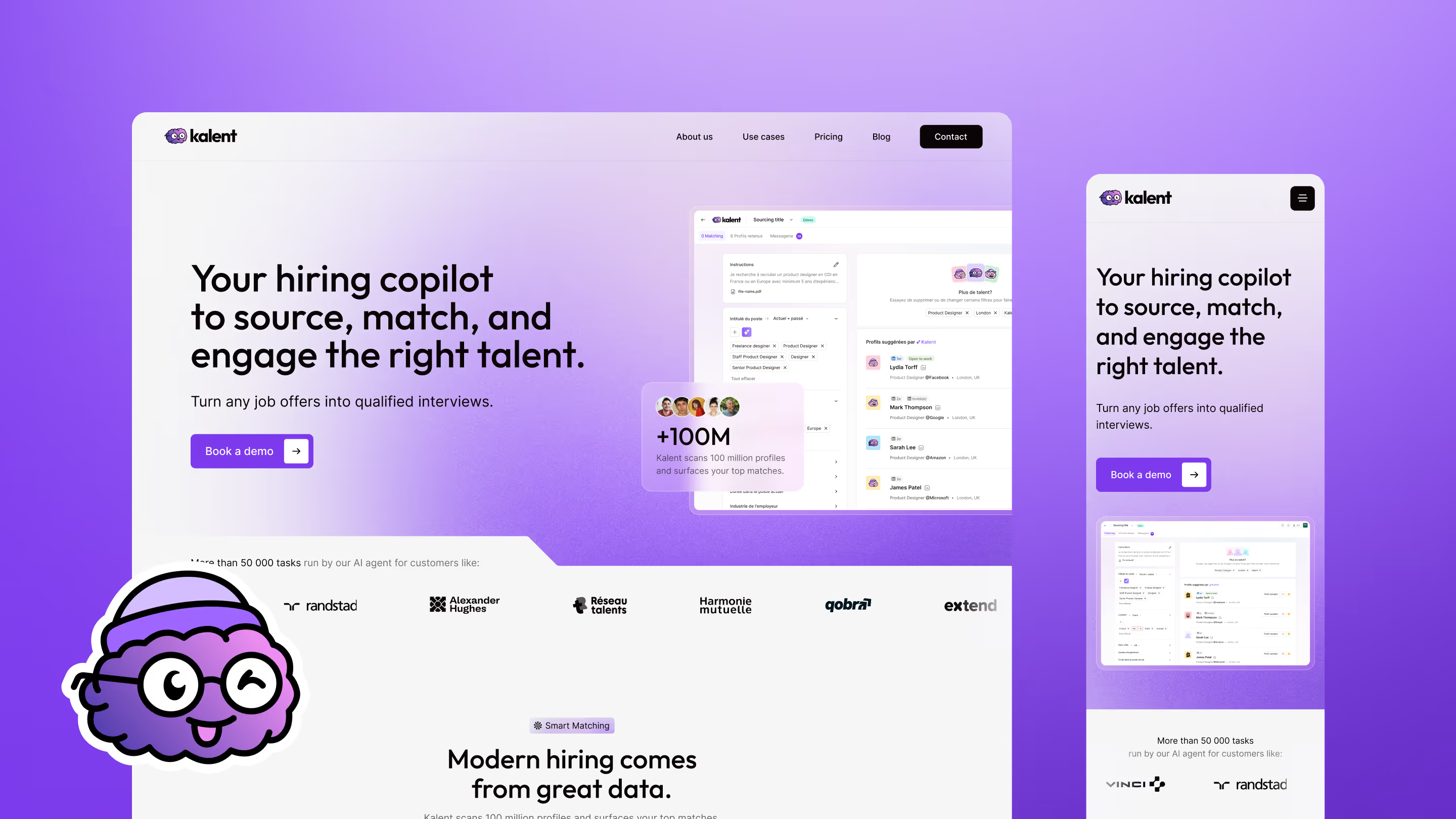
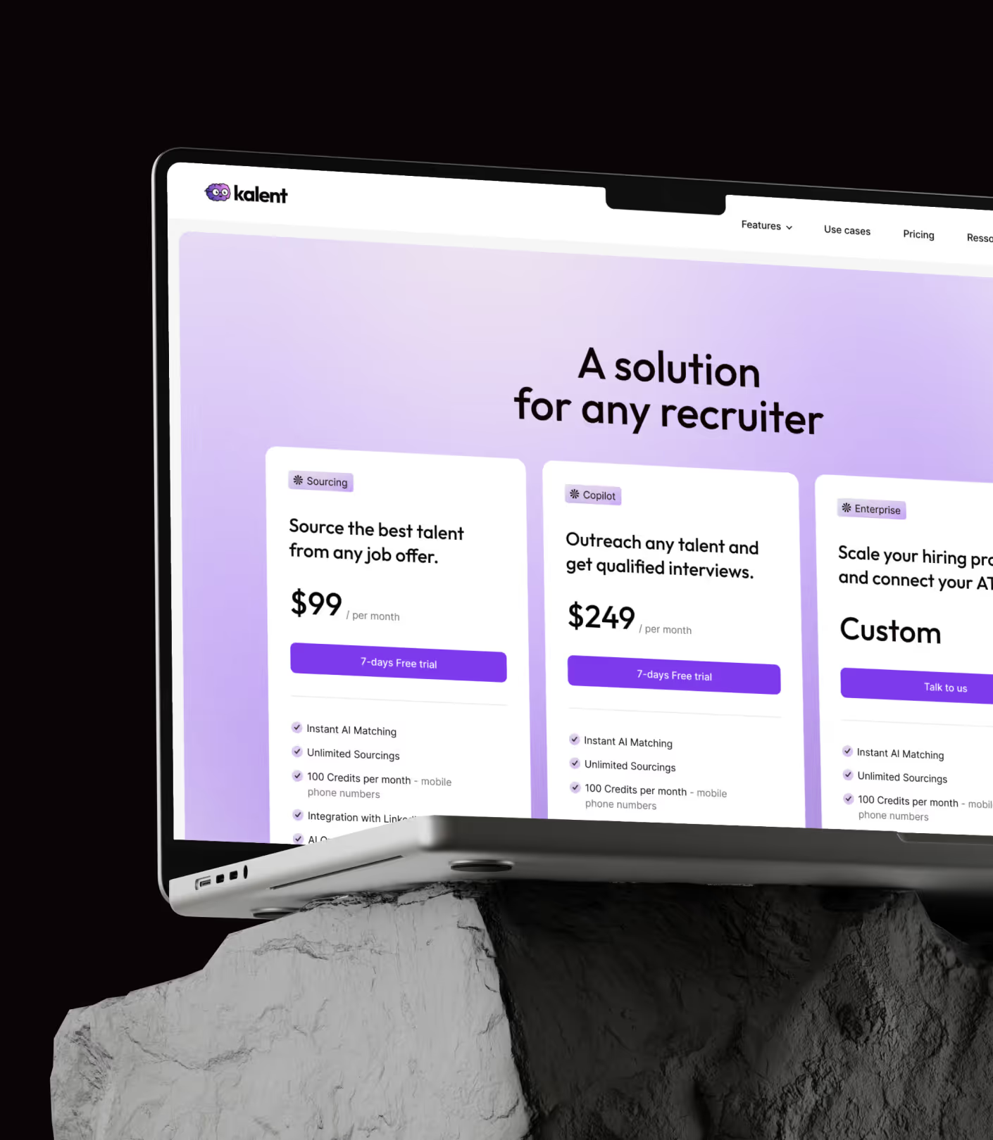
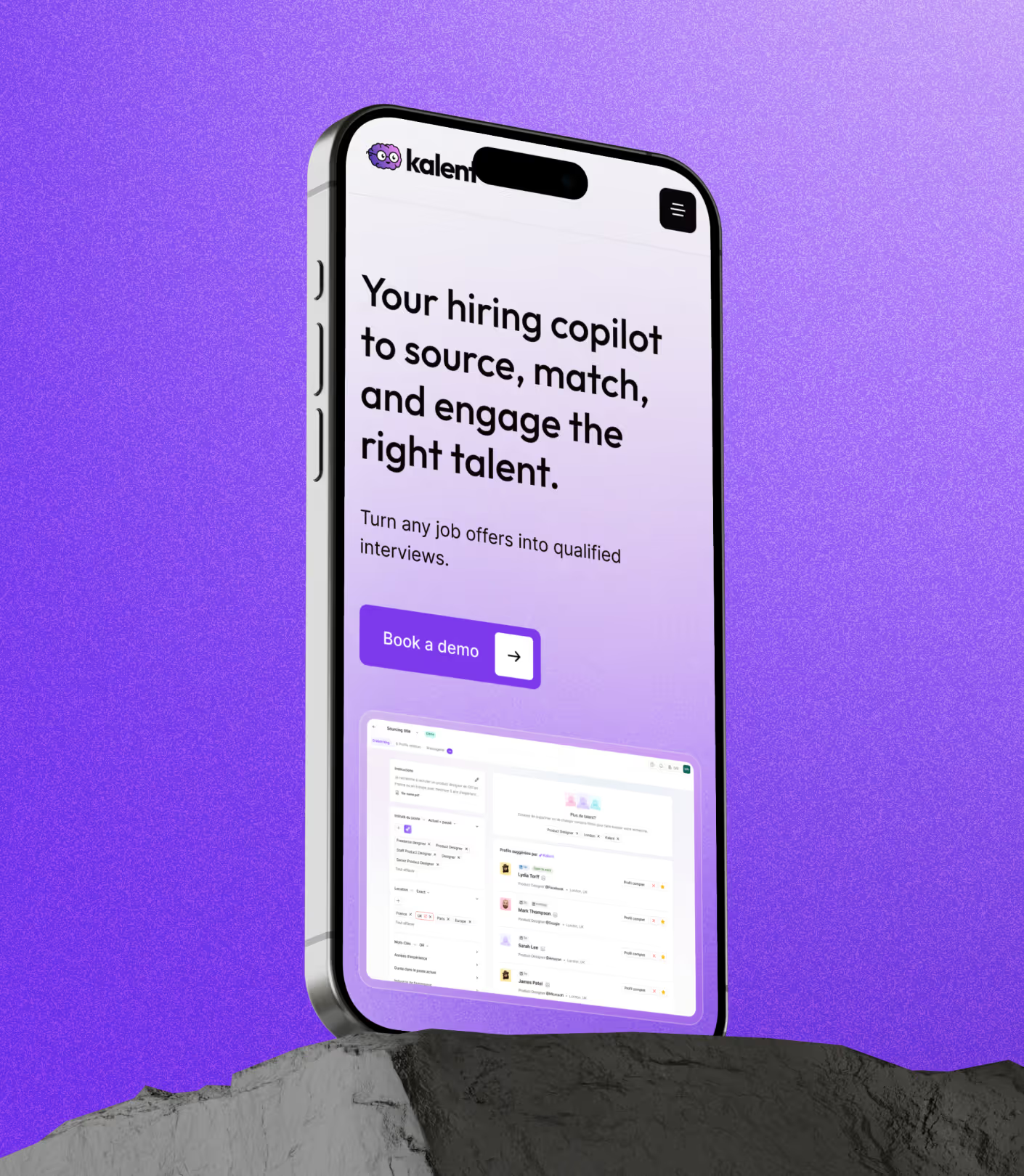
The art direction came together around three key choices. First, a tight palette: deep purple, soft pastel-leaning gradients, and white space to breathe.
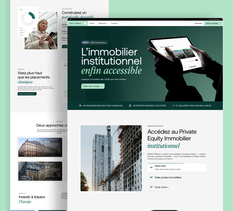
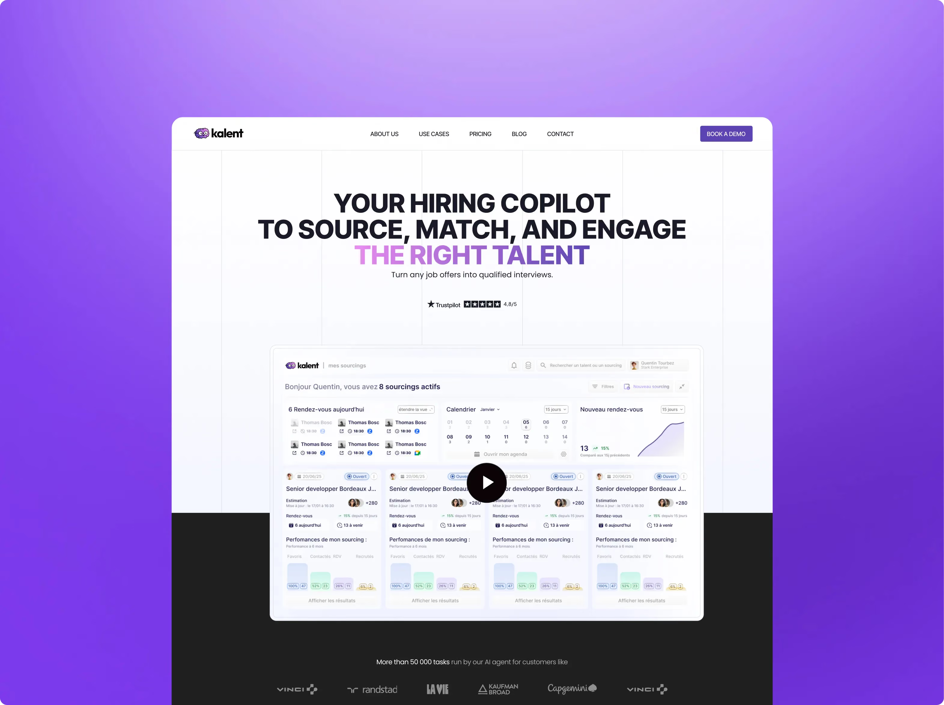
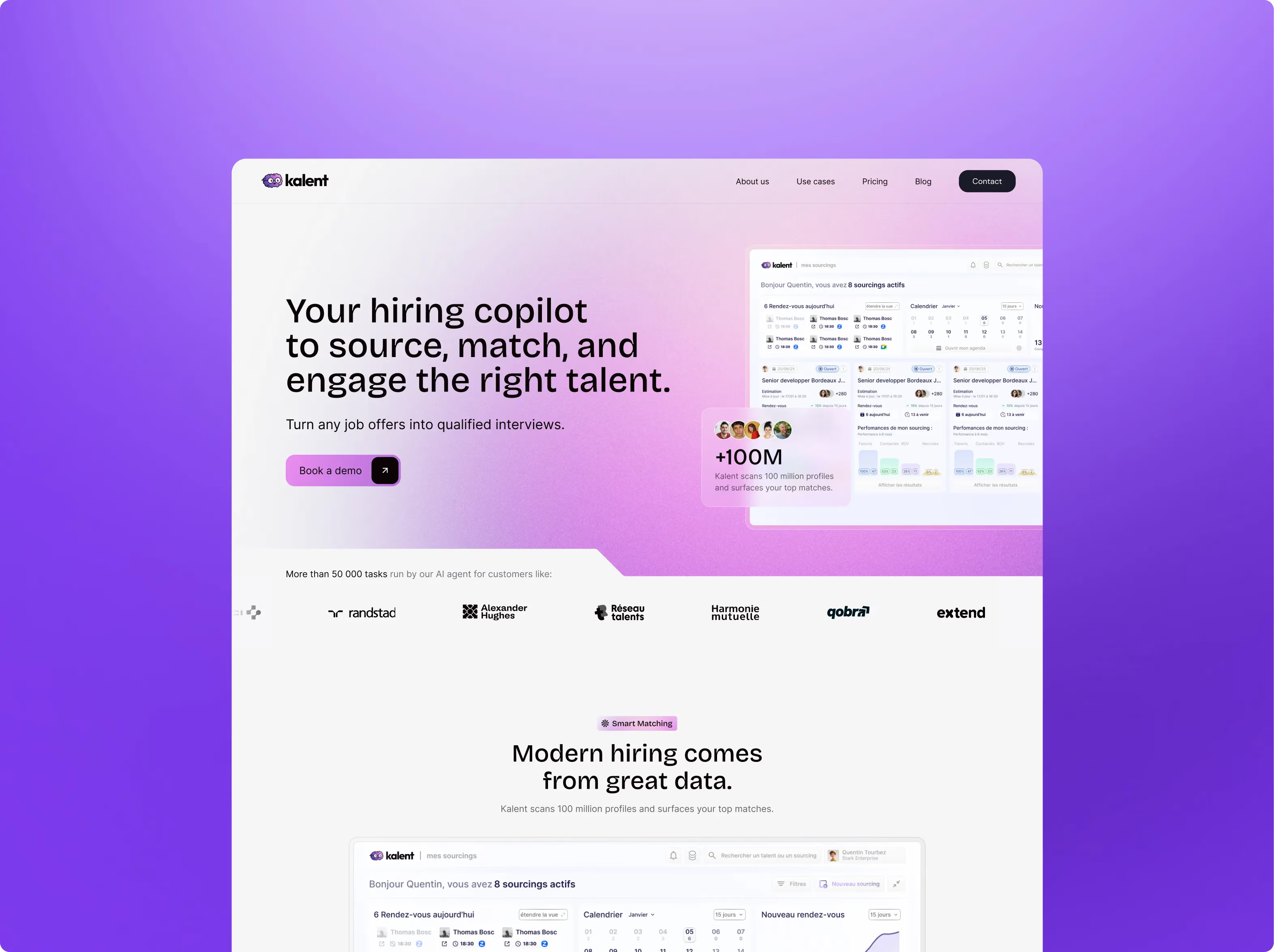
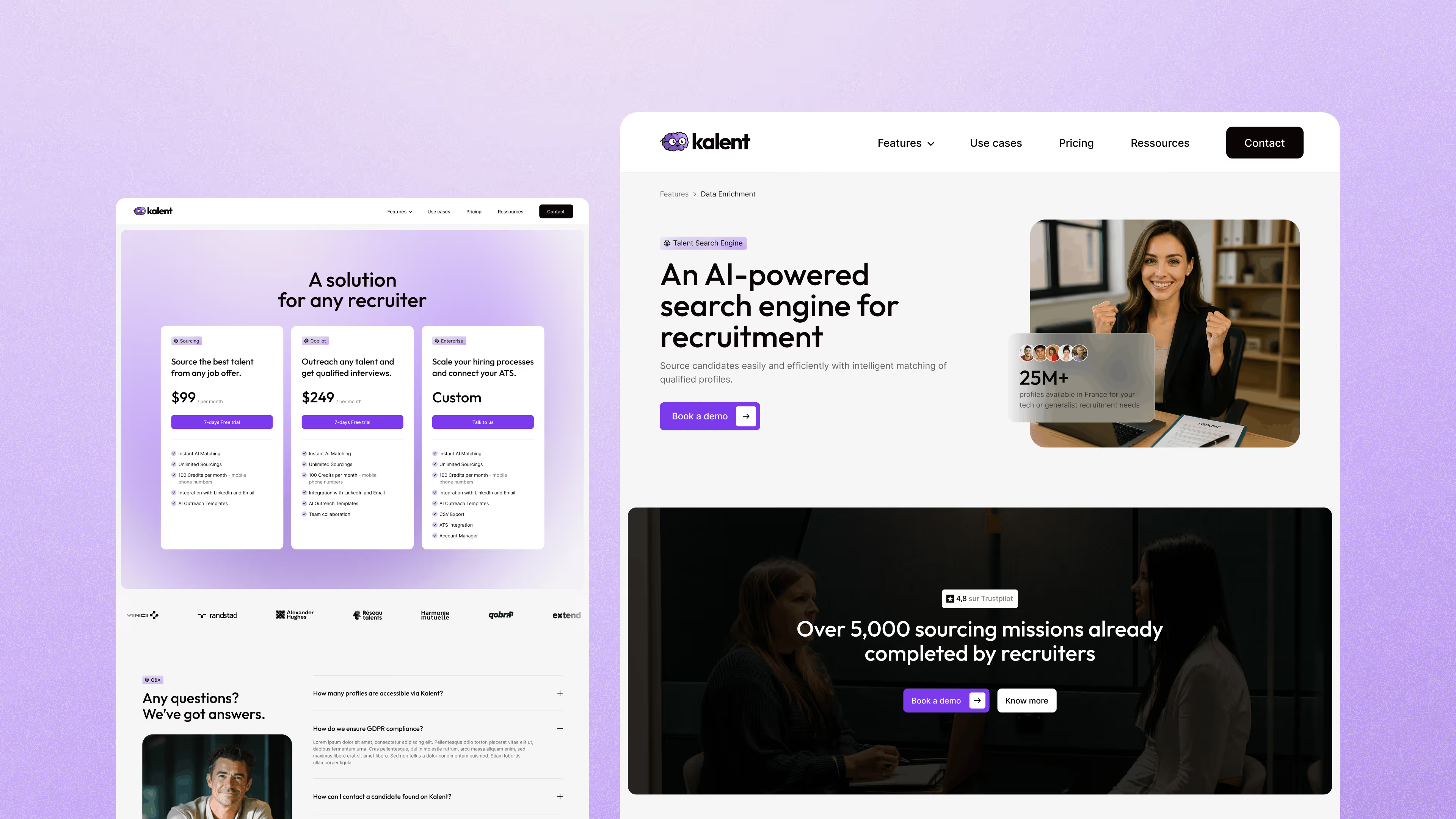
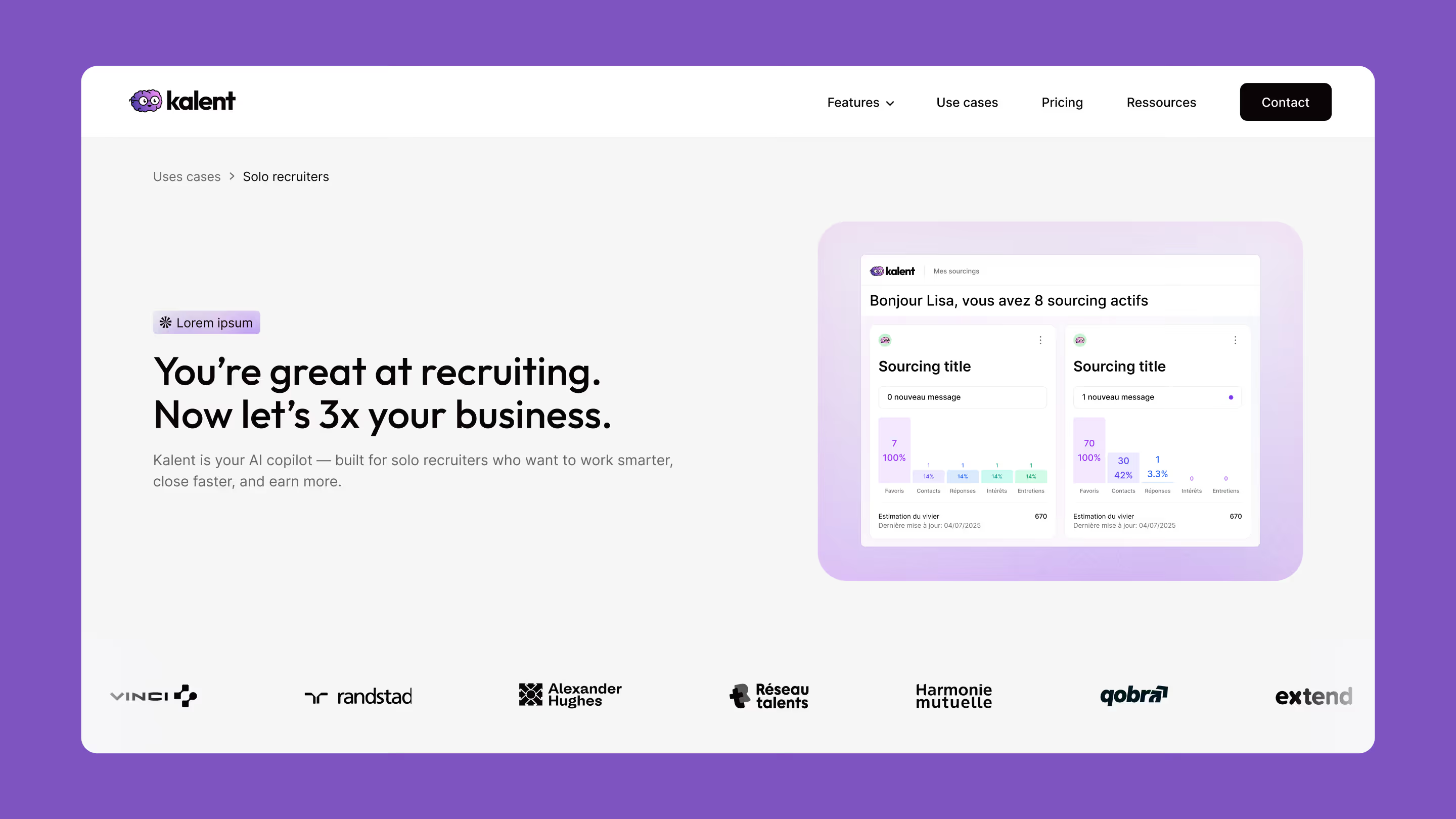
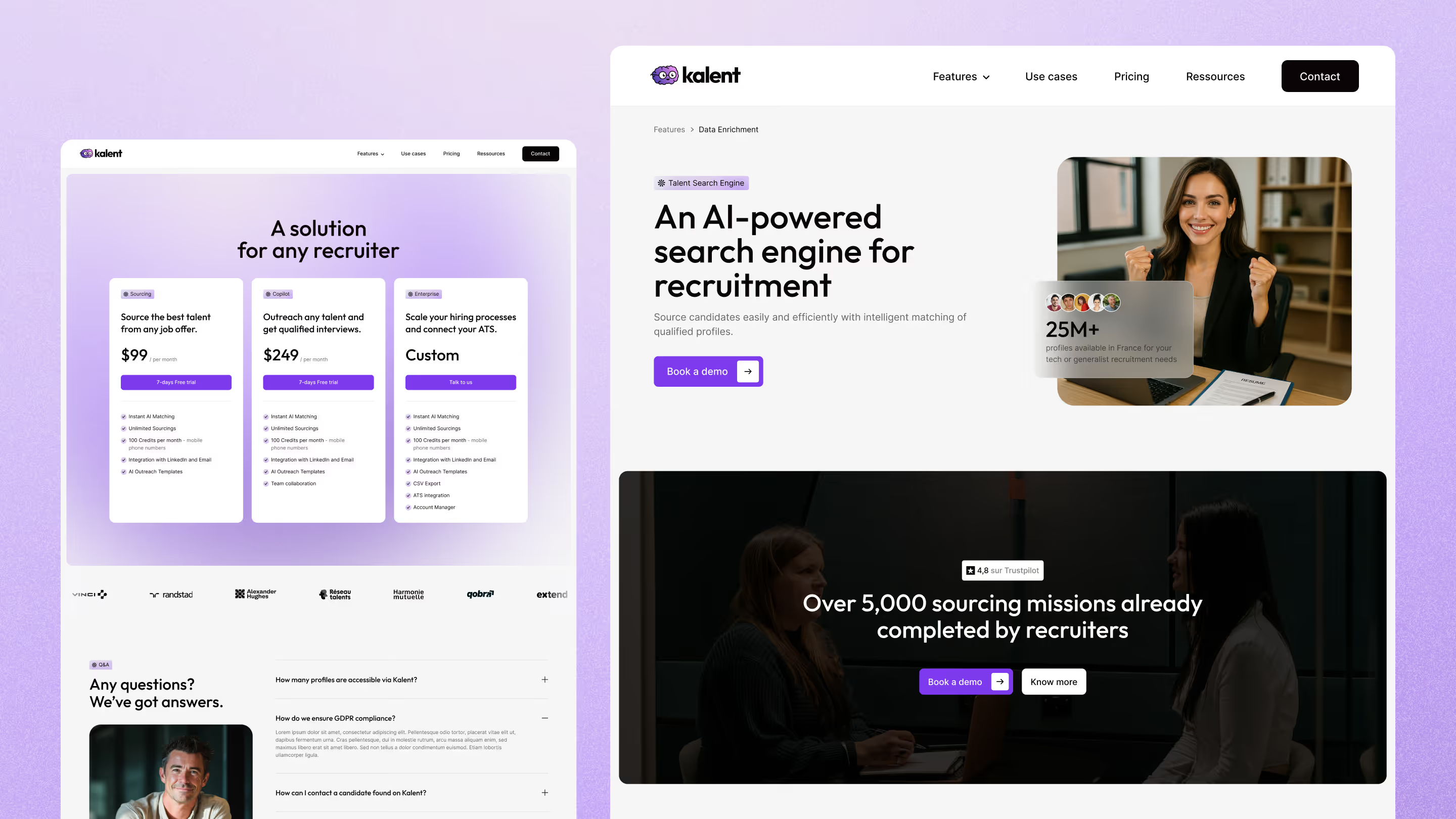
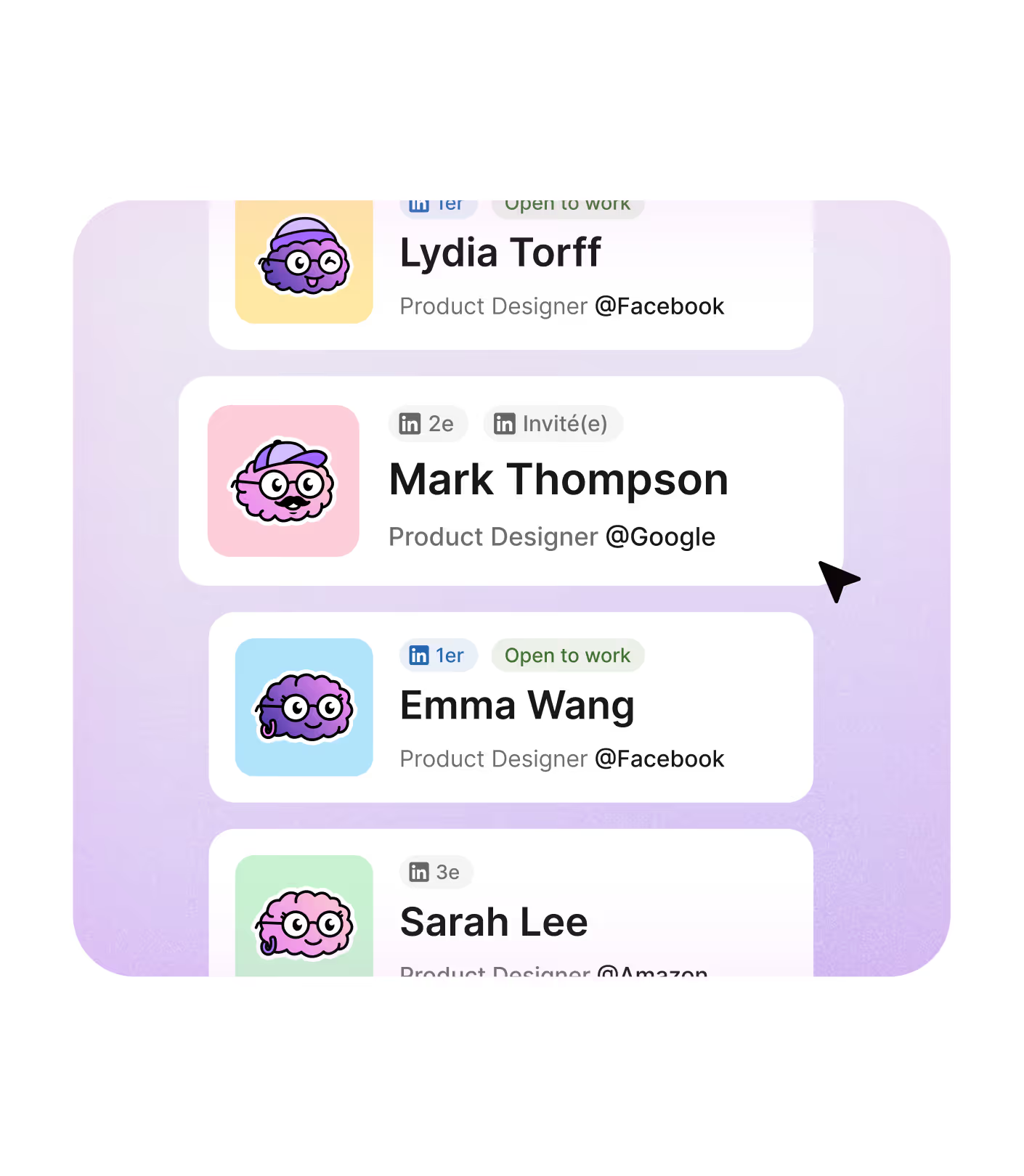
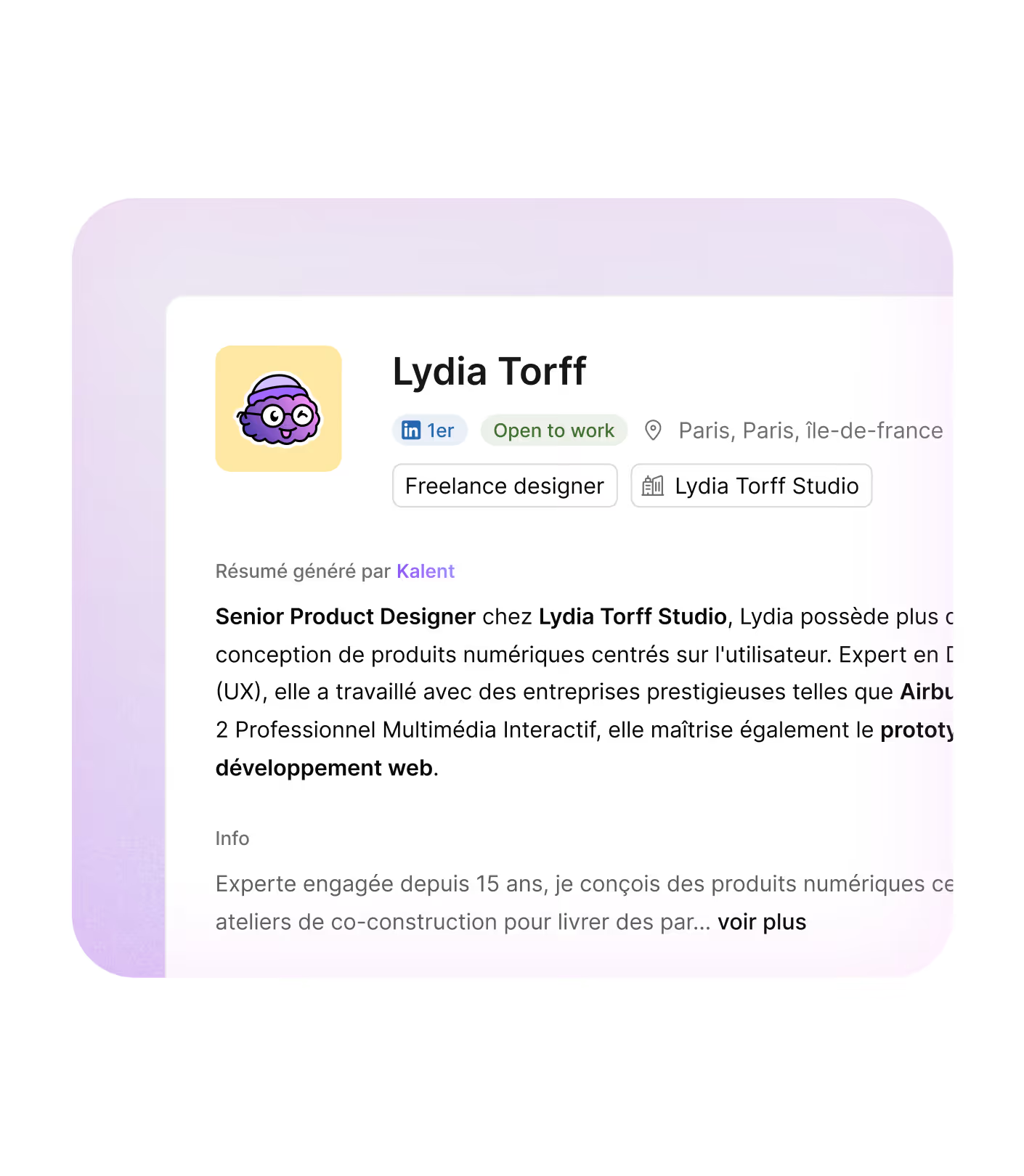
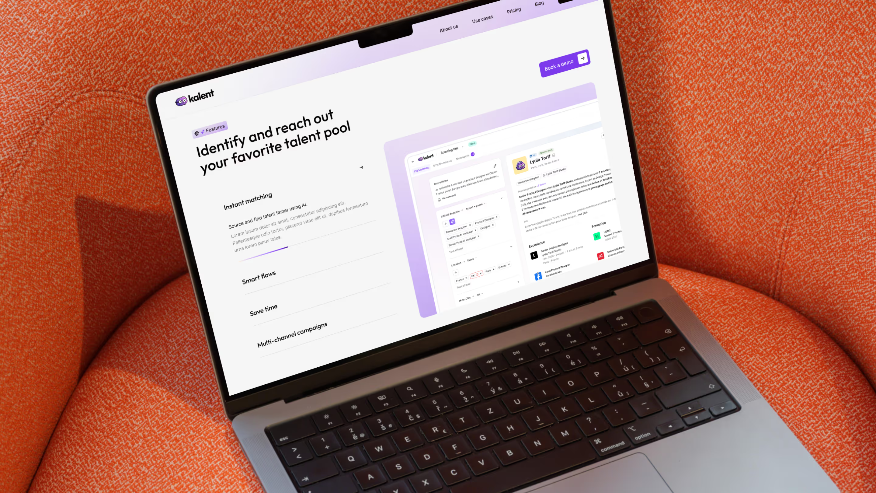
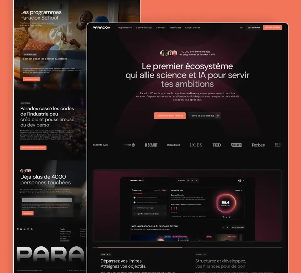
Then, product screen staging pulled directly from Kalent's Figma app design, adapted to stay readable in both FR and EN.
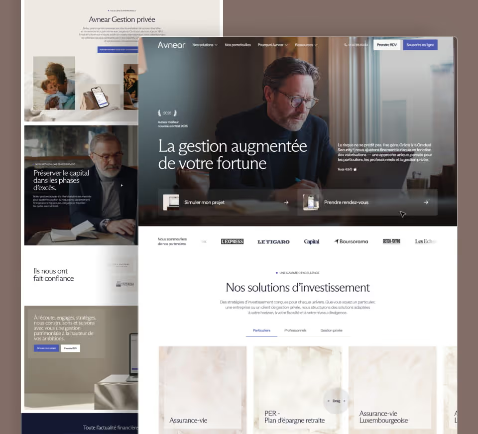
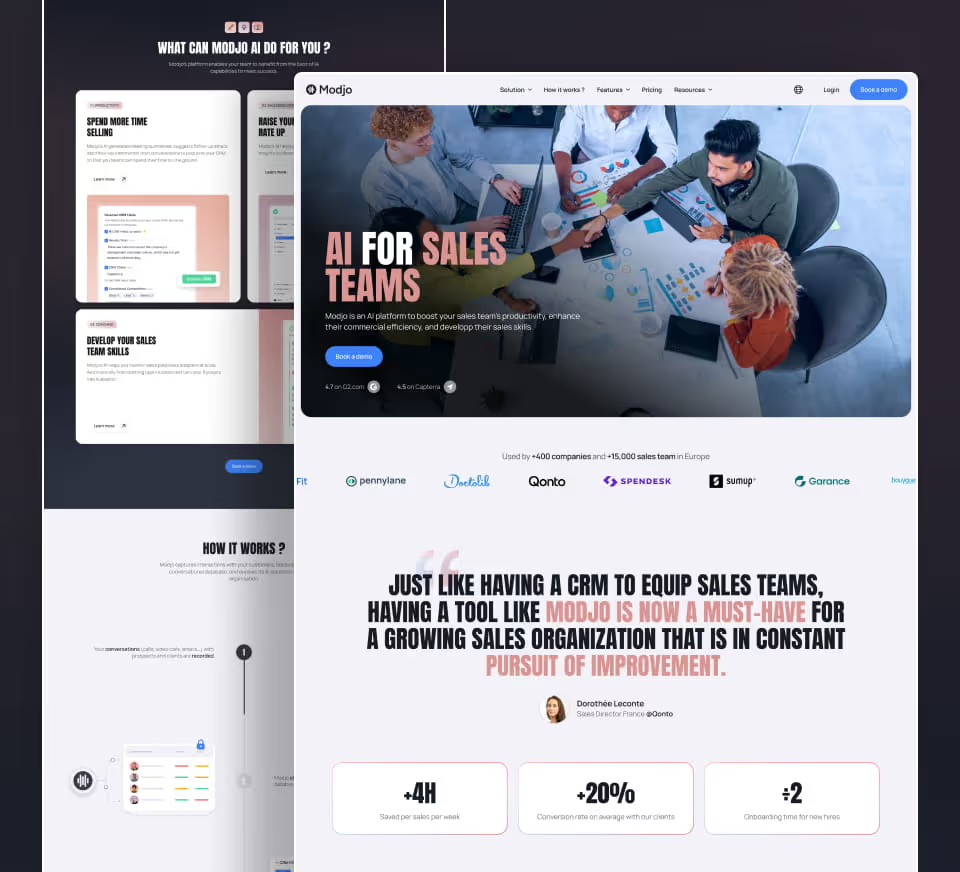
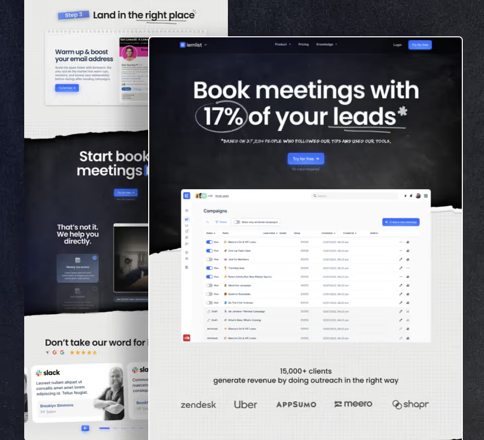
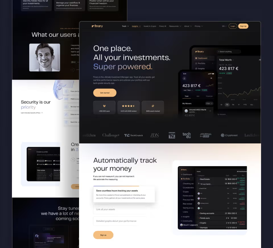
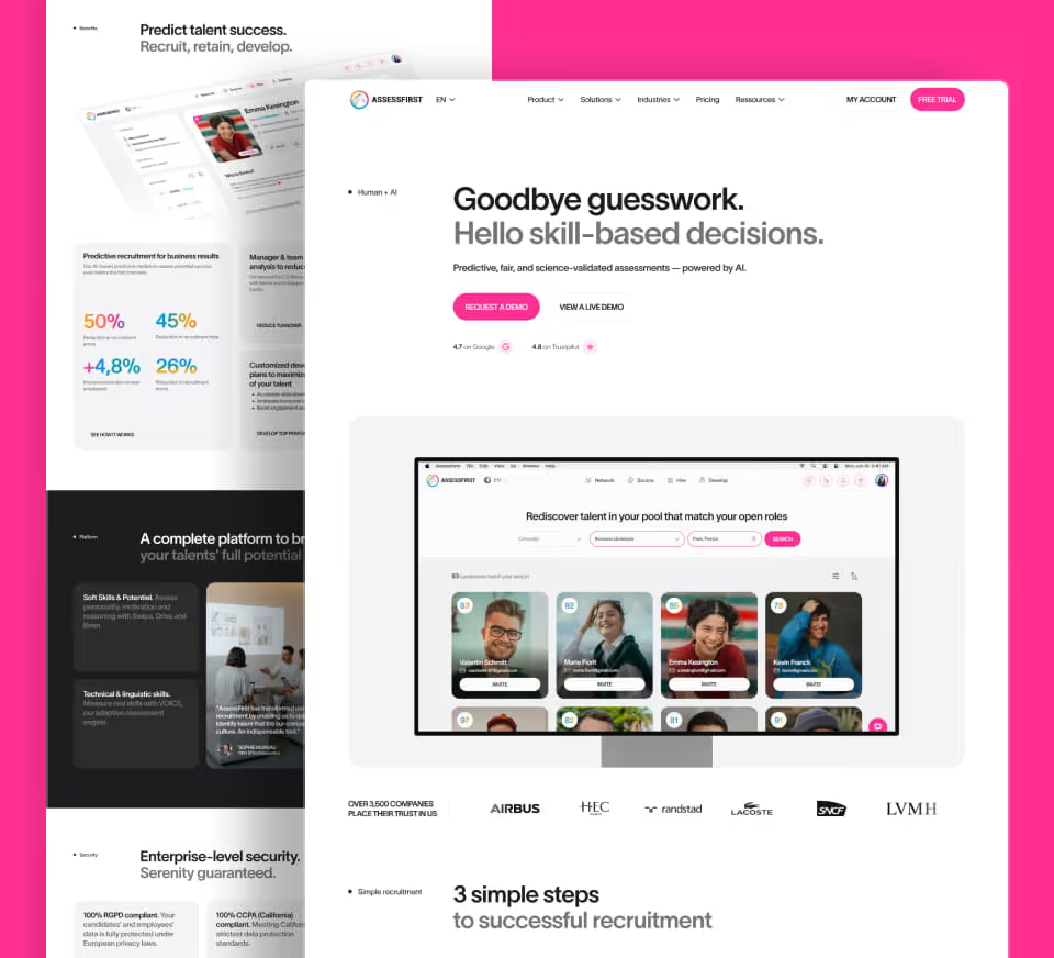
Finally, a visual balance between dense information and generous negative space, inspired by the references approved with the client: Deel, Apollo, Attio, Clay.
The goal wasn't to "make it pretty." It was to build visual consistency strong enough to convert decision-makers — agency CEOs, startup TAMs — in just a few seconds of scrolling.
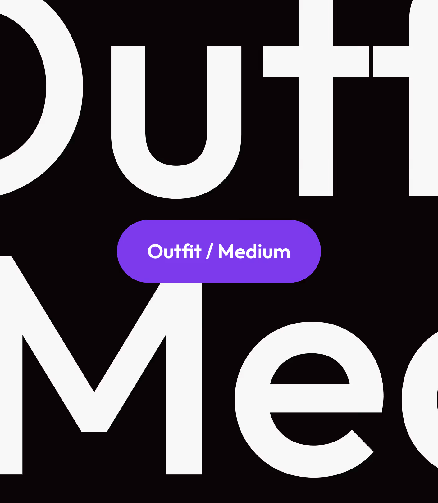
The split text/product layout, with a floating metric in the foreground, conveys power without friction. The serif type and pastel background signal a mature tool, built for demanding recruiters who want to see the product before they hear the pitch.
This is the visual language of next-gen B2B SaaS tools: Greenhouse, Ashby, Lever.
Kalent would capture a tech-first HR audience — HR leaders or Talent Acquisition Managers at mid-market companies and enterprise accounts — who want proof before they book a demo


.avif)