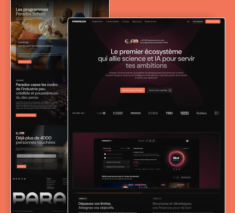
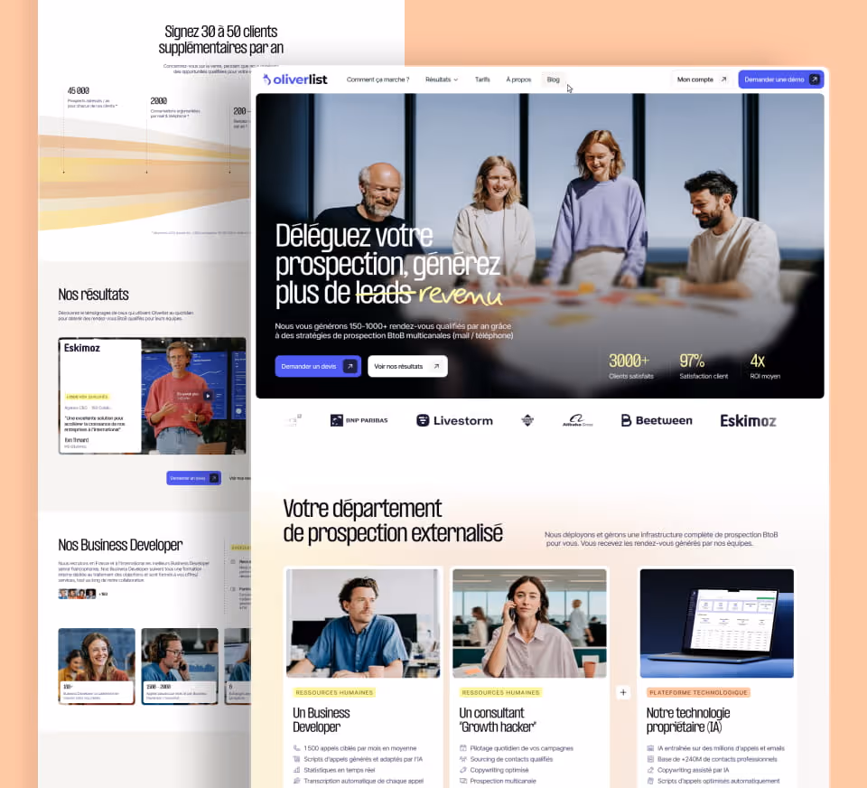
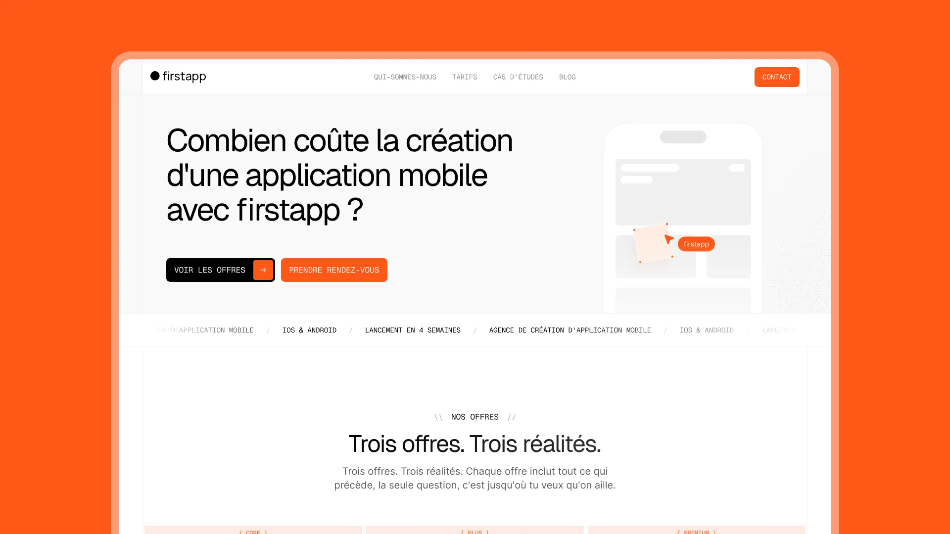
A site that matches the product: direct, ambitious, human
firstapp supports first-time founders from idea to first revenue. Their site had to capture that mindset: direct, effective, no fluff, but with real personality. The Gemeos team designed a look and feel that reflects the agency’s culture — a crew of friends with serious skills — without falling into the trap of an institutional brochure site.
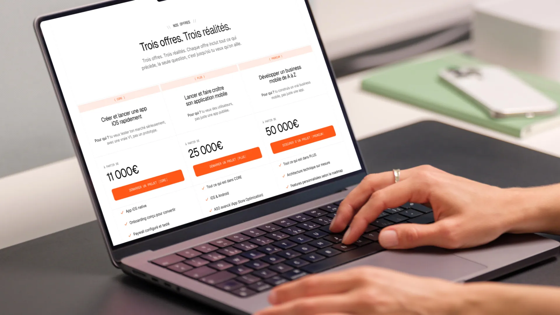
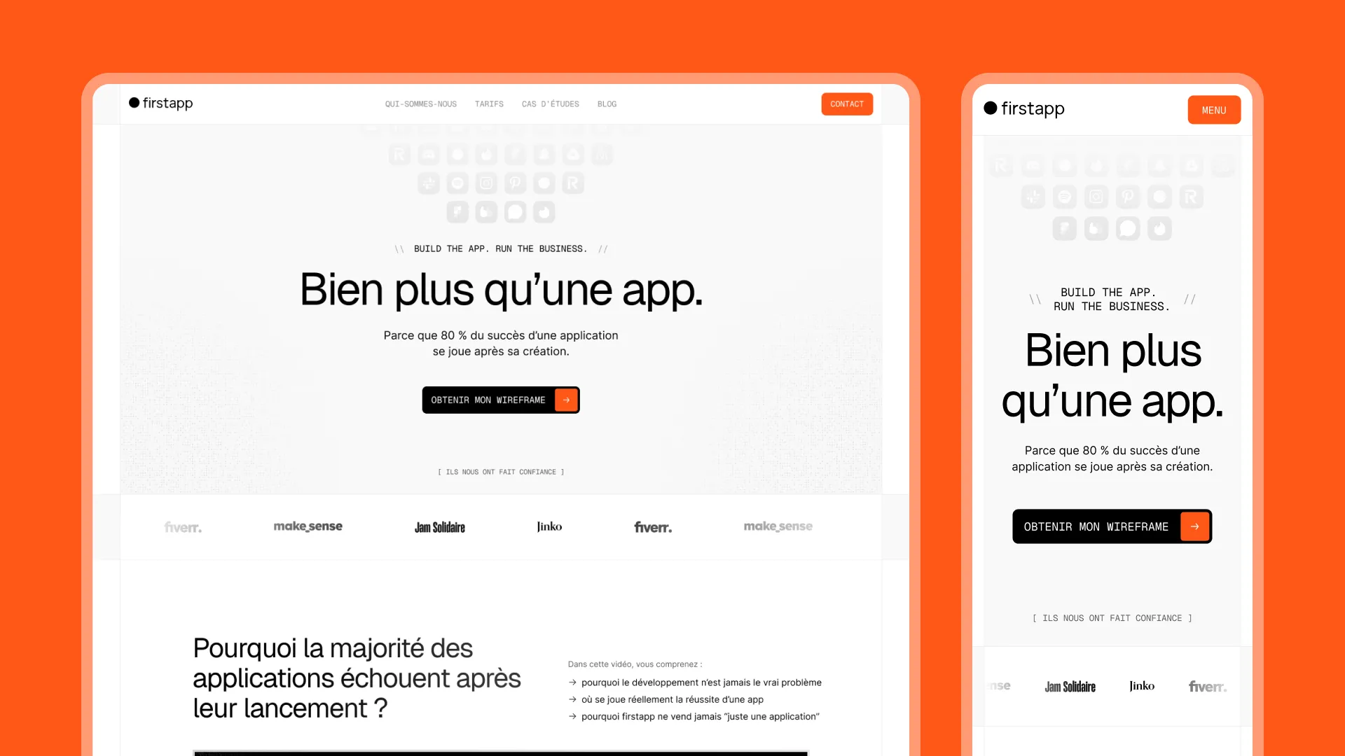
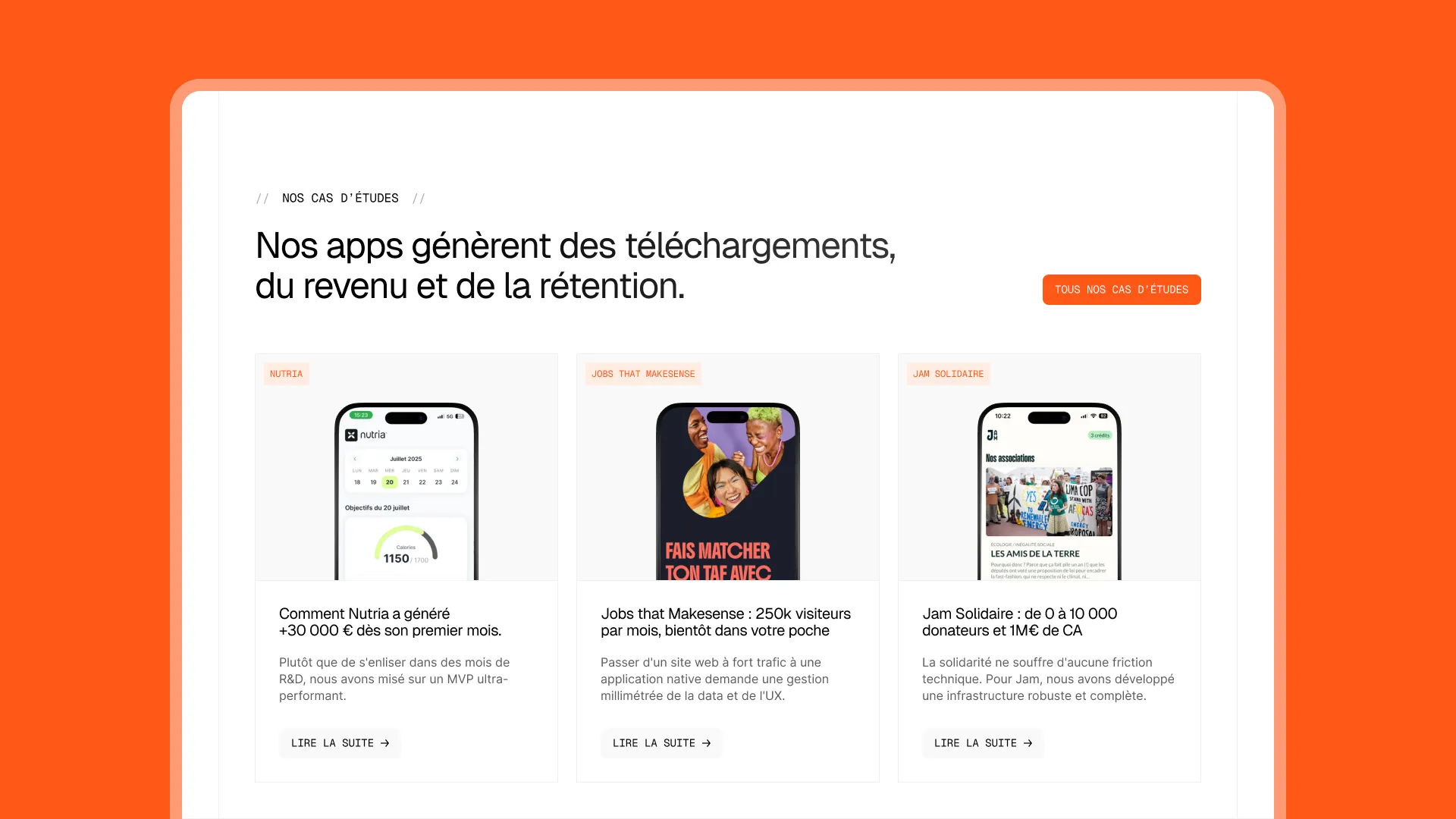
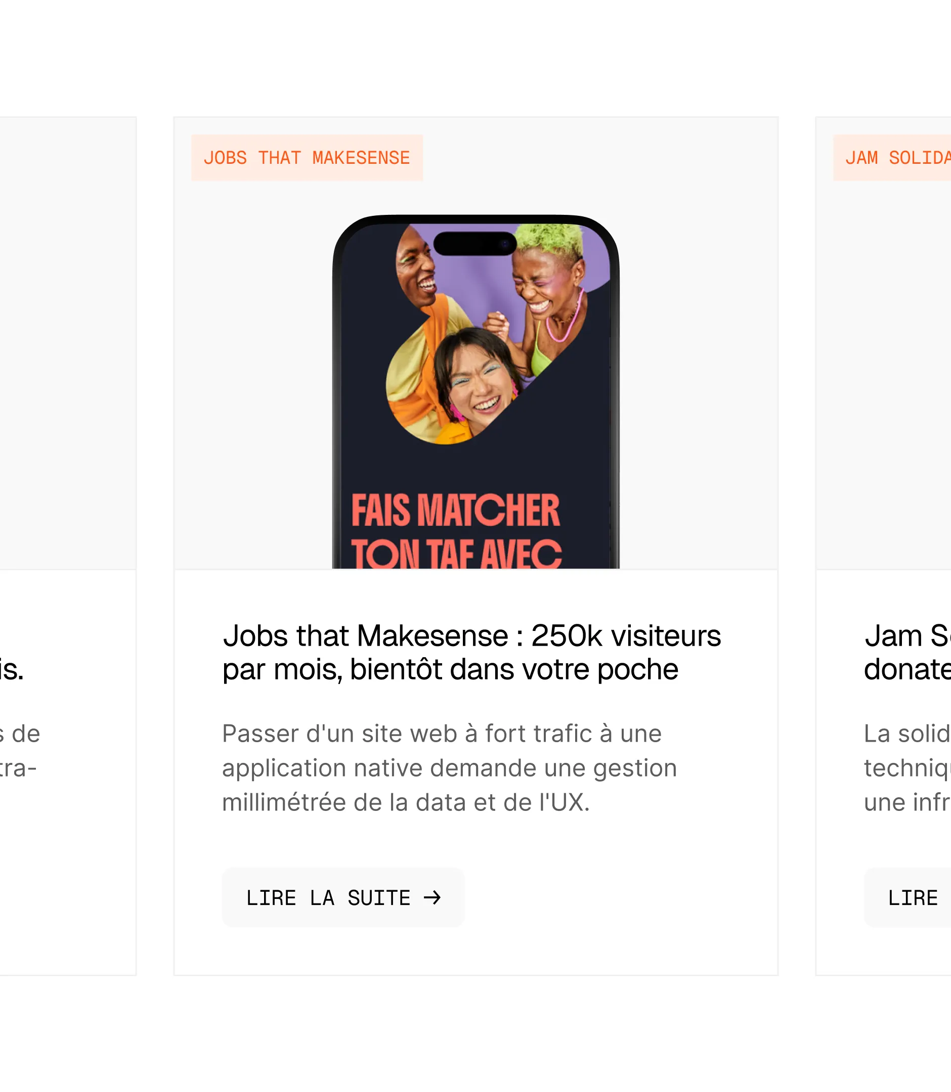
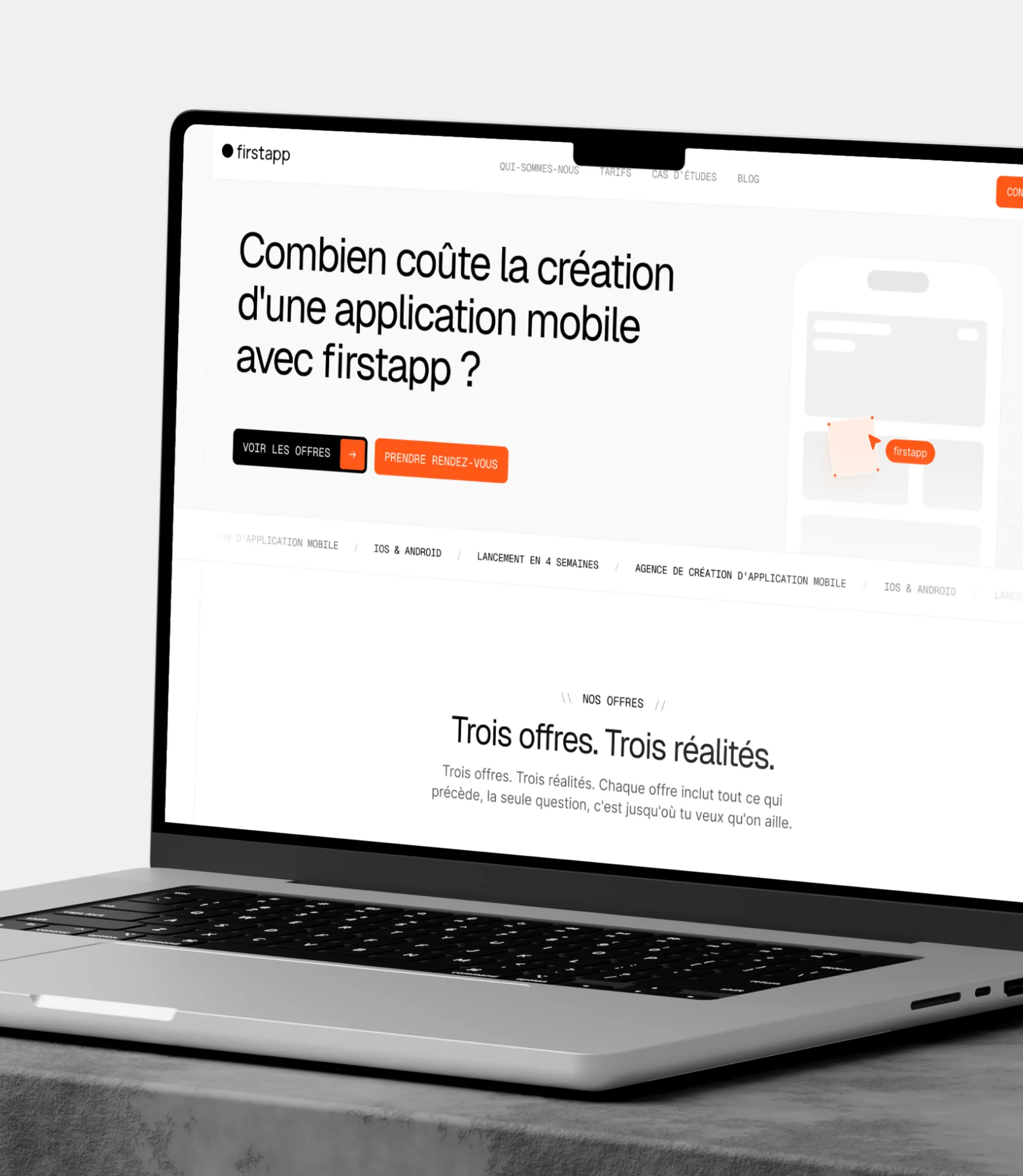
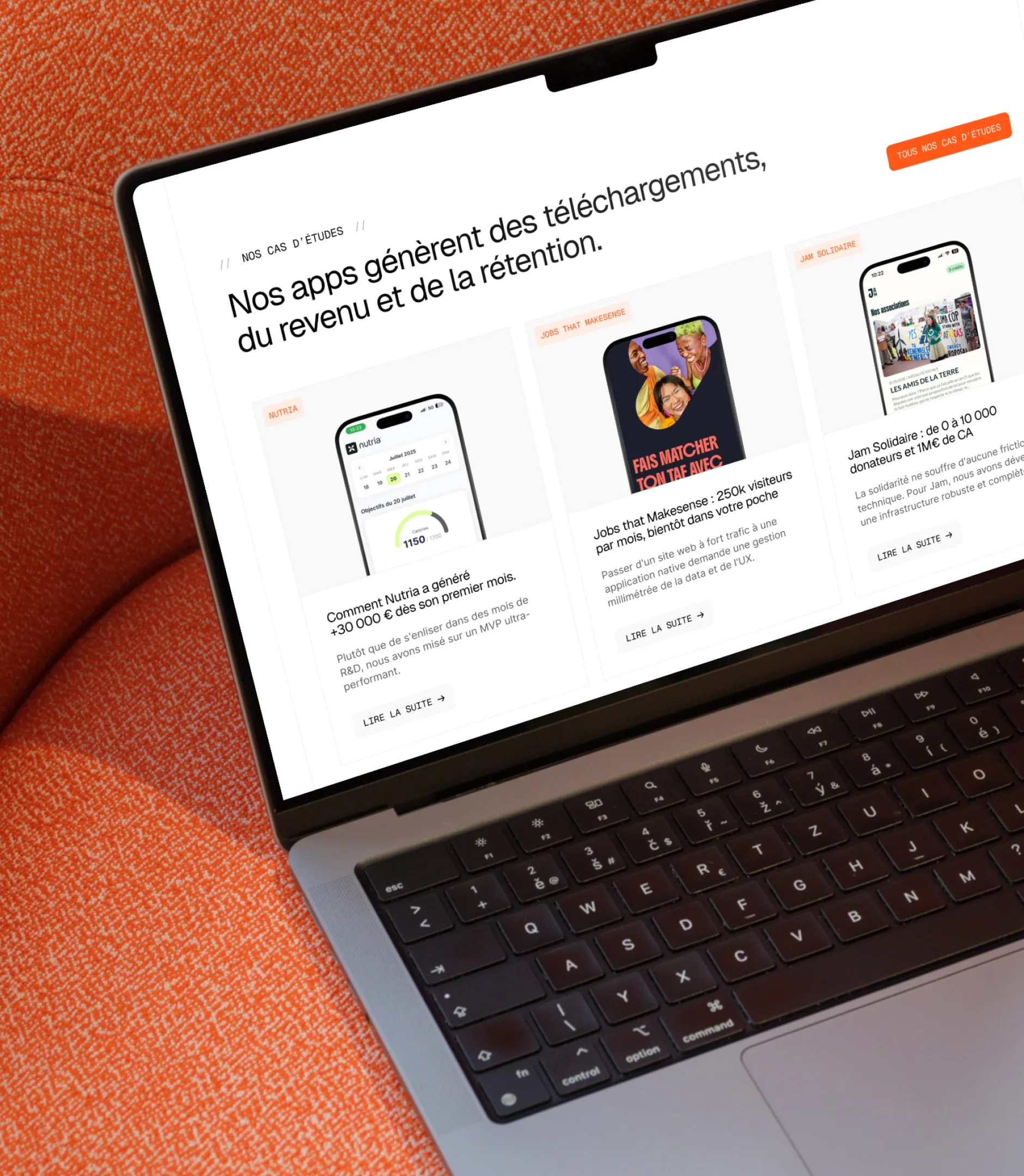
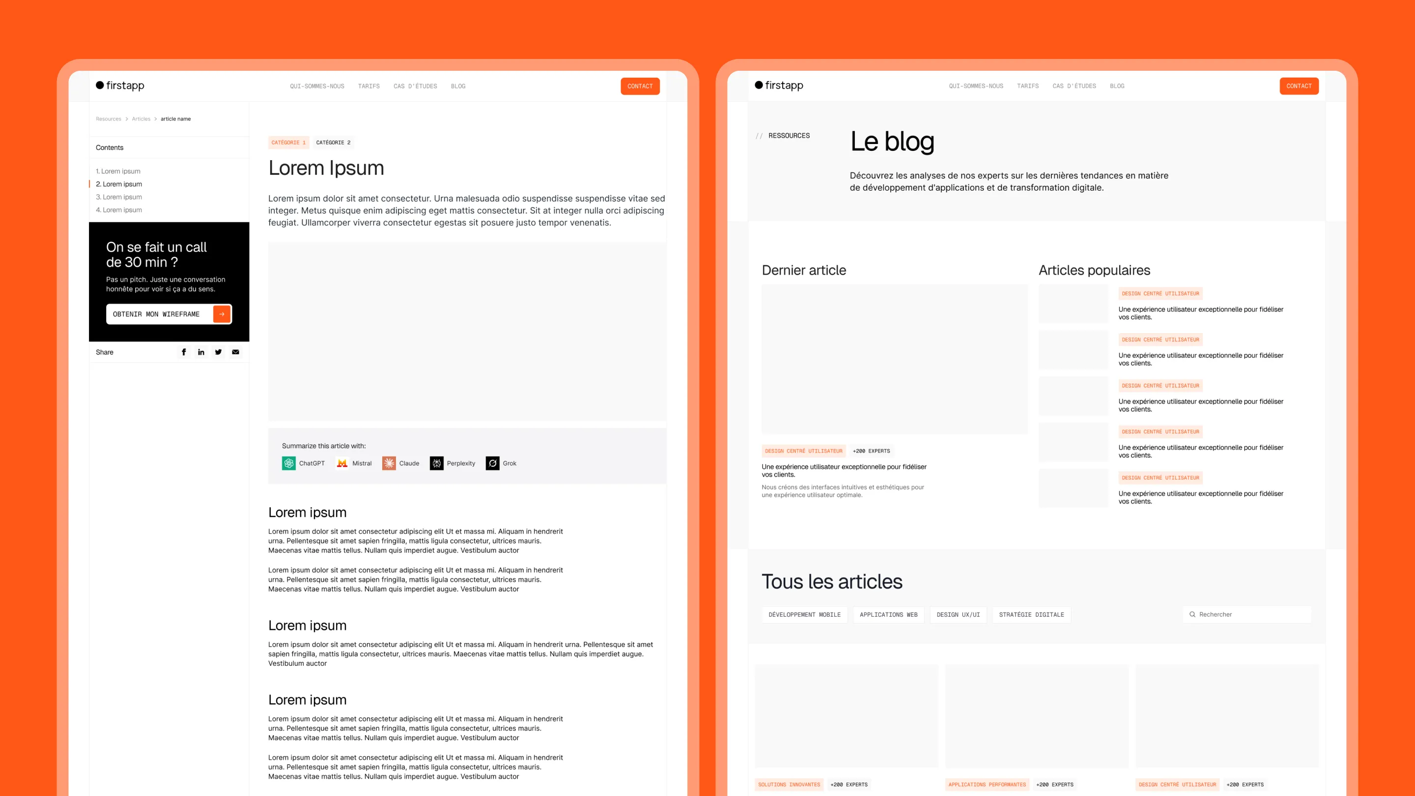
The information architecture was built to convert entrepreneurial profiles. In just a few seconds, visitors need to understand what firstapp does, why it’s different, and what to do next. The homepage follows a clear narrative: promise → proof → real-world examples → action. Every section answers a question visitors are asking as they move through the page.
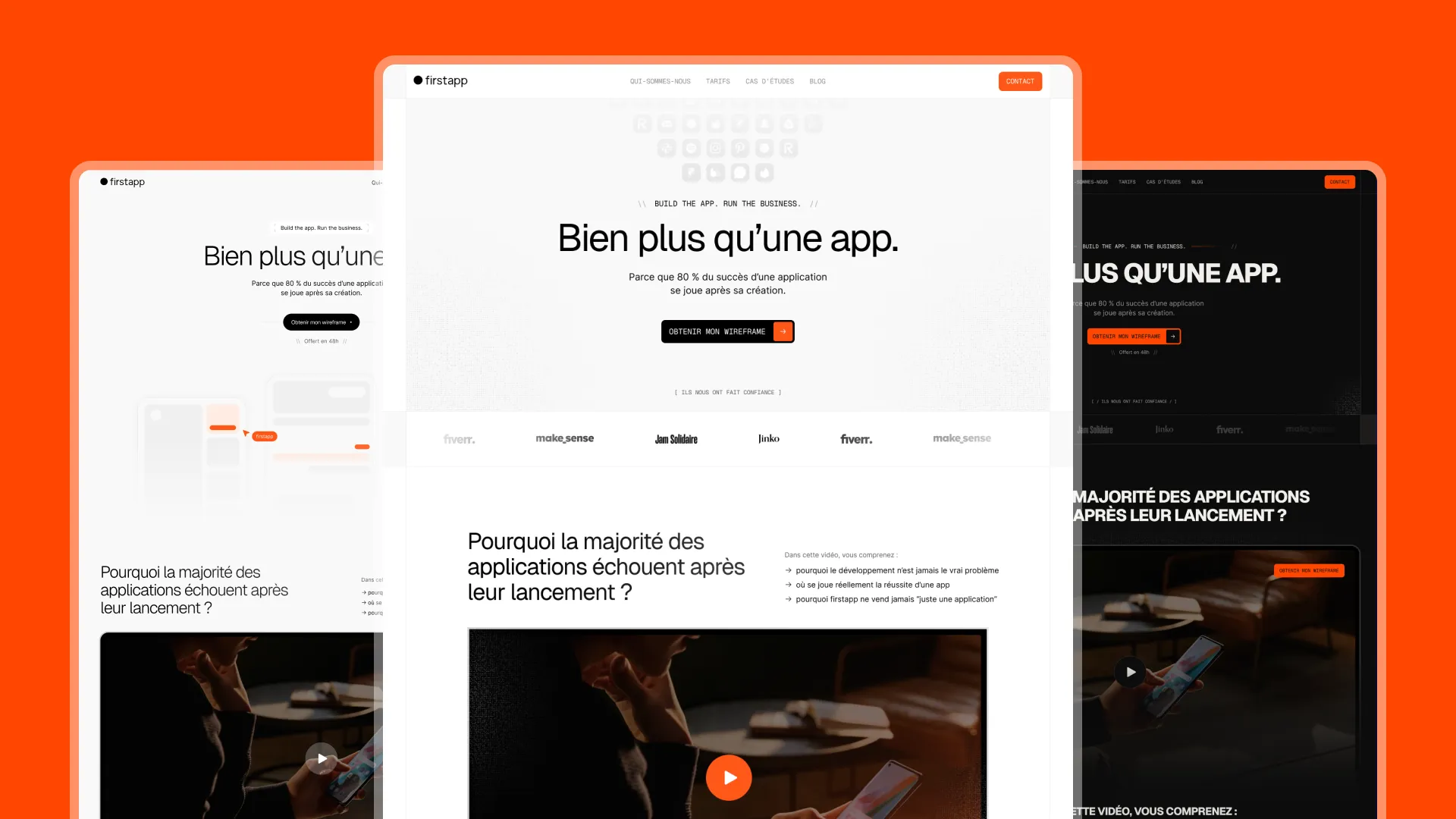
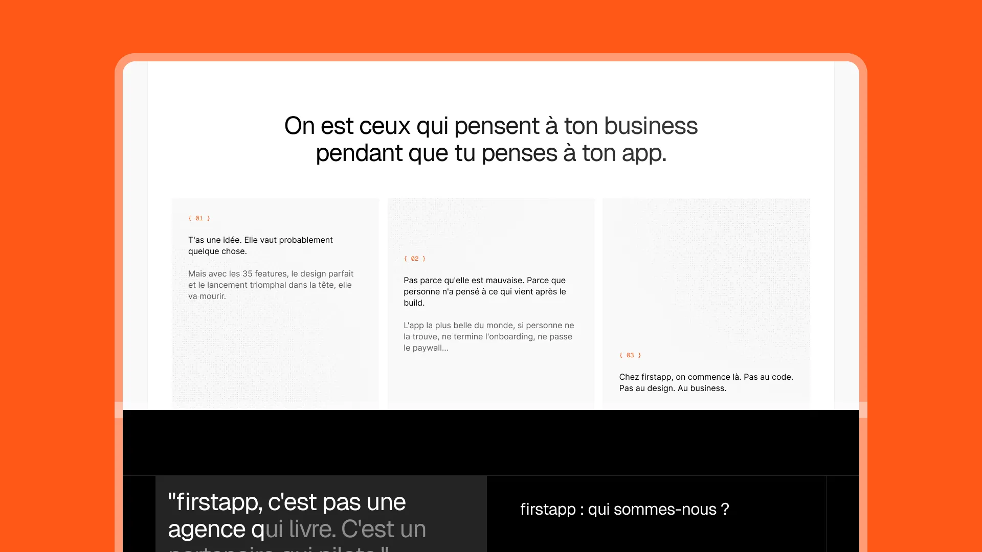
Art direction: black, orange, energy
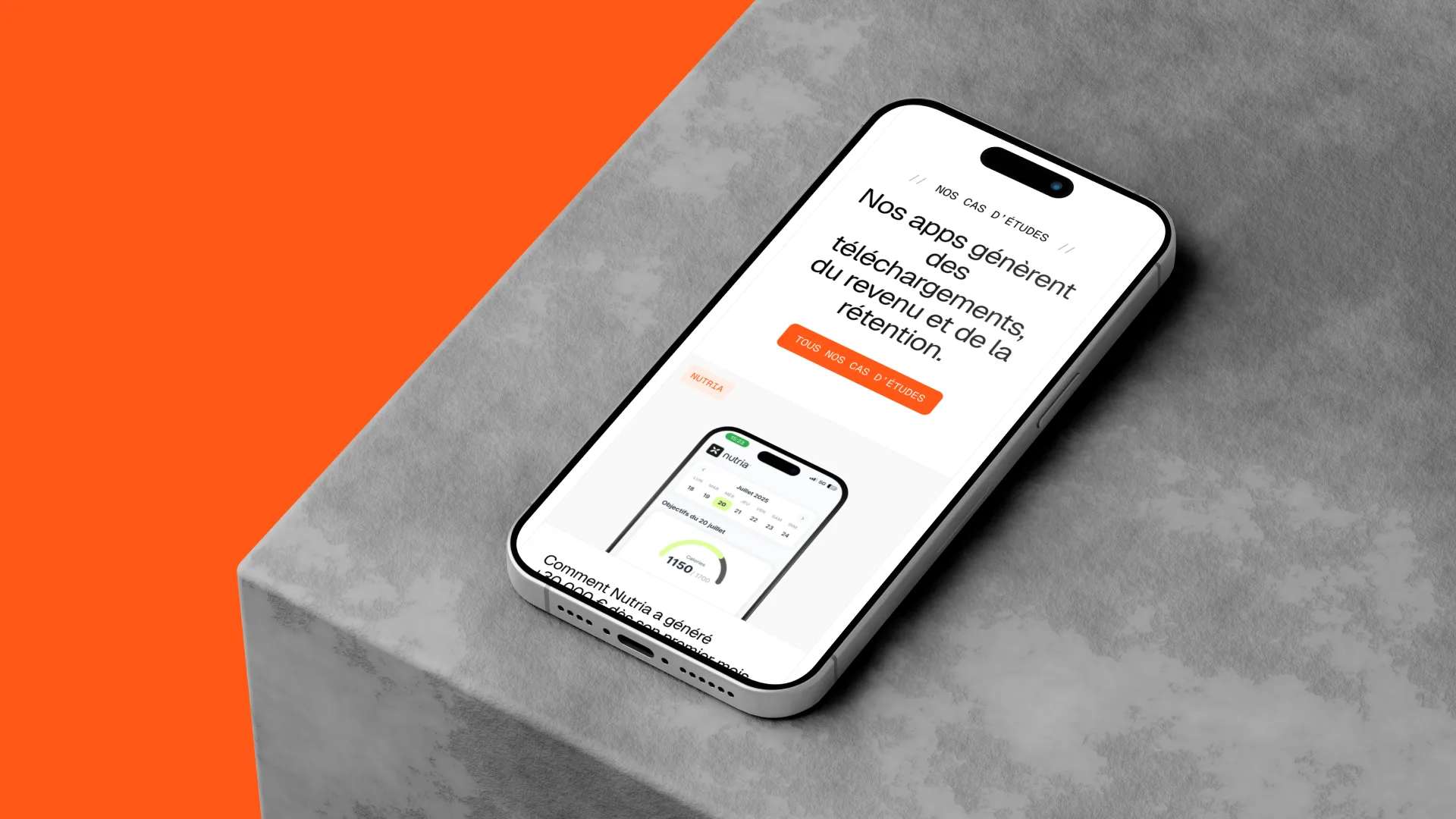
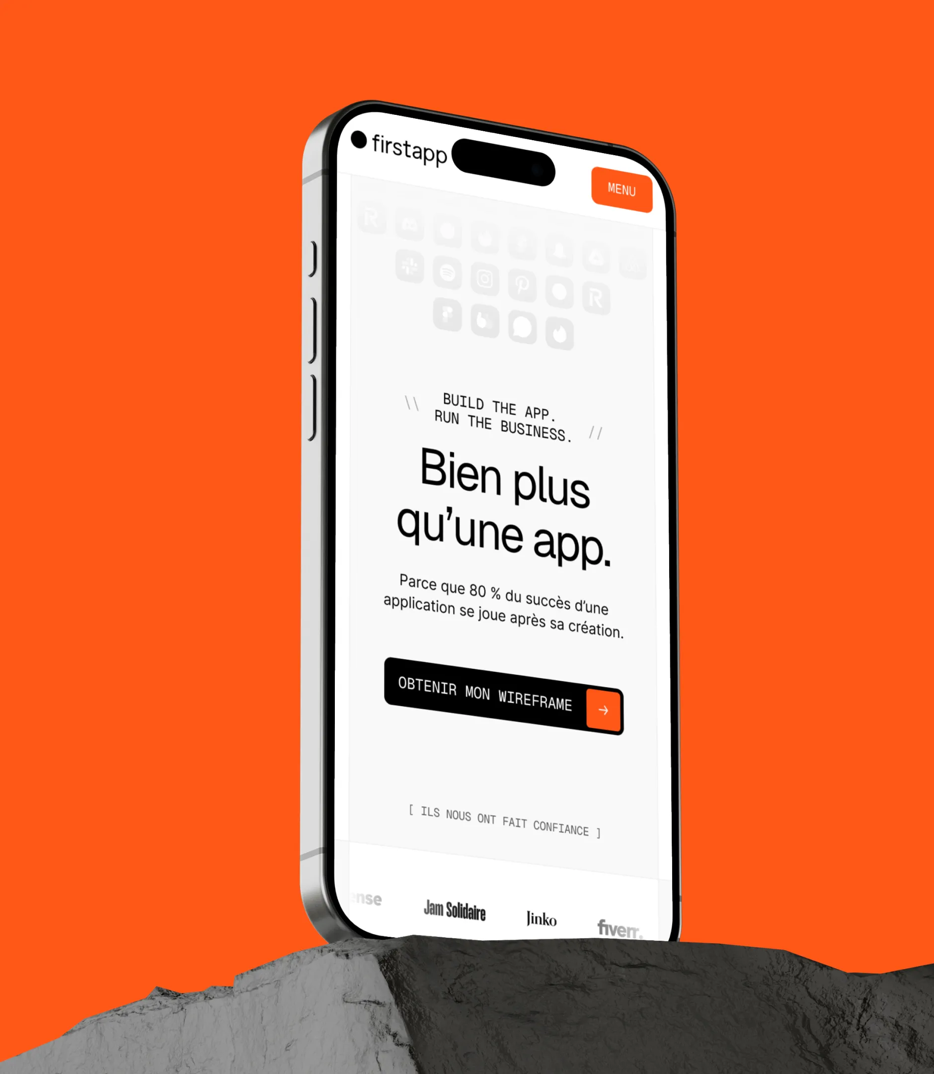
firstapp is already known for its black-and-orange palette — a strong identity that Gemeos expanded and structured. Two creative directions were proposed: one fully committed to dark mode, the other with a more balanced approach. The relaxed tone and informal voice show up in every typographic and editorial choice.
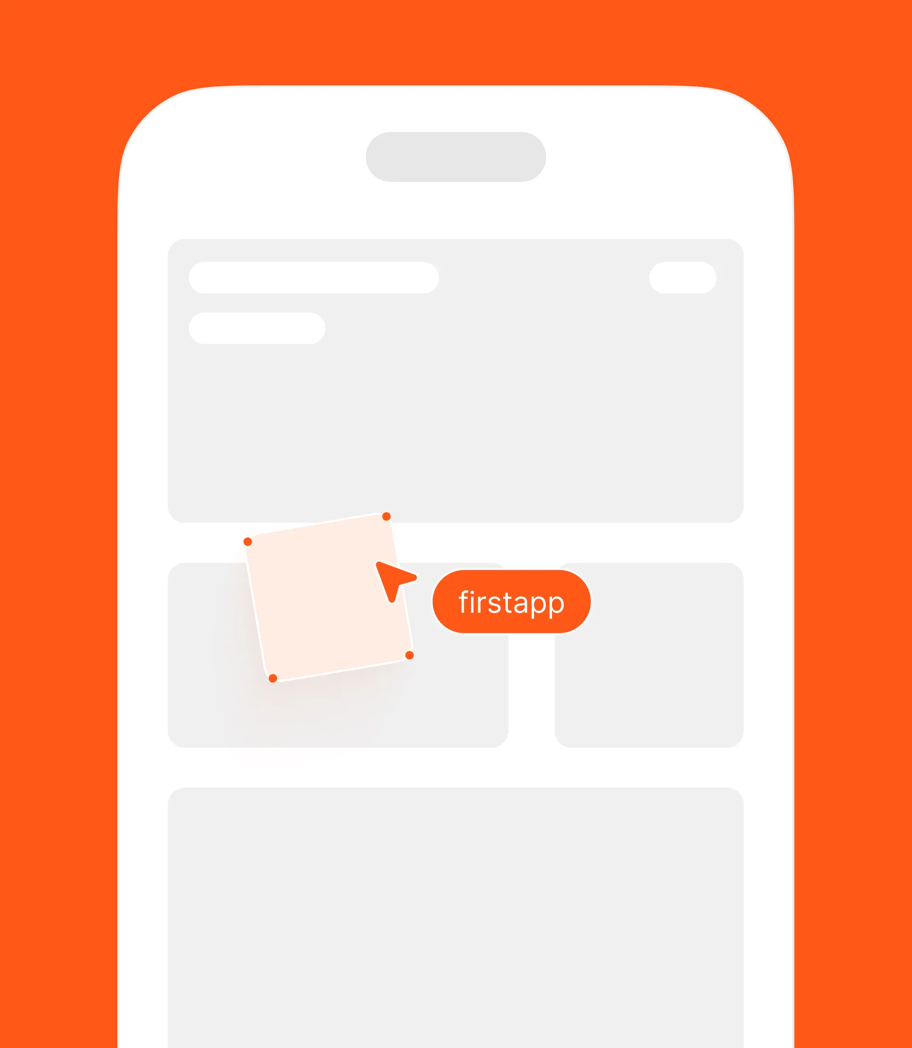
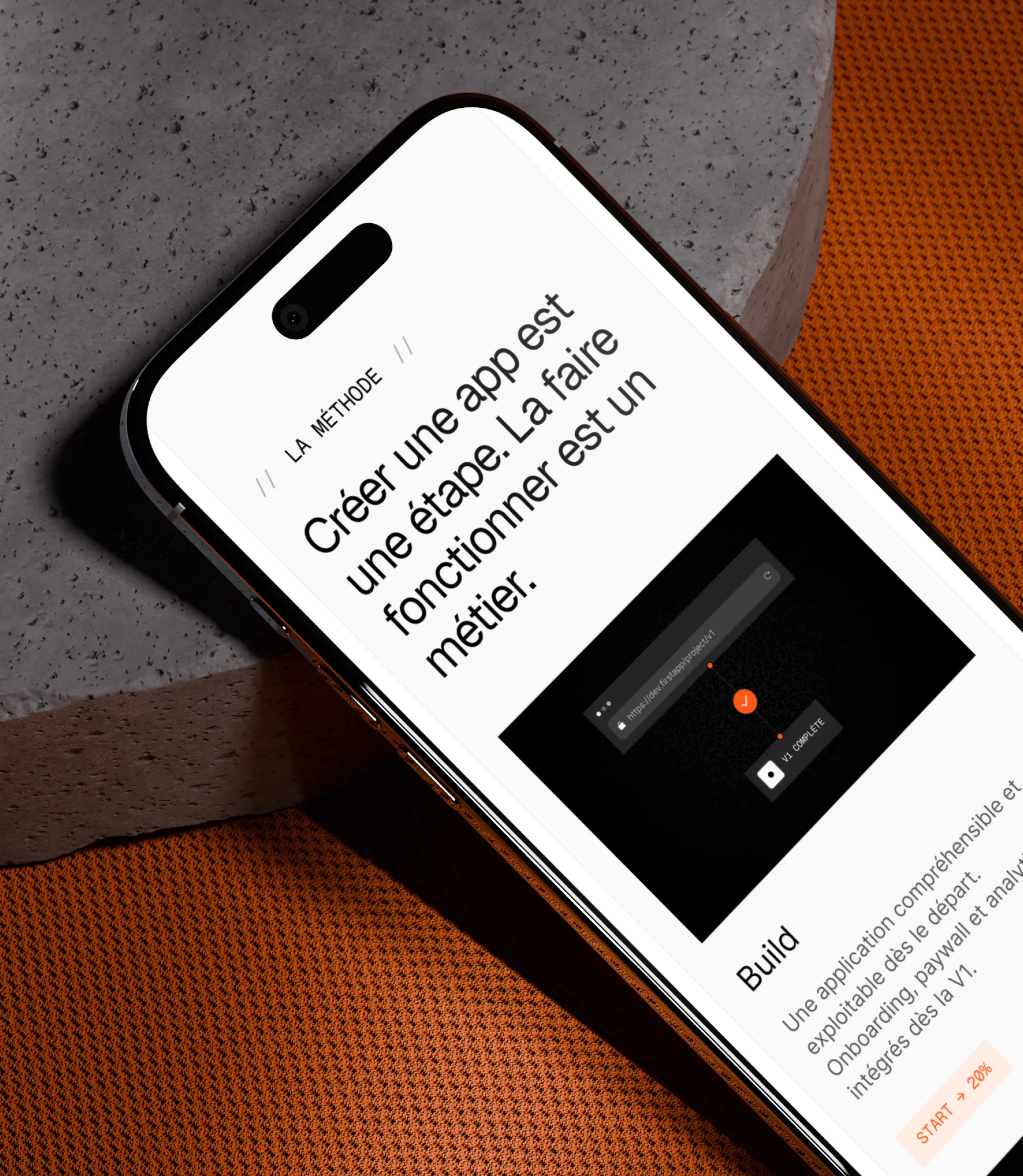
The design system built in Figma formalizes that identity: colors, typography, components, interactive states. The high-fidelity mockups cover every page, mobile state, and animation, adding rhythm to the experience without slowing down load times.