Projects
 Our Offers
 Dedicated team
 Blog
 Academy
 About Us
Side: website redesign for a staffing platform
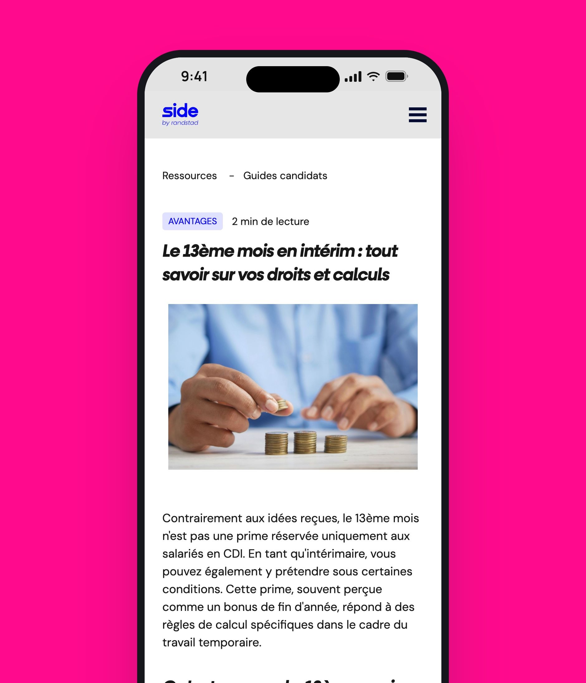
Side connects companies with temporary workers from the Randstad group. After its rebranding, the platform wanted a website aligned with its new identity, without mixing up the recruiter and candidate journeys.
Our web agency dedicated to HR players supported Side on the art direction, UI design, Webflow and SEO.
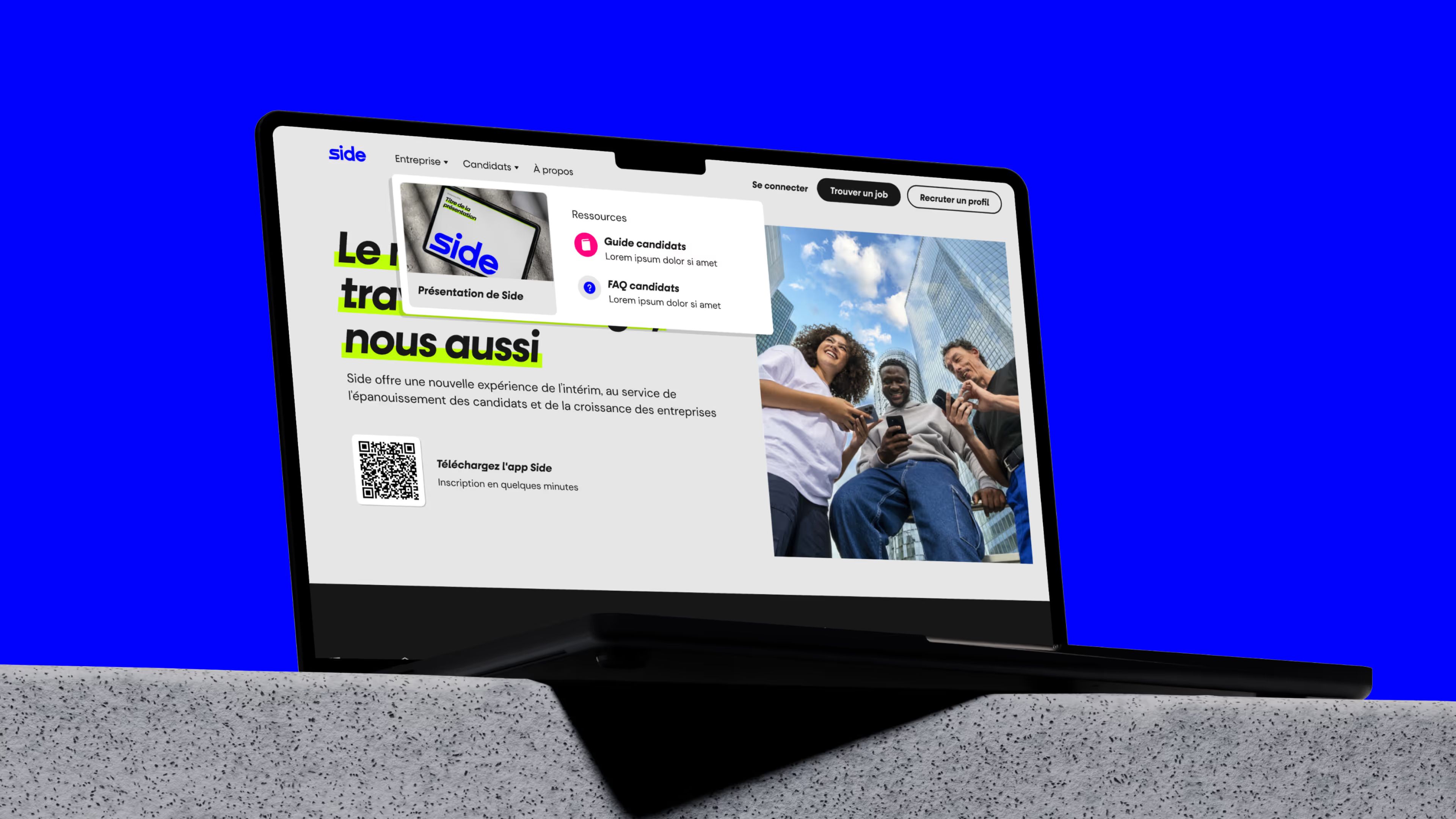
Two journeys to tell apart after Side's rebranding
Side, the Randstad group's staffing platform, speaks to two audiences with different expectations: companies that want to hire and candidates looking for assignments. After its brand evolution, the website had to showcase the new identity while guiding each visitor to the relevant information and actions.
Gemeos adapted Side's art direction to its digital channels, then designed the interfaces together with the marketing team. The Webflow build was structured so pages can evolve without starting from scratch. The SEO work supported the organization of content aimed at companies and temporary workers.
- Industry
- HR
- Services
- Artistic Direction
- Development
- SEO
- UX/UI Design
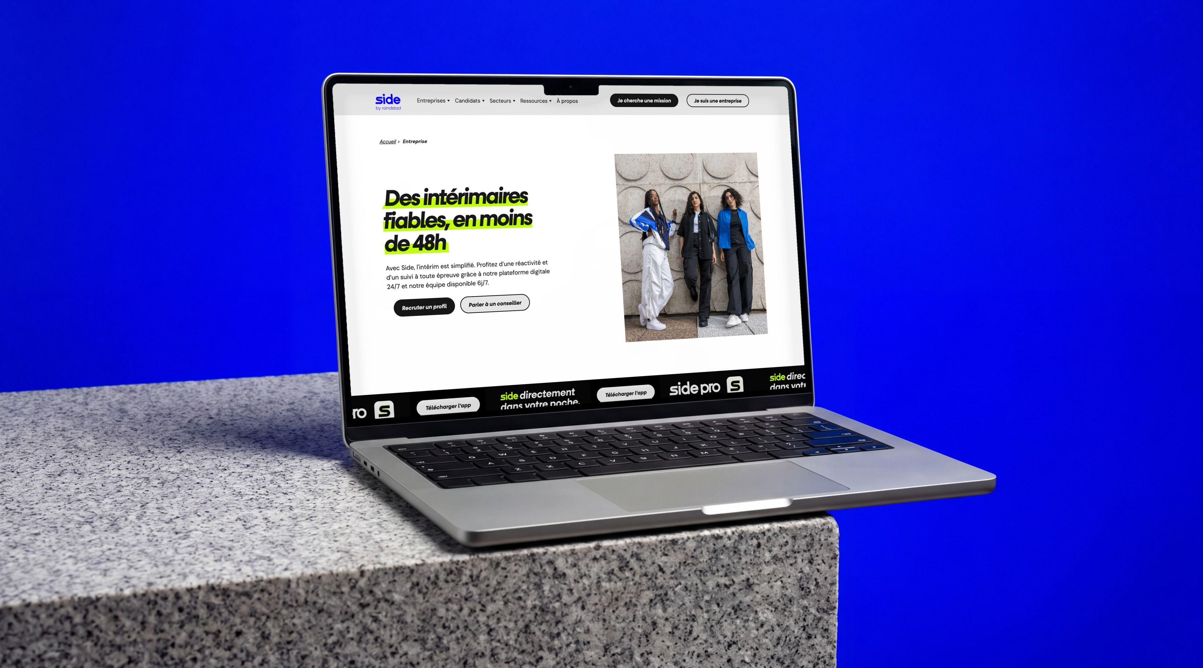
Art Direction
A new positioning translated pixel by pixel
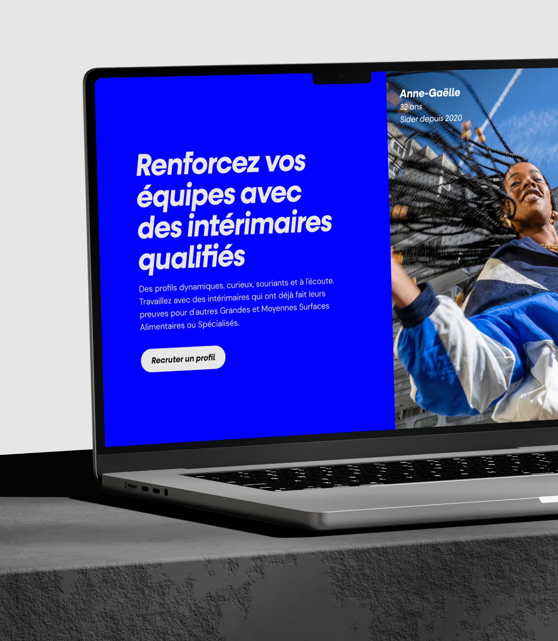
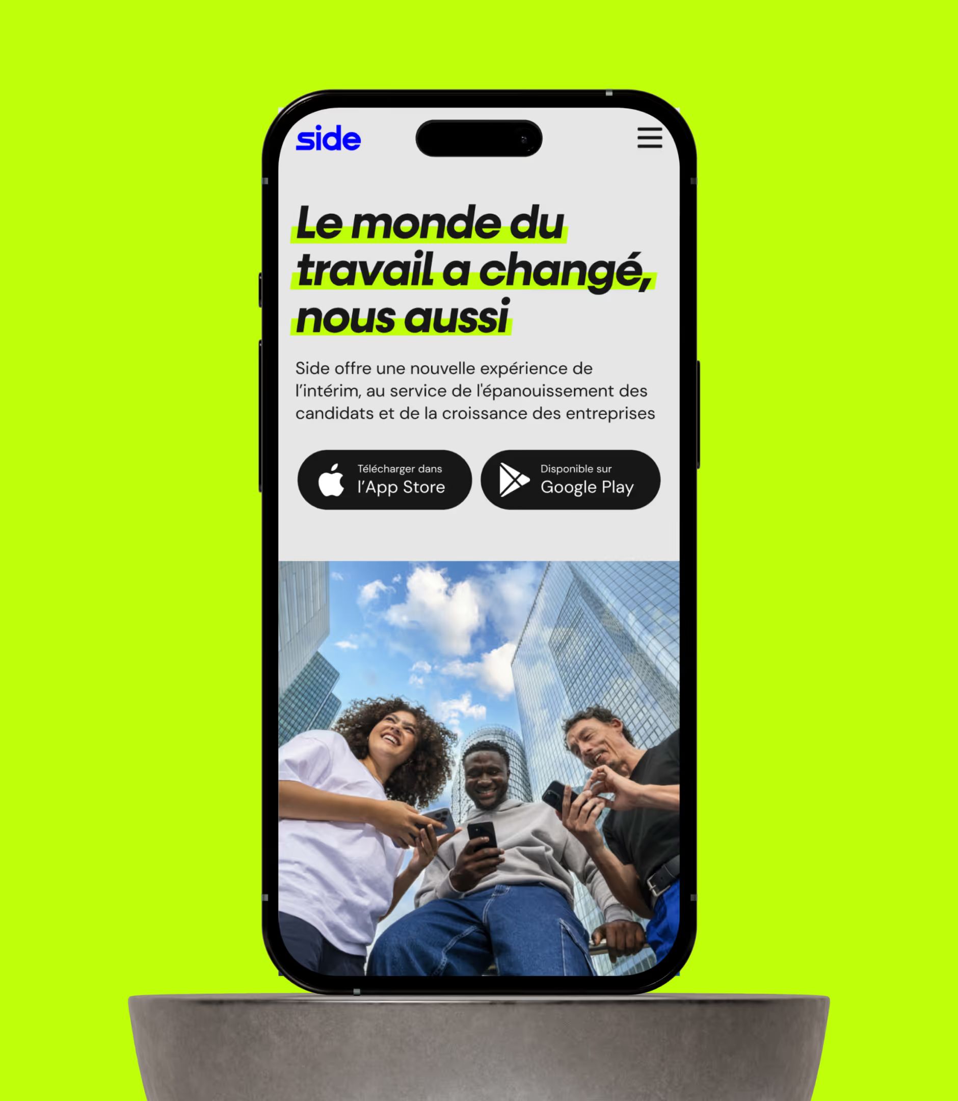
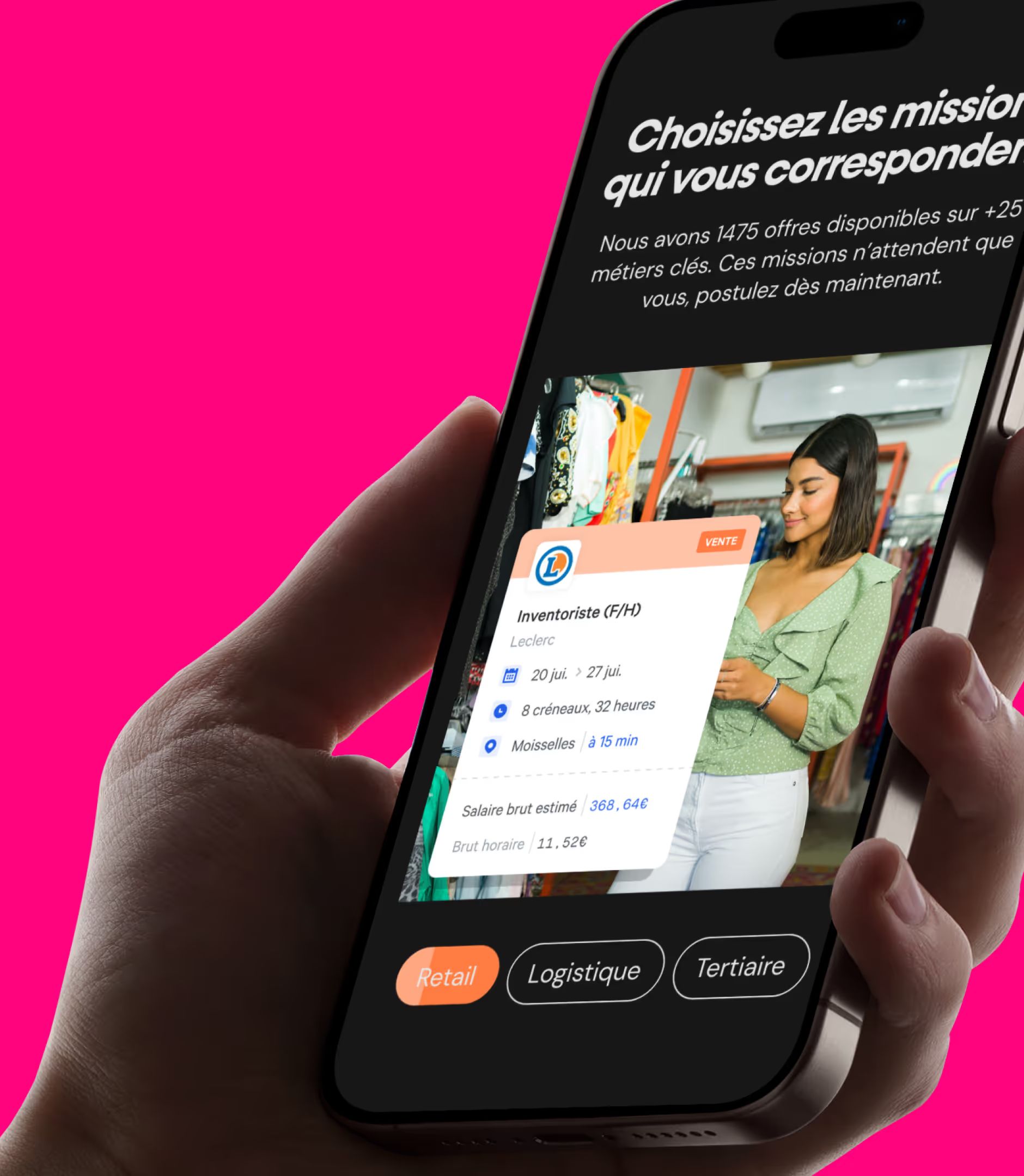
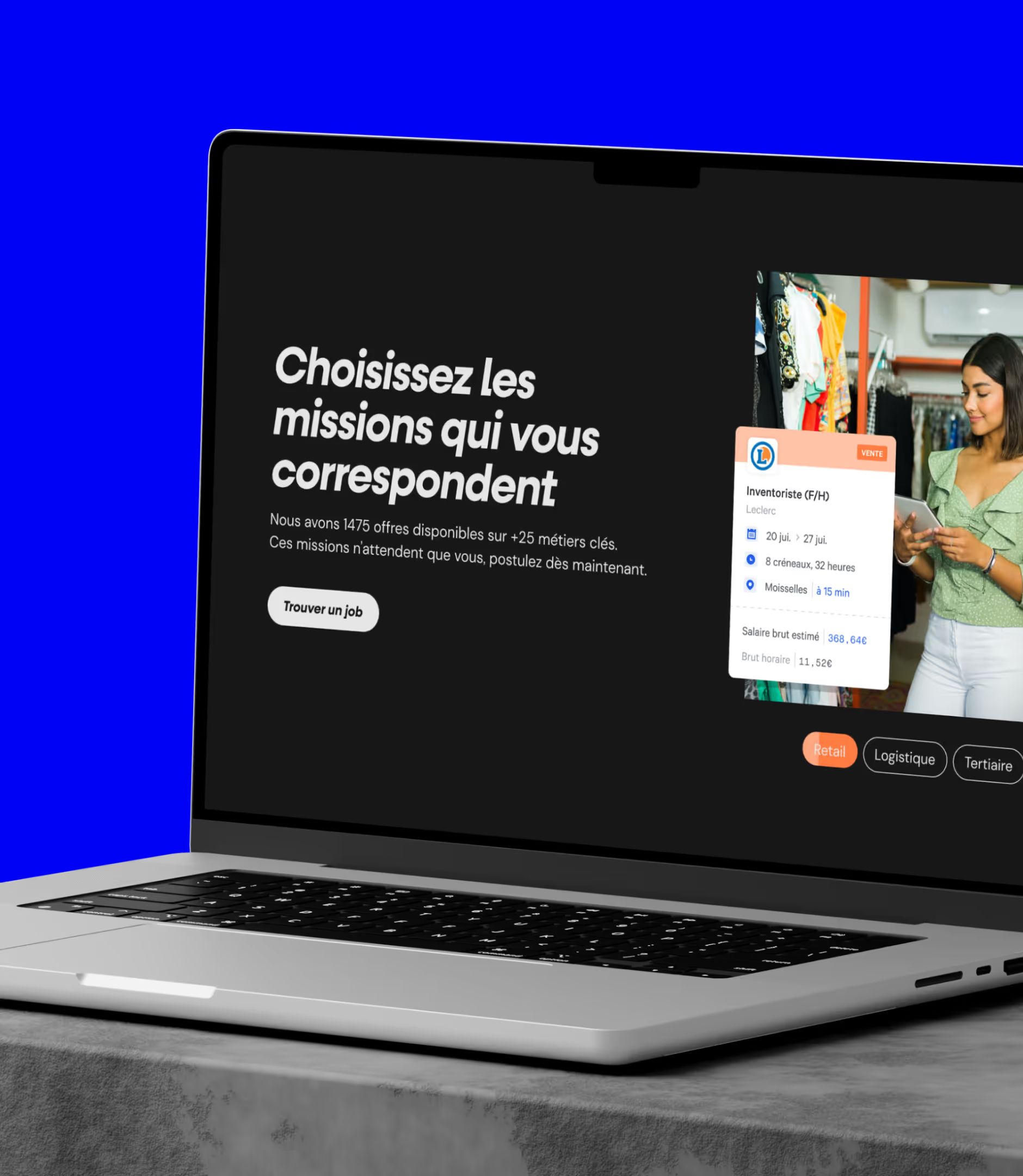
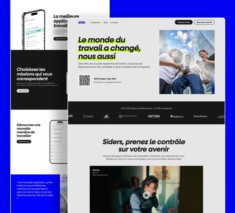
Following Randstad’s acquisition in May 2023, Side redefined its brand identity. Our job: bring that rebrand to life on their website with precision and consistency. Using the assets provided by the Side team, we laid the foundation for a digital visual system, typography choices, color palette, image treatment, illustration style, directly aligned with the new brand identity. Every design decision was validated in collaboration with the Marketing team to ensure the result matched the Randstad Group while preserving Side’s DNA: direct, human, and experience-driven.
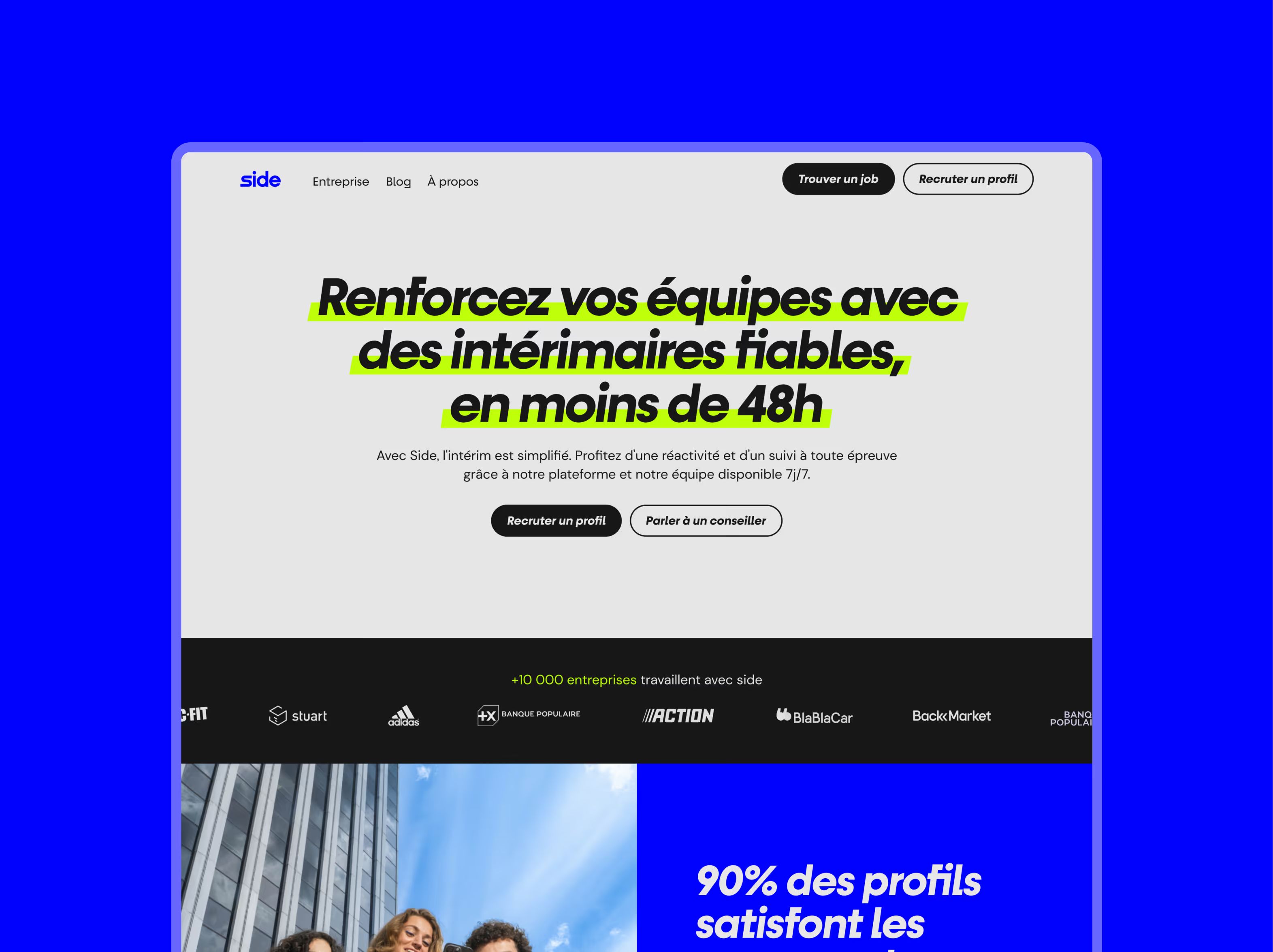
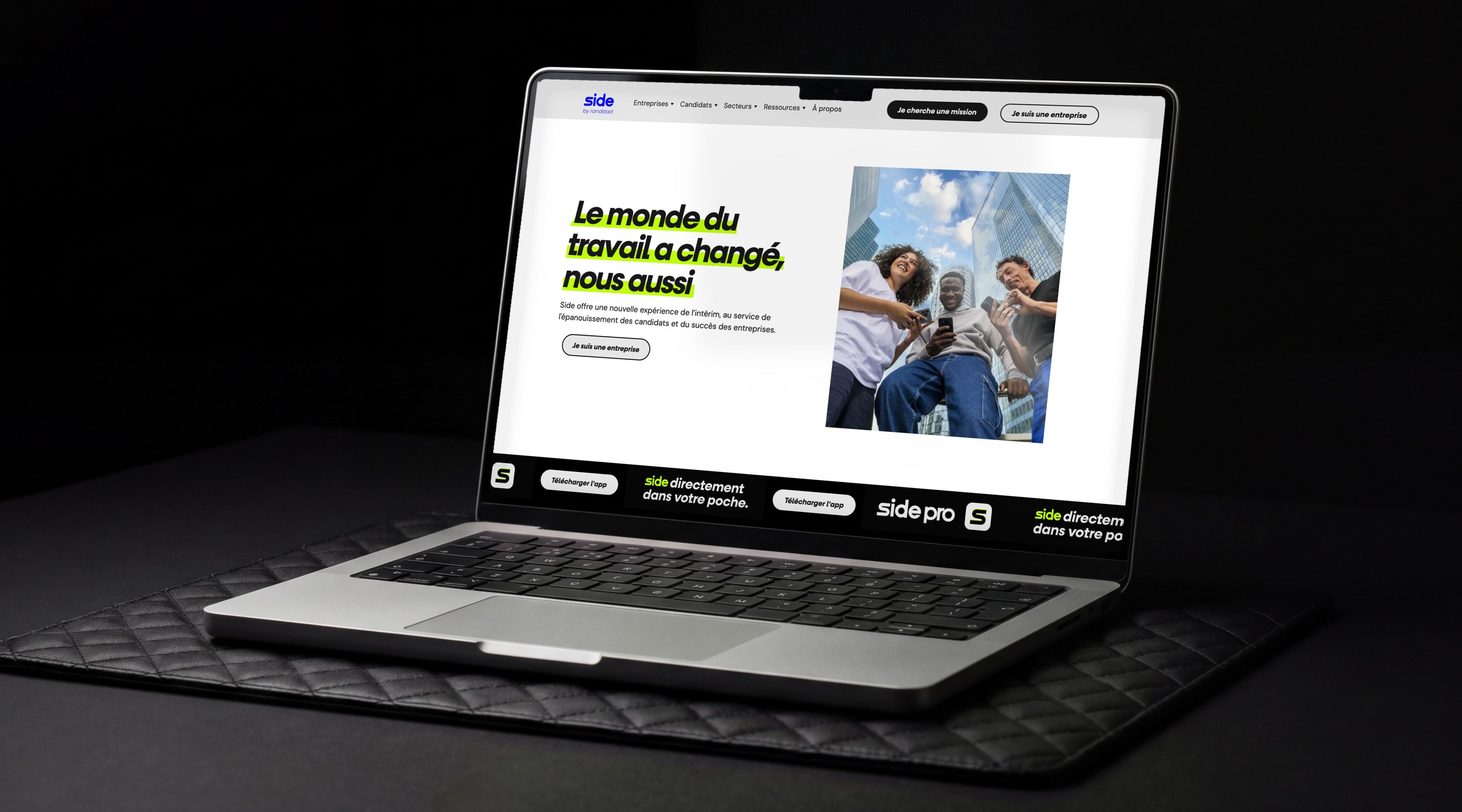
Concept 1: Centered Hero
The headline spans the full width of the page, centered, with no image opposite it. The fold stays clean and type-driven. The next section brings back the blue photo/stat split. The most minimal layout. And the one that puts the message front and center.
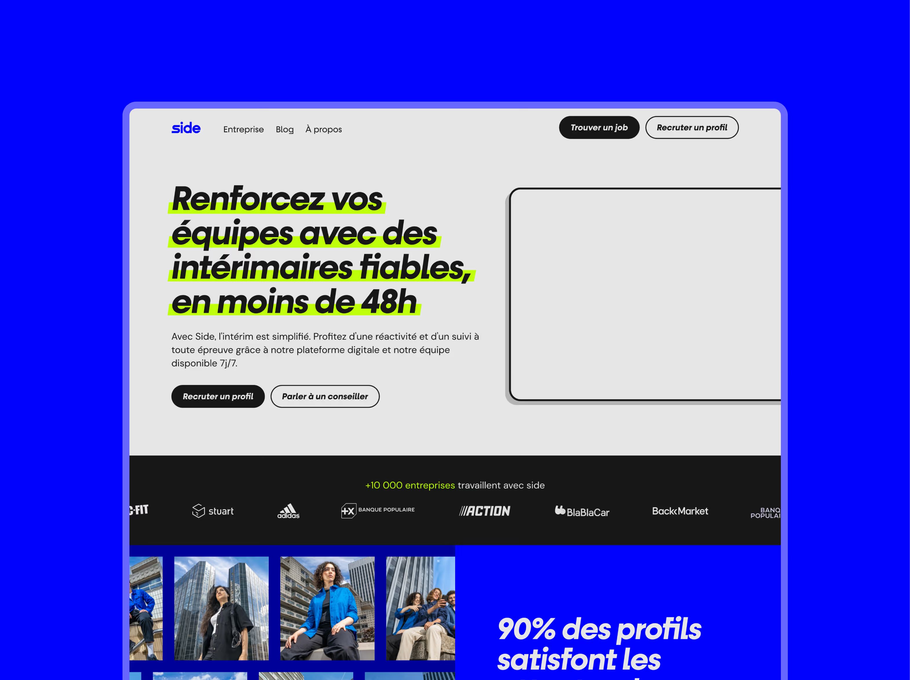
Concept 2: Split Hero + Video Placeholder
Two-column layout, but the right side features a video frame instead of a photo. The stats section uses a horizontal photo strip before the blue block. A layout that leans more into product demonstration.
Concept 3: Split Hero + Photo
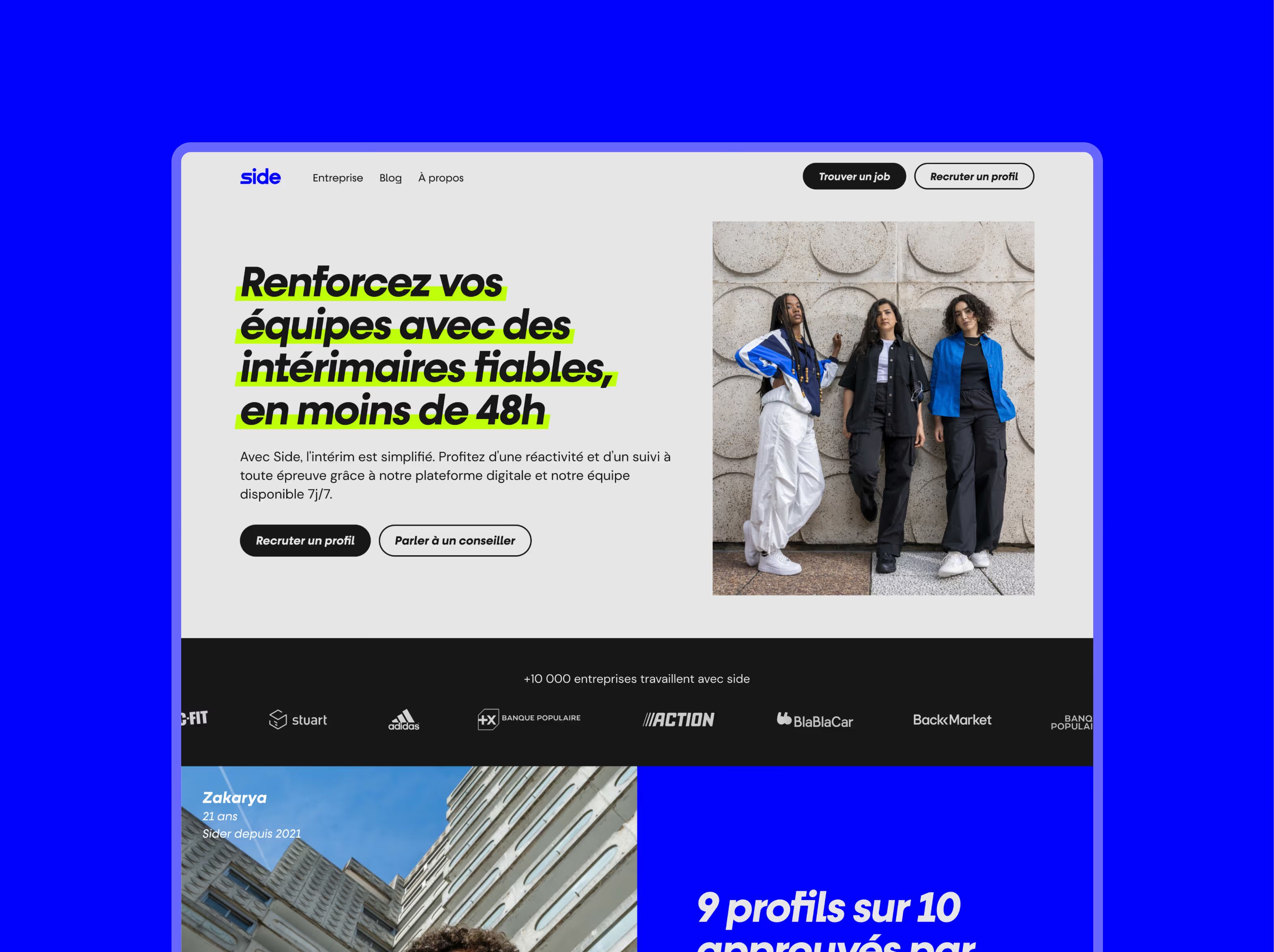
The hero section splits into two columns, headline on the left with neon yellow highlighting, Side profile photography on the right against a light background. The next section flows into a black client strip, then a split photo-and-stats layout in electric blue.
UI Design
Mockups built with the team, not for it
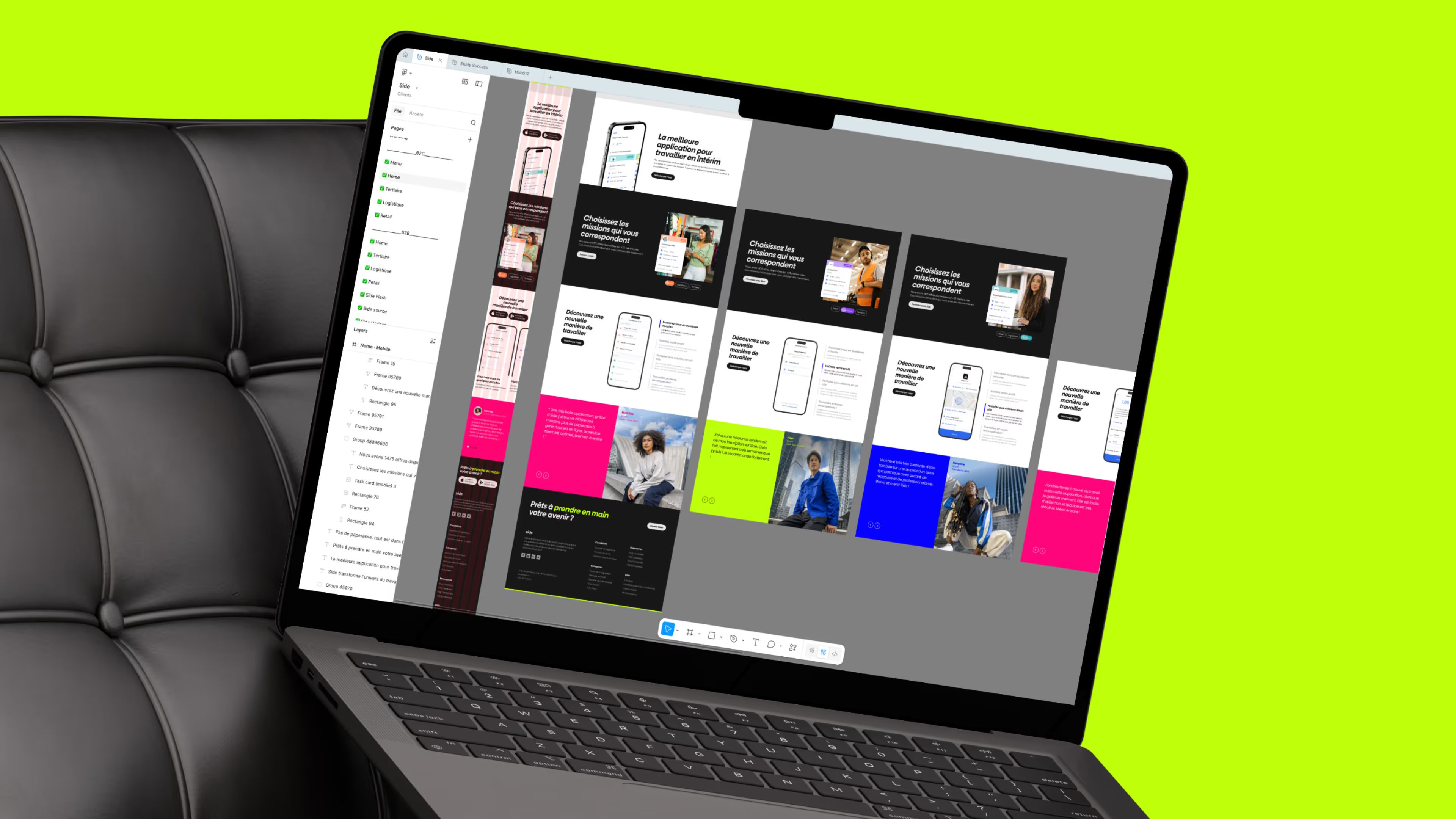
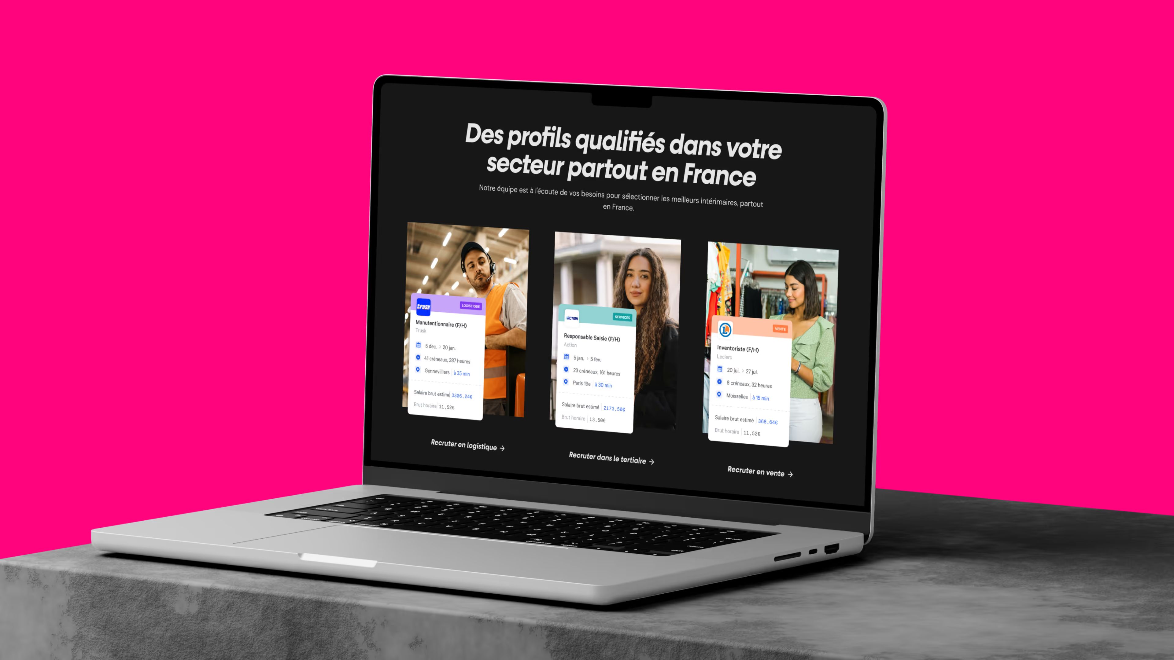
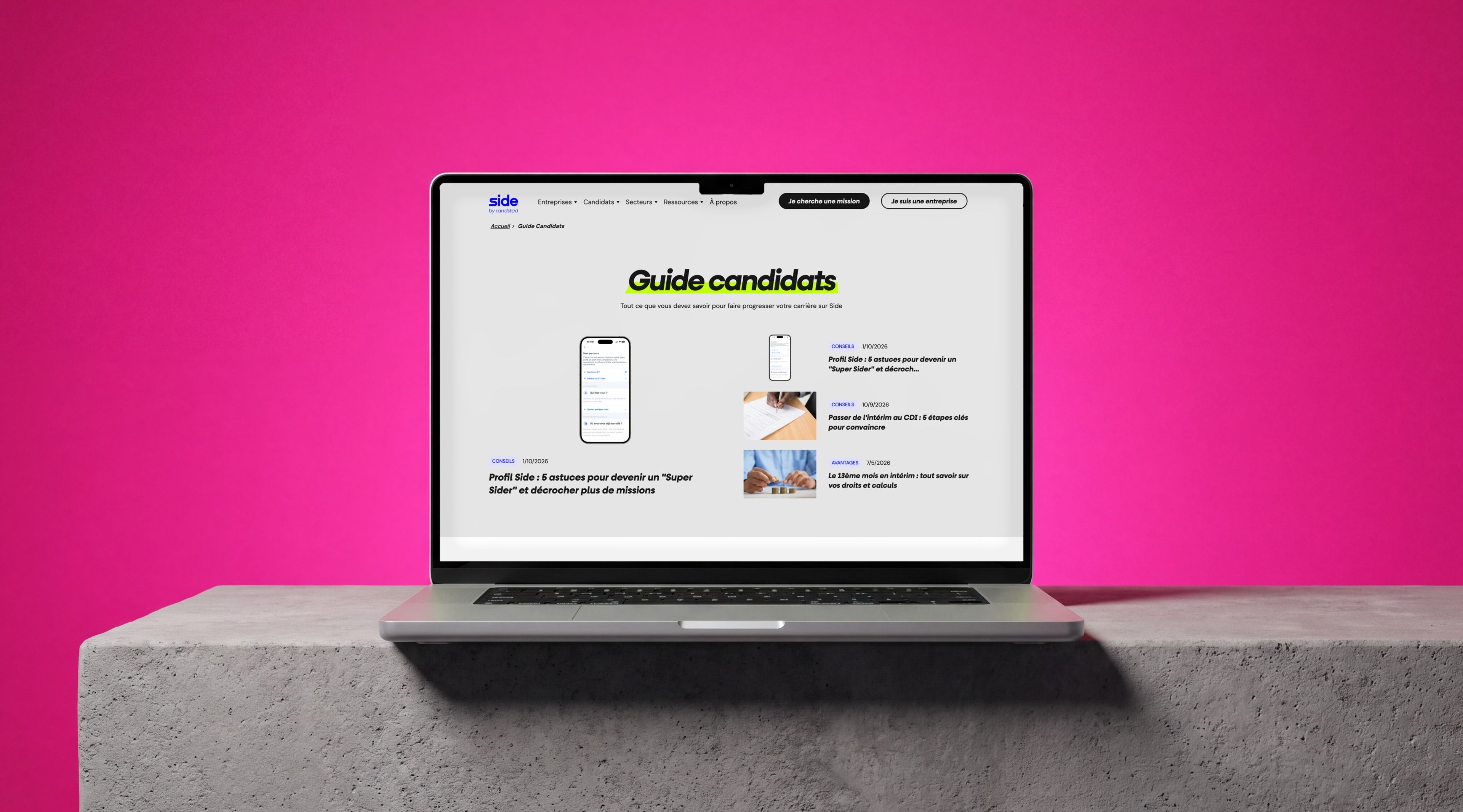
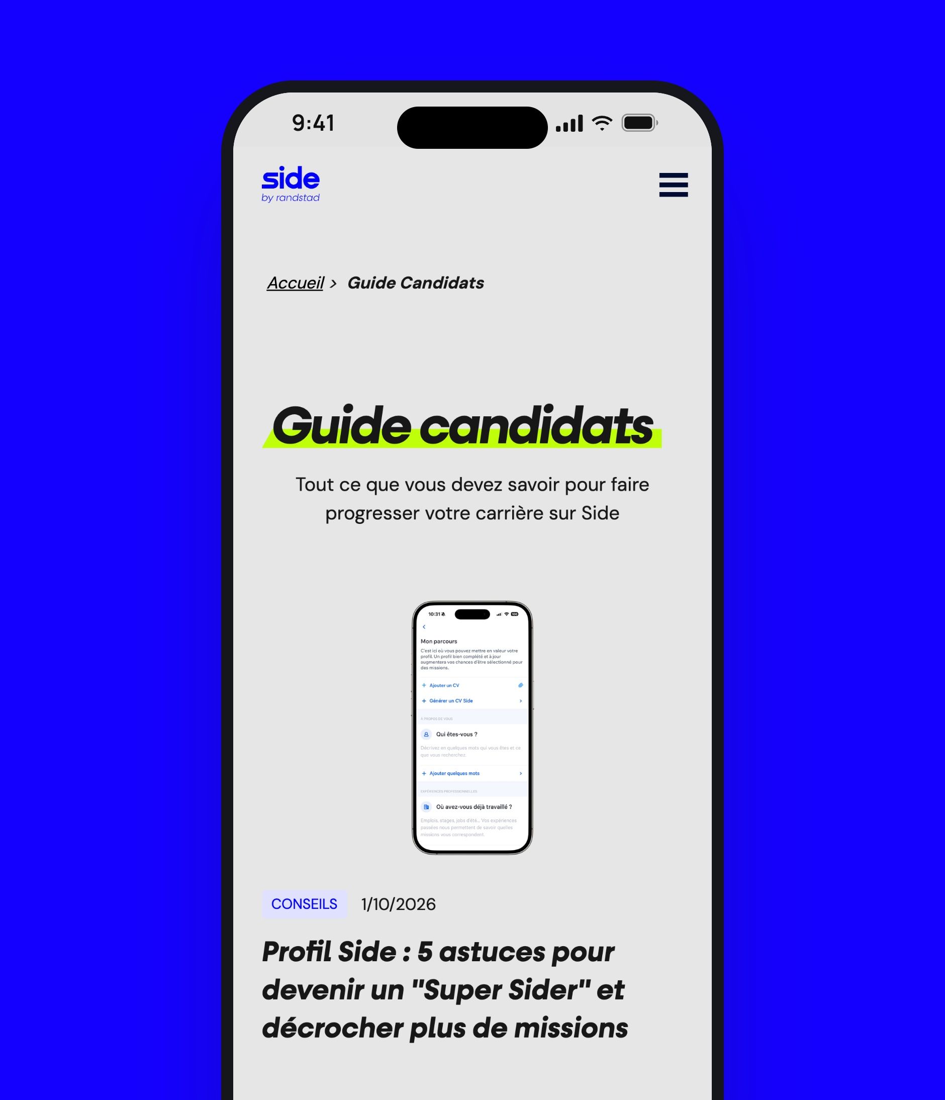
The design followed an iterative, collaborative approach with Side's Marketing team. Instead of shipping everything at once, each section was shaped, presented, and refined in short cycles. The result: a site that reflects Side's exact business challenges, two distinct audiences (companies and Siders), three offers that needed clear prioritization, and a straightforward journey for every profile. The navigation, product pages, industry landing pages, and resource pages all got the same level of attention, inside one cohesive design system from end to end.
Webflow Development
Clean integration. Scalable. No technical tradeoffs.
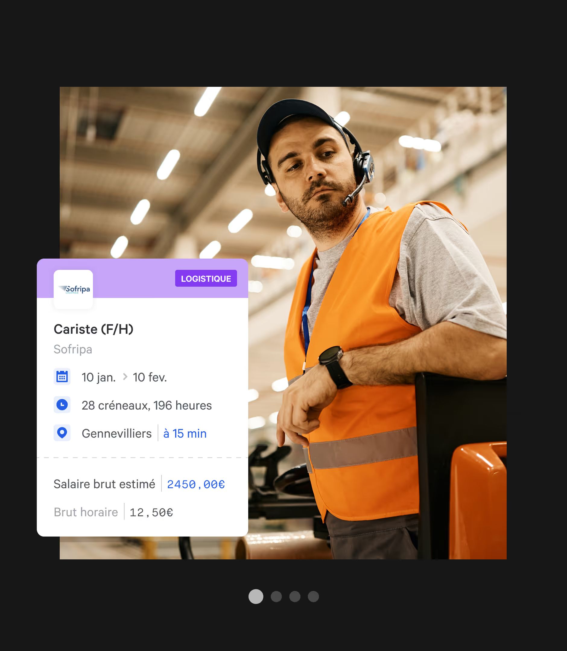
The migration to Webflow was handled like a full engineering project. Every page was built using Webflow best practices: strict class naming, semantic HTML structure, asset optimization (compression, lazy loading, WebP formats), and a component logic system built on native Symbols and global Webflow Variables.
The DOM was optimized to minimize render-blocking. Animations were handled in native CSS wherever possible to reduce JavaScript dependencies and protect WebPerf scores. A custom video player was integrated for client testimonials, no autoplay, in line with current UX standards.
The technical result:
| Criterion | Gemeos Approach |
|---|---|
| Class structure | BEM-like, consistent and documented naming |
| Components | Symbols + global Webflow Variables |
| Assets | WebP, lazy loading, automated compression |
| Animations | CSS-first, JS limited to complex interactions |
| Maintenance | Full ownership for the Growth team |
| Scalability | Architecture designed to support new pages without a redesign |
SEO / GEO
A technical foundation built for search engines, and for LLMs
The SEO work started before launch with a full audit of the existing architecture. A complete 301 redirect plan mapped every old URL to its new destination, preserving all of Side’s hard-earned SEO equity. The site’s semantic structure, Hn tags, breadcrumbs, alt attributes, meta descriptions, was reviewed and standardized page by page.
On the tracking side: GA4, Facebook Pixel, Hotjar, and Google Tag Manager were integrated and tested before launch, with full QA to confirm there were no tracking duplicates or data loss between the old site and the new one.
| SEO Action | Detail |
|---|---|
| 301 Redirects | Complete old → new architecture mapping |
| Semantic Structure | Normalized Hn hierarchy, alt text, optimized meta |
| Tracking | GA4 + Facebook Pixel + Hotjar + GTM |
| Pre-Launch QA | Tracking tests, crawl checks, redirect verification |
On the GEO side (Generative Engine Optimization), the site was structured to stay readable and usable for generative search engines, ChatGPT, Gemini, Perplexity. That means a clear content hierarchy, Schema.org microdata (Organization, FAQPage, BreadcrumbList), and content that answers the exact questions LLMs use to build their responses. The goal: make sure Side gets cited and ranked when a candidate or employer asks an AI about the best online temp staffing platforms.


Our latest projects
+250 companies
supported
Websites designed and developed with








You're going to working with us, guaranteed
Ready to launch
your business?
Let’s f*****G GO !!