Add

Lorem ipsum

Lorem ipsum

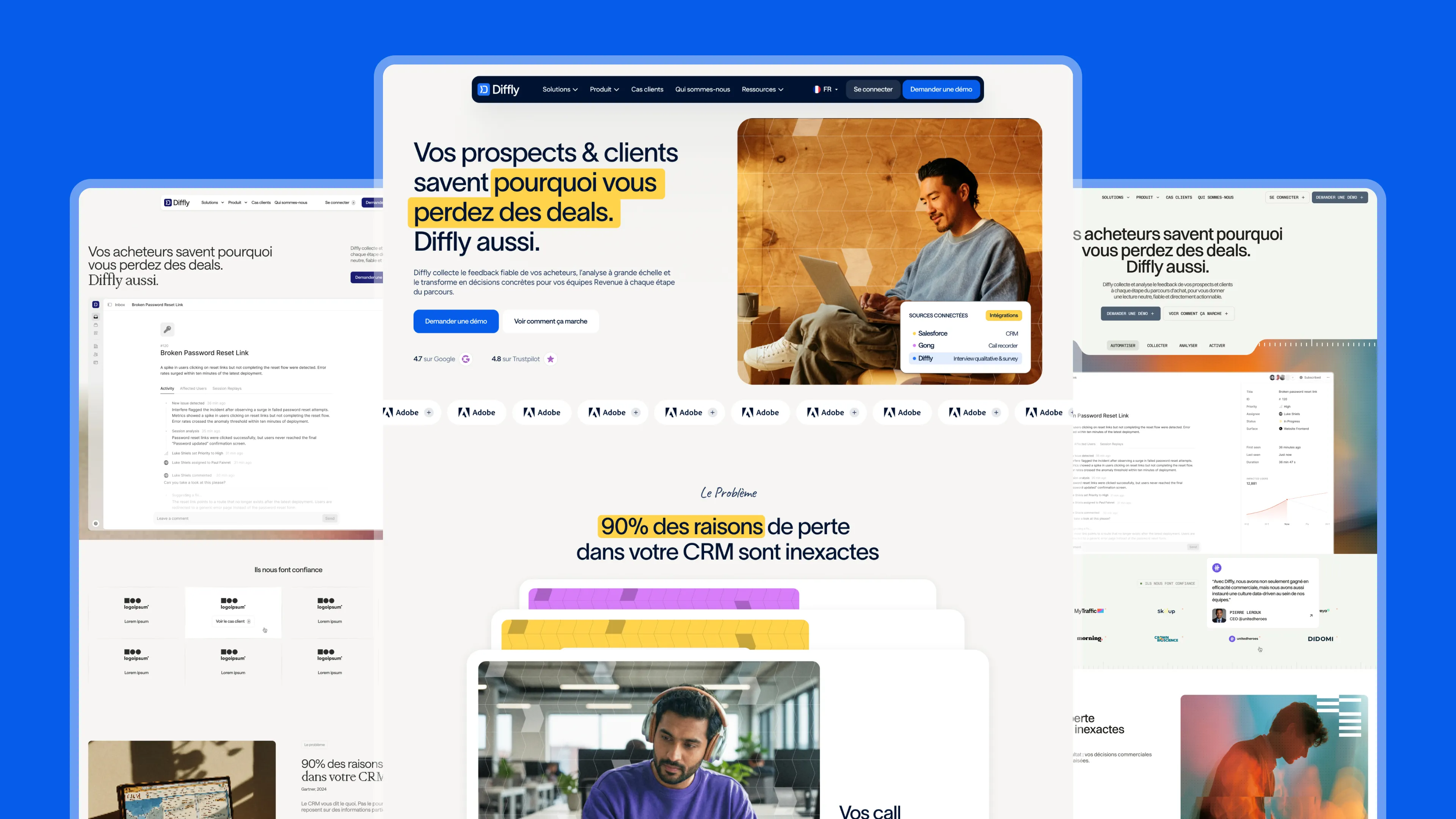
Diffly x Gemeos

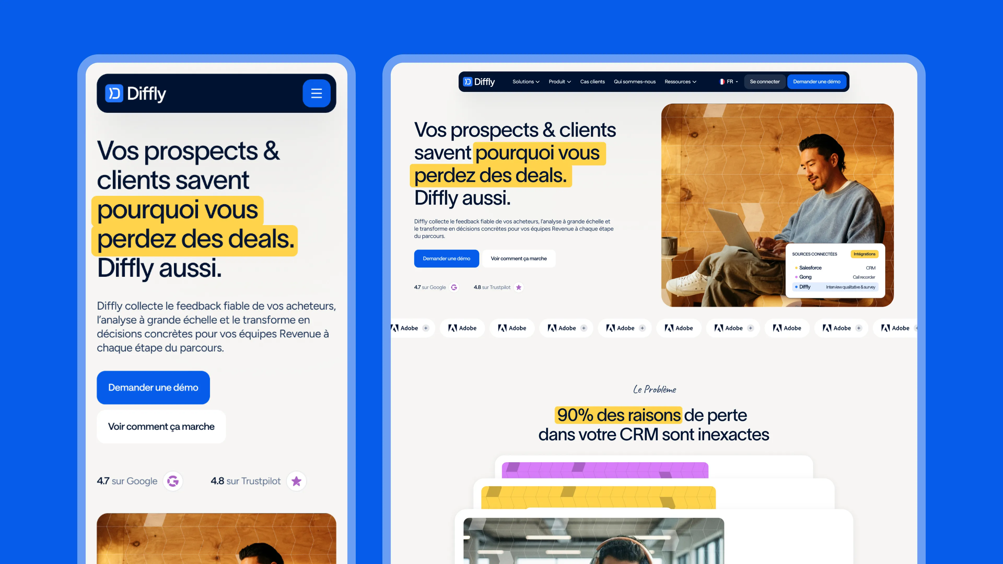
Complete redesign of diffly.co by Gemeos: art direction, UX/UI, product visuals, bilingual Webflow integration, and technical SEO. Diffly is the win-loss analysis and buyer feedback platform for B2B revenue teams.

Diffly, the truth behind buying decisions, finally visible

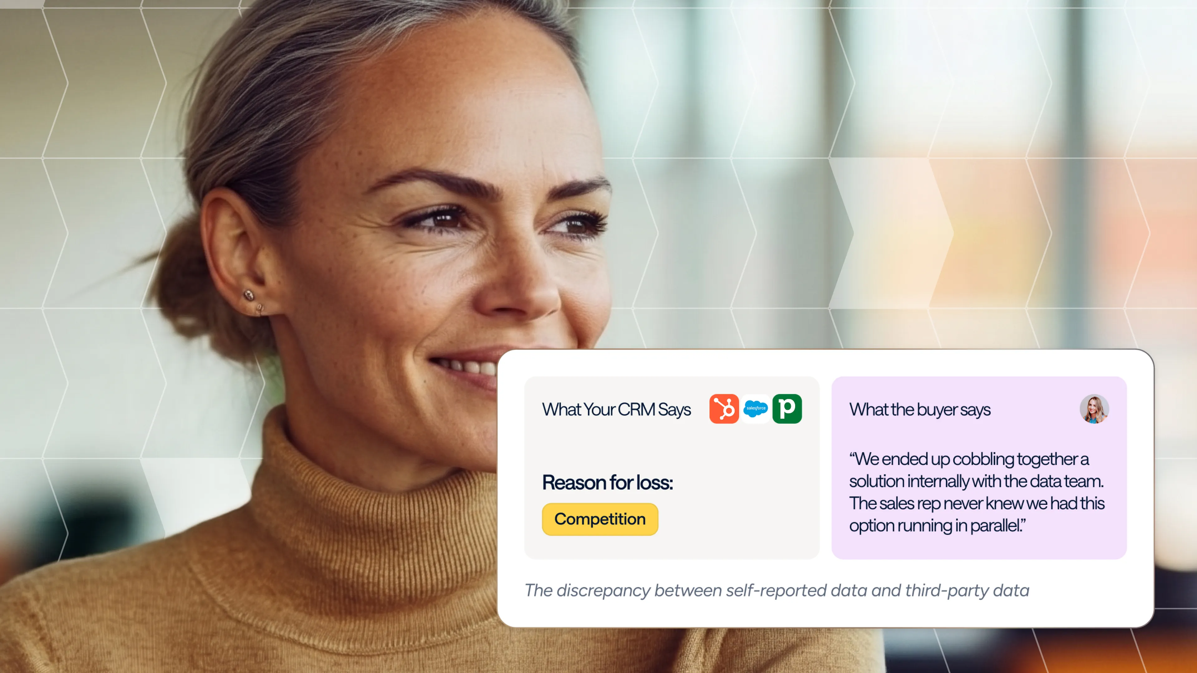
Diffly helps B2B companies understand why they win, lose, or churn: buyer interviews conducted by neutral experts, questionnaires, cross-referencing with CRM and call recordings, and AI analysis. A strong promise—an average 22% increase in win rate—supported by a site that no longer reflected it: monochrome, heavy on gradients, structured like a generic SaaS, and, above all, unable to convey what Diffly actually does in a few seconds.

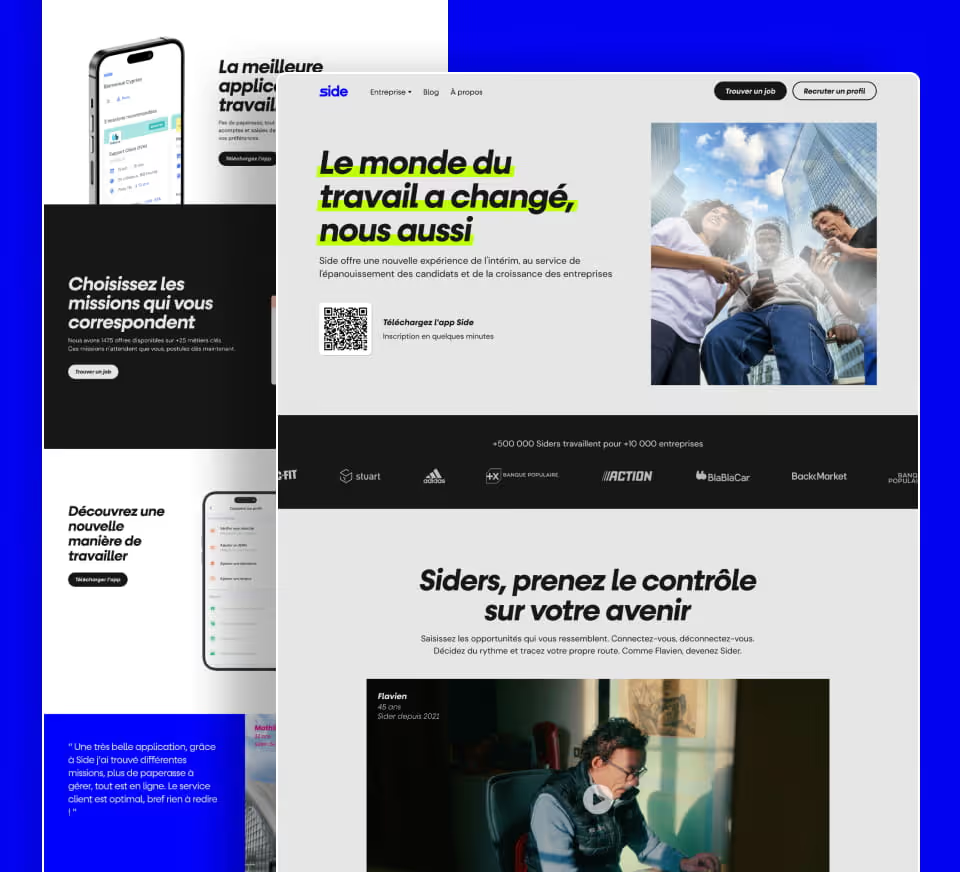
Gemeos rebuilt the site from scratch: new architecture focused on problems rather than features, art direction developed through three concepts, a full UI kit and page designs, around twenty product visuals, Webflow integration in French and English, followed by technical SEO QA and team training. Twelve weeks from brief to launch.

Industry

Services

Branding

The brief was clear: keep the name Diffly, retain a place for blue without being trapped by it, move away from the dated gradients, and make the human element at the heart of the product visible. Rather than a complete logo redesign, Gemeos evolved the identity through the surrounding system.

ÉlémentÉvolution
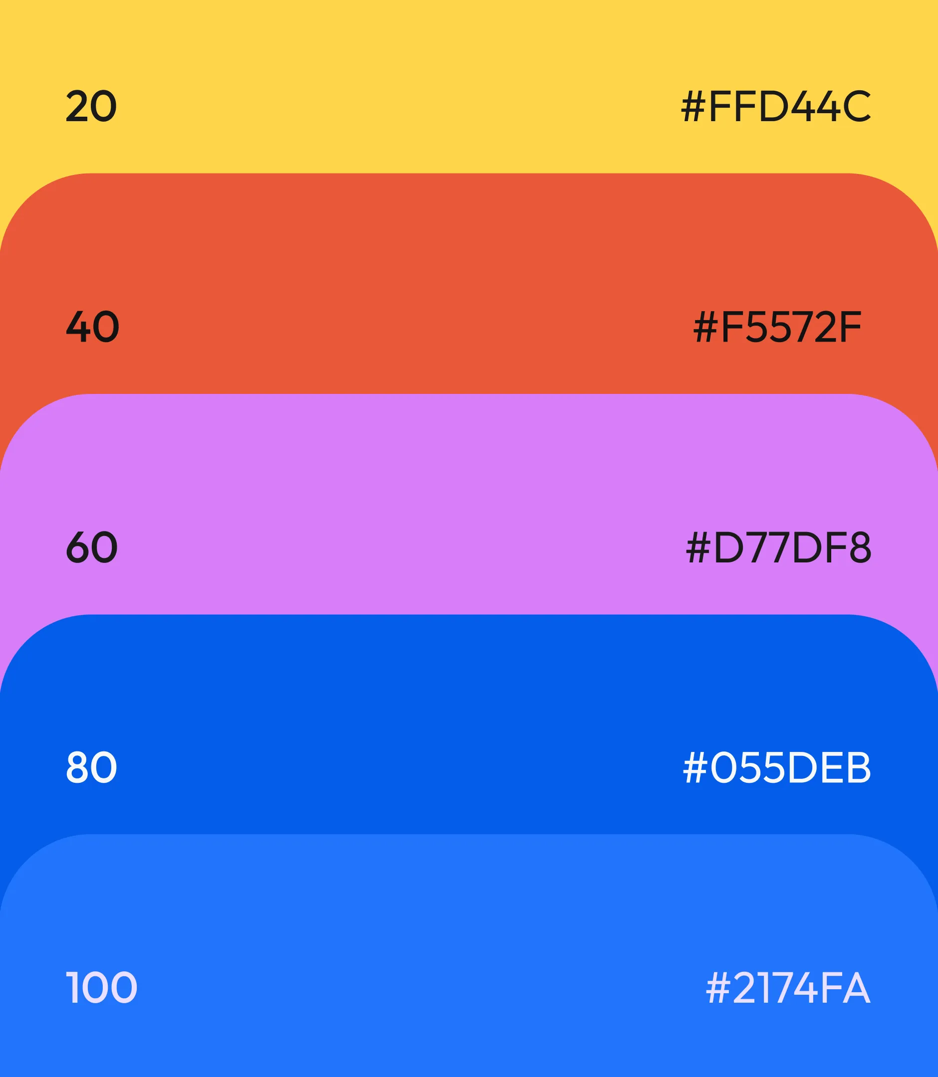
PaletteUn bleu nuit structurant, un bleu électrique pour l'action, un jaune signal pour surligner ce qui compte, réchauffés par des beiges et un orange brûlé
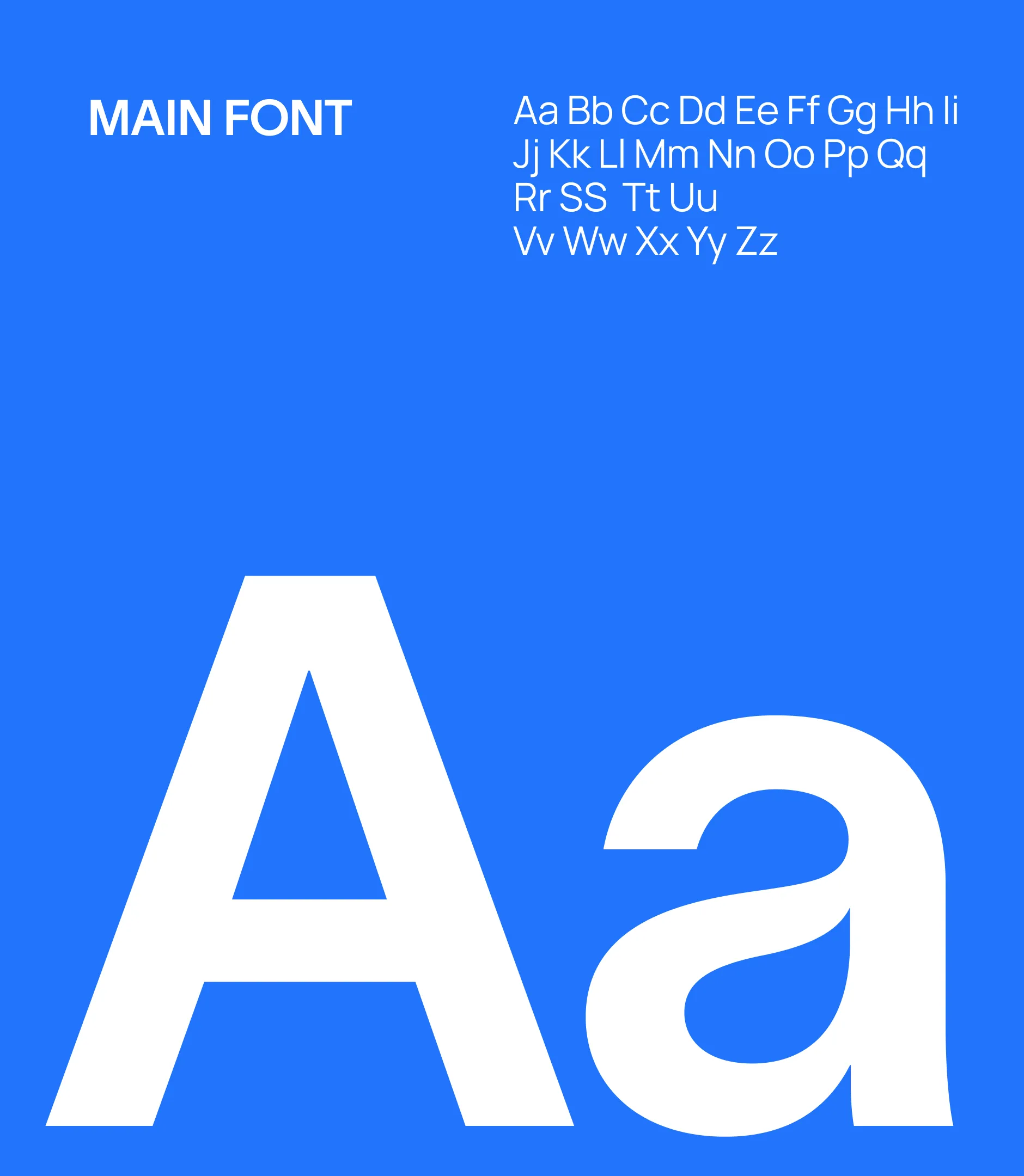
TypographieSans serif lisible et volontairement peu grasse pour le corps et les titres, complétée d'une écriture manuscrite pour les annotations
Gestes graphiquesSurlignage des mots-clés dans les titres, annotations manuscrites qui ponctuent les sections, motifs géométriques superposés aux photographies
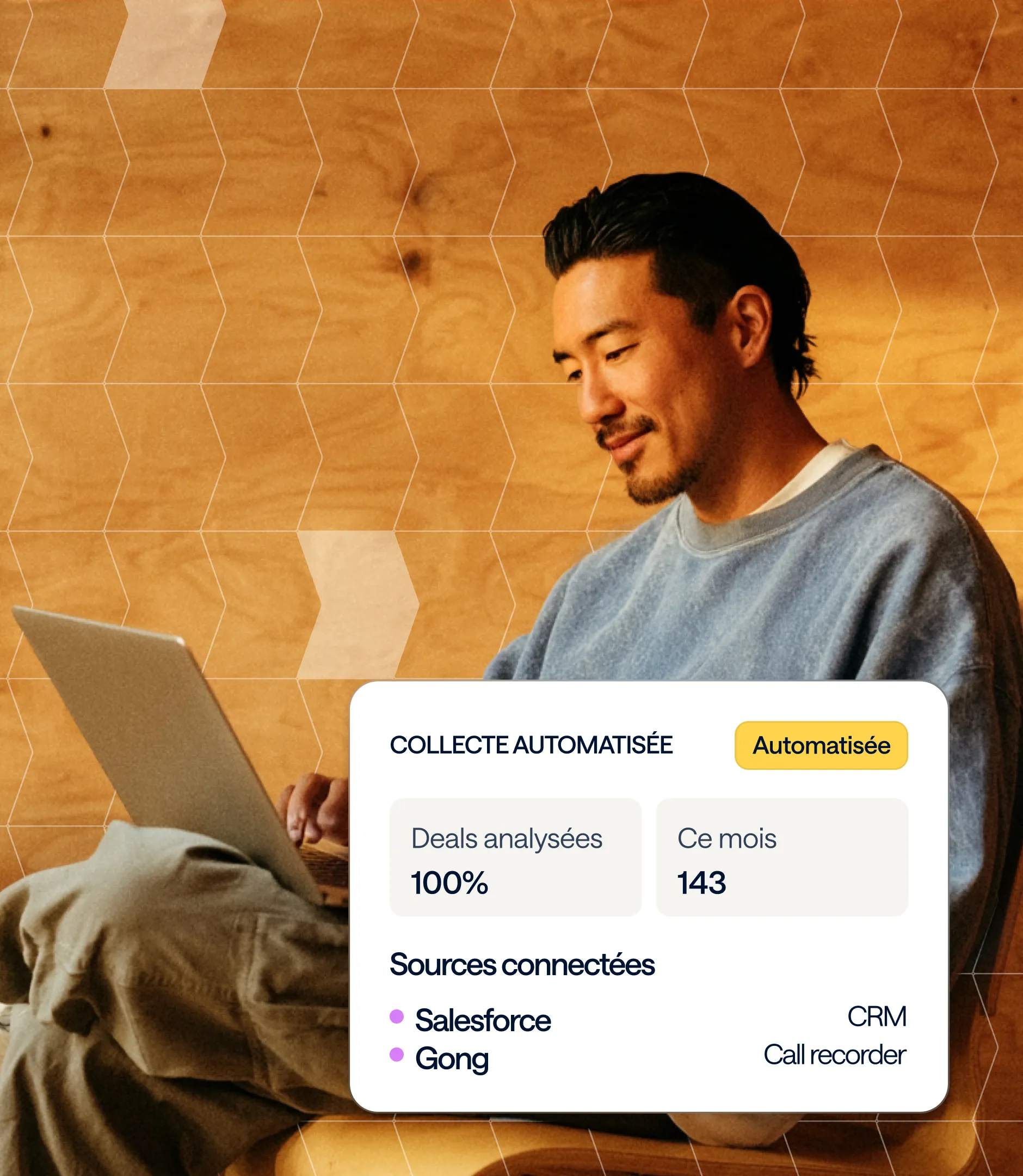
IconographiePhotographies de vraies personnes au travail plutôt que des illustrations abstraites, pour incarner les interviews humaines
DéclinaisonsSystème appliqué au site, aux visuels produit et aux ressources (webinars, livres blancs), avec un UI kit Figma comme référence unique

The result is a warmer, more readable brand that maintains its tech roots while no longer looking like an interchangeable SaaS.

No items found.

Art Direction

The brief was summed up in one sentence: "not too cold, not too data-heavy, but rigorous and premium." Diffly wanted to keep the blue without being defined by it, move away from corporate gradients, and highlight what makes them different: humans talking to humans to uncover the truth. The cited references (Batch, Gong, Mercateam) all pointed in the same direction: a bold identity, a rich palette, and warmth.

Three concepts, three interpretations of the same product

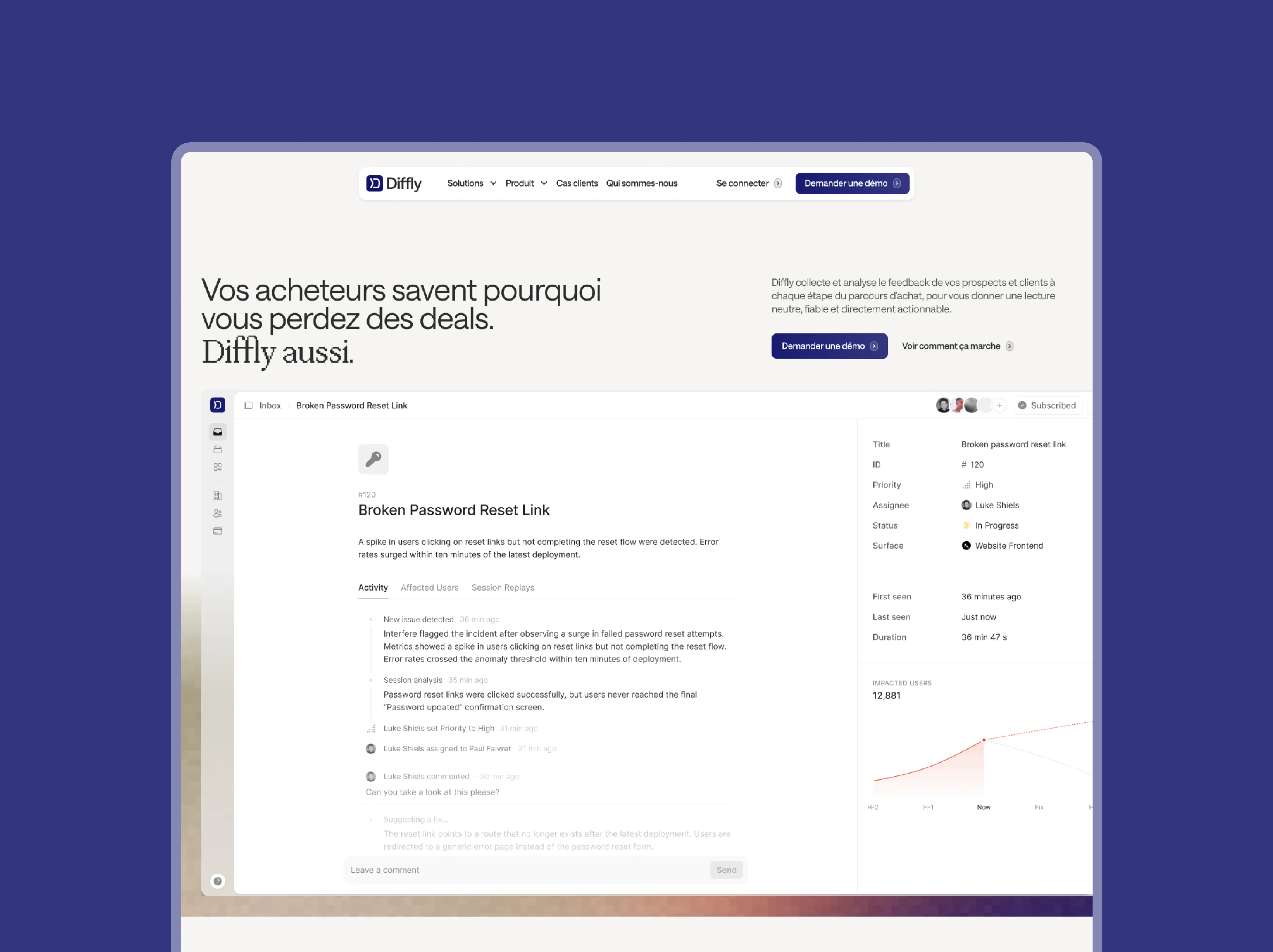
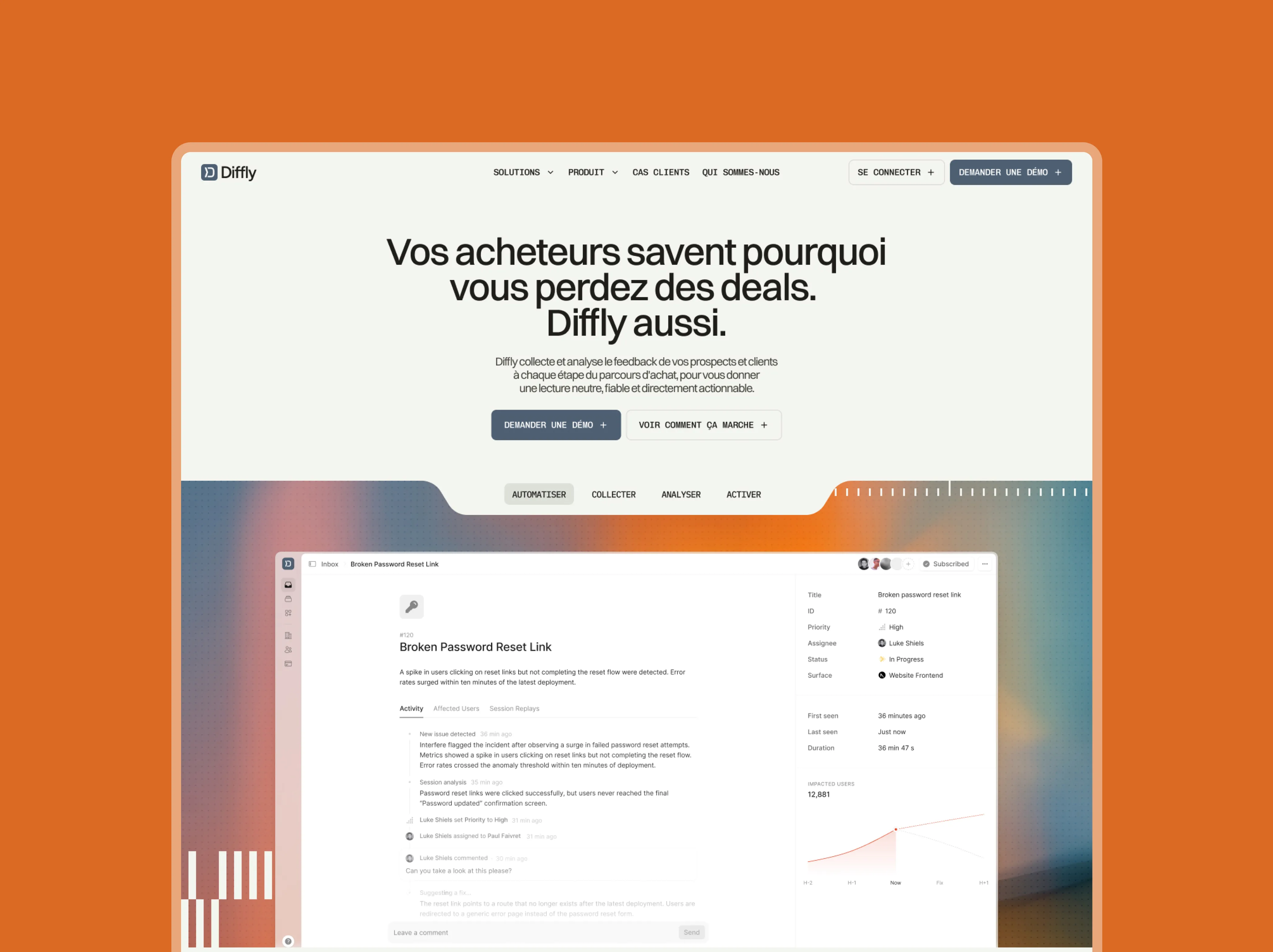
Rather than a single proposal, Gemeos built three complete visual territories, each with its own palette, typography, and a fully mocked-up homepage.

The chosen direction

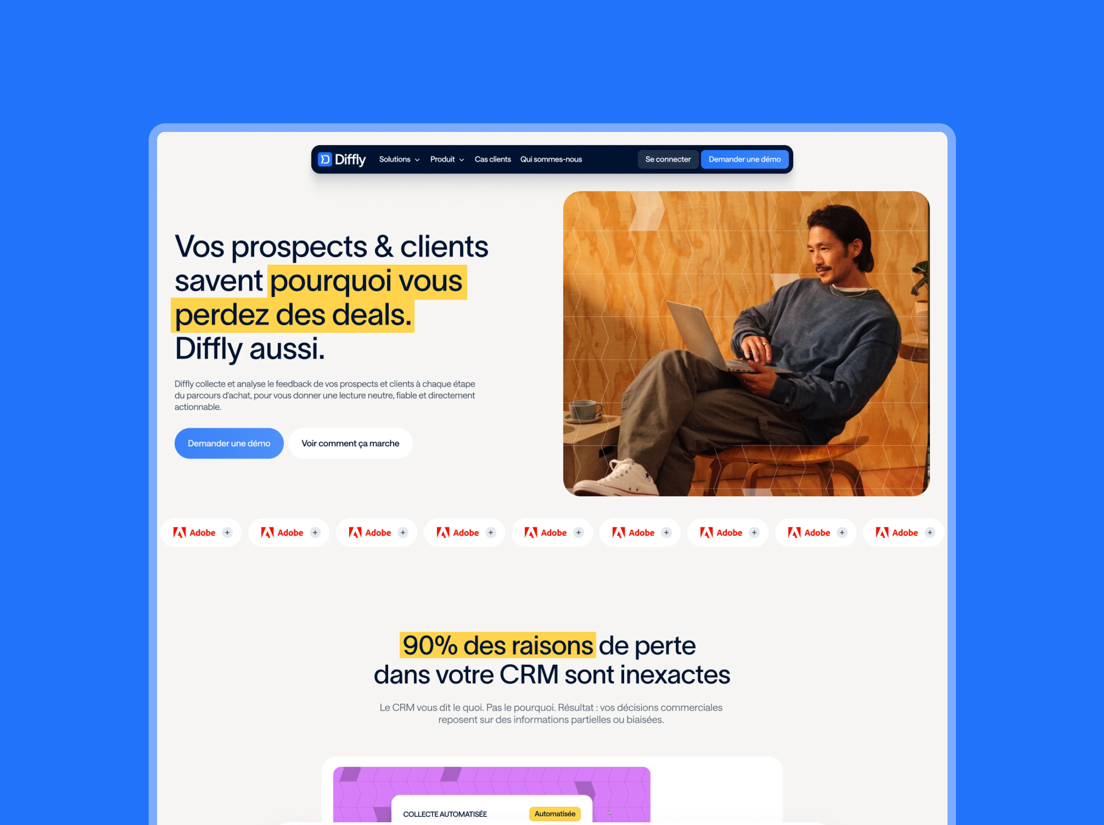
Diffly chose the Signal concept as its foundation, enhanced by the most impactful elements of the other two: highlighting keywords in headings, handwritten annotations punctuating sections, and human-focused photography accented with geometric patterns. The result: a structural midnight blue, a signal yellow that draws the eye to what matters, photos of real people at work, and a legible typeface that lets the message shine.

Signal

A tension between warm and cold: a palette rooted in human warmth, balanced by a primary blue that evokes technological rigor. Slightly pixelated line illustrations—neither purely organic nor digital—and a sophisticated, light sans-serif typeface for a premium feel tailored to the C-suite.

Between the lines

Seeing through the noise, reading between the lines, revealing what is blurred. Photographs layered with patterns that evoke the assembly of multiple sources, partial blurring for the "pre-Diffly" state, and handwritten words that recall the human experts behind the platform. A palette inspired by developer consoles: vibrant colors on a dark background.

Confrontation

The most emotionally assertive direction. Colors chosen far from typical AI tropes, with no corporate grays or gradients, hand-drawn icons, and keywords encapsulated in headings as if highlighted with a marker. Rounded shapes and airy compositions create a warm universe: humans speaking to humans to uncover the truth.

Look&Feel

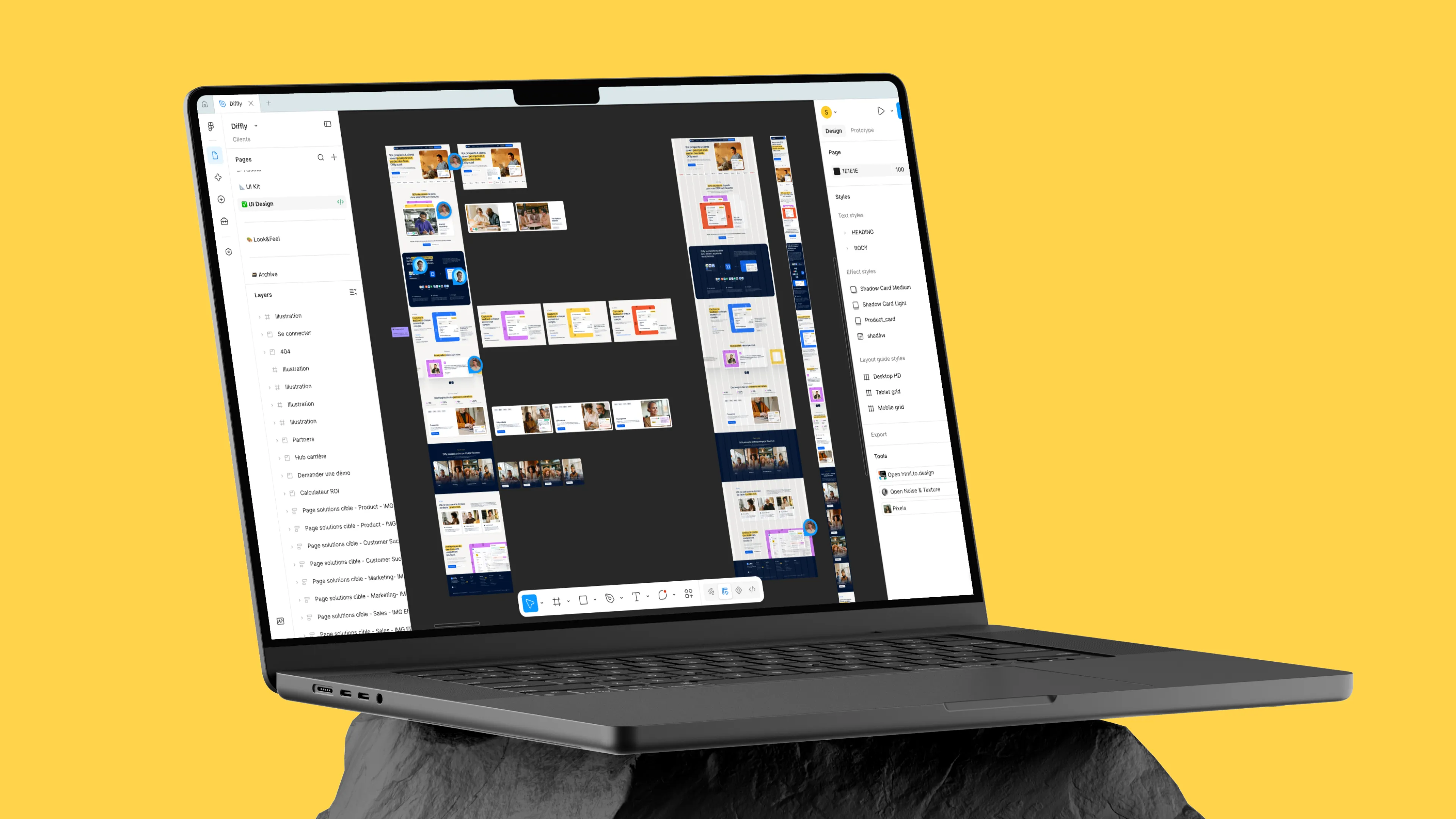
UX / UI Design

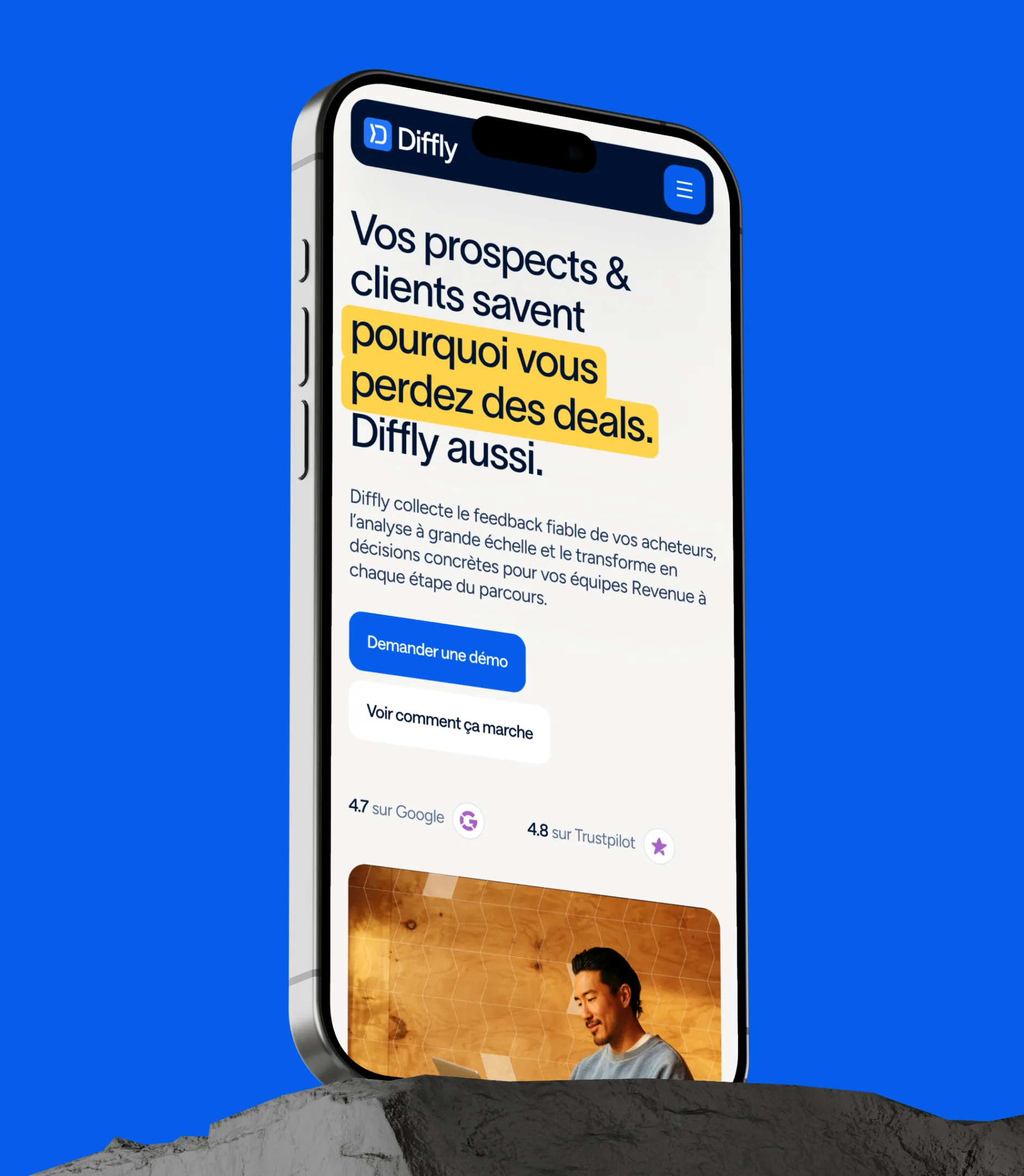
The audit of the existing site highlighted three main issues. The value proposition was too abstract: it focused on win-loss analysis before defining the problem. The product wasn't understood quickly enough: was it a SaaS, an interview service, or a research firm? It was actually all three, but nothing communicated that. Finally, the navigation was "feature-driven," modeled after a standard SaaS, even though Diffly sells a strategic shift for Revenue teams.

A problem-oriented architecture

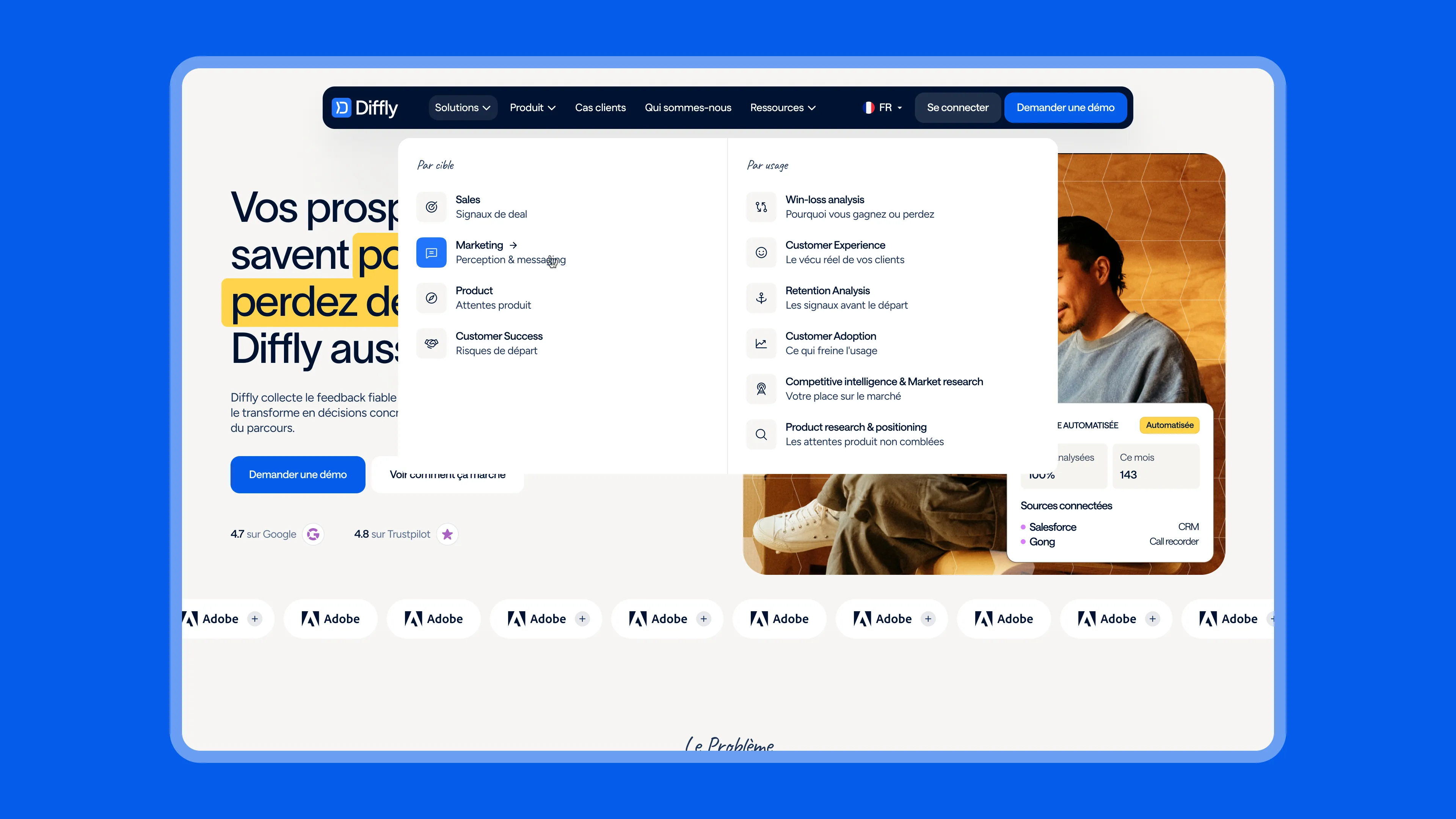
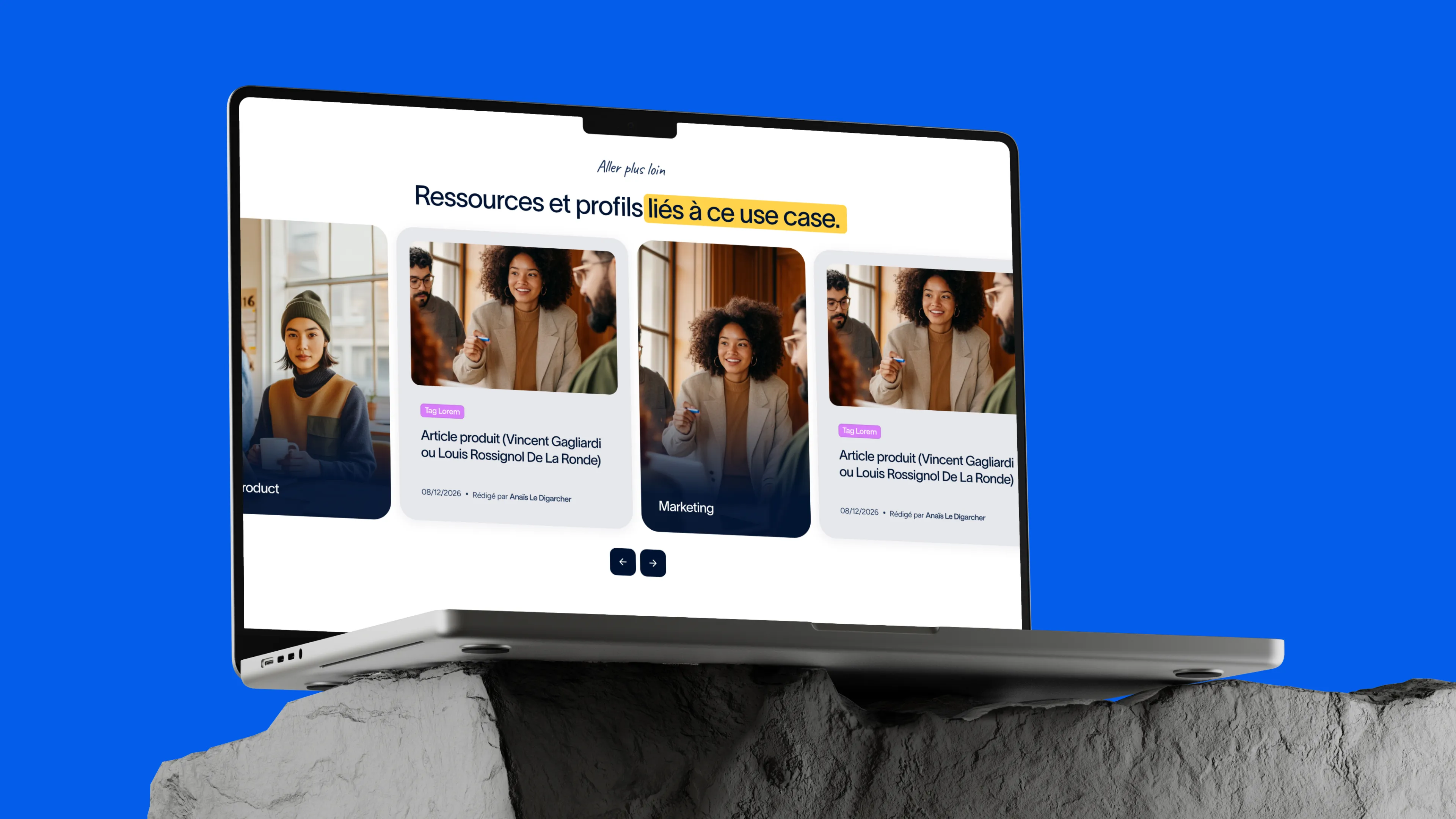
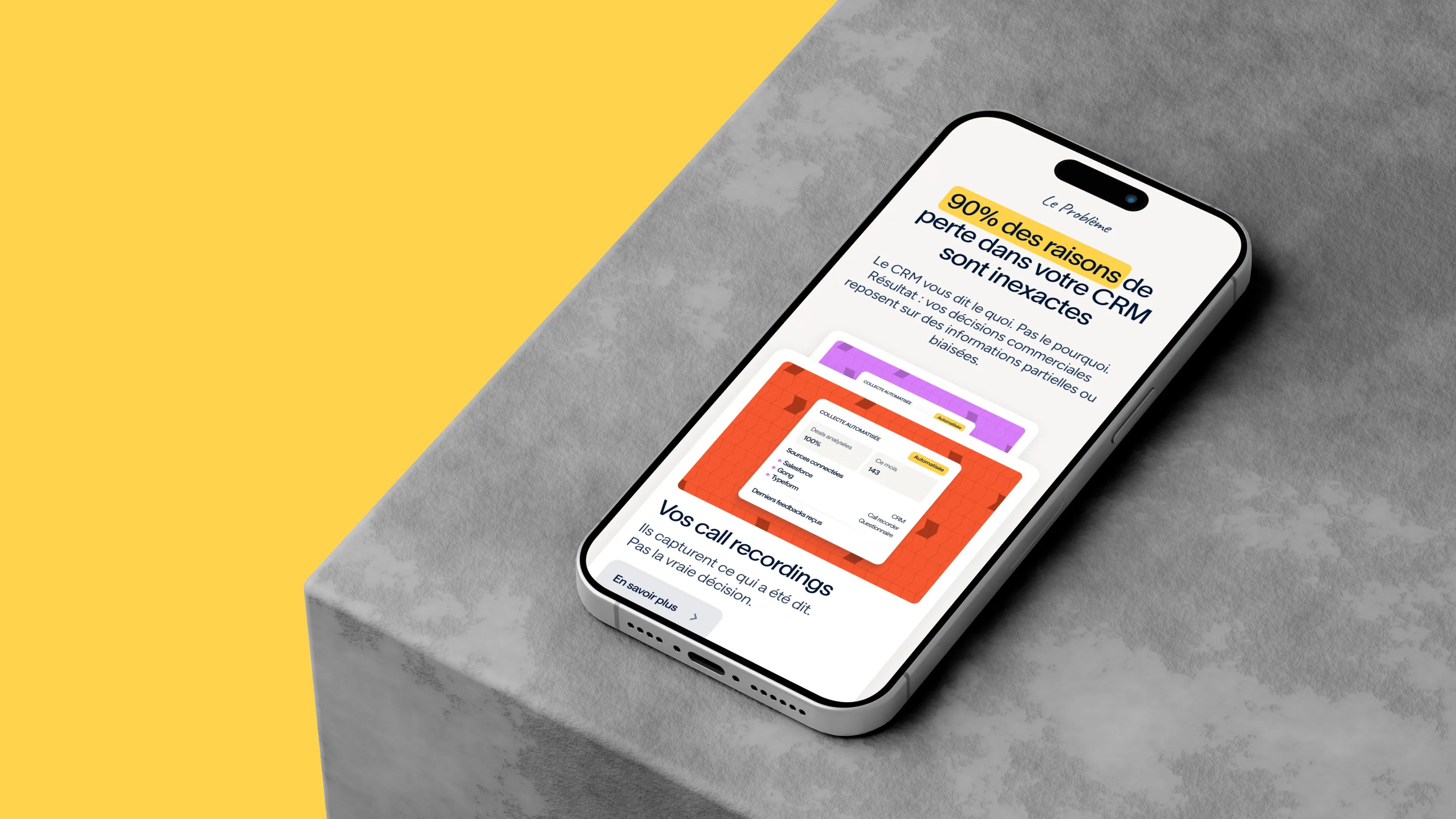
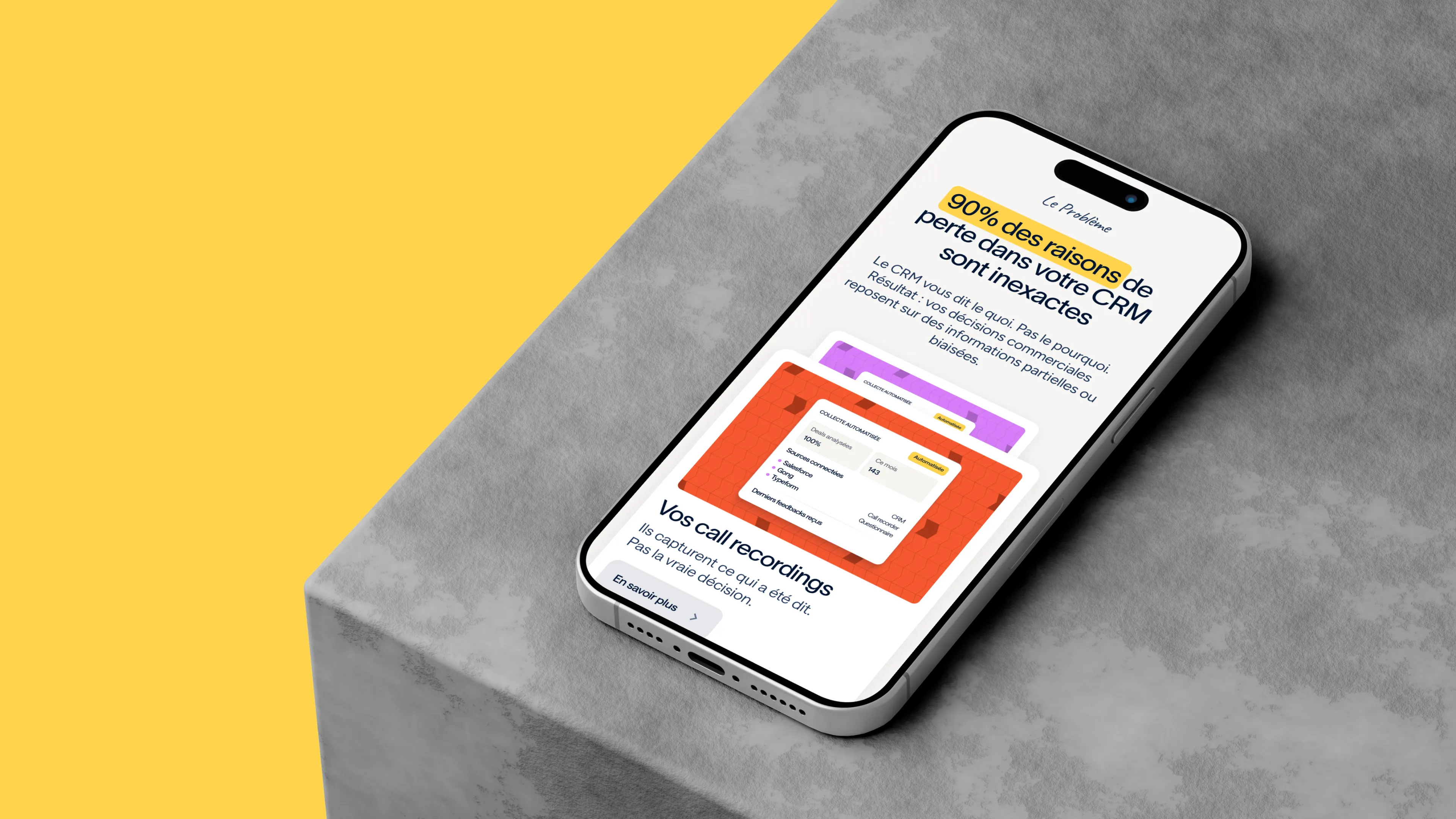
Gemeos rebuilt the site structure with the Diffly team, starting with the hook rather than the features: "90% of the reasons for loss in your CRM are inaccurate." The site is now organized by product, use case, and persona, with dedicated pages for every combination.

SectionPagesObjectif
HomeHomepage FR/ENPoser le problème, montrer le produit en action, prouver par les clients
ProduitPlatform, Live Interviews, AI Insights & Alerts, IntegrationsFaire comprendre que Diffly = SaaS + service + IA
Solutions par use caseWin-loss analysis, Customer Experience, Retention, Customer Adoption, Competitive Intelligence, Product ResearchCapter les requêtes métier et parler à chaque enjeu
Solutions par personaSales, Marketing, Product, Customer SuccessAdresser directement les décideurs et utilisateurs
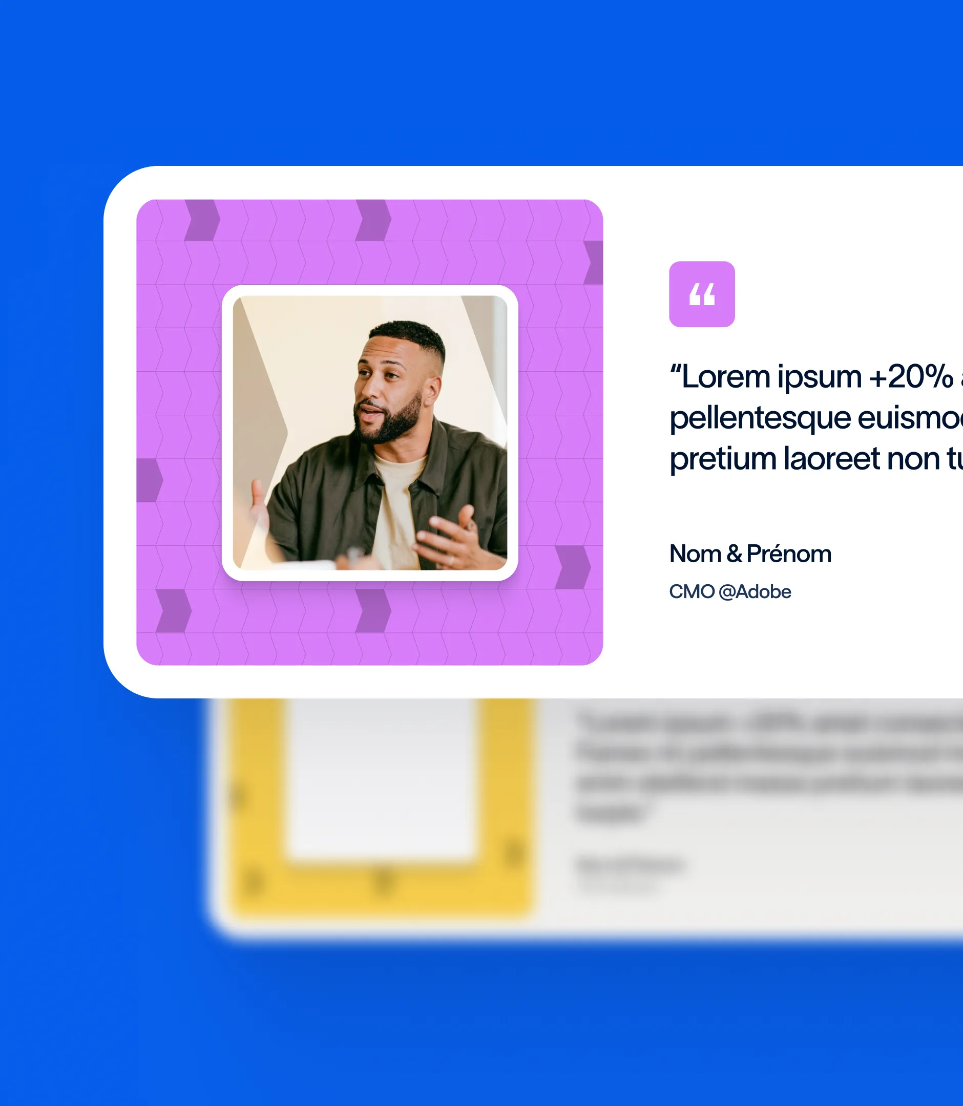
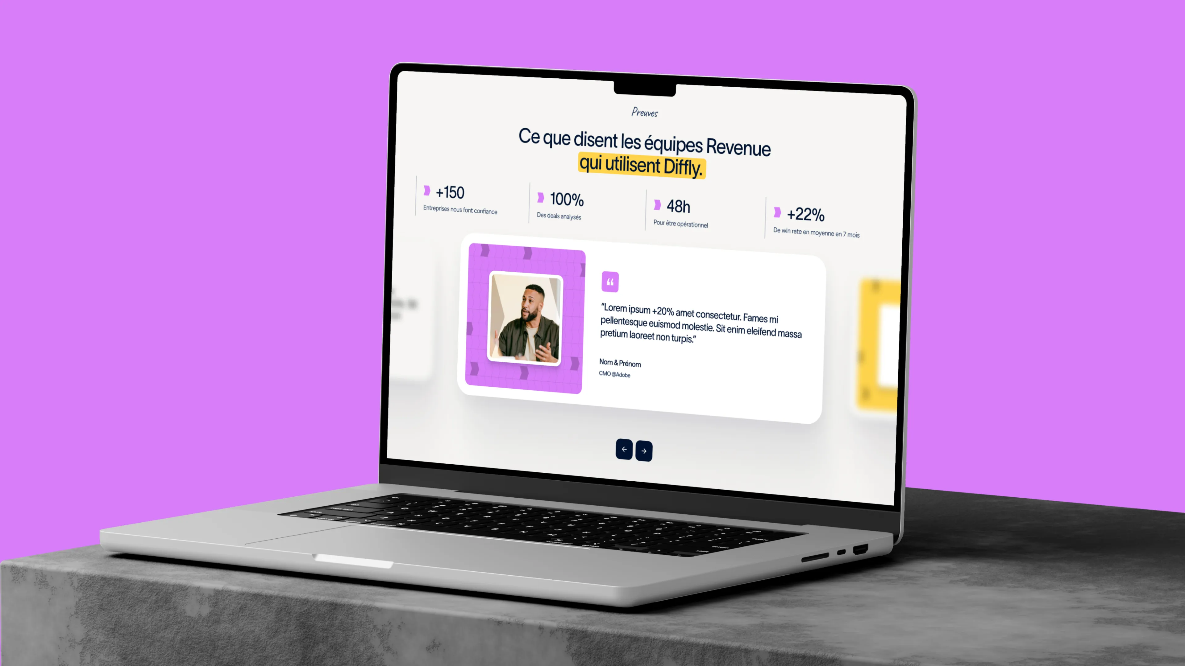
CustomersCas clients avec filtres par industriePreuve sociale (Adobe, Workday, Didomi, Skillup…)
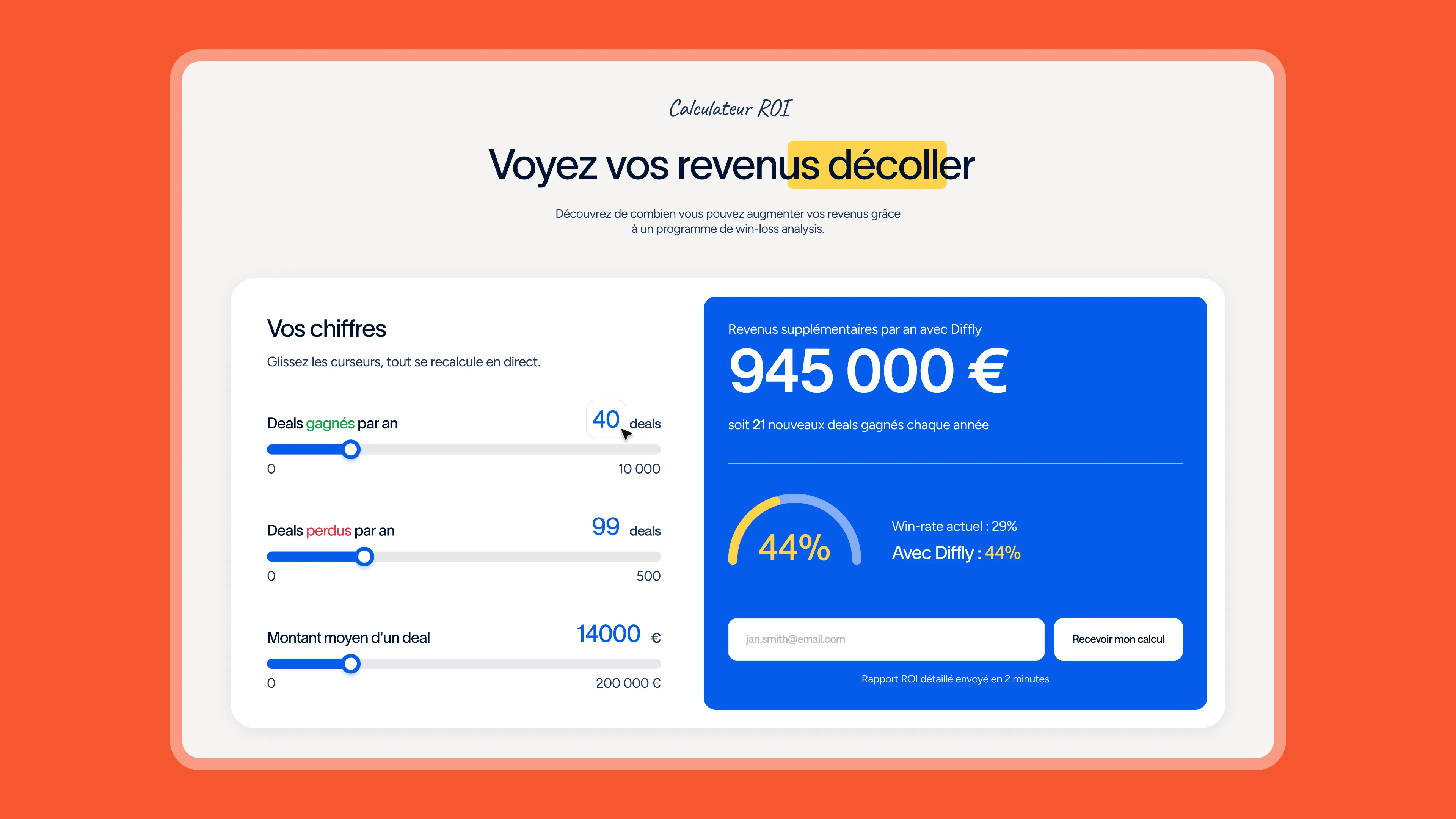
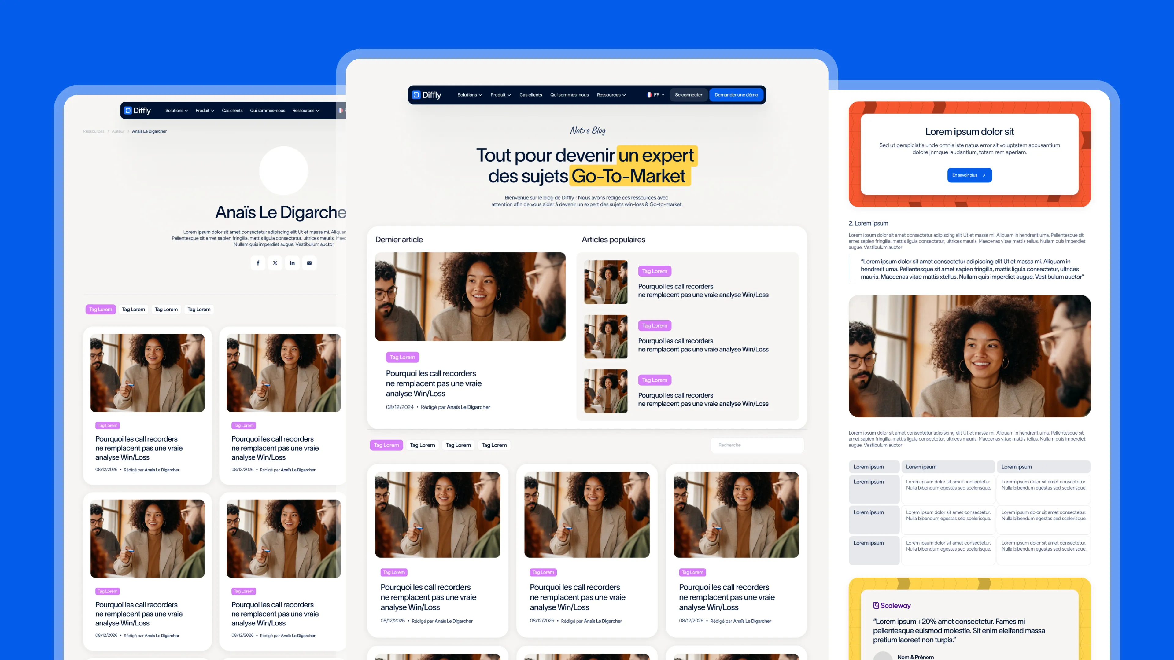
ResourcesBlog, Toolbox (webinars, livres blancs), ROI Calculator, DiagnosticAlimenter le SEO et la génération de leads
Pricing / DemoPages dissociéesUn parcours clair pour comparer, un autre pour convertir
AboutQui sommes-nous, Careers, Partner ProgramIncarner l'équipe et ouvrir le canal partenaires

UI kit and page design

A complete UI kit was designed before the pages: colors, typography, components (cards, tabs, pricing tables, testimonials, FAQs, CTA banners), states, and responsive variations. All templates were then designed for desktop and mobile in Figma, first in English (the site's default language) and then adapted into French. Every key section includes a product visual to ensure visitors are never left with an abstract promise.

Product Design

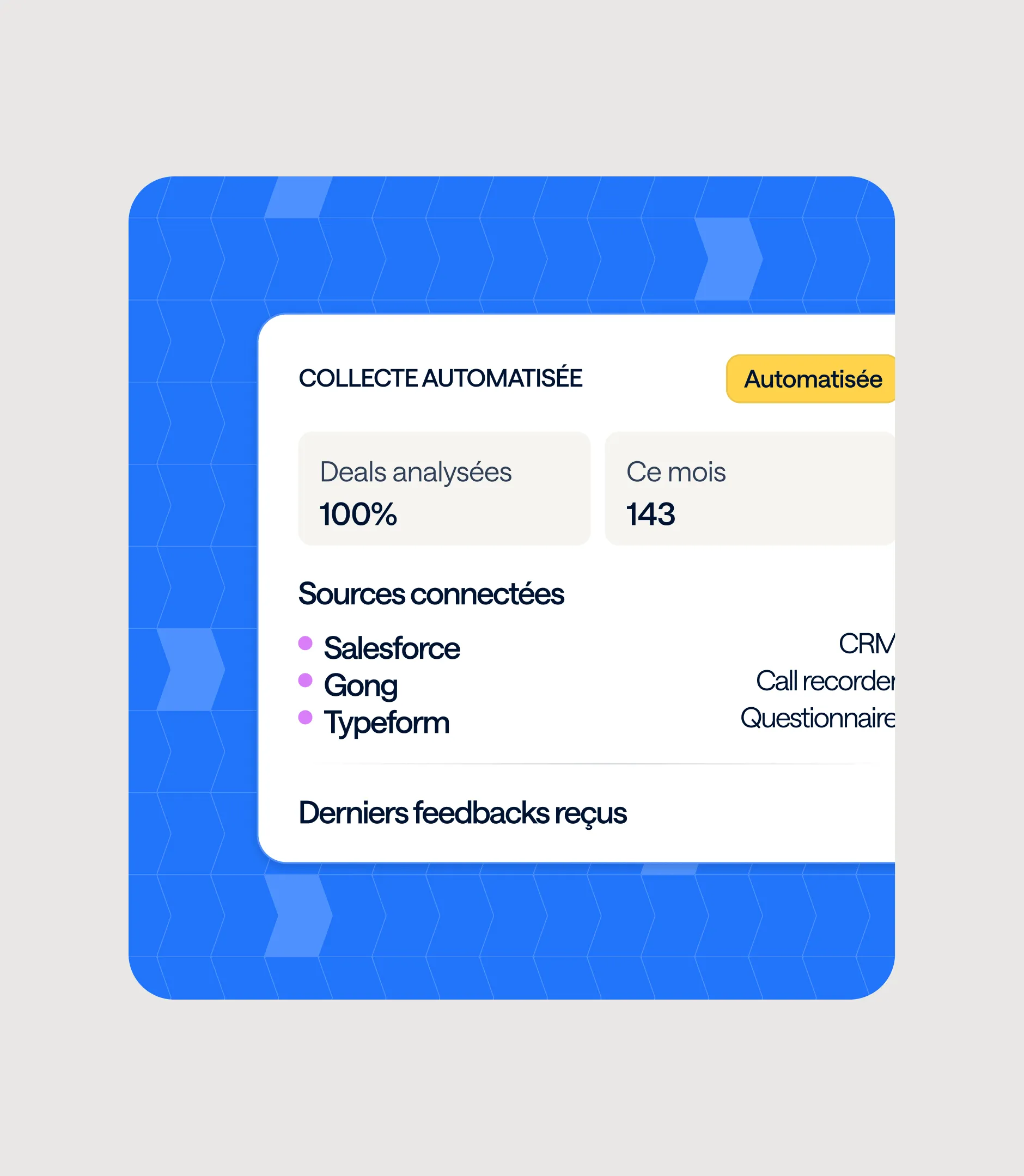
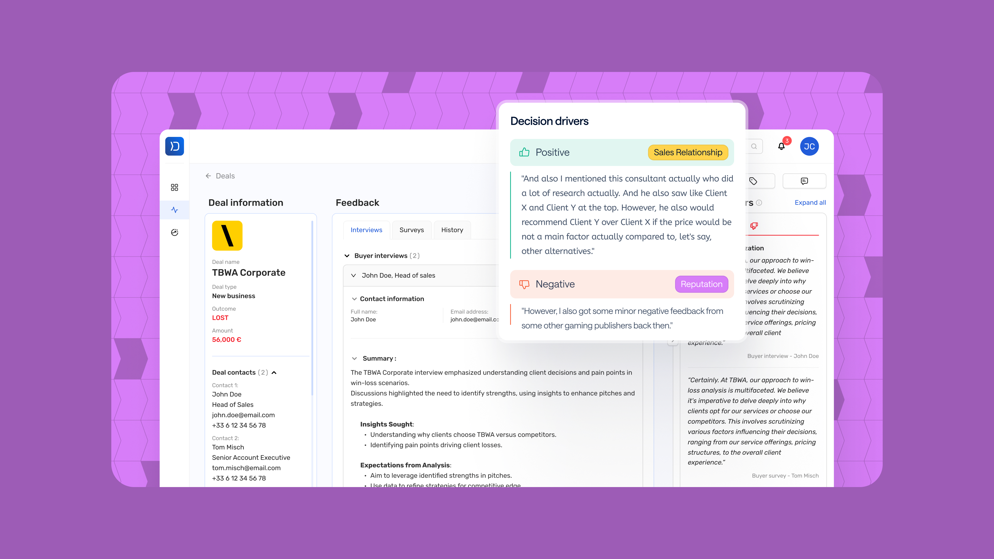
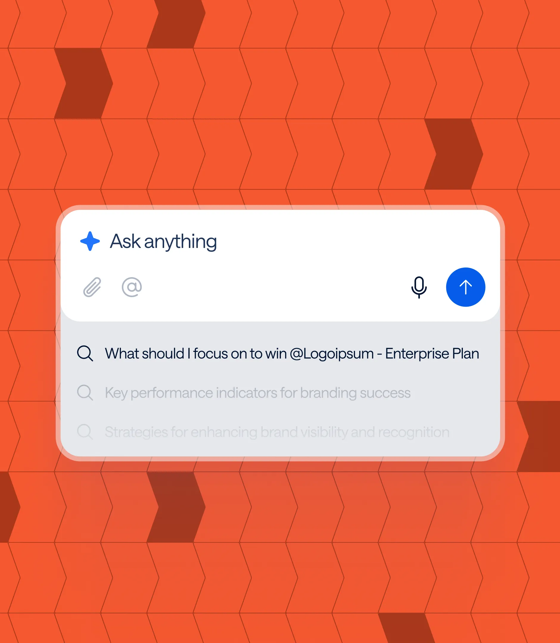
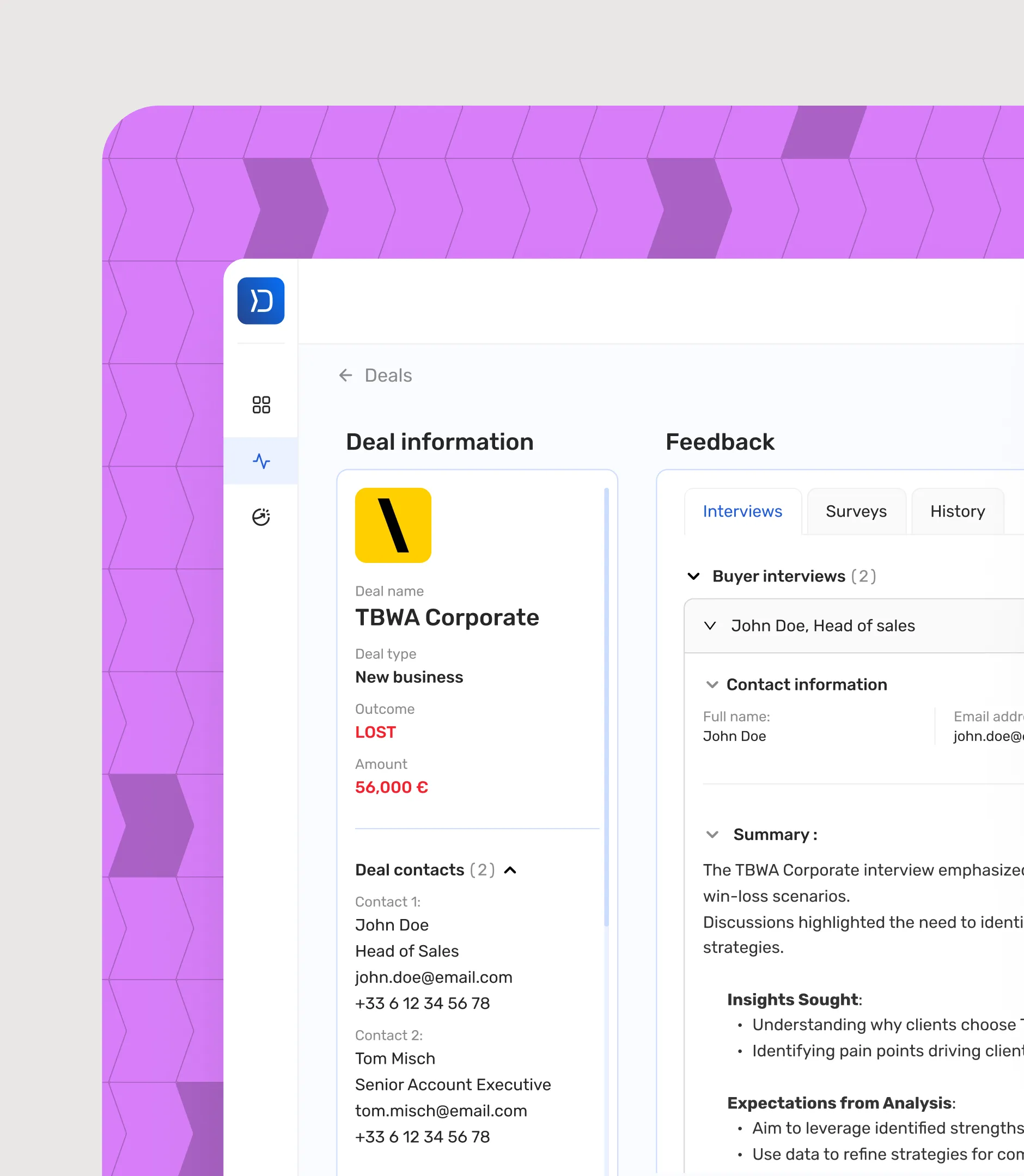
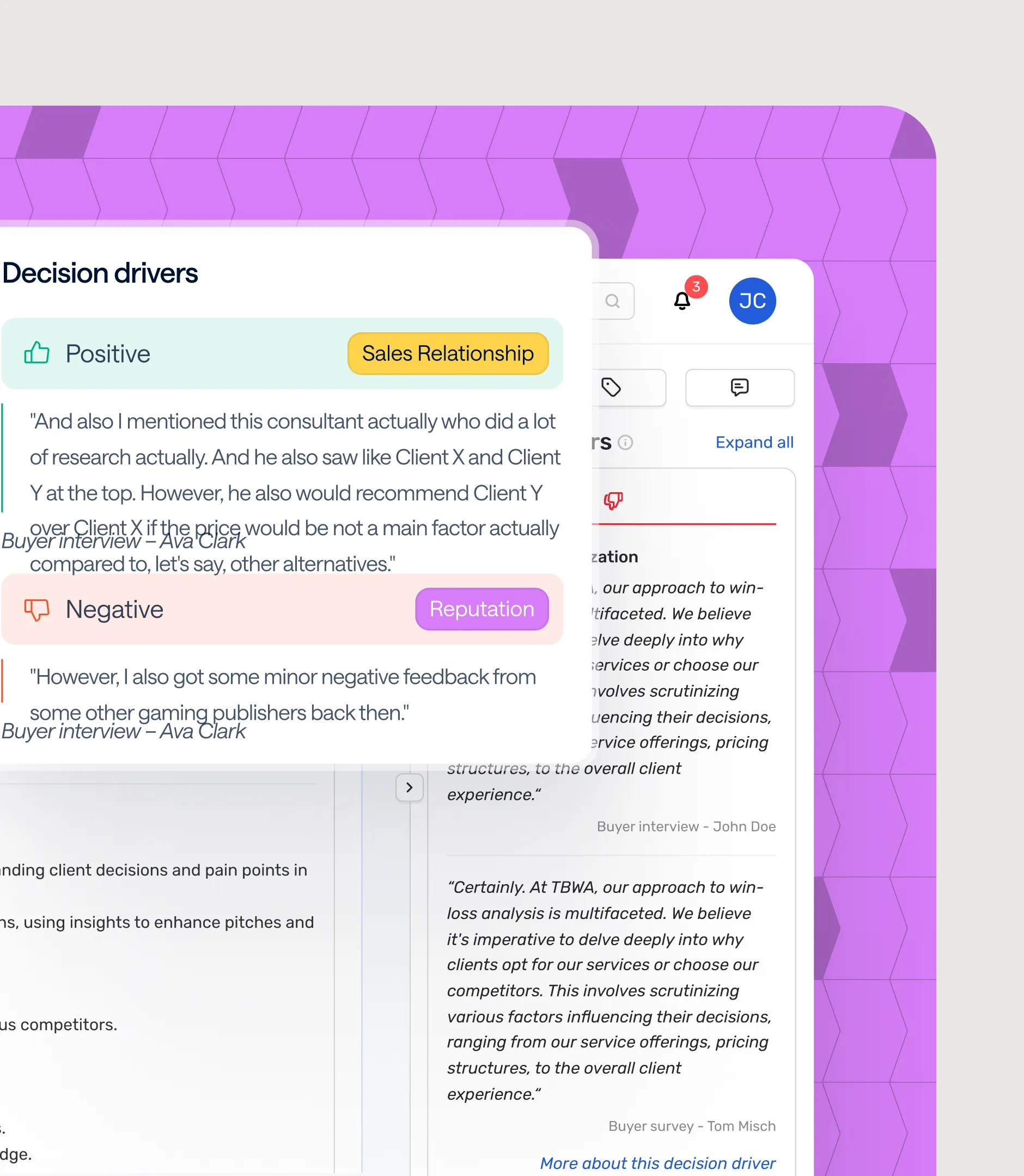
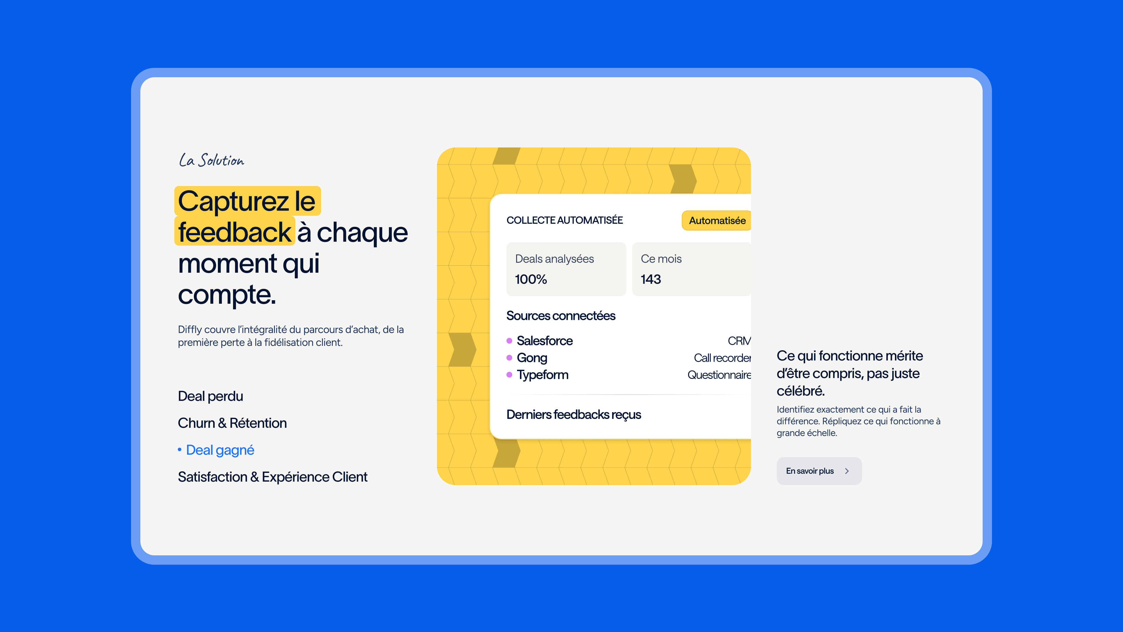
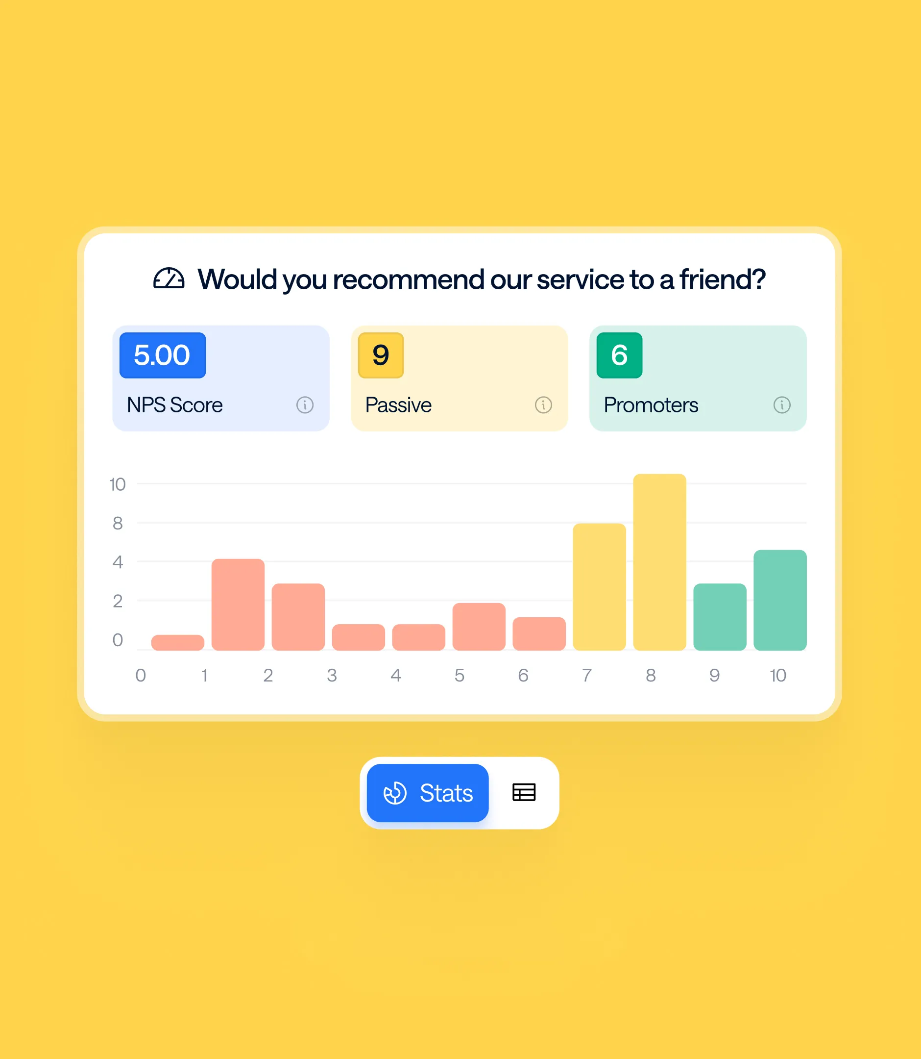
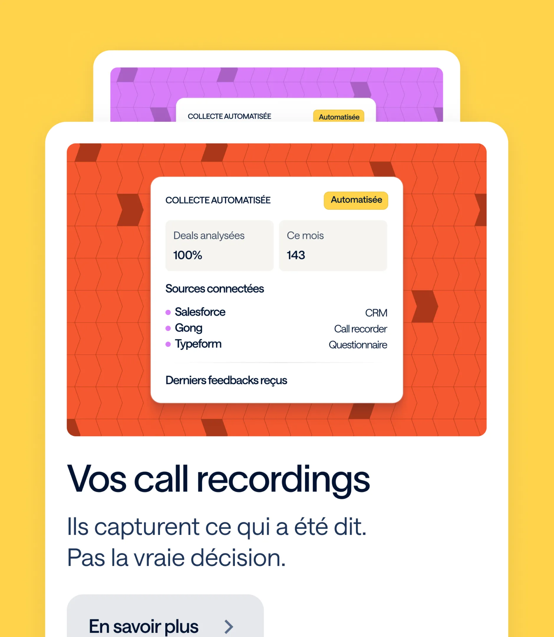
Diffly had no product design system or web-ready visuals. However, the brief was clear: communicate at a glance that Diffly is a single source of truth for multiple data streams and that its AI can answer any question about your deals. Gemeos therefore created a library of product visuals for the site, based on actual platform screens and a list of features provided by Diffly.

FamilleVisuelsCe qu'ils montrent
Diffly AIBarre de recherche, « Ask Diffly AI » (question, bibliothèque de questions, résultat), AI reco sur un deal en coursPoser n'importe quelle question, obtenir une réponse sourcée
InsightsDashboards critères de décision (gagné, perdu, satisfaction, churn), critères sur une interview, deal page / post-mortemLa profondeur des insights récupérés à chaque interview
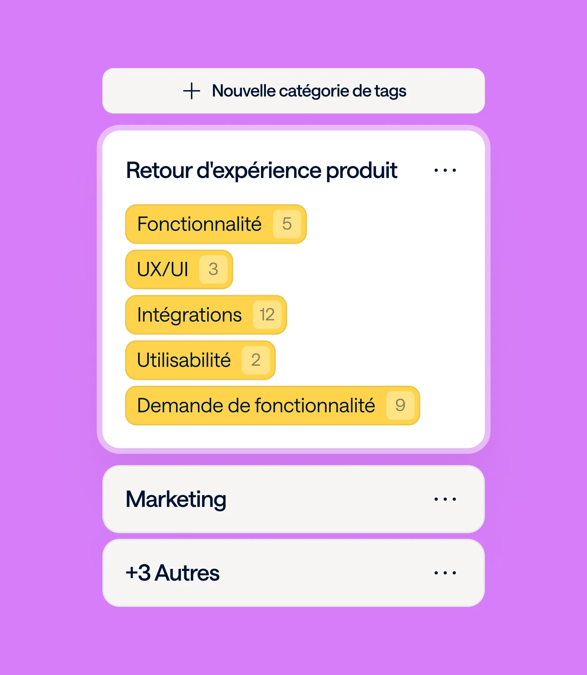
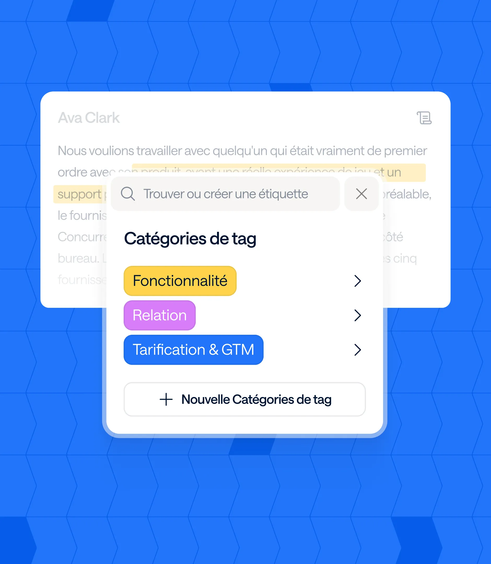
OrganisationAI Tag, page Tag global, catégories de tagsComment Diffly structure et agrège les feedbacks
CampagnesChoix du format, personnalisation des séquences, critères de déclenchementLancer une collecte de feedback en quelques clics
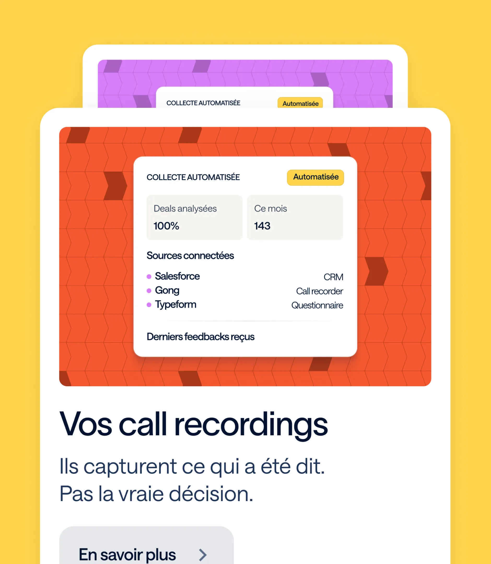
ÉcosystèmeMulti-source (interviews, surveys, call recordings, CRM), battle card générée par IA, intégrationsDiffly comme source unique de vérité

Each visual was redesigned to match the site's style (cards, shadows, palette, typography) rather than simply captured as-is, ensuring the product looks as polished as the messaging. The visuals are available in both English and French, with several animated versions created for the hero sections.

No items found.

Webflow integration

A bilingual site, a three-tier architecture (product, use case, persona), a resource hub, and a blog to migrate: Diffly’s Webflow integration was a complex project, carried out in parallel with the final design stages to meet the early July launch deadline.

LivrableDétail
Intégration des pagesUne trentaine de templates statiques et dynamiques intégrés pixel-perfect depuis Figma, desktop et mobile
Multilingue FR/ENWebflow Localization sur l'ensemble du site : pages statiques, CMS, title tags et meta descriptions traduits, gestion des visuels par langue
Architecture CMSCollections cas clients (avec catégories d'industries), blog et auteurs, ressources Toolbox (webinars, livres blancs), témoignages sélectionnables page par page, logos clients
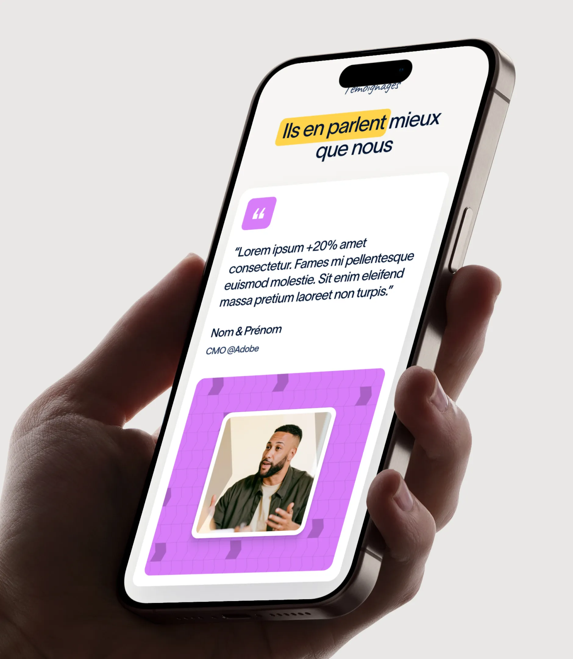
Composants sur mesureSections à onglets, sliders de témoignages, tableaux de pricing, blocs FAQ, hub Toolbox
AnimationsMicro-interactions et transitions au scroll, visuels produit animés dans les hero, optimisés pour ne pas dégrader le chargement
Hub Toolbox & landing pagesMigration des LP webinars et livres blancs vers un template unique, réutilisable pour les campagnes emailing
Redirections & mise en lignePlan de redirections 301 depuis l'ancien site, recette SEO, bascule du domaine sans interruption
FormationSérie de vidéos : gestion du multilingue, sections tabs, ajout de logos, édition du blog, remplacement des visuels et sélection des avis

Collaborative QA

Diffly challenged the integration closely: over 140 pieces of feedback were submitted before launch, each addressed one by one. This high standard paid off: the site went live with content validated word-for-word in both languages, and the Diffly team is now fully autonomous in managing their pages, resources, case studies, and translations.
Technical SEO

The redesign changed everything: the domain was kept, but the URLs, site structure, and default language were completely rethought. The SEO challenge was twofold: to retain all existing search rankings while laying the groundwork to capture industry-specific queries (win-loss analysis, voice of customer, churn analysis, buyer feedback) in both French and English.

ChantierDétail
Plan de redirectionsCartographie ancien site → nouveau site, redirections 301 page à page, contrôle des 404 après bascule
Structure sémantiqueUn H1 par page, hiérarchie Hn cohérente avec l'architecture use case / persona, maillage interne entre solutions, produit et cas clients
Balises & métadonnéesTitle tags et meta descriptions rédigés et traduits pour chaque page statique, balises hreflang FR/EN via Webflow Localization
Données structuréesSchema Organization sur le site, Article et auteurs sur le blog
PerformanceImages optimisées (WebP, lazy loading), animations légères, scripts tiers limités
Stratégie de contenuRecommandations sur la fréquence d'articles, la fraîcheur des dates de publication, les pages auteurs et l'usage d'outils d'aide à la rédaction

Designed for search engines and LLMs

The solution and persona pages were written using clear, verbatim language, structured as Q&As and concise definitions—the exact format ChatGPT, Perplexity, and Google’s AI Overviews pull from when citing sources. Combined with structured data and a readable architecture, this approach positions Diffly to be cited as a reference for win-loss analysis in Europe, rather than just ranked.

OUR latest projects

+240 companies
supported

Websites designed and developed with 

Let’s f*****G GO !!

Ready to launch
Your business?

Alexandre

Max

Enora

Bryan

Cannelle

Tiphaine

You'll :heart: our collaboration...