Good to know

Heading

Lorem ipsum dolor sit amet, consectetur adipiscing elit. Suspendisse varius enim in eros elementum tristique. Duis cursus, mi quis viverra ornare, eros dolor interdum nulla, ut commodo diam libero vitae erat. Aenean faucibus nibh et justo cursus id rutrum lorem imperdiet. Nunc ut sem vitae risus tristique posuere.

Lorem ipsum dolor sit amet consectetur.

Lorem ipsum dolor sit amet consectetur. Aliquam orci sagittis dignissim sapien praesent donec.

Lorem ipsum

Lorem ipsum dolor sit amet, consectetur adipiscing elit, sed do eiusmod tempor incididunt ut labore et dolore magna aliqua. Ut enim ad minim veniam, quis nostrud exercitation ullamco laboris nisi ut aliquip ex ea commodo consequat. Duis aute irure dolor in reprehenderit in voluptate velit esse cillum dolore eu fugiat nulla pariatur.

Add

Lorem ipsum

Lorem ipsum

Hub612 × Gemeos

Since 2016, HUB612 has been supporting B2B tech startups across the Rhône-Alpes region with acceleration, early-stage investment, and a community of entrepreneurs. With an outdated visual identity and a website that no longer matched their ambition, they brought Gemeos in to completely redesign their brand and web presence.

A
A
A

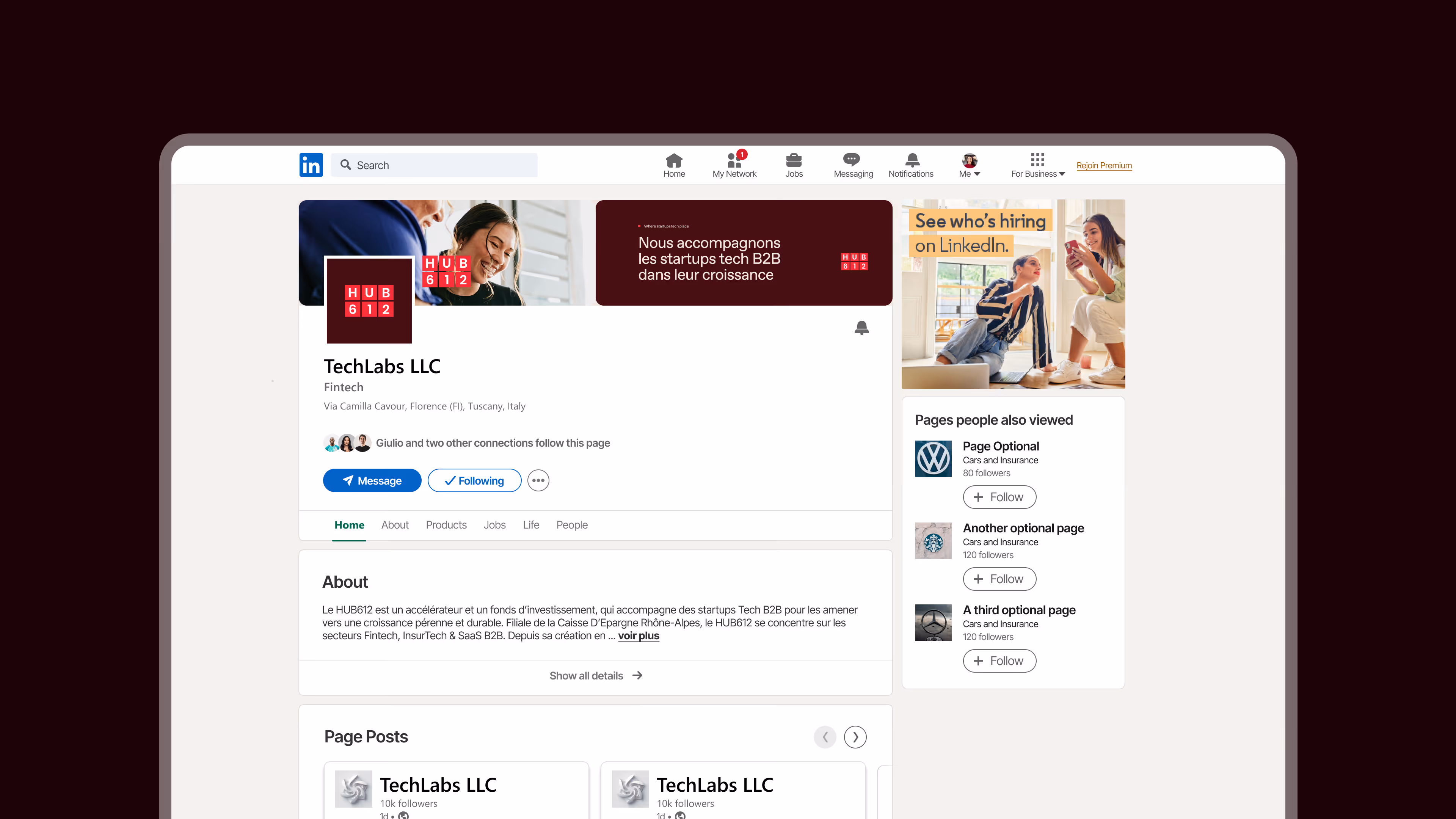
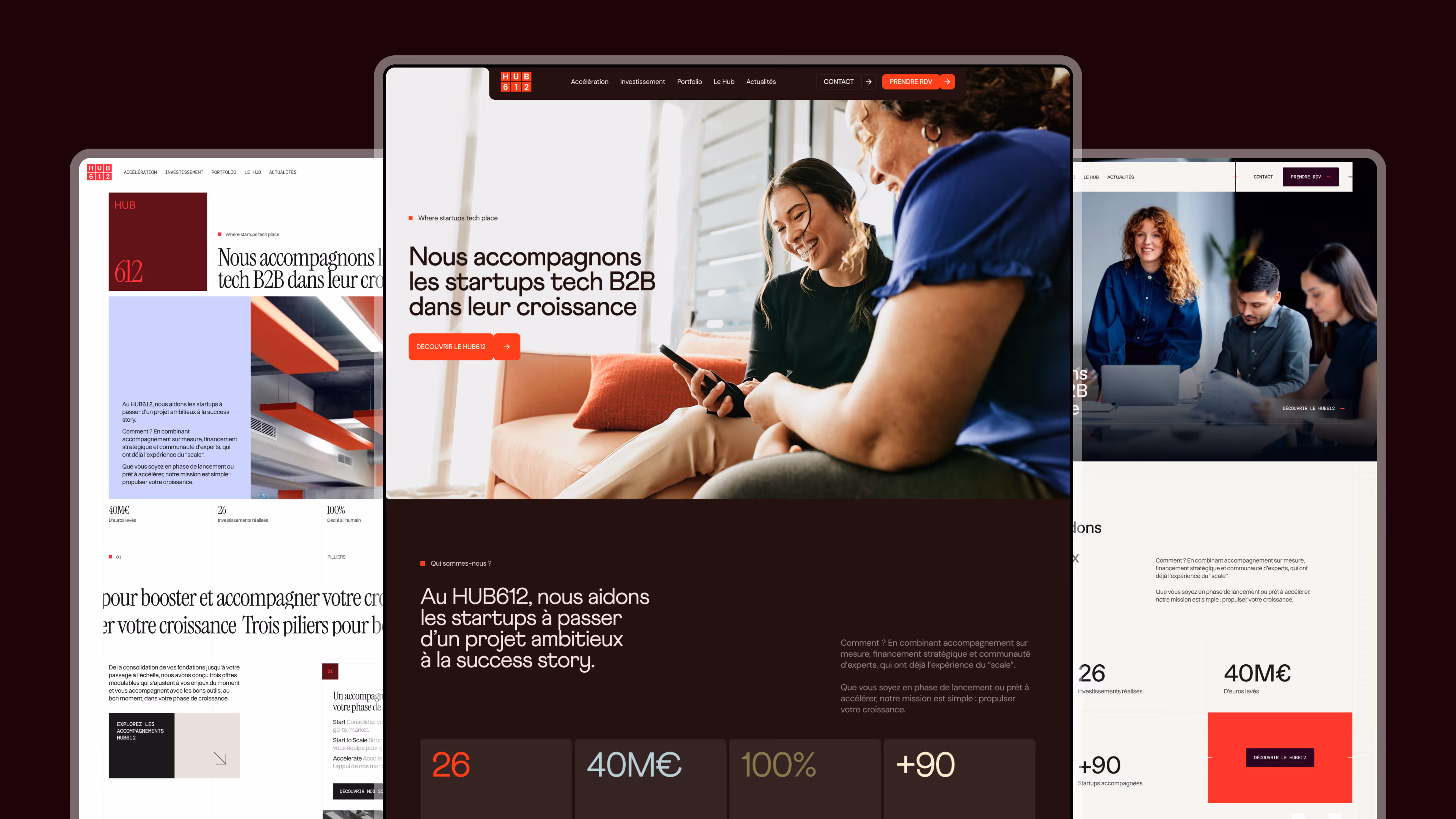
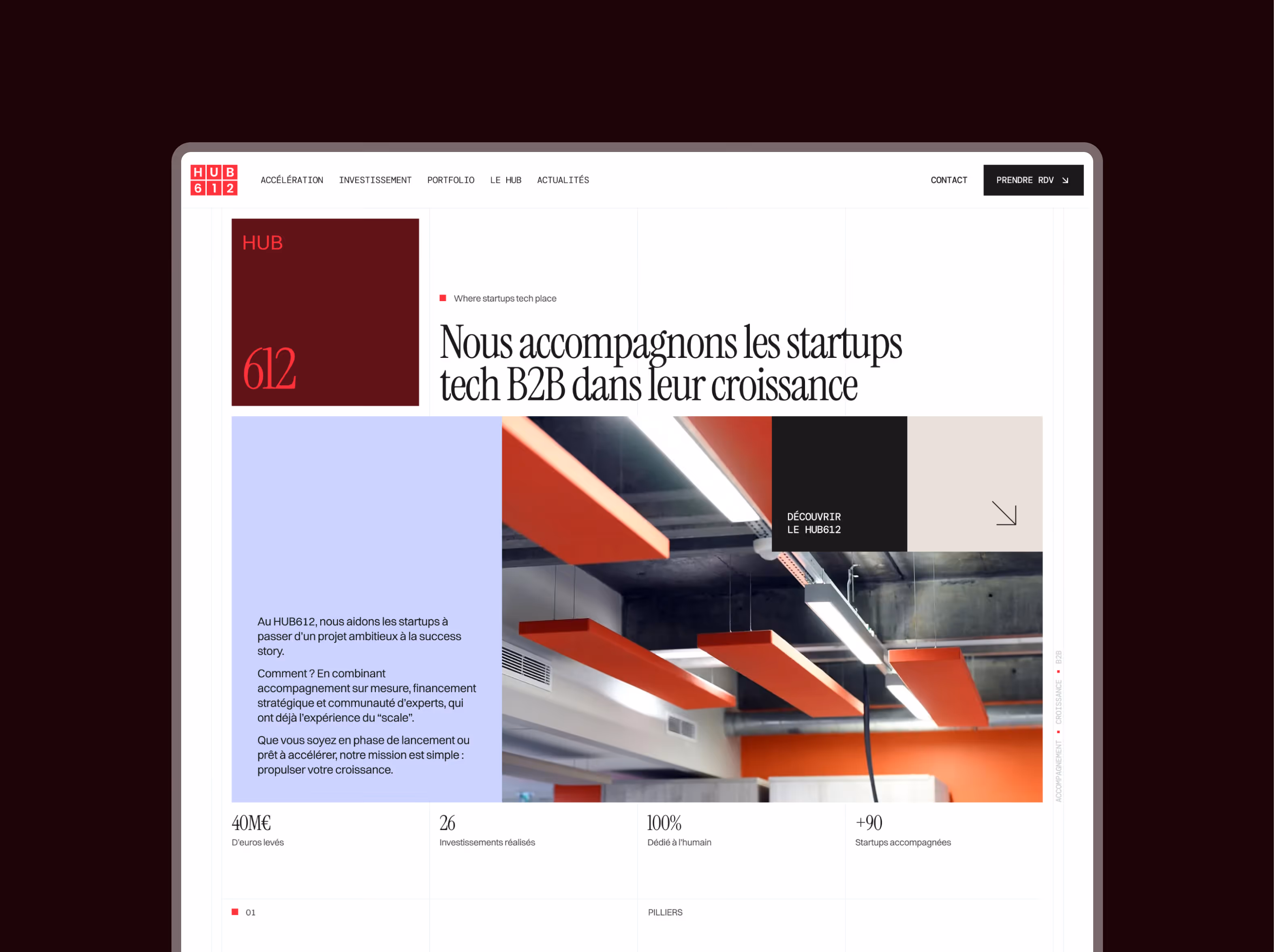
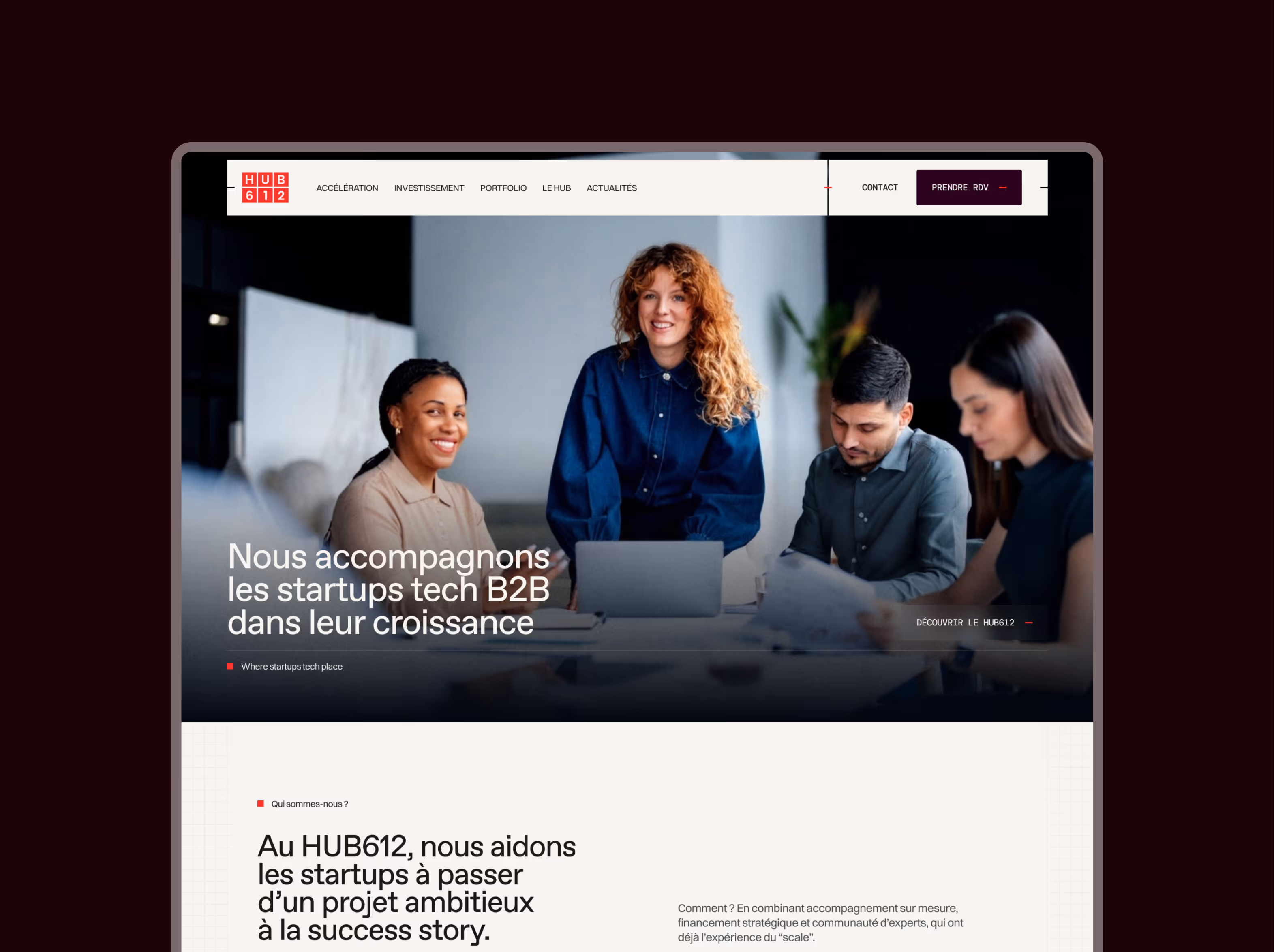
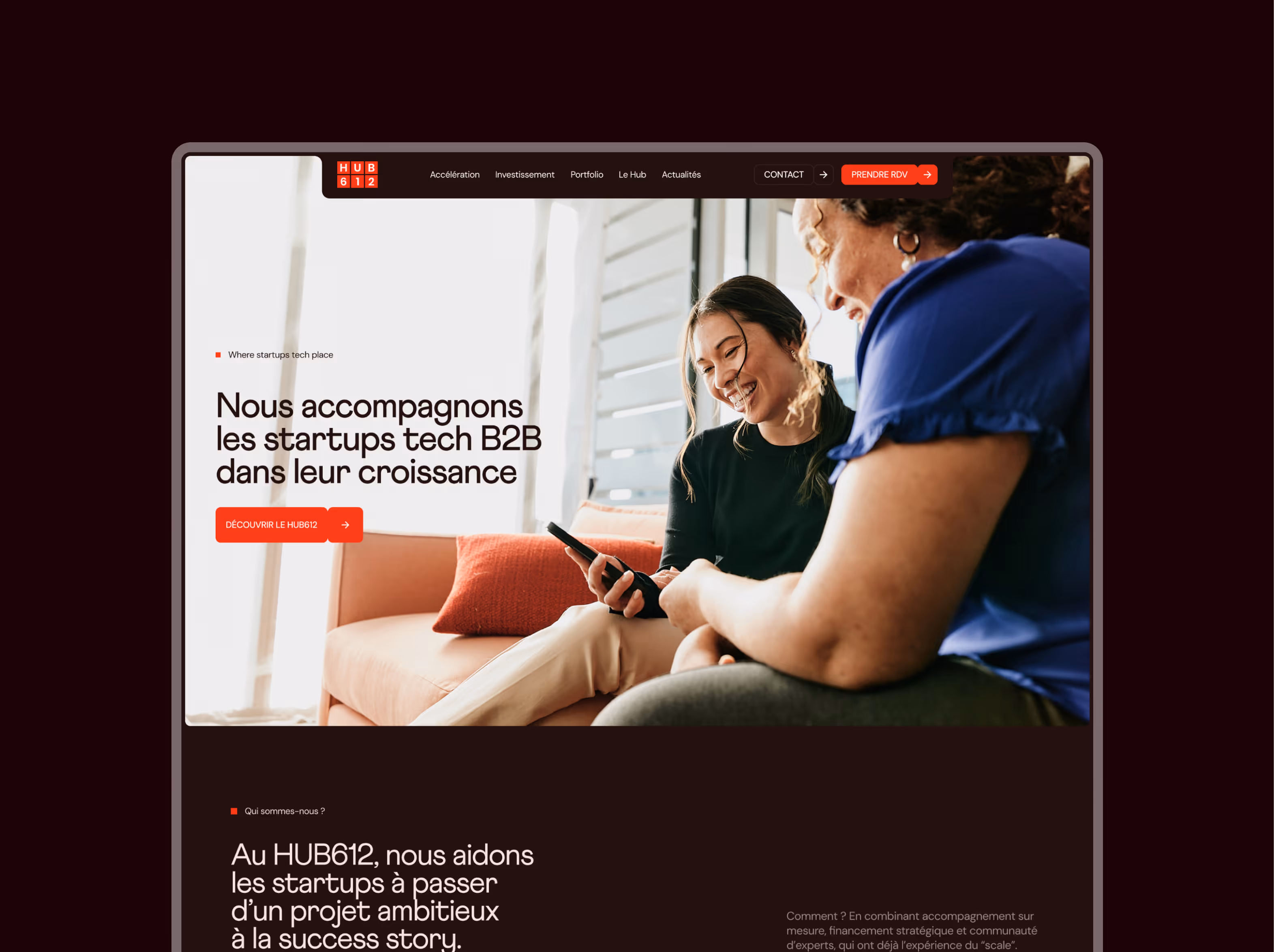
Hub612 — Accelerator & Investment Fund for B2B Tech Startups

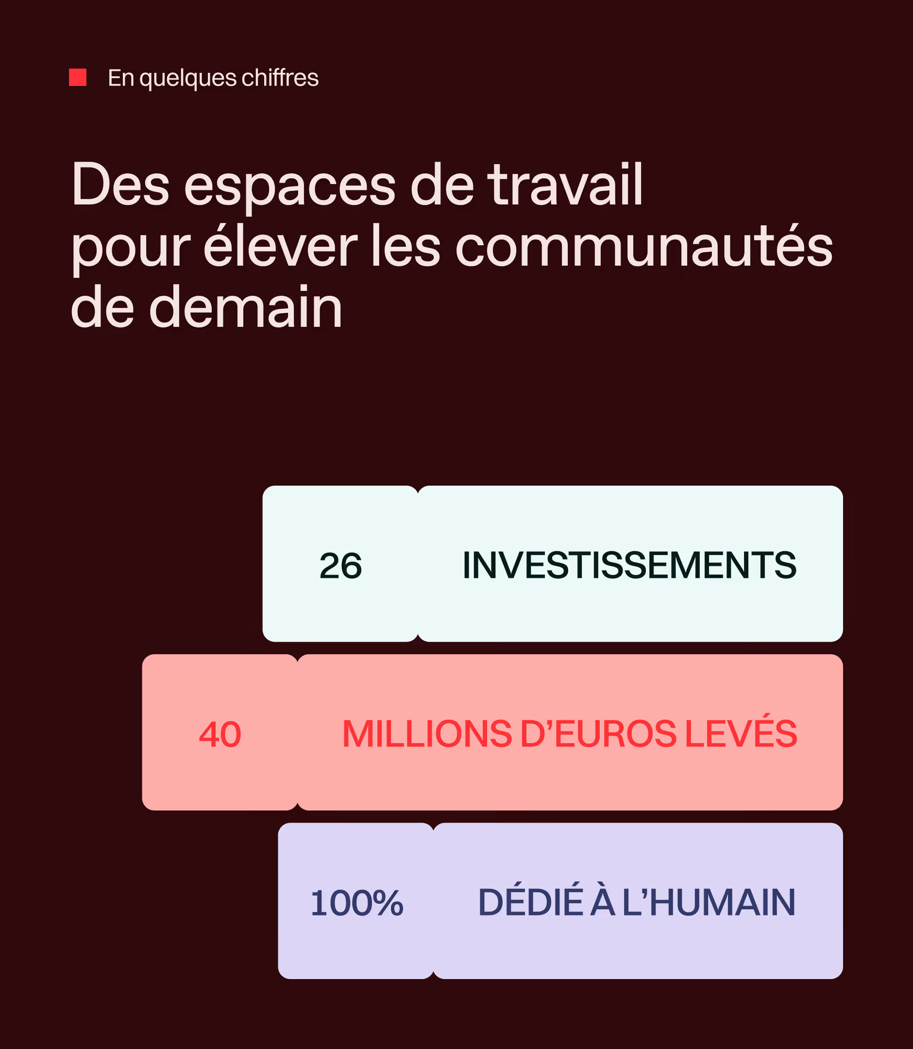
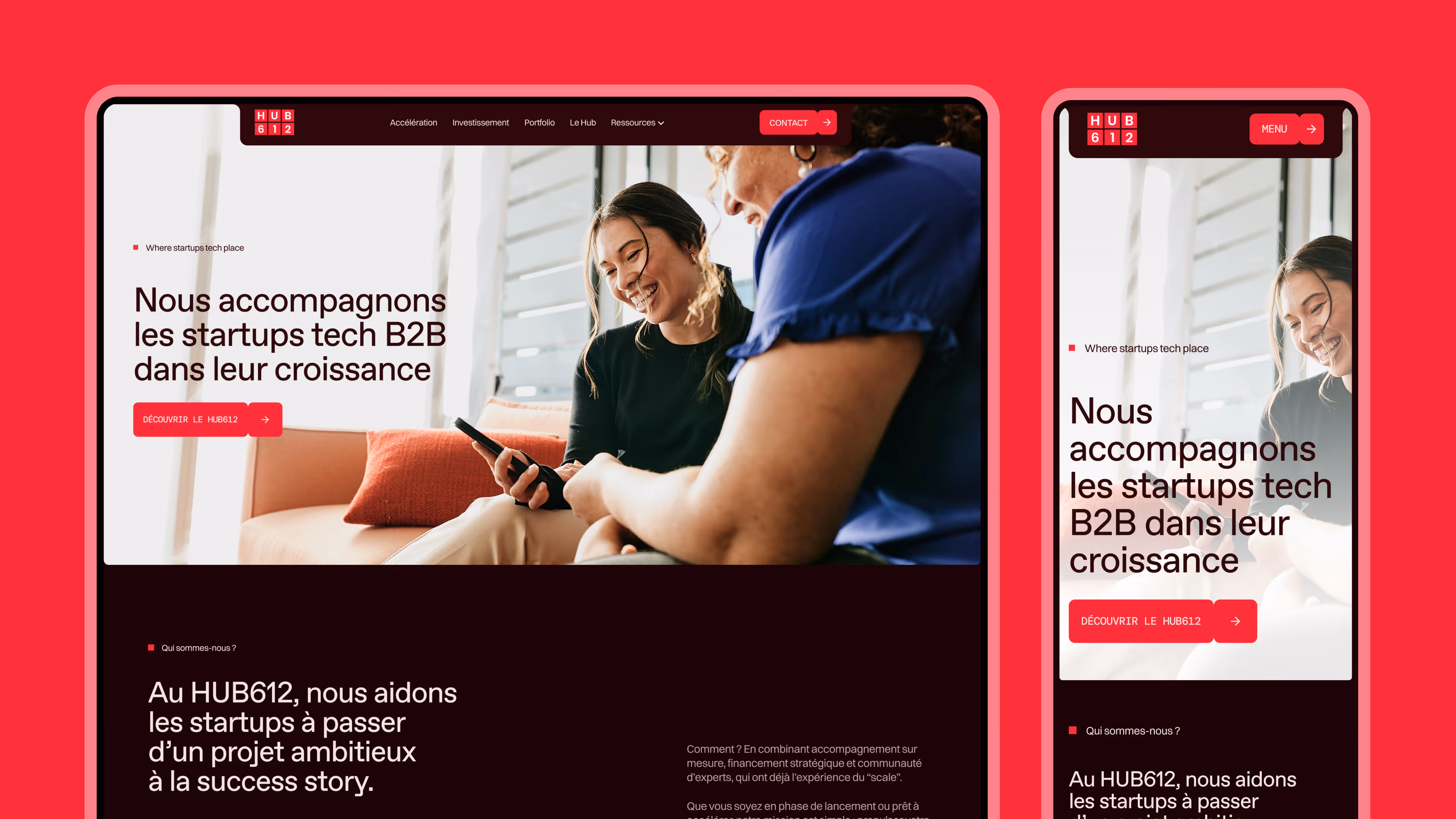
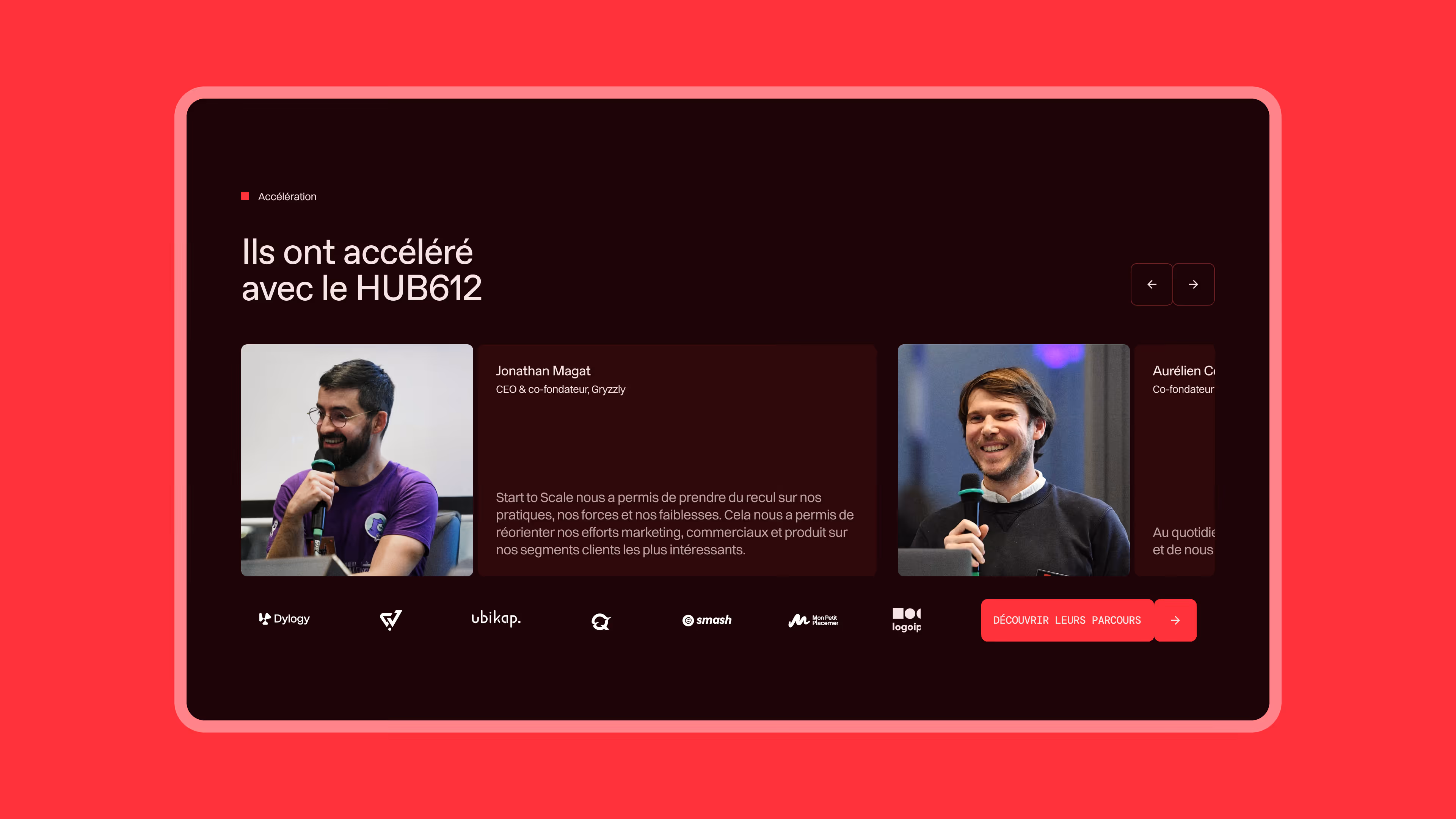
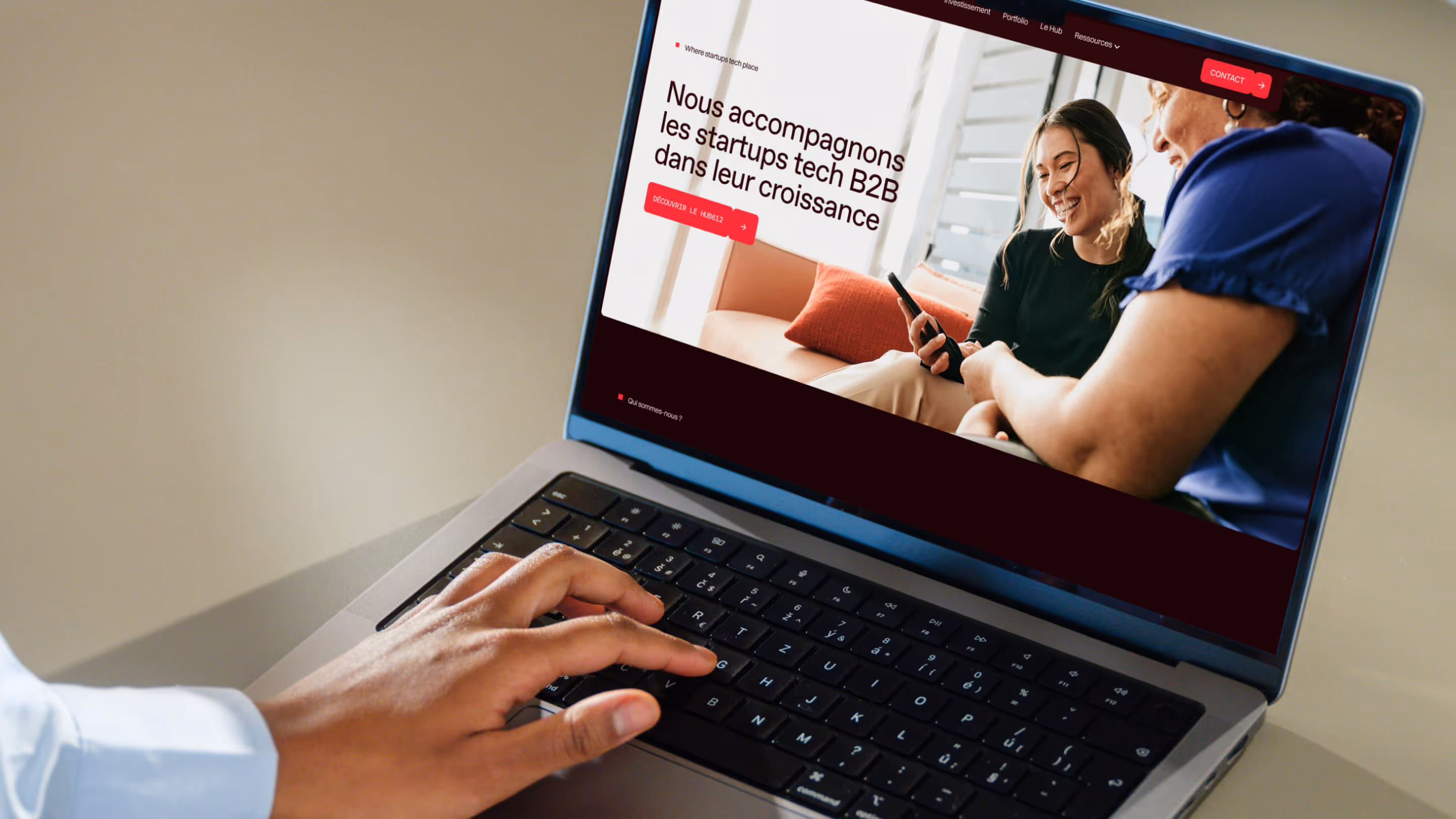
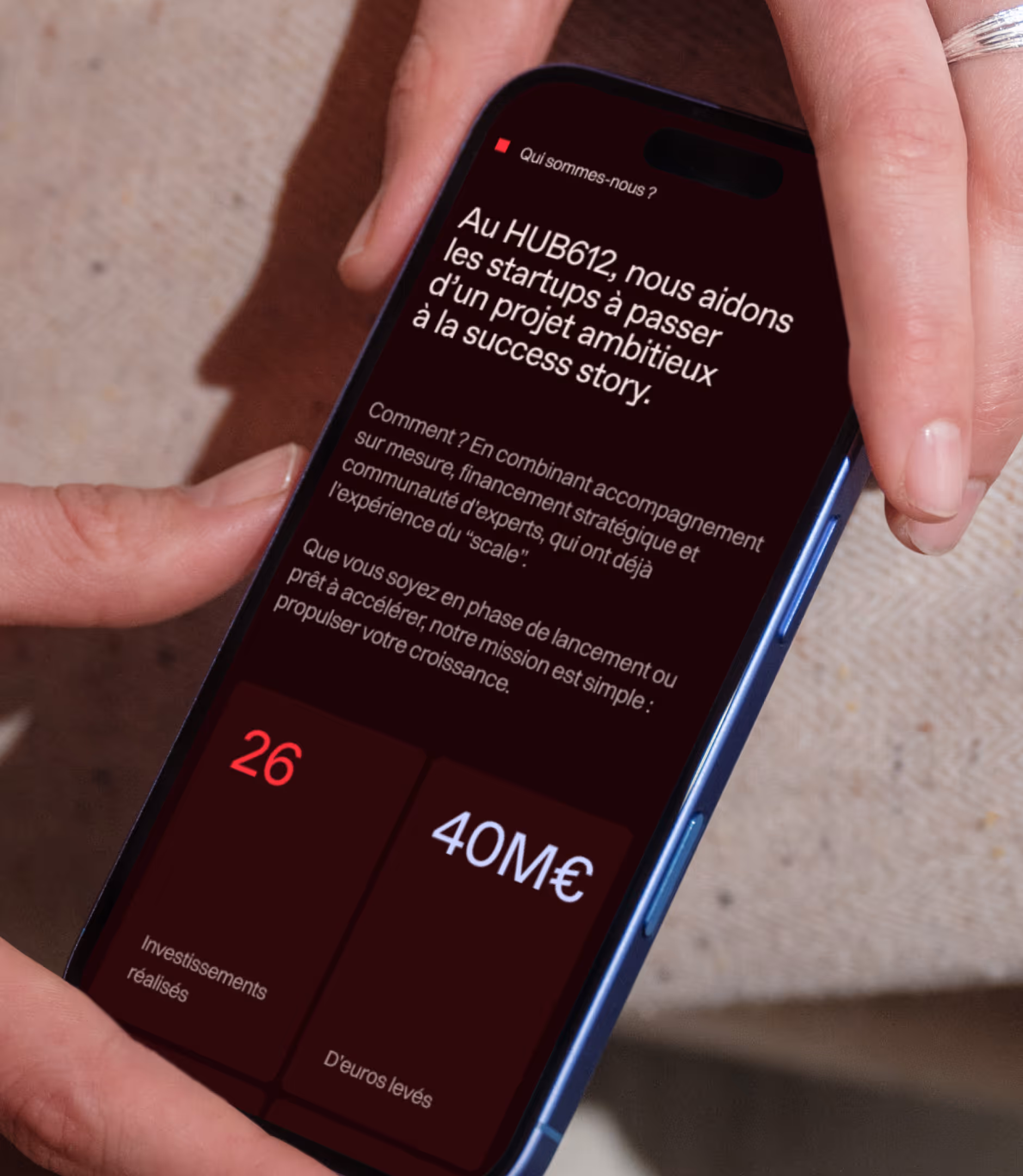
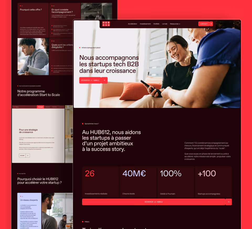
Founded in 2016 by Caisse d'Épargne Rhône-Alpes, HUB612 supports B2B tech startups at every stage of growth: acceleration through the Start to Scale program, early-stage investment from pre-seed to Series A, and a community of entrepreneurs. More than 90 startups supported, €40M raised, and 550+ jobs created.

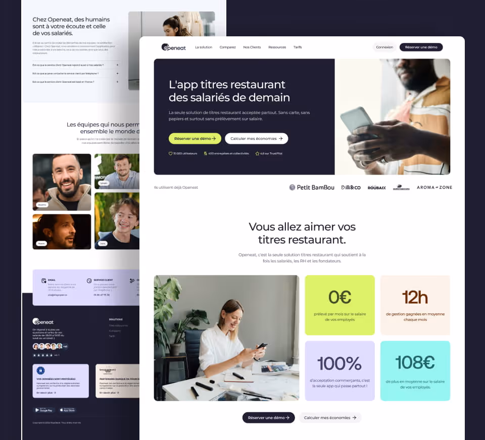
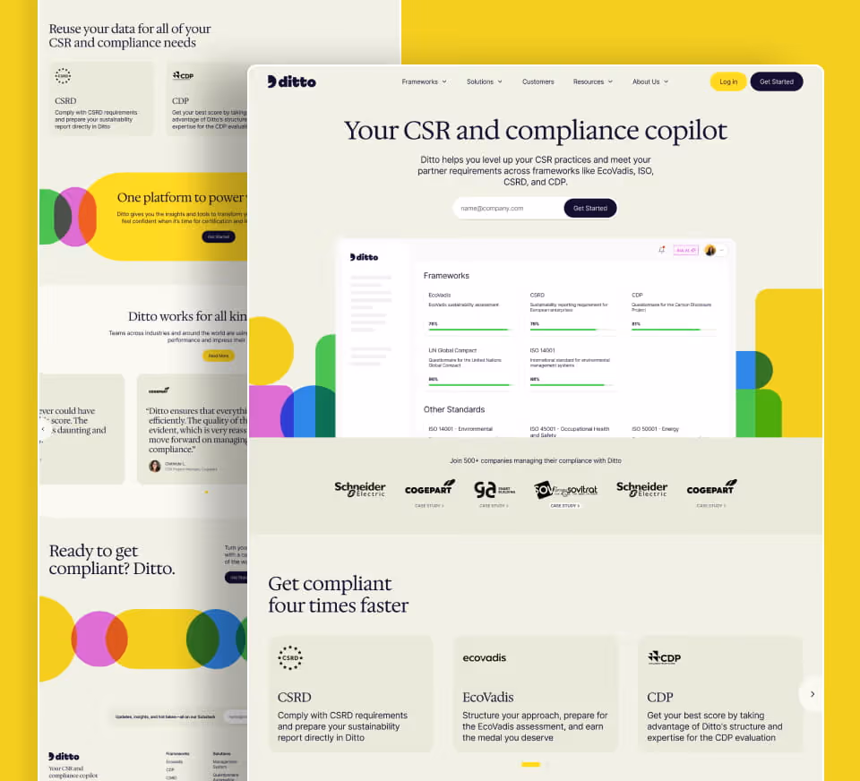
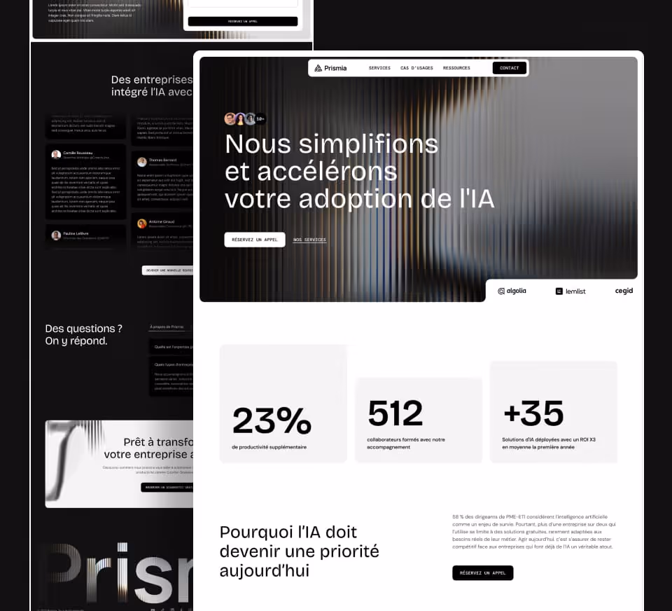
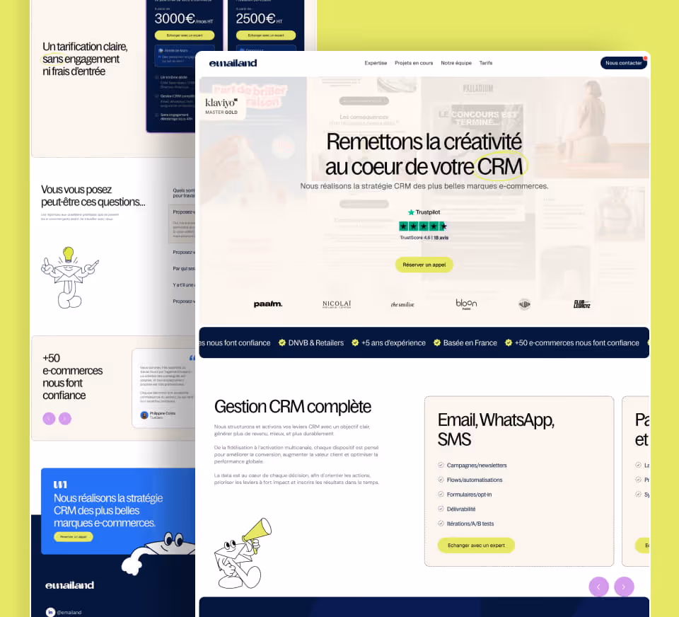
Gemeos handled the full stack — brand identity, art direction, UI design, Webflow development, and SEO/GEO optimization — from brief to launch.

Industry

Services

A
A
A

An identity that grows without losing its roots

HUB612 had a valuable asset: a recognizable logo, rich with history, that was never going to change. The challenge was elsewhere — building a cohesive brand system around it, one that could carry both its accelerator side and its investment fund side, while still feeling warm and human as a community.

Gemeos worked from the brand briefing to pull out what really defines HUB612: boldness, high standards, and a collective mindset. Three creative directions were presented, exploring different typographic and color paths while staying true to the historic red. The chosen direction strikes the right balance between institutional credibility and accessibility — exactly the tone the client wanted. The final deliverable includes a complete brandbook (colors, typography, logo usage, social media templates, and slides), delivered to the client in PDF and Figma.

No items found.

Contents

Very happy with the work! The brief was well structured, the art direction quickly captured our identity, and the Webflow site is a real success. A professional, responsive team that takes the time to talk things through!

Marine Thivend

Communication & Marketing Manager @HUB612

A
A
A

Art Direction

Three directions. One vision. Zero compromises.

Before designing a single page, Gemeos set a clear art direction. Three distinct visual directions were presented to the client — each with its own palette, typography, and mood. The goal: let them choose with confidence, not approve something blind.

The selected direction leans into a clean, tech-forward aesthetic, with a strong typographic hierarchy and a controlled use of the signature red. The look and feel was then refined through several rounds of iteration — calls plus Figma comments — before moving into page design. That early art direction approval is what keeps the final design from surprising anyone — and avoids costly backtracking later.

Structured Elegance

The design is built on a typographic contrast between a modernized classic serif for headlines and a clean sans-serif for body copy, creating rhythm and hierarchy. The palette is anchored in the HUB612 brand system, enriched with deep burgundy, powder blue, and muted lavender tones. Tonal layering adds depth without ever feeling showy. The visual architecture pulls directly from the HUB612 logo grid — geometric squares and rectangles structure the layout into a cohesive visual language. Generous white space and carefully framed photography complete the system. The result: a modernized institutional credibility that feels serious, contemporary, and built to inspire trust in investors and strategic partners.

Human Authenticity

The typography uses a modern sans-serif with subtle graphic twists in the letterforms, creating dynamic hierarchies with a tech-forward feel. The palette draws from HUB612’s colors, then softens them with brighter greens and blues — the signature red stays as the energy point, but within a gentler, more human color ecosystem. The logo grid structures the whole system, supported by frieze-like graphic patterns that act as visual connectors between content blocks. On CTA buttons, small graphic accents pulled from the logo system create a subtle brand signature at every interaction point. Photography takes up 60 to 70% of the space: authentic images of people, teams, and bright environments, treated with a natural, warm finish that keeps people at the center. The overall mood leans into emotion and closeness — it speaks to founders looking for a real community, and it radiates transparency, positive energy, and a collaborative culture.

Bold Impact

This direction makes a clean break from the existing visual codes, which felt cold and rigid, and brings warmth and humanity into every layer of the design. Roundness becomes the through-line: generous corners, organic cuts, soft curves — a logic that carries into the typography too, with rounded typefaces that feel welcoming rather than corporate. The palette shifts to orange and warm tones — red-orange, khaki, brown — to create a positive, optimistic energy, far from institutional blues. Graphic elements sit deliberately close together, almost interlocked, a direct metaphor for the HUB612 model: nothing stands alone, everything connects and overlaps to signal collaboration and cohesion. Variable-weight typography adds impact without losing accessibility. The overall feel is that of a partner, not an institution — a design that says, “we’re with you” and visually embodies HUB612’s values of support and closeness.

Look&Feel

Summary

Very happy with the work! The brief was well structured, the art direction quickly captured our identity, and the Webflow site is a real success. A professional, responsive team that takes the time to talk things through!

Marine Thivend

Communication & Marketing Manager @HUB612

A
A
A

Web Design

A UI Kit built to last. Pages designed to convert.

Based on the approved visual direction, Gemeos designed a complete UI Kit: color system, typography, reusable components (buttons, cards, forms, navigation, footer). A solid foundation that lets the HUB612 team evolve their site independently and keep everything consistent over time.

The design covers every page on the site: homepage, Acceleration and Investment pages, blog, resources and case study pages, author pages. Each page was designed to guide entrepreneurs toward action — without overwhelming them. The mockups were approved after several rounds of refinements in Figma.

Summary

Very happy with the work! The brief was well structured, the art direction quickly captured our identity, and the Webflow site is a real success. A professional, responsive team that takes the time to talk things through!

Marine Thivend

Communication & Marketing Manager @HUB612

A
A
A

Webflow Build

From mockup to live site in Webflow, with training included

The build was handled directly in Webflow, on a staging environment before launch. Every component from the UI Kit was integrated in line with the design system conventions, with a sharp focus on responsive consistency and interactions.

The project called for custom technical solutions — especially for FAQ handling (triggering interactions, fixing a click bug with no visual feedback), blog pagination, and the structure of dynamic pages (case studies, authors). At launch, we ran a Webflow training session with the client so she could take full control of the CMS and editorial content.

Summary

Very happy with the work! The brief was well structured, the art direction quickly captured our identity, and the Webflow site is a real success. A professional, responsive team that takes the time to talk things through!

Marine Thivend

Communication & Marketing Manager @HUB612

A
A
A

SEO

A clean migration. A solid technical foundation for search engines — and LLMs

The redesign was the perfect moment to rebuild the entire technical SEO layer from the ground up. We ran a full crawl of the site with Screaming Frog to spot friction points before launch. The fixes covered Hn tag structure, breadcrumb integration, the meta robots index tag, and proper blog pagination.

The biggest lift focused on Schema.org structured data, implemented page by page to maximize readability for search engines and language models (GEO):

PageImplemented SchemaGoal
/accelerationServiceDefine the acceleration offer for search engines
/investissementFinancialServicePosition HUB612 Participations for VC-related searches
/blog/*ArticleQualify for article rich snippets
/portfolioCollectionPage + ItemListCreate a semantic structure for the startup portfolio
/etude-de-cas/*ArticleIndex case studies as editorial content

These Schema.org markups directly enrich LLM responses (ChatGPT, Perplexity, Gemini) when someone asks these tools about the Rhône-Alpes startup ecosystem or early-stage investment funds in France.

Summary

Very happy with the work! The brief was well structured, the art direction quickly captured our identity, and the Webflow site is a real success. A professional, responsive team that takes the time to talk things through!

Marine Thivend

Communication & Marketing Manager @HUB612

OUR latest projects

+240 companies
supported

Websites designed and developed with 

Let’s f*****G GO !!

Ready to launch
Your business?

Alexandre

Max

Enora

Bryan

Cannelle

Tiphaine

You'll :heart: our collaboration...