Good to know

Heading

Lorem ipsum dolor sit amet, consectetur adipiscing elit. Suspendisse varius enim in eros elementum tristique. Duis cursus, mi quis viverra ornare, eros dolor interdum nulla, ut commodo diam libero vitae erat. Aenean faucibus nibh et justo cursus id rutrum lorem imperdiet. Nunc ut sem vitae risus tristique posuere.

Lorem ipsum dolor sit amet consectetur.

Lorem ipsum dolor sit amet consectetur. Aliquam orci sagittis dignissim sapien praesent donec.

Lorem ipsum

Lorem ipsum dolor sit amet, consectetur adipiscing elit, sed do eiusmod tempor incididunt ut labore et dolore magna aliqua. Ut enim ad minim veniam, quis nostrud exercitation ullamco laboris nisi ut aliquip ex ea commodo consequat. Duis aute irure dolor in reprehenderit in voluptate velit esse cillum dolore eu fugiat nulla pariatur.

Add

Lorem ipsum

Lorem ipsum

Emailand x Gemeos

Emailand is a specialized agency for CRM and email marketing for e-commerce brands. In 5 weeks, Gemeos delivered a full redesign — art direction, UX/UI, Webflow build, and on-page SEO — for a site that matches the brand’s expertise.

A
A
A

Showcasing Emailand’s email marketing expertise

Emailand is a CRM and email marketing agency for e-commerce brands. With deep platform expertise and proven client results, they needed a site that matched their level — one built to convert from the very first impression.

In just 5 weeks (November to December 2025), Gemeos delivered a full redesign — art direction, UX/UI, Webflow build, and on-page SEO.

Industry

Services

A
A
A

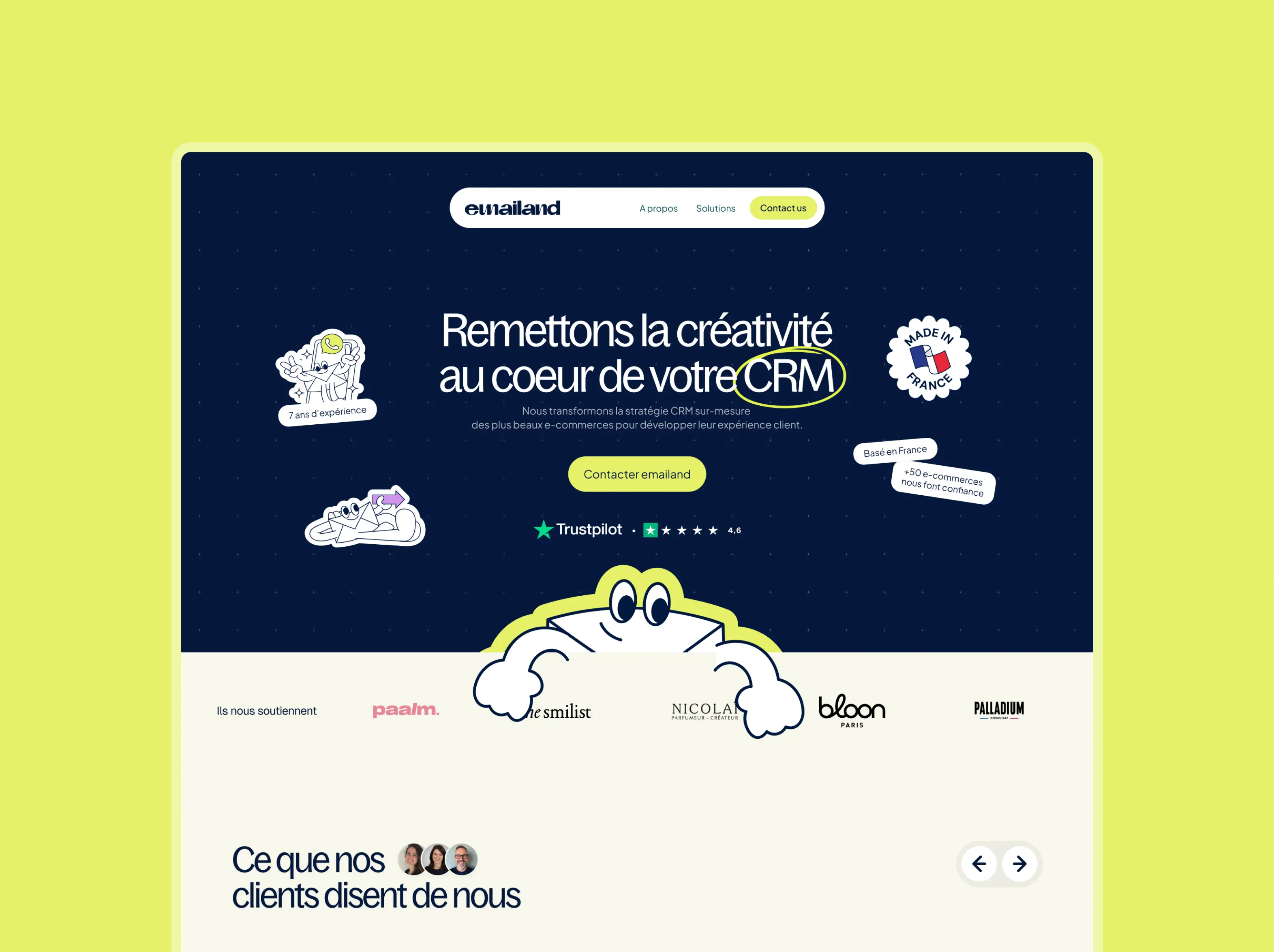
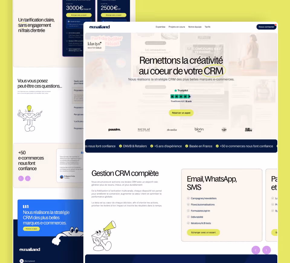
Emailand’s art direction had to instantly signal what the brand does: send the right messages, at the right time, to the right people. Gemeos crafted an elegant, strategic visual territory where every design decision is justified by UX logic.

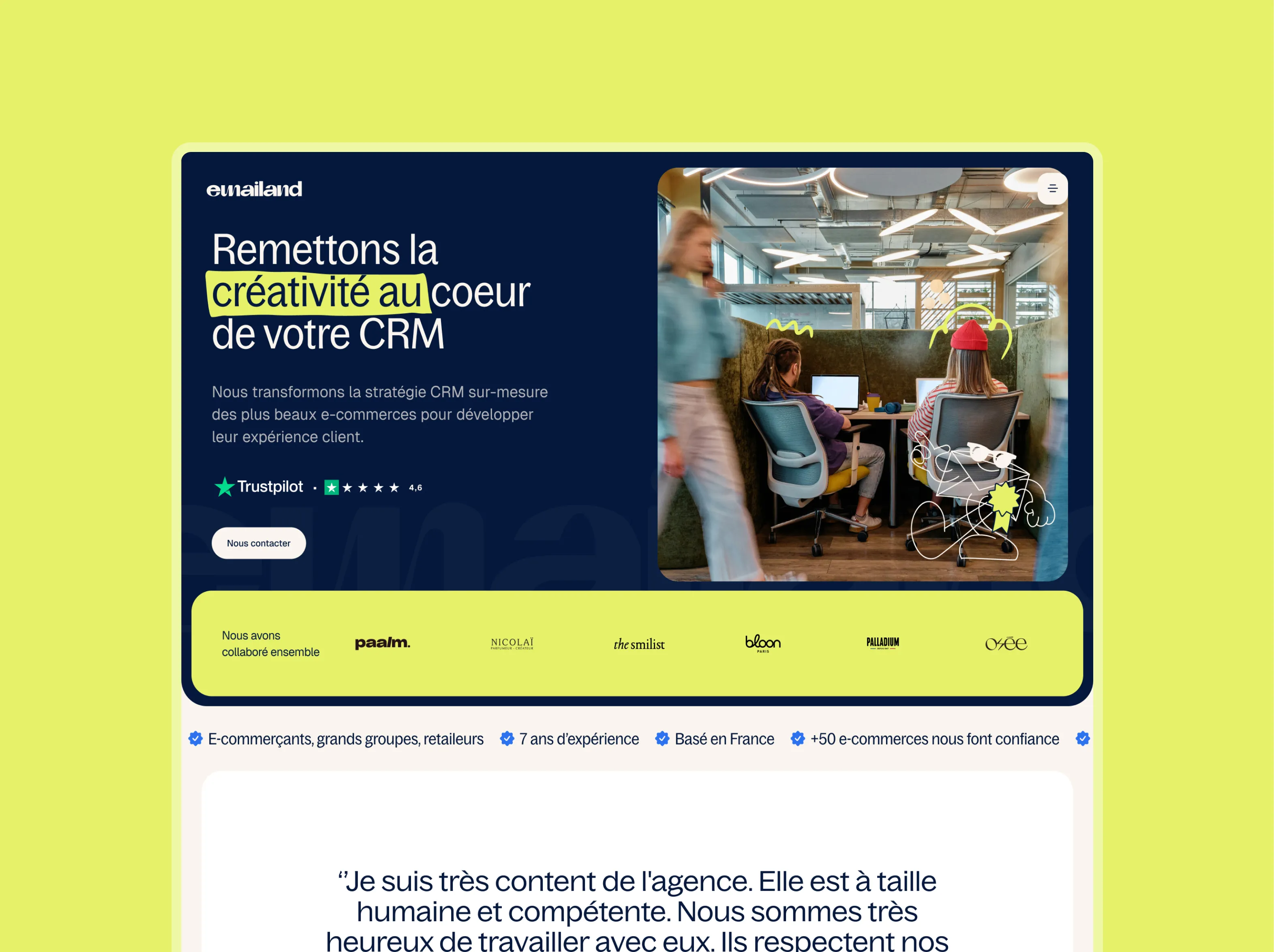
The most distinctive choice: a transparent header with emails visible in the background, intentionally blurred and unreadable. The goal isn’t to let visitors read those emails. It’s to create an immediate visual context. In a split second, visitors understand they’re in the world of email marketing — without a single word being needed. The header becomes a breathing space. Clean. Elegant. A calm lead-in before the denser content unfolds as you scroll.

This approach, championed and explained by the design team through a detailed UX rationale, was approved by the client right away.

Dark & Mascot

A dark world set against a deep navy backdrop. It breaks sharply from the usual CRM playbook. The yellow-green illustrated mascots bring in a strong, memorable personality. Bold white typography and the circled logo create a distinct, instantly recognizable visual identity. The service cards lean into bright colors — blue, yellow, and purple — against the dark environment, making them pop. A bold, creative direction that positions Emailand as an agency with serious personality.

Split & Human

A split text/photo hero puts the team and workspaces front and center — human proof before product proof. Bright yellow accenting the key words guides the eye with precision. The dark block, “Strategy + Creativity = Retention & Revenue,” creates a strong visual break halfway down the page. The service cards on a dark background, paired with mascots, keep the illustrated world consistent. A more balanced direction between human emotion and a clear offer.

Clear & Editorial

A full-screen lifestyle hero image sets a warm, contemporary tone. The white background for the content sections delivers maximum readability. Mascots appear sparingly in the service cards on a light background, kept more subtle than in the other two directions. The reassurance ticker at the bottom of the hero smoothly structures the key selling points. The most approachable direction — and the easiest to evolve over time.

Look&Feel
A
A
A

Emailand’s site was designed to turn e-commerce brands into clients — guiding them from a strong first impression to a contact request or a case study inquiry. The UI structure puts trust-building elements front and center — client logos, performance results — followed by a clear presentation of the service offering and a project section showcasing real email campaign examples.

The “Current Projects” section got special attention on mobile: instead of a scrollable carousel, we proposed a layout with an email mockup to better showcase Emailand’s editorial work on smaller screens. Every iteration was reviewed in Figma until it was fully approved, before the build.

A
A
A

The Webflow build took 4 to 5 weeks, from November to December 2025. Special attention went to the mobile version, which was completed and approved through the Markup review link before launch.

The project was delivered in Phase 1 (core pages), with Phase 2 planned for the case study pages — which will also handle SEO redirects from the old URLs. The team also delivered a one-hour Webflow training session at handoff, so Emailand can manage their content independently (copy, visuals, new projects).

A
A
A

Emailand’s on-page SEO support laid the groundwork for a clear, structured positioning. The main title tag was defined as “Emailand | CRM & Email Marketing Agency for E-commerce” — directly anchoring the key target queries.

For the old indexed pages (step 2), Alex Baverel planned a 301 redirect strategy: instead of sending traffic to the homepage, the old URLs (e.g. /success-stories) will redirect to the future case study pages, maximizing the transfer of accumulated SEO authority.

SEO LeverImplementation
Main title tagEmailand | CRM & Email Marketing Agency for E-commerce
Page structureSEO-friendly, progressive
301 redirectsPlanned (old URLs to future case study pages)
Content strategyCase study pages (step 2) planned

OUR latest projects

+240 companies
supported

Websites designed and developed with 

Let’s f*****G GO !!

Ready to launch
Your business?

Alexandre

Max

Enora

Bryan

Cannelle

Tiphaine

You'll :heart: our collaboration...