Art Direction
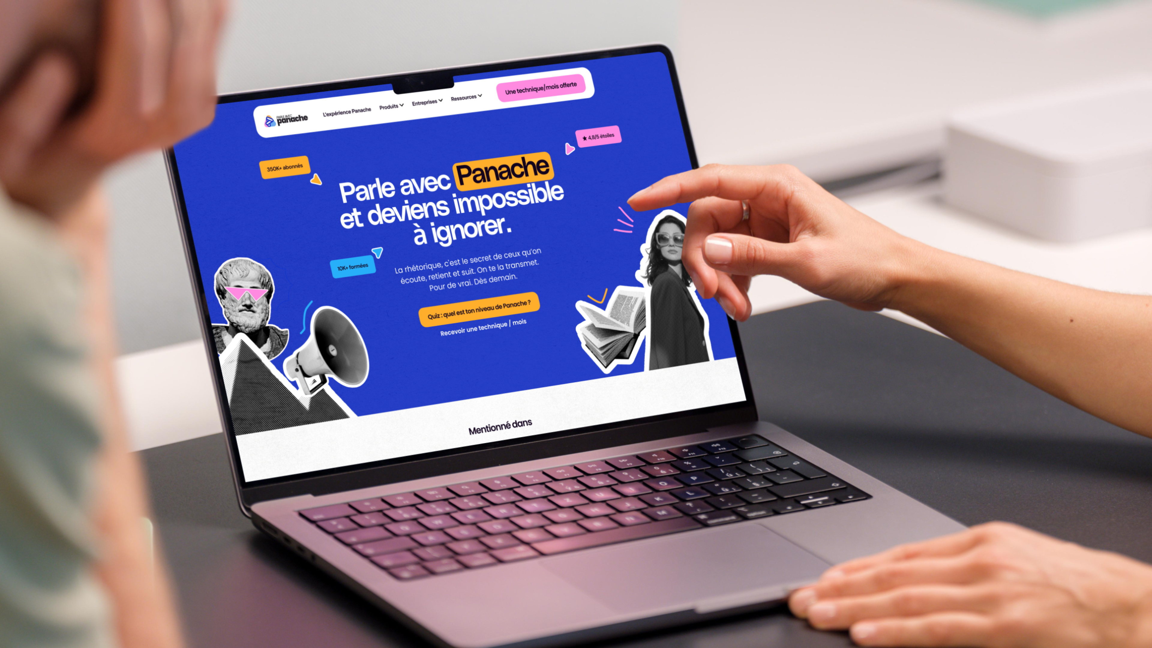
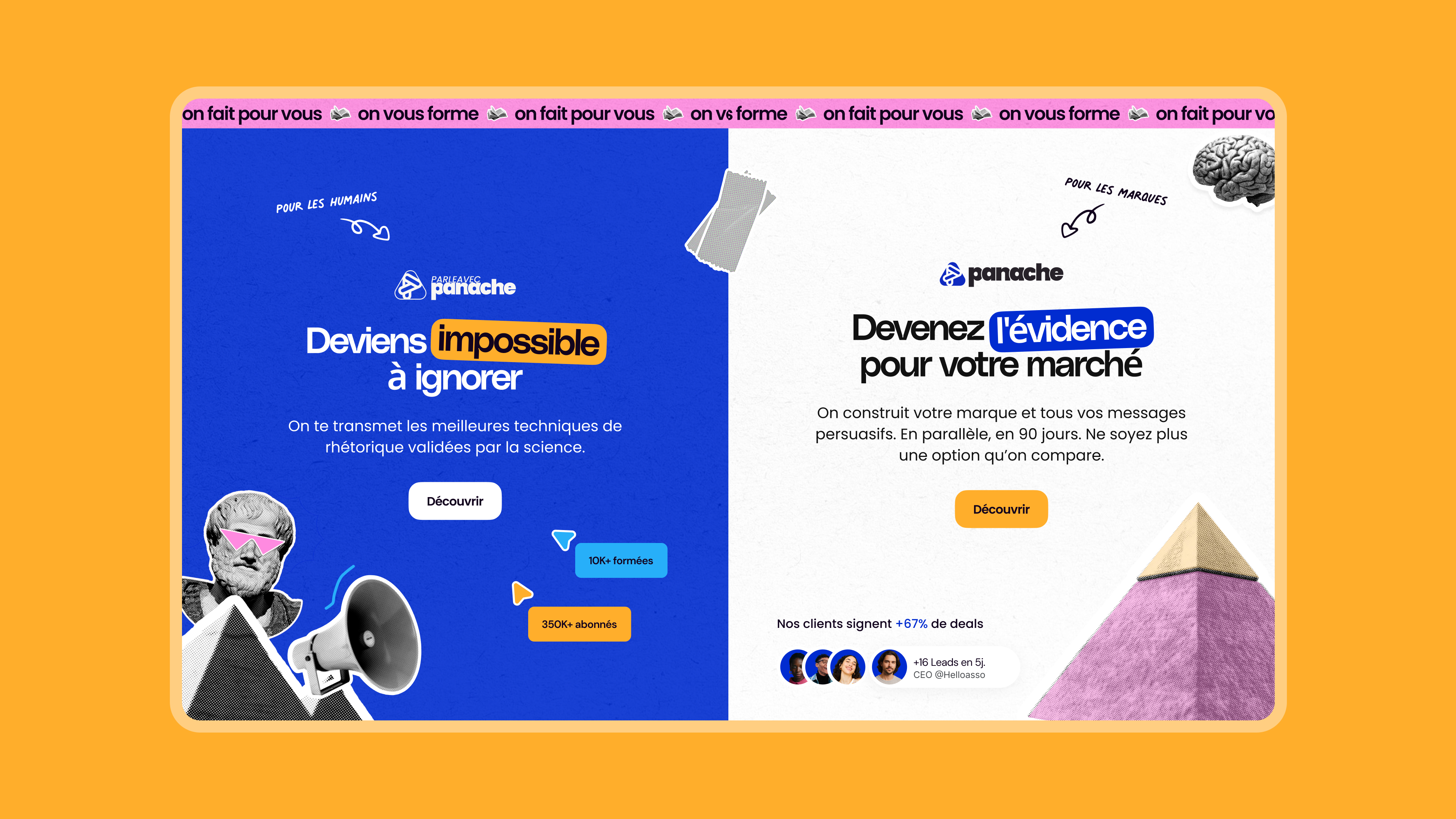
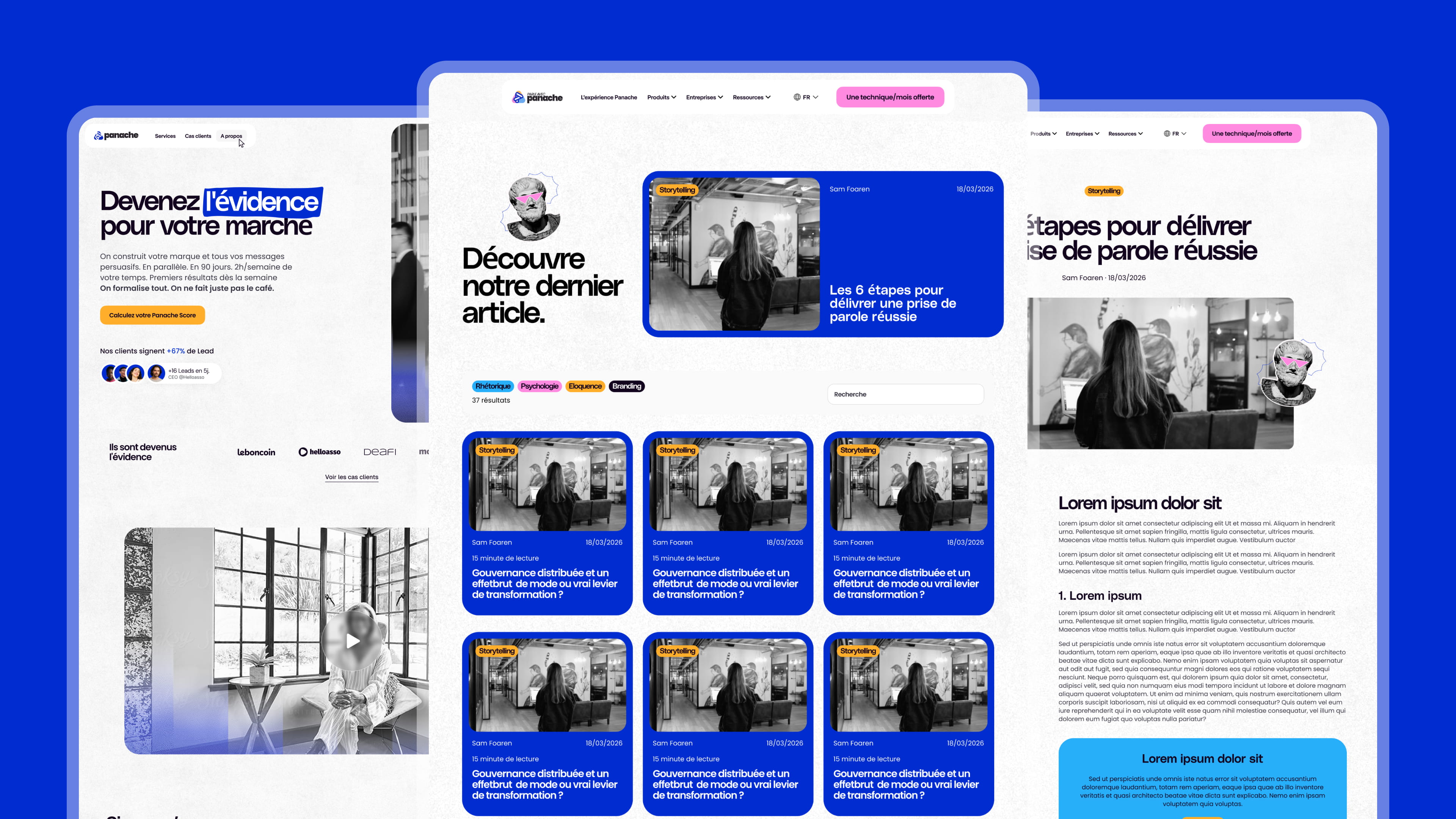
Panache sells rhetoric: the art of choosing the word that tips the scales. Their promise is simple: to become the obvious choice in their market. The primary challenge for the art direction was not to illustrate this message, but to demonstrate it—ensuring the agency's work is understood just by looking at a page, even before reading it.
Highlighting as a brand signature
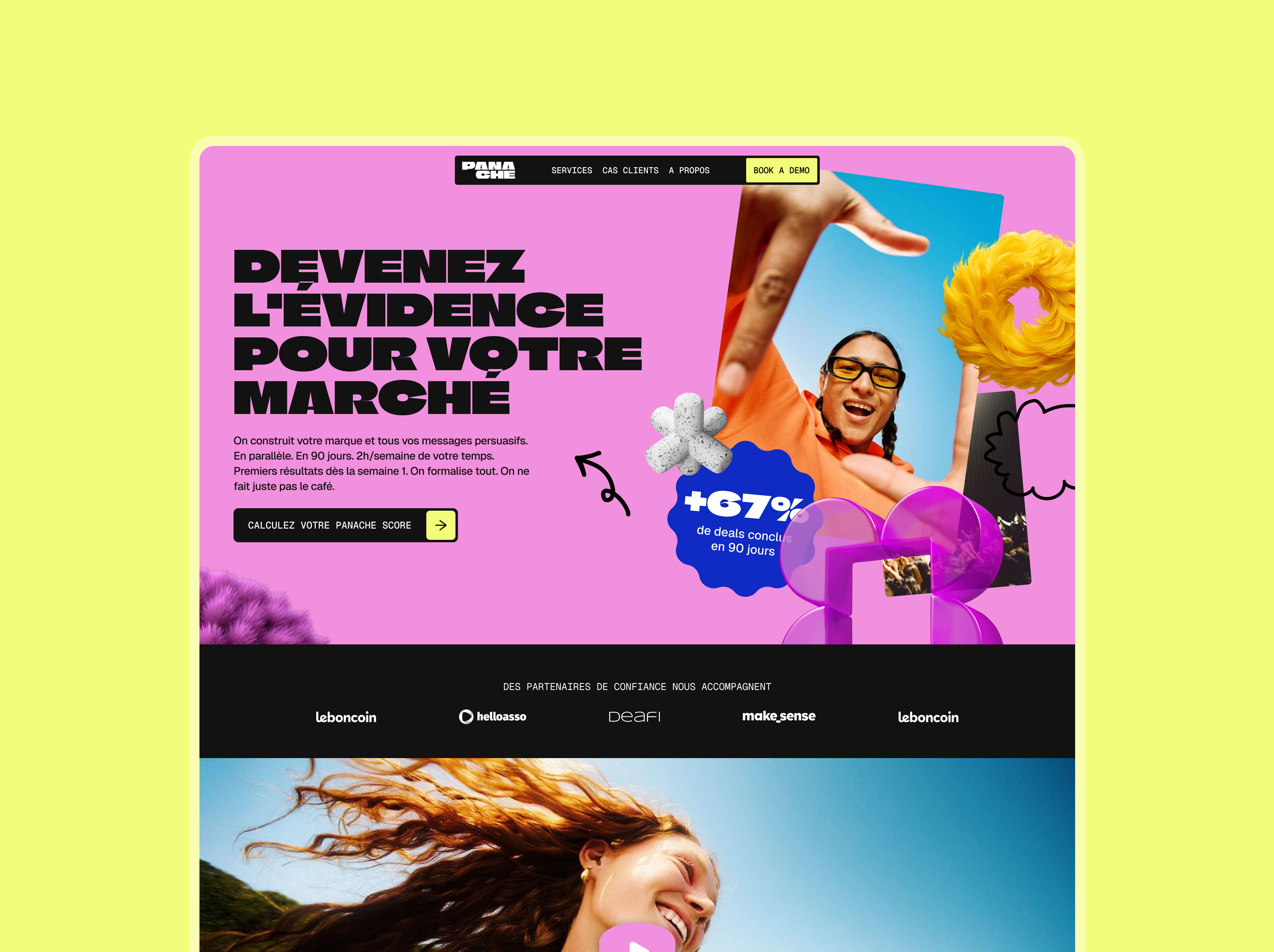
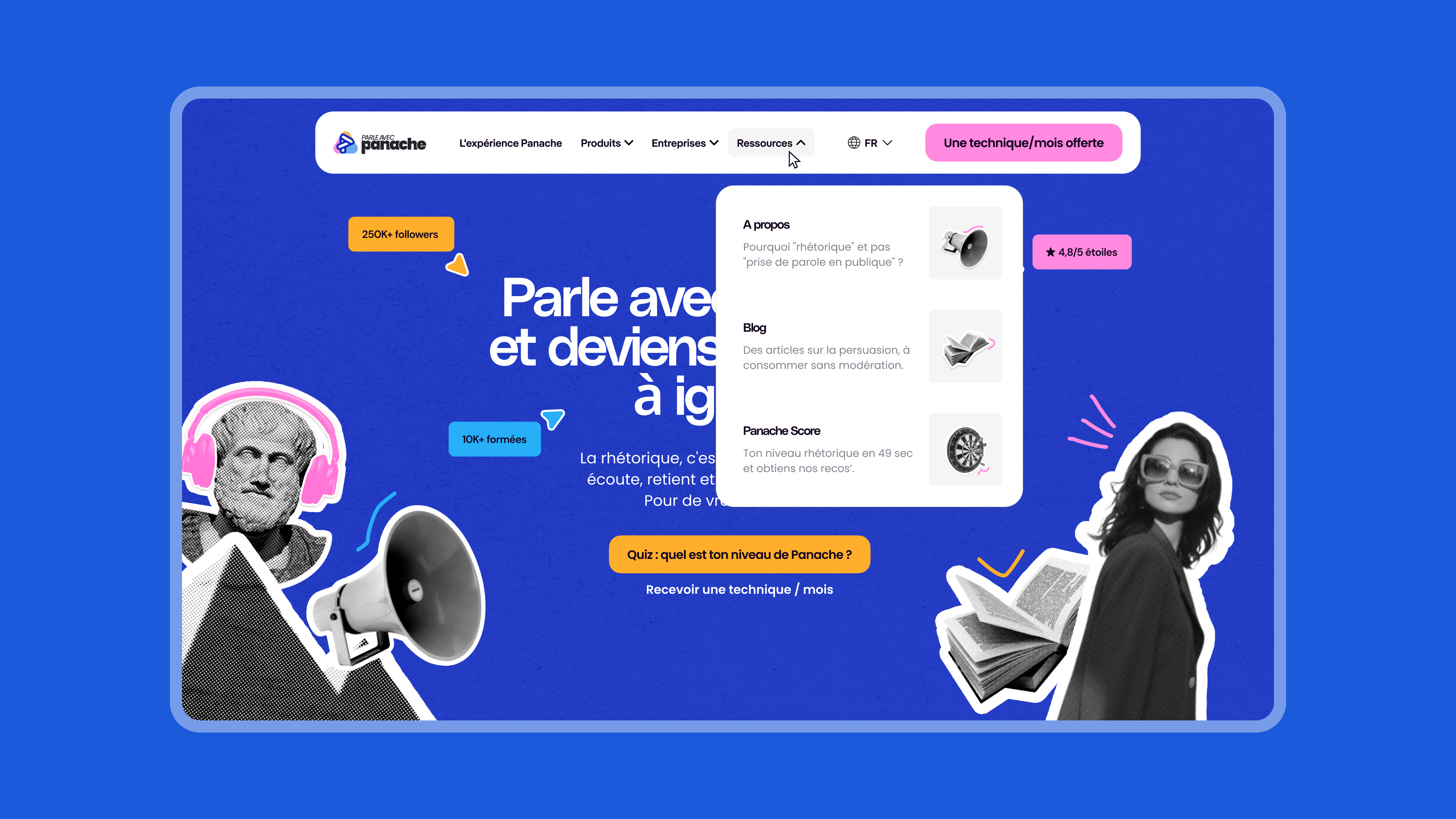
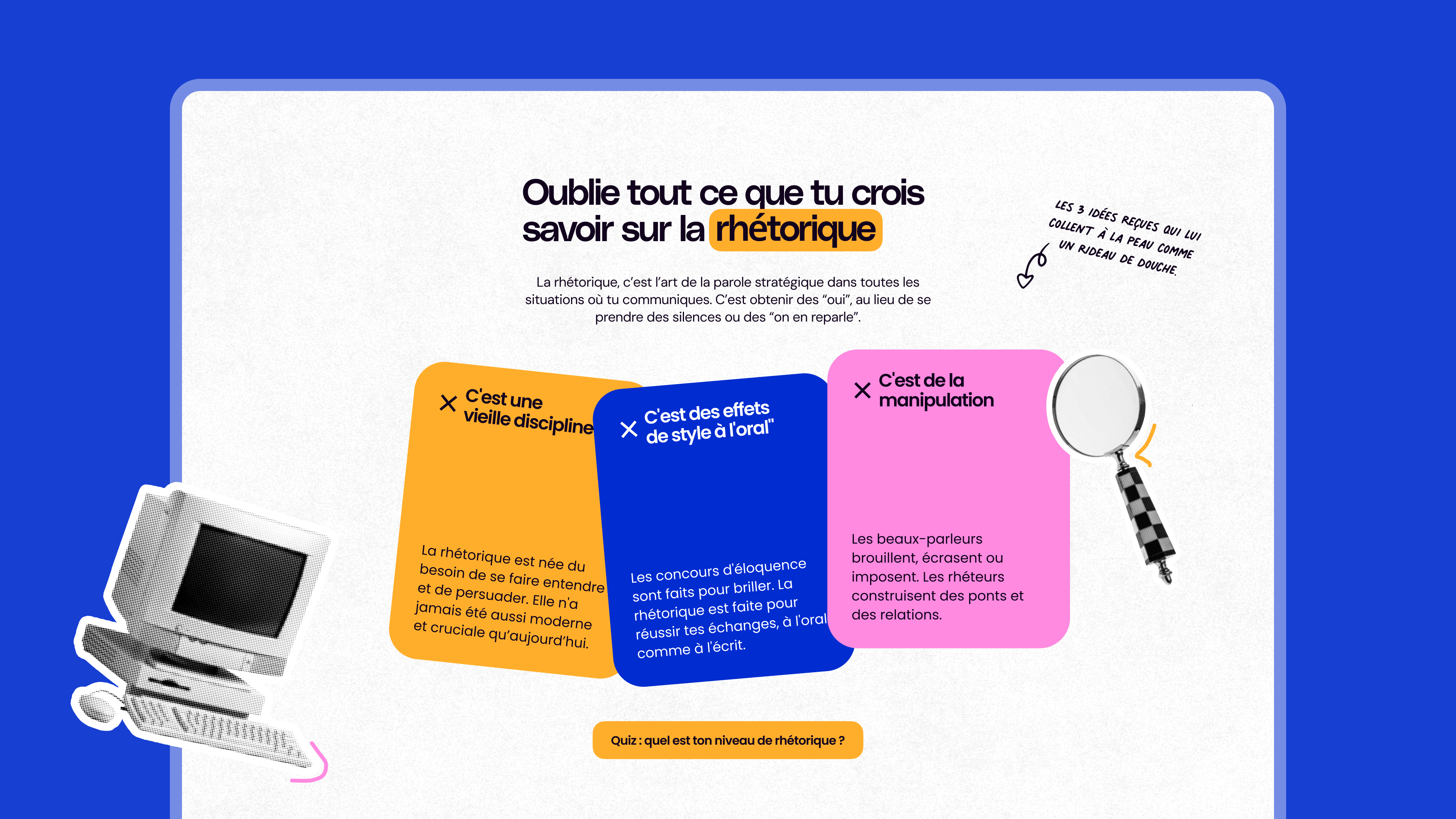
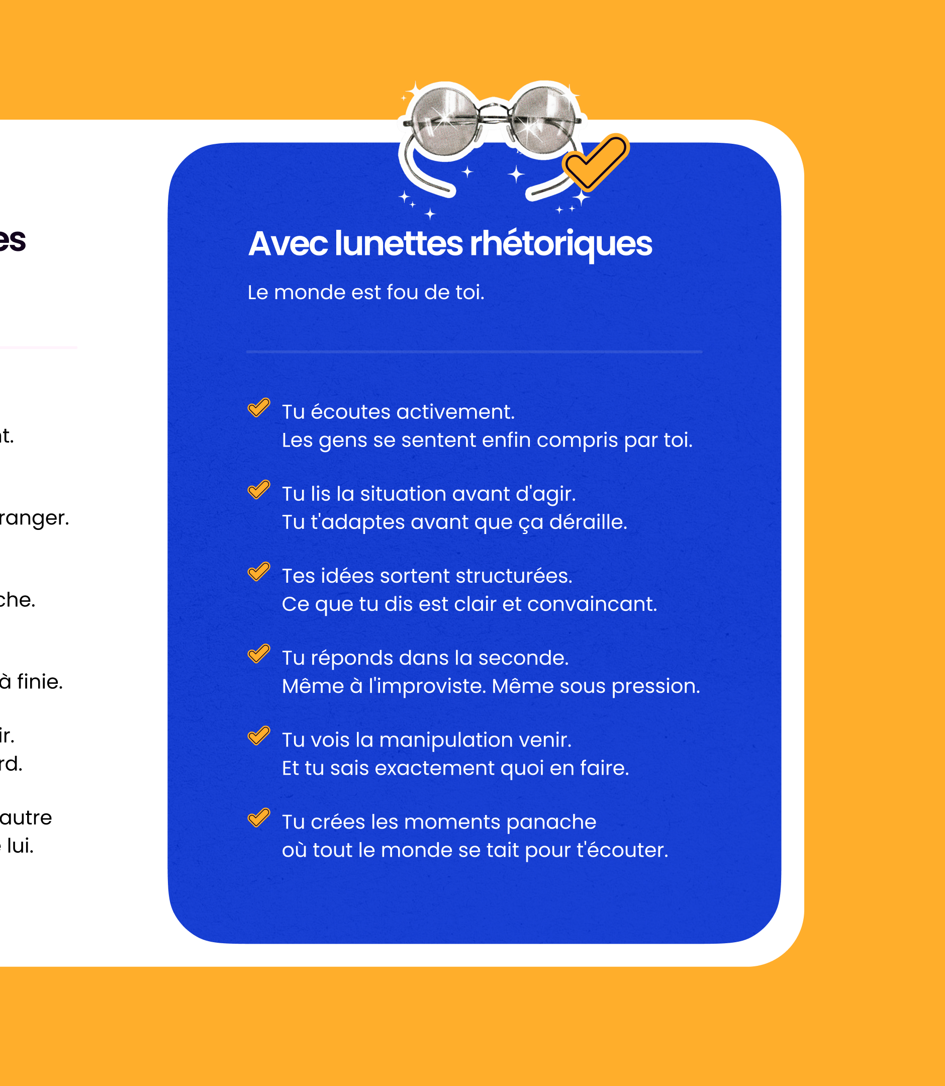
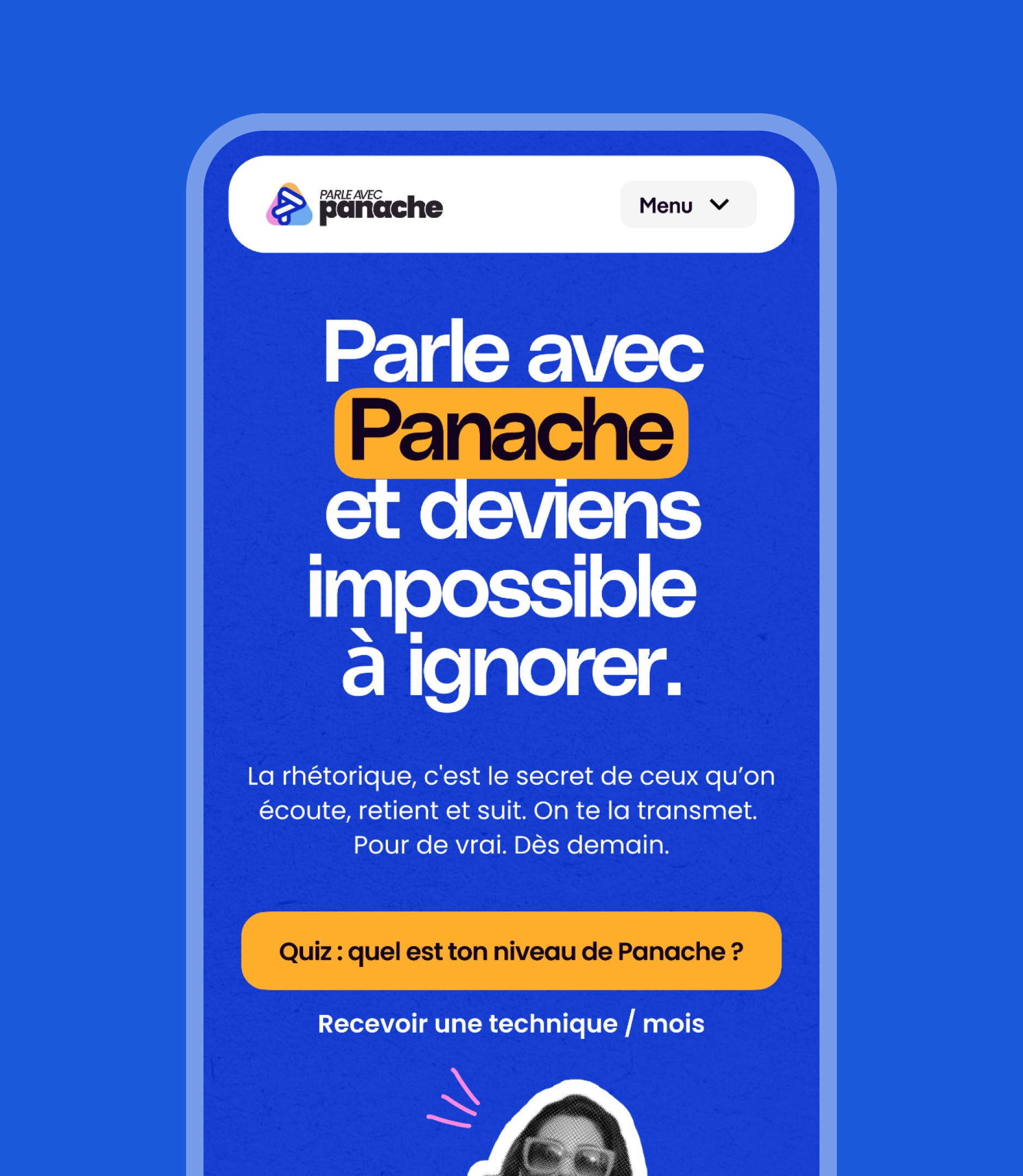
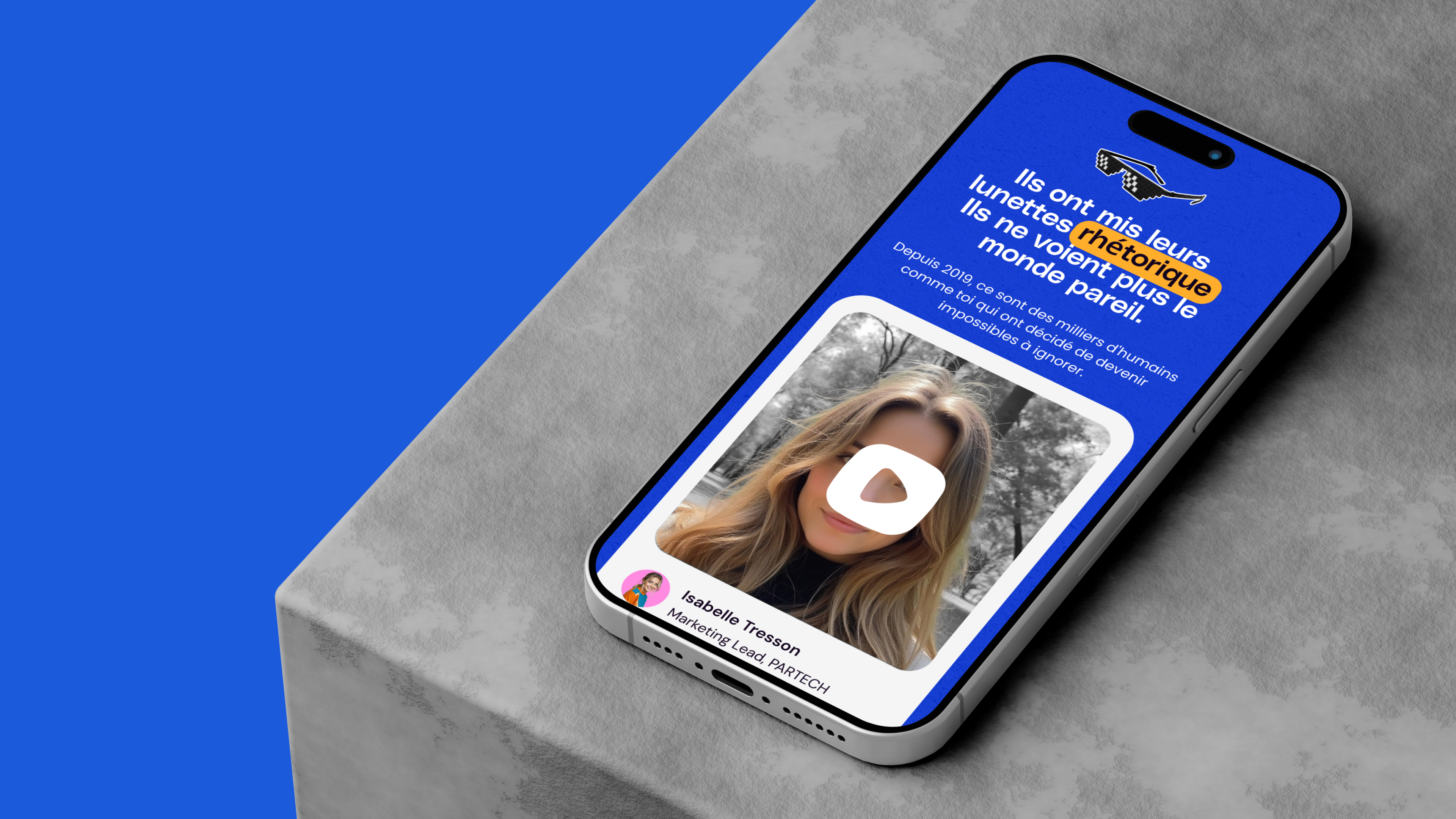
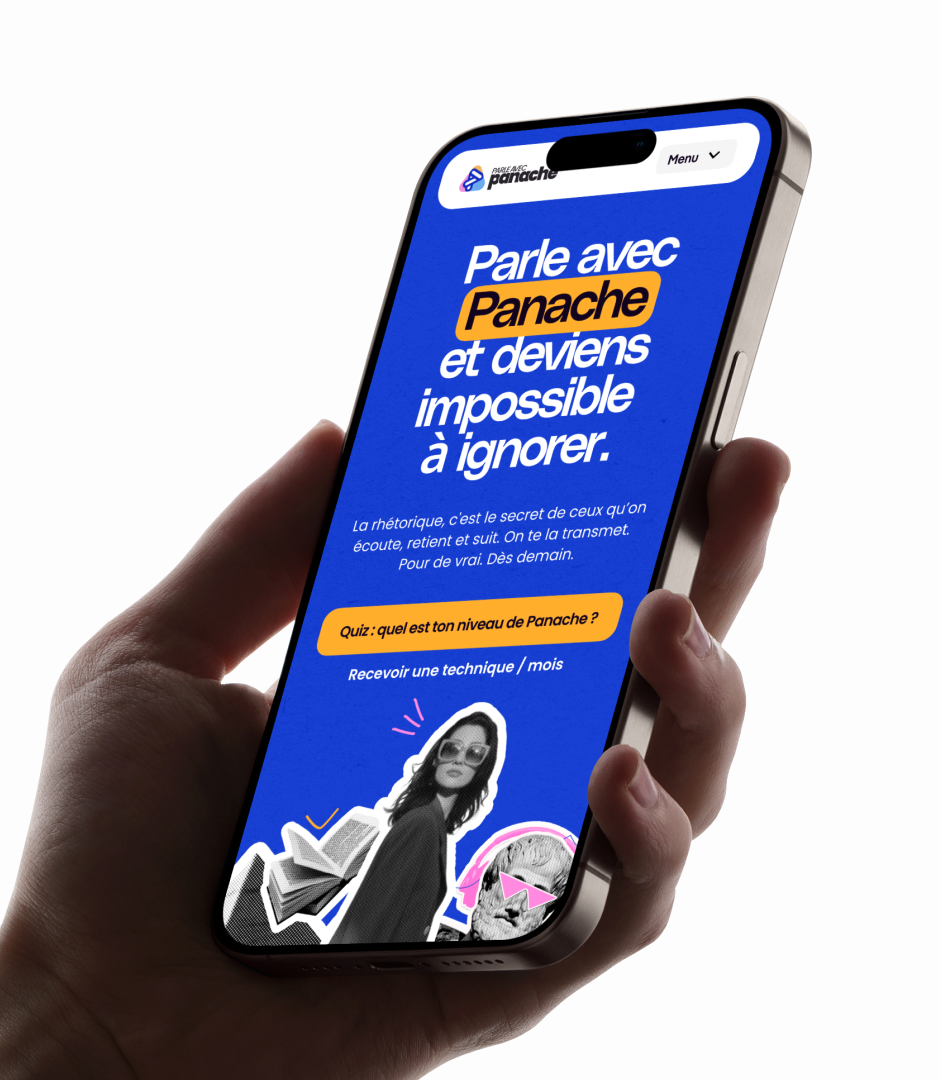
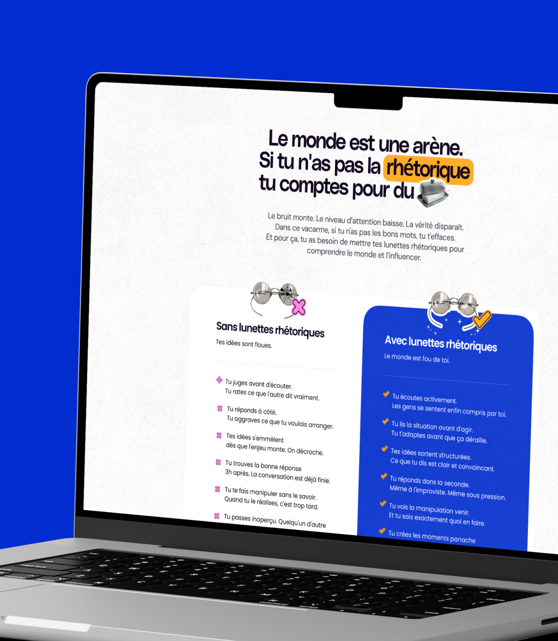
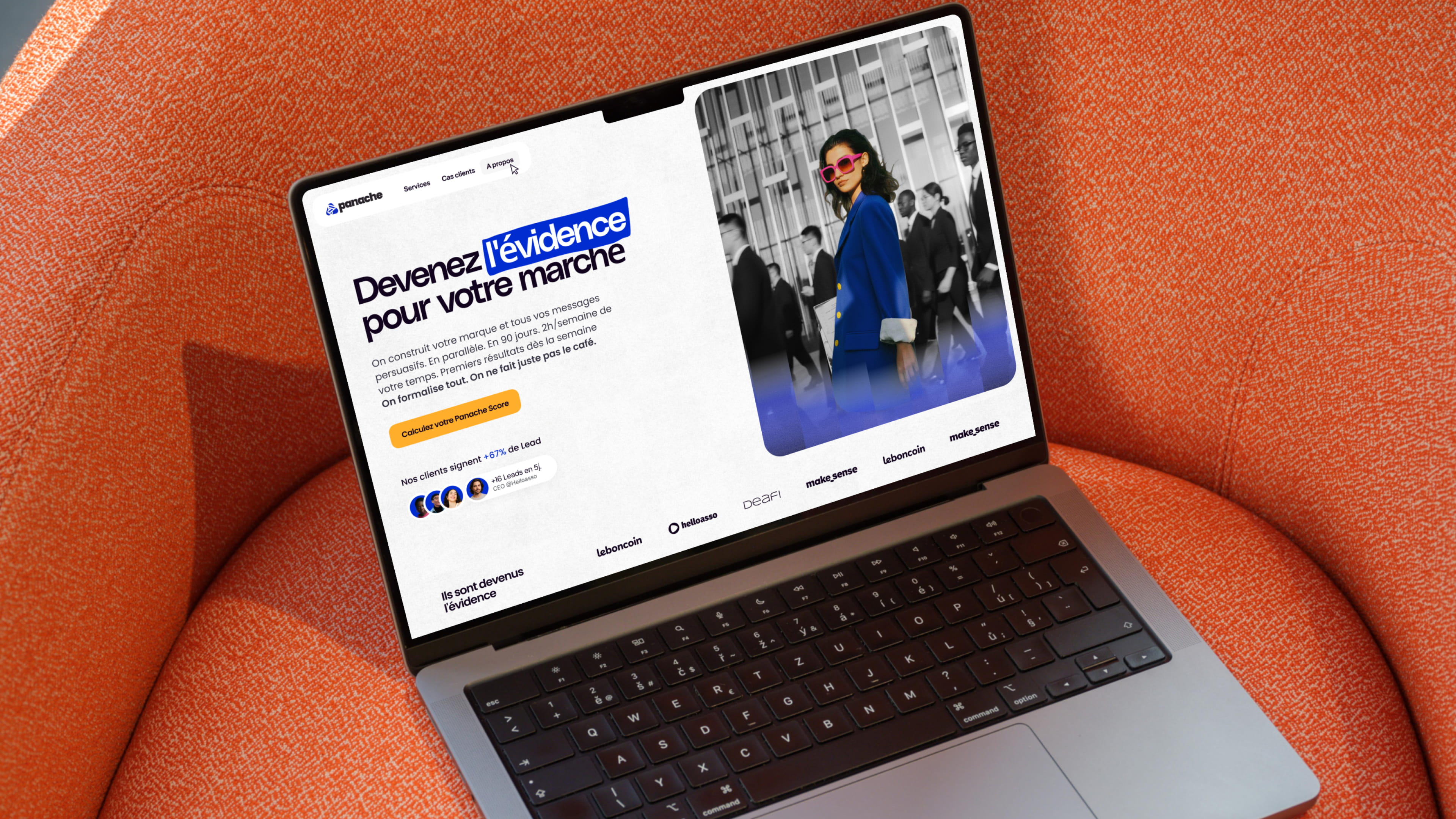
The core design choice is a unique gesture, repeated throughout: electric blue highlights the word that matters. In headlines, it isolates the "obvious" in the middle of a sentence; in photography, it colorizes a single subject amidst documentary-style black and white. This is exactly what Panache does for its clients—stripping away the noise so that only what convinces remains. A figure of speech transposed into a graphic system.
A three-step system
| Élément |
Parti pris |
| Couleur |
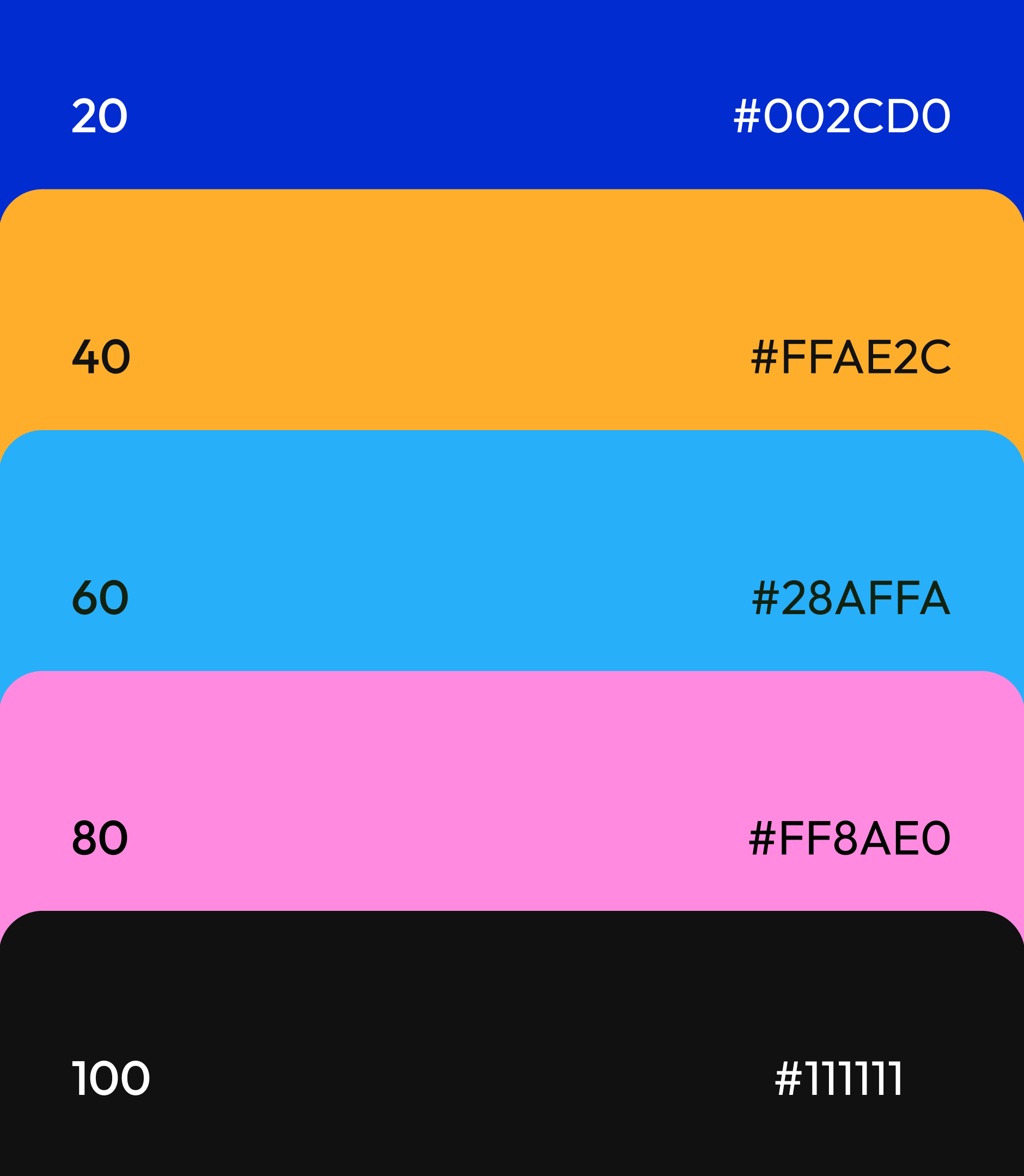
Un bleu électrique saturé, utilisé en aplat de fond, en surligneur typographique et en colorisation sélective. Une seule couleur signature, pour une reconnaissance immédiate en digital comme en social |
| Contraste |
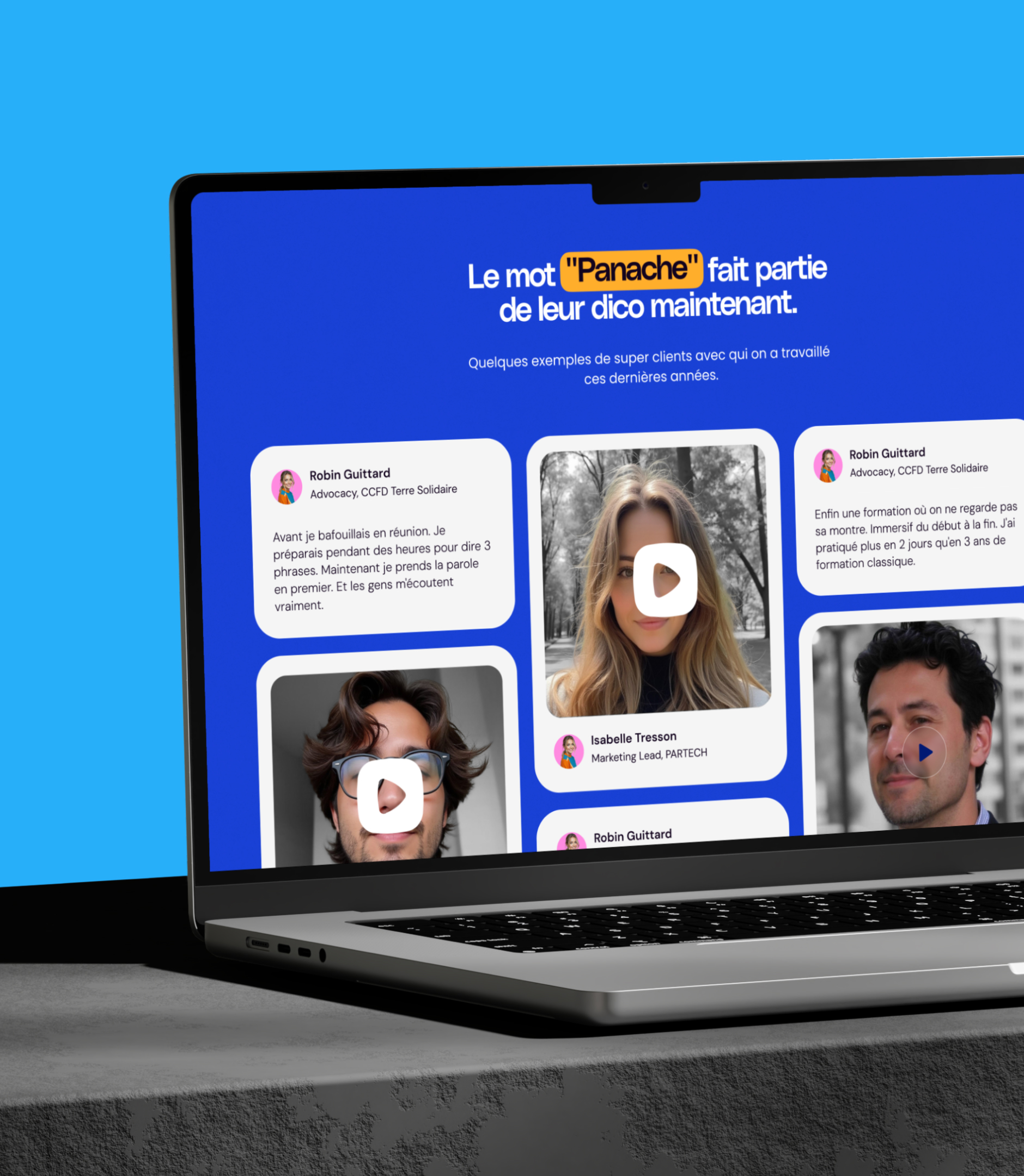
Photographies en noir et blanc dont un seul élément passe en bleu de marque : le regard n'a nulle part ailleurs où aller |
| Typographie |
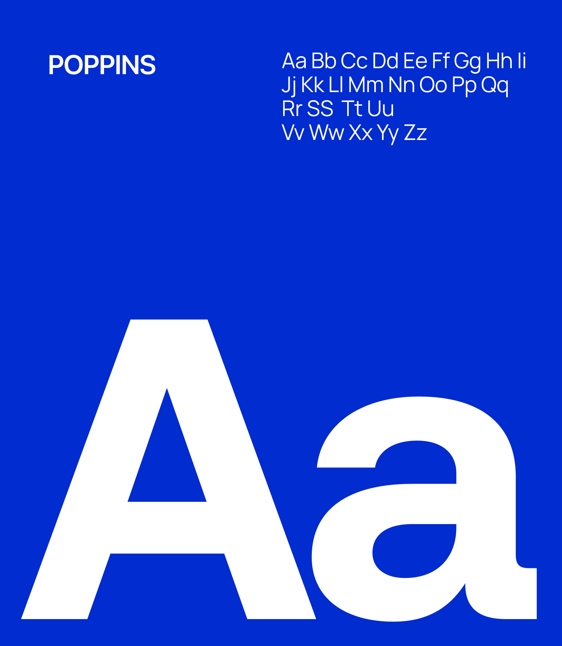
Sans serif grasse et resserrée, sans ornement, au service d'un discours direct et assumé |
| Accent chaud |
Un jaune miel réservé aux appels à l'action, seule rupture autorisée dans la bichromie, qui signale sans ambiguïté où cliquer |
| Interface |
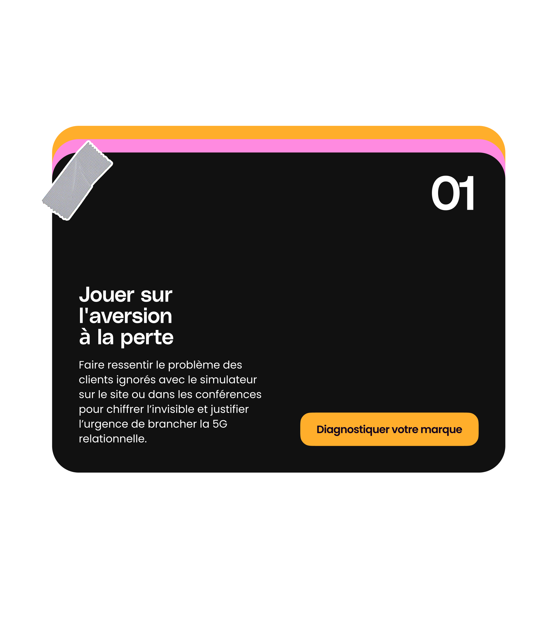
Blocs clairs posés sur l'aplat bleu, pour garder de la respiration et de la lisibilité sur des pages denses en argumentation |
A direction that works beyond the website
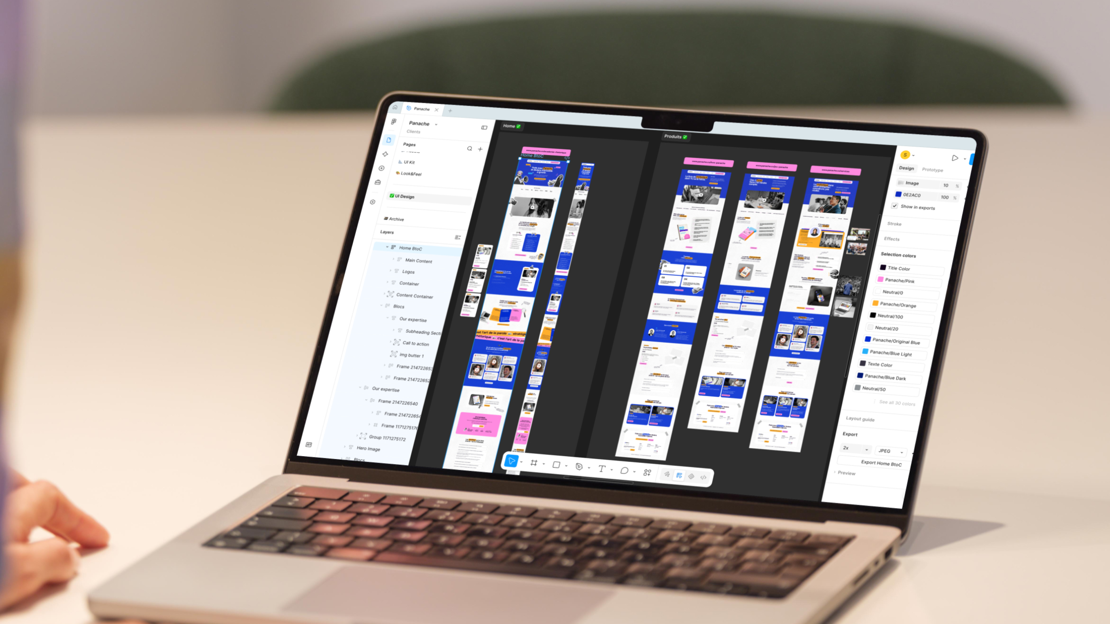
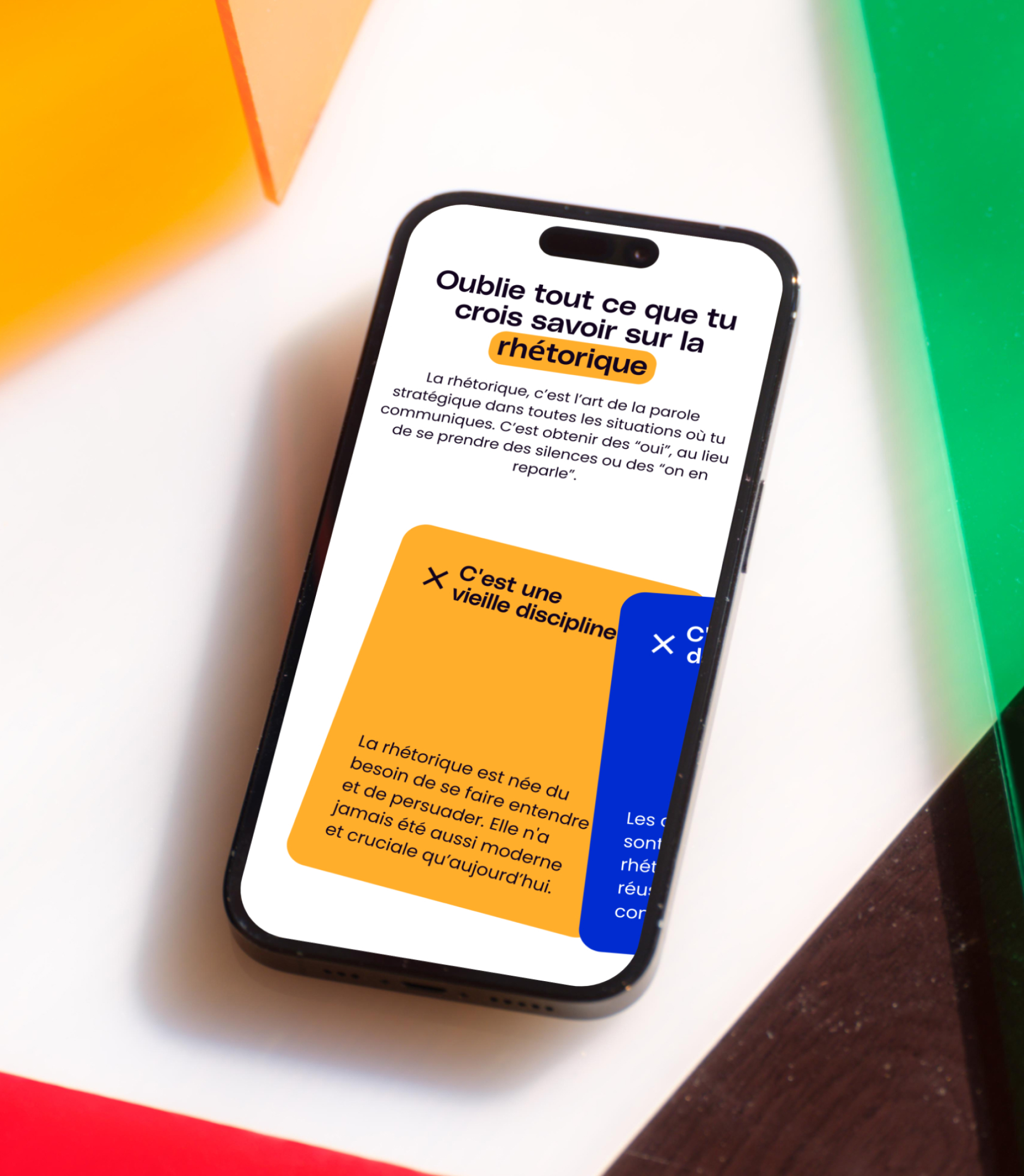
The strength of this system is that it can be reduced to a single gesture: a highlighted word, a colorized silhouette. It translates seamlessly to a LinkedIn post, a training slide, or a sales deck, which is vital for a brand whose primary reach happens outside of its own website.
Two possible adjustments. If you only kept one direction, keep the text as is. If you presented two or three, I can add a paragraph contrasting them before "Highlighting as a brand signature," like on Diffly and Sowapi—just let me know the names of the other directions.
And if you want the HTML version ready to paste into the CSV rather than the text, I can generate that for you.









.jpg)
.jpg)
.jpg)






.avif)