Projects
 Our Offers
 Dedicated team
 Blog
 Academy
 About Us
Perle Noire: logo, identity, design and Webflow website for a strategy consultancy for business leaders
Perle Noire supports business leaders in analysing, building the strategy for and steering their growth. Its founding idea: the very wealthy entrust their fortune to a family office that brings every specialist together under one roof; Perle Noire applies this philosophy to companies. Two partners, Farah Rouassi and Quentin Mayet, and a three-step method: analyse, build, steer.
Perle Noire entrusted Gemeos, a B2B web agency, with its logo and identity, the design of its website and its development on Webflow.
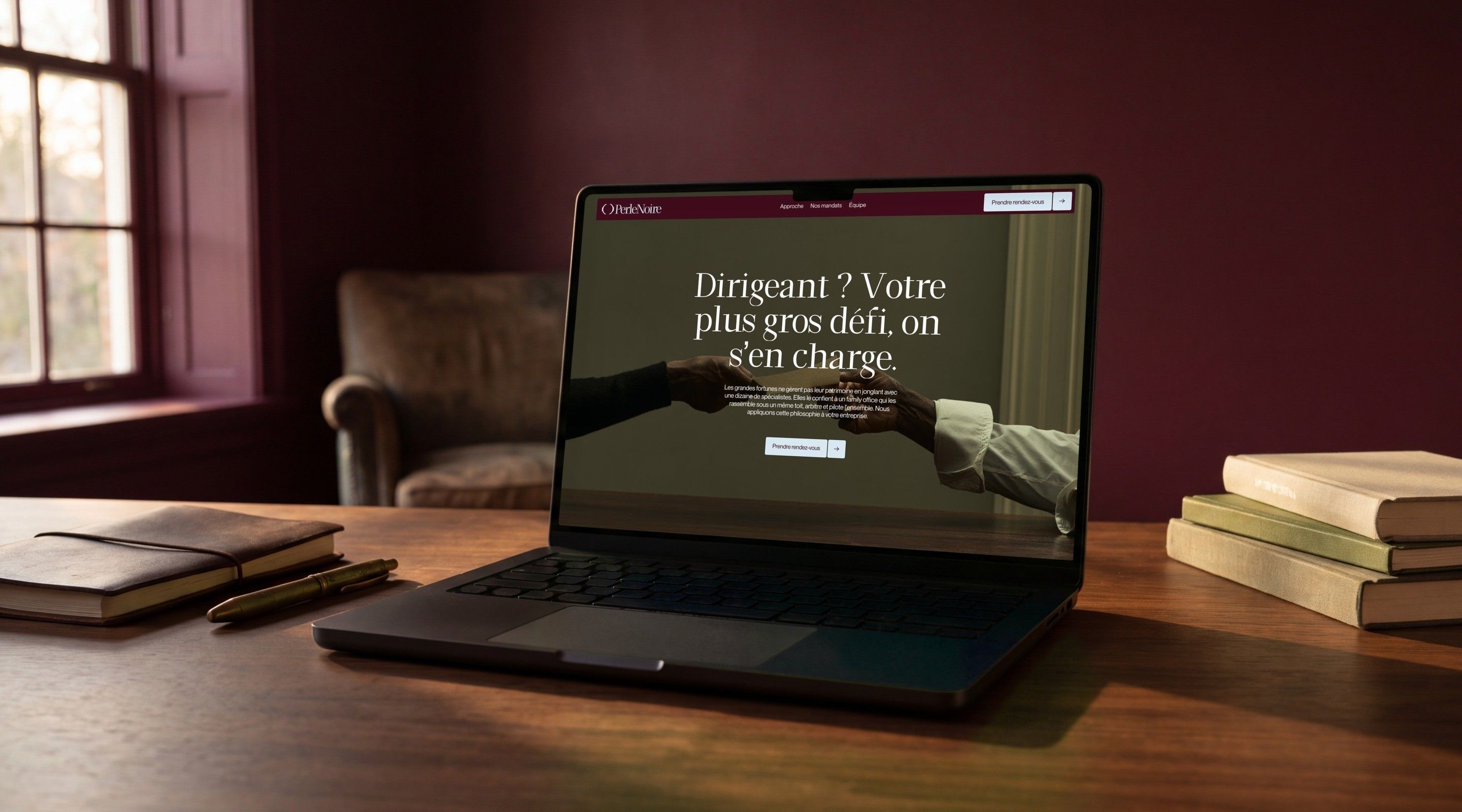
The brand of a private firm, not a consultants' brochure
Perle Noire says it itself: it is neither an agency nor a consultancy, but two partners who commit alongside a business leader. It turns down more engagements than it signs and its assignments are confidential. The brand therefore had to convey the discretion and high standards of a family office, while staying warm for founders who have already seen other providers come and go and are looking for something that fits better.
Gemeos explored two complete identity directions, from pictogram to photography, then developed the chosen one into a logo, palette, typefaces, pattern and UI kit. The site was then designed and developed on Webflow: a home page that lays out the method, an engagements page and a detailed case study, published from the CMS.
- Industry
- Services
- Services
- Logotype
- Branding
- UX/UI Design
- Development
Branding
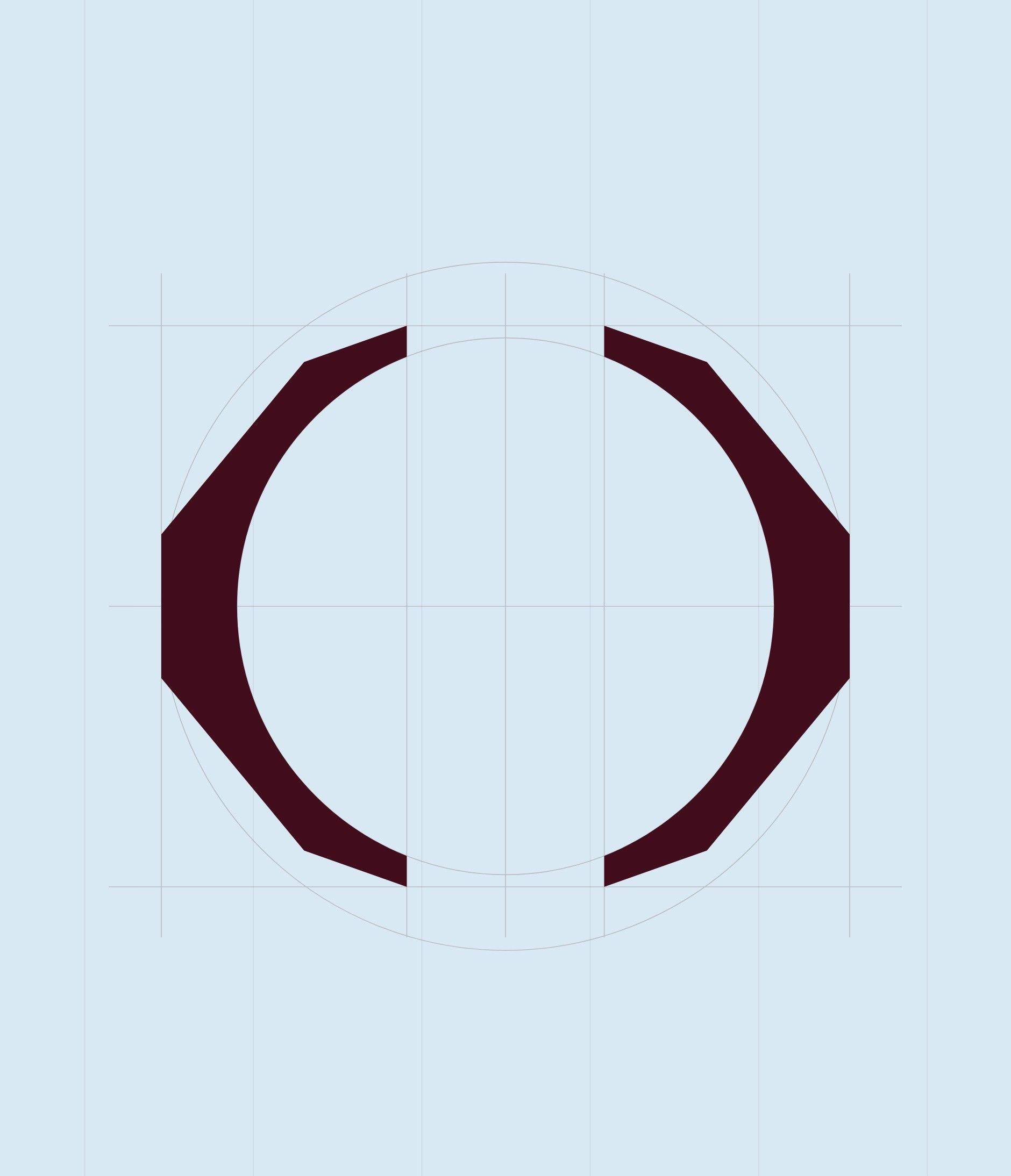
The pearl is read in negative space, between two brackets
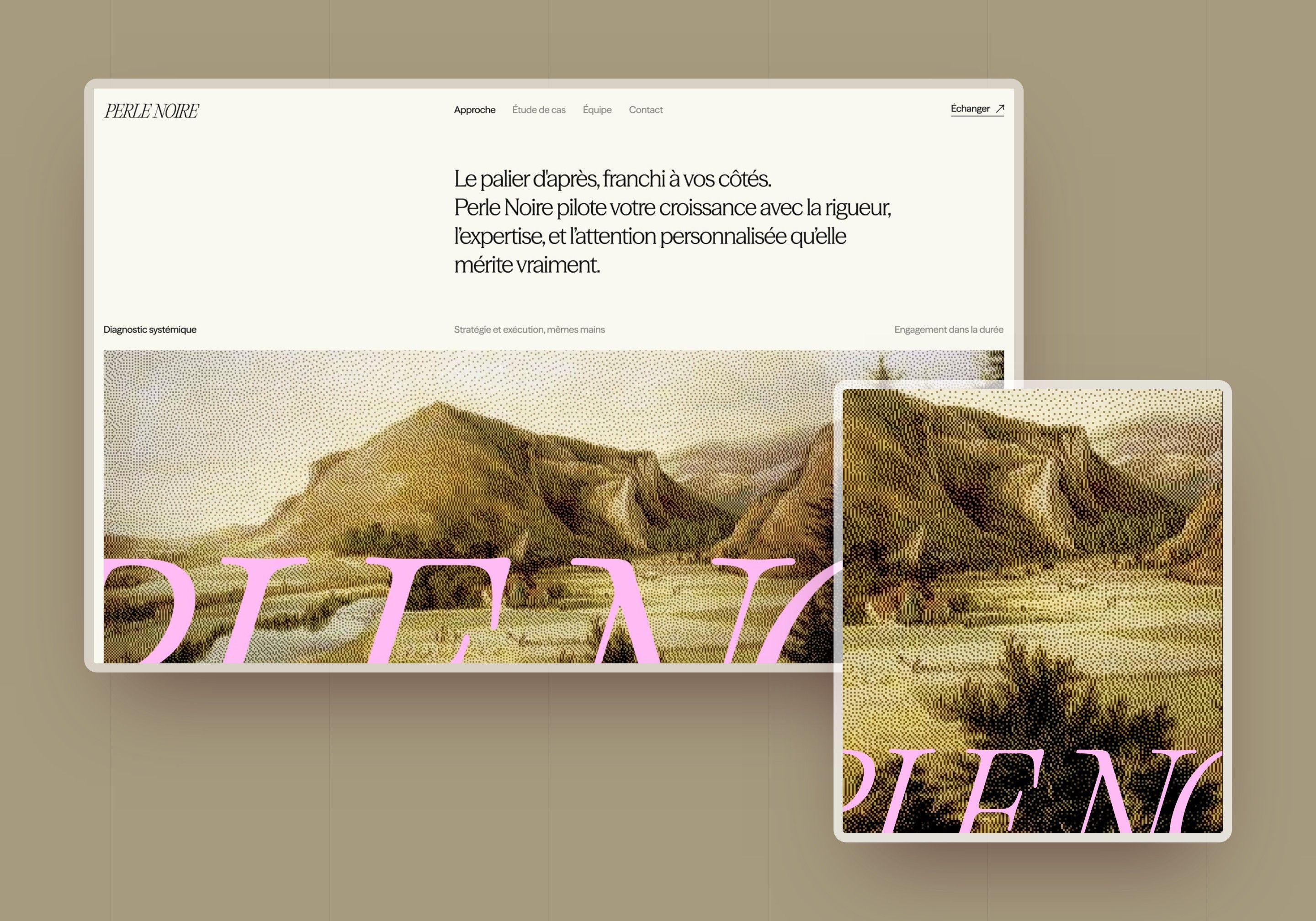
Gemeos explored two directions. The first brought the pearl out at the centre of four interlaced circles, one per pillar of the method, with the name set in capitals and a painting photograph reworked in pixels. The second doesn't draw the pearl: two brackets enclose it and the eye completes the shape. It is the one that was chosen, because it avoids the cliché of a black dot and leaves the sign open, like an aside between the business leader and their advisers.
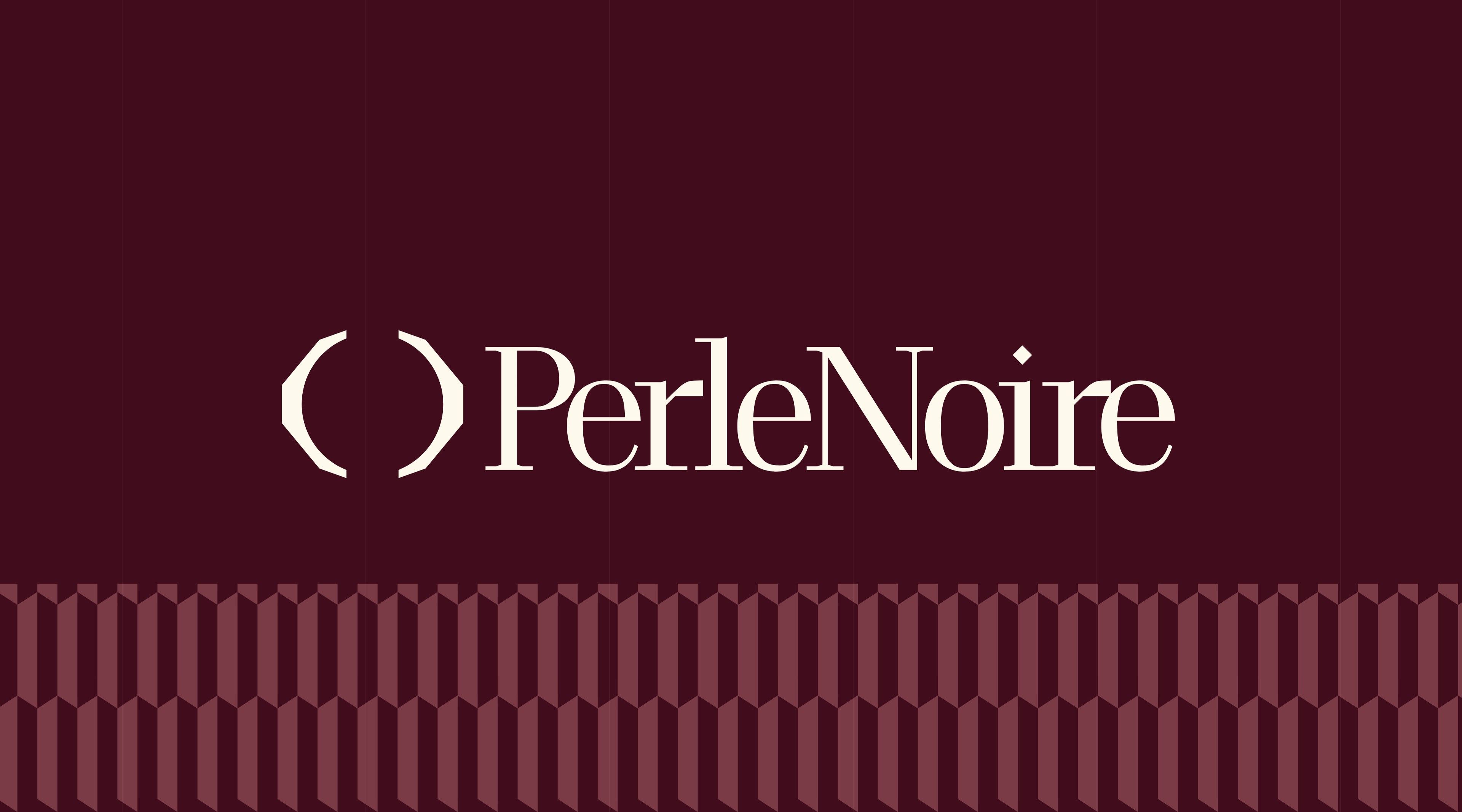
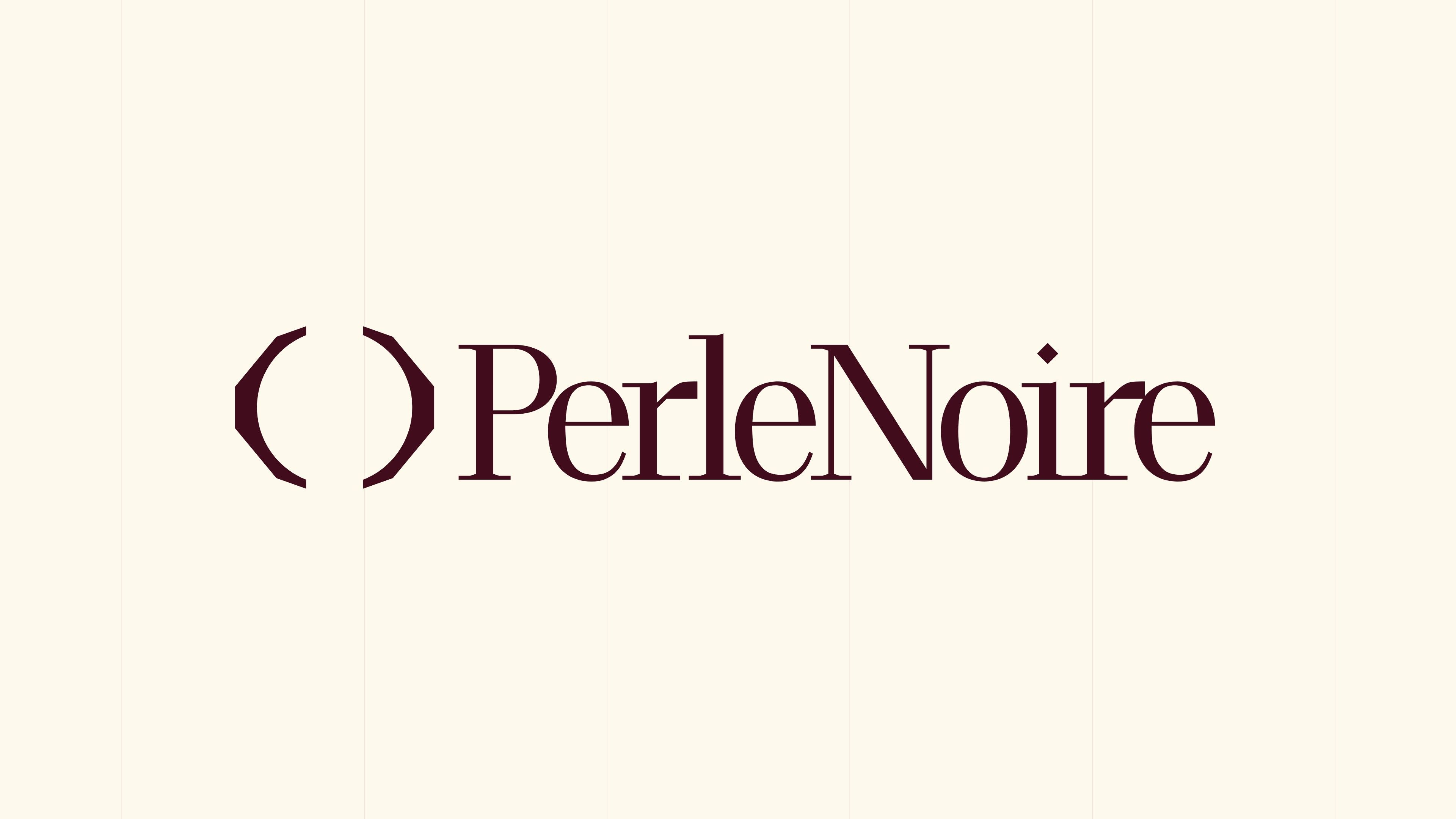
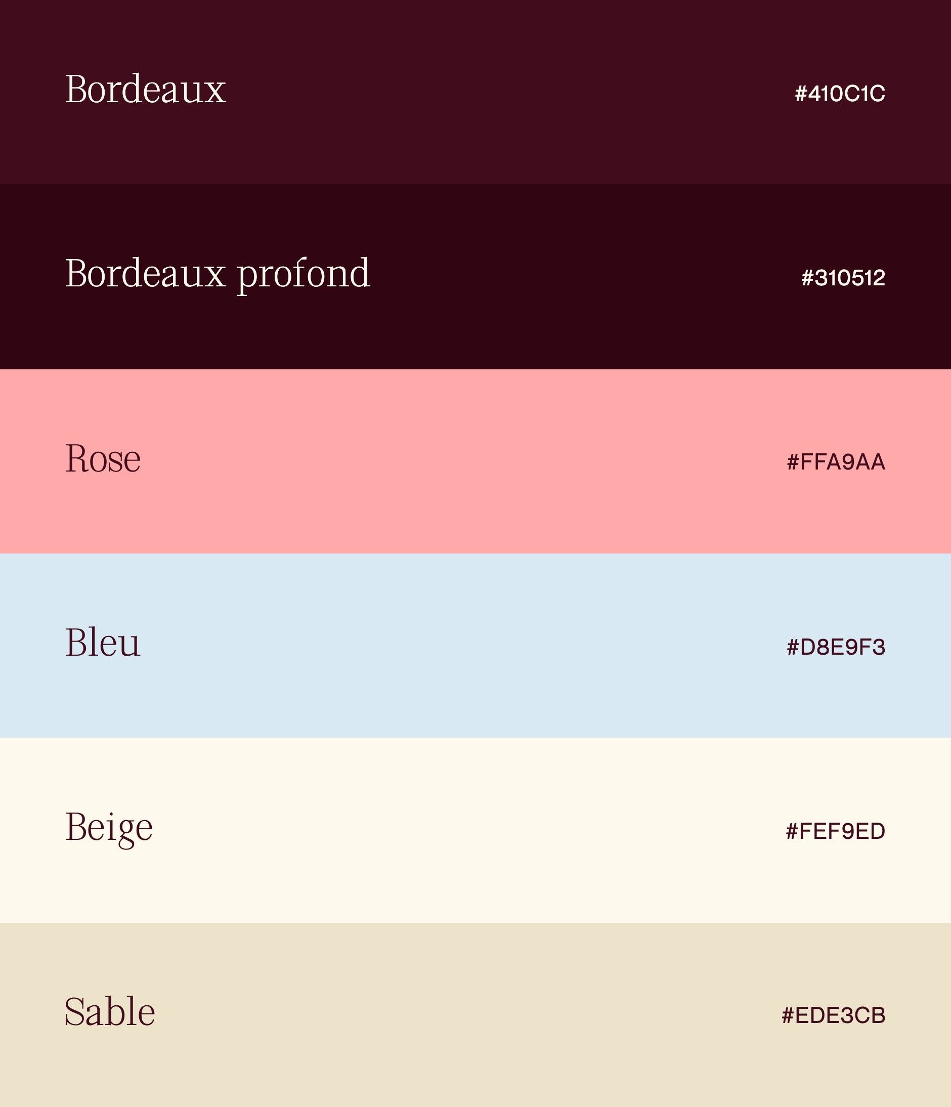
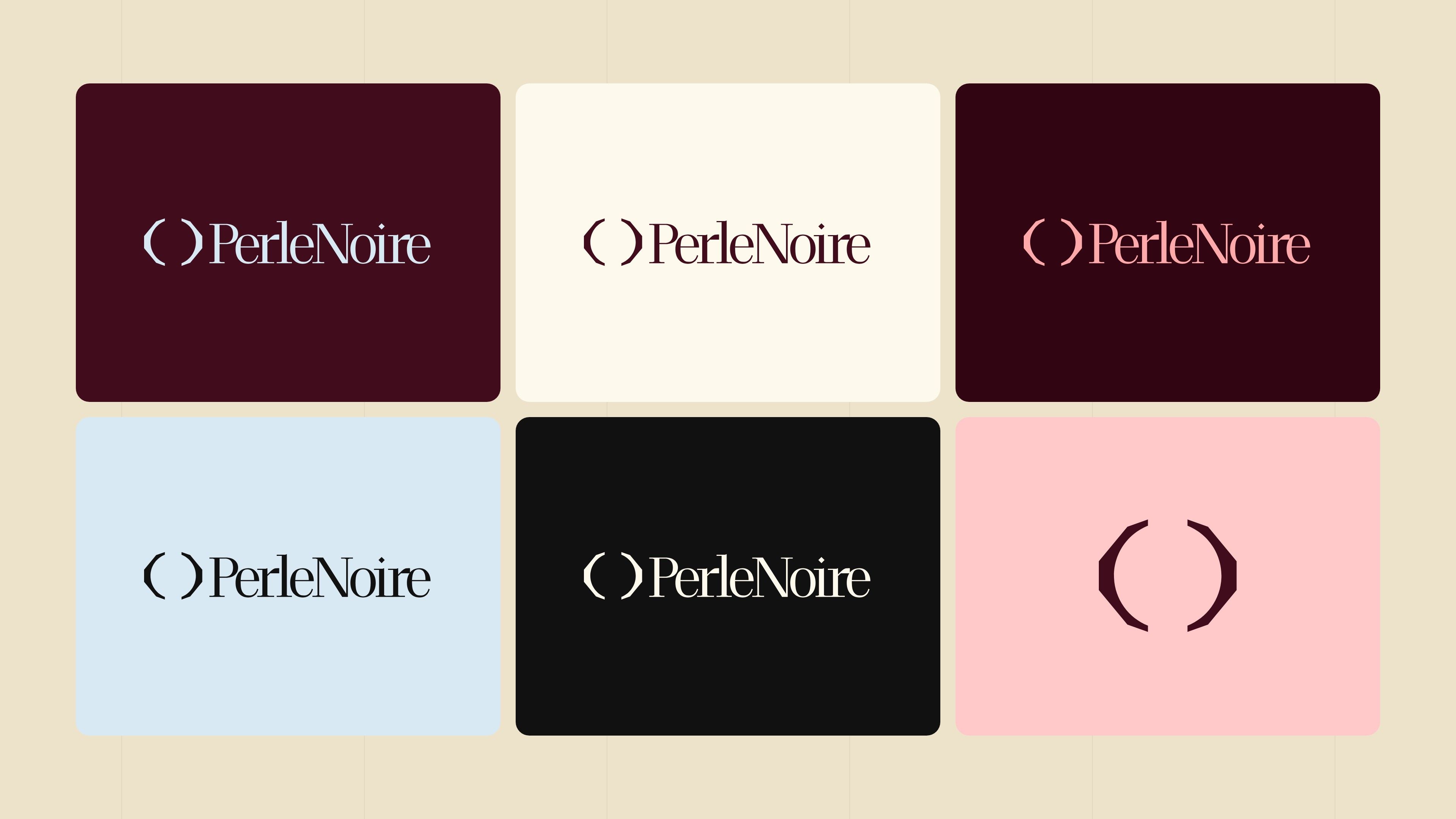
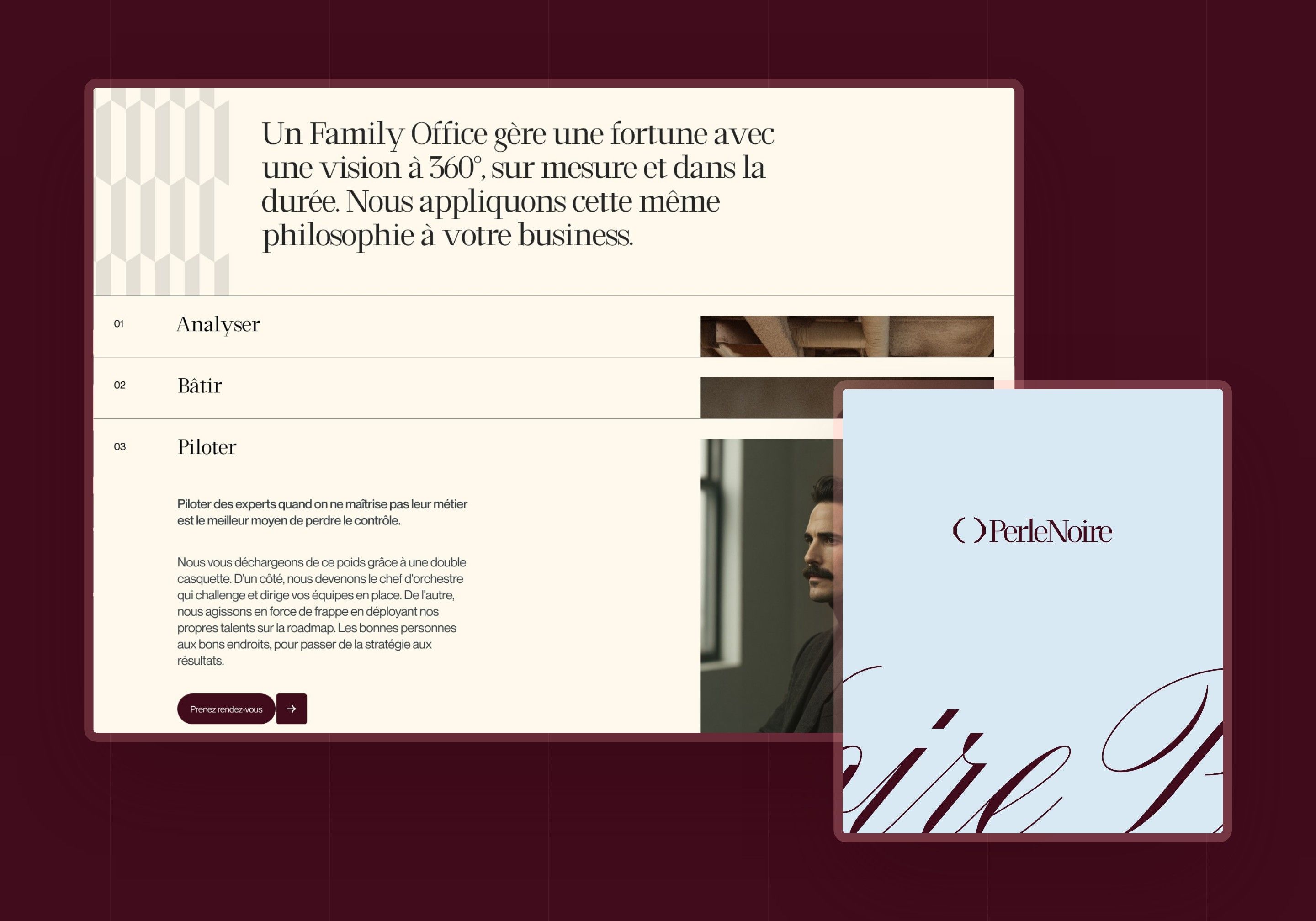
The logo pairs this pictogram with the name Perle Noire as a single word, and comes in five versions in the UI kit: blue, burgundy, pink, light and dark. The identity rests on a deep burgundy (#410C1C), a light blue (#D8E9F3), a beige (#FEF9ED) and a pink (#FFA9AA): burgundy grounds, blue gives air, pink punctuates. Each colour is extended into shades for the interface.
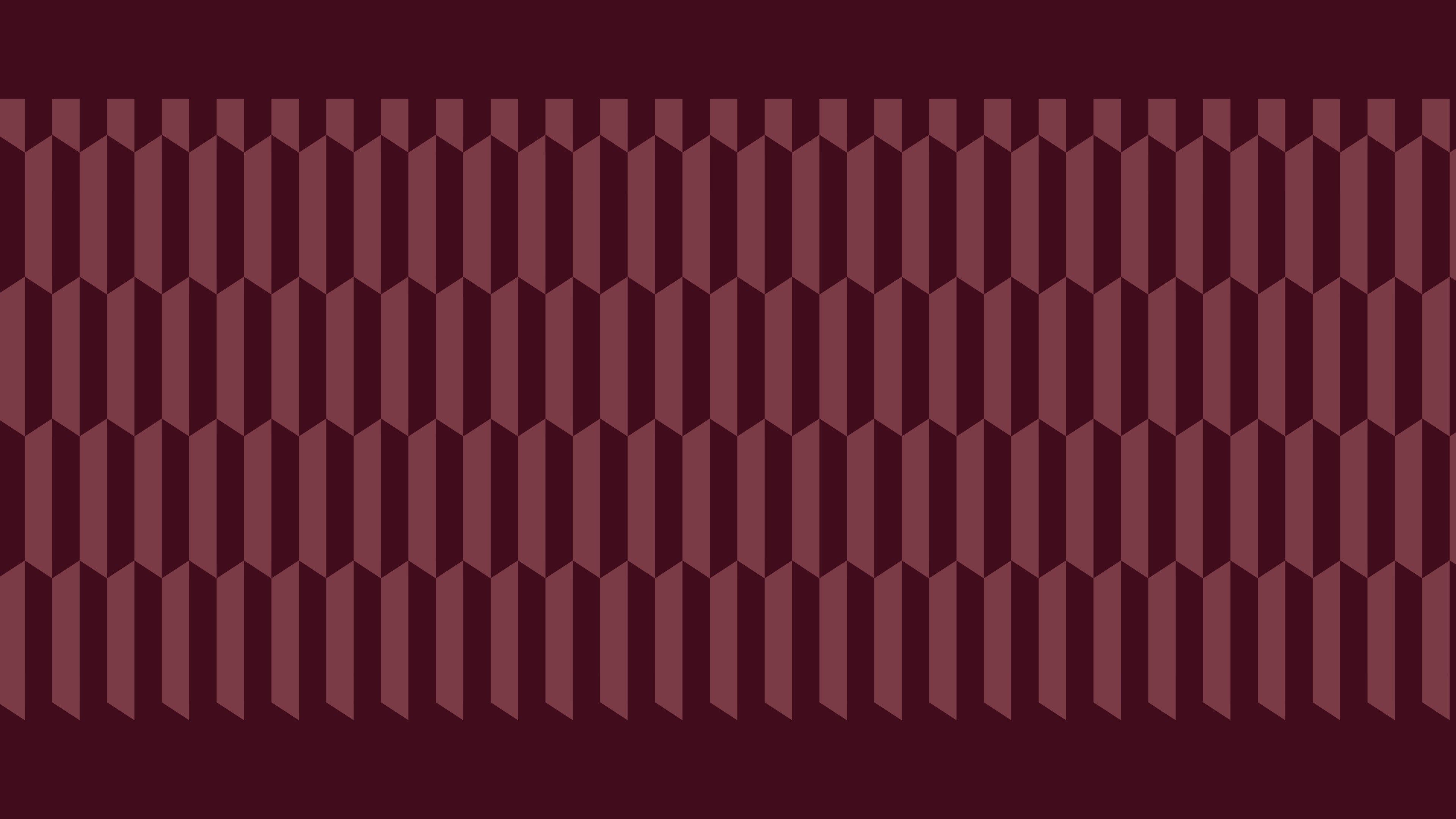
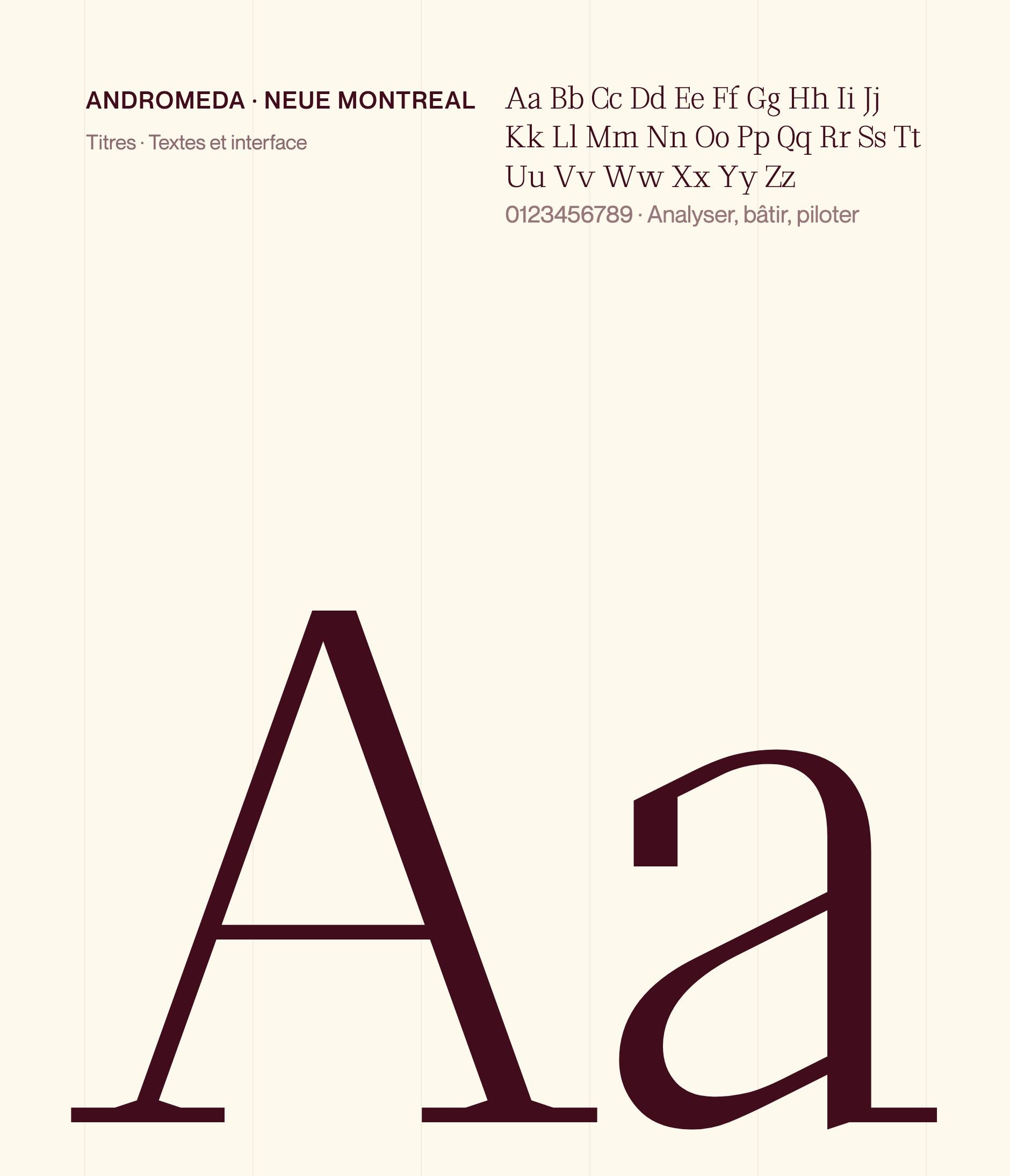
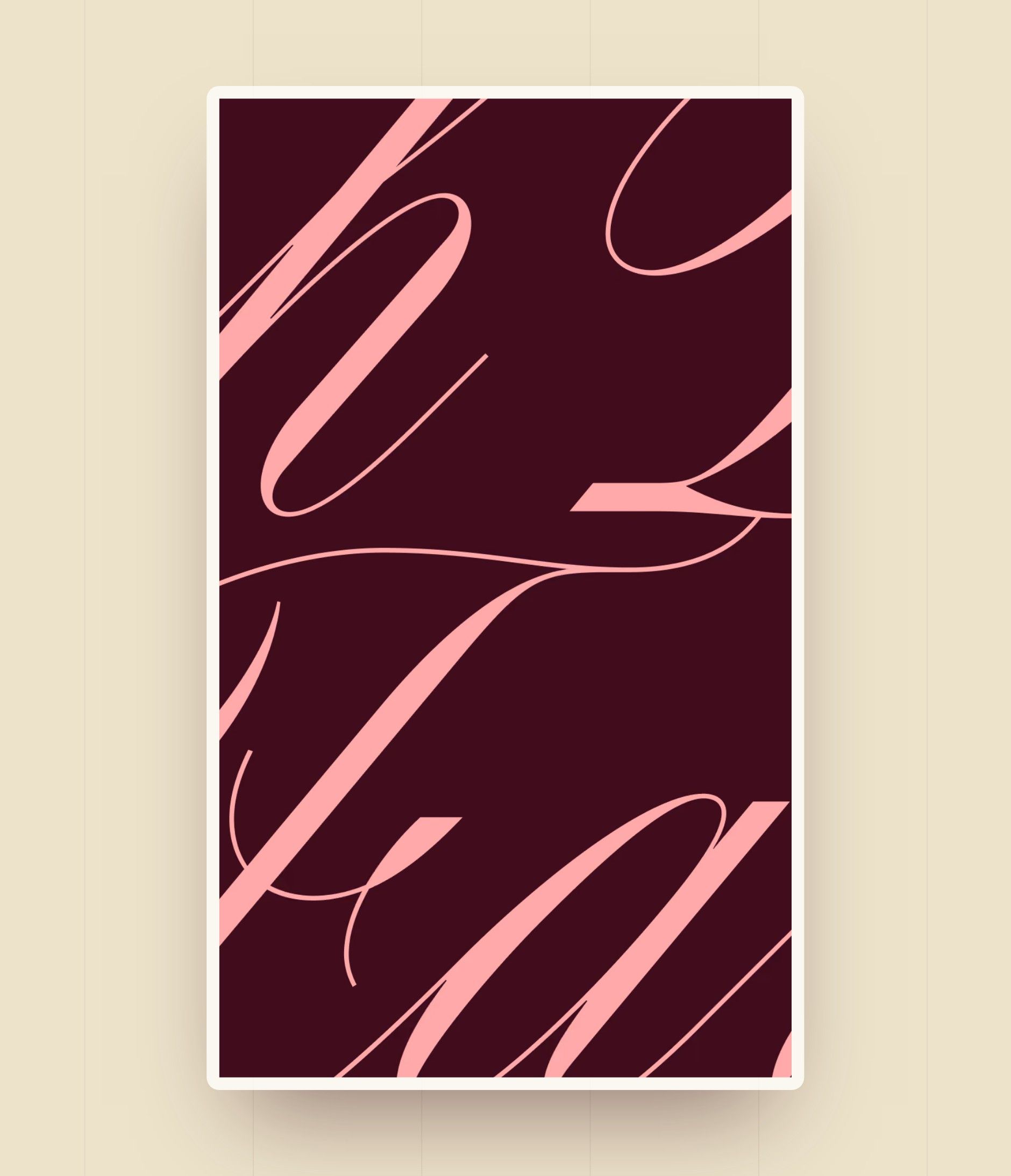
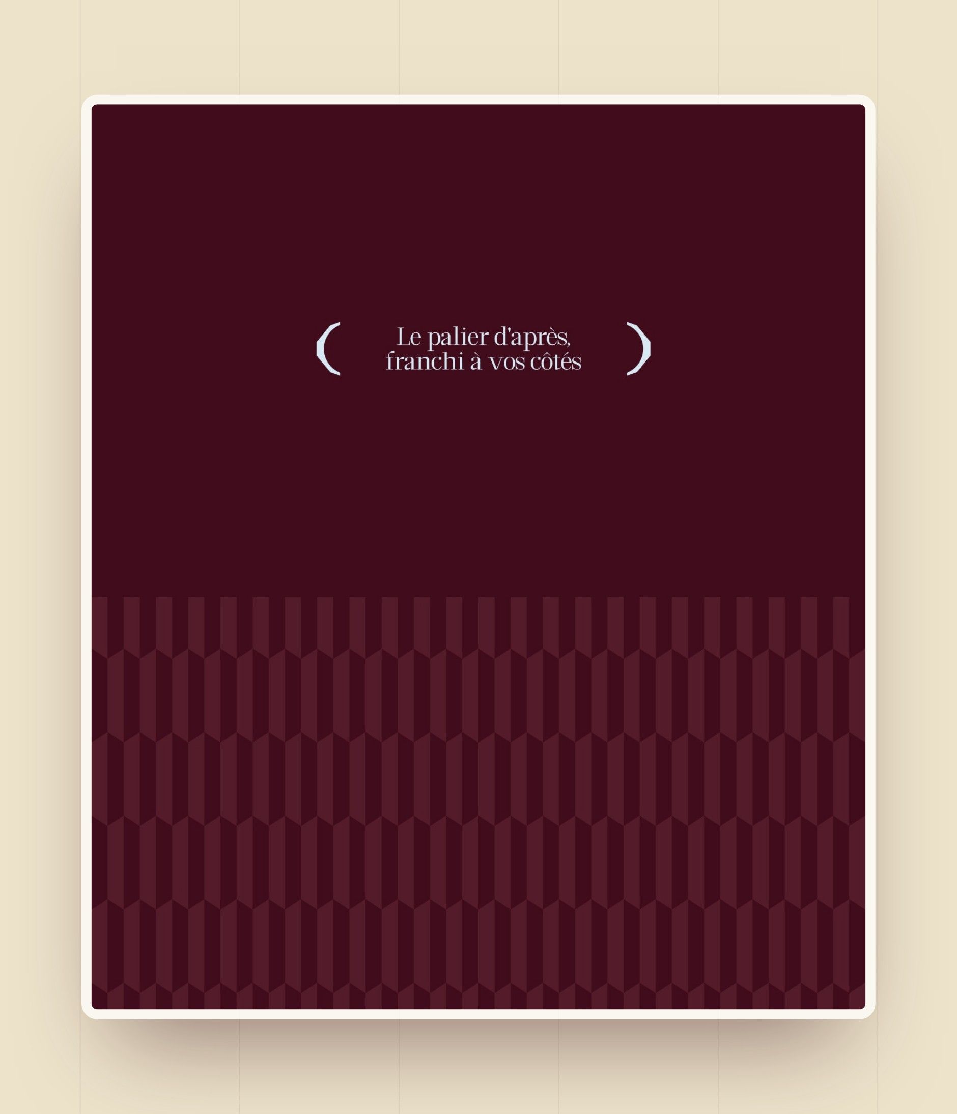
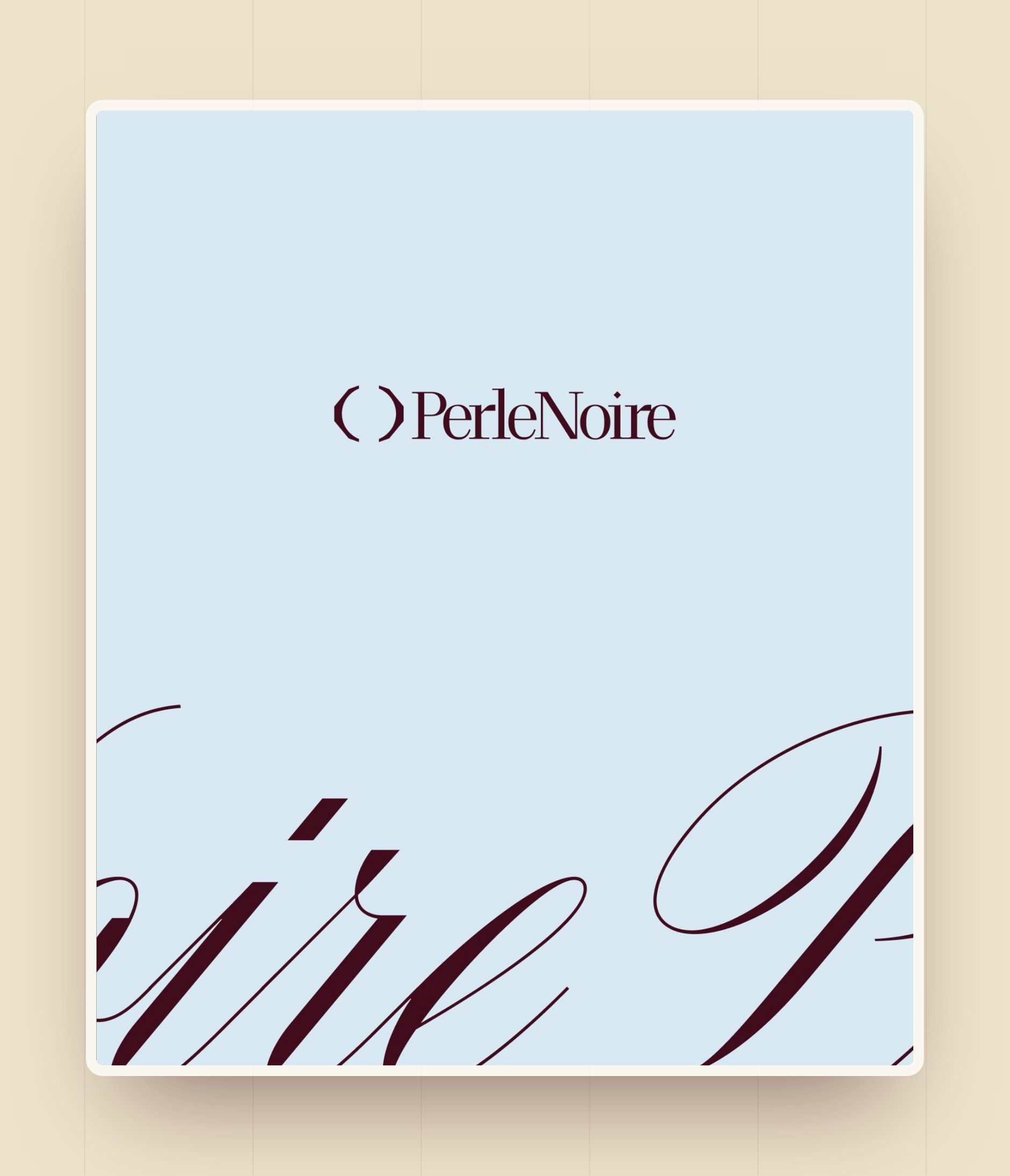
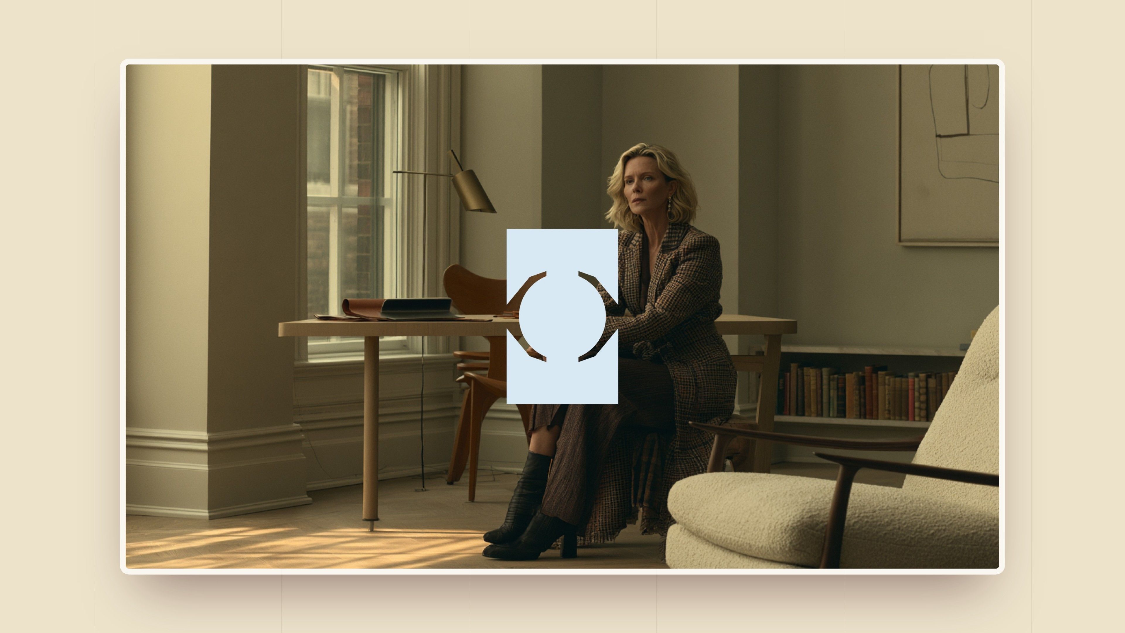
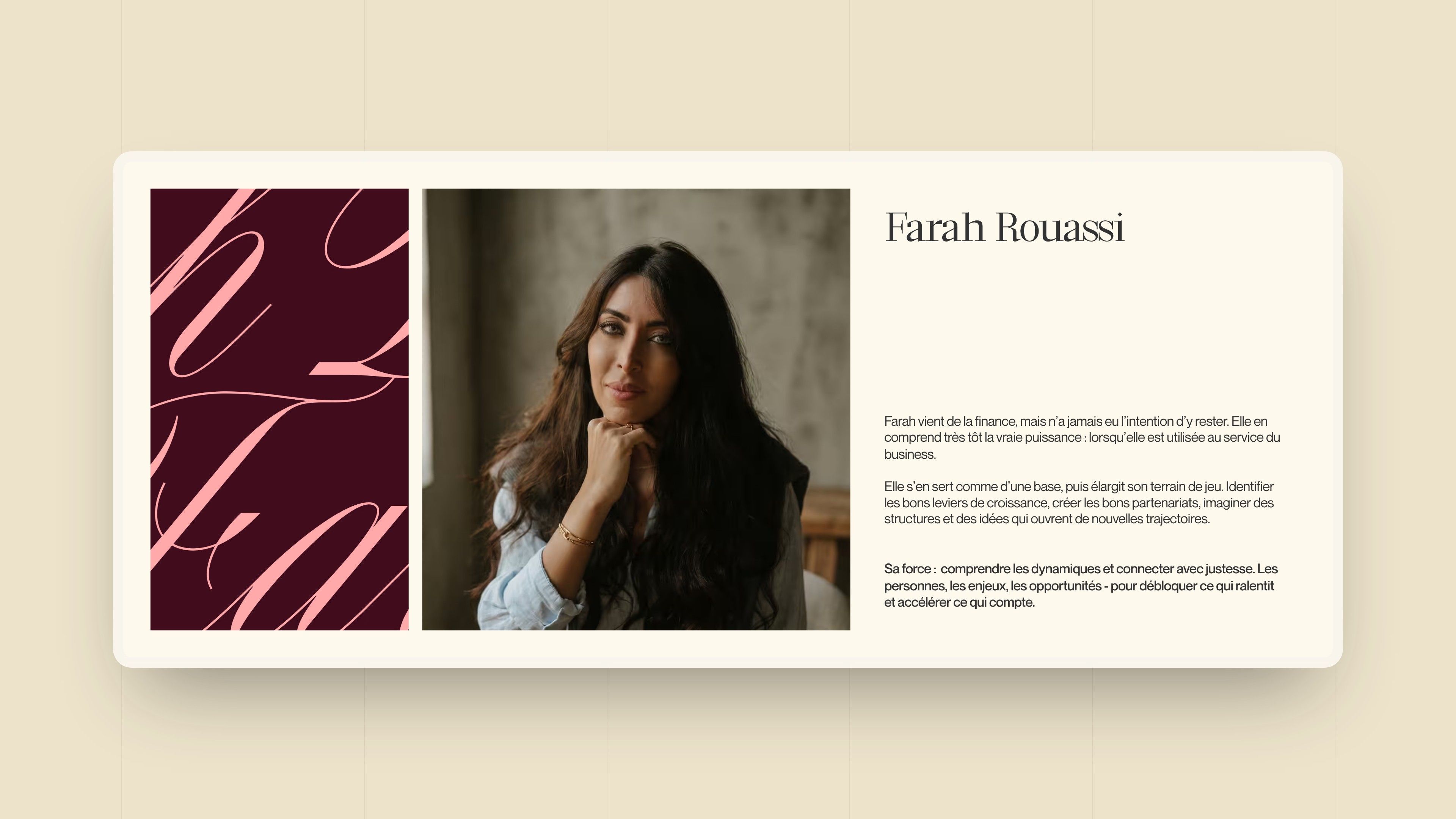
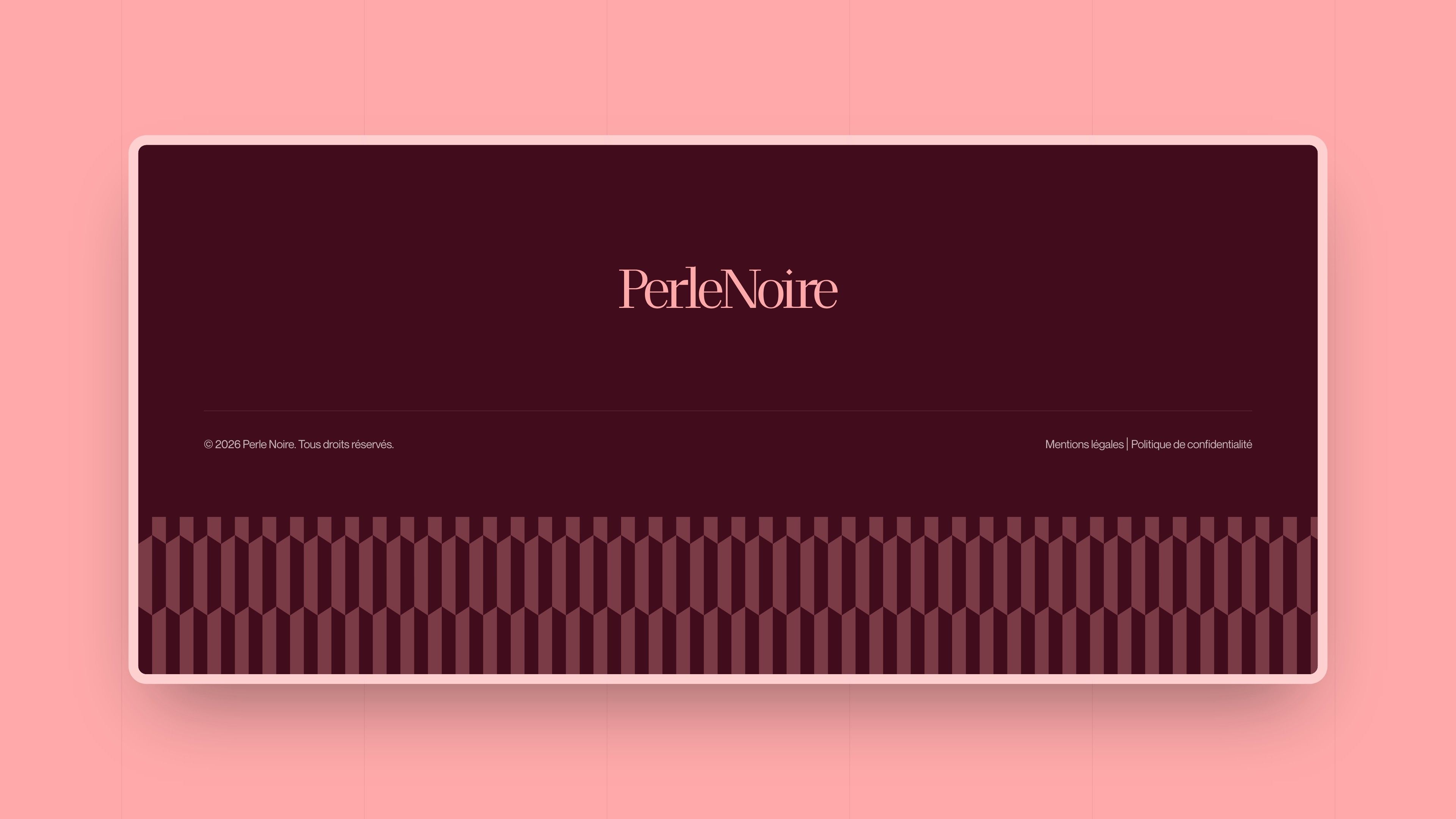
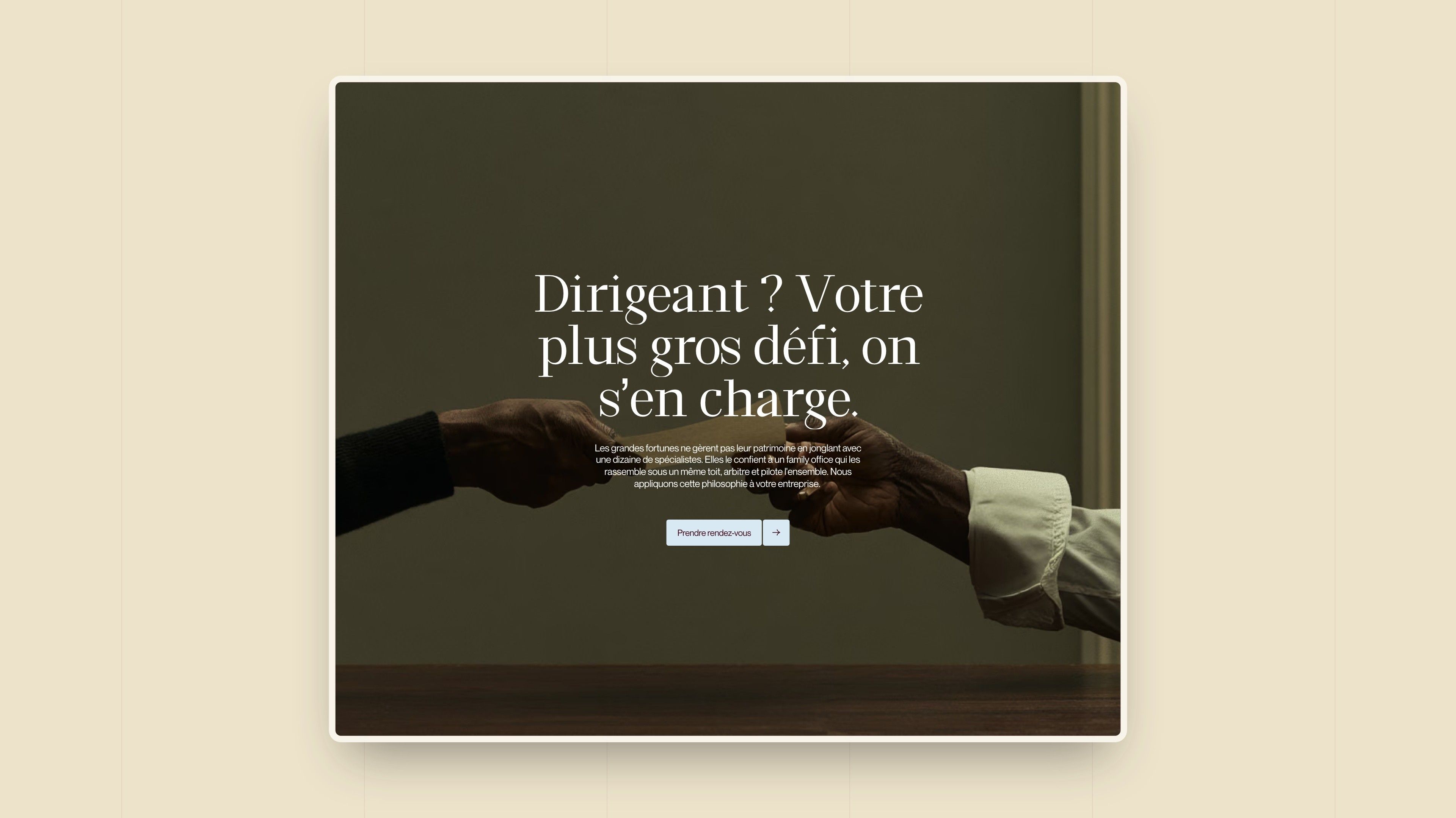
Headings are set in Andromeda, an editorial serif, body text and interface in Neue Montreal. Two assets give the brand its signature: a very large script, which accompanies the partners' portraits, and a pattern of repeated facets that gives rhythm to backgrounds and the footer. Photography follows the light of Flemish painting: composed, calm people, in chiaroscuro.
Direction 1 - The four circles
Burgundy, beige, black and pink; a pictogram of four circles that bring the pearl to life at the centre, one circle per pillar of the method; the name in a capital serif, like an author's publication; painted landscapes reworked with a pixel effect. Intended perception: warm and grounded, without the rigidity of an institution.
Direction 2 - The pearl in negative space
The chosen direction: deep burgundy, light blue and pink; two brackets revealing the pearl in negative space; an editorial serif paired with a script; a pattern of repeated geometric shapes and portraits in Flemish light. Intended perception: firm, contemporary and elegant, without needing to overplay its difference.
Web Design
A short site that lets the method and the proof speak
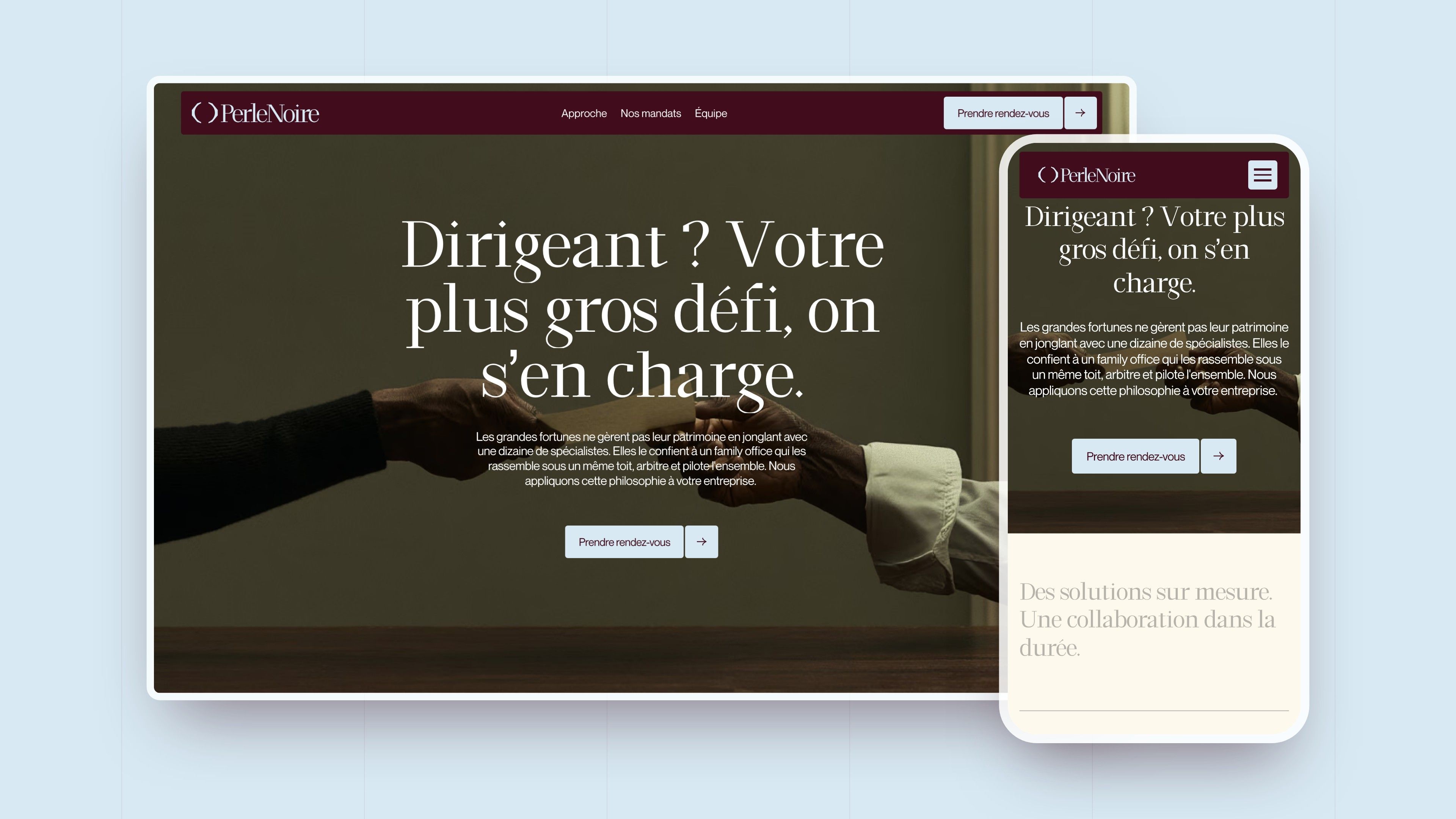
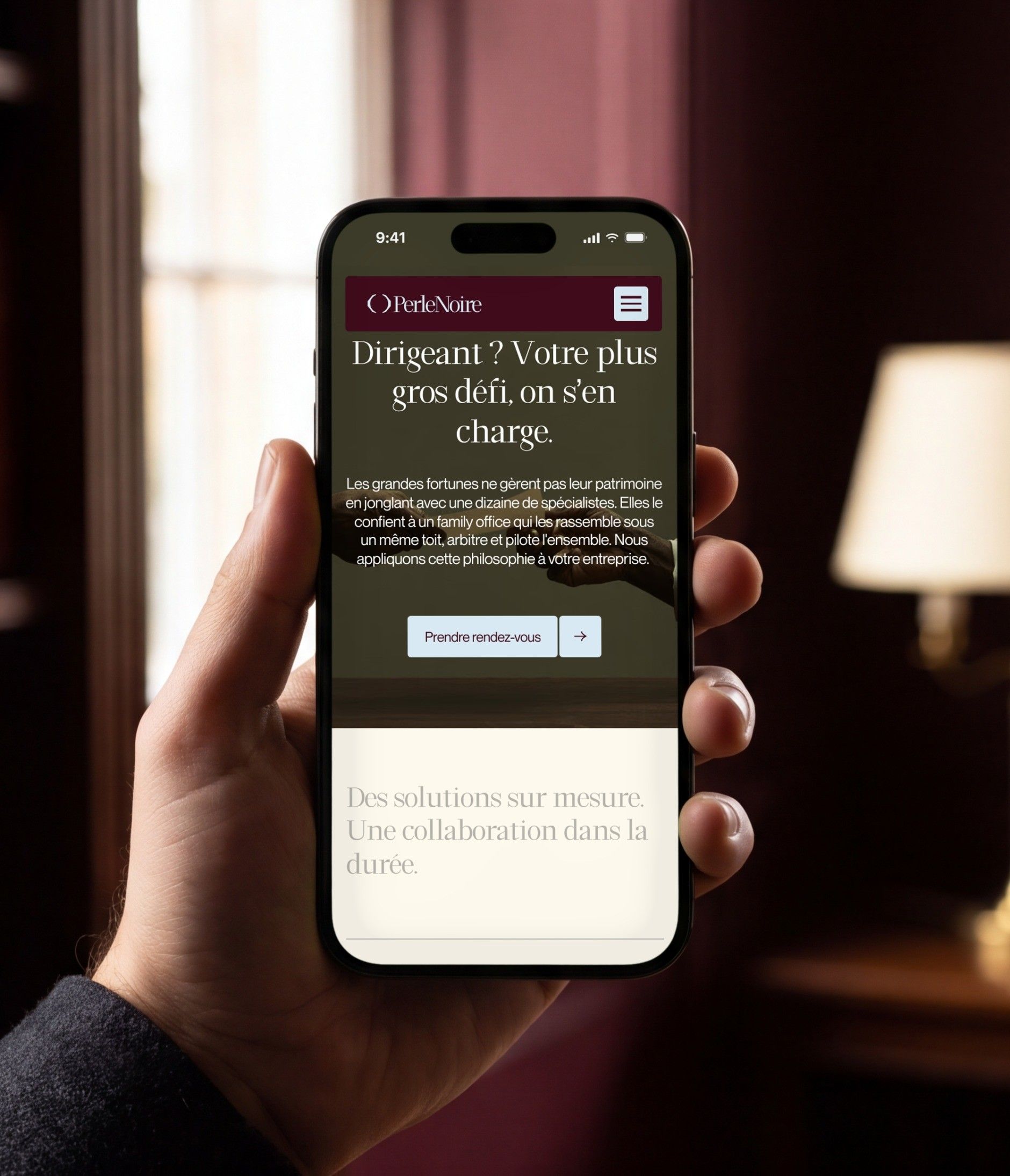
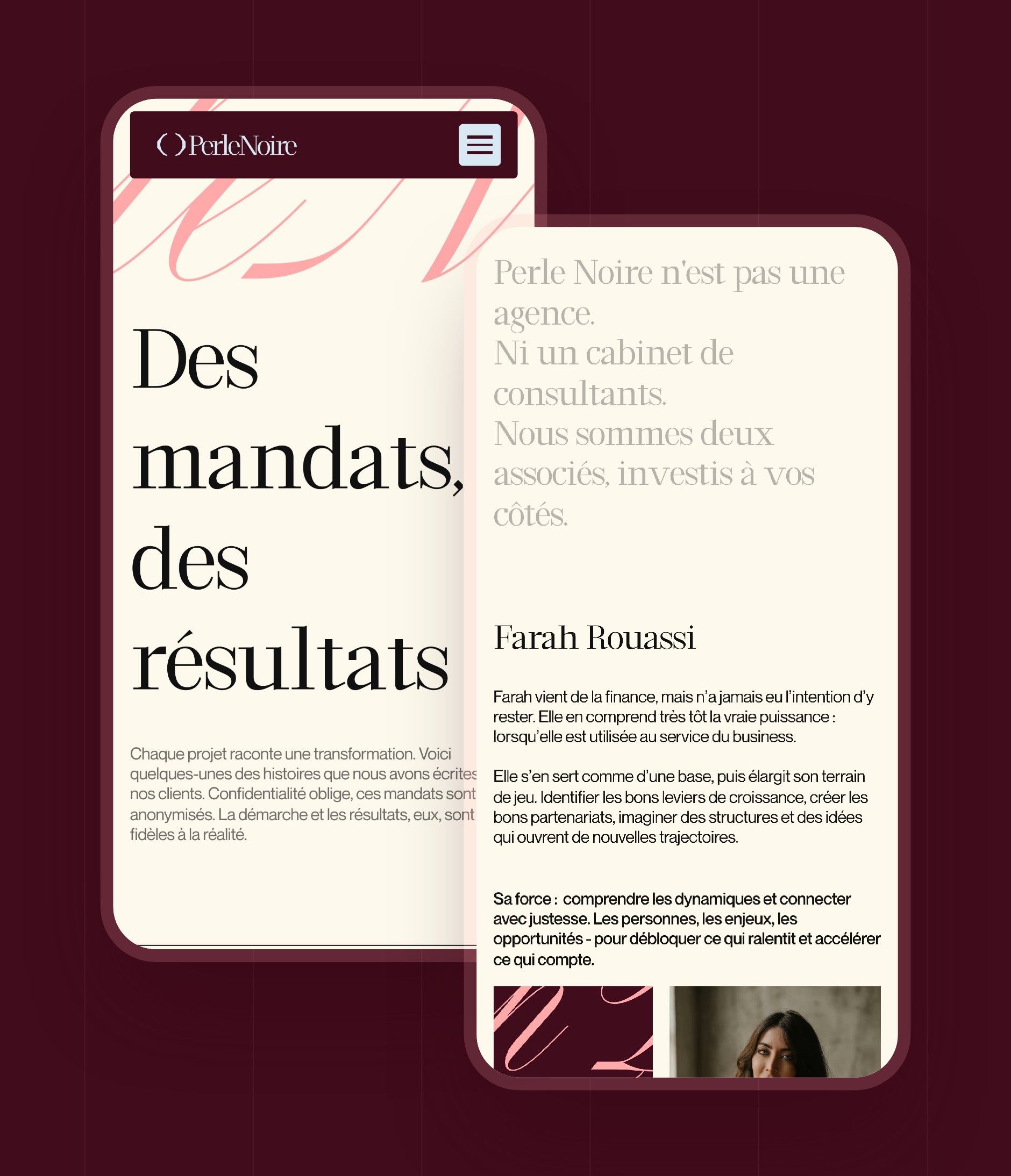
A business leader arriving on the site must understand in a few seconds what Perle Noire does, how it works and who they will be talking to. The site fits into a few pages: the home page sets out the promise, the method and the team, the engagements provide the proof, and every page leads back to the same action, booking a meeting.
| Page | What it does for the visitor |
|---|---|
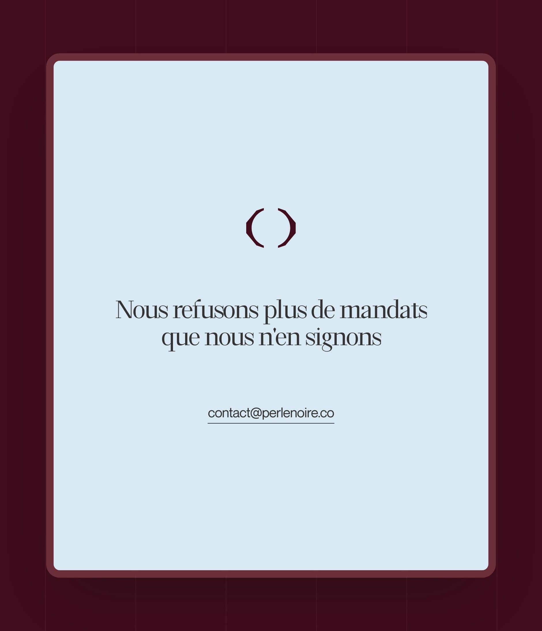
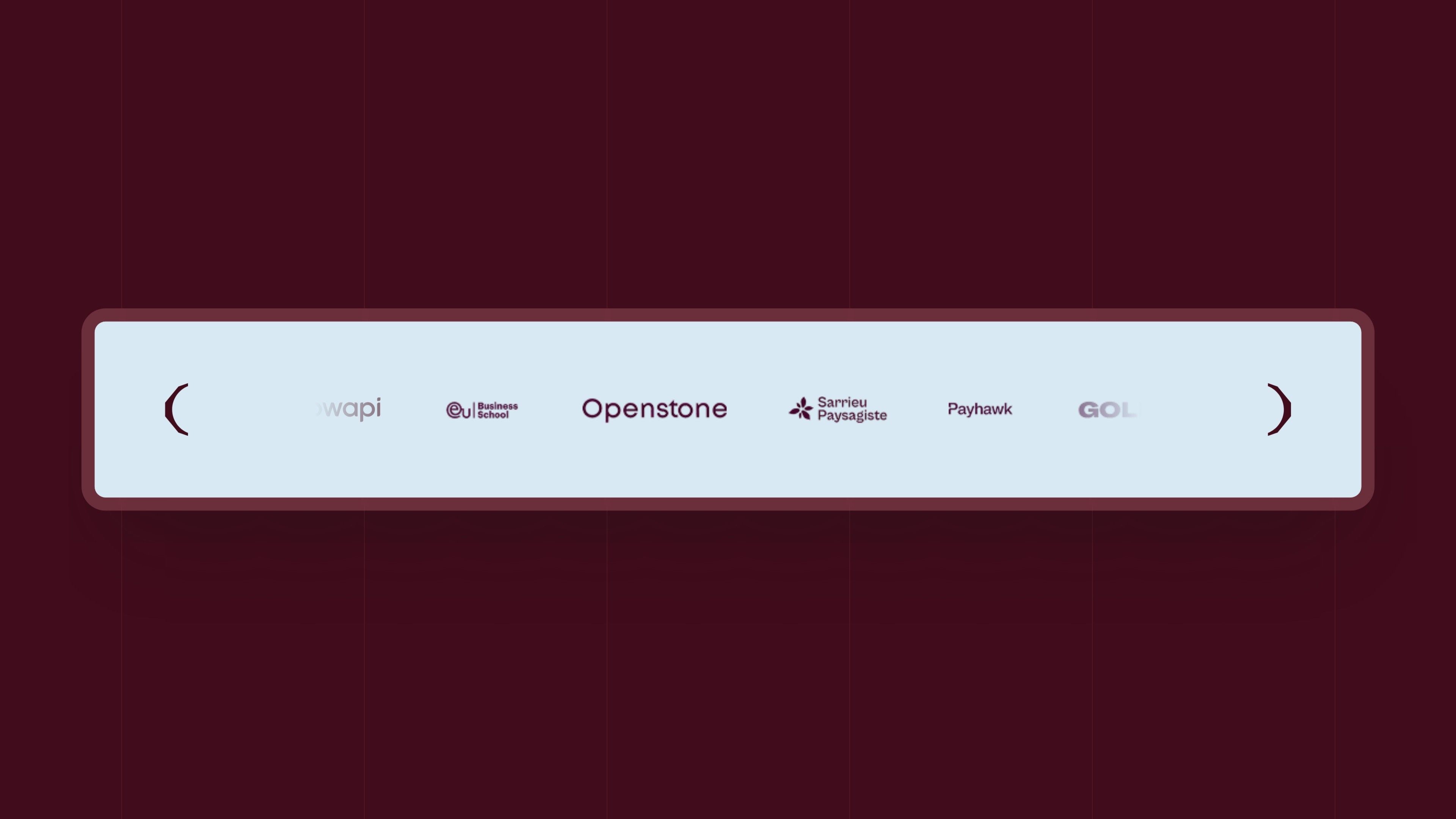
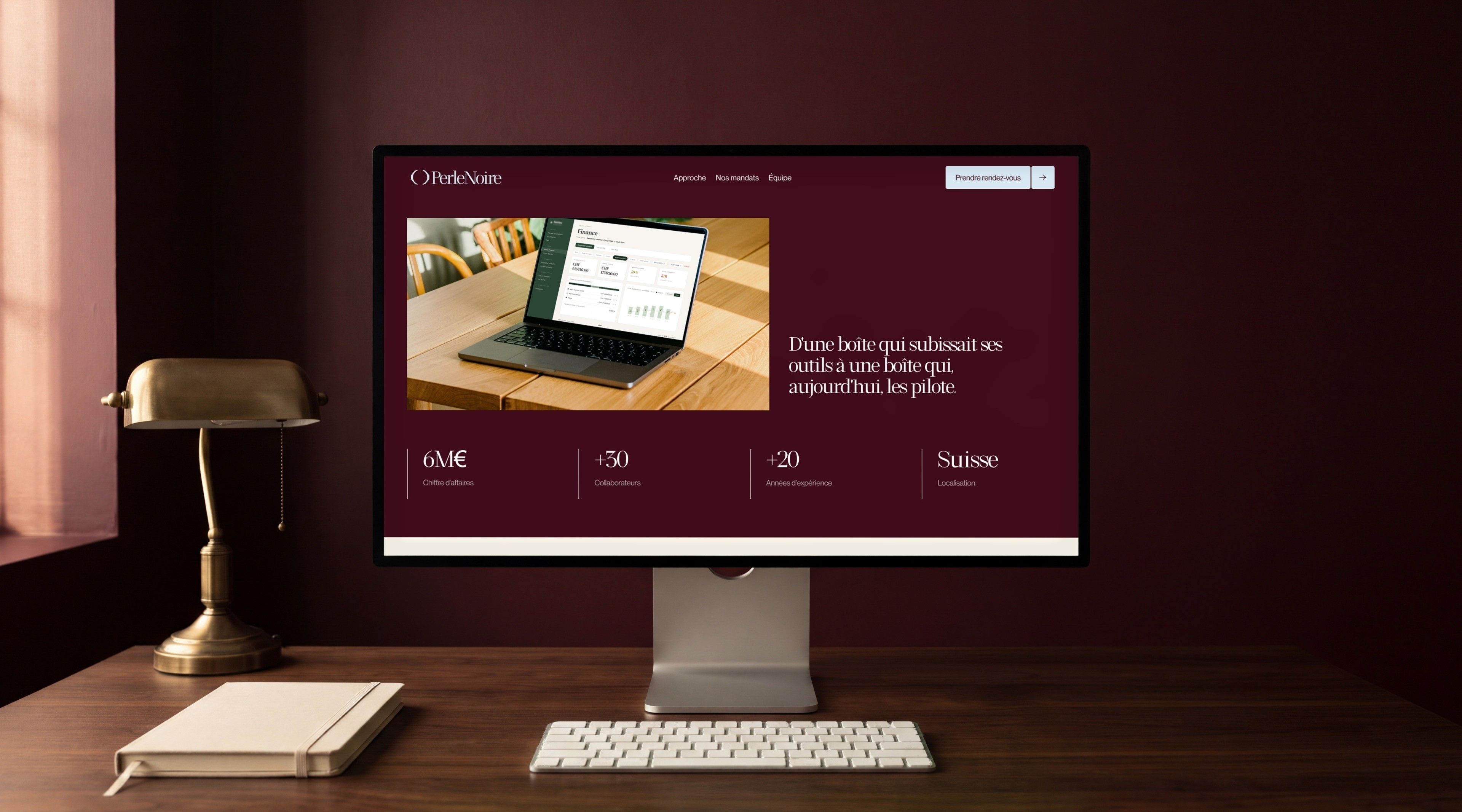
| Home | The promise “Business leader? We'll take on your biggest challenge.”, the Analyse, Build, Steer method, a logo banner, the featured case study, the two partners and the call-out “We turn down more engagements than we sign” |
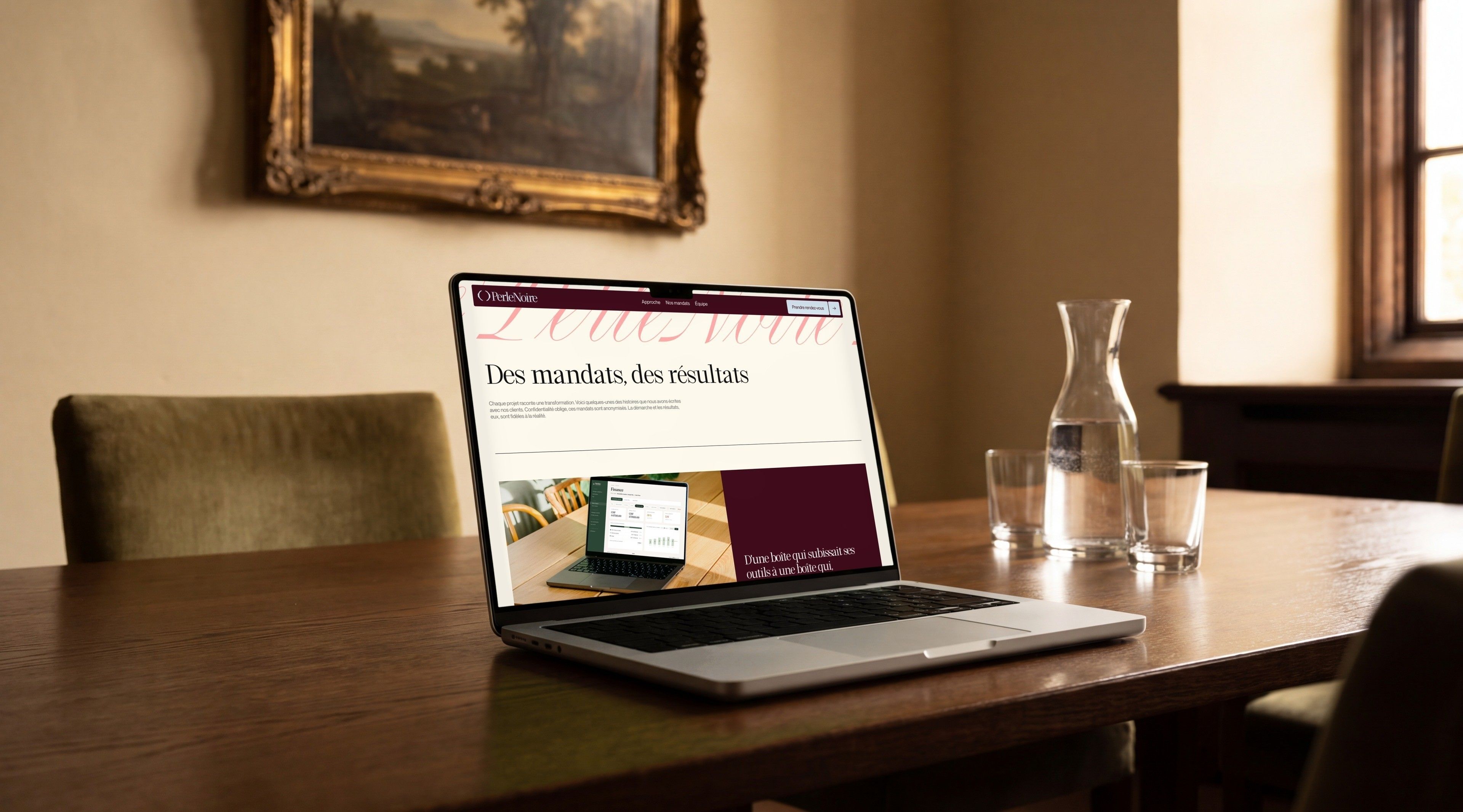
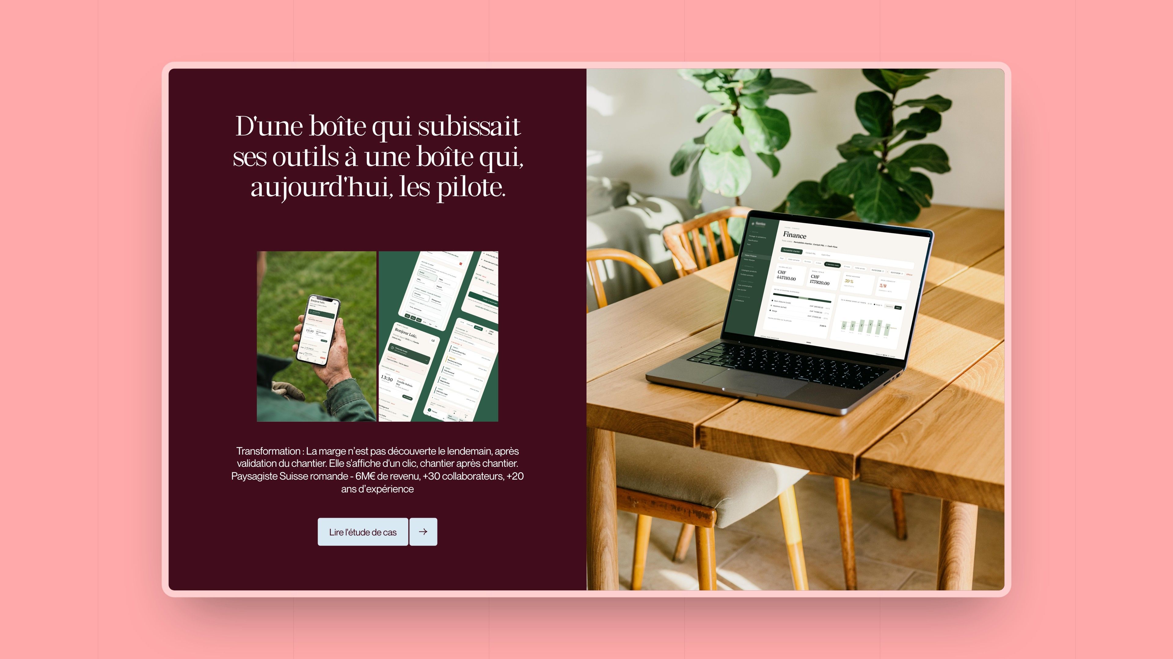
| Our engagements | Assignments told as transformations, anonymised for confidentiality, with an approach and results true to reality |
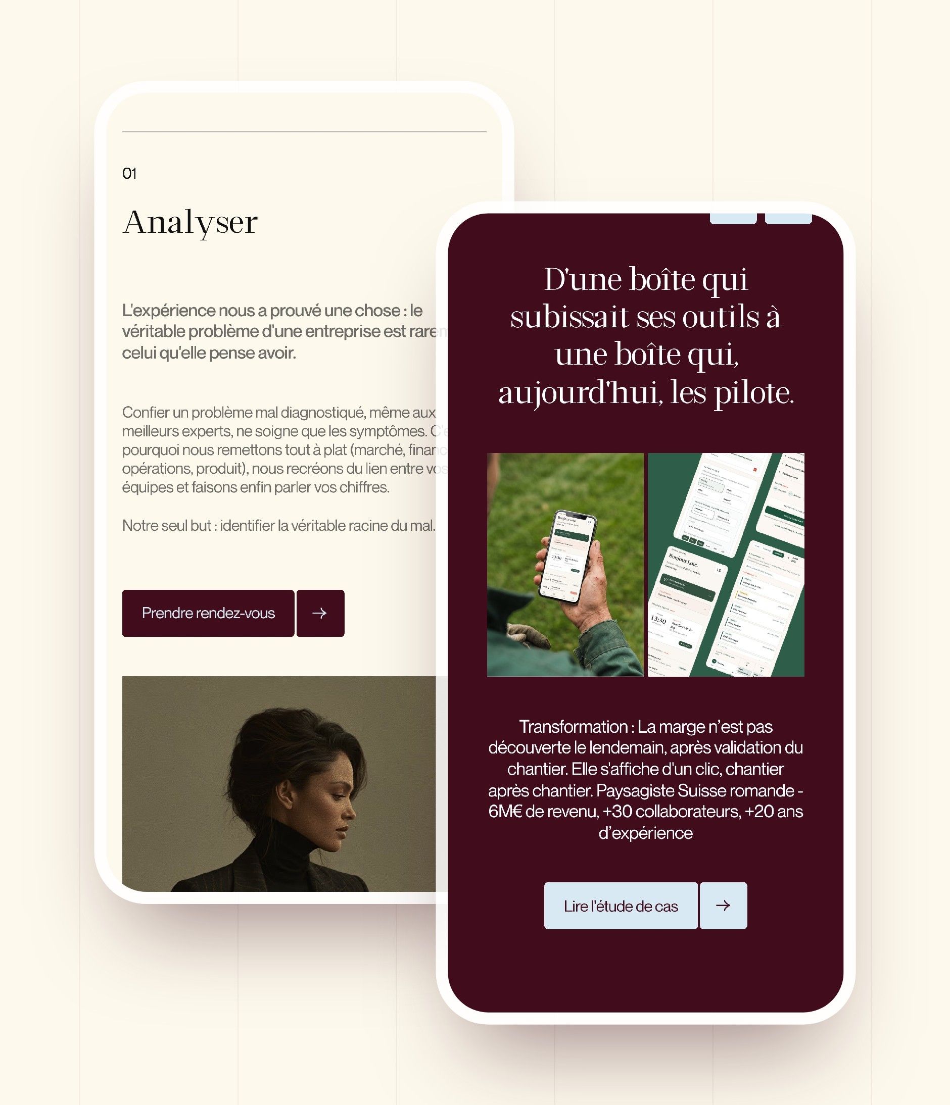
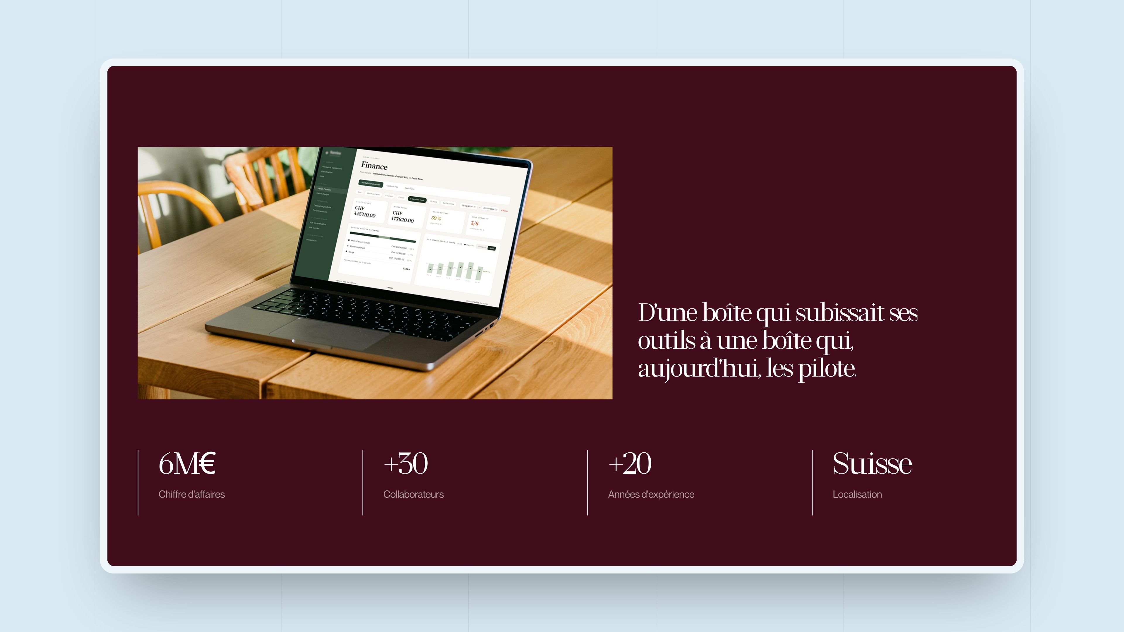
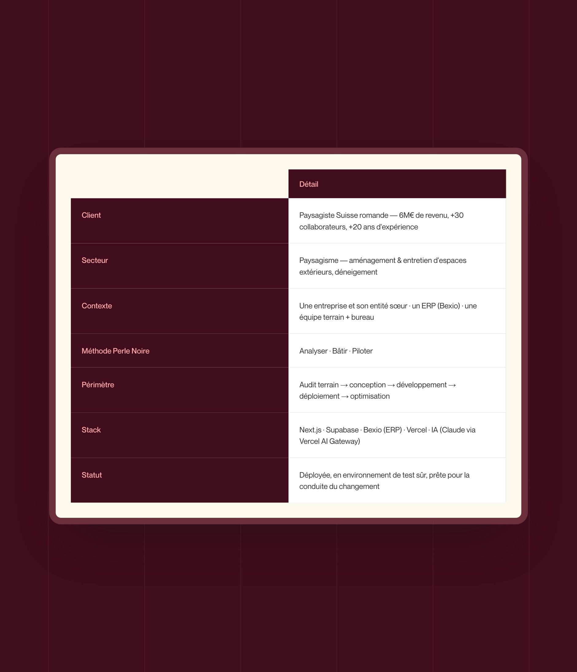
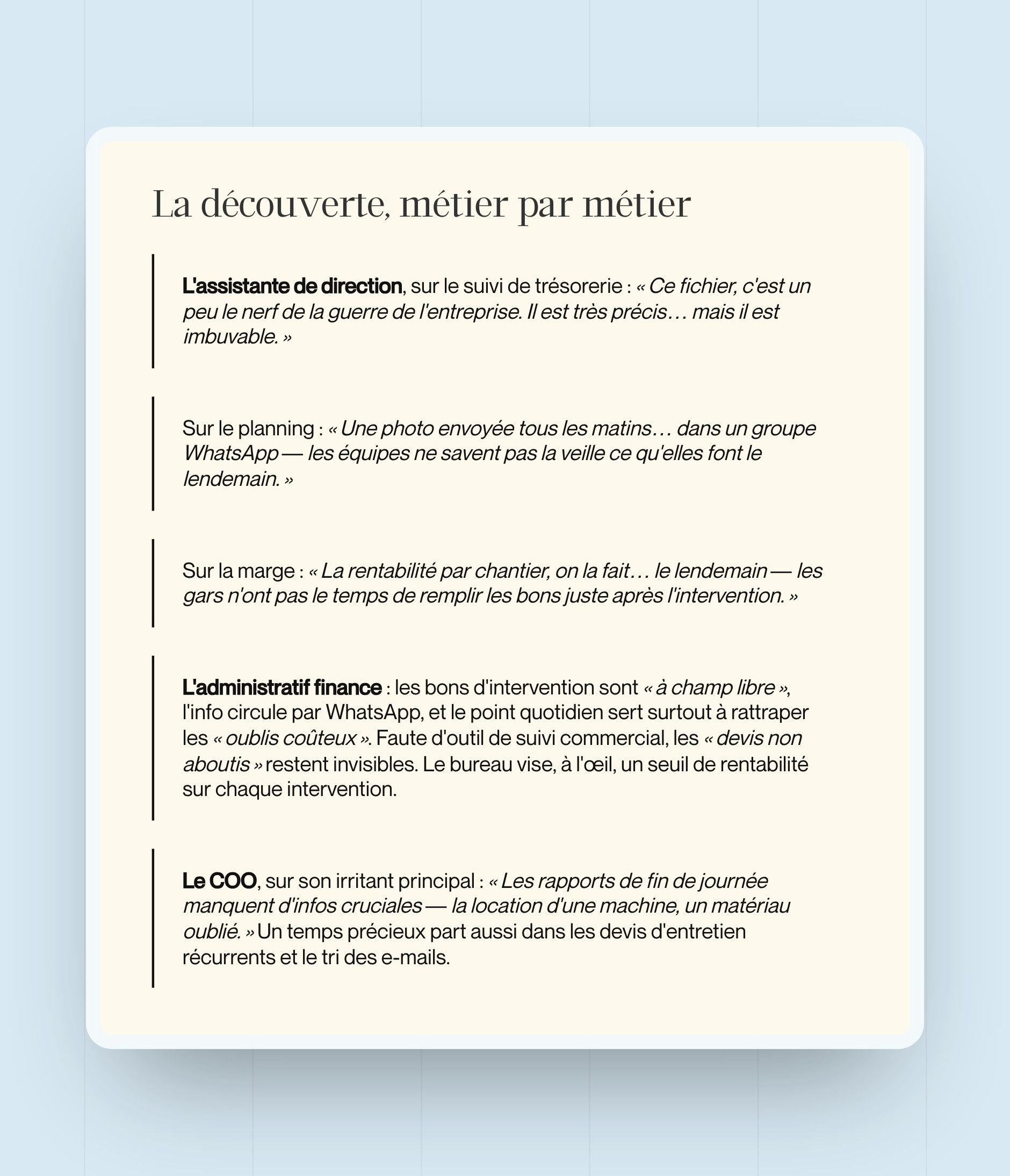
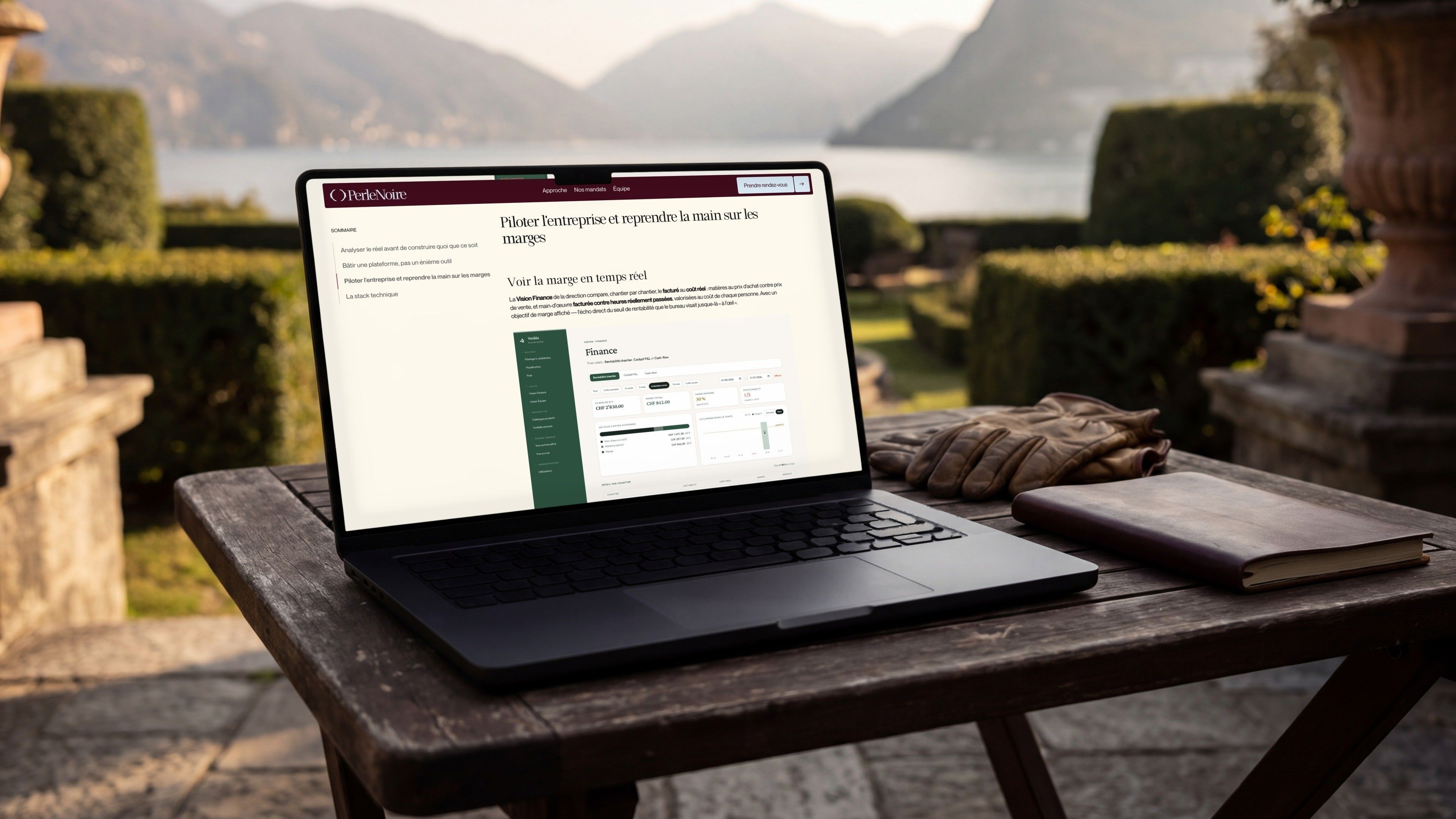
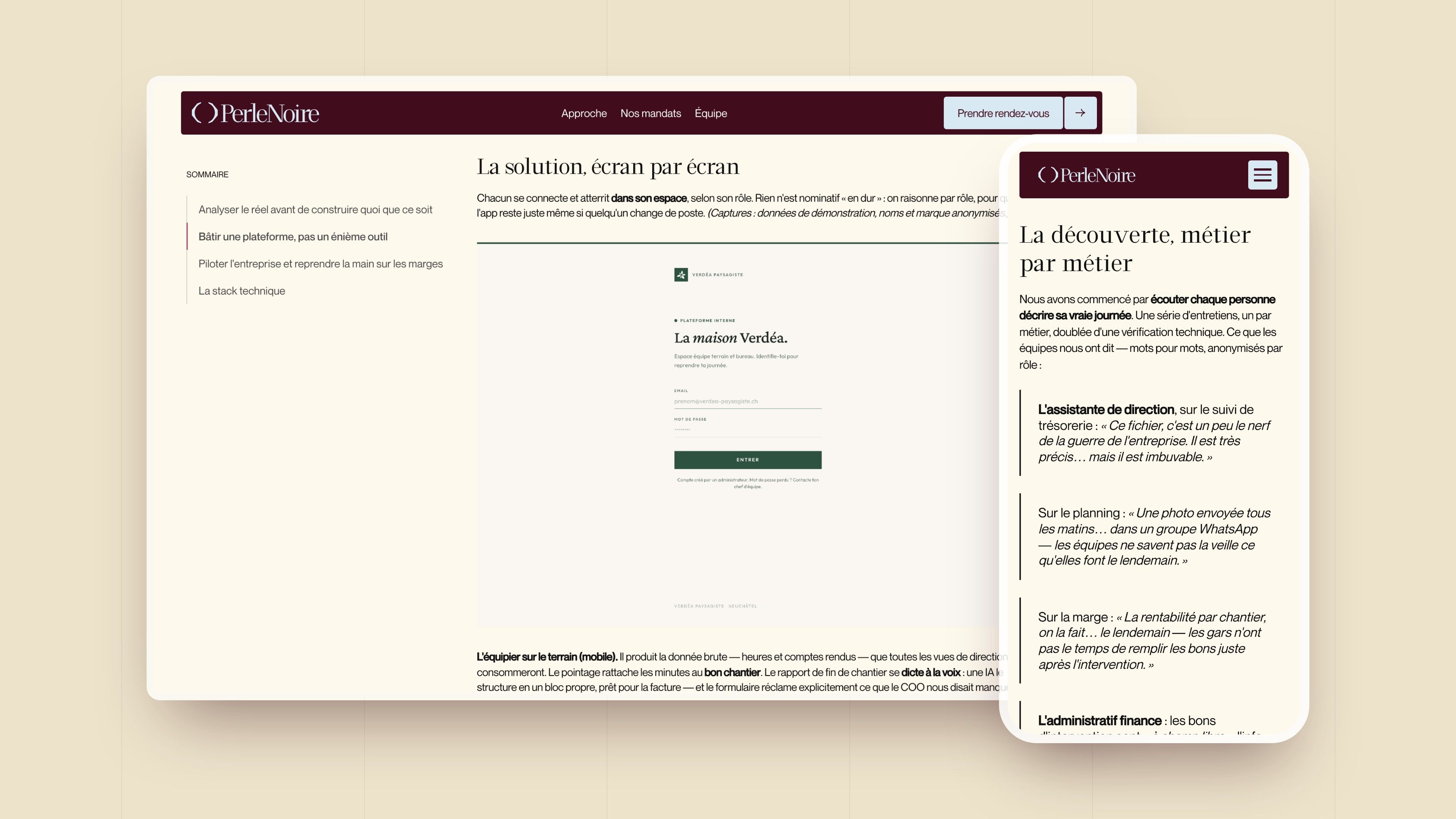
| Case study | An engagement told from start to finish: the client's key figures, table of contents, summary table, team quotes, screenshots of the solution and technical choices |
| Booking a meeting | The “Book a meeting” button, on every page, opens a WhatsApp conversation with the firm directly |
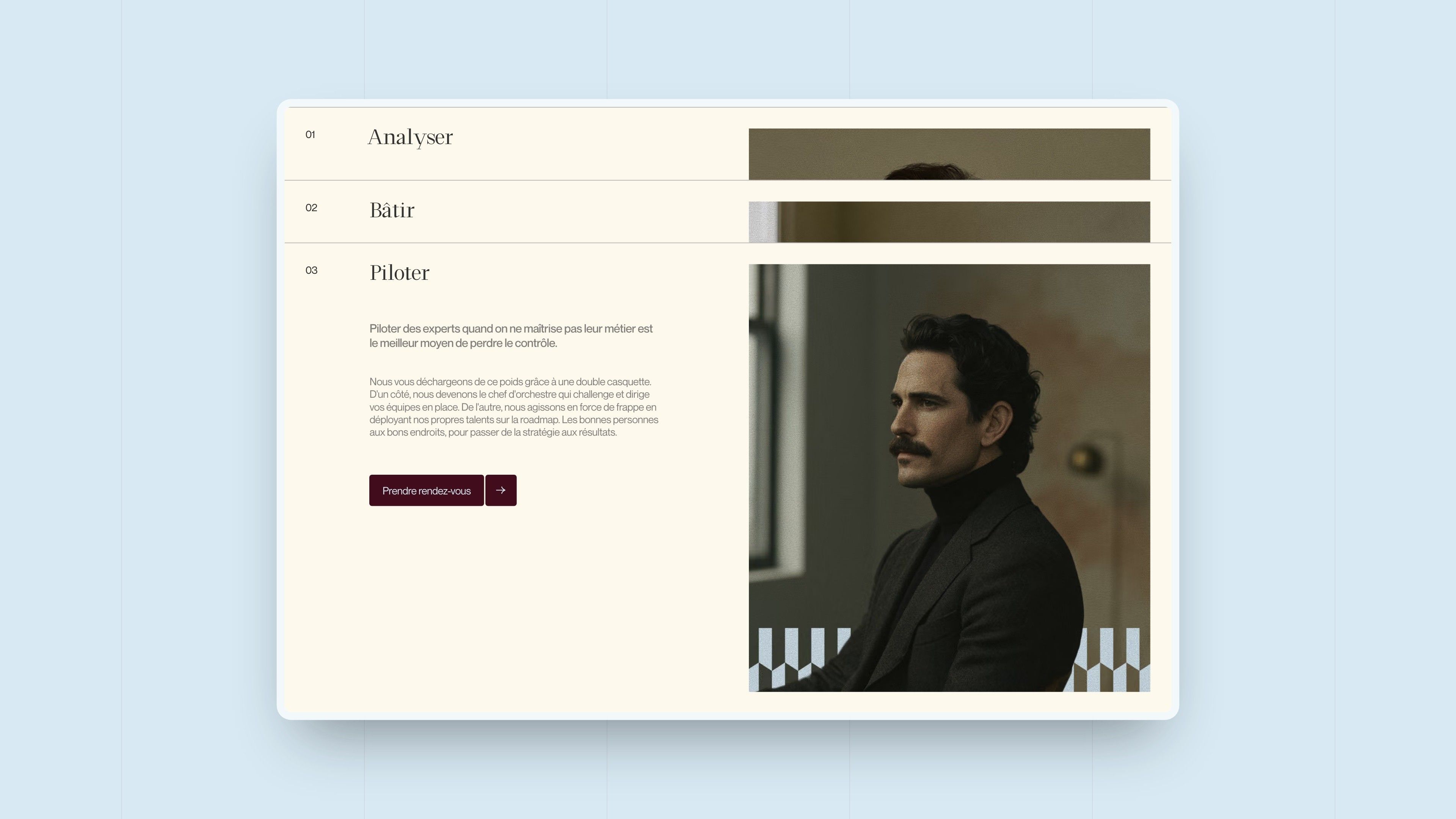
Pages alternate beige and burgundy, with light blue for call-out moments. The three steps of the method are cards that stack as you scroll, each with its portrait. The partners are presented facing the brand's script, and the footer closes on the faceted pattern. On mobile, each section recomposes into a single column, losing nothing.
Webflow Development
Engagements published from the CMS, animations that follow the reading
The site is built on Webflow. Engagements live in a CMS collection: the Our engagements page and the home page carousel fill themselves, and each engagement has its page, served by a single template: header and key figures, table of contents, then the story in rich text, tables and quotes included. Publishing a new case study takes no layout work.
The animations follow the brand's tone, without showing off. Headings come in word by word, each rising from its line with a slight blur (GSAP and SplitText), the method cards slot in under one another as you scroll, and both the engagements carousel and the logo banner rotate with Splide.


Our latest projects
+250 companies
supported
Websites designed and developed with









You're going to working with us, guaranteed
Ready to launch
your business?
Let’s f*****G GO !!