Branding
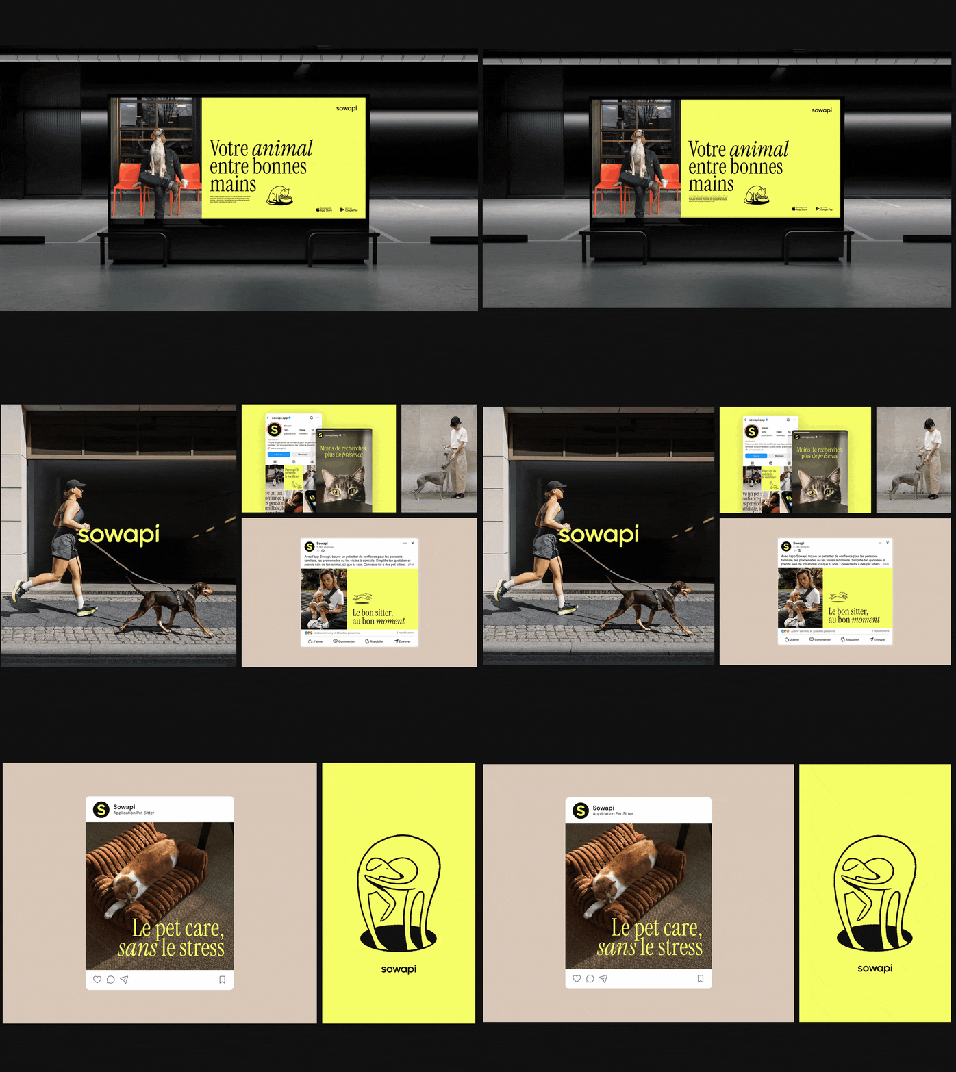
Two directions were proposed, built around the same promise: positioning Sowapi as the benchmark for trusted pet care. The first focused on energy and lifestyle, with a saturated palette, bold condensed typography, and an identity designed for social feeds. The second leaned into a premium signal: signature electric yellow, a mix of italic and regular serif fonts, and hand-drawn illustrations—a direction that works just as well for large-format advertising as it does for digital.
The selected direction
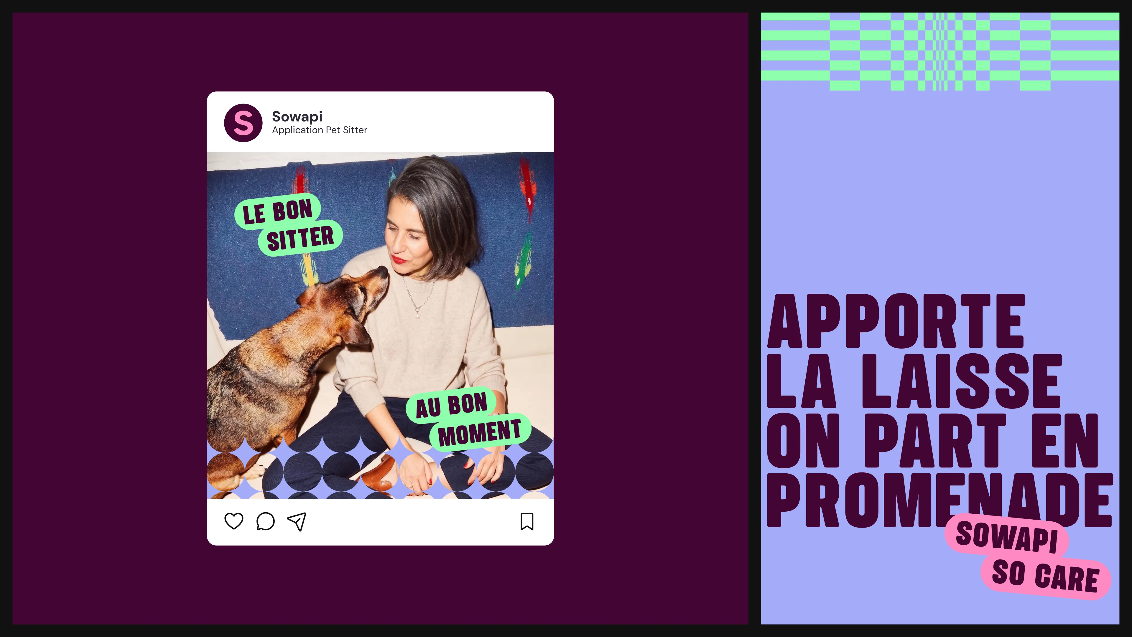
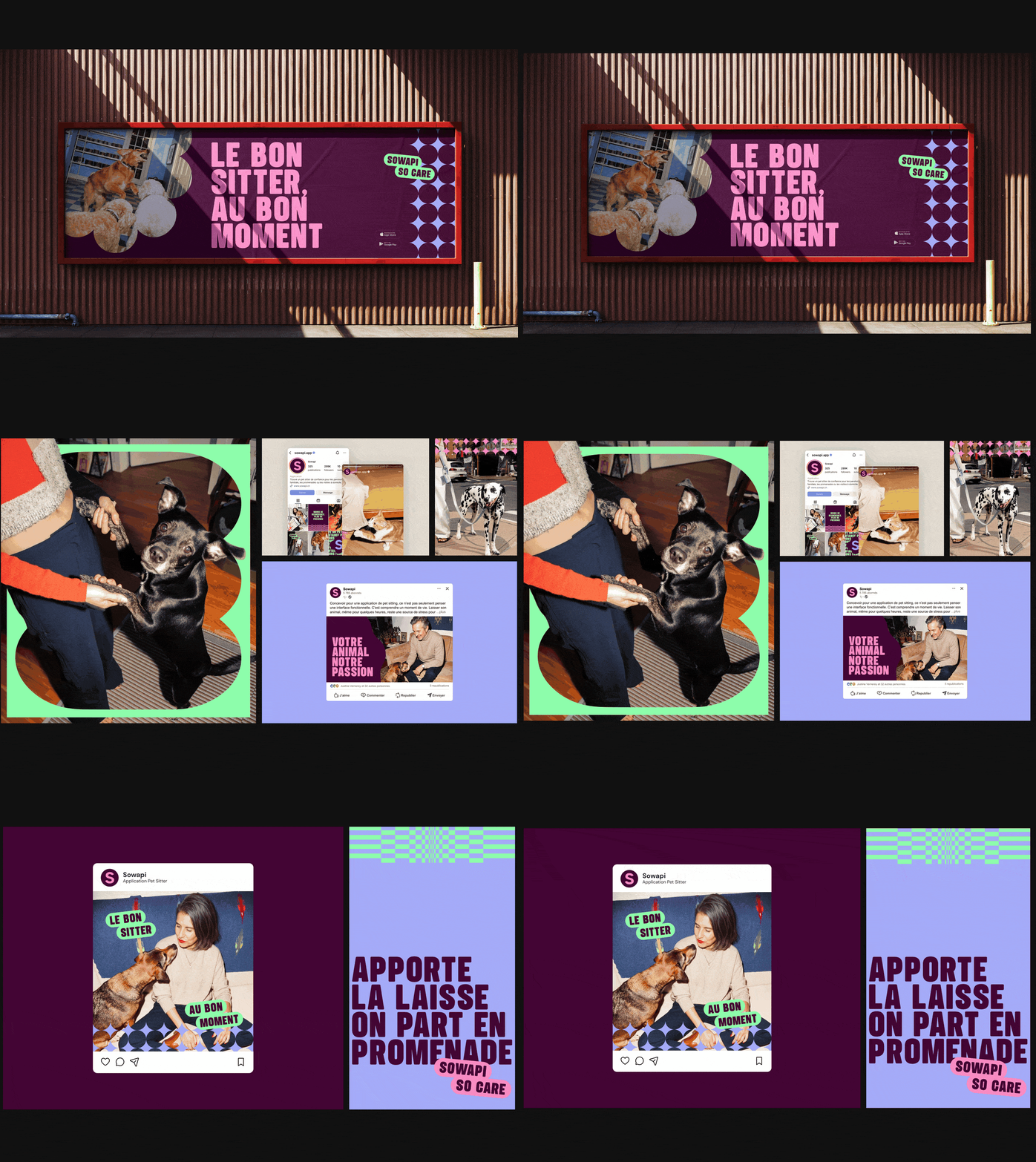
Sowapi chose energy. The direction was then refined over three iterations with the founders: better highlighting the "super app" positioning rather than just pet sitting, showcasing the identity applied within the product and around Kosia, the conversational AI, and lightening the palette by removing the yellow to make room for four bold, clear colors.
| Élément | Système |
|---|
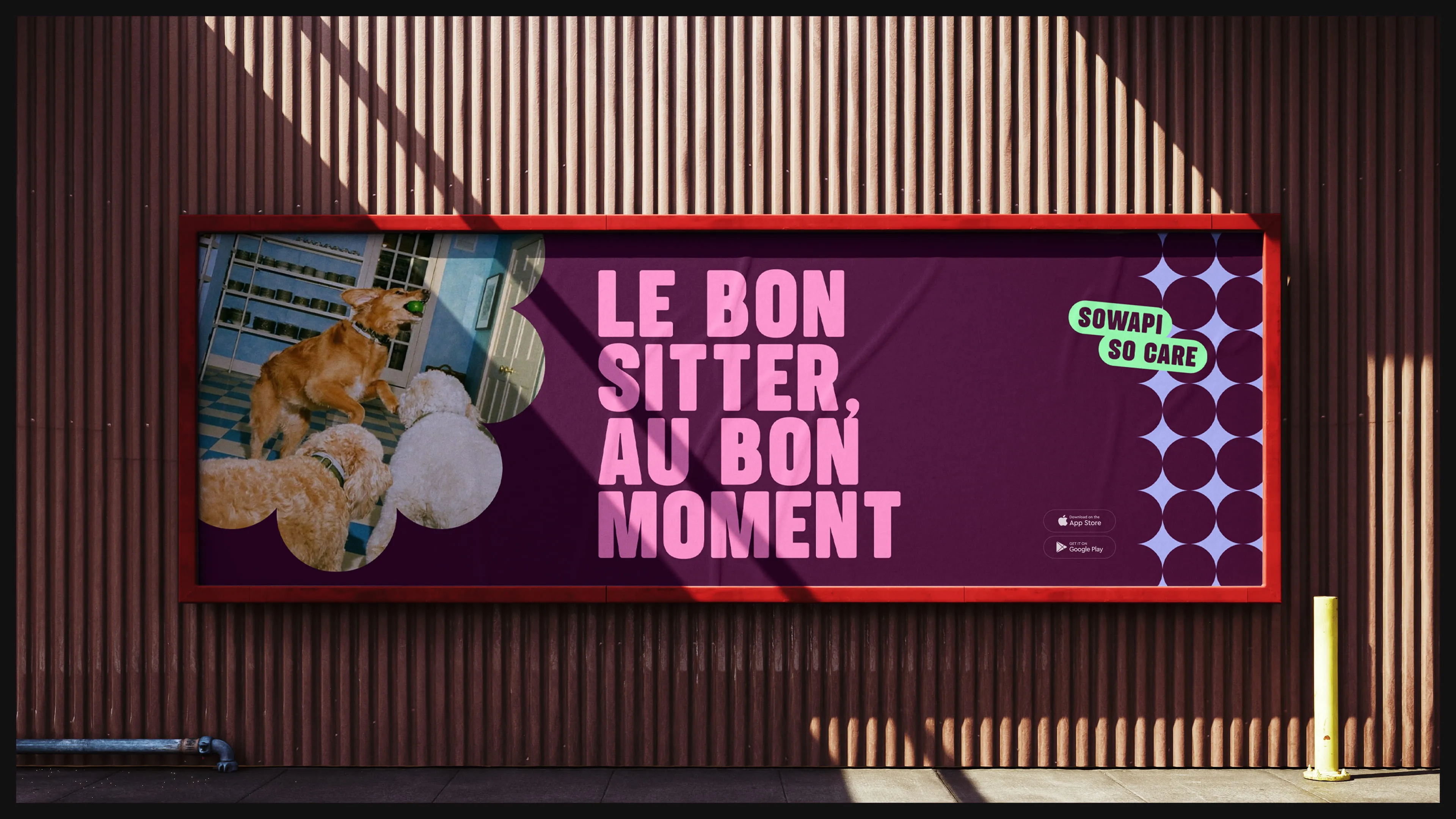
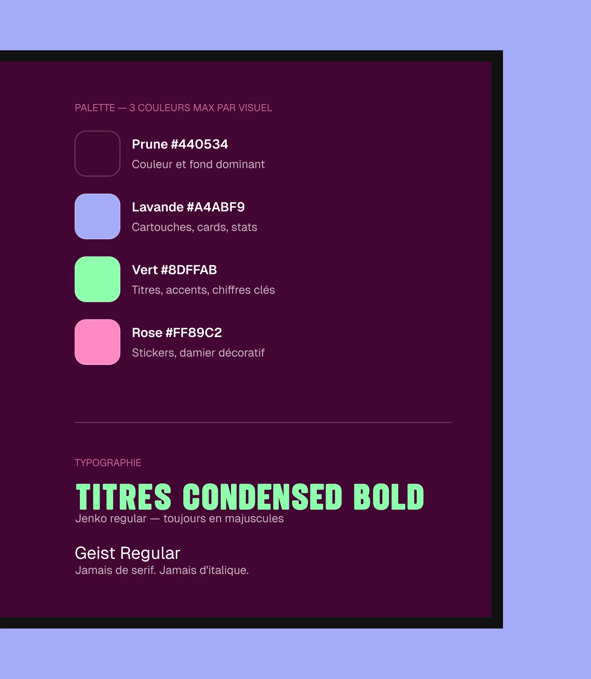
| Palette | Prune #440534 en couleur et fond dominants, Lavande #A4ABF9 pour les cartouches et les stats, Vert #8DFFAB pour les titres et chiffres clés, Rose #FF89C2 pour les stickers et le damier. Trois couleurs maximum par visuel. |
| Typographie | Jenko en condensed bold, toujours en majuscules, pour les titres ; Geist Regular pour le texte courant. Jamais de serif, jamais d'italique. |
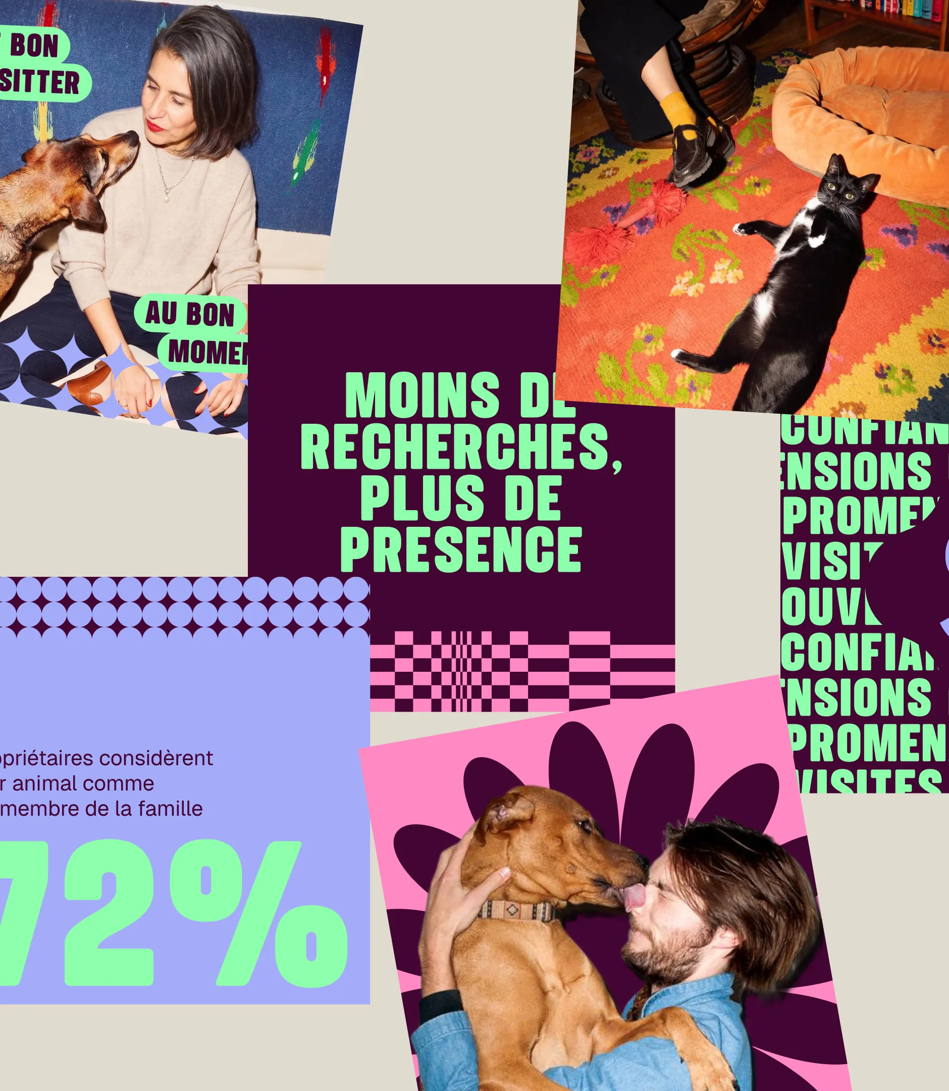
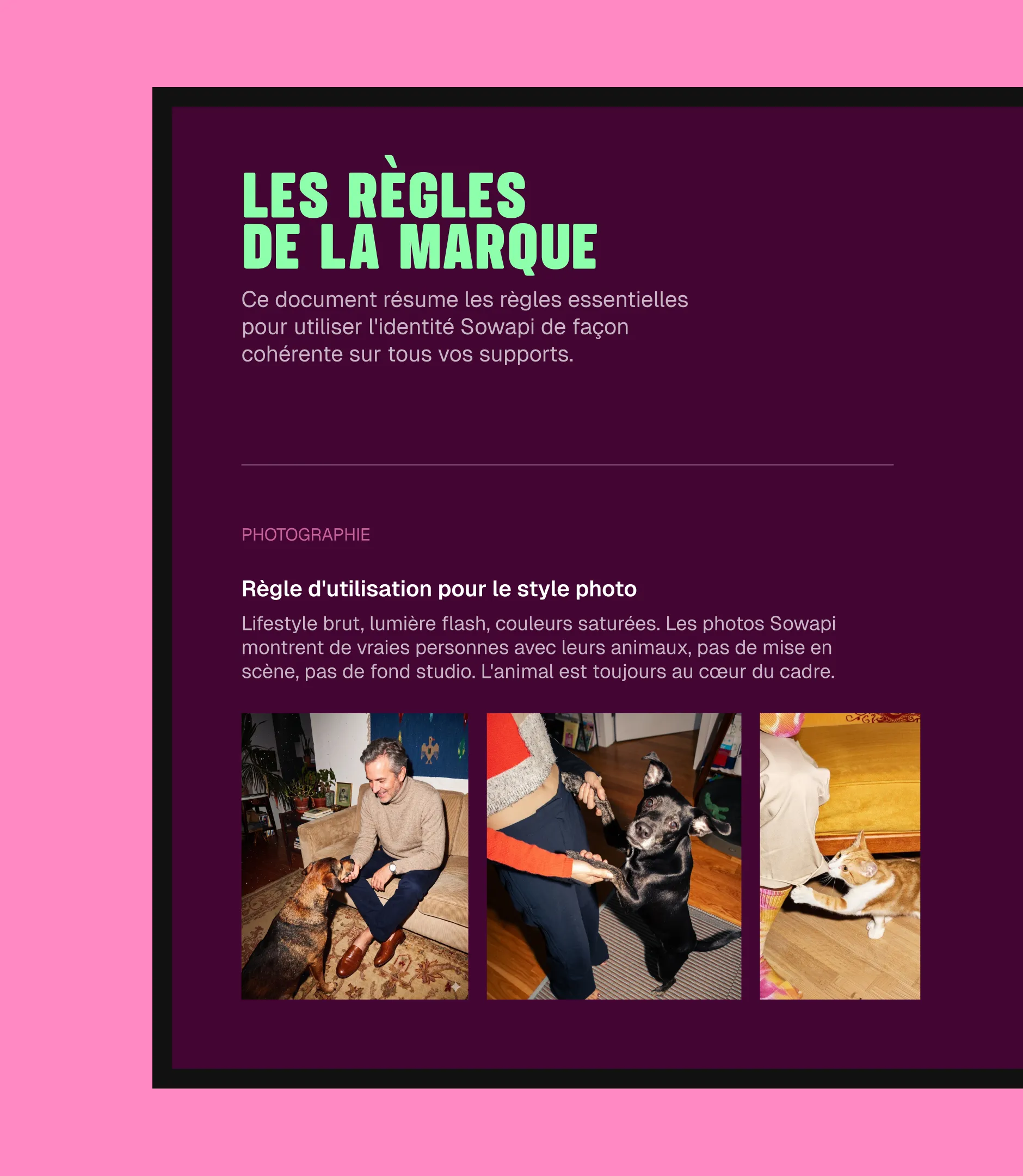
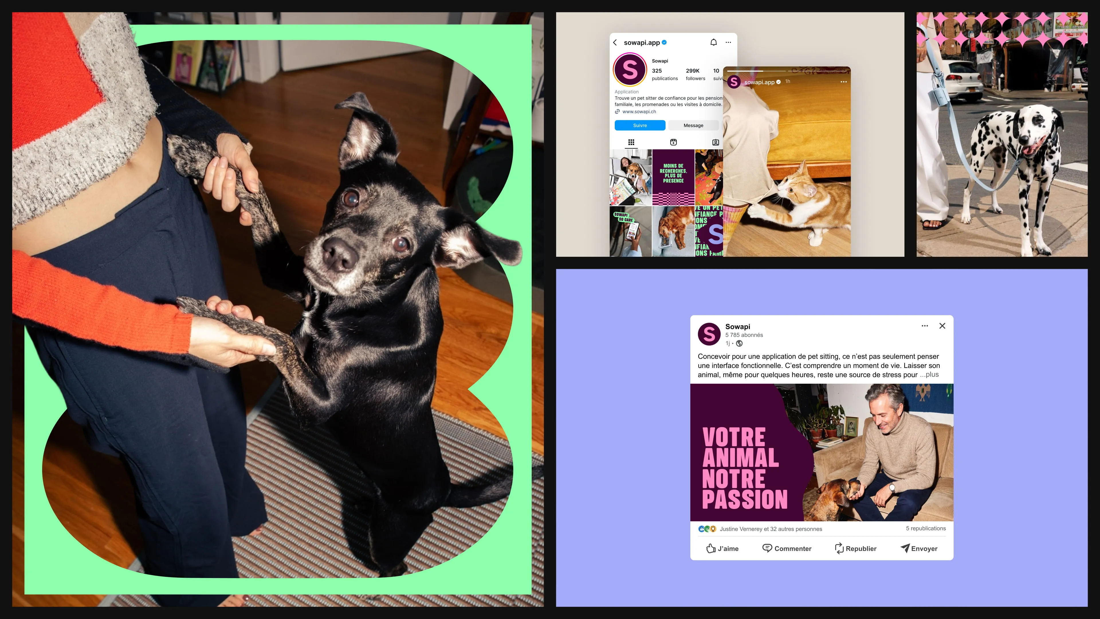
| Photographie | Photos flash lifestyle, de vraies personnes avec de vrais animaux, pour ancrer la marque dans le quotidien des pet parents. |
| Motifs graphiques | Étoile posée sur les photos mais toujours sous le texte, damier décoratif, formes blob pour contenir un texte, encadrer une photo ou servir de masque. |
| Labels & stickers | Cartouches typographiques (« Réservé en 2 min », « So care ») qui ponctuent les visuels et construisent un langage reconnaissable sur les réseaux. |
| Logo | Logo officiel et règles d'usage : pas de changement de couleur, pas d'effet, pas de rotation, pas de déformation, contraste préservé. |
A brand tested before delivery
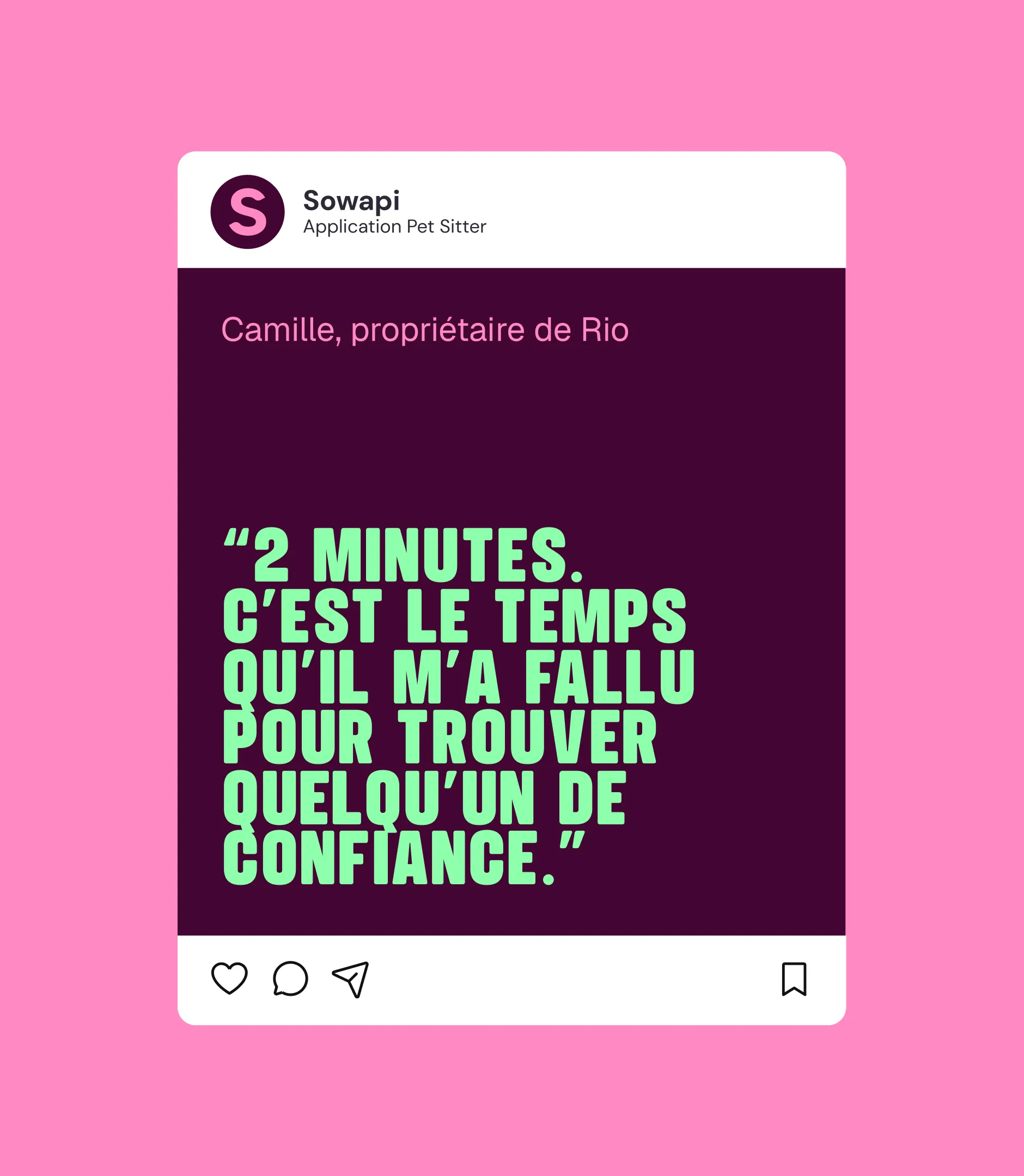
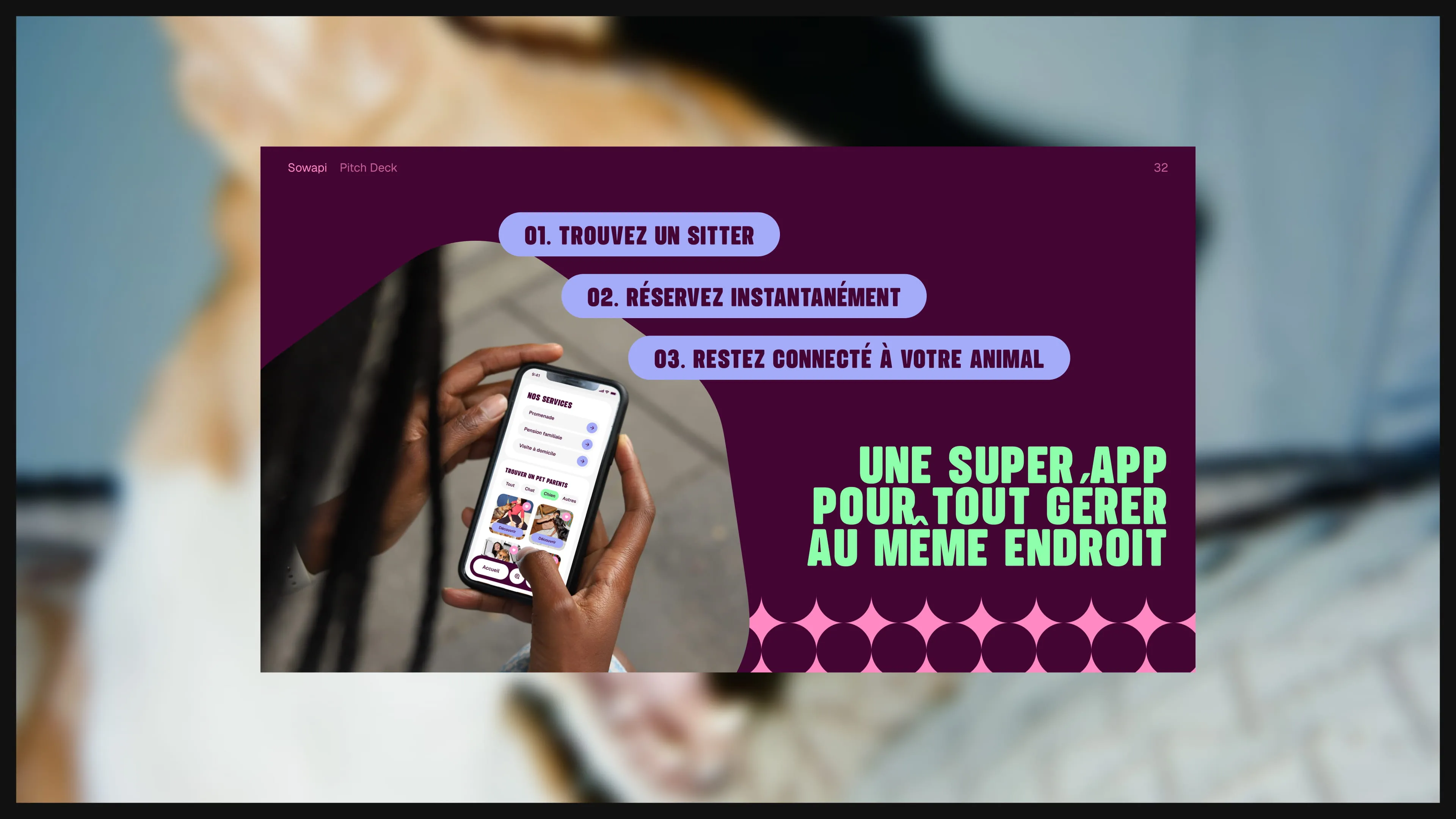
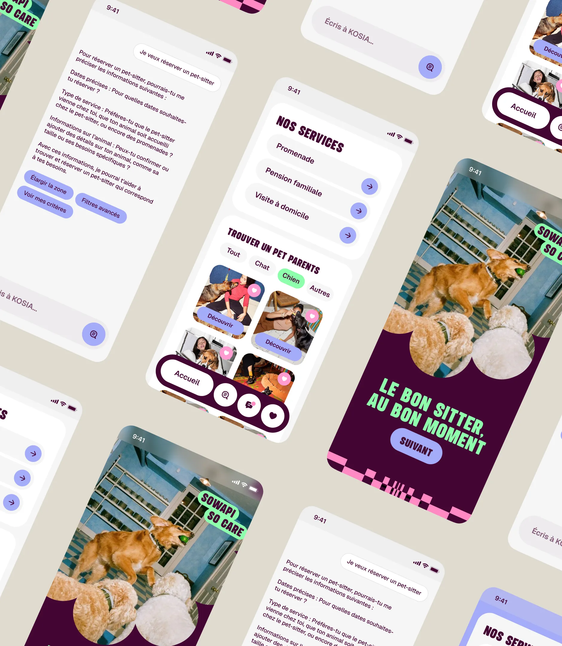
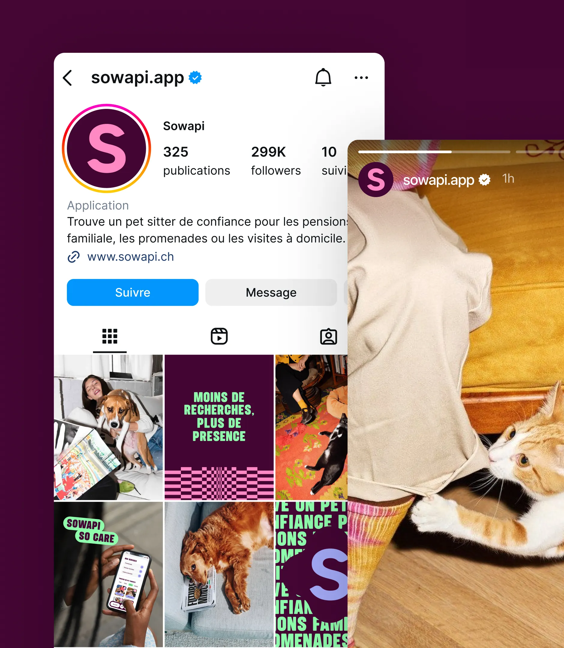
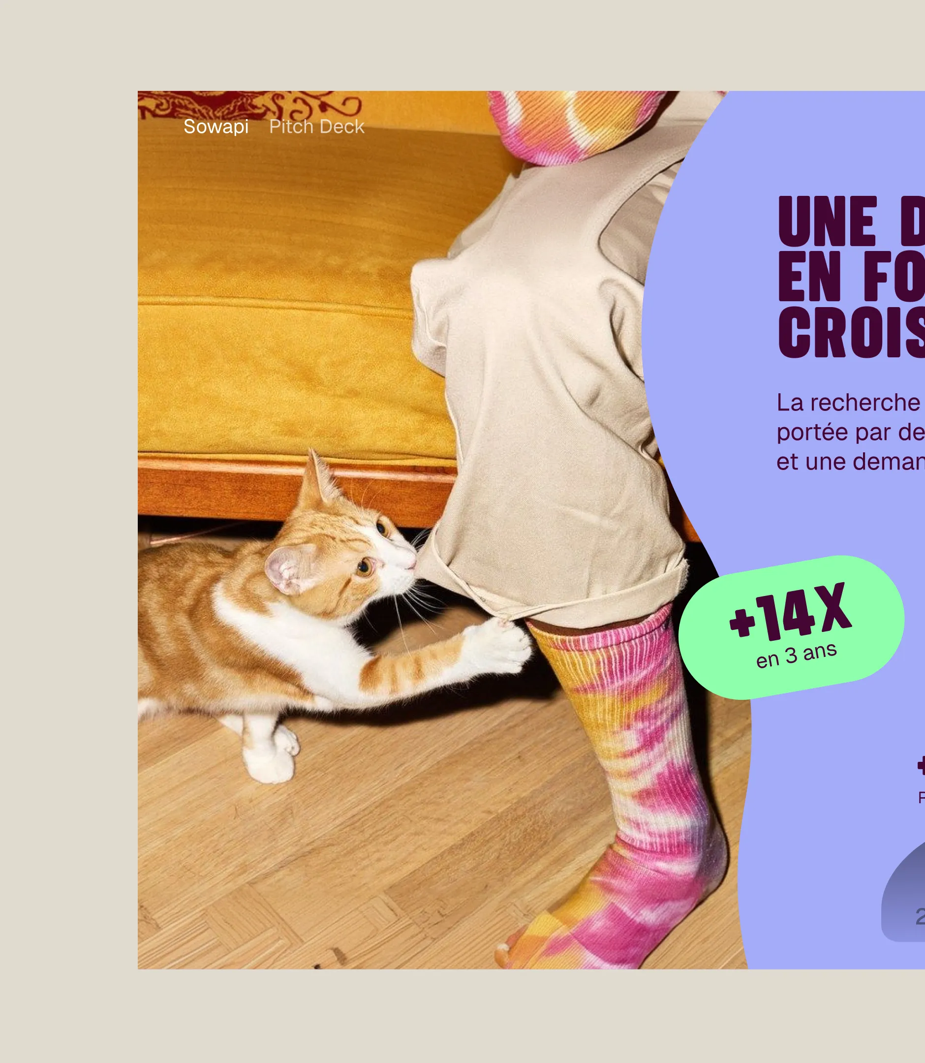
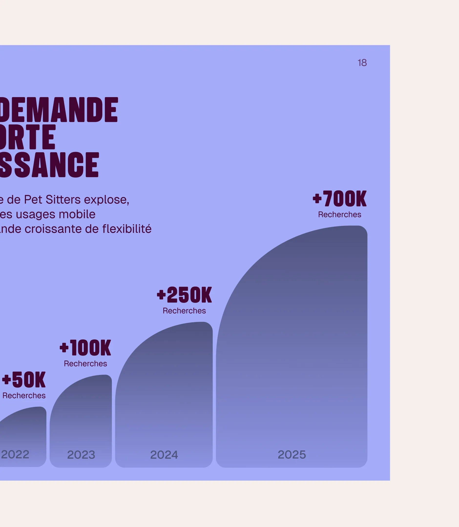
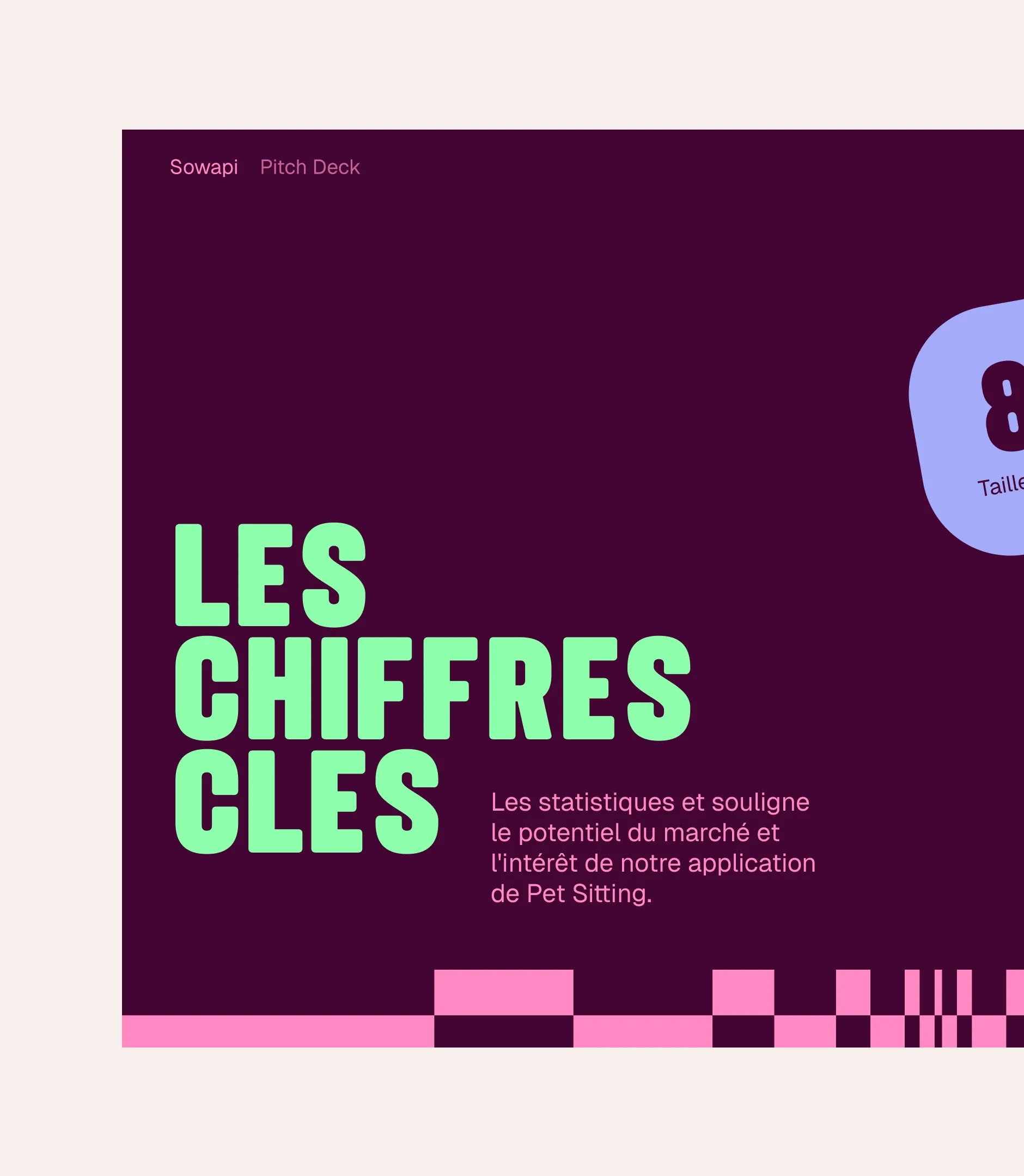
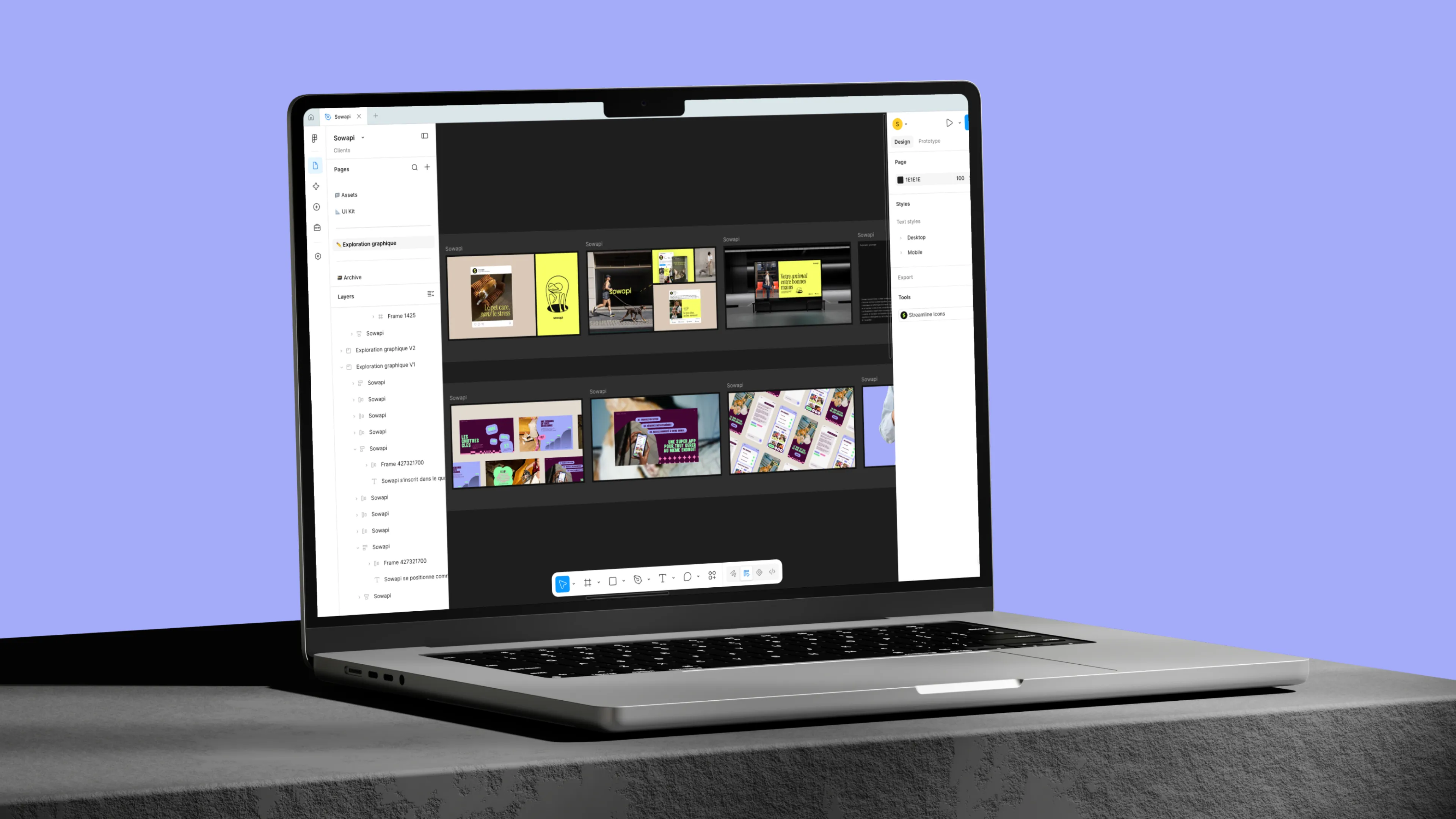
Rather than delivering an abstract style guide, Gemeos applied the system to the assets Sowapi would actually produce: a pitch deck for fundraising (market figures, promise, user journey), a series of Instagram posts and stories, and app screens (sitter search, filters, services, conversation with Kosia) that show the identity within the product. Everything is compiled into a brand guidelines document and a Figma UI Kit, harmonized asset by asset, so the Sowapi team can roll out the identity without depending on a designer.









.webp)



.avif)