Projects
 Our Offers
 Dedicated team
 Blog
 Academy
 About Us
En Immersion: art direction, design and Webflow website for an immersive retreat agency
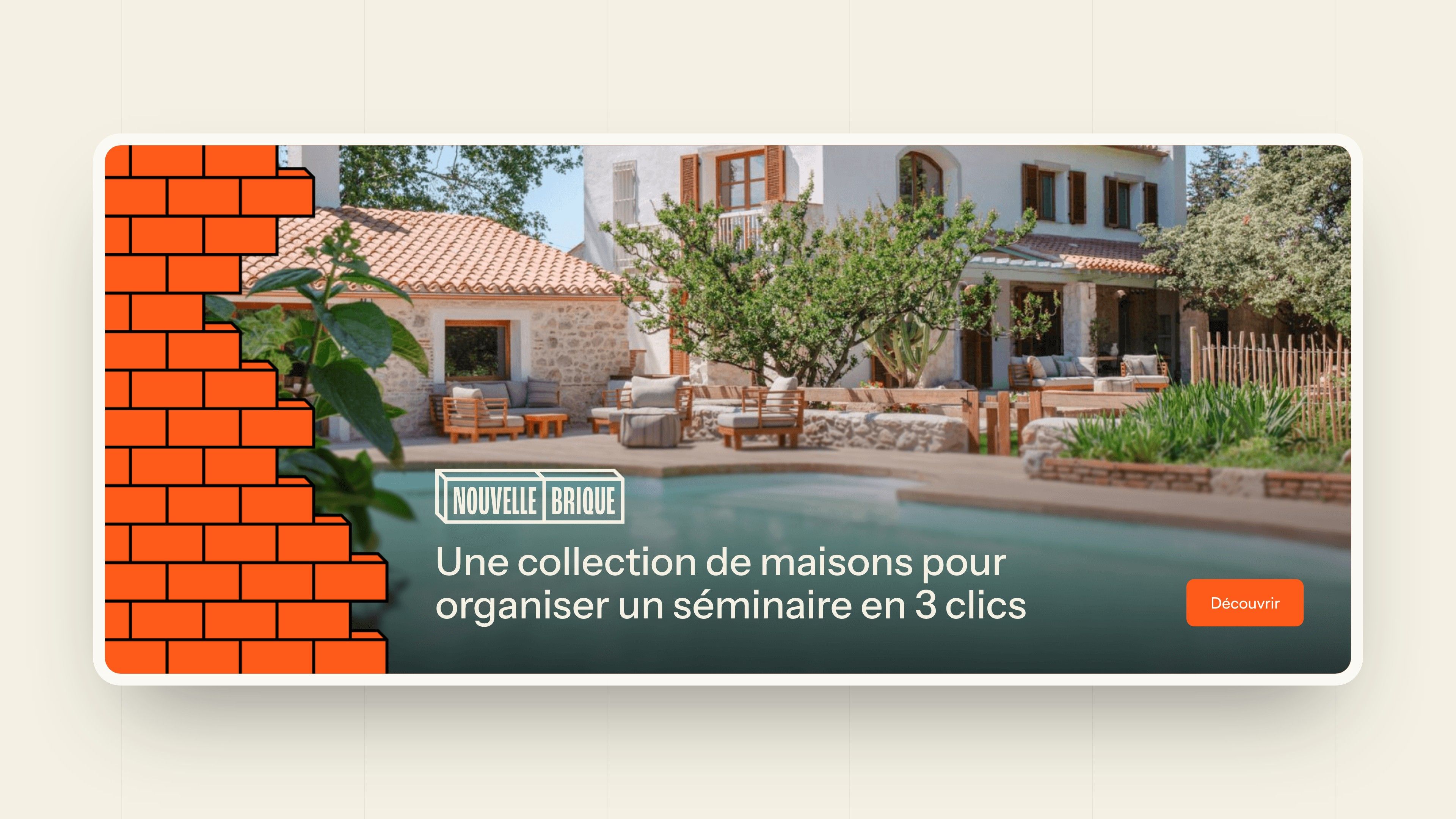
En Immersion is a travel agency registered with Atout France, born in Toulouse, that produces off-the-beaten-track company retreats: from 5 to 600 people, by train, in France and Europe, in a privately booked house and alongside locals who keep a craft alive. Its collection of houses, Nouvelle Brique, lets you choose a venue and then put your retreat together.
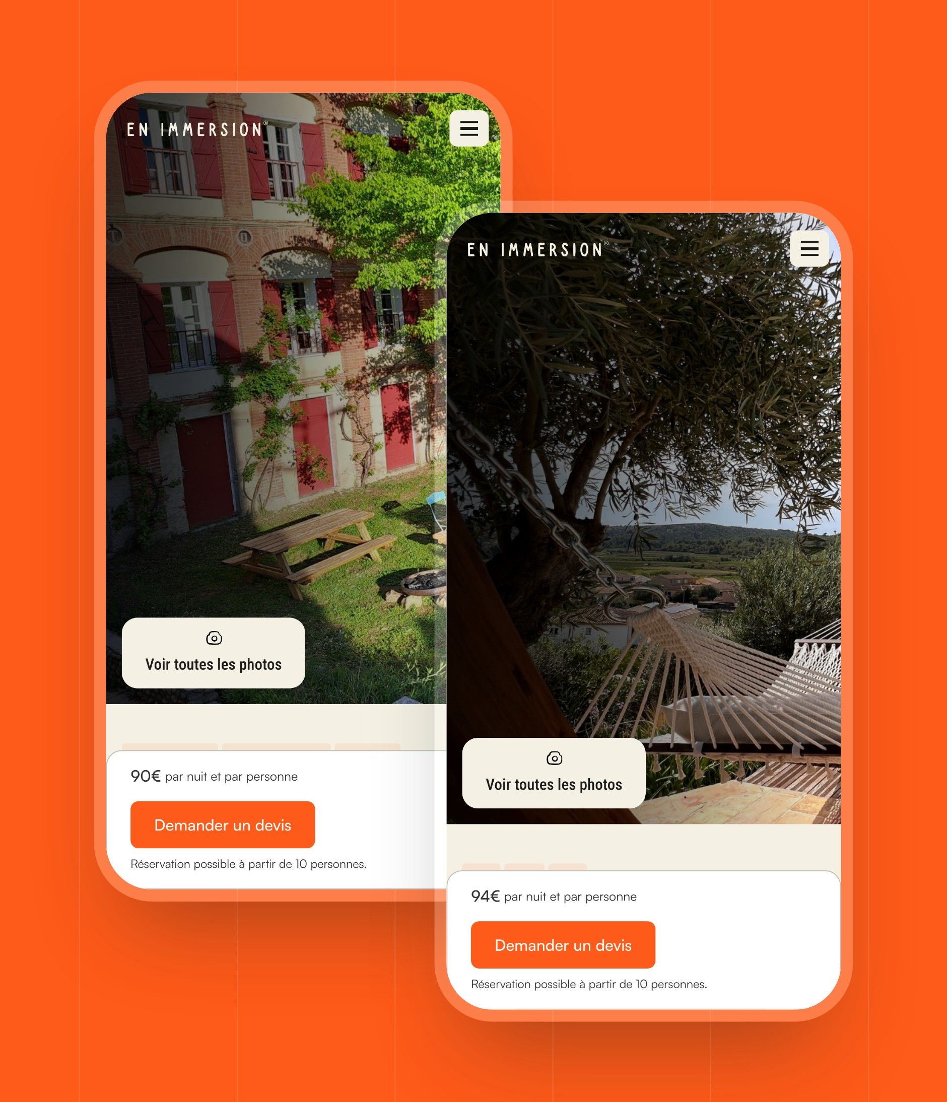
En Immersion entrusted Gemeos, a web agency for events, with the art direction of Nouvelle Brique and then of its whole website, along with the design and Webflow development.
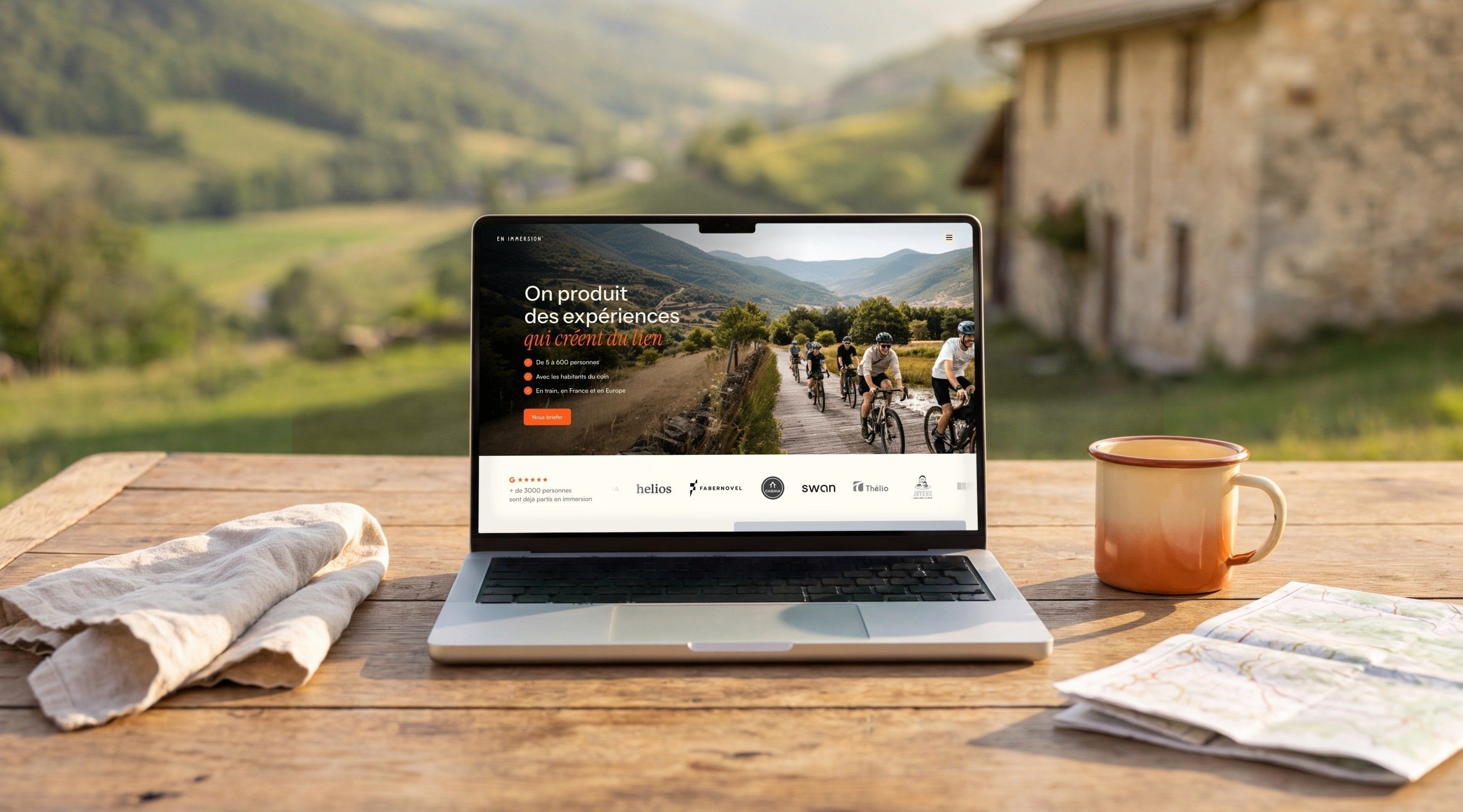
Making people want to leave the office, and go together
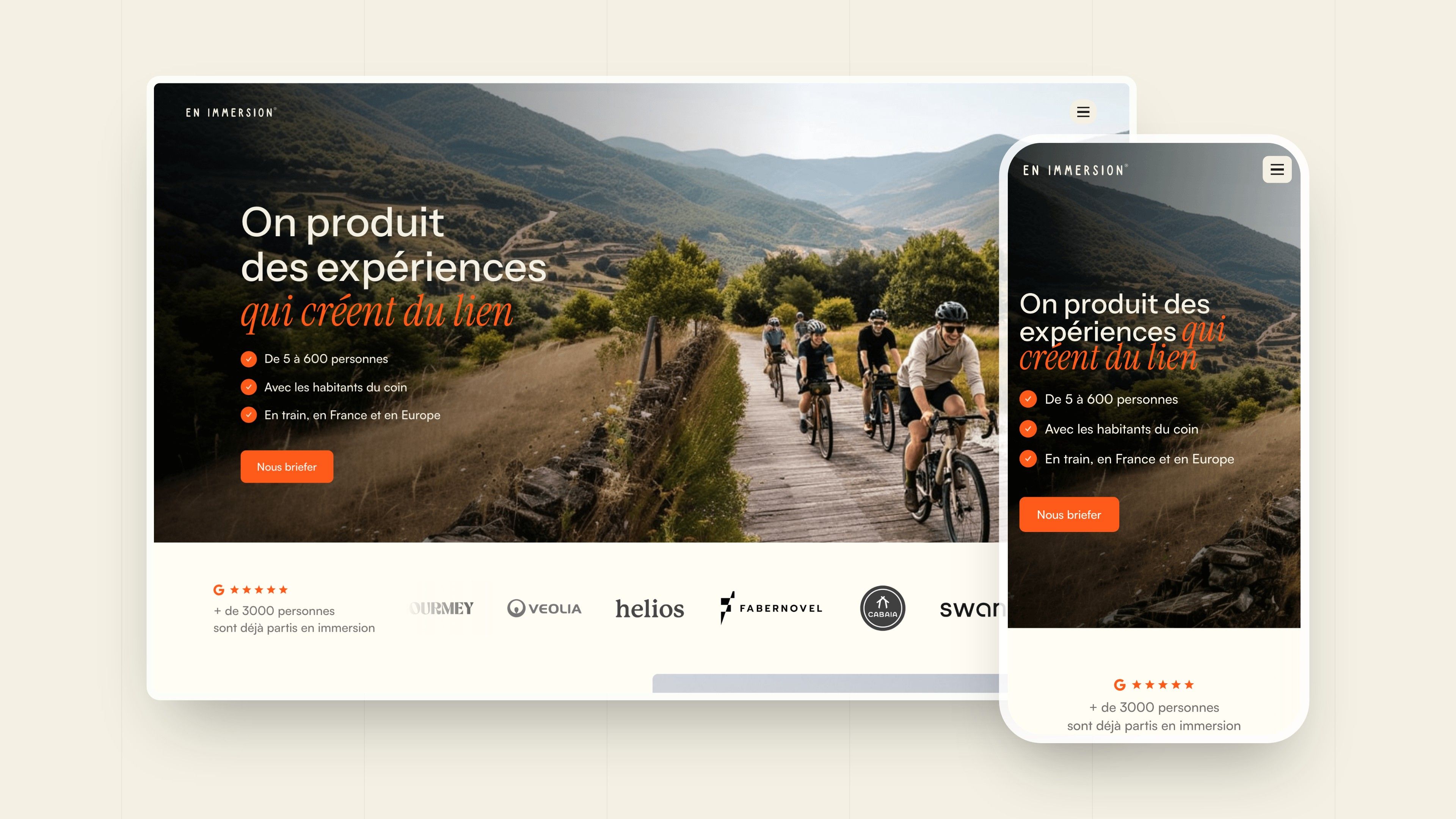
An En Immersion retreat is not like a classic company offsite: you travel by train, book a whole house or estate, and spend a few days with a shepherd, an oyster farmer or a mountain guide. The site had to convey this from the very first screen, speak to the HR managers and executives who organise, and make the offer easy to read: tailor-made retreats for companies, guides for individuals and a collection of houses, Nouvelle Brique.
Gemeos started with Nouvelle Brique: several look & feel directions, a logo made of two stacked bricks, then the collection page and its house pages. The identity was then extended to the whole En Immersion site, redesigned on Webflow: home page, company offer, individuals, about, case studies and houses, managed from the CMS.
- Industry
- Events
- Services
- Services
- Artistic Direction
- UX/UI Design
- Development
Look & Feel
A warm brand that smells of the great outdoors
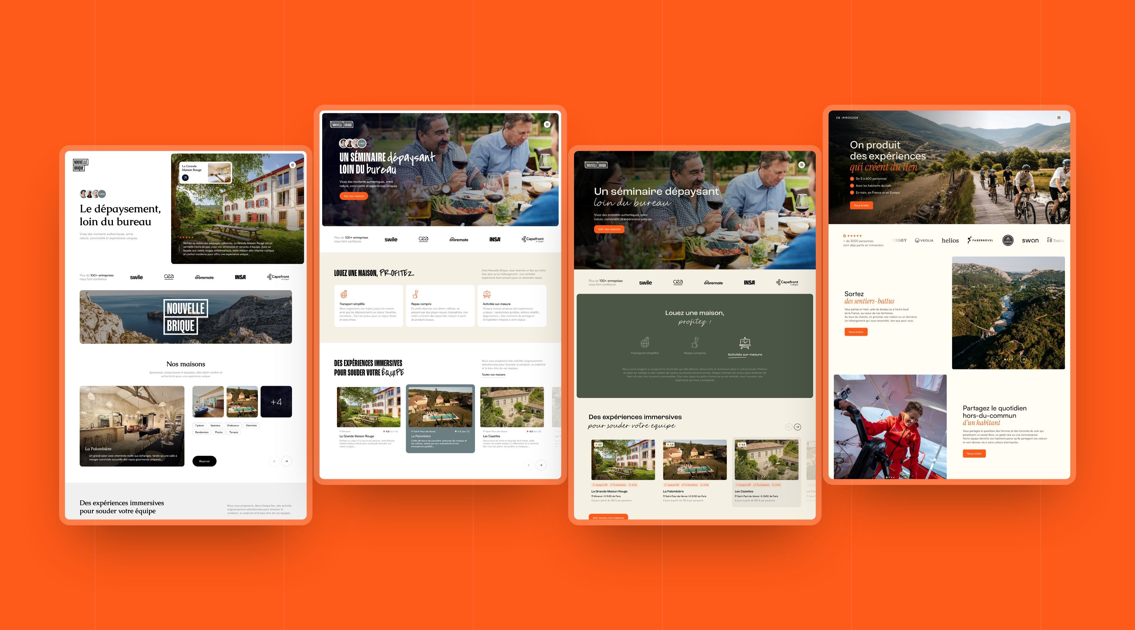
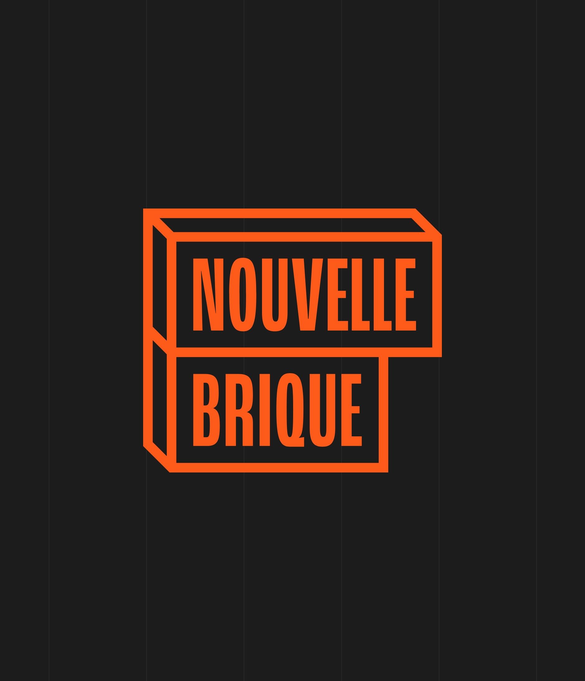
The first directions were designed for Nouvelle Brique, En Immersion's collection of houses: an editorial version in serif on a white background, a poster version in condensed capitals over a mountain landscape, and a third, available in several shades, that combines handwriting with a wall of orange bricks. It was the one that set the tone for the whole site.
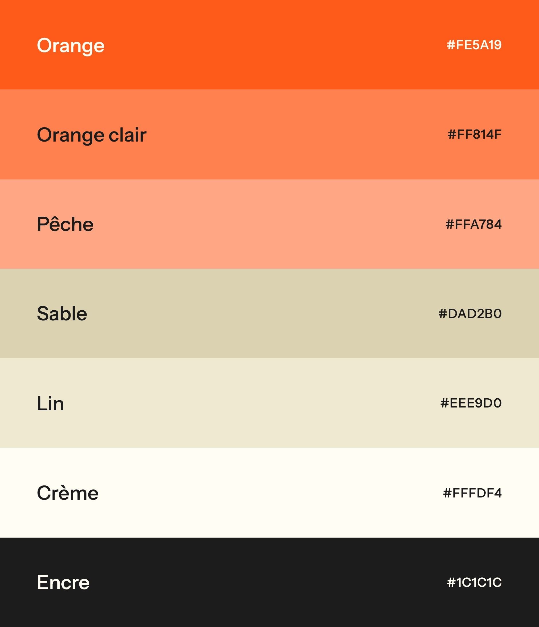
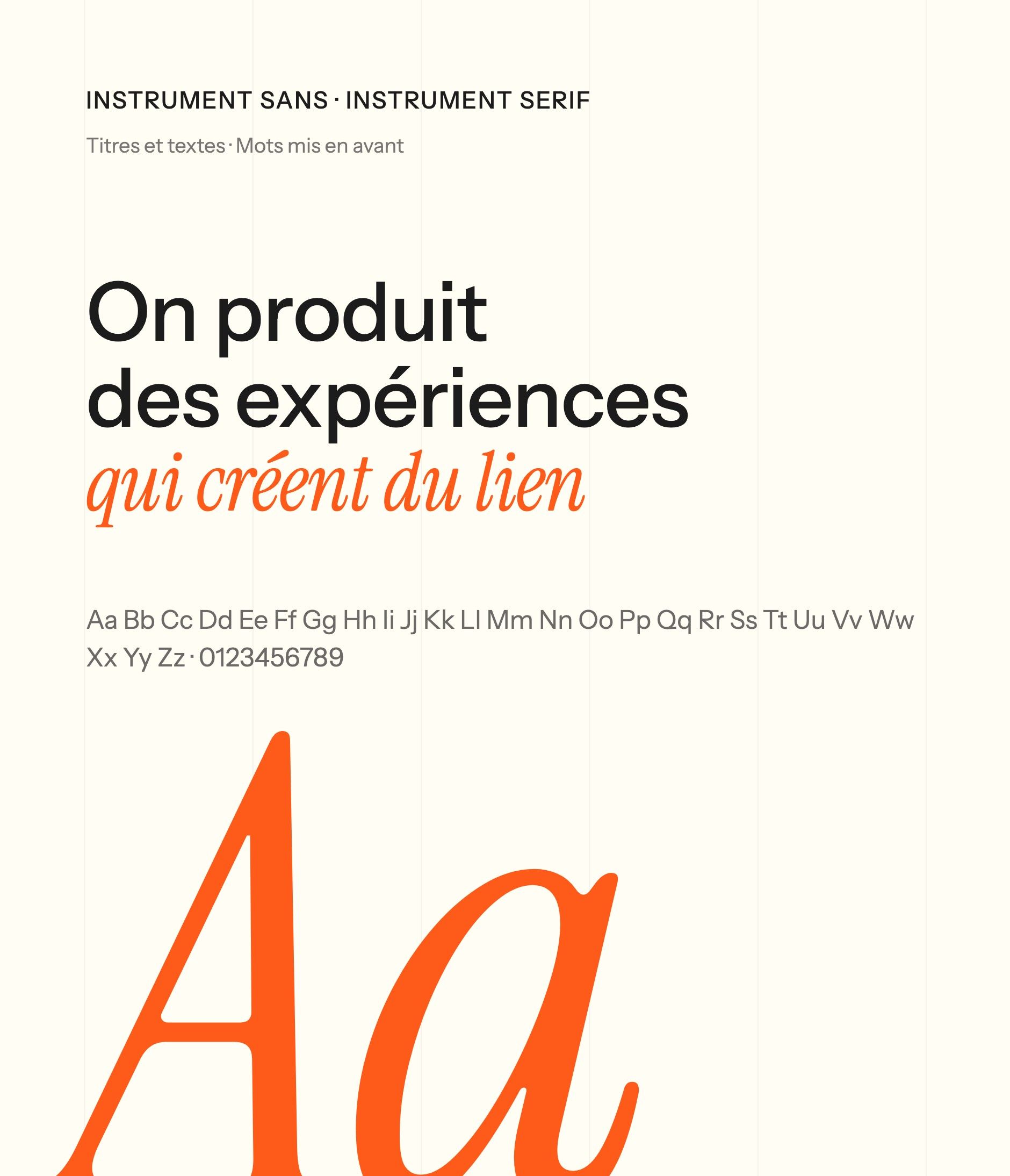
The palette starts from the brand's orange (#FE5A19), extended into light orange and peach, set on sand, linen and cream backgrounds that evoke the stone and linens of country houses. Headings are set in Instrument Sans, and a group of words switches to Instrument Serif italic, in orange: “that bring people together”, “in immersion”, “to your questions”.
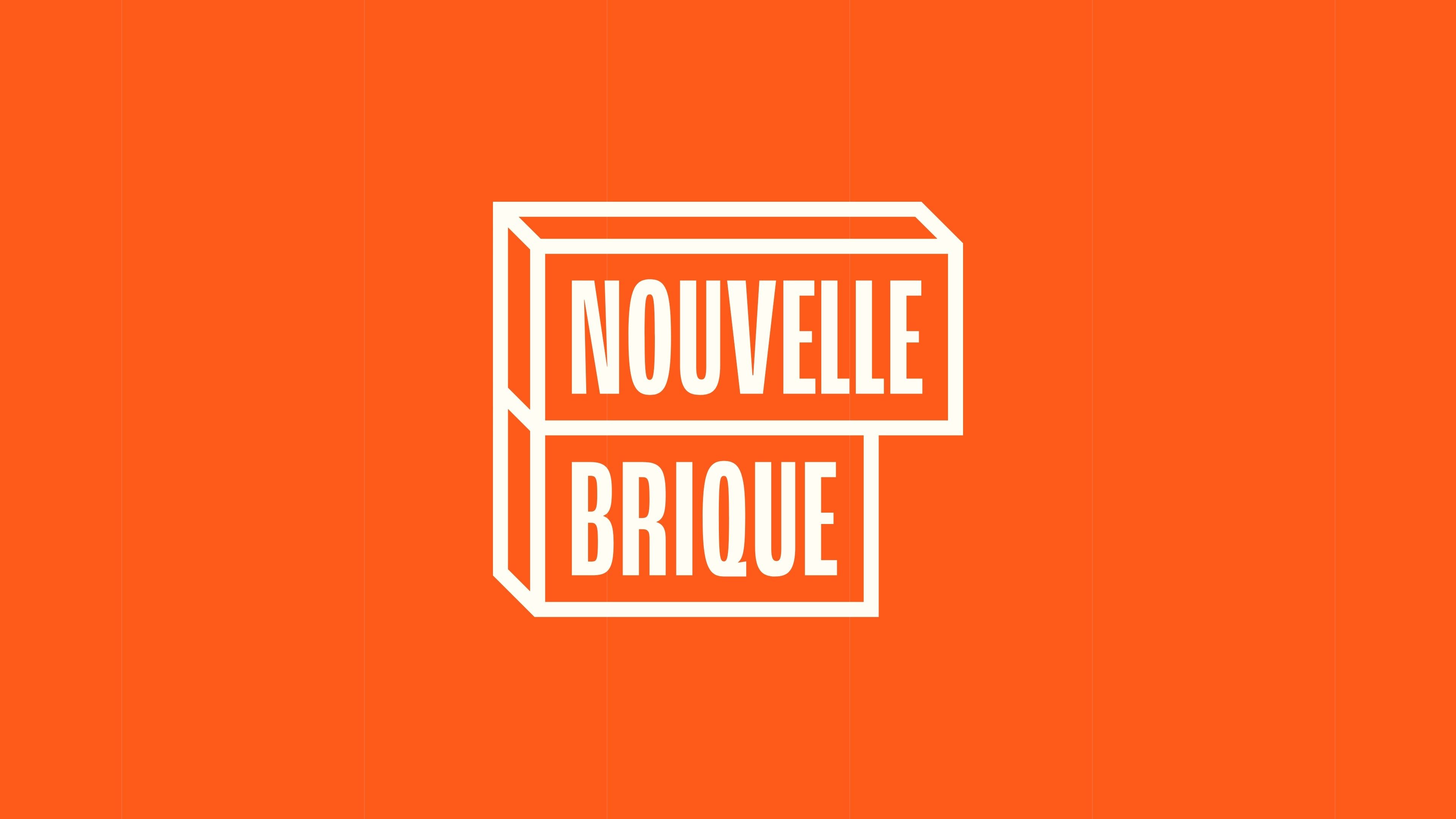
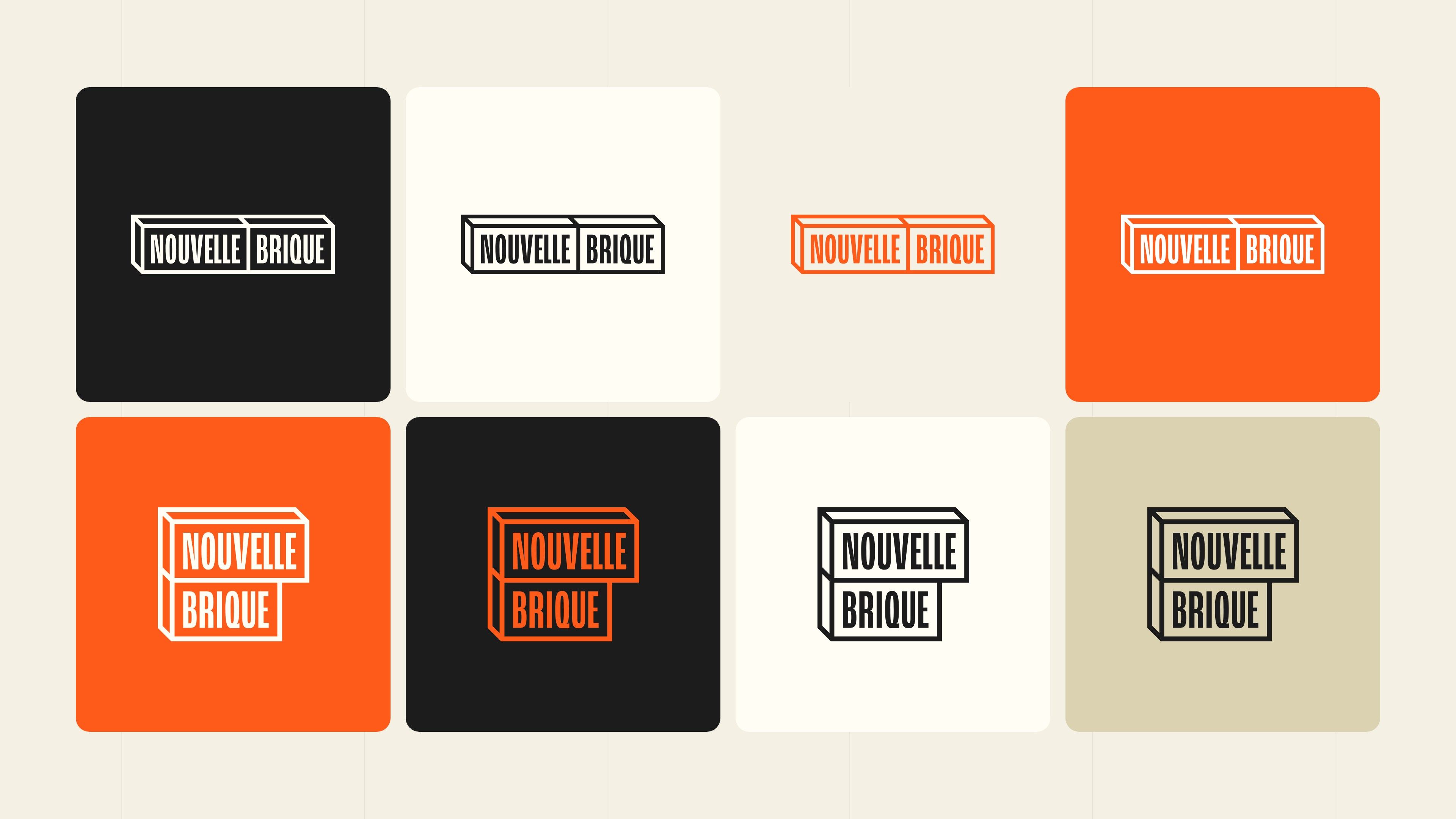
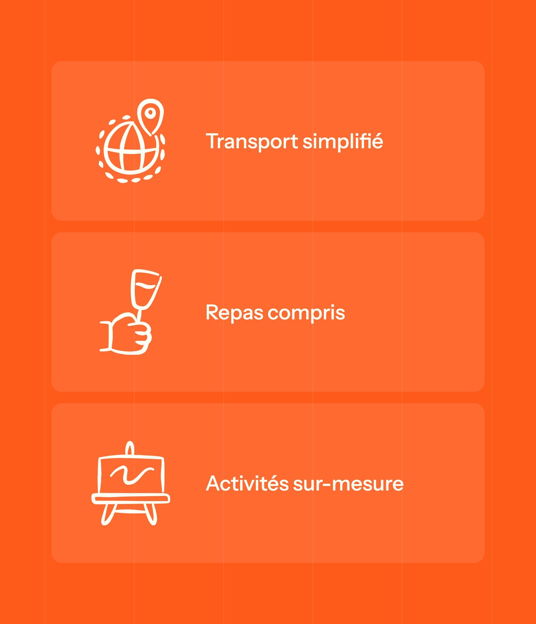
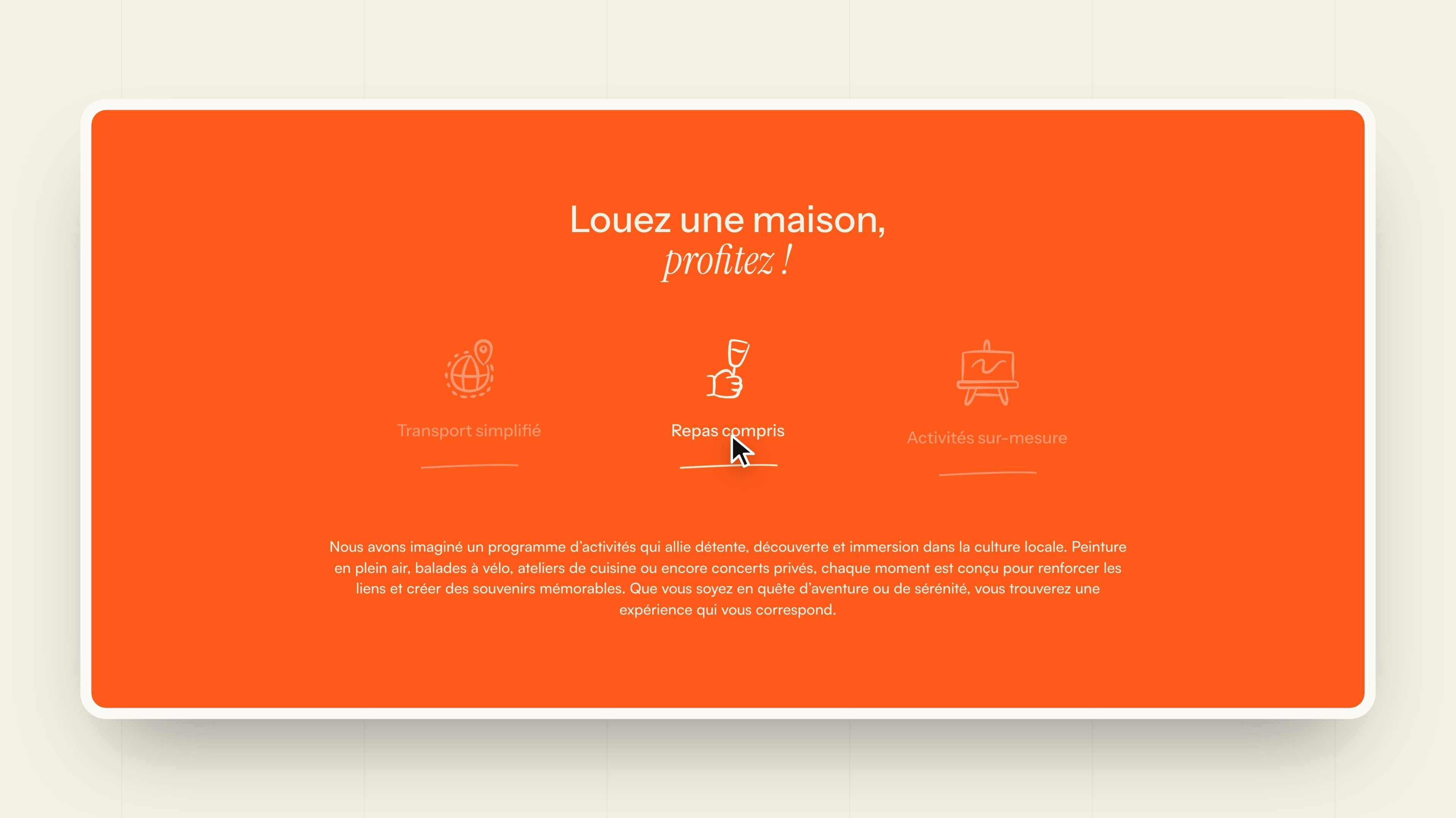
Nouvelle Brique got its own logo: its name set in two bricks drawn in perspective, stacked like a wall being built. It comes in a horizontal and a stacked version, in white, cream, black and orange. Line pictograms illustrate the collection's commitments: transport, meals, activities.
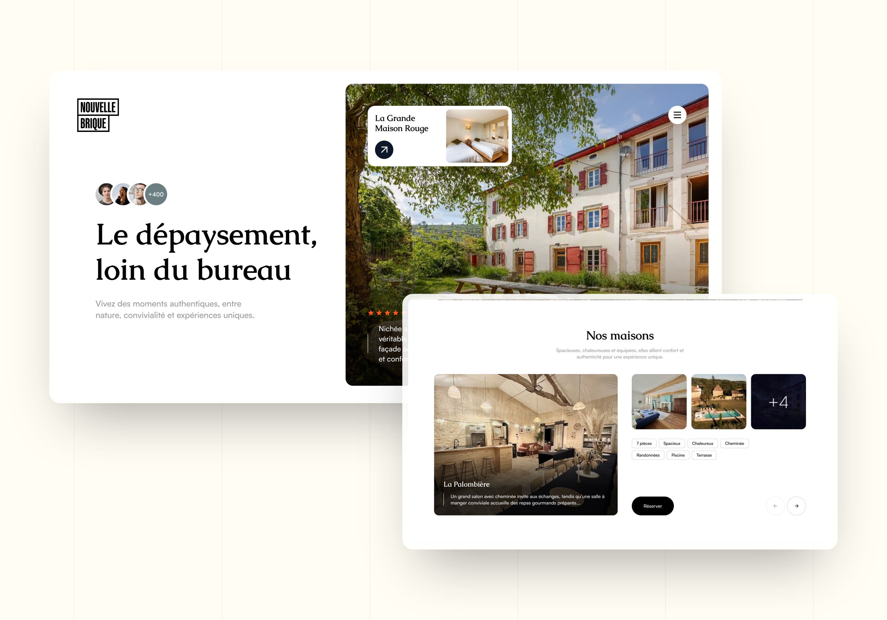
Direction 1 - Editorial
A serif headline, “A change of scene, far from the office”, a large photo of a house and plenty of white space. Houses and experiences are presented as in a travel magazine. Intended perception: calm and upmarket.
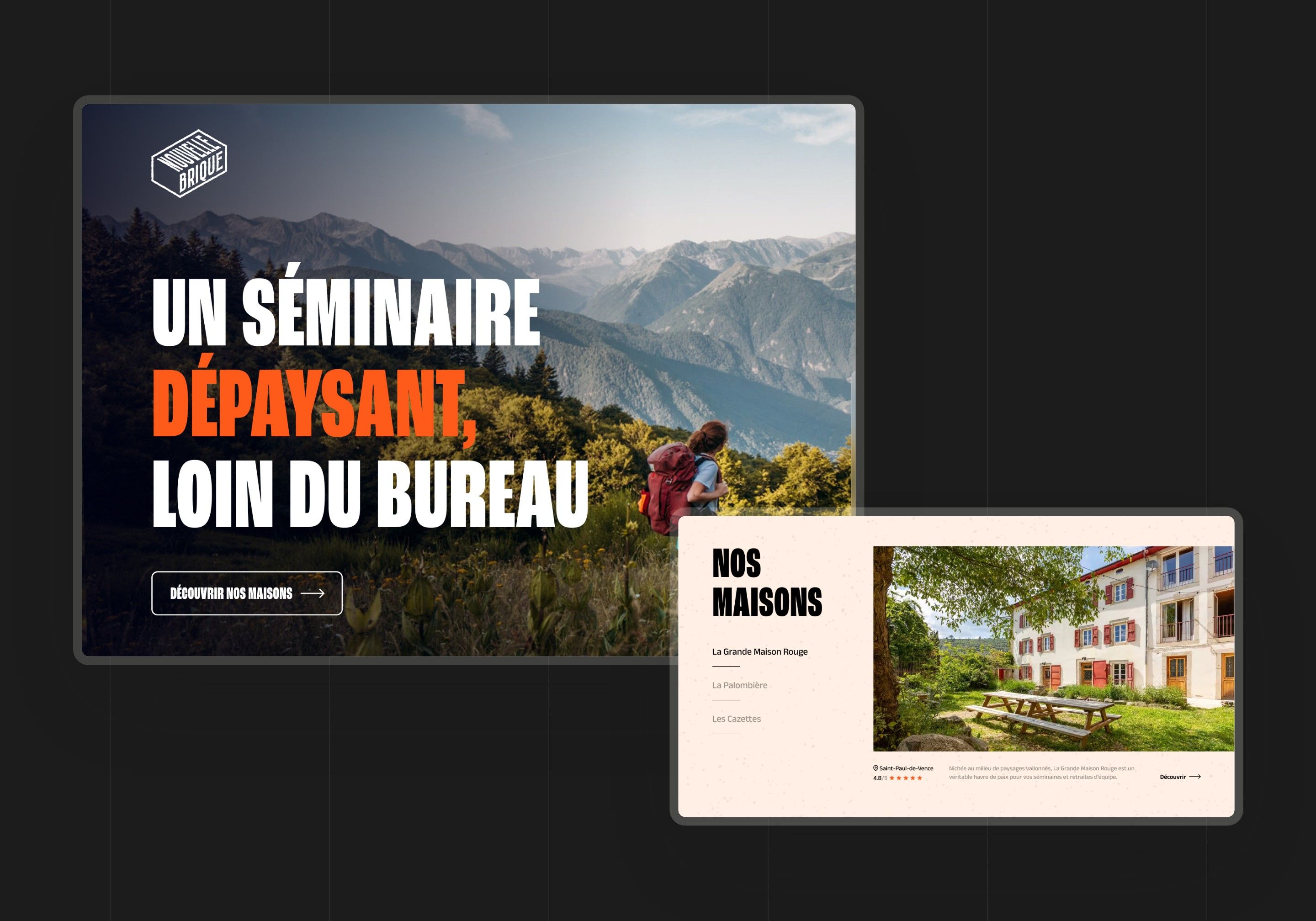
Direction 2 - The poster
Condensed capitals over a mountain landscape, orange reserved for strong words, a black background for the commitments (transport, meals, activities) and a powder pink for the houses. Intended perception: energetic and assertive.
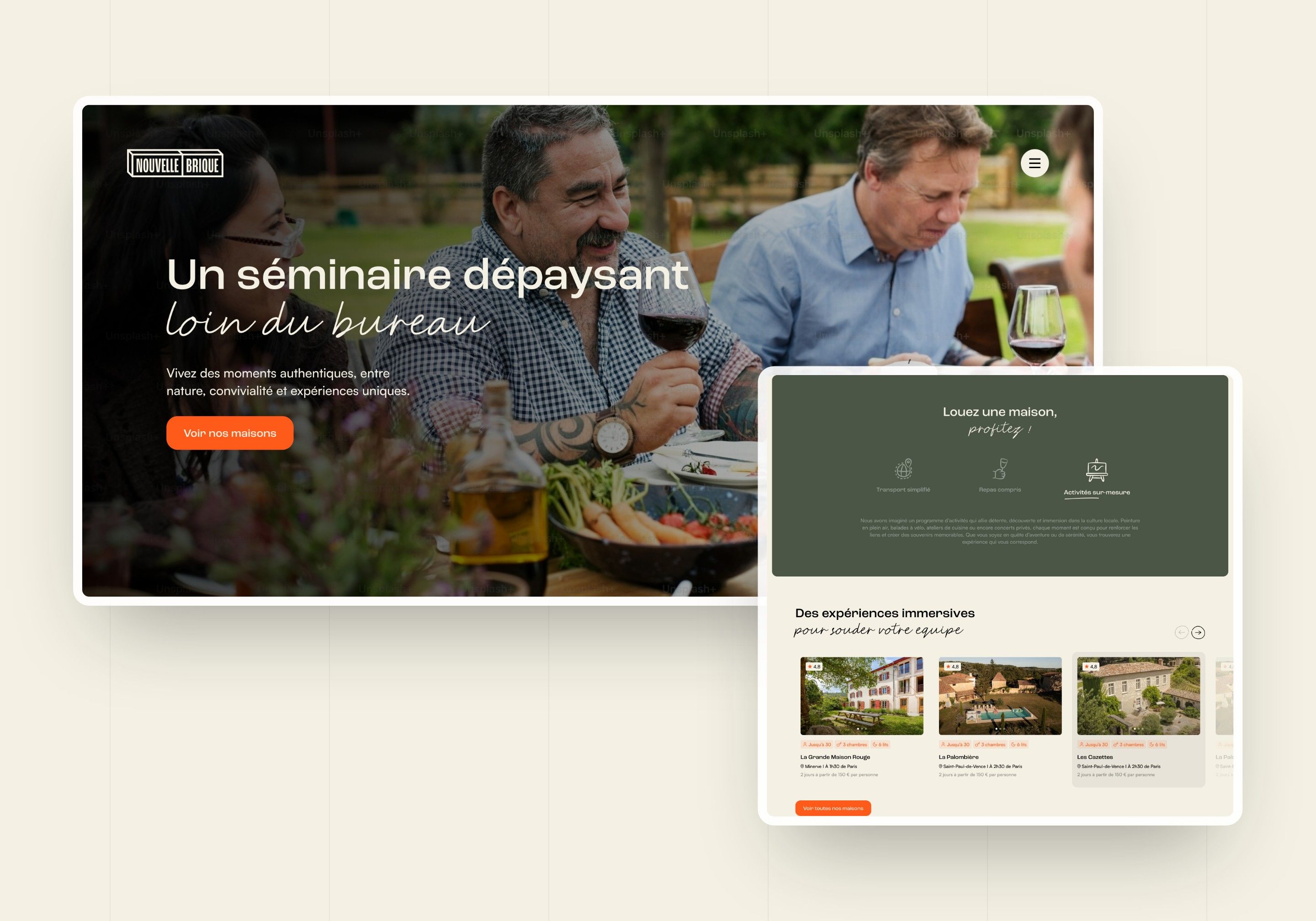
Direction 3 - The brick wall
The chosen direction: handwriting for the words that matter and a wall of orange bricks framing the sections, available in olive green, black and sand. The En Immersion site keeps its orange, light backgrounds, bricks and the principle of highlighted words.
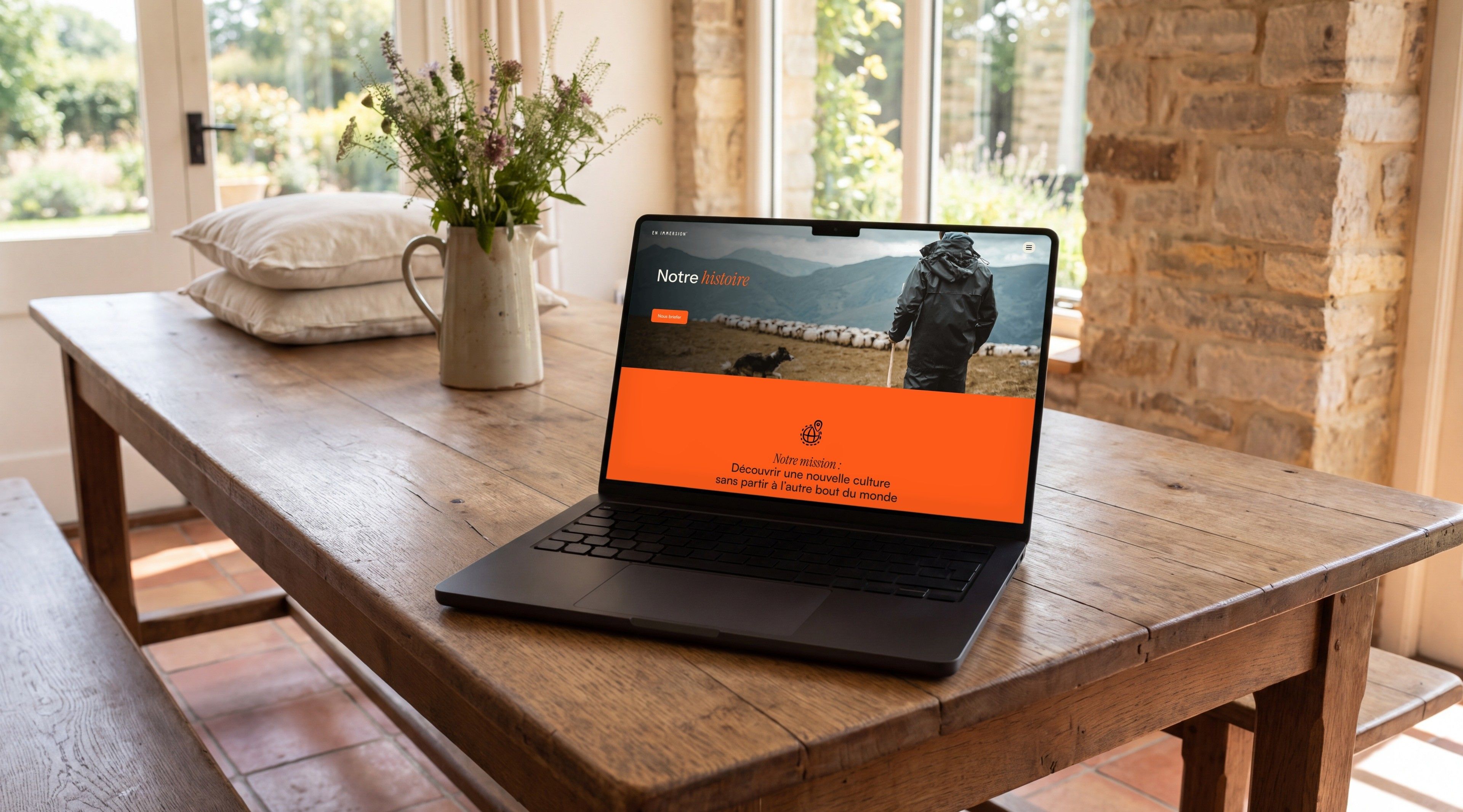
Web Design
Photos that make you want to leave, an offer you can read at a glance
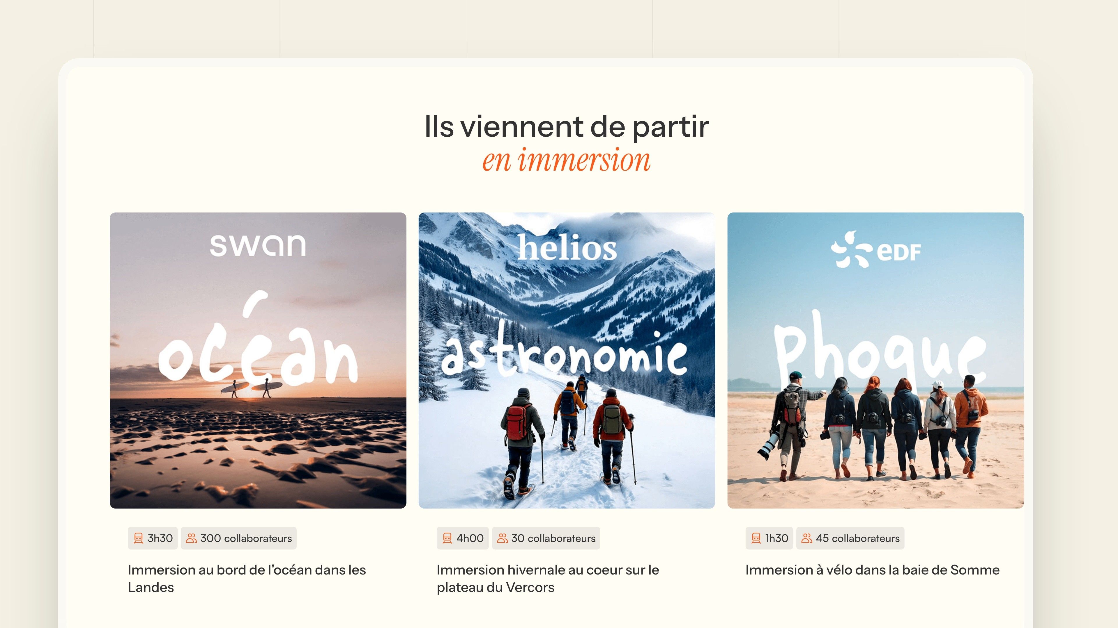
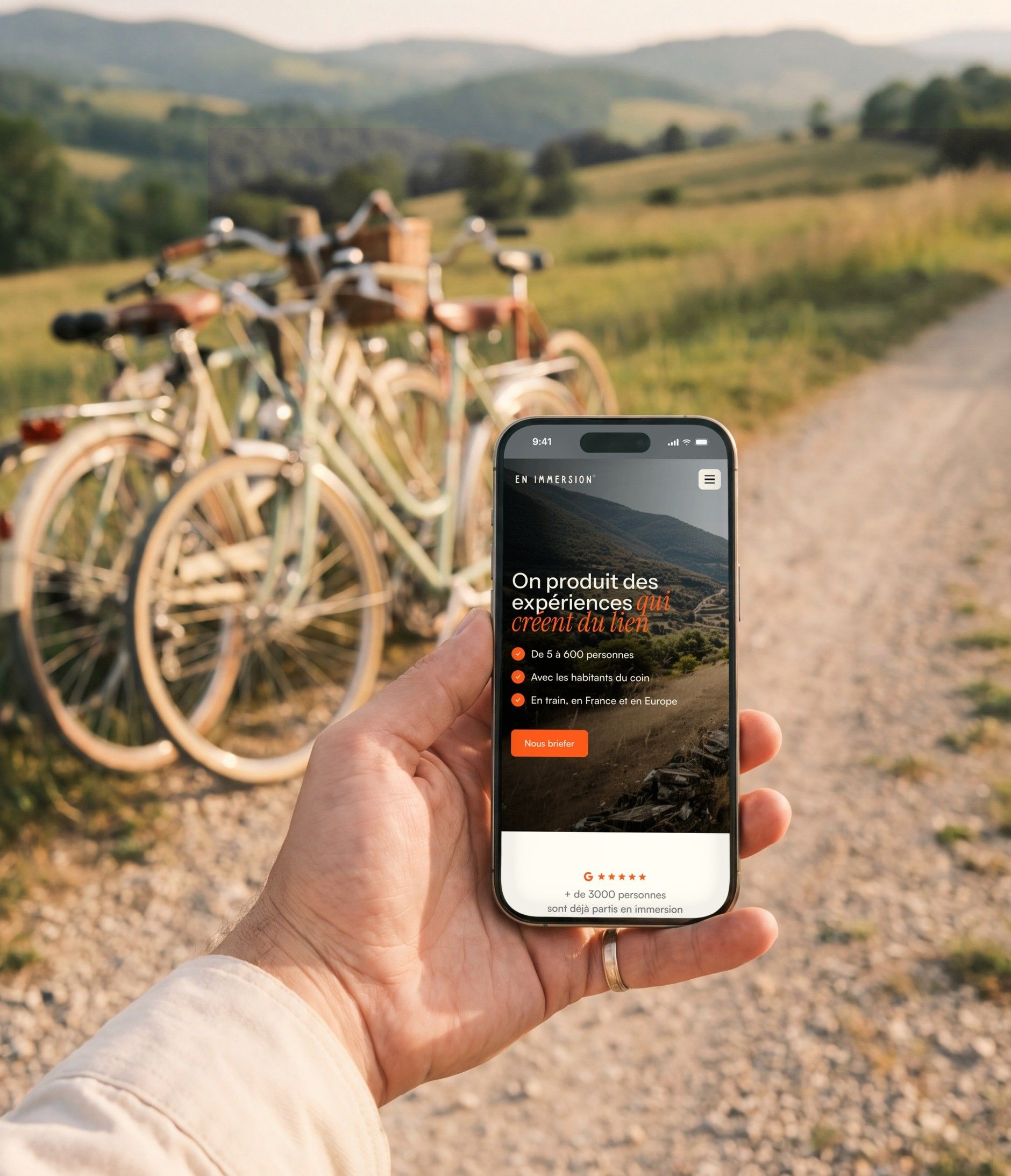
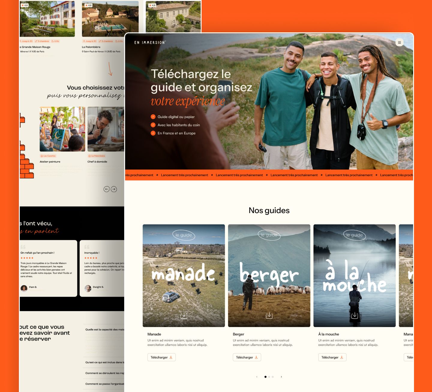
Each page opens on a large photo (a valley, a team on bikes, a shepherd) and three commitments in orange badges: from 5 to 600 people, with local people, by train, in France and Europe. Recent immersions scroll by as cards: a photo, a handwritten word overlaid (ocean, astronomy, seal), a duration and the number of team members.
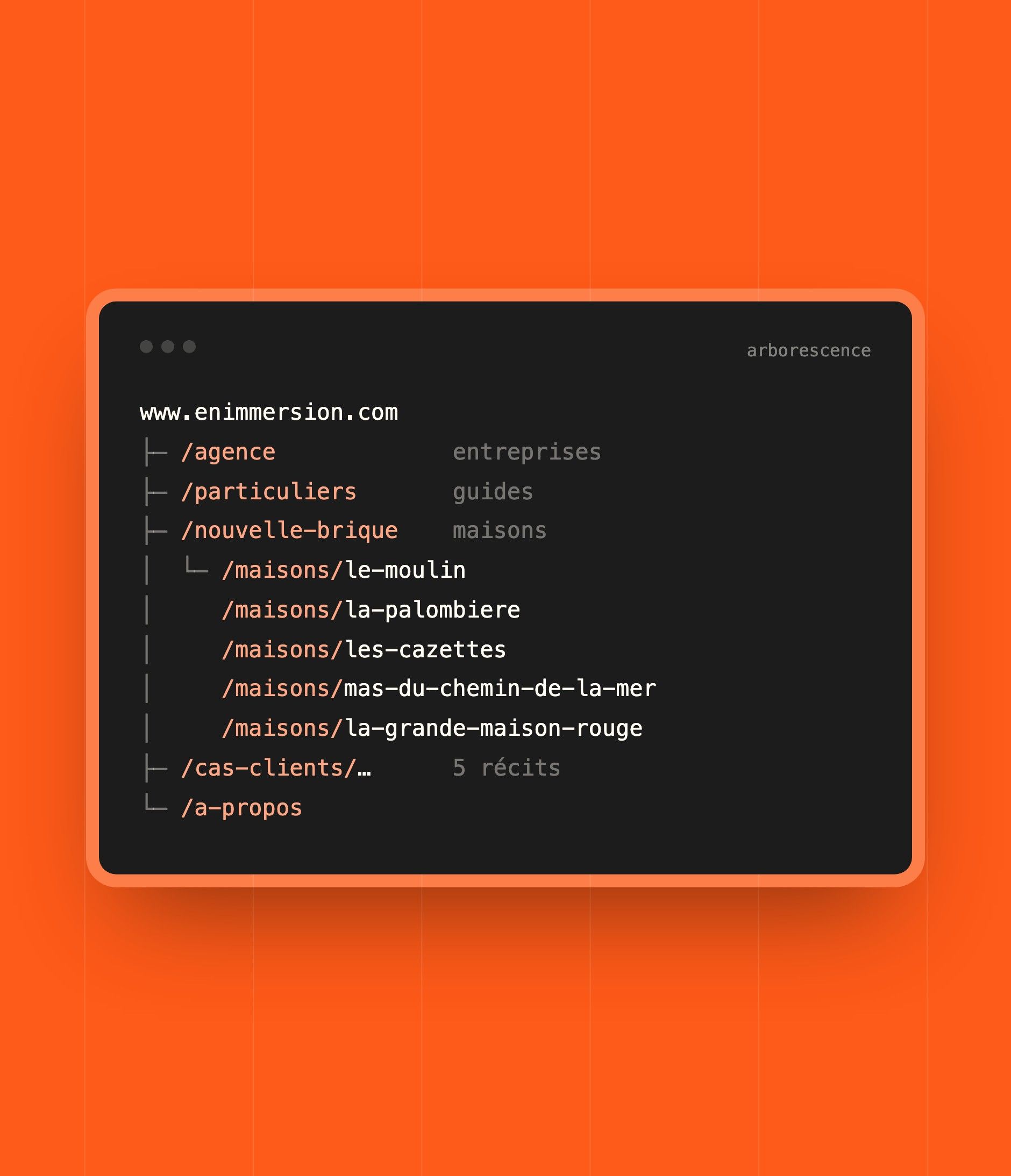
| Page | Role |
|---|---|
| Home | The approach: going off the beaten track, sharing a local's daily life, bringing people together by rolling up their sleeves |
| Agency | The company offer: tailor-made retreats, collaborative workshops, project stages and upcoming retreats |
| Individuals | The En Immersion guides (manade ranch, shepherd, fly fishing) |
| Nouvelle Brique | The collection of houses: choose your house, then customise your experience |
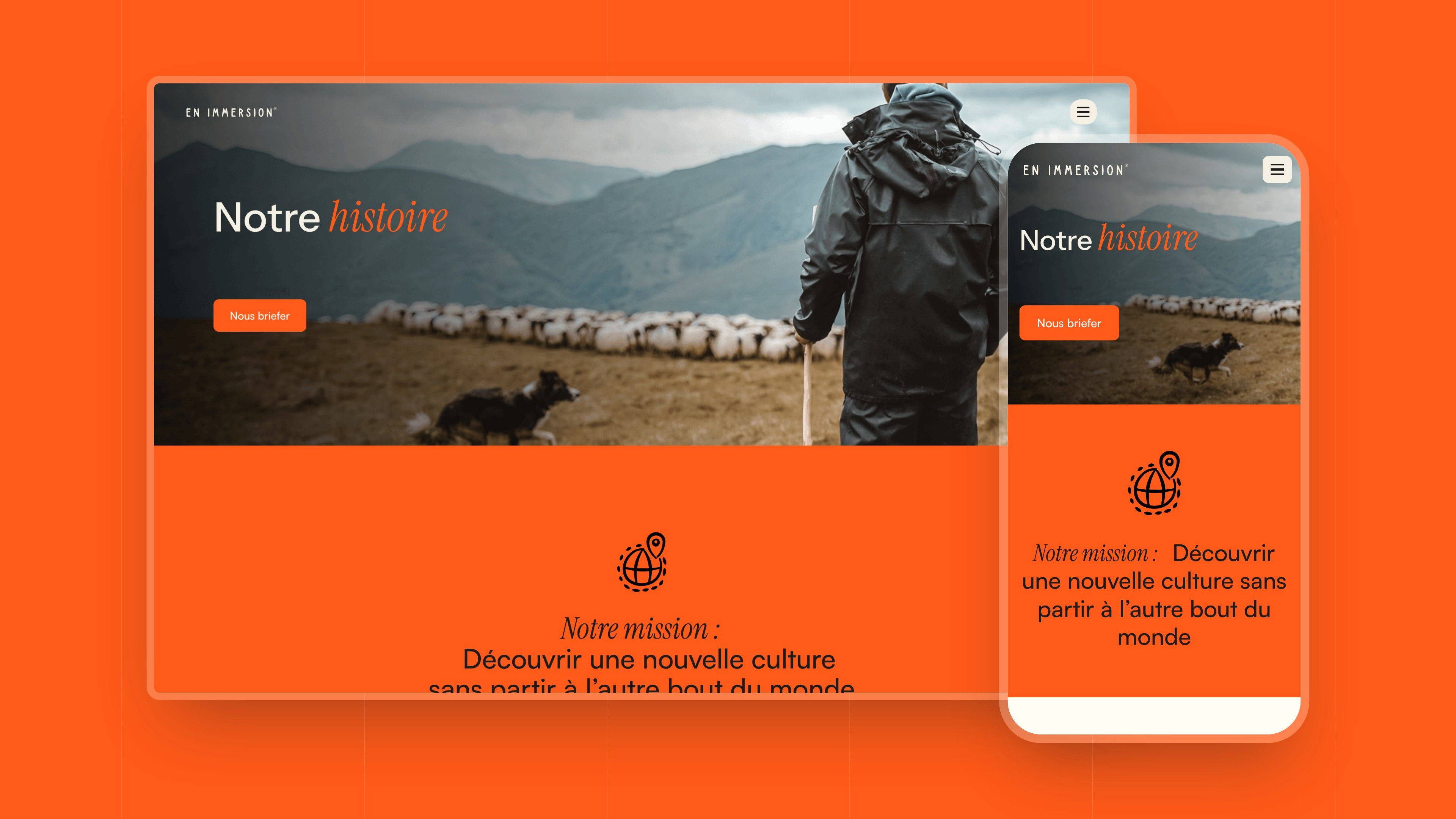
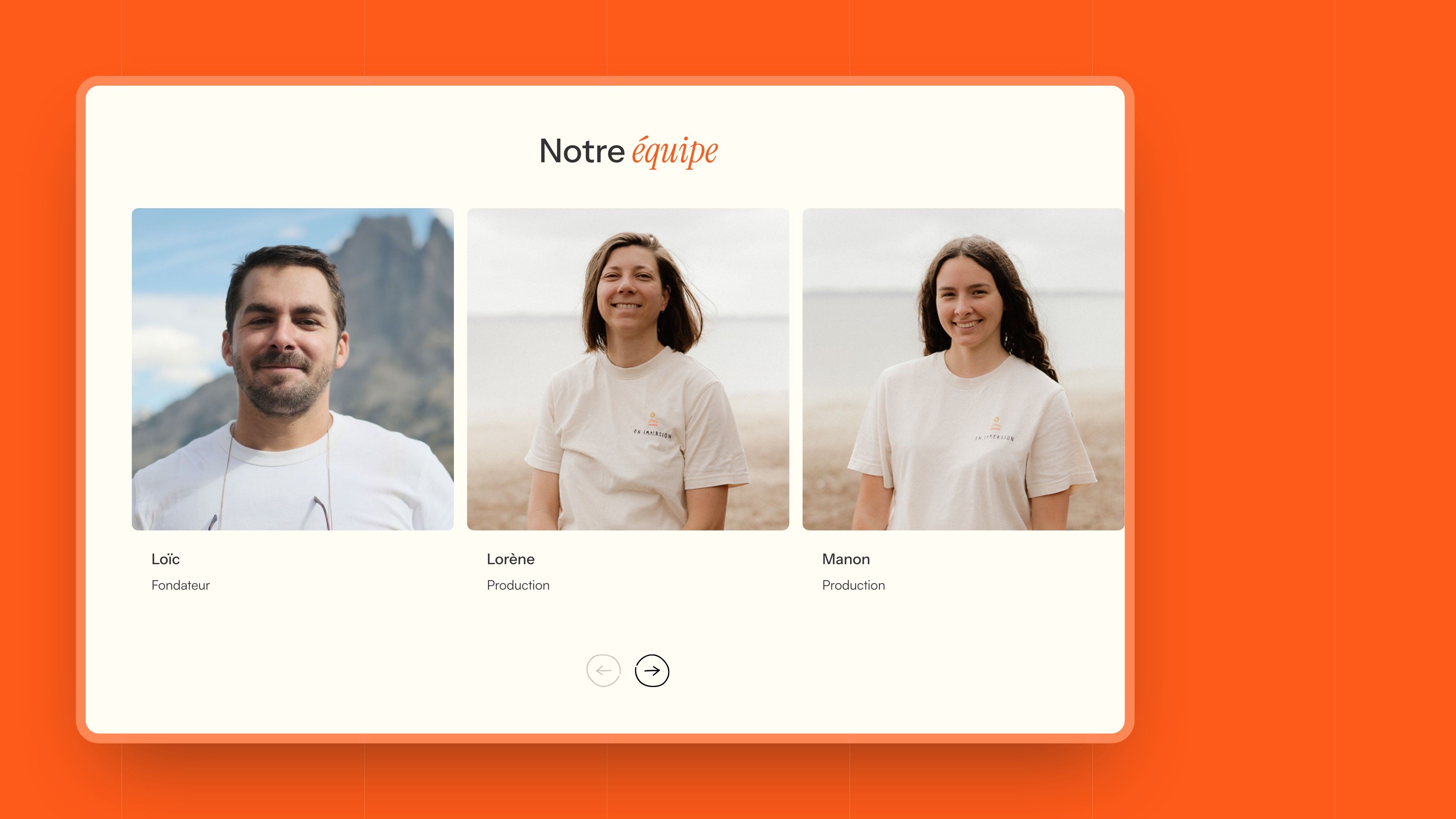
| About | The story, the mission and the team |
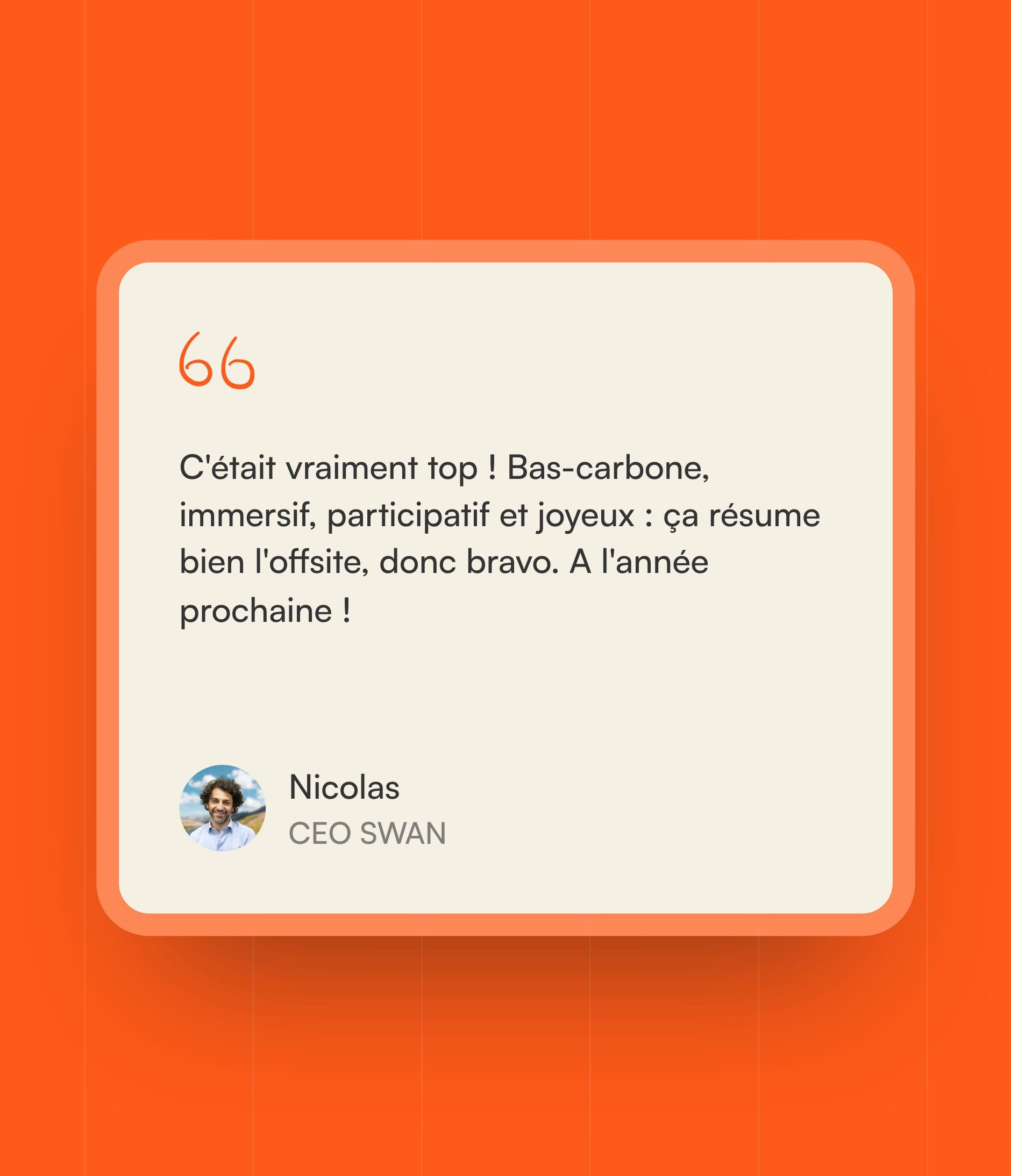
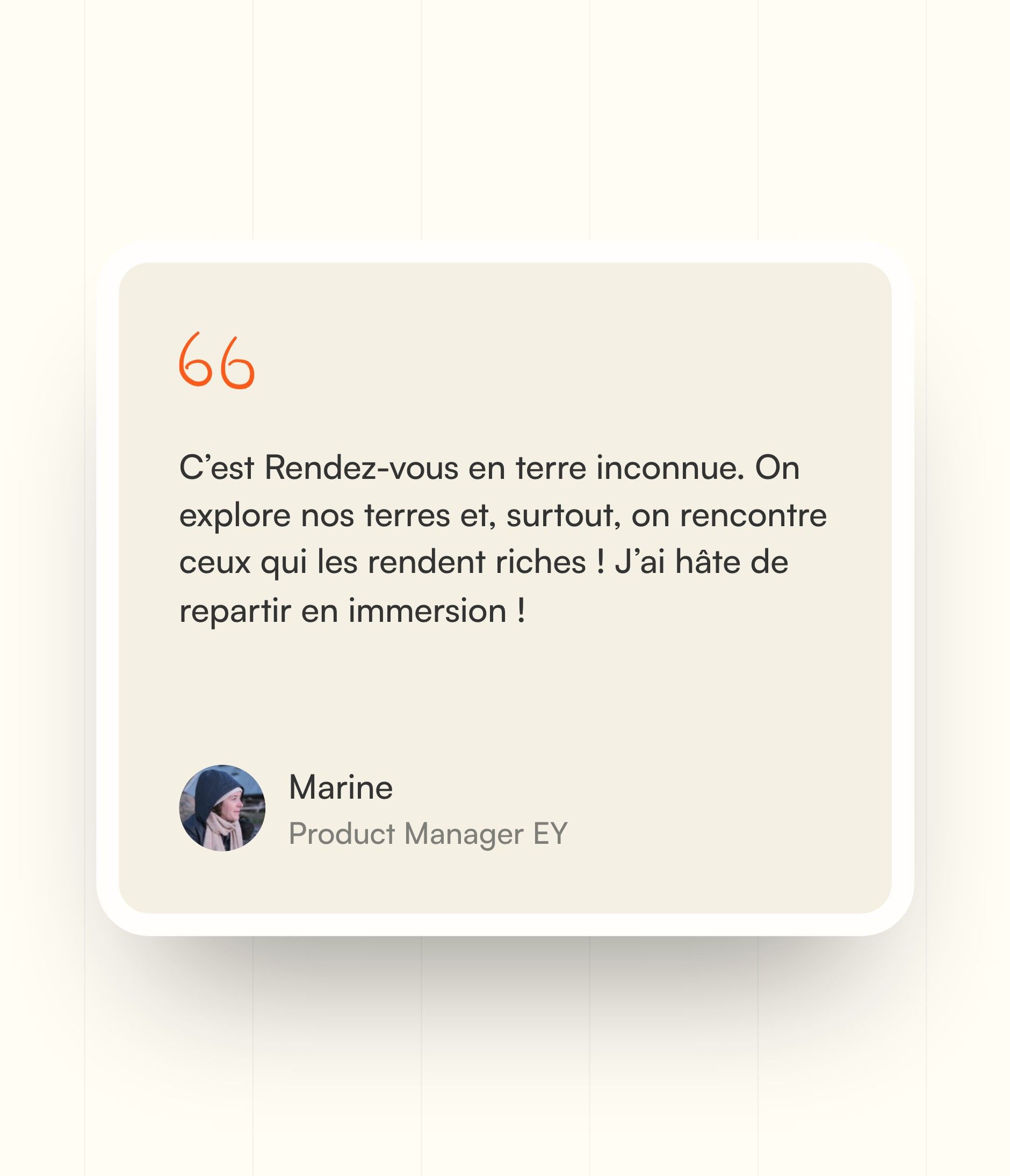
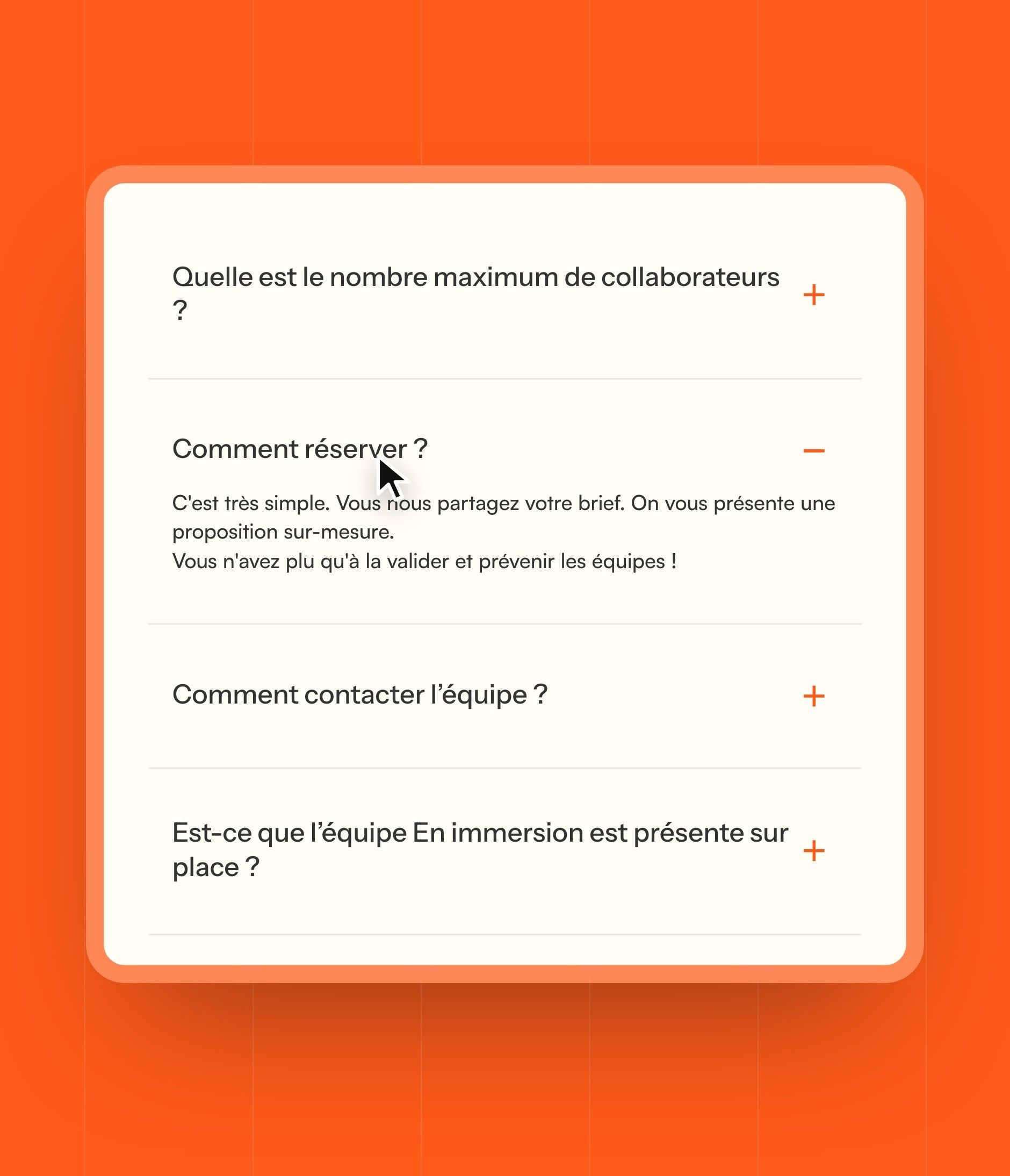
Participants' reviews, press coverage (National Geographic, Le Figaro, Itinéraire, GEO), the FAQ and the brief form appear on every offer page: you can brief the team wherever you come in.
Development
A Webflow site the team runs on its own
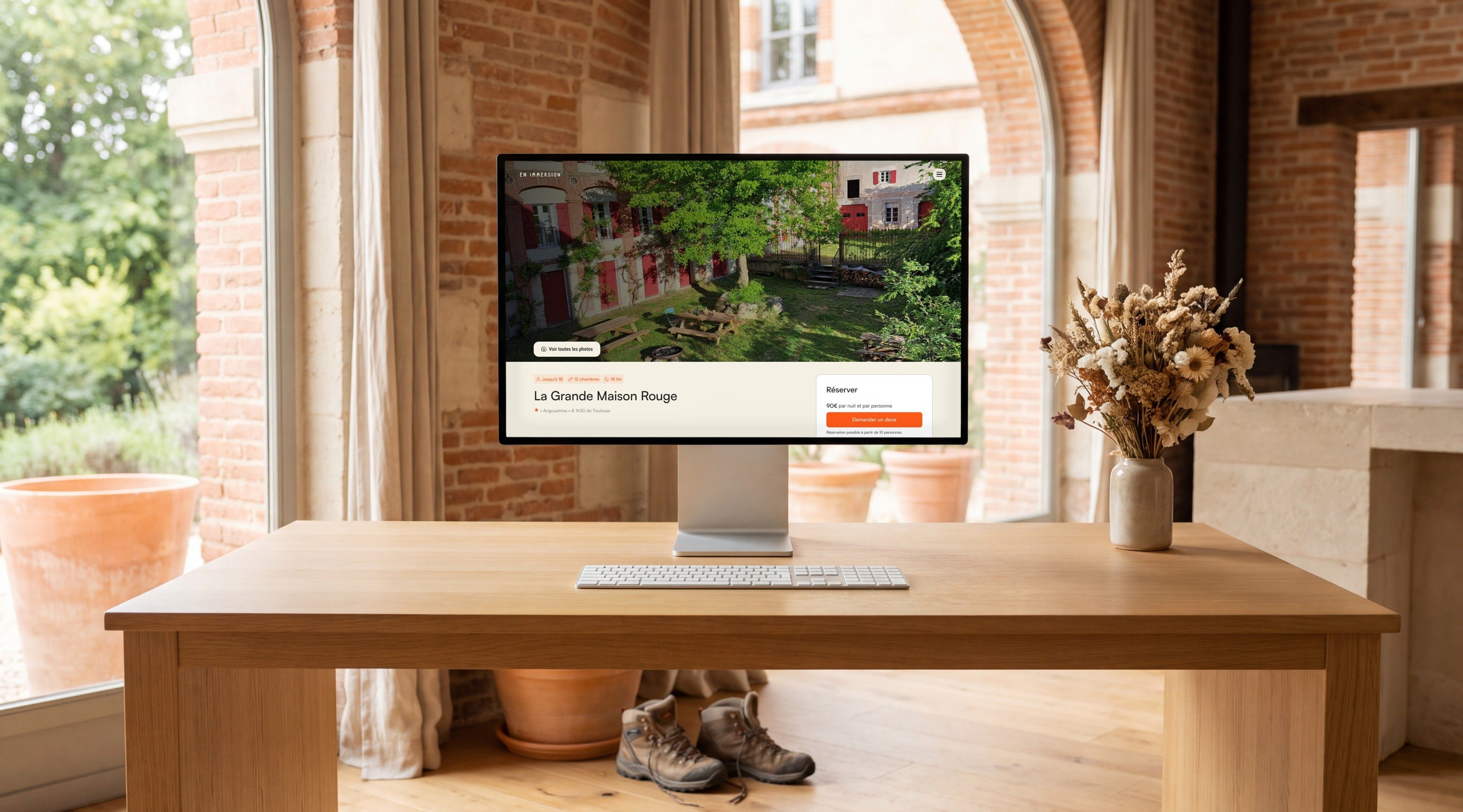
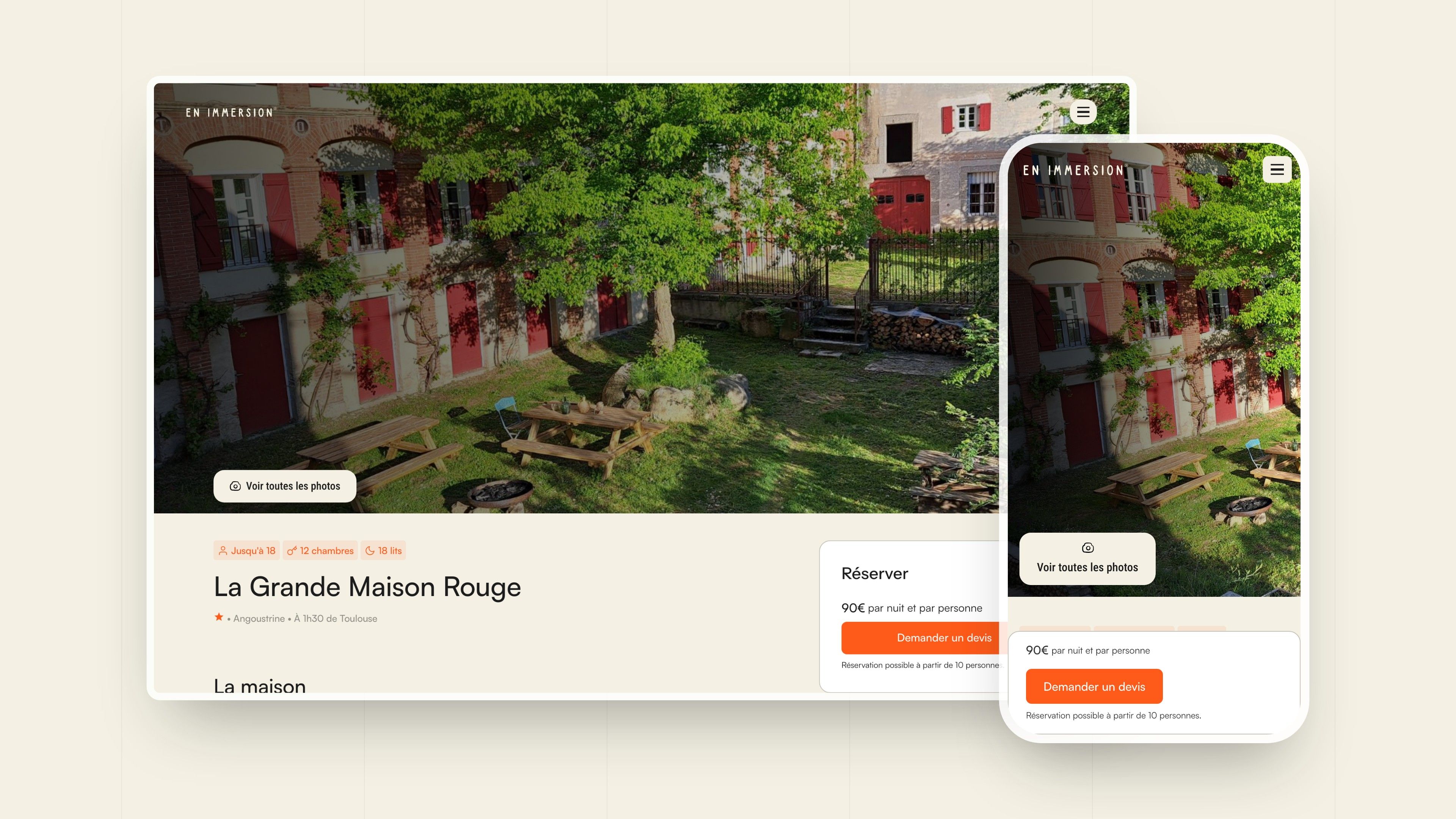
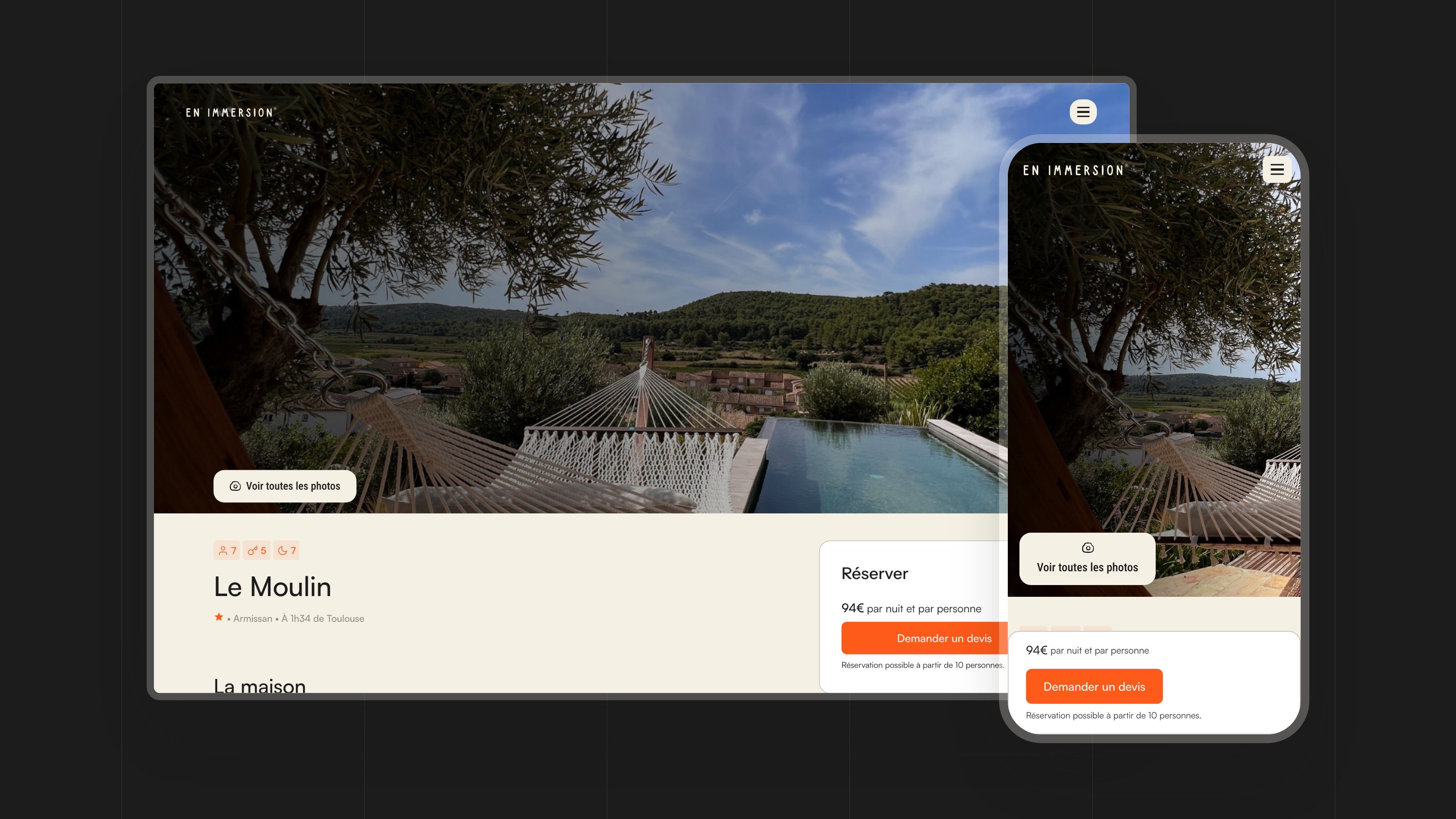
The site is built on Webflow. Houses and case studies are CMS collections: each house page brings together its capacity (up to 18 people, 12 bedrooms and 18 beds for the Grande Maison Rouge), its amenities, living spaces, bedrooms, outdoor areas, activities and an availability calendar, next to a “Book” card that leads to the quote request.
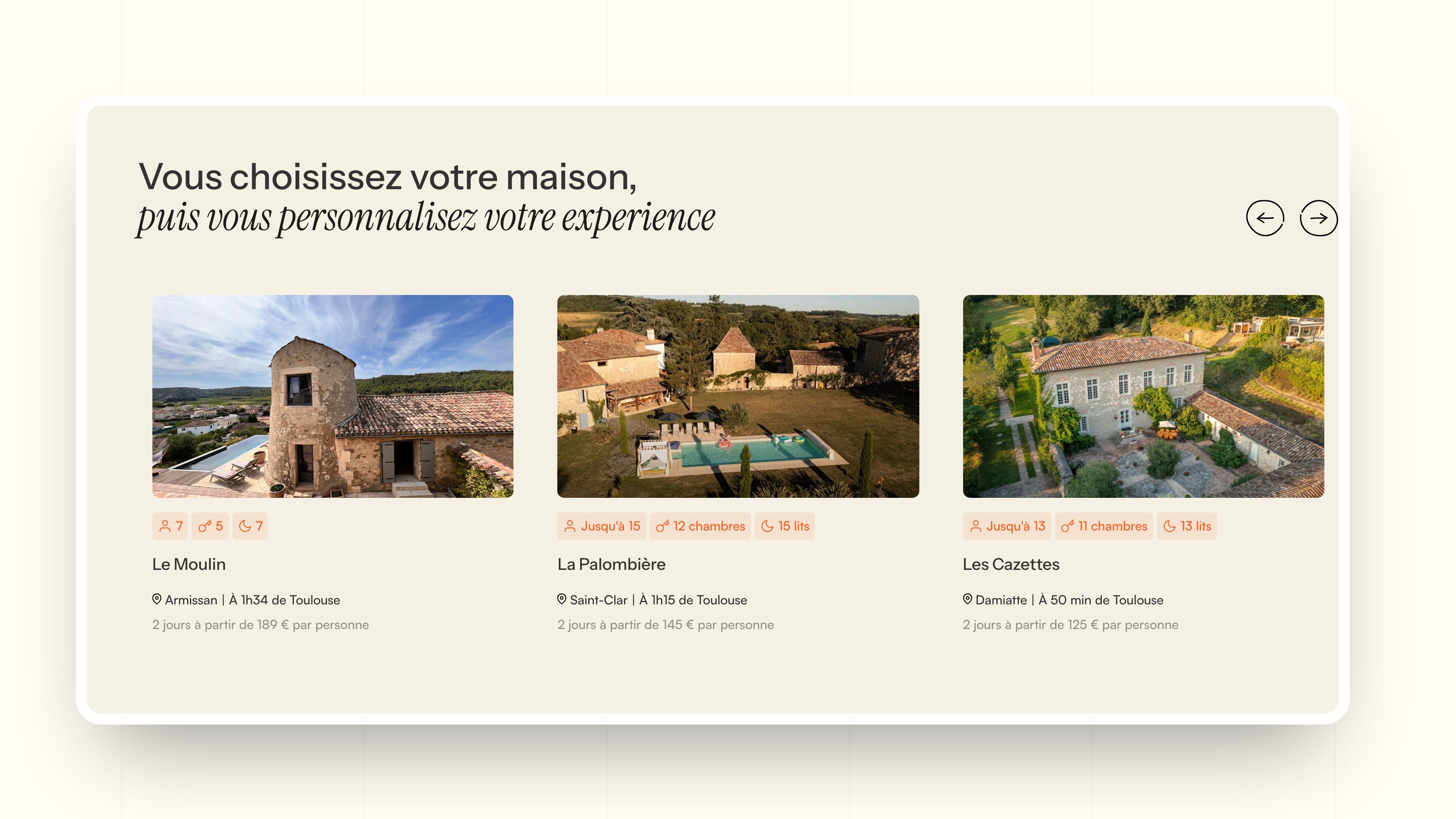
The carousels (immersions, houses, reviews, team) are built with Splide, the Nouvelle Brique tabs with Webflow's native components, and the brief form collects the team size, the city and the preferred dates.


Our latest projects
+250 companies
supported
Websites designed and developed with










You're going to working with us, guaranteed
Ready to launch
your business?
Let’s f*****G GO !!