Projects
 Our Offers
 Dedicated team
 Blog
 Academy
 About Us
Scale: brand identity and landing page for an entrepreneurship event
Scale is a Paris entrepreneurship event led by Alec Henry and Entrepreneurs.com. After an unsatisfying first logo proposal, the team needed a strong identity and a page that drives registrations, fast.
Gemeos, web agency for professional events, took over the logotype design, created the visual world and developed the Webflow landing page.
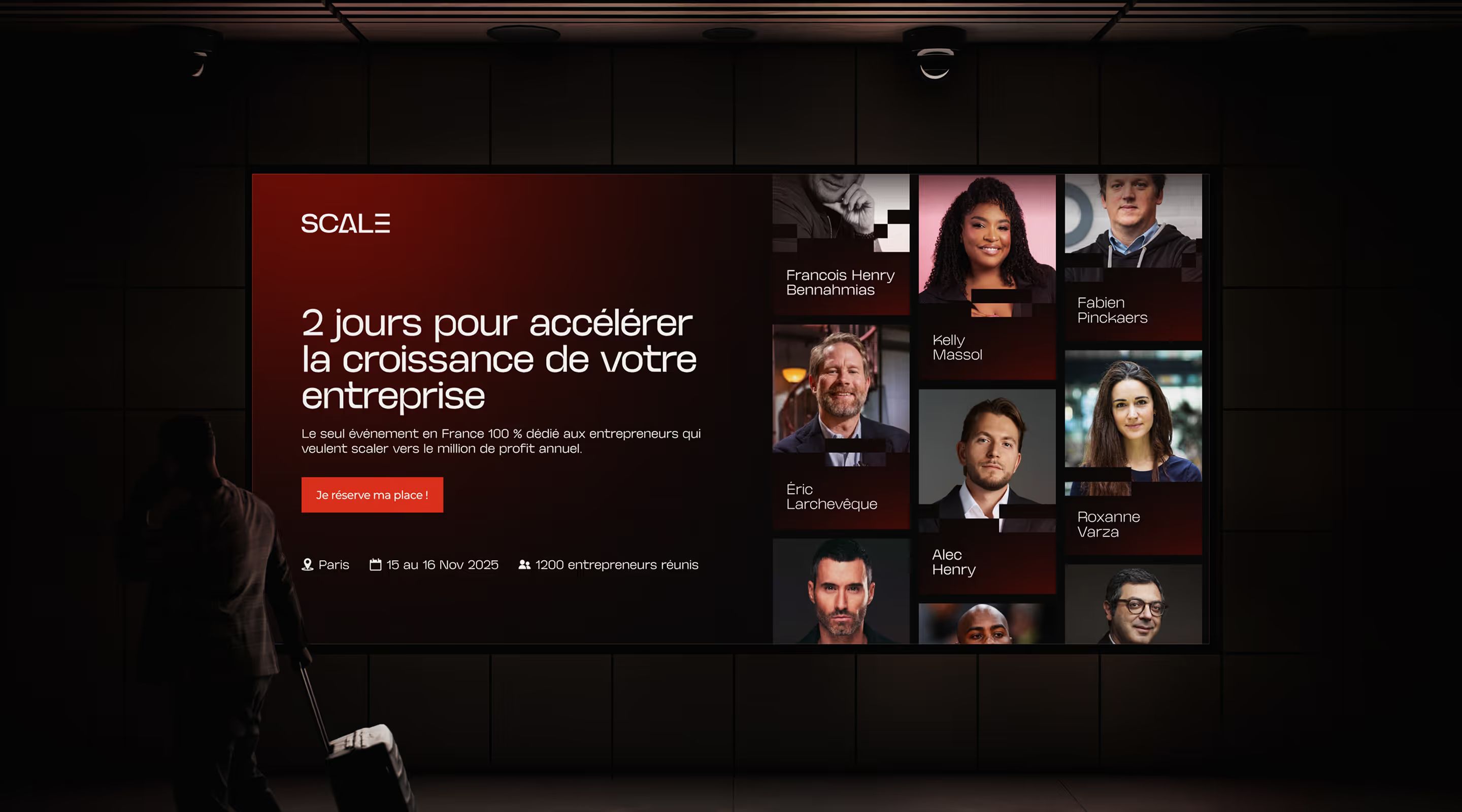
An event to launch fast, with a logo and a page that convince
Scale brings together entrepreneurs and speakers from the French-speaking ecosystem in Paris. The project timeline called for speed: after a first logo proposal that fell short, an identity had to be created that could live on the event's materials and convince visitors to book their seat. The mark had to evoke progress without relying on growth-curve clichés.
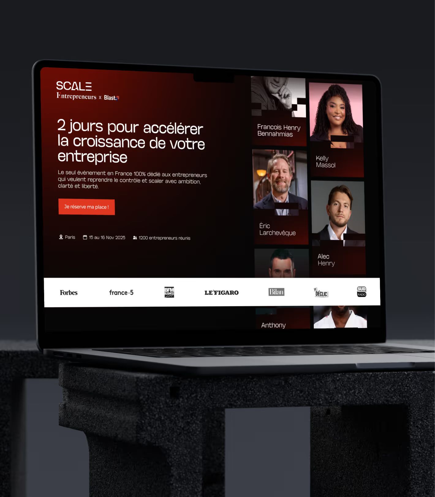
Gemeos created a logo built from the letter E in Scale, then a brand world playing on black, white and red. This identity was rolled out on a Webflow landing page where every section serves a precise goal: setting the mood, introducing the speakers, detailing the program and guiding visitors to buy tickets.
- Industry
- Events
- Services
- Branding
- Artistic Direction
- Development
- UX/UI Design

LOGO
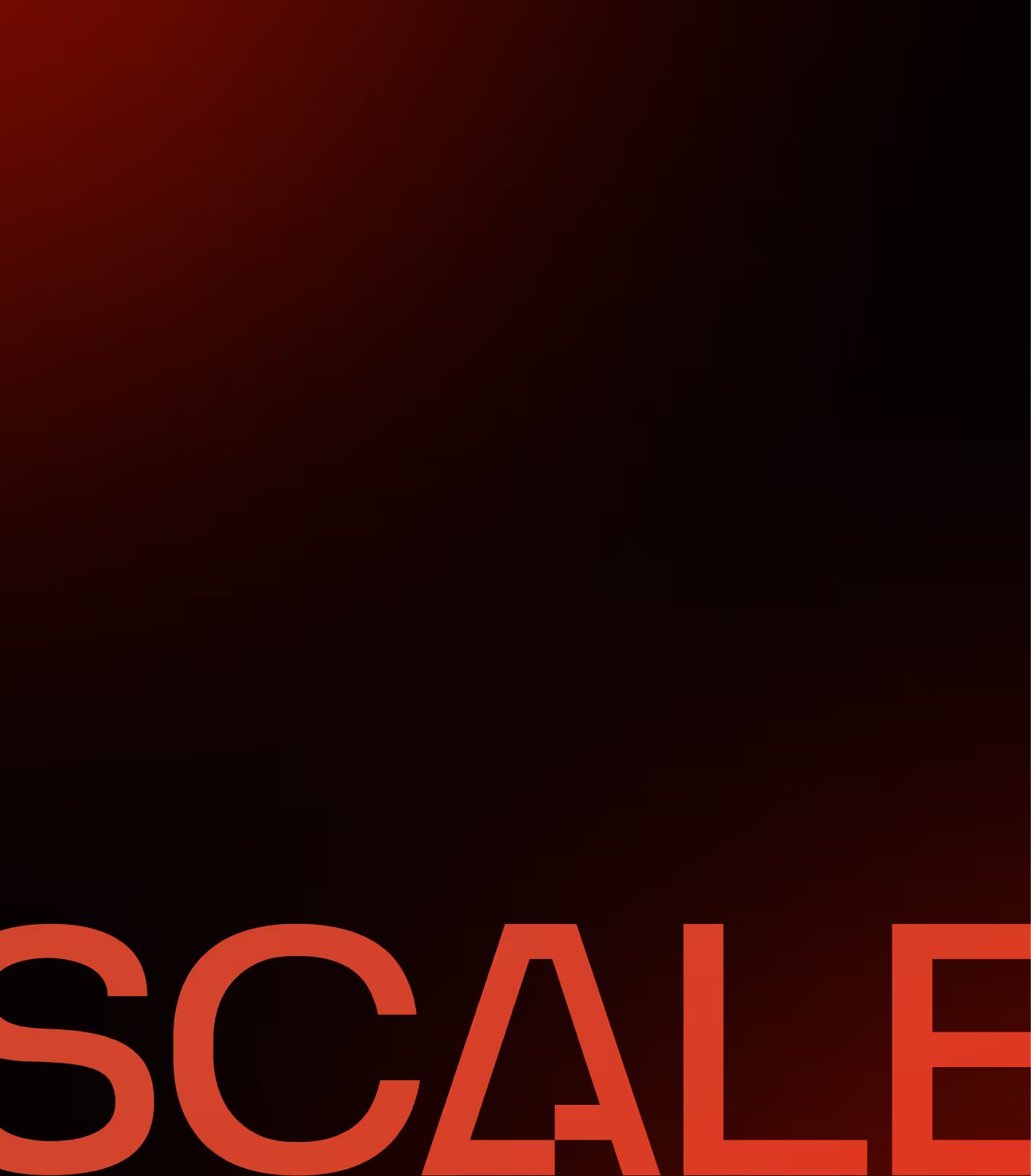
An “E” Like No Other
The project kicked off in a rush. The previous agency hadn’t delivered a logo that matched the event’s ambition. Gemeos started from scratch. The brief was clear, create a mark that captures progress without falling into the usual growth clichés: arrows, curves, charts.
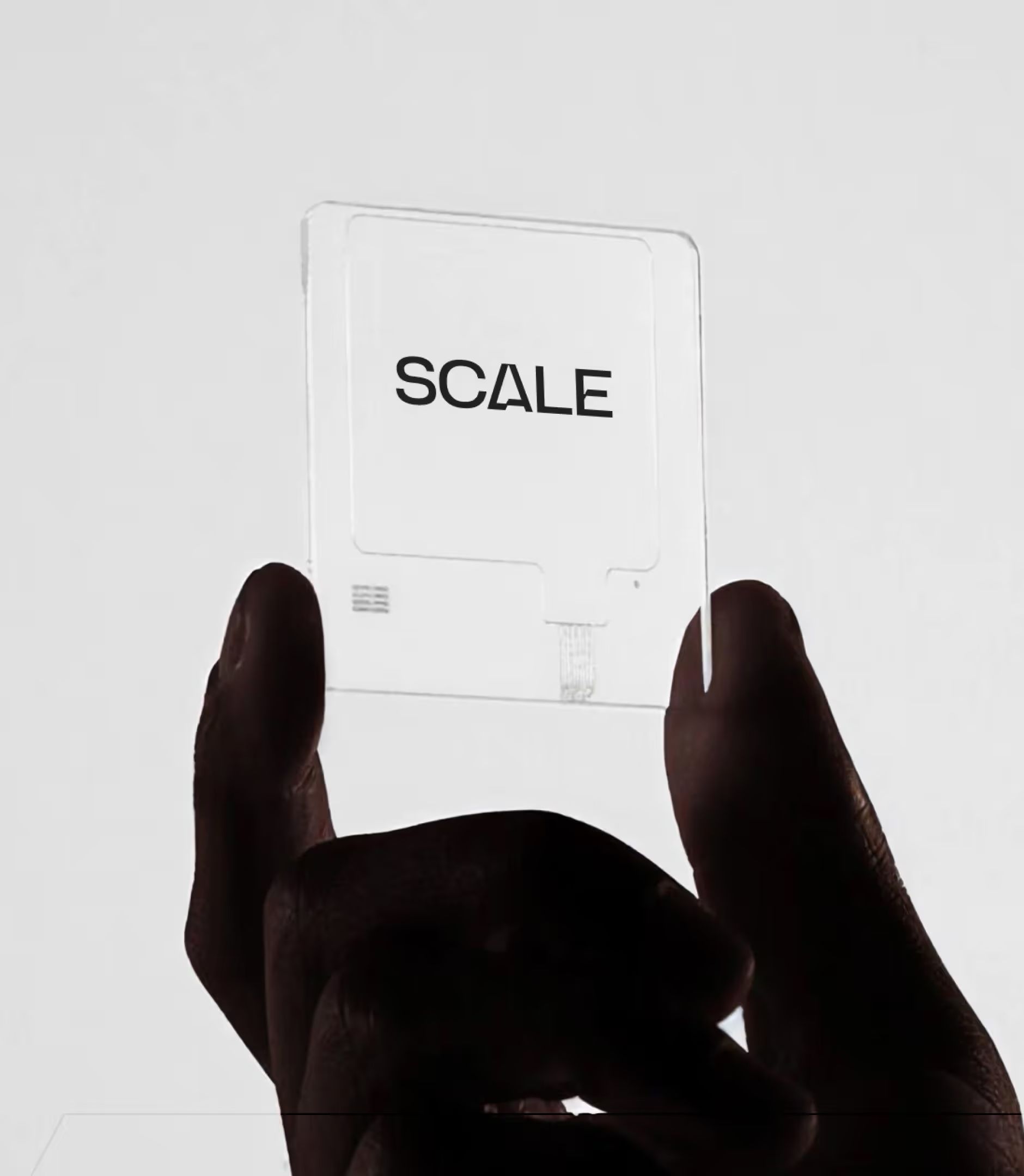
The solution: turn the “E” in SCALE into three horizontal bars that get progressively shorter, creating a staircase effect. An instantly readable symbol, the idea of moving upward with support, built directly into the typography, with no extra icon needed. The “A” was also reworked with diagonal cuts to reinforce the pattern and give the word its own visual consistency.
The logo was delivered in three versions, black, white, and red, and exported in SVG, PNG, and JPG for every print and digital use across the event.
BRAND
An event identity, not just a logo
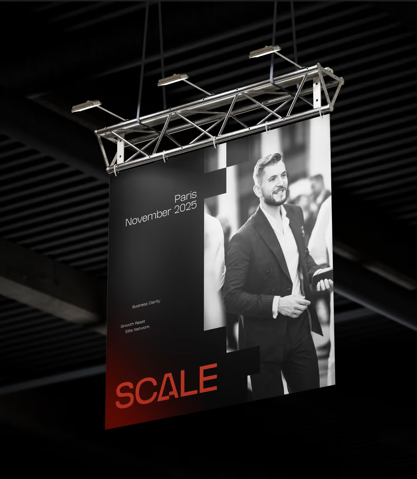
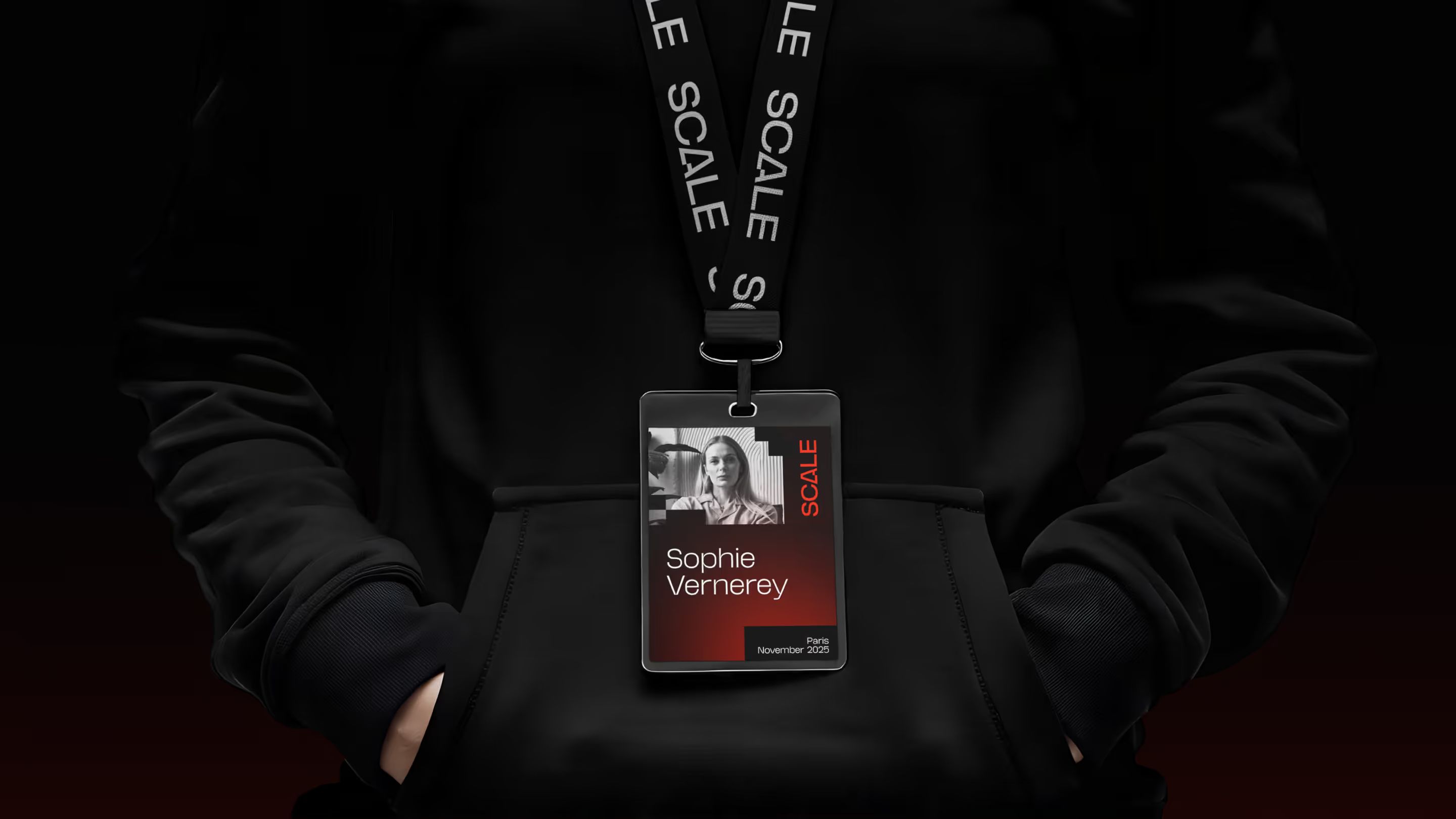
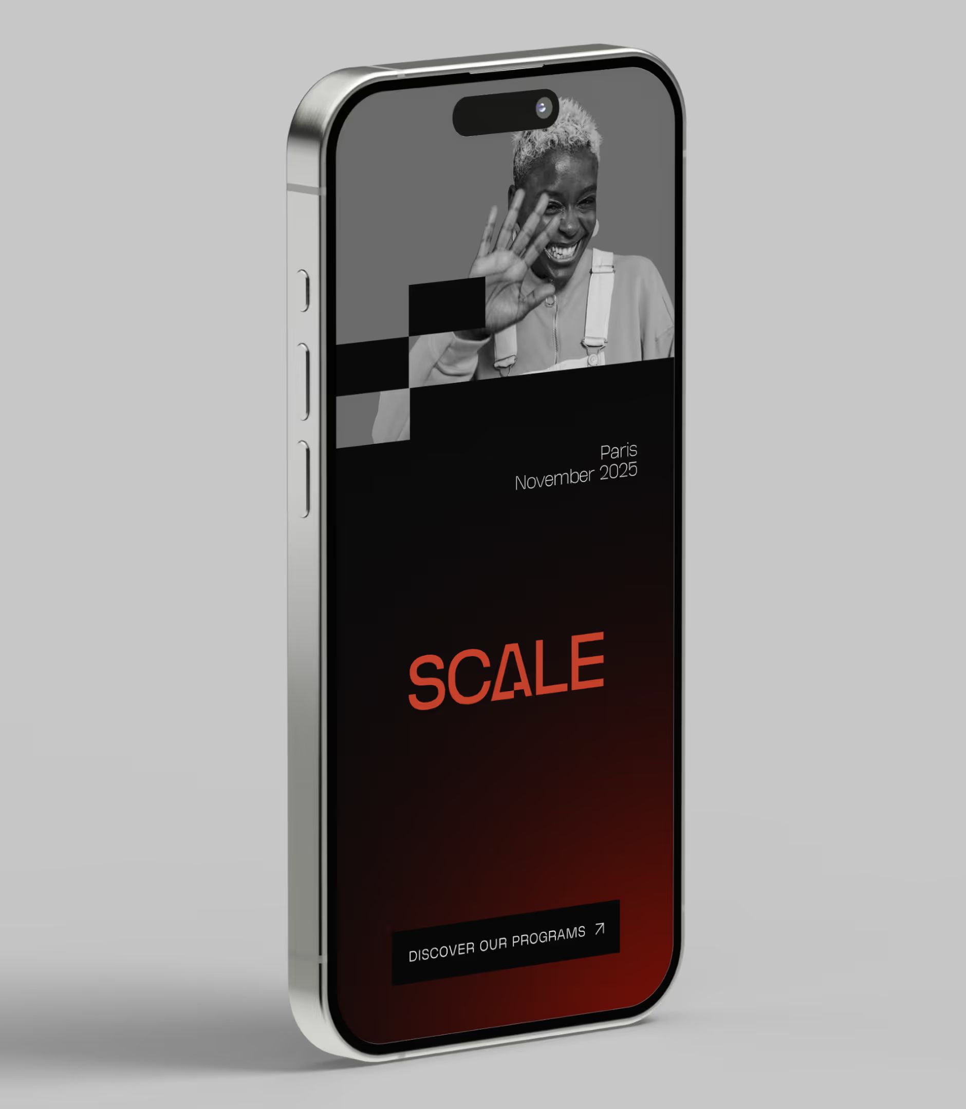
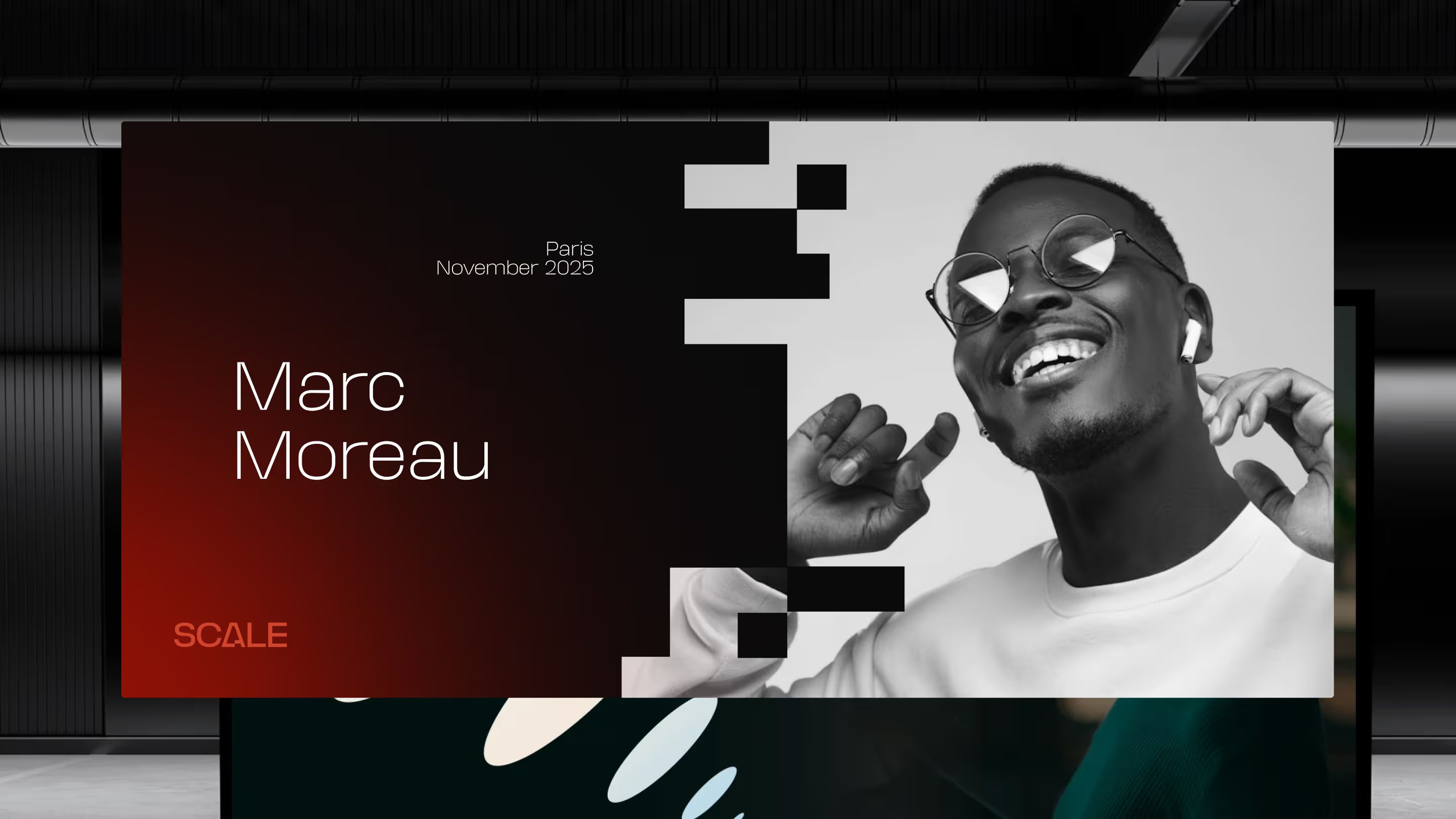
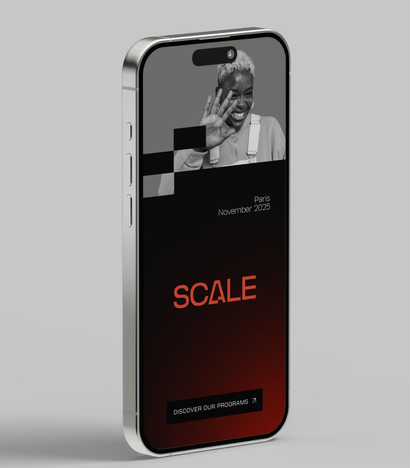
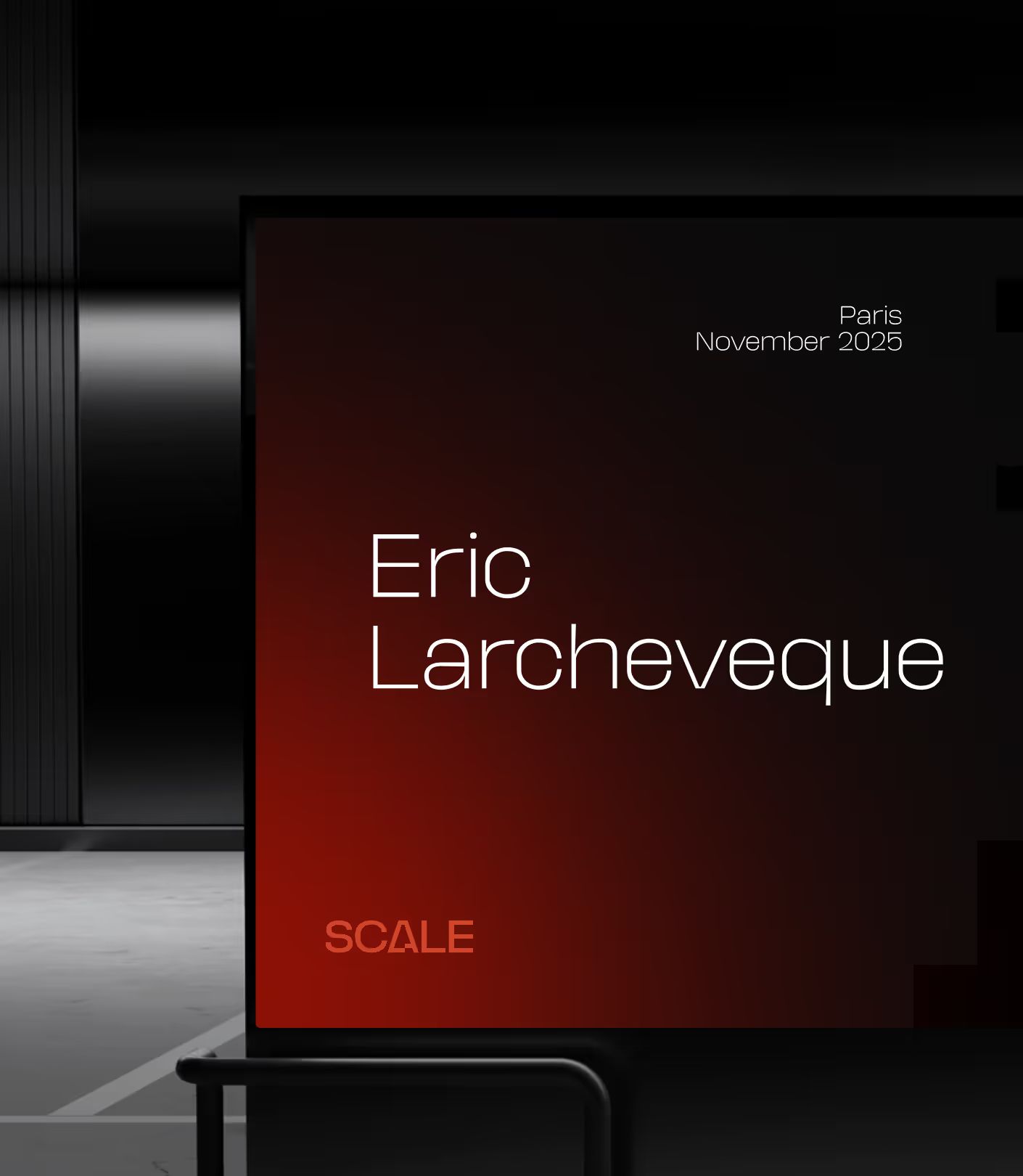
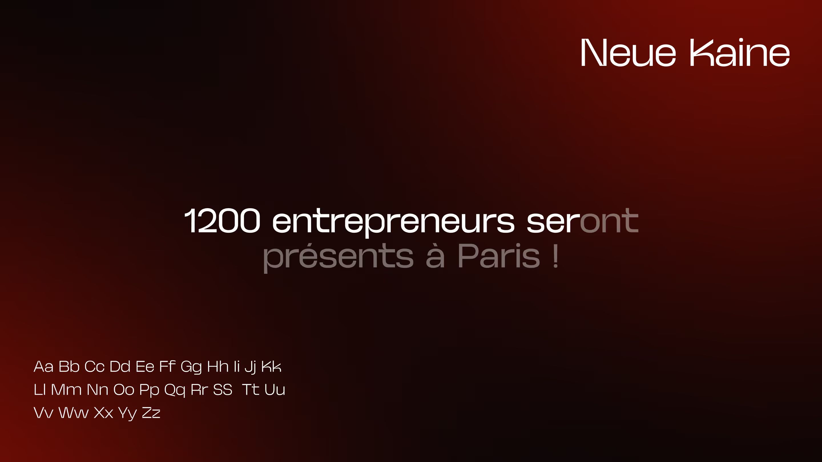
Once the mark was approved, we had to build everything that brings an event of this scale to life. The Brand Scale rests on three pillars: a tight palette of deep black, vivid red, and white; dramatic black-and-white photography set against color accents; and a display typeface that feels dense yet stays readable at large scale.
We rolled it out across the event’s real-world touchpoints:
| Support | Usage |
|---|---|
| Event poster | Print & digital communication |
| Badge / lanyard | On-site participant check-in |
| Stage screen | Screen graphics for the venue |
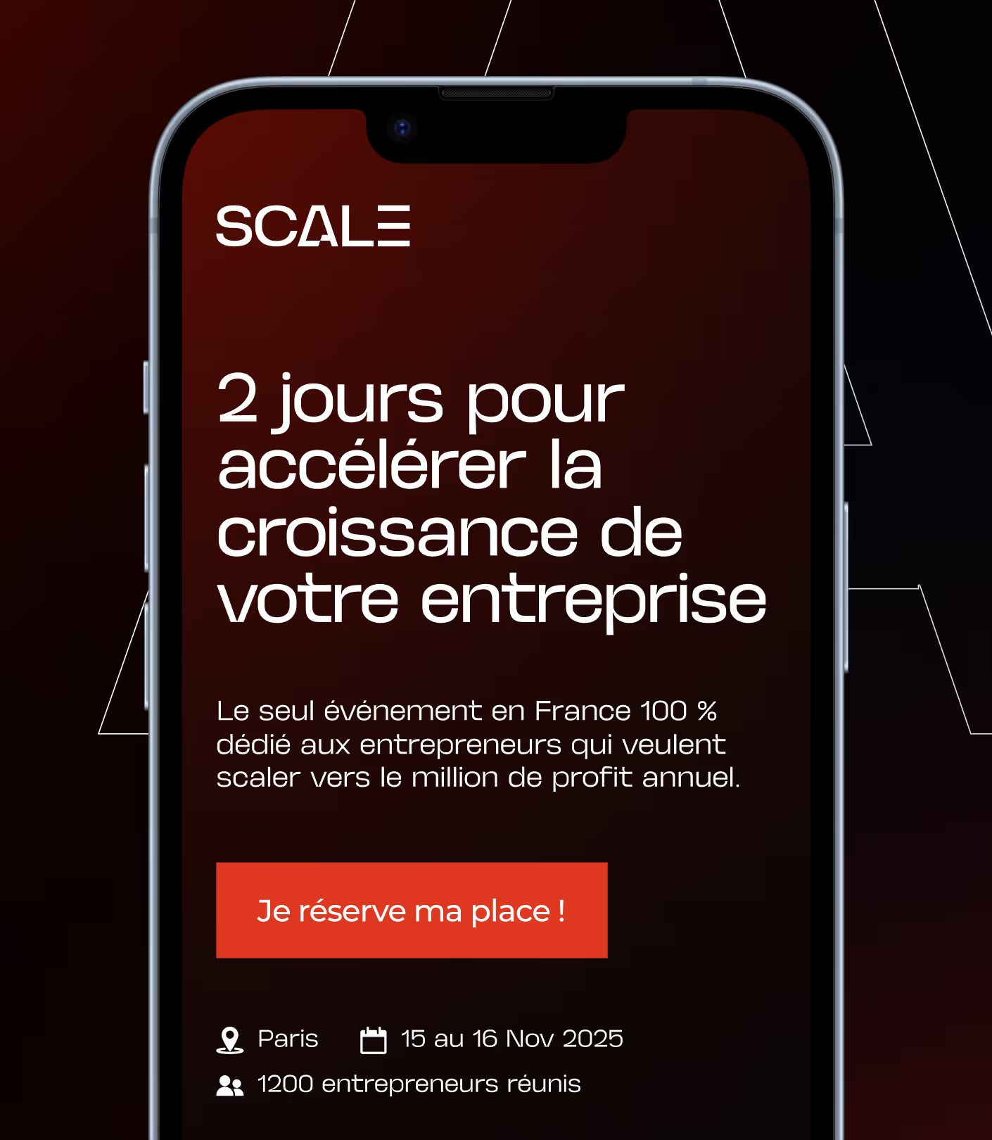
| iPhone mockup | Social media visuals and announcements |
| Apple Watch mockup | Promotional applications |
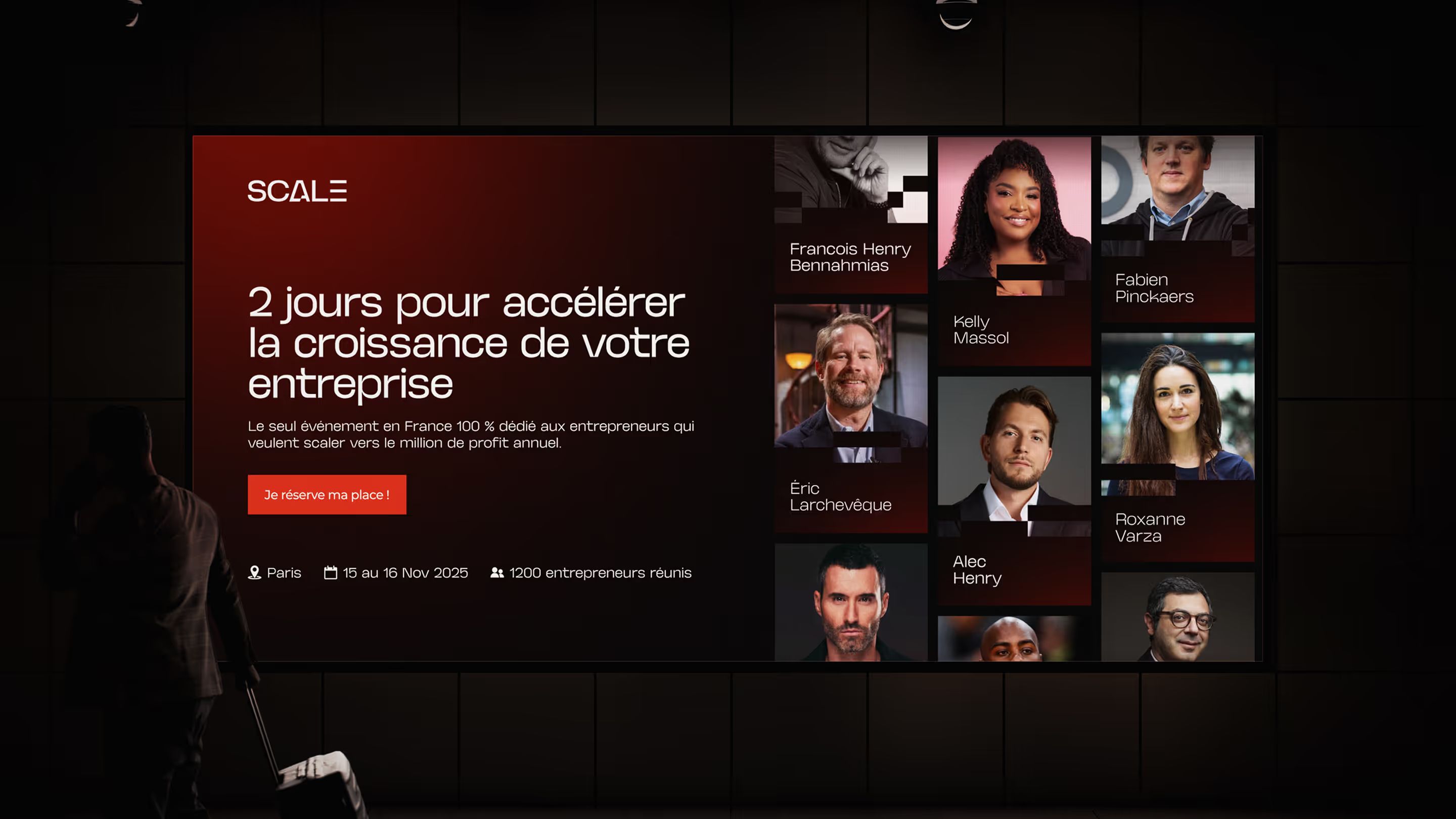
| Digital OOH | Digital advertising display |
The result is a cohesive identity from the very first digital touchpoint to the big day on site, built to work at every scale.

Art Direction
Cinematic and effective: art direction built to convert
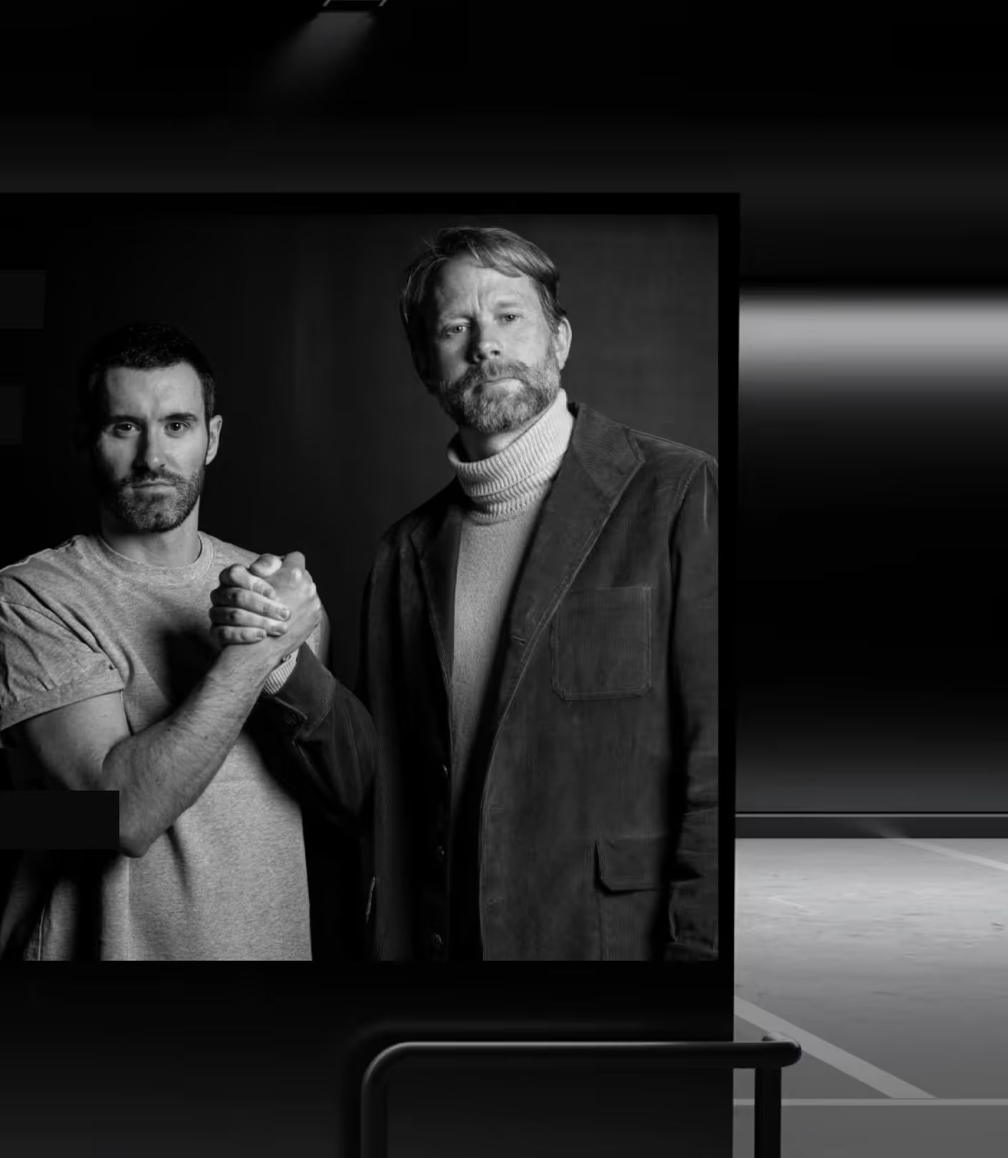
Scale’s art direction draws from the visual language of cinema and major international conferences, while staying rooted in the French-speaking entrepreneurial world. The goal wasn’t just aesthetic. Every visual choice had to drive conversion.
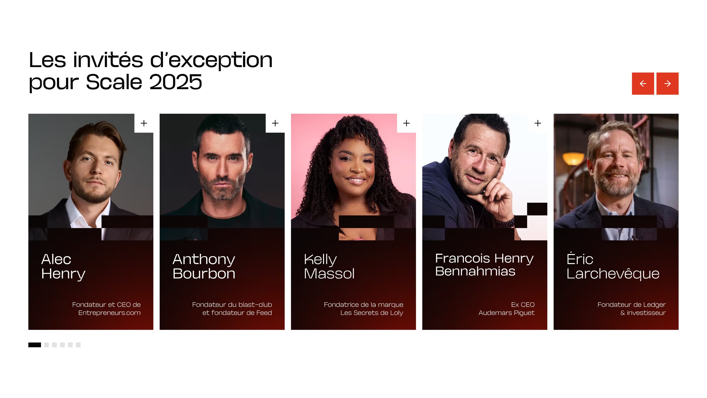
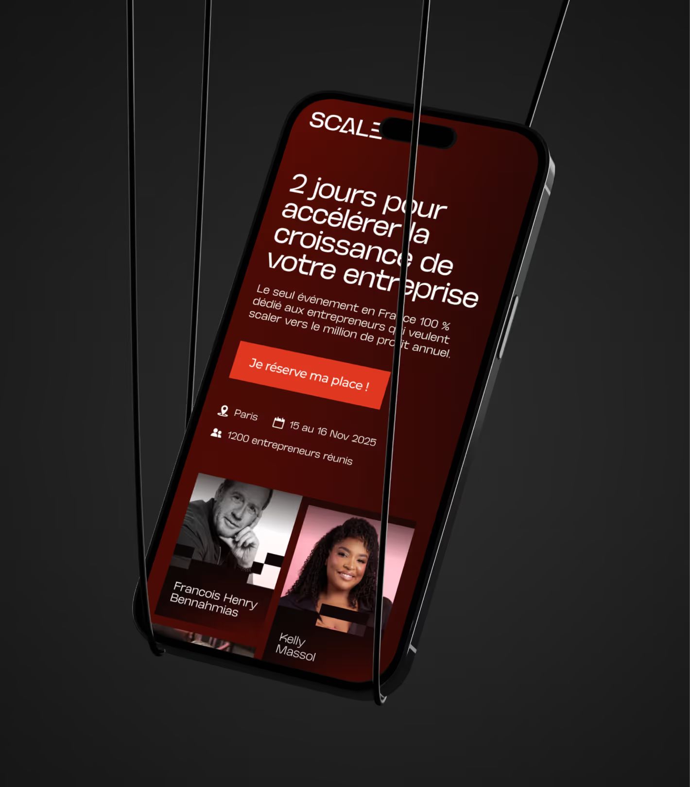
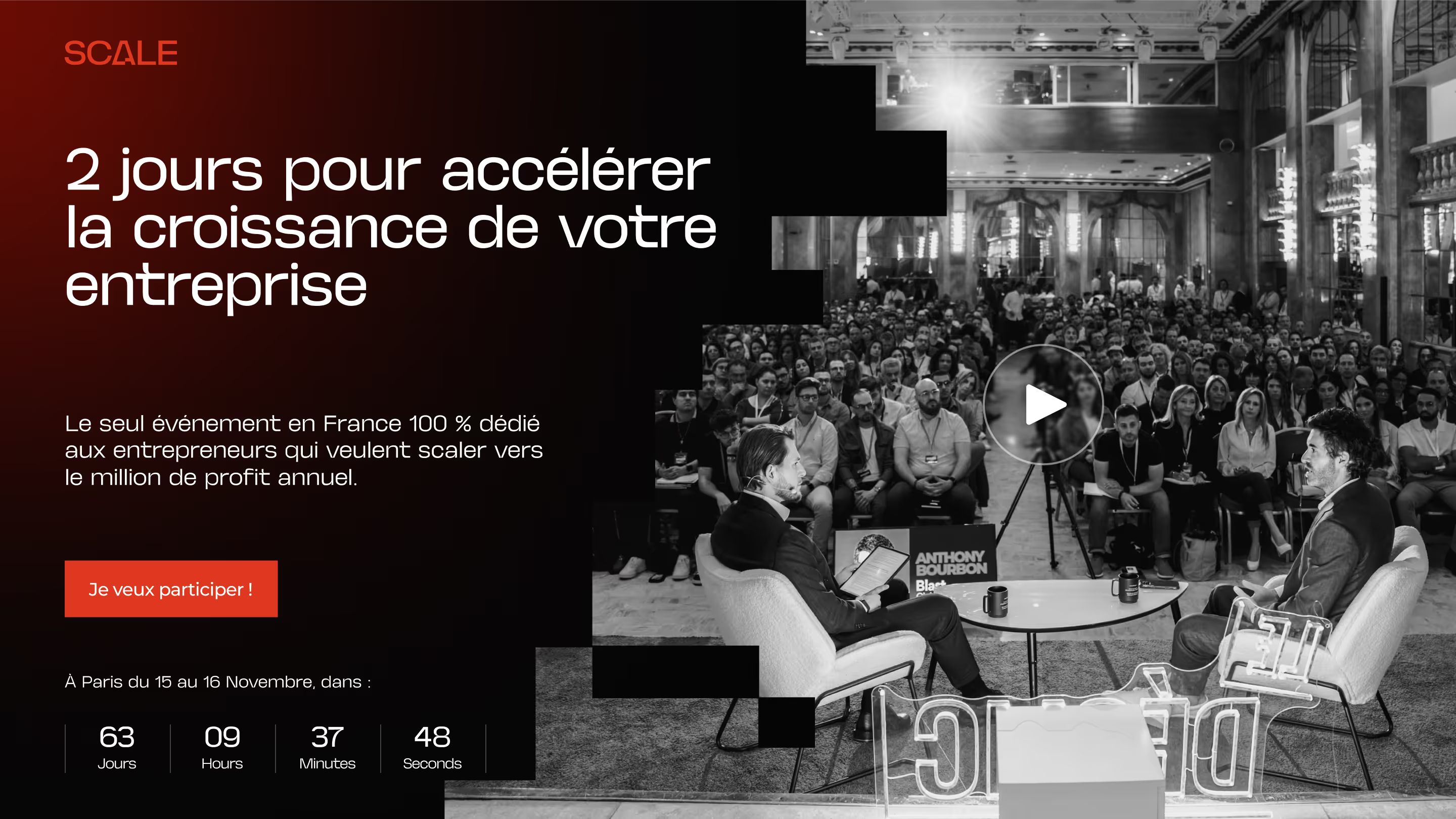
The core concept, overexposed black-and-white photography on a dark background with red accents, creates an immediate contrast that grabs attention while scrolling. Speakers stand out through full-page portraits, a treatment that reinforces credibility and the promise of the stage. Conversion sections like pricing and CTA reuse the same color system for a seamless experience from start to finish.
The visual direction was designed directly in Figma by Sacha, with feedback from Maxime, who created the logo, to ensure continuity between the identity and the page experience. Several iteration cycles helped refine the details, especially the gradients, texture effects, and typographic hierarchy, before the handoff to development.
UI DESIGN
A landing page built to sell tickets
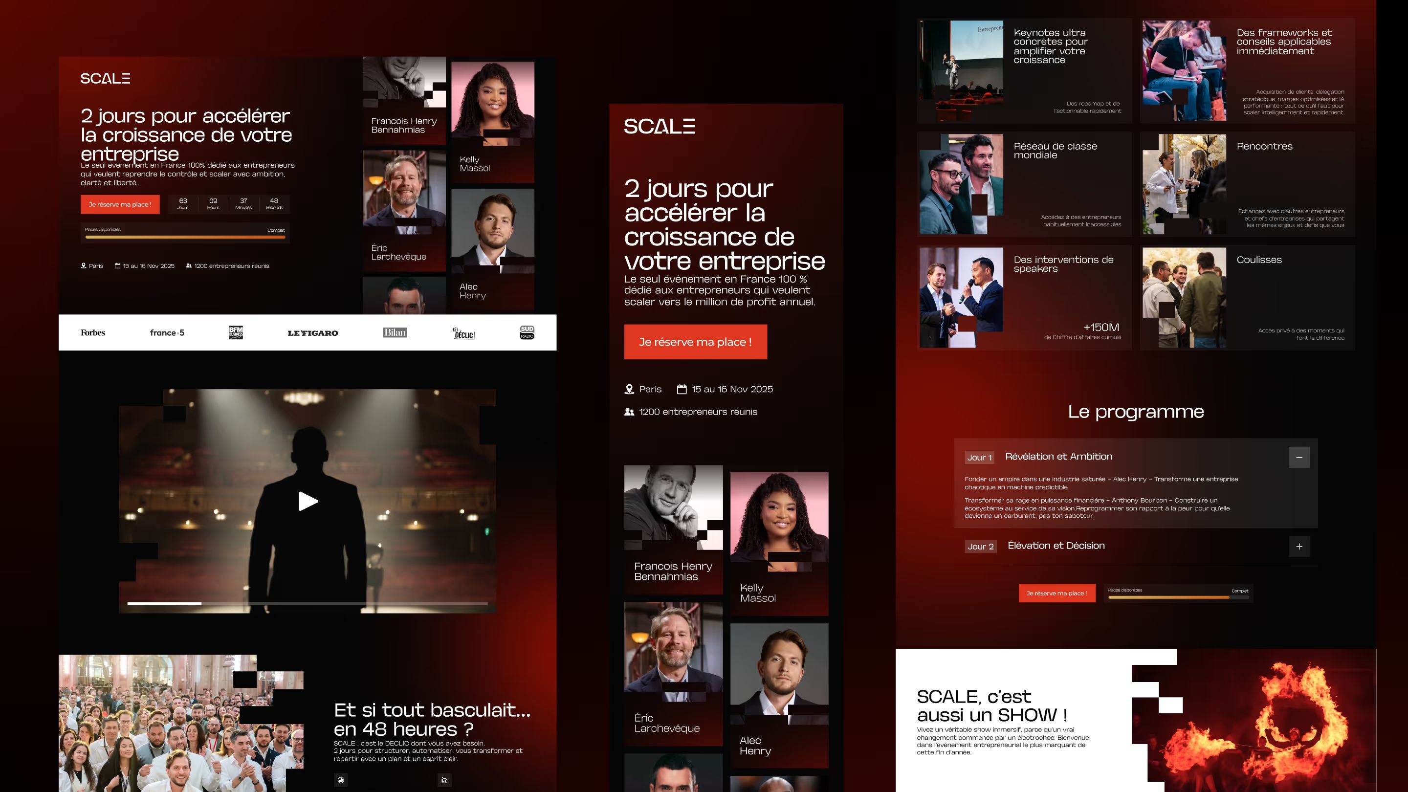
The Scale landing page is a long-form page with a high conversion stake. Every section plays a specific role in the visitor journey: grab attention, build credibility, persuade, reassure, and convert.
| Section | Goal in the funnel |
|---|---|
| Hero + teaser video | Grab attention, set the tone |
| Editorial promise | Qualify the audience, highlight the benefits |
| Speakers (portraits + bios) | Build credibility through the names |
| Program / agenda | Add substance to the promise |
| Pricing & tickets | Trigger the purchase with less friction |
| Video testimonials | Reassure, remove objections |
| Legal footer + final CTA | Capture the last hesitant visitors |
The interactions were designed to reinforce the event’s density without weighing down the reading experience: animated scrolling banner, parallax effects on images, transitions between sections.
On mobile, the design was reworked to prioritize readability and speed, trimming some animations that caused lag on iOS devices.


WEBFLOW DEVELOPMENT
An event site built with the standards of a digital product
The Scale landing page was fully built in Webflow, with a CMS plan, and hosted in the client’s workspace. The challenge came from both the depth of the interactions and the high-stakes conversion flow: every button had to send users to the right checkout, with zero data loss.
Interactions & animations
The site ships with an advanced animation setup for Webflow: scroll-triggered motion on text and KPI cards, parallax effects on hero images, fade-and-slide transitions between sections, a looping marquee banner, and multi-item carousels with simultaneous drag/click handling on mobile.
Video integration
The teaser video is hosted on Cloudinary (CDN) to ensure smooth playback without relying on YouTube or Vimeo for rendering. Client testimonials are embedded via Vimeo with a custom modal, the native player was replaced to keep the page visually consistent.
Tracking & UTM
At the client’s request, UTM parameters in the URLs are automatically passed into the redirect buttons linking to the checkout pages. That makes end-to-end campaign tracking possible, from acquisition source to completed purchase, with no break in analytics data.
Cross-browser and cross-device compatibility$
Several technical points required custom development:
| Issue identified | Solution applied |
|---|---|
| SVG gradients ignored by iOS Safari | SVG exports resized to 479px + mobile-friendly formats |
| Display bugs on desktop Safari | Targeted CSS fixes after QA |
| Lag on mobile text animations | Animations disabled / simplified at the mobile breakpoint |
| Drag+click interactions on mobile carousels | Clickable area limited to the CTA button only |
The site went live in late August 2025, after several internal desktop and mobile QA cycles before handoff to the client.



Our latest projects
+250 companies
supported
Websites designed and developed with










You're going to working with us, guaranteed
Ready to launch
your business?
Let’s f*****G GO !!