Projects
 Our Offers
 Dedicated team
 Blog
 Academy
 About Us
Fenoma x Gemeos
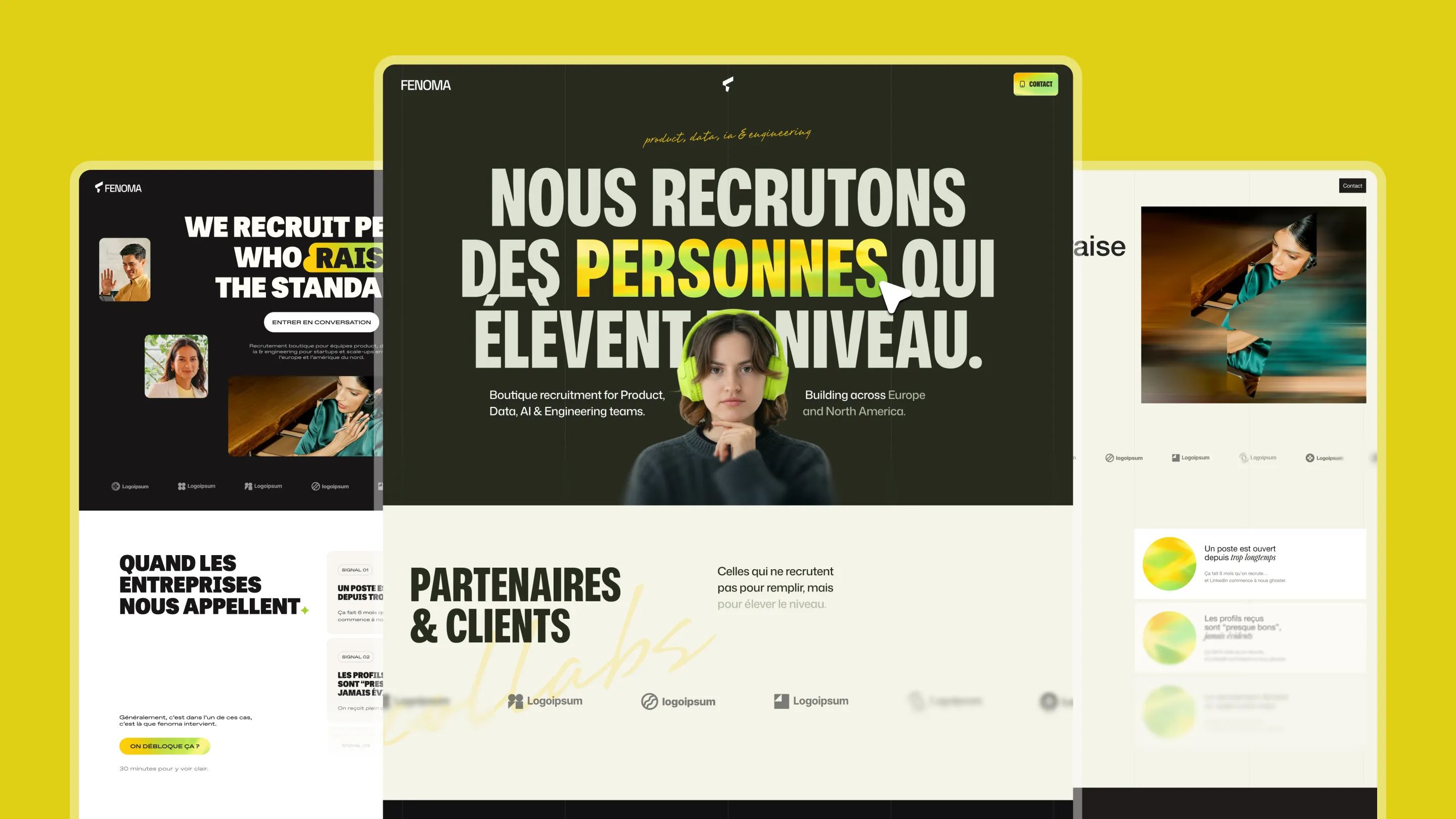
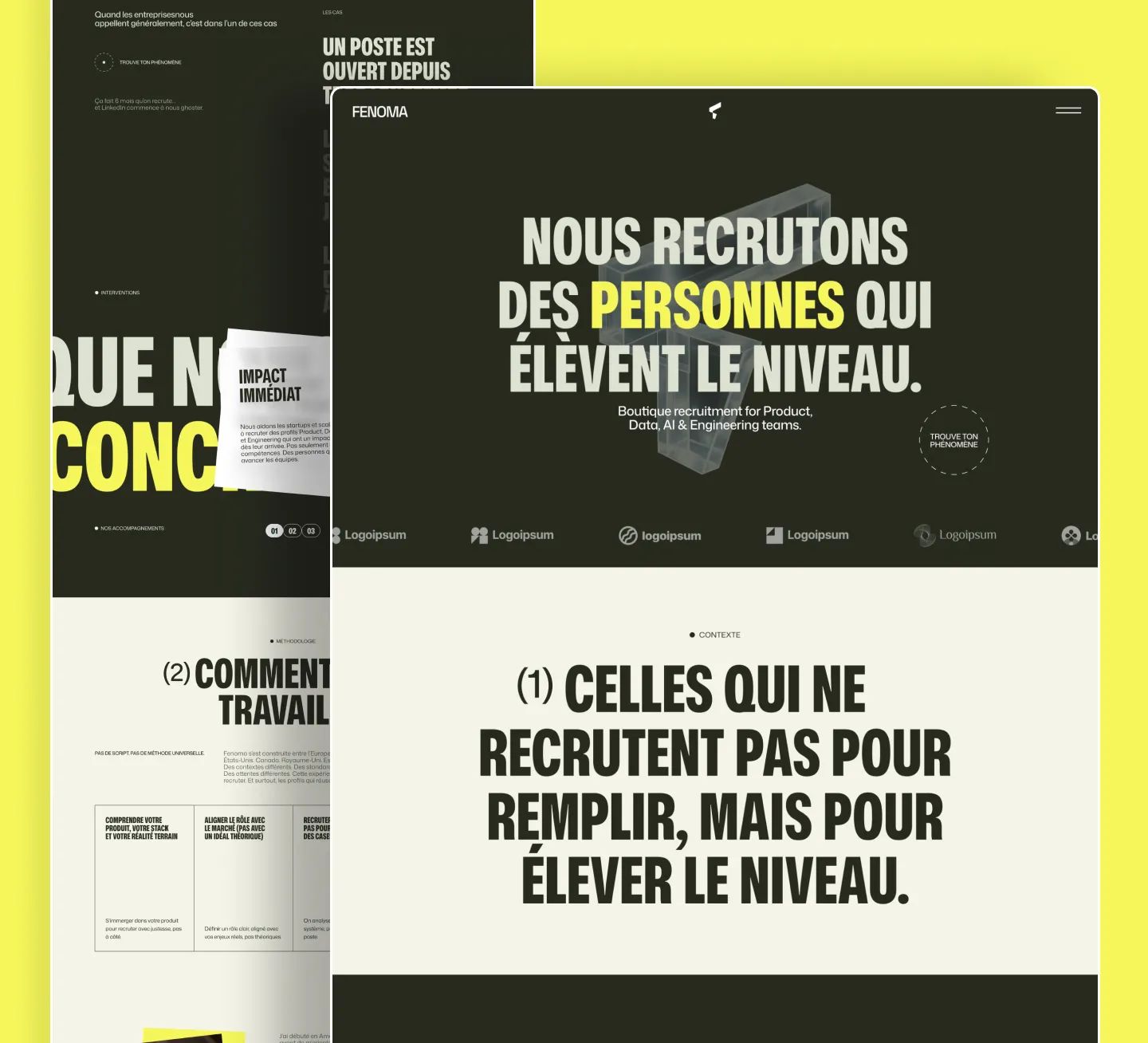
Branding, art direction, UX/UI, Webflow, and SEO for Fenoma, boutique recruiting for Product, Data, AI & Engineering teams across Europe and North America.
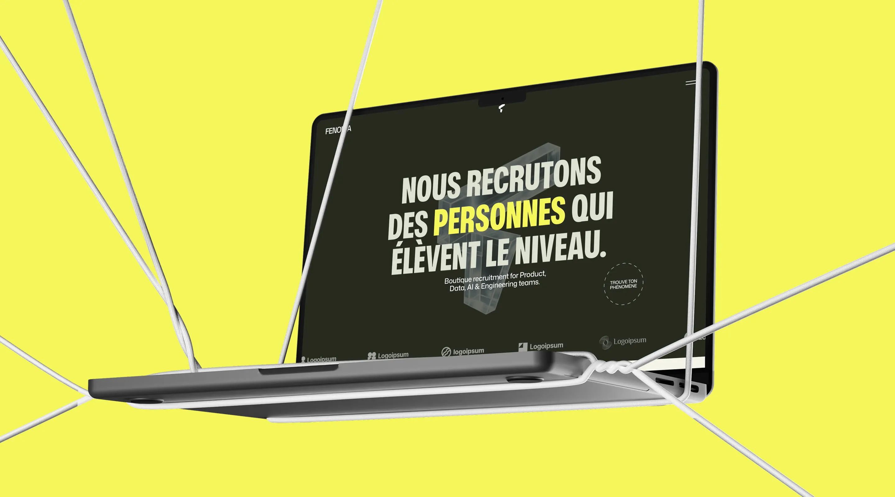
Fenoma: The recruiting firm that hires people who raise the bar
Fenoma is a boutique recruiting firm specializing in Product, Data, AI, and Engineering talent for startups and scale-ups operating between Europe and North America. Their philosophy: quality over quantity, always. No mass CV blasts. No recruiting theater.
Gemeos built Fenoma’s visual identity from the ground up, branding, art direction, UX/UI design, Webflow development, and SEO optimization, for a site as demanding as the hires they deliver.
- Industry
- HR
- Services
- Branding
- Artistic Direction
- UX/UI Design
- Development
- SEO
Branding: A visual identity as selective as the firm
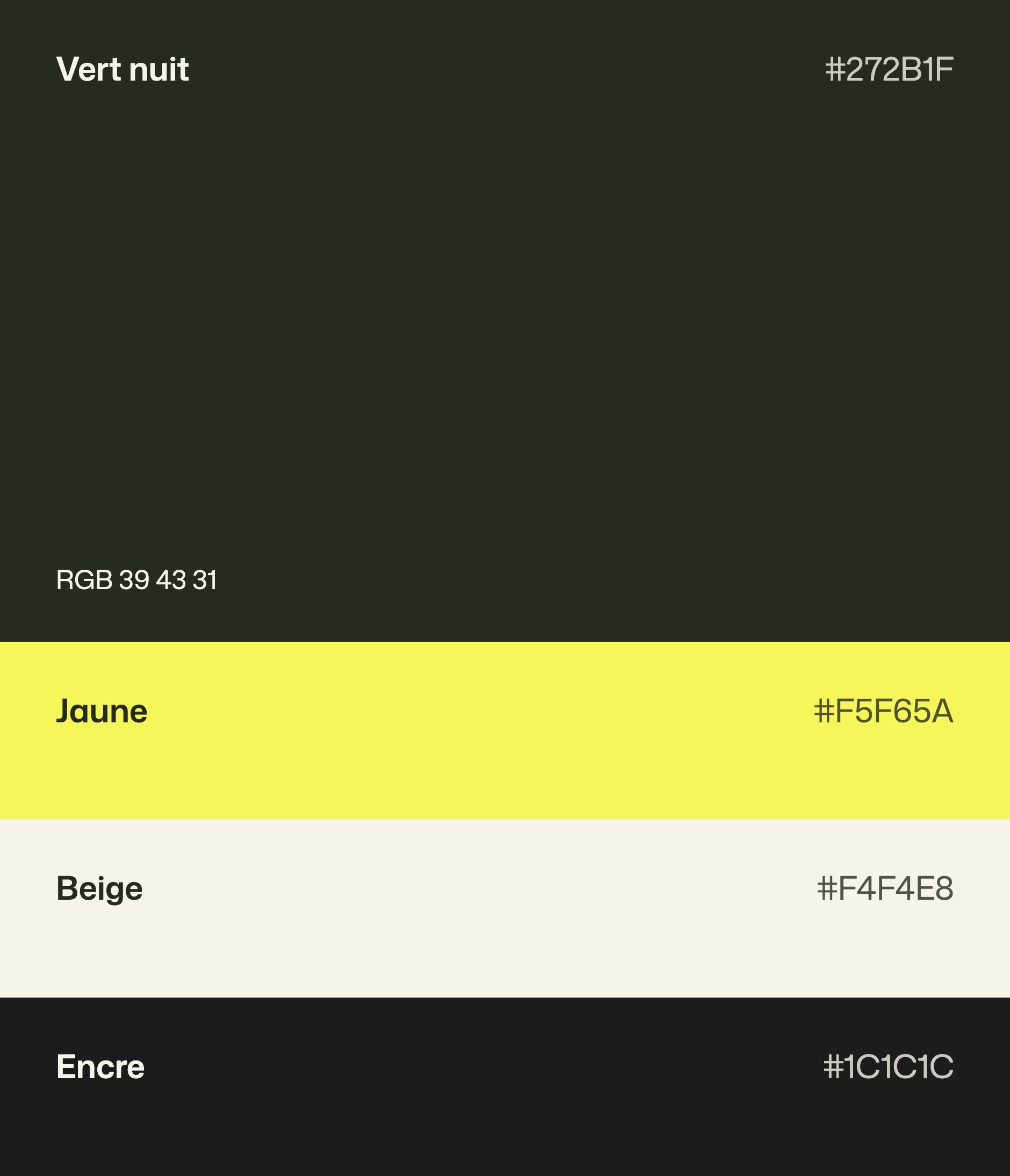
Fenoma’s branding had to embody a rare stance in recruiting: direct, demanding, and free of corporate bullshit. Gemeos developed a clean, memorable visual identity built to speak to founders, CPOs, and CTOs at Europe’s best startups.
| Branding deliverable | Details |
|---|---|
| Logotype | Creation, clean and memorable |
| Brand guidelines | Palette, typography, usage rules |
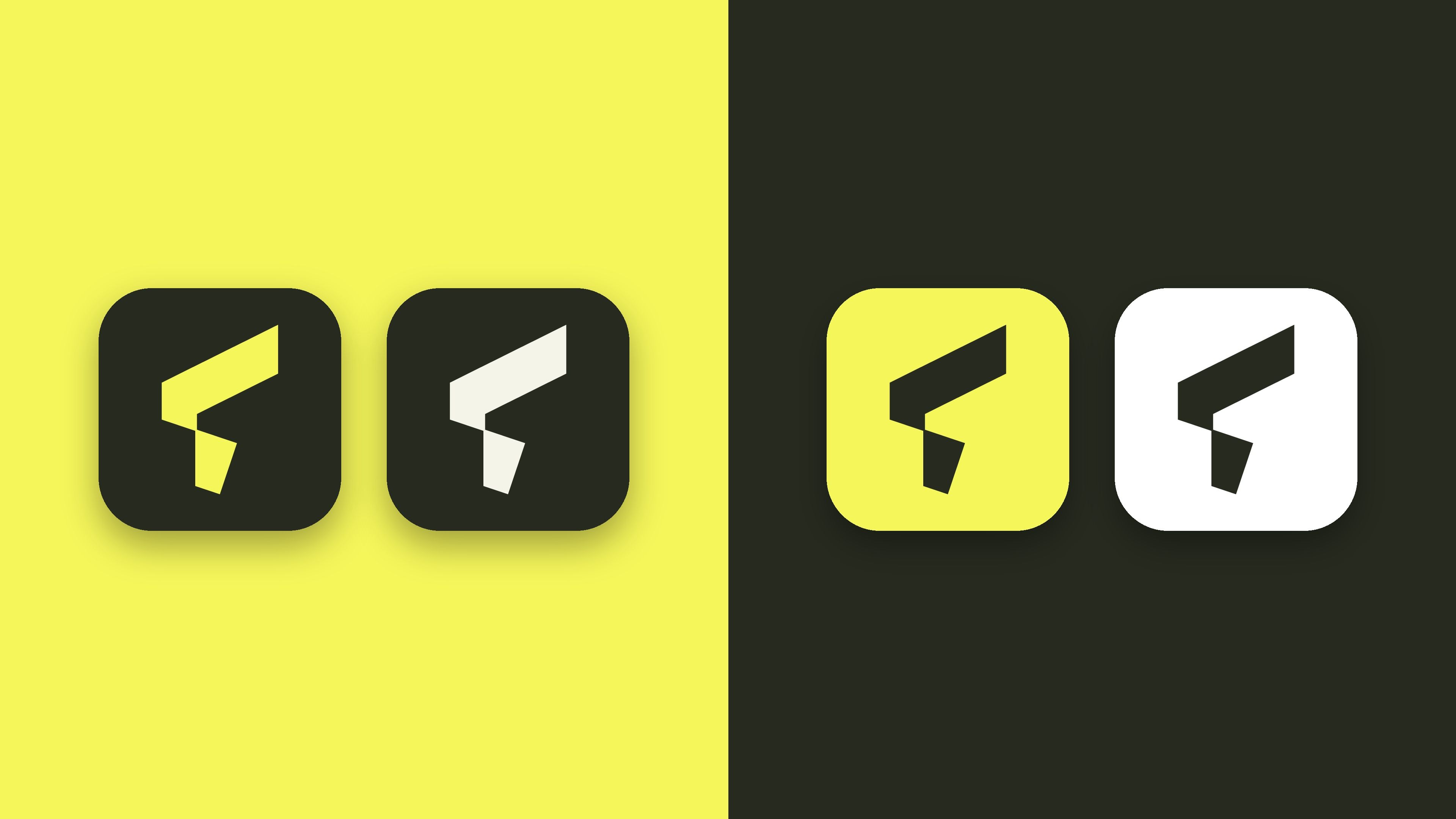
| Variations | Digital assets and communications |
| Guidelines | Full guidelines for LinkedIn communications |

Art Direction: A Boutique World, Between London and Paris
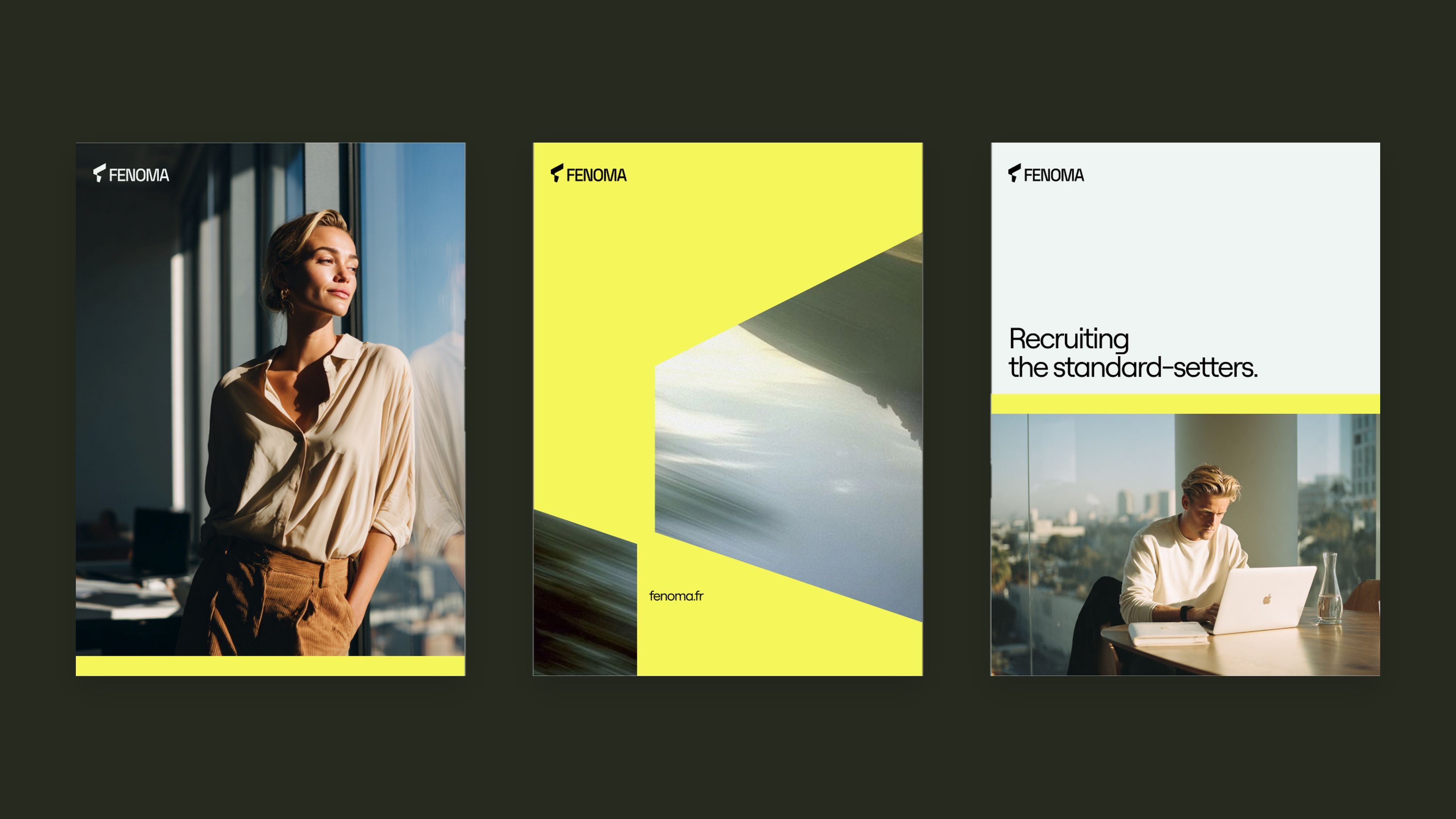
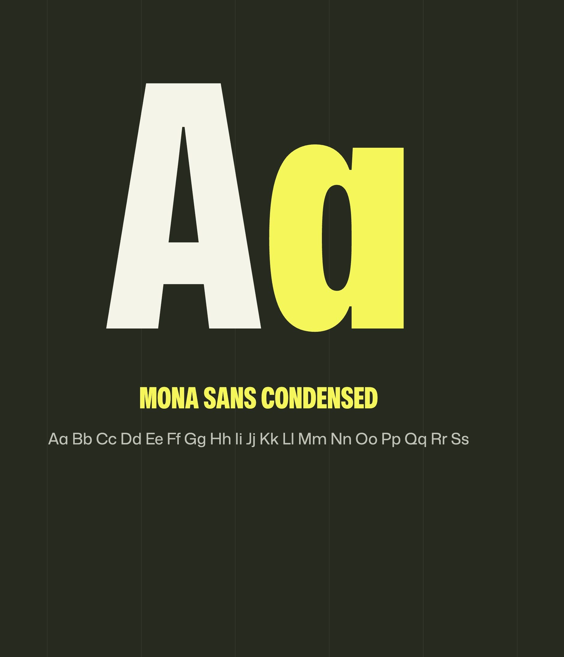
Fenoma’s art direction had to break away from standard recruiting codes. Gemeos built an editorial visual world that feels elegant and exclusive, and speaks to top tech talent as well as the founders looking for them.
| Art Direction Element | Approach |
|---|---|
| Visual World | Boutique, editorial, between Europe and North America |
| Graphic Tone | Confident restraint, without standard HR codes |
| Typography | Character and readability, with a strong personality |
| Brand Consistency | Aligned with Fenoma’s branding |

Phenomenon & Energy
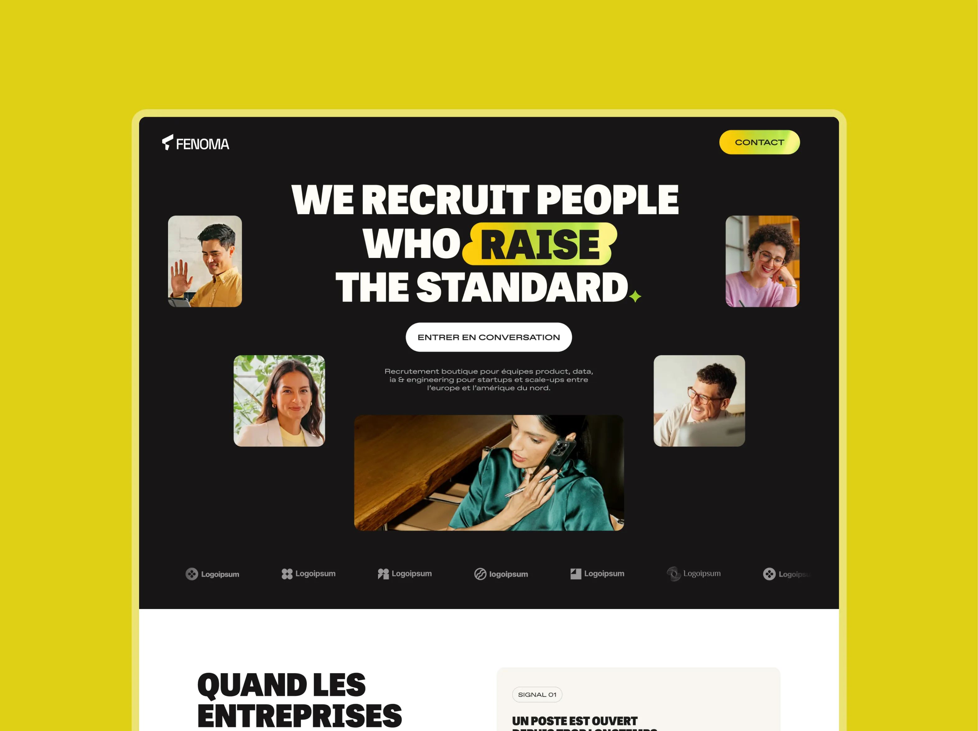
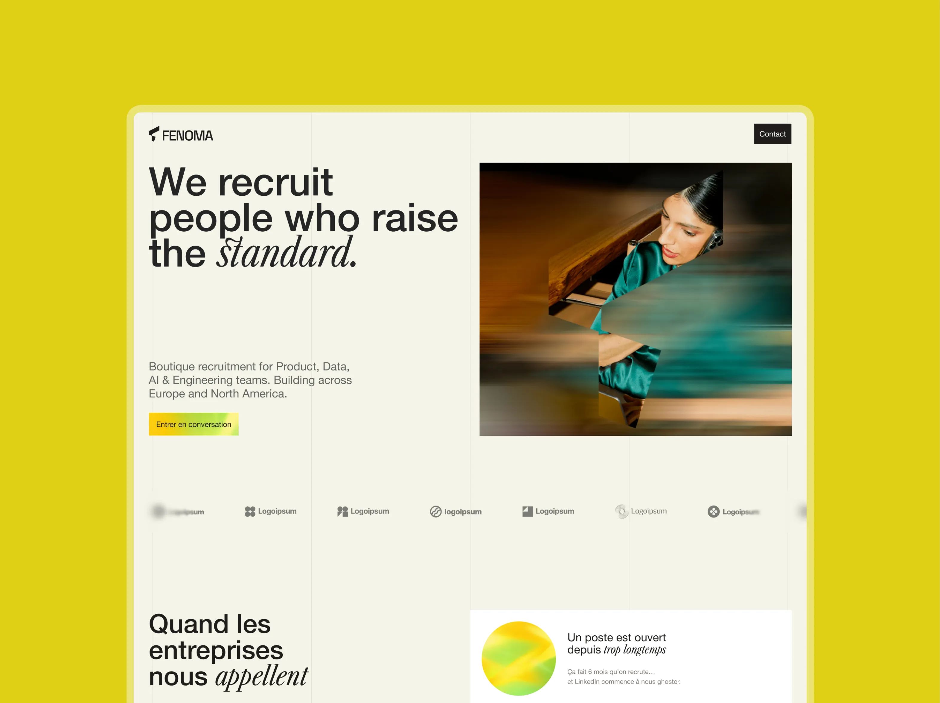
A massive, contemporary sans-serif typeface sets a high bar from the very first glance, bold, structured, and confident without feeling aggressive. The vibrant gradient keyword in the hero turns energy and momentum into something you can see: not a decorative effect, but a deliberate choice. Human imagery in natural light grounds the message in reality, Fenoma talks performance through people, not abstractions. The palette pairs a restrained base with bright accents that capture the energy of the phenomenon. A modern, confident, high-energy identity.
Discernment & Precision
A deliberate typographic contrast between a structured, expert sans serif and a more expressive, instinctive italic, a reflection of Fenoma’s DNA: rigorous process and sharp instinct in selection. Blur becomes a strategic element: slightly veiled images that gradually reveal clarity, visually expressing the essence of Fenoma’s recruiting approach, bringing clarity out of complexity. Fine line icons capture the boutique, made-to-measure feel. The restrained editorial palette plays with light and rhythm rather than spectacle. A more signature-led stance. Less showy. More selective.
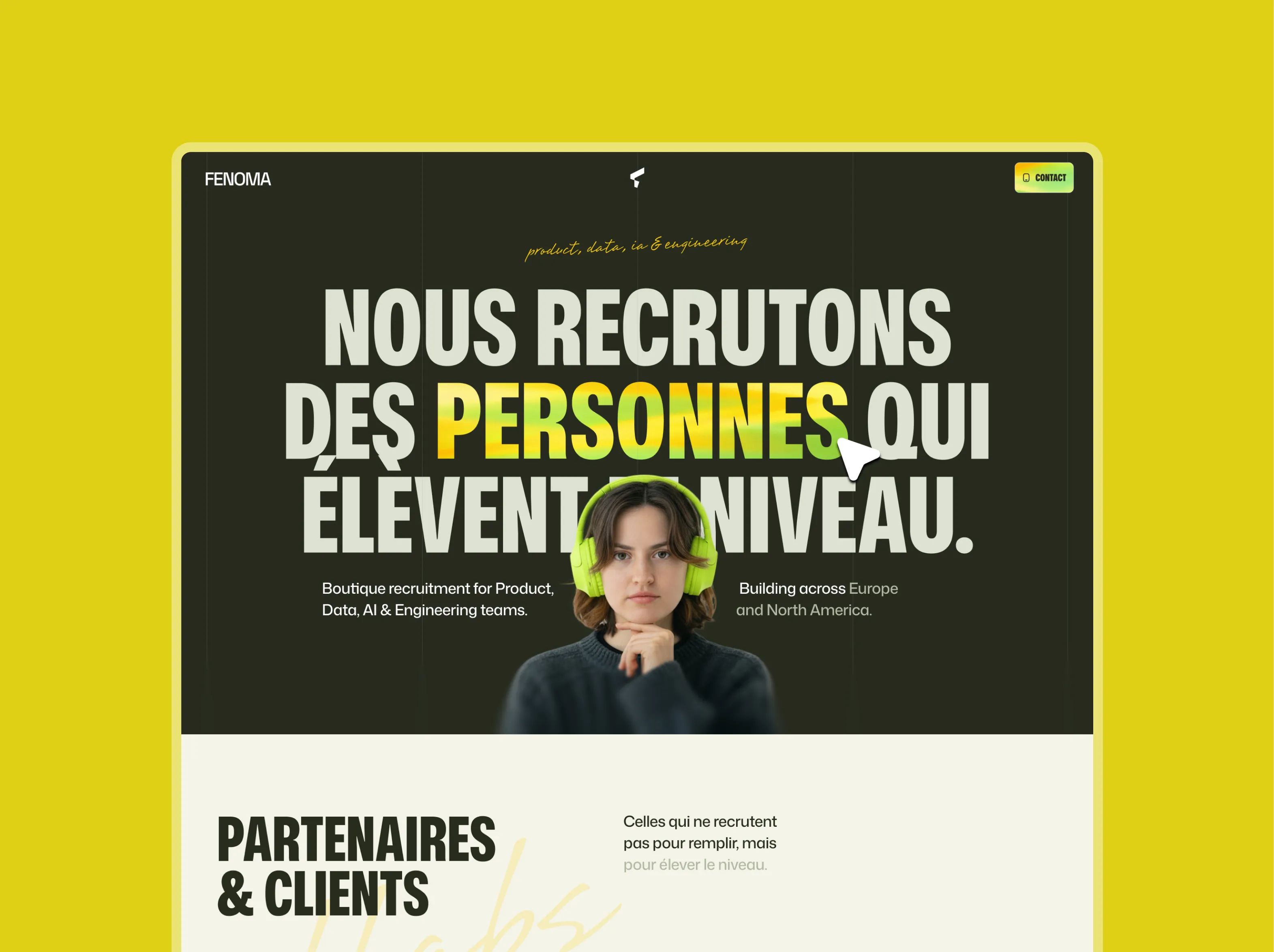
Dark & Typographic
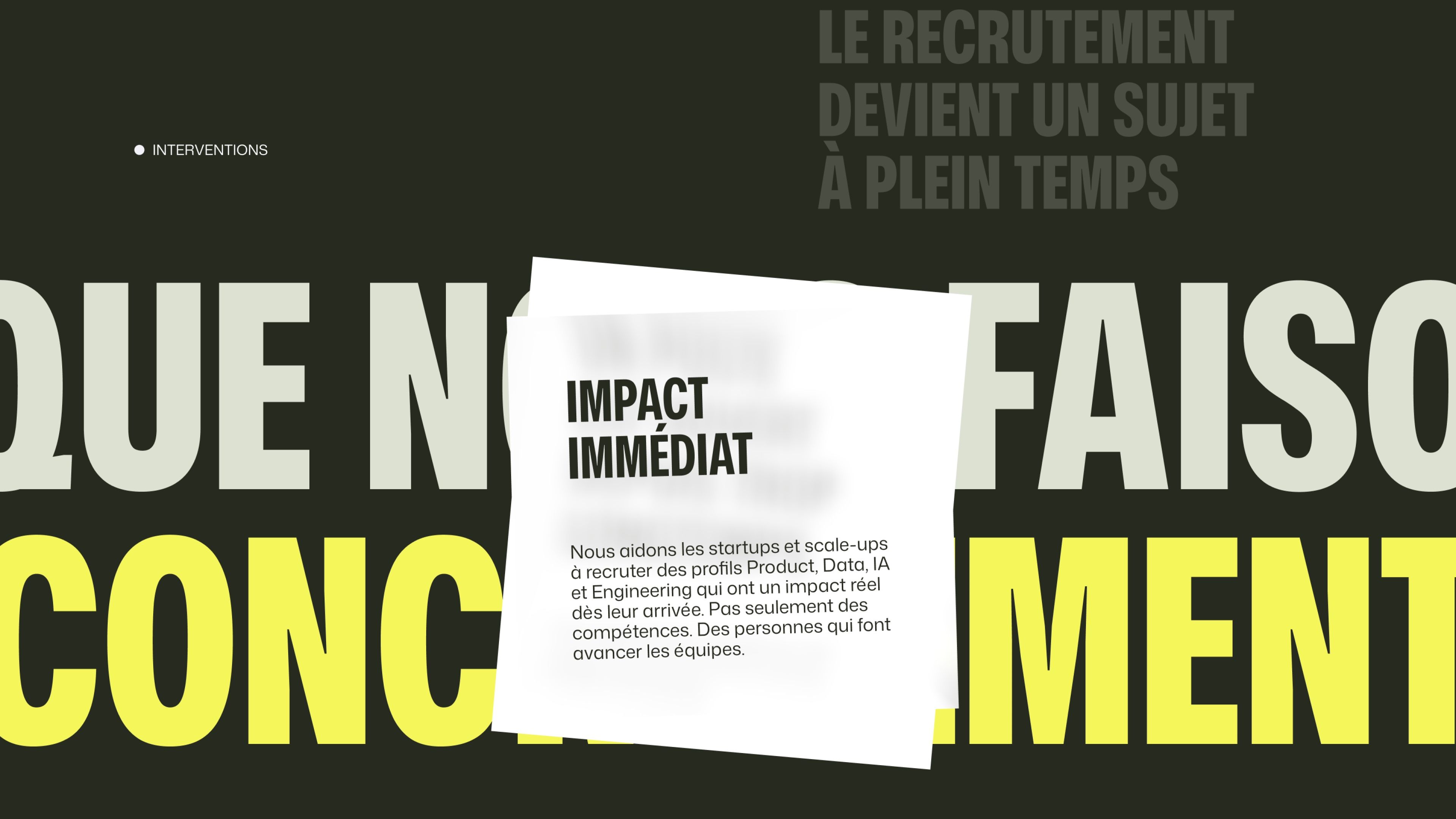
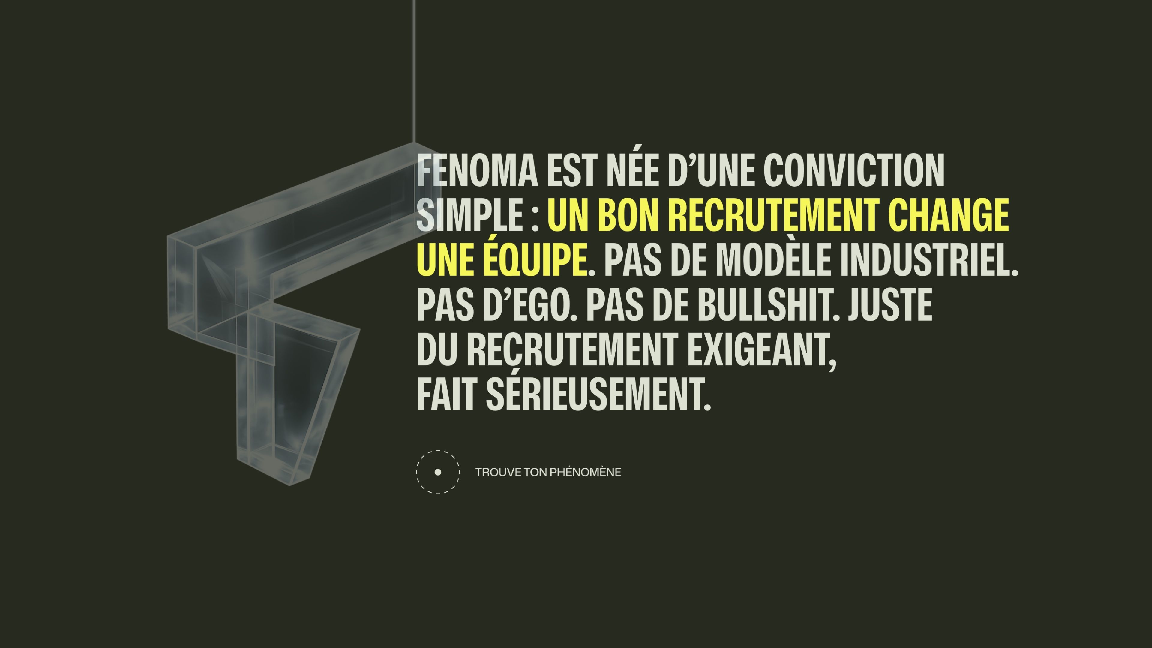
Same typographic energy as Concept 1, but pushed to the extreme in a dark, immersive world. The deep khaki background makes the extra-bold white type pop, with vibrant yellow-green accents, a sharp contrast that sticks instantly. Human photography is woven directly into the headline, merging image and text into a single composition. The cream-colored client section creates a welcome breather between two dark blocks. A radical, signature direction that positions Fenoma as a standout player in tech recruiting.
UX/UI Design: A Site That Filters as Much as It Attracts
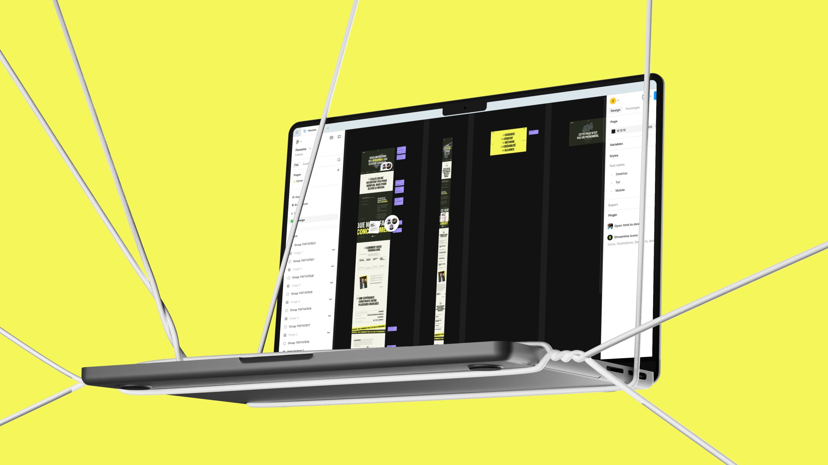
The Fenoma site doesn’t try to please everyone, and that’s intentional. The pages are clear, direct, and free of unnecessary friction. Every section supports the positioning: explain what makes Fenoma different, who it serves, and how to start a conversation.
| Designed Page | UX Goal |
|---|---|
| Homepage | Boutique positioning, conversation CTA |
| Services Page | Success-based recruiting + flexible RPO |
| Markets Page | Europe & North America |
| About Page | Philosophy and selective approach |
| Contact Page | Direct conversation, no corporate form |
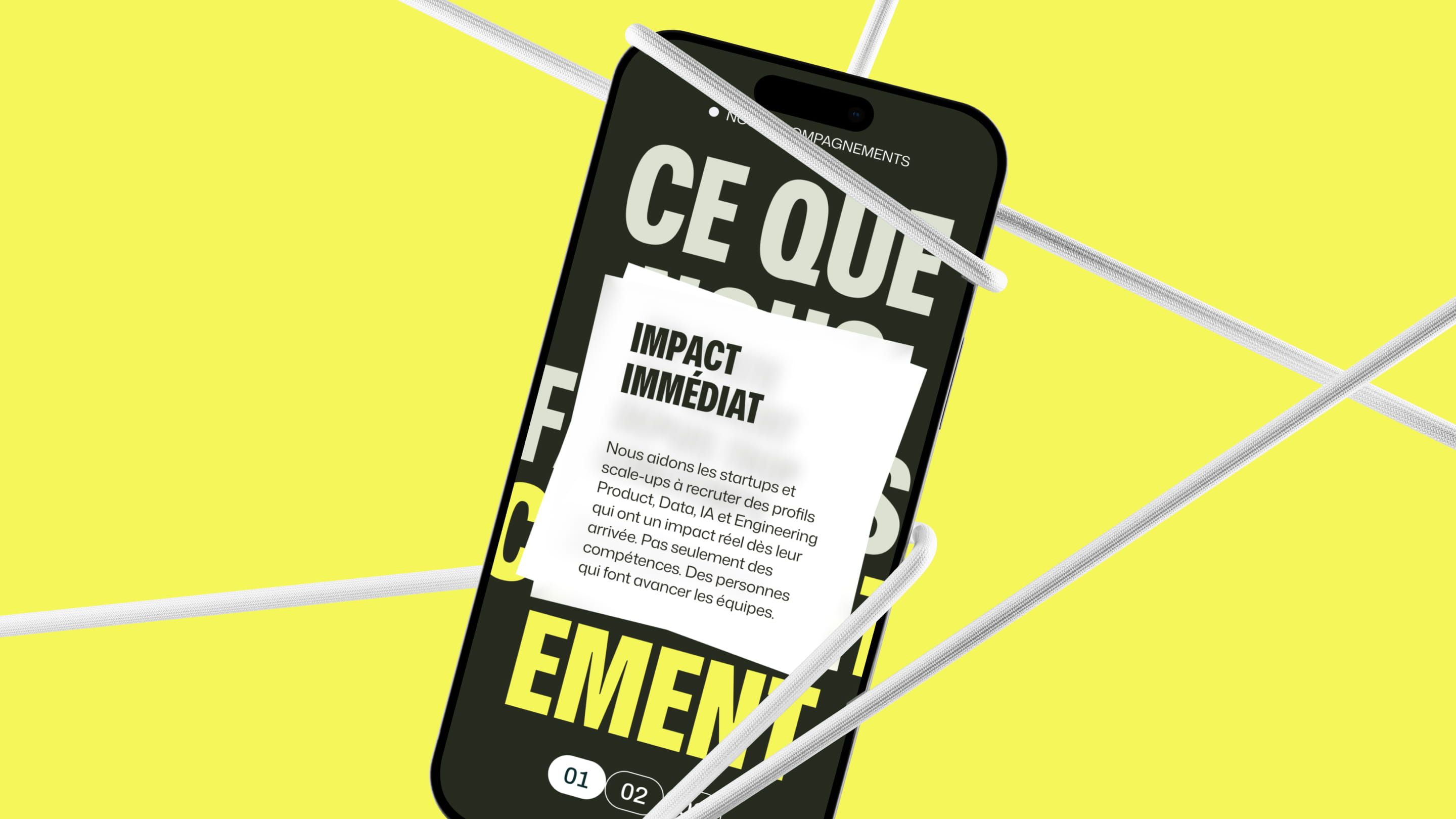
Webflow Build: A Lightweight, Precise, and Efficient Site
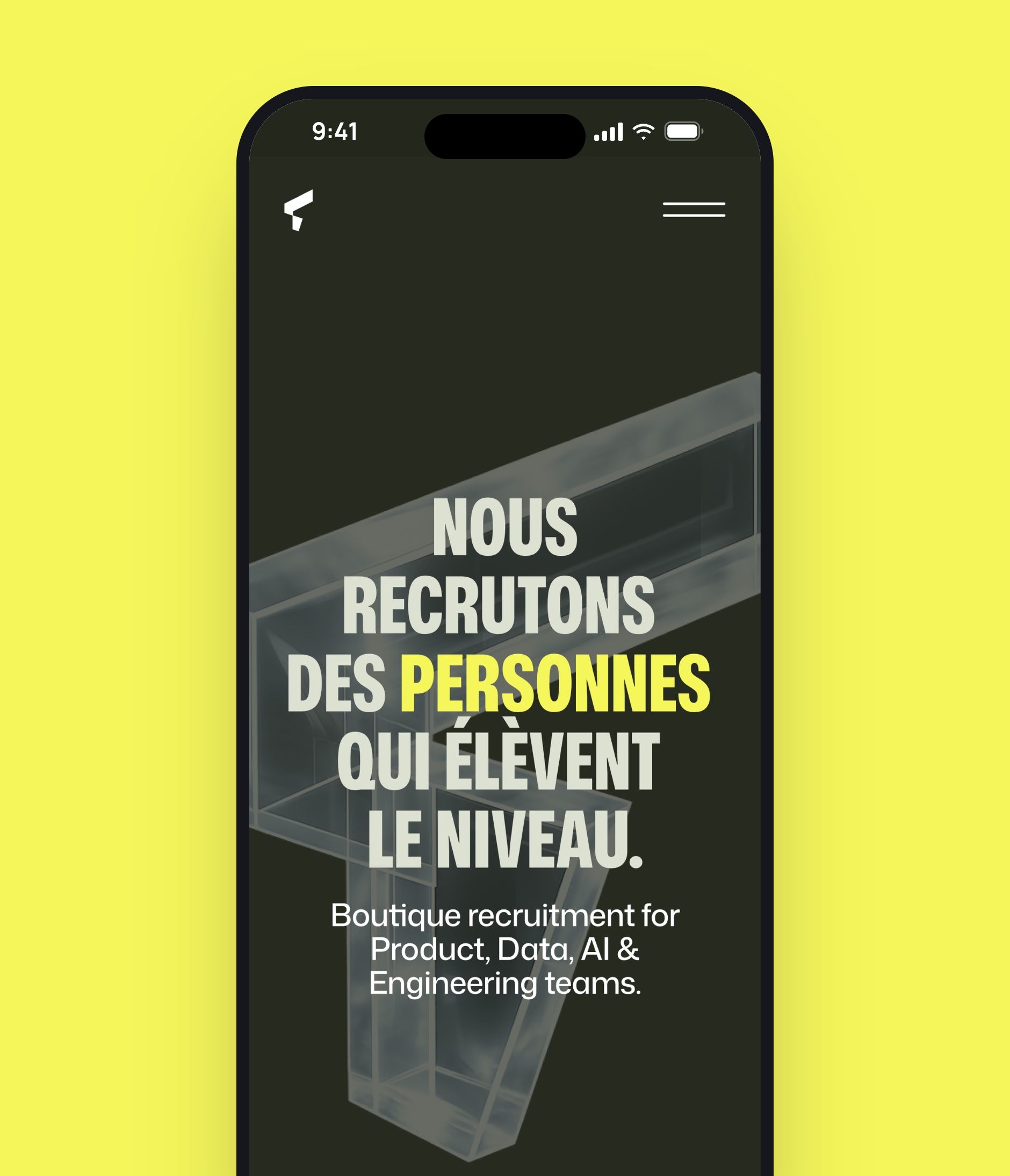
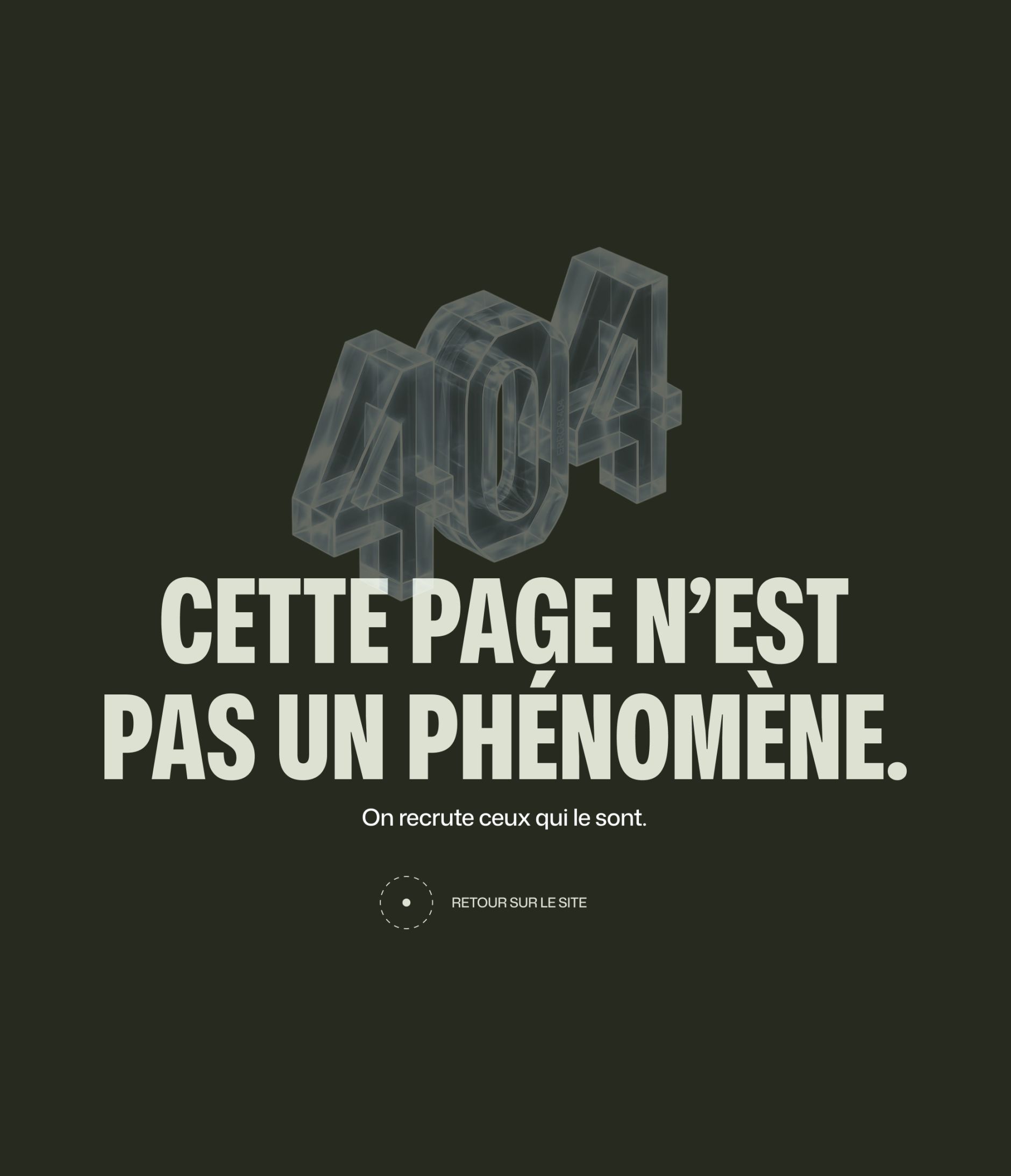
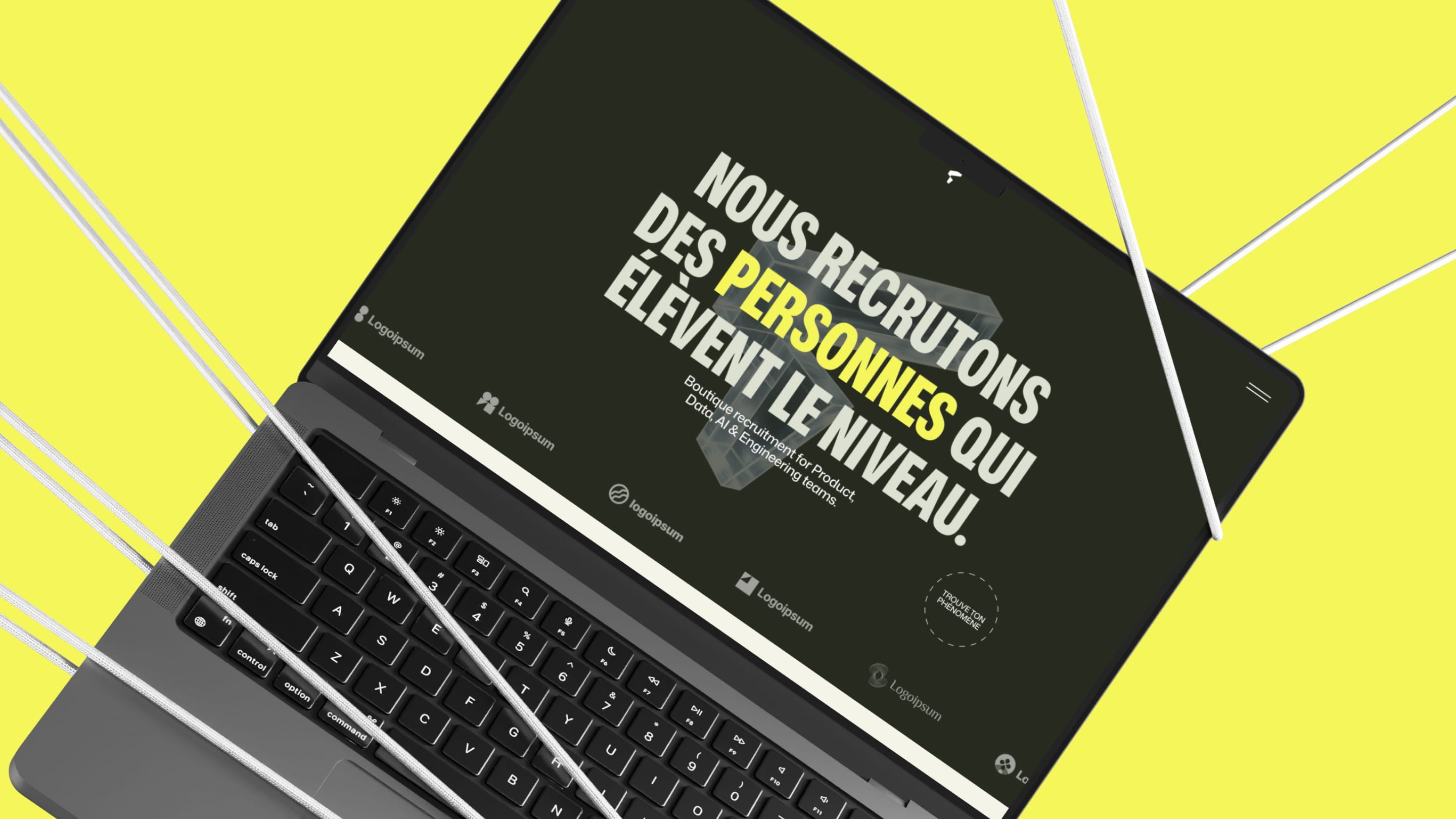
Fenoma’s Webflow build reflects the firm’s approach: no unnecessary effects, no clutter, just clean execution. The site is responsive, fast, and easy to manage on your own.
| Technical Aspect | Detail |
|---|---|
| Platform | Webflow |
| Responsive | Desktop, tablet, and mobile |
| Performance | Lightweight and fast loading |
| Maintenance | Client autonomy via Webflow Editor |
SEO: Visibility for Tech & Product Hiring Searches
Fenoma’s SEO strategy was built around high-intent searches in tech recruiting: Product Manager recruitment agency, Data Engineer recruiting, engineering recruitment London startup. The goal: attract founders and hiring managers at the right moment in their journey.
| SEO Focus | Action |
|---|---|
| Strategic keywords | Product, Data, AI, Engineering recruiting, FR + EN |
| On-page optimization | Titles, meta, Hn, semantic structure |
| Technical SEO | Speed, clean URLs, sitemap |
| SEO content | Pages by expertise and geographic market |
| Internal linking | Services → markets → client case studies |


Our latest projects
+250 companies
supported
Websites designed and developed with









You're going to working with us, guaranteed
Ready to launch
your business?
Let’s f*****G GO !!