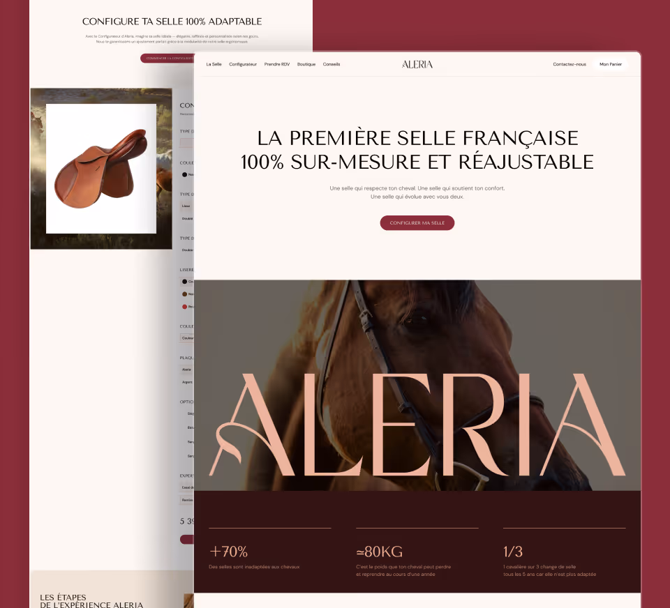
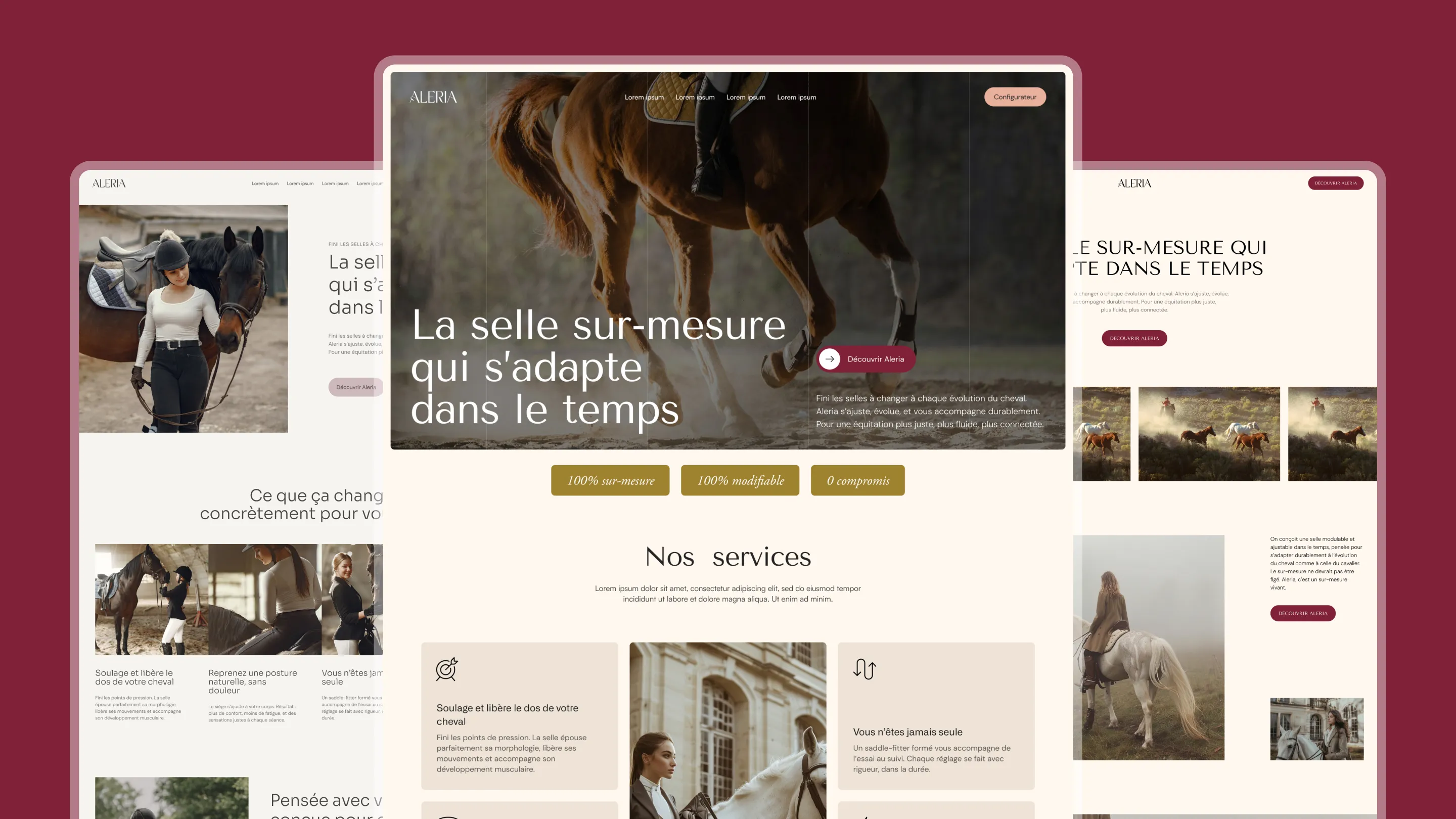
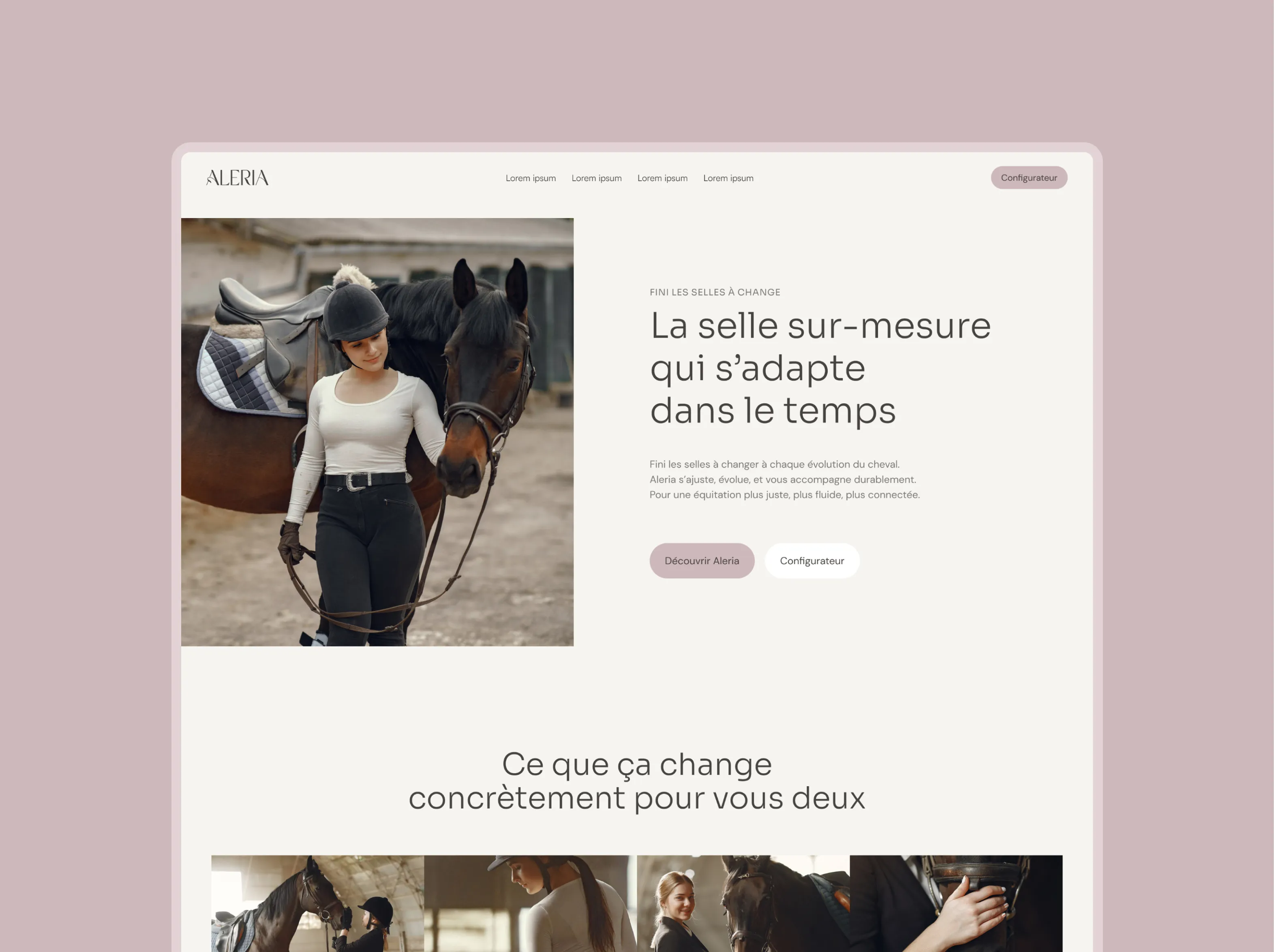
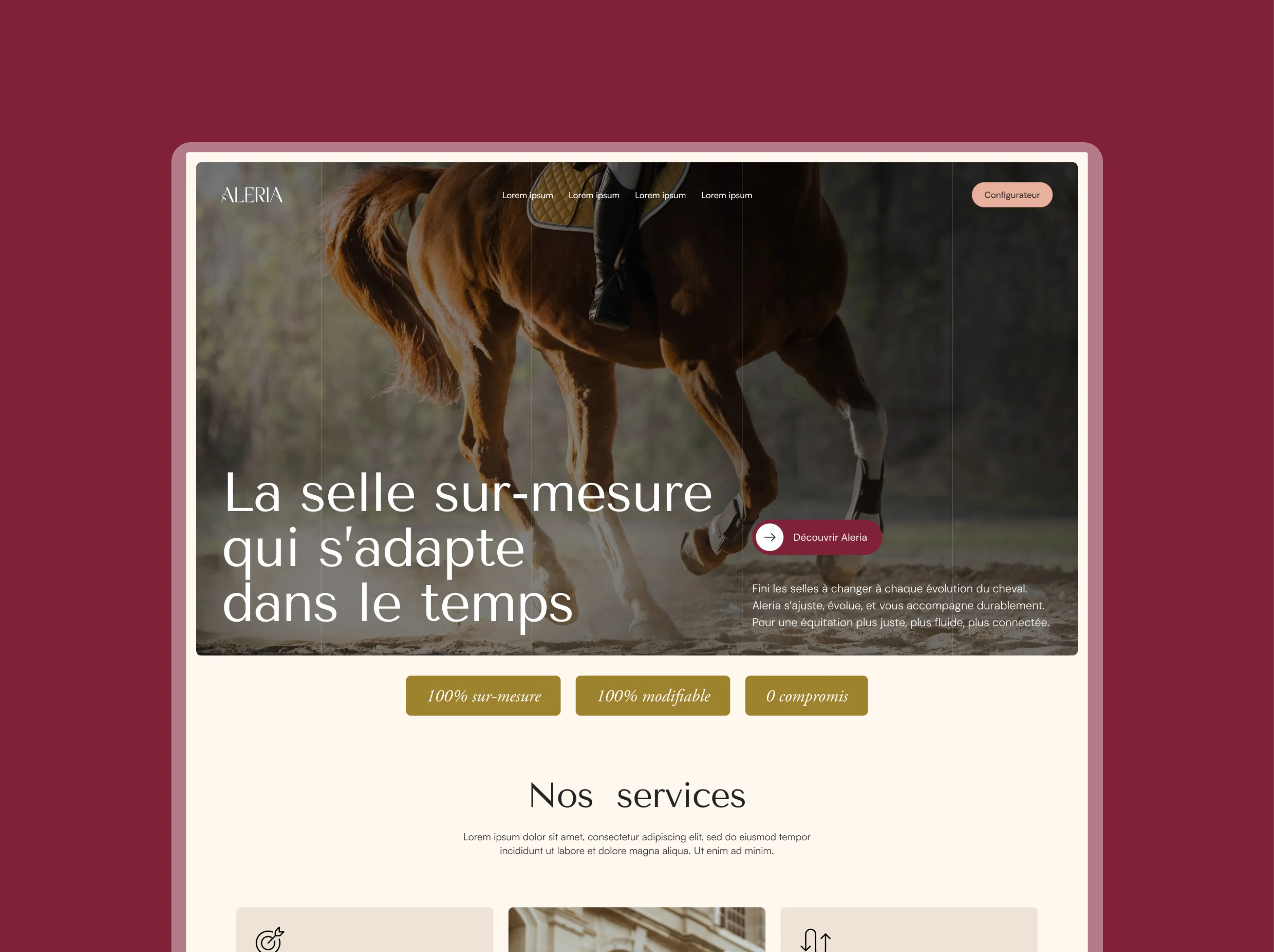
Art Direction
Aleria faces a double paradox: the French premium saddle market is dominated by brands with austere, institutional visual codes (Antares, CWD, Butet), while the few brands that dare to feel modern and digital are foreign. The founder wanted an identity that captures both the elegance of French luxury and digital modernity — without sacrificing one for the other.
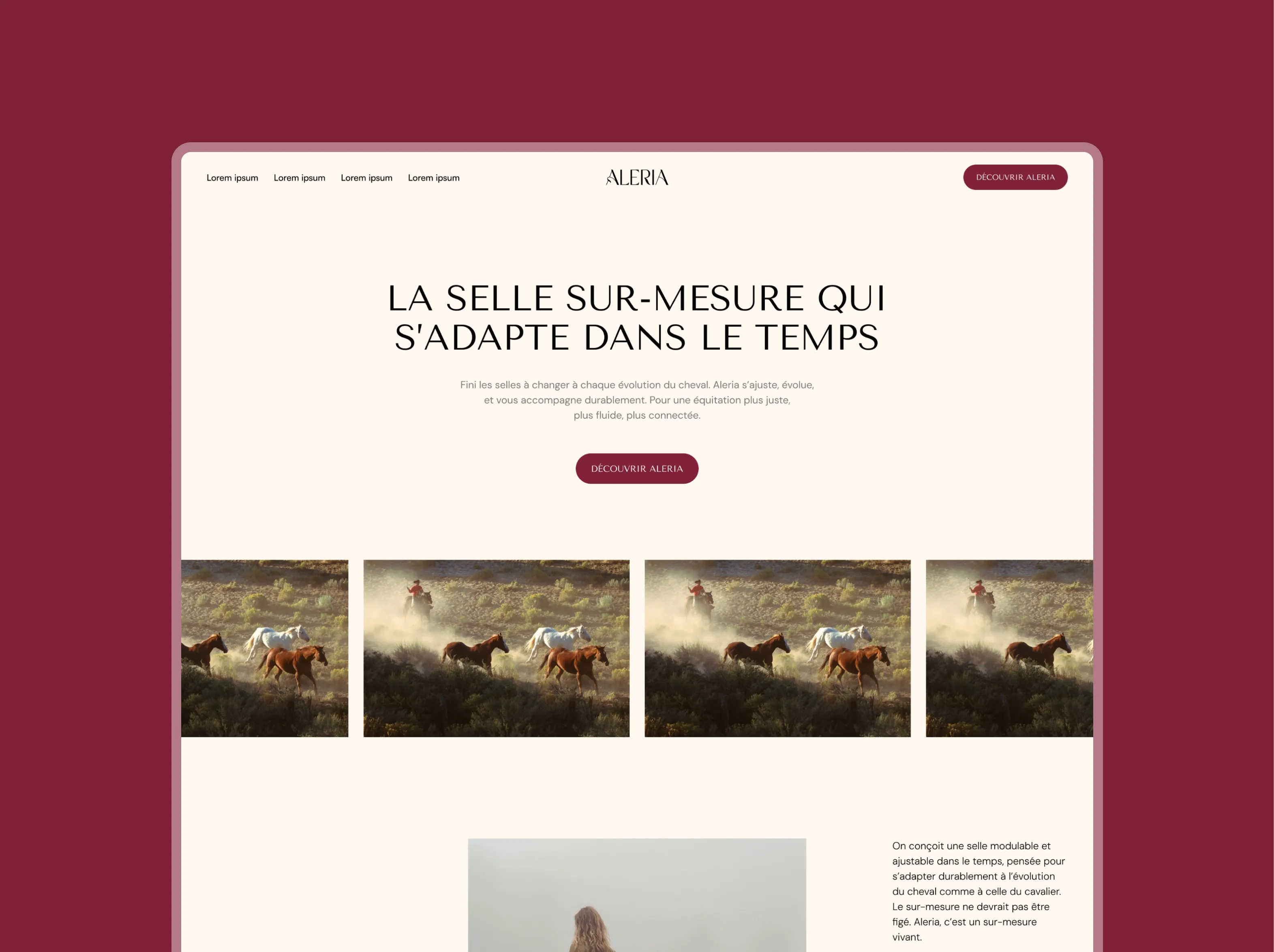
Visual Territory
Maxime built the art direction around references outside the equestrian world: Apple for product presentation and interface clarity, Hermès for originality and brand differentiation, and Butet for credibility in the saddle-making space. The palette keeps Aleria’s existing visual identity, enriched with a more premium photographic treatment and a stronger typographic hierarchy.
The Specific Challenge
The saddle is the hero product — it should never get lost in the pages. Unlike competing saddle brands’ websites (Stübben, WOW Saddles), where the saddle gets buried under accessories, every Aleria page is designed so users can reach the saddle in one click max, with a presentation worthy of the biggest names in luxury saddle-making.


%25201.webp)
.webp)
.webp)
.webp)