Good to know

Heading

Lorem ipsum dolor sit amet, consectetur adipiscing elit. Suspendisse varius enim in eros elementum tristique. Duis cursus, mi quis viverra ornare, eros dolor interdum nulla, ut commodo diam libero vitae erat. Aenean faucibus nibh et justo cursus id rutrum lorem imperdiet. Nunc ut sem vitae risus tristique posuere.

Lorem ipsum dolor sit amet consectetur.

Lorem ipsum dolor sit amet consectetur. Aliquam orci sagittis dignissim sapien praesent donec.

Lorem ipsum

Lorem ipsum dolor sit amet, consectetur adipiscing elit, sed do eiusmod tempor incididunt ut labore et dolore magna aliqua. Ut enim ad minim veniam, quis nostrud exercitation ullamco laboris nisi ut aliquip ex ea commodo consequat. Duis aute irure dolor in reprehenderit in voluptate velit esse cillum dolore eu fugiat nulla pariatur.

Add

Lorem ipsum

Lorem ipsum

Kanta x Gemeos

Full redesign of Kanta’s site, a compliance SaaS for accounting firms (LAB + prospecting). 2,000+ client firms. A clean new website delivered in 2 months — art direction, UX/UI, Webflow build, and technical SEO.

A
A
A

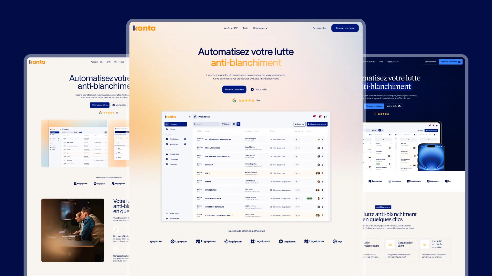
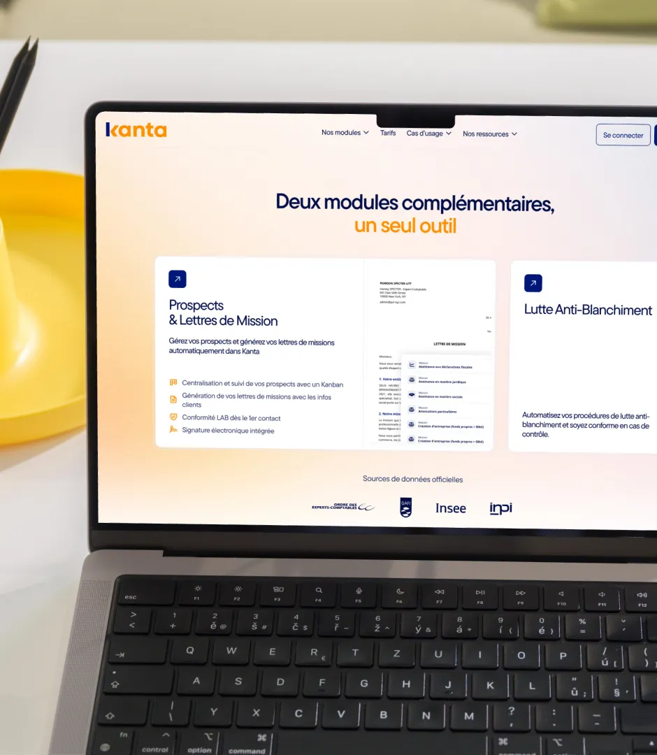
Kanta, the go-to compliance reflex for 2,000 accounting firms

Kanta is a SaaS built by accountants, for accountants. The platform automates the ethical compliance requirements of accounting firms — AML compliance and prospect management through a dedicated Kanban module. In under 3 years, more than 2,000 firms have adopted Kanta.

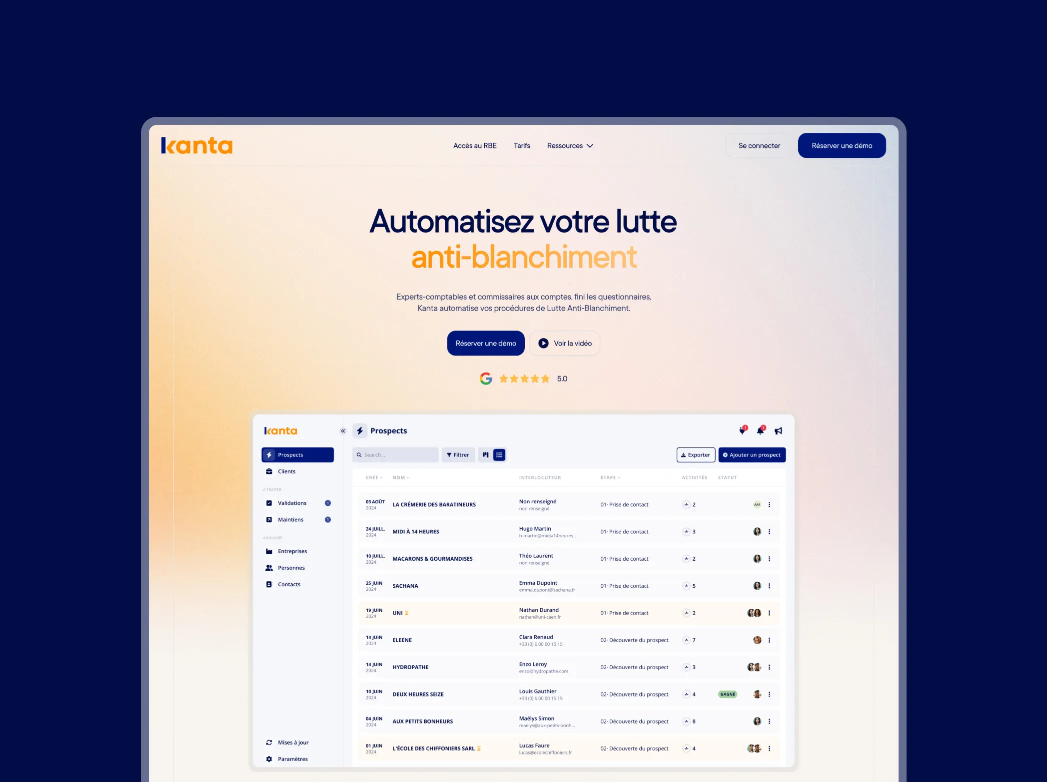
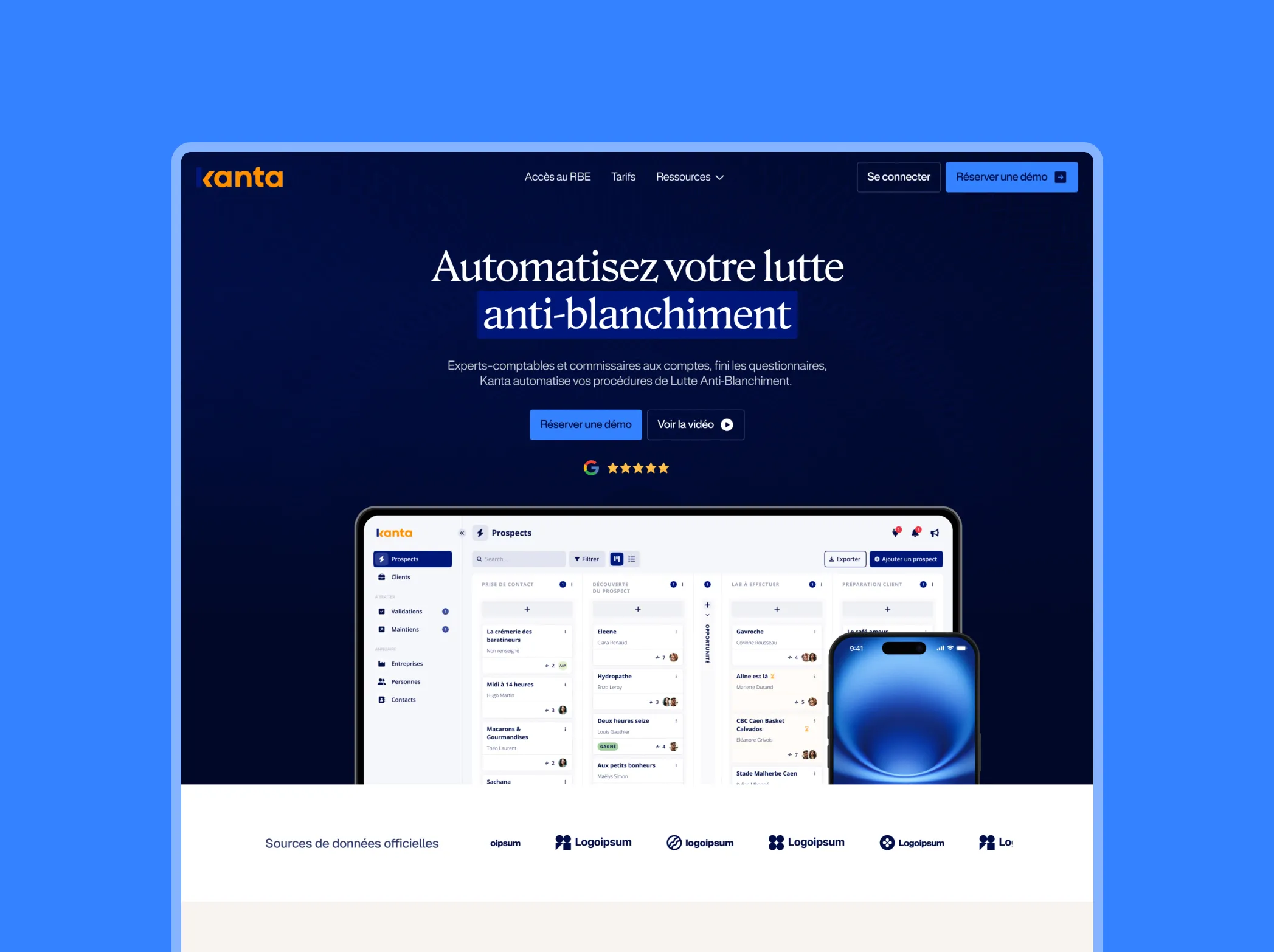
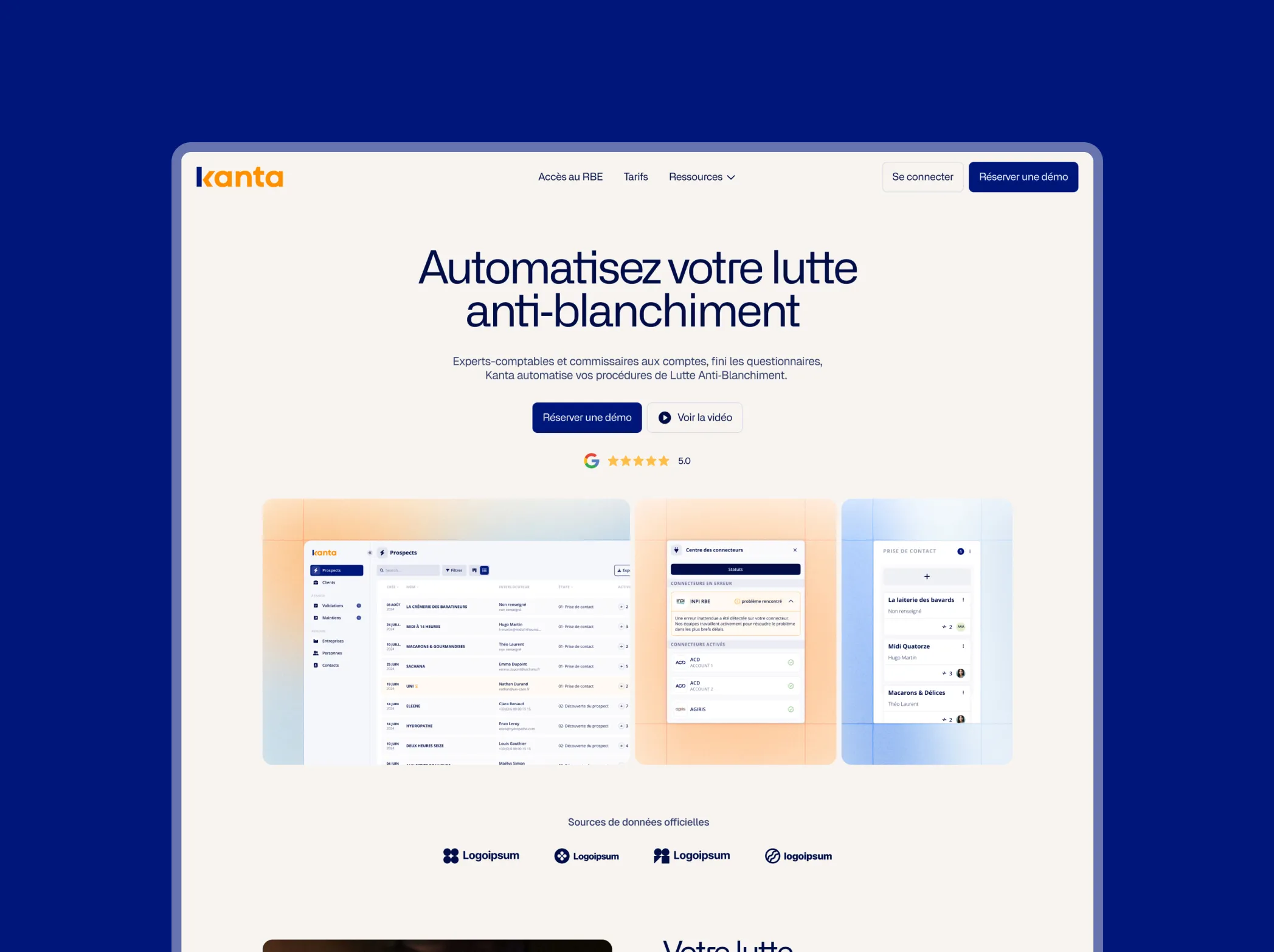
Despite a strong product and solid traction, the existing site didn’t reflect the quality of the solution: too many colors, too many patterns, no visual consistency. Gemeos delivered a full redesign in 2 months, guided by one core idea: “Serious simplicity, without being boring.”

Industry

Services

A
A
A

Art Direction

Kanta’s art direction had to solve a tricky equation: modernize a brand operating in the austere world of regulatory compliance without losing the credibility expected by accountants. The brief was clear — "we’re buttoned-up, but not boring."

Sacha and Claire worked from carefully selected references — Sellsy, Investing.com — to identify the visual codes of premium B2B SaaS without drifting into generic territory. The existing palette (blue + orange) was kept and refined: out went the overload of colors and patterns from the original site, in came a clean design system with bento elements, squircle corners, and subtle color auras in the background.

Open Sans was expanded in the headlines to bring a stronger character, while keeping the readability expected in a professional context. Every creative direction was presented and iterated with the Kanta team until full approval — a solid foundation to move the rest of the project forward fast.

Lightness & Cohesion

The headlines use a subtle gradient that adds brightness and warm orange accents. The very rounded typography — in the spirit of Sellsy — creates an inviting, harmonious, and reassuring feel. The warm beige background keeps the design light and airy, with soft color halos in the background that define each block and energize the composition. The icons use squircle shapes to maintain visual cohesion, while a background grid signals rigor and compliance. This direction leans into clean design and accessibility, strengthening Kanta’s image as a pleasure to use without ever compromising the seriousness required by its place in the compliance space.

Boldness & Authority

Roslindale serif typography for the headlines brings authority and character. Rounded body fonts soften the experience. Deep navy backgrounds add depth and sophistication, while the electric blue reserved for CTAs grounds the whole system in a tech-forward world. As the visual through-line, a banknote-inspired pattern creates a direct link to finance and Kanta’s core business. This bold, high-contrast direction positions Kanta as a serious, dynamic compliance player — while keeping the interface engaging and memorable.

Harmony & professionalism

The refined, elegant typography immediately signals maturity and professionalism. The gradients bring product visuals to life with rhythm and energy, while reinforcing brand consistency. White and beige backgrounds create a warm, airy feel. Squircle icons add a modern touch without breaking the overall harmony. On human photography, colored halos add warmth and create a natural visual link with the product imagery. Finally, line-based illustration details give the cards visual structure and reflect Kanta’s rigor and control. The overall mood feels welcoming and professional — the kind of mature, reliable solution that knows how to blend aesthetics with functionality.

Look&Feel
A
A
A

UX/UI Design

Once the art direction was approved, Sacha and Claire designed the entire site around two goals: make Kanta’s value instantly clear, and make people want to try the product. The SaaS has two distinct modules — LAB and PLM — so the navigation architecture was built to guide each accountant profile to the solution that fits them best.

A complete UI kit was delivered: card components, feature comparison tables, interface elements showing the app in context, and prioritized CTAs. The mockups also include dashboard screenshots to ground the product promise in something tangible — one of Kanta’s team’s explicit requests.

The brand’s “inside joke” tone — with its touches of humor and offbeat phrasing — was translated visually through micro-interactions, light illustrations, and short, punchy lines in the UI blocks. Responsive behavior was handled with care so an accountant could browse the site from the office or from their phone between meetings.

A
A
A

Webflow Build

Abdul handled the Webflow build for every page on Kanta’s site, starting from the final Figma designs. The structure was built around reusable components to keep the visual system consistent across every page and make future updates easy for the Kanta team — without needing a developer.

The two existing landing pages (info.kanta.fr/lab and info.kanta.fr/plm), already on Webflow, served as the reference point for the migration to the new main site. The “Our Resources” menu was added with a polished dropdown, the final touch before launch. Client-provided images from Drive were integrated directly into the designs, following QA feedback.

The site went live in June 2025, wrapping up a 2-month project — a strong result given how packed May was. A recorded Webflow training session was delivered to the Kanta team so they could manage the site on their own. Their reaction at launch: "This is so awesome!"

A
A
A

SEO

Kanta’s SEO optimization focused on the technical fundamentals that help a new site get indexed cleanly and quickly in Google. At launch, we completed a full review of meta tags, H1/H2 headings, image alt attributes, and load speeds.

The URL structure was designed to be clear, short, and memorable — an asset for both SEO and brand perception. The XML sitemap was configured and submitted to Google Search Console to speed up indexing. Structured data schemas (Organization, SoftwareApplication) were implemented to improve visibility in rich results.

Kanta operates in a highly specific niche market — LAB compliance and prospecting for accounting firms. Search volumes are targeted, and competition is moderate: a well-executed content strategy can quickly generate qualified leads. The site delivered by Gemeos provides the ideal technical foundation to unlock that potential and turn visitors into users.

OUR latest projects

+240 companies
supported

Websites designed and developed with 

Let’s f*****G GO !!

Ready to launch
Your business?

Alexandre

Max

Enora

Bryan

Cannelle

Tiphaine

You'll :heart: our collaboration...