Good to know

Heading

Lorem ipsum dolor sit amet, consectetur adipiscing elit. Suspendisse varius enim in eros elementum tristique. Duis cursus, mi quis viverra ornare, eros dolor interdum nulla, ut commodo diam libero vitae erat. Aenean faucibus nibh et justo cursus id rutrum lorem imperdiet. Nunc ut sem vitae risus tristique posuere.

Lorem ipsum dolor sit amet consectetur.

Lorem ipsum dolor sit amet consectetur. Aliquam orci sagittis dignissim sapien praesent donec.

Lorem ipsum

Lorem ipsum dolor sit amet, consectetur adipiscing elit, sed do eiusmod tempor incididunt ut labore et dolore magna aliqua. Ut enim ad minim veniam, quis nostrud exercitation ullamco laboris nisi ut aliquip ex ea commodo consequat. Duis aute irure dolor in reprehenderit in voluptate velit esse cillum dolore eu fugiat nulla pariatur.

Add

Lorem ipsum

Lorem ipsum

Study Success x Gemeos

Study Success is a French tutoring platform focused on science, founded by former tutors.

Gemeos handled the full redesign: visual identity, product design, Webflow build, and local SEO strategy.

A
A
A

Study Success — The private science tutoring platform that combines expertise and trust

Study Success is a French tutoring platform focused on science subjects — Math, Physics-Chemistry, Earth and Life Sciences, Biology, and Computer Science. It was founded by former tutors who know exactly what students need from the inside. With more than 1,700 students supported and a 98% exam success rate, the brand needed a website that lived up to those results.

Gemeos handled the full redesign — art direction built for affluent parents, UX/UI optimized for conversion, modular product design to handle a large catalog of levels × subjects, and a Webflow build with team training. All of it backed by a local SEO strategy to capture high-intent searches.

Industry

Services

A
A
A

Art Direction - Look & Feel

An identity that builds trust without overplaying the academic angle

Study Success wanted to stand out from the big tutoring players — often cold and institutional — while still feeling credible to demanding parents.

The art direction was built around a precise balance: a soft violet and lavender palette on a cream background, reinforced by gold accents that signal excellence without the flash.

The owl, already part of the existing identity, was kept and brought to the center as the mascot. A bold choice that anchors the brand in the world of knowledge.

Pastel colors, authentic photos (no AI images), clean typography: every visual decision was made to speak to the core audience — affluent women aged 35 to 60 — and earn their trust from the very first glance.

Soft & Reassuring

A clean, reassuring design that leans into clarity and warmth. A white background, serif headlines, and orange and purple accents bring energy and warmth without overwhelming the layout. Content cards breathe. The icons stay simple and expressive. Human photography — kids and families — sits at the center and feels authentic. The whole system creates an immediate sense of closeness with parents: serious, approachable, human.

Editorial & Minimalist

A more editorial, stripped-back direction that leans on white space and generous breathing room. The layout alternates text blocks and photography in a more organic way, with a bright yellow accent on key words to guide attention. The reading pace feels slow and measured, almost instructional. Accordion-style FAQ sections reinforce that same clarity and transparency. A restrained approach that lets the content breathe and builds trust through subtlety.

Bold & Conversion

The most ambitious and conversion-oriented direction of the three. A full-screen photographic hero with a bold oversized headline, trust badges built into the fold, and a richer navigation. The deep purple palette creates a strong visual break between sections. The “situations” blocks call out parents’ pain points directly with color-coded tags — an instant empathy engine. This is the design that sells the hardest, without losing its human warmth.

Look&Feel
A
A
A

UI Design

A user journey designed to convert without friction

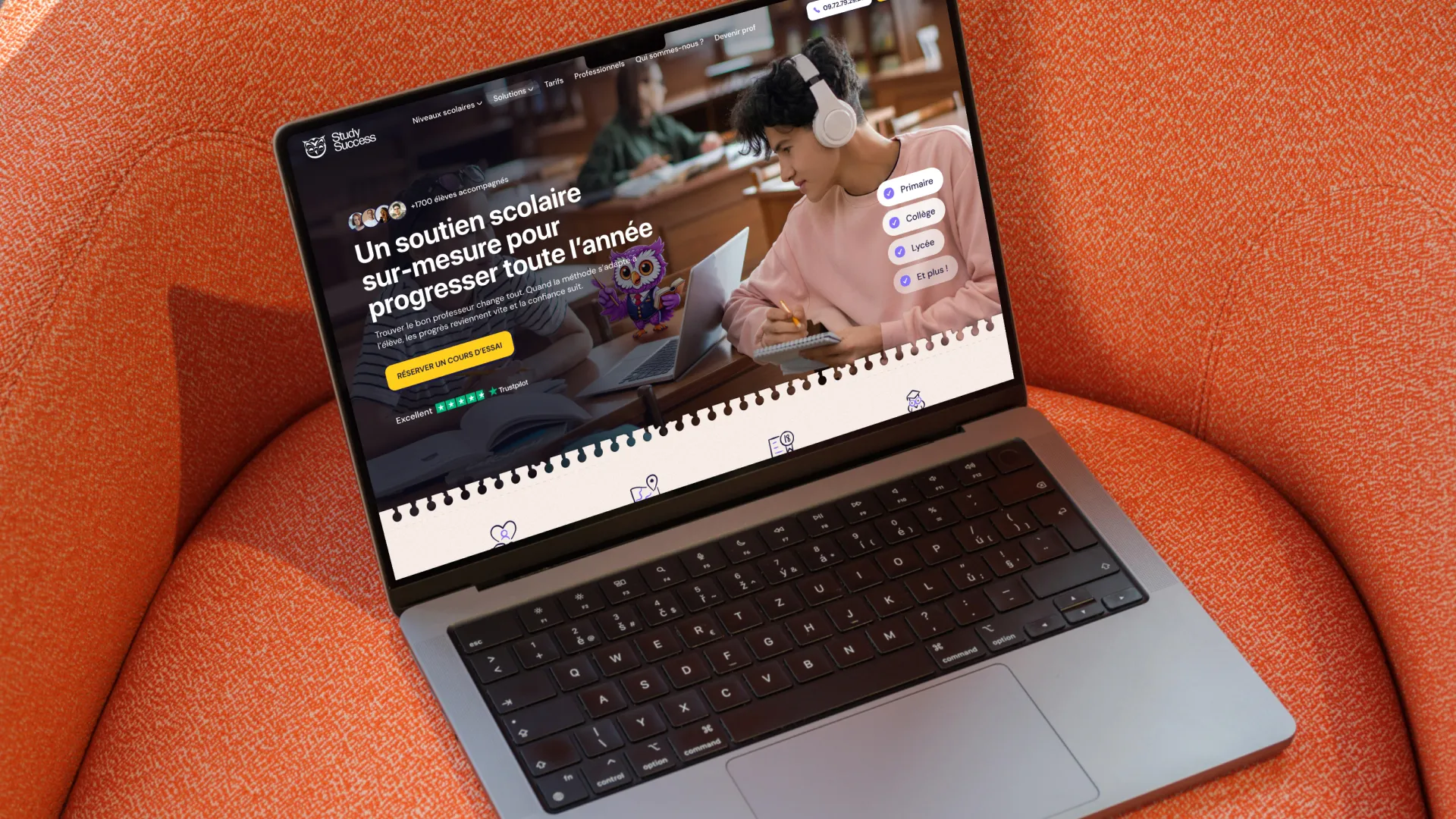
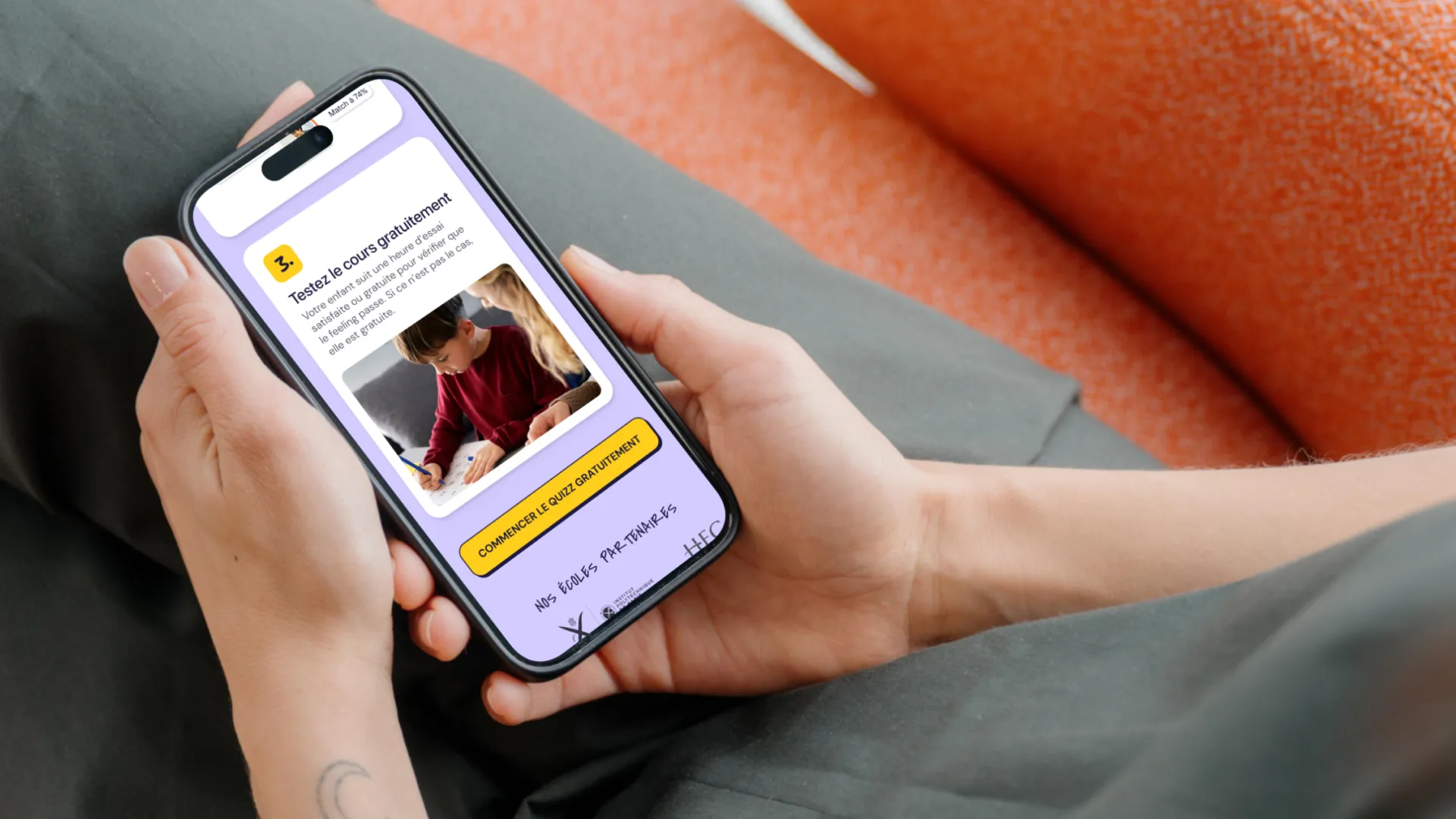
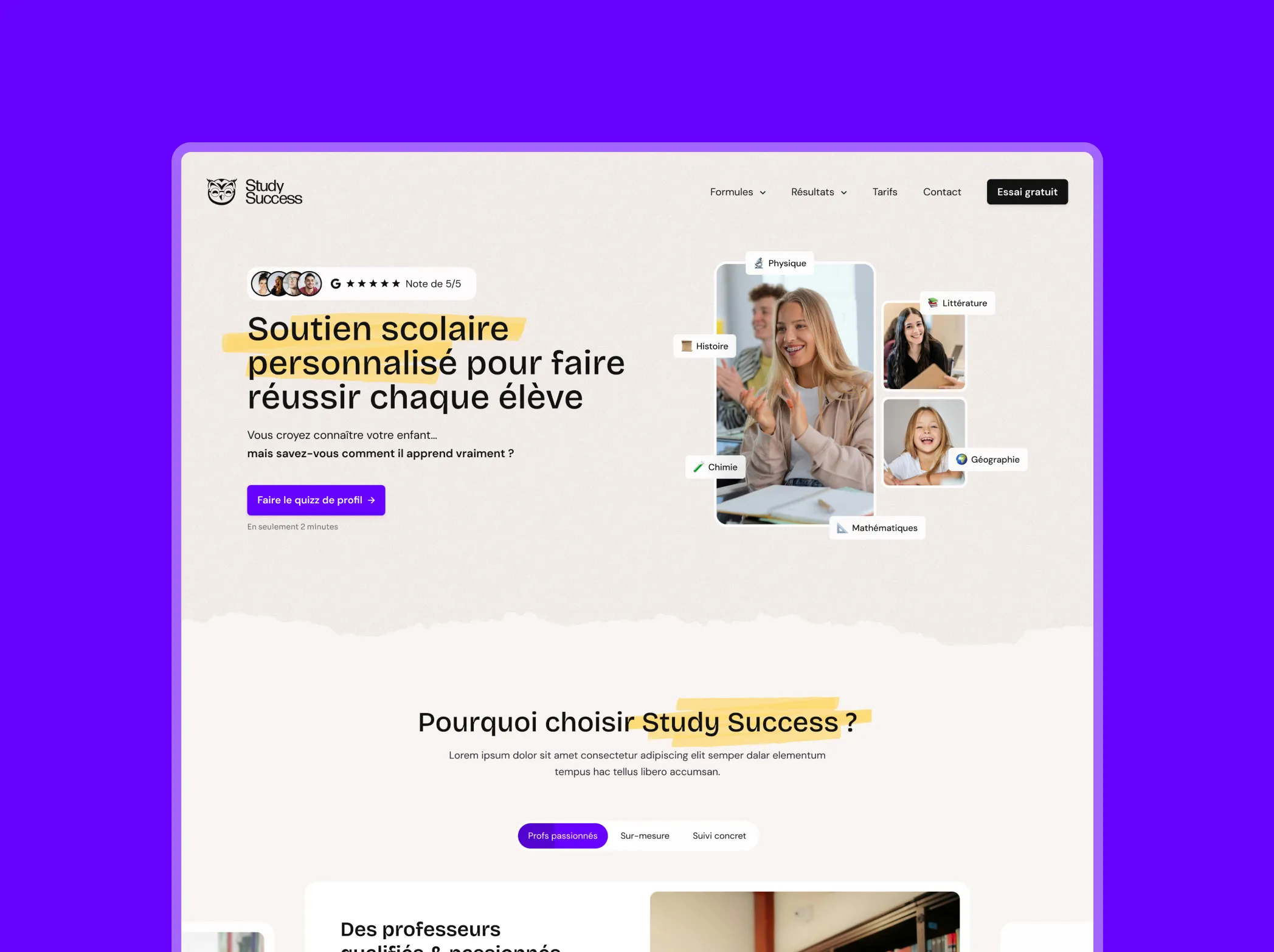
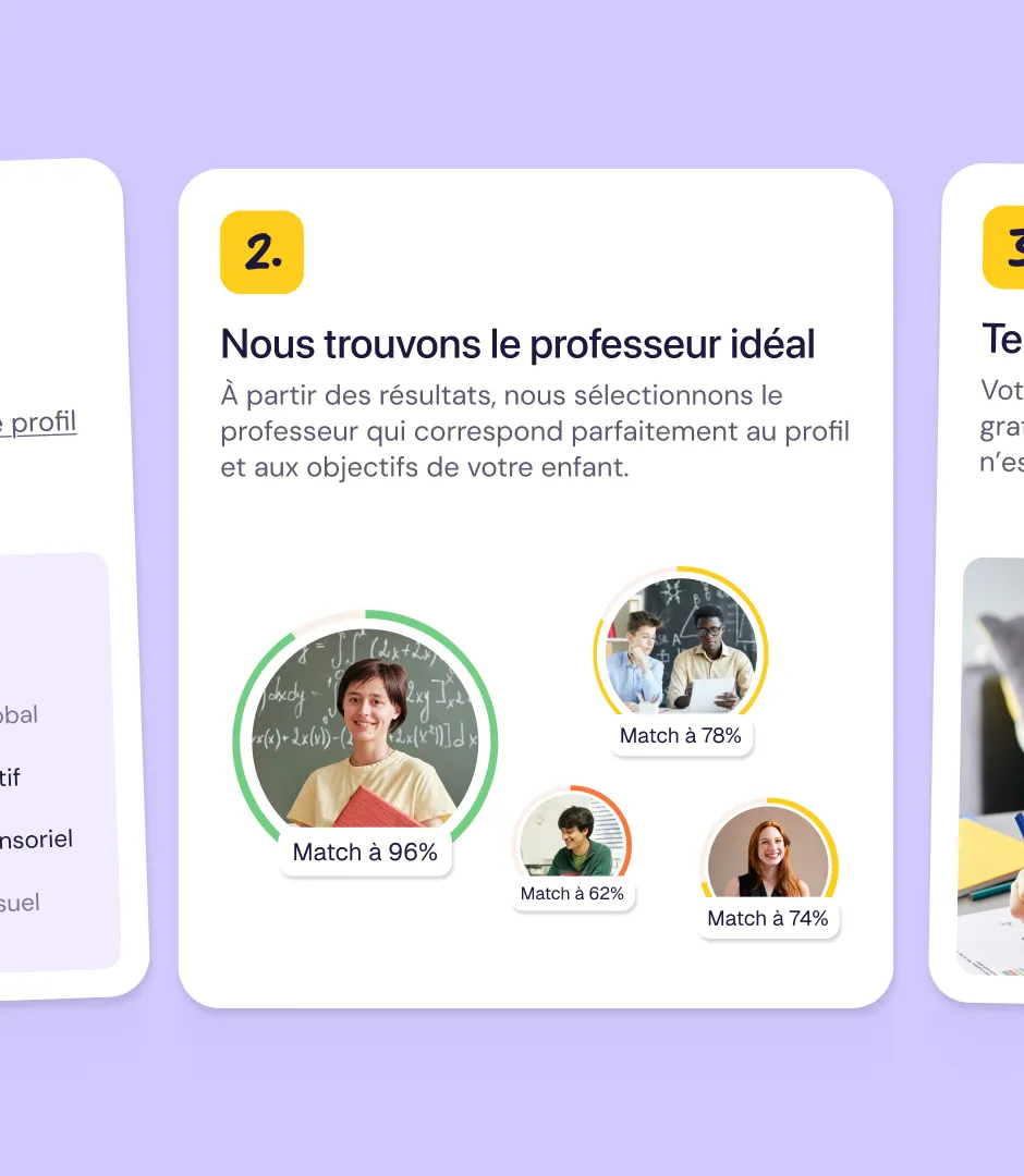
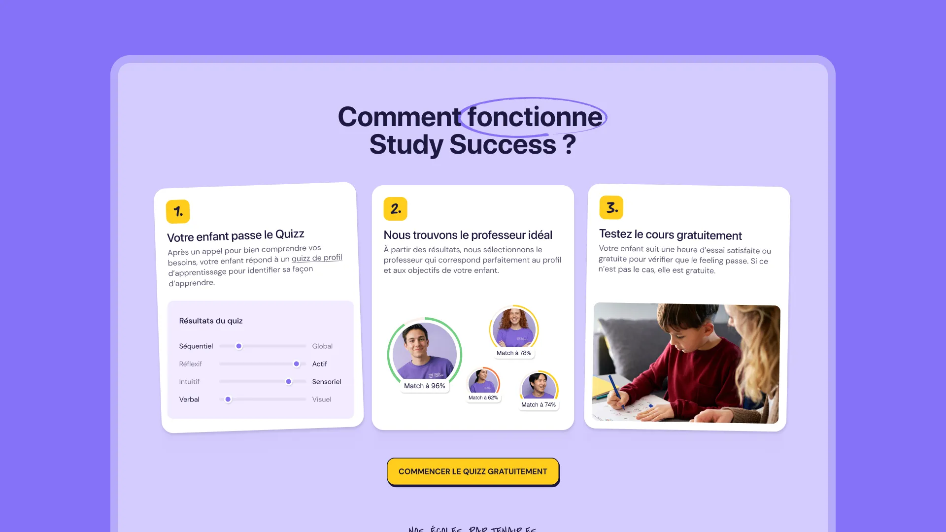
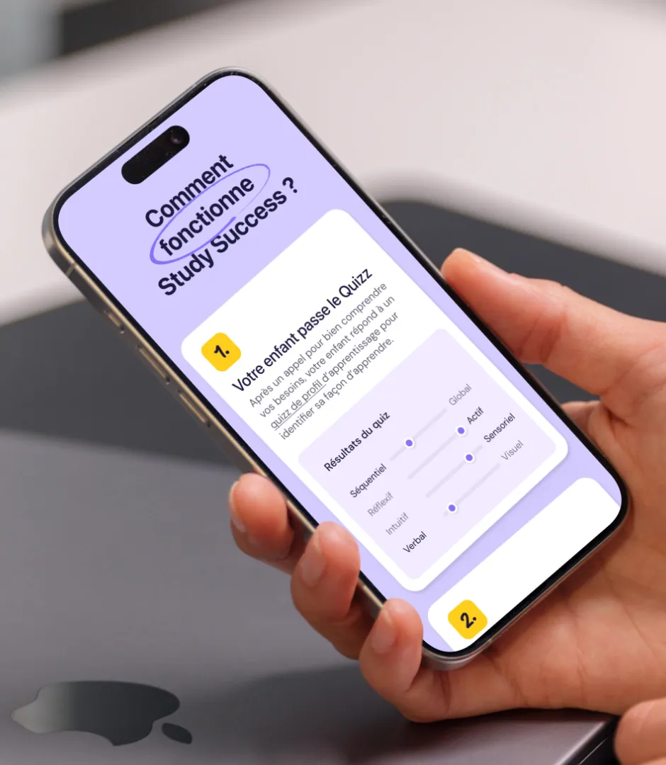
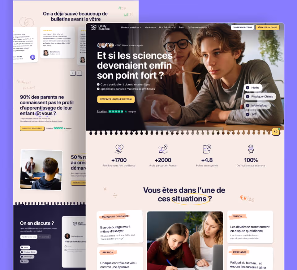
The UI was built to guide parents from discovery to booking in three clear steps: learning profile quiz, teacher selection, free trial lesson.

Every screen was designed in Figma with a consistent UI kit, creating a seamless experience across the entire site. The matching interface — with compatibility scores between student and teacher (96%, 78%...) — became one of the most refined modules in the project: making an algorithm easy to read and reassuring, without technical jargon.

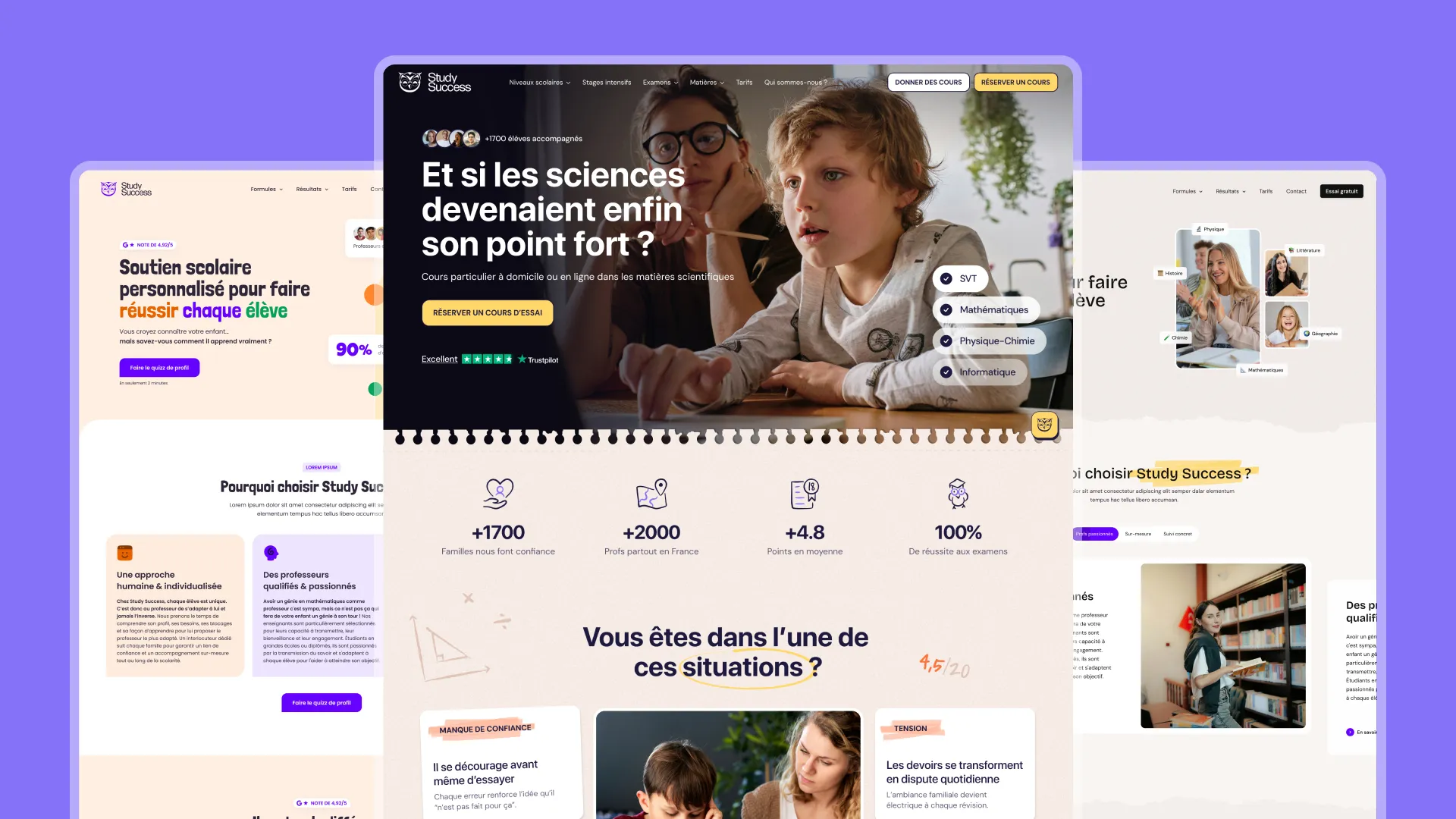
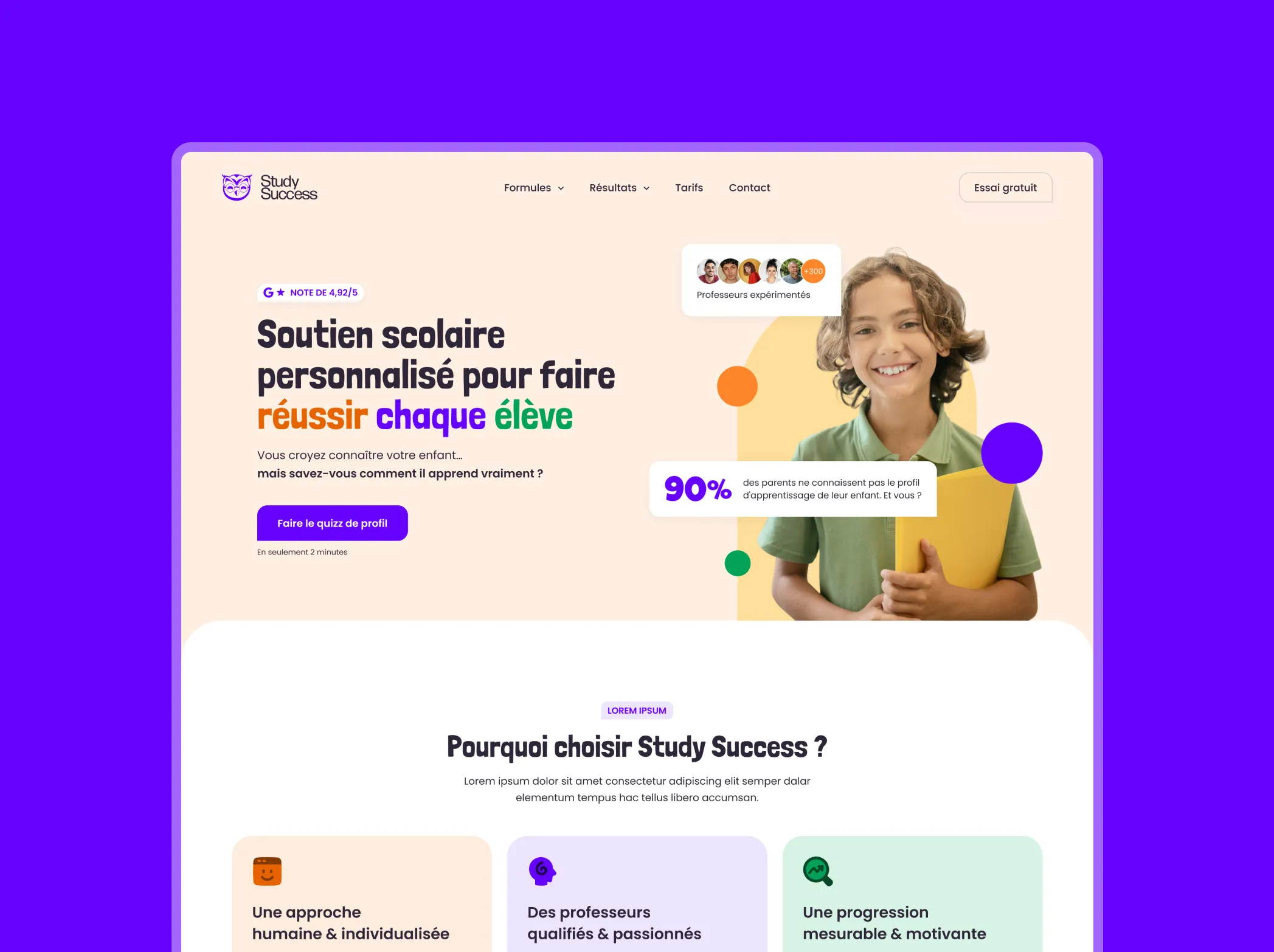
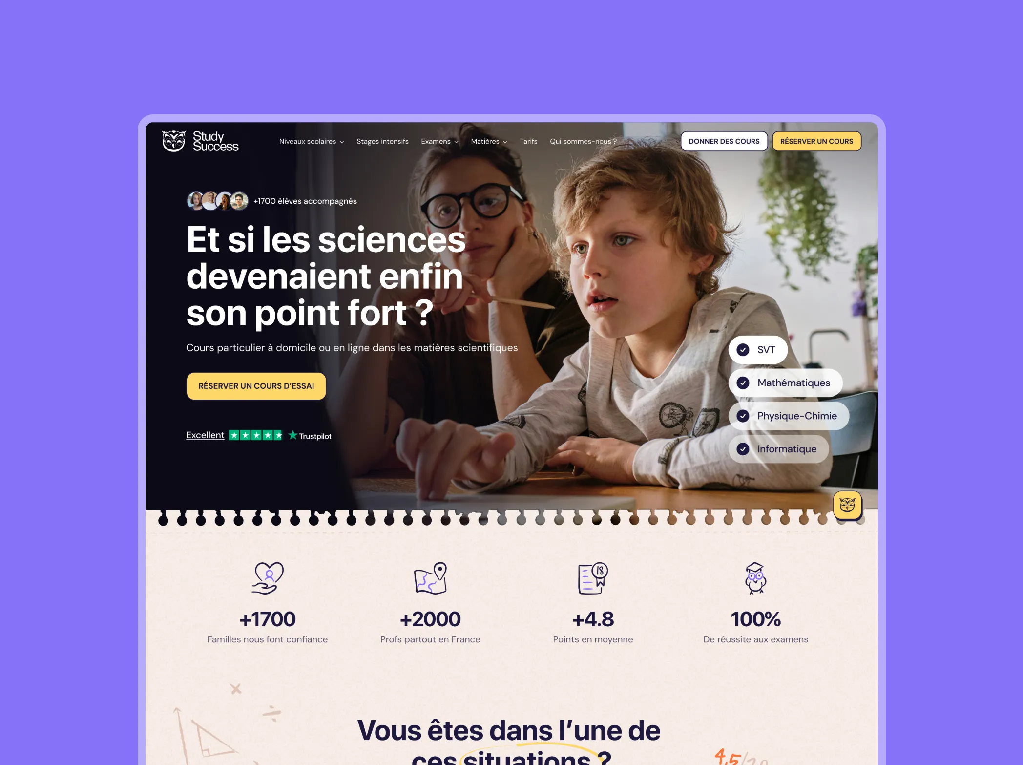
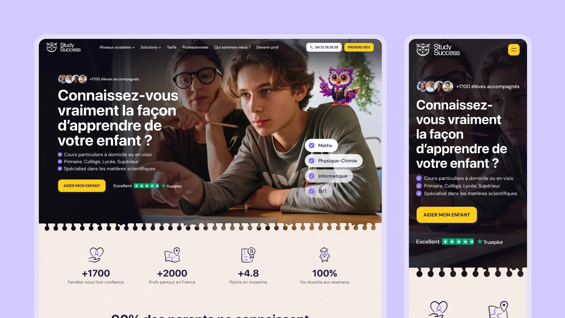
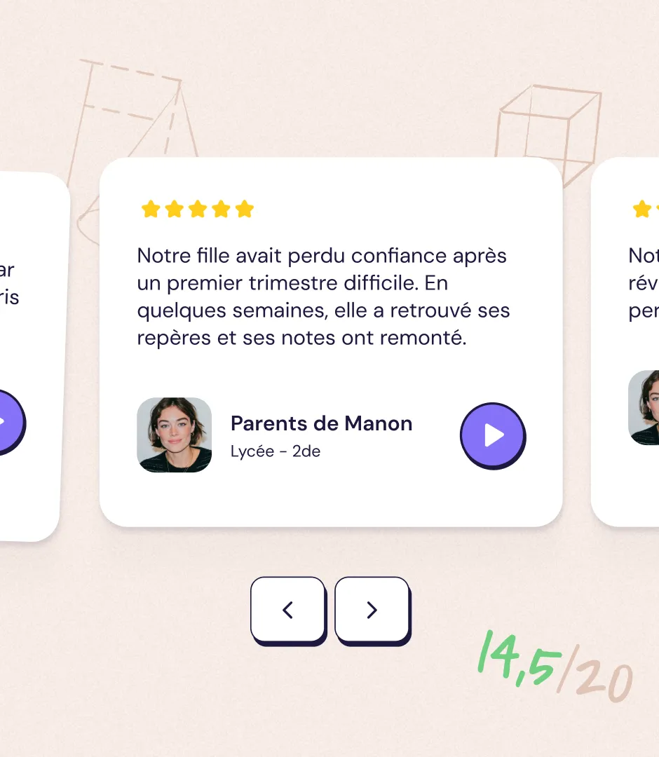
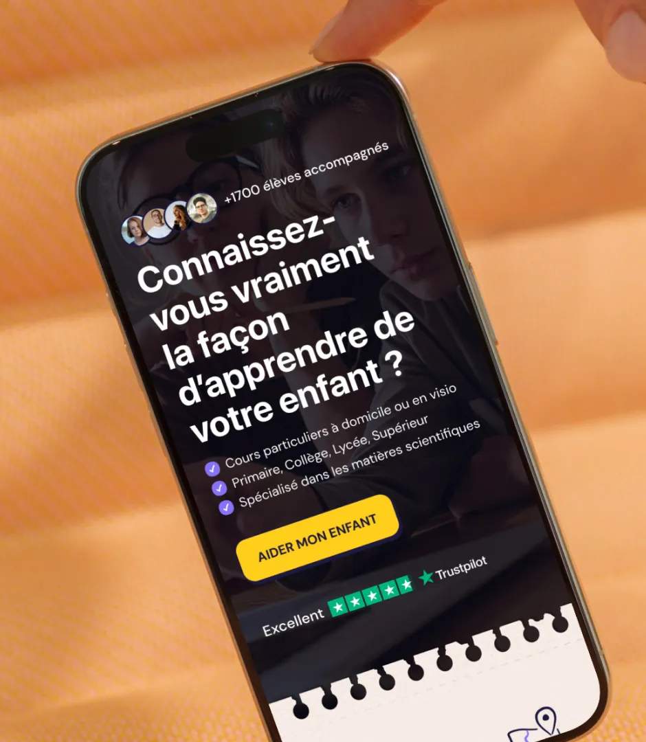
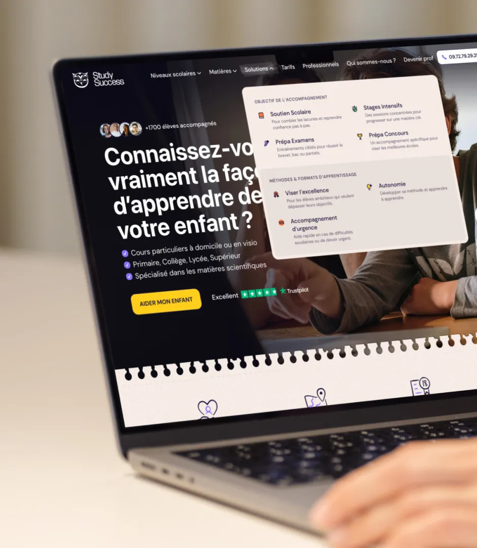
The KPIs (+1,700 students, 98% exam pass rate, Trustpilot Excellent) are front and center in the hero to handle objections before the user even scrolls.

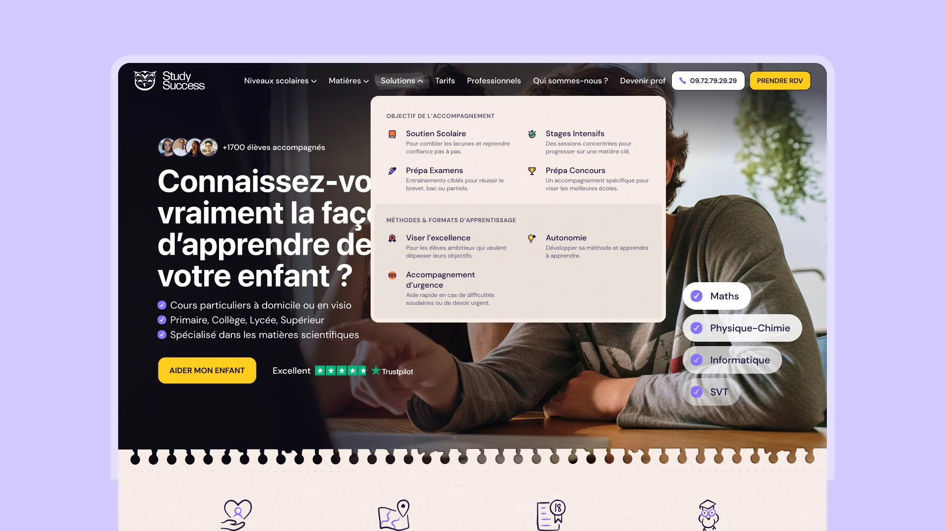
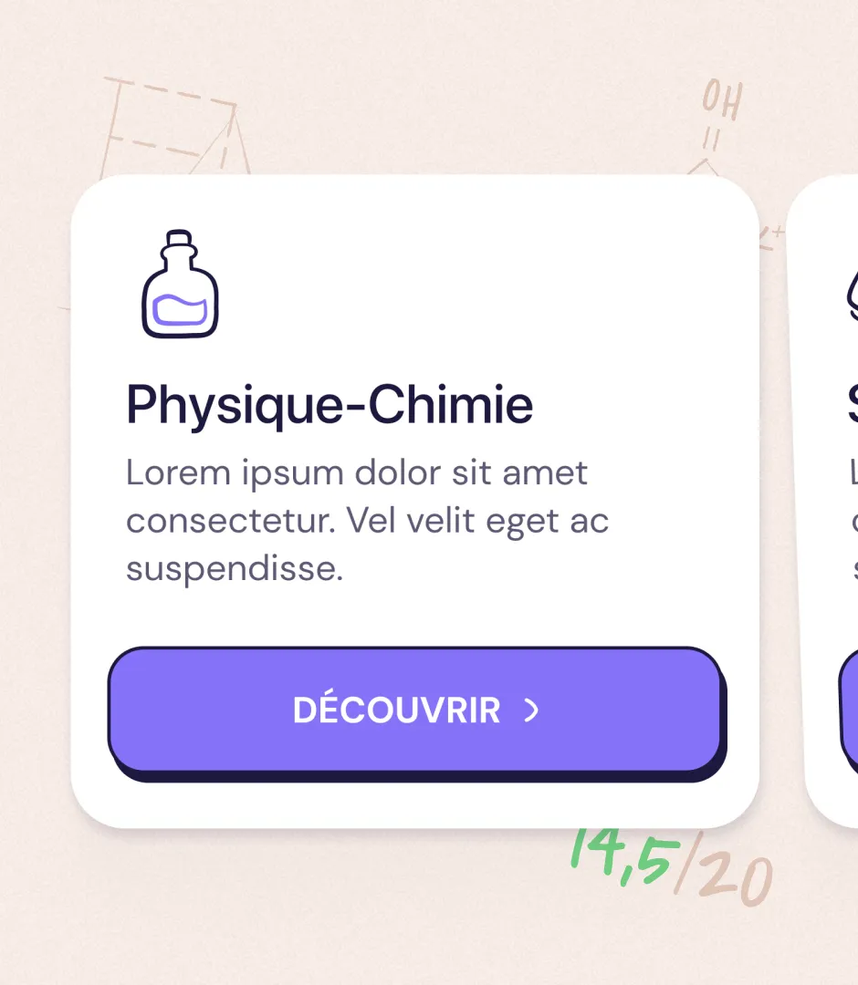
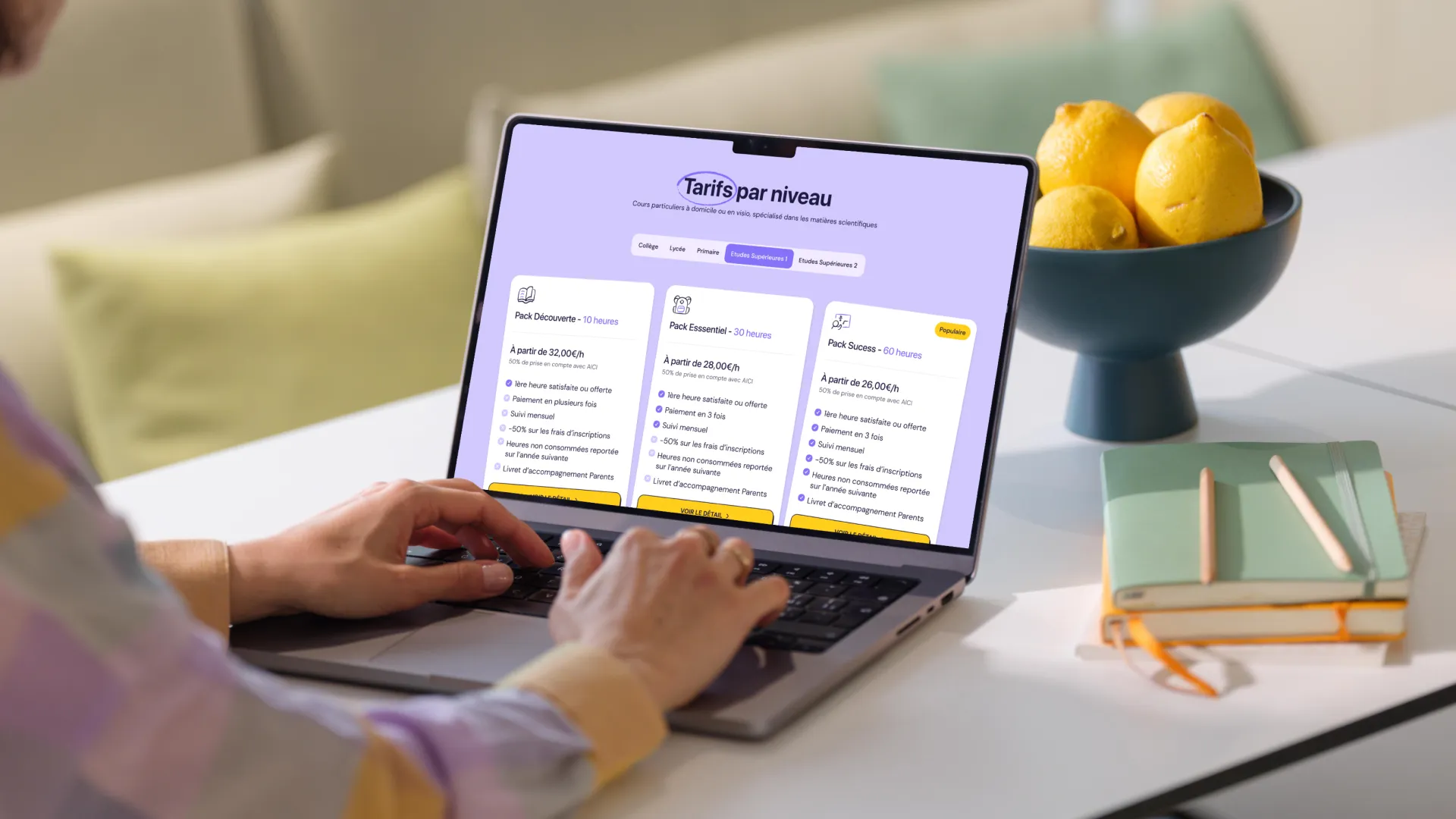
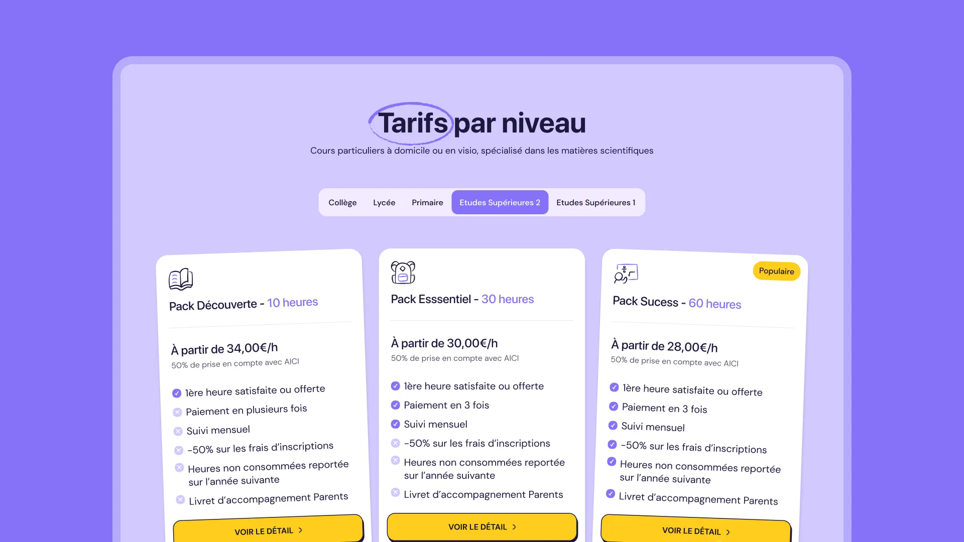
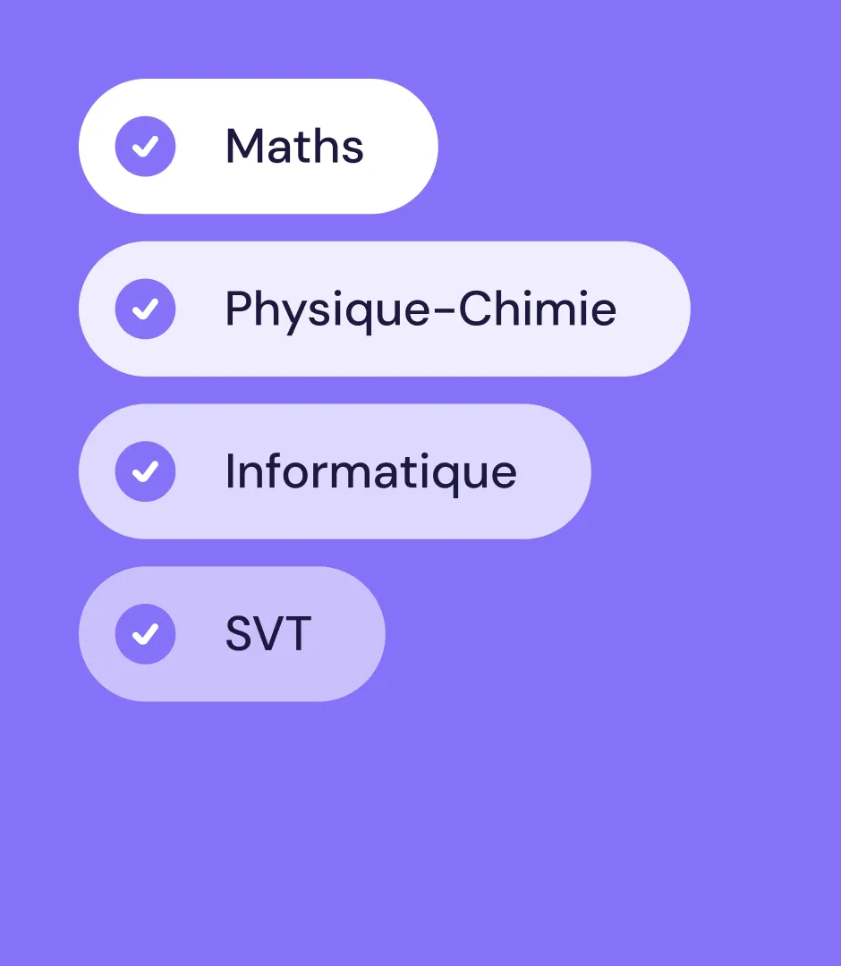
Beyond the marketing pages, Study Success needed a structure that could handle a large catalog: multiple school levels (Elementary, Middle School, High School, Higher Education), multiple subjects (Math, Physics-Chemistry, Life and Earth Sciences, Biology, Computer Science), and multiple solutions (tutoring, intensive courses, exam prep, entrance exam prep...).

Gemeos designed a modular architecture built on reusable Webflow templates (subjects × levels), giving the Study Success team full ownership to create new pages without depending on a developer.

Two new pages were also designed at the end of the project: a dedicated page for professionals and a standalone learning quiz page. The site architecture was mapped in Flowmapp before any wireframing work began, making sure the navigation reflected real user search intent.

A
A
A

Webflow Development

No-code build designed for full client ownership

The Webflow build kicked off once the final design was approved, with one clear goal: deliver a site the Study Success team could keep evolving on their own.

The entire content structure runs on the Webflow CMS  (subject pages, level pages, solution pages), with collections configured to mirror the architecture defined upfront.

The teacher-student matching module was integrated with a dynamic UI that displays compatibility scores in real time.

A full QA phase (week 7 of the timeline) made it possible to test every user flow before launch.

Delivery wrapped with Webflow training for the client team, so they could take full ownership from day one.

A
A
A

SEO

Local pages built to capture high-intent searches

Study Success’s SEO strategy is built on a strong local linking structure: a dedicated “Find a tutor in my city” section organizes the site architecture around geo-targeted pages, mirroring the proven model used by players like Eddmon, which the client had explicitly identified as a benchmark.

Each local page follows a standardized Webflow template, making it possible to scale production without sacrificing editorial consistency or technical quality. At the same time, subject and grade-level pages were structured to target high-volume transactional queries (e.g. “private math lessons high school,” “math and physics tutoring Paris”). The copy for each page was written in advance in Notion, organized by page type, before integration. A workflow that aligned SEO and Webflow from the production phase onward.

OUR latest projects

+240 companies
supported

Websites designed and developed with 

Let’s f*****G GO !!

Ready to launch
Your business?

Alexandre

Max

Enora

Bryan

Cannelle

Tiphaine

You'll :heart: our collaboration...