Good to know

Heading

Lorem ipsum dolor sit amet, consectetur adipiscing elit. Suspendisse varius enim in eros elementum tristique. Duis cursus, mi quis viverra ornare, eros dolor interdum nulla, ut commodo diam libero vitae erat. Aenean faucibus nibh et justo cursus id rutrum lorem imperdiet. Nunc ut sem vitae risus tristique posuere.

Lorem ipsum dolor sit amet consectetur.

Lorem ipsum dolor sit amet consectetur. Aliquam orci sagittis dignissim sapien praesent donec.

Lorem ipsum

Lorem ipsum dolor sit amet, consectetur adipiscing elit, sed do eiusmod tempor incididunt ut labore et dolore magna aliqua. Ut enim ad minim veniam, quis nostrud exercitation ullamco laboris nisi ut aliquip ex ea commodo consequat. Duis aute irure dolor in reprehenderit in voluptate velit esse cillum dolore eu fugiat nulla pariatur.

Add

Lorem ipsum

Lorem ipsum

Cureety x Gemeos

Brand redesign and UX/UI design for the first oncology remote monitoring platform fully covered in France.

A
A
A

Tech that serves life

Cureety helps hospital teams monitor oncology patients remotely, with a CE-certified medical device deployed across more than 170 healthcare facilities.

Gemeos led the full visual identity redesign and interface design for a brand evolving from startup to leading solutions provider.

Industry

No items found.

Services

A
A
A

Brand Refresh: From Startup to Market Leader

Cureety was founded in 2018 with a clear ambition: to transform cancer care through digital technology. In just a few years, the platform became the first remote patient monitoring solution in oncology fully covered by France’s national health insurance system, deployed across more than 170 facilities and used to monitor over 45,000 patients in France, Italy, and Portugal.

Despite that impressive trajectory, Cureety’s visual identity no longer reflected the company’s maturity or ambition. The existing logo suffered from a fragile wordmark, an ambiguous symbol, and an overall lack of strength and clarity. Gemeos was brought in for a full redesign with one clear goal: move Cureety from startup energy to a leading software provider in its category.

New Identity: Clinical Precision, Human Warmth

The Cureety name carries three ideas at once — care, cure, and clarity — and they shaped the entire art direction. The identity was designed to convey both the trust expected in a regulated medical environment and the human closeness that sets Cureety apart from its competitors.

The visual system centers on a new logotype that pairs a strong, cohesive wordmark with a clean symbol that feels bold and instantly recognizable, even at very small sizes. The refined palette of professional greens and blues preserves brand continuity while signaling a more premium, expert position.

No items found.

Contents

Thanks to the whole team, always going the extra mile to push the boundaries!

Florent Darrault

CMO @Cureety

A
A
A

UX/UI for a Digital Medical Device

Designing the interfaces for an oncology remote-monitoring platform comes with stakes that go far beyond aesthetics. The users — oncologists, IDEC nurses, healthcare managers — work in high-pressure environments where every second counts. UX has to be ruthlessly efficient: critical information instantly accessible, intuitive navigation even for someone in a rush, and clear feedback on every action.

The Gemeos design team (Claire and Maxime) started by analyzing user journeys to map the needs of each profile: the clinician reviewing patient data, the nurse configuring protocols, the HDJ manager overseeing alerts. Those journeys shaped a rigorous information architecture, tested and refined before the mockups went into production.

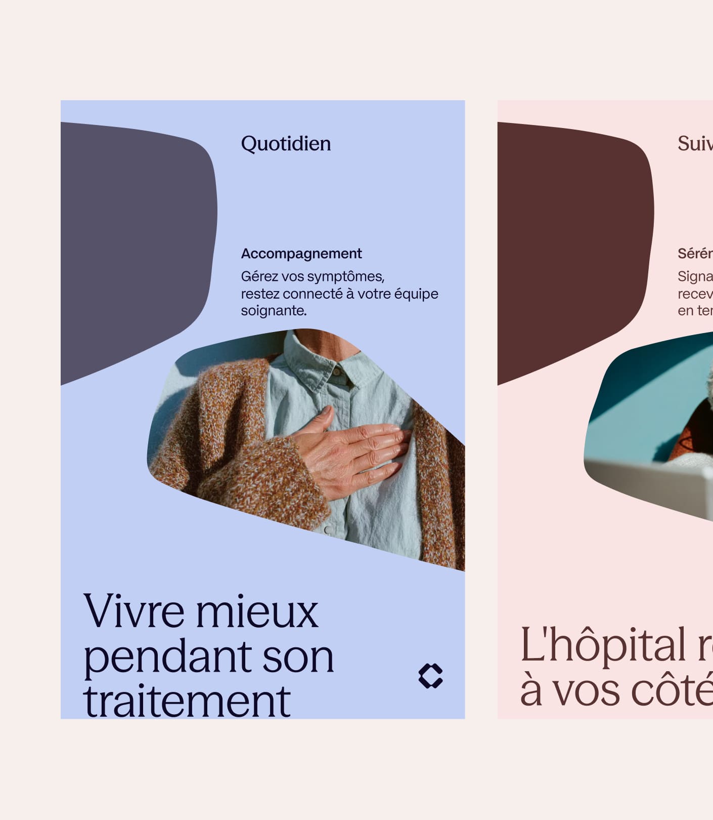
Art Direction and Design System

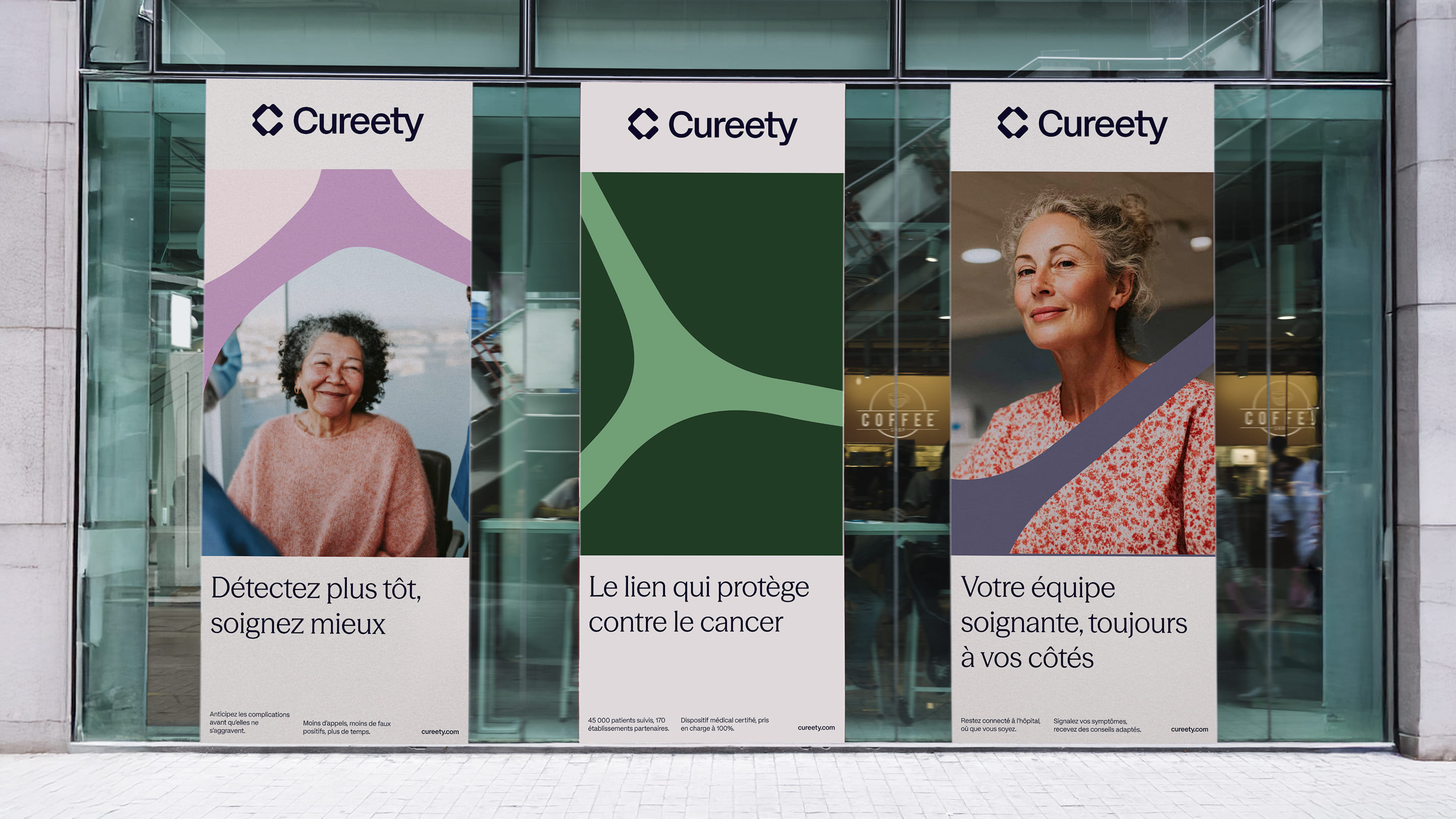
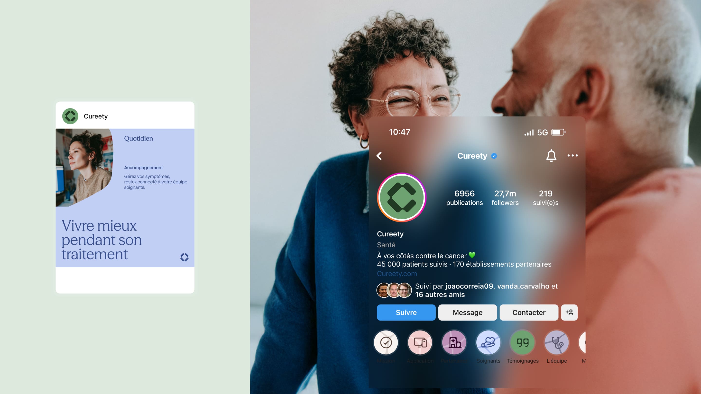
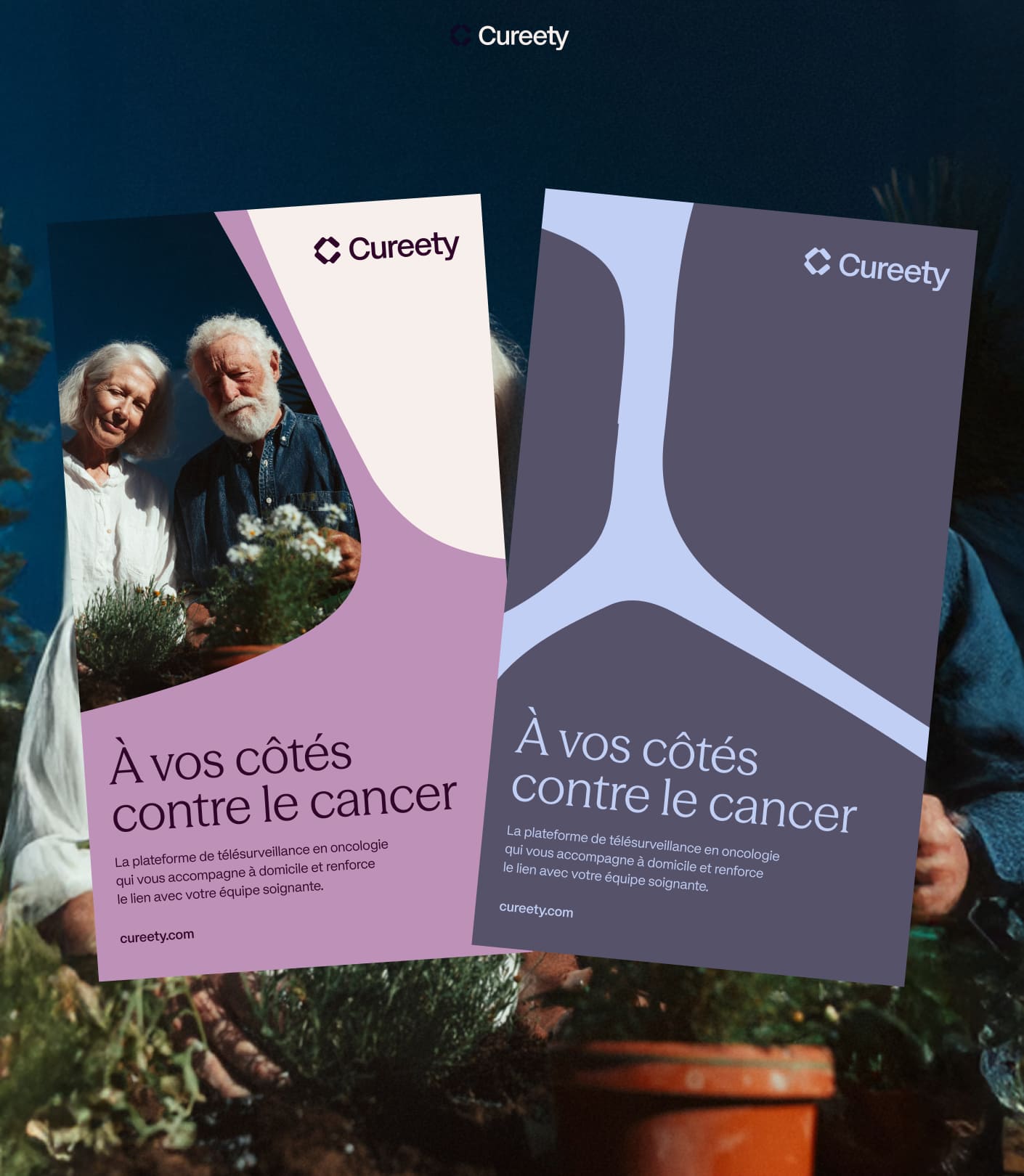
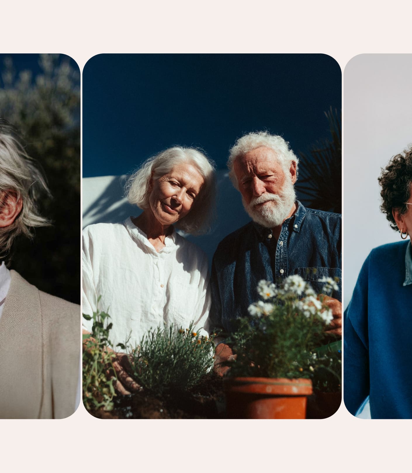
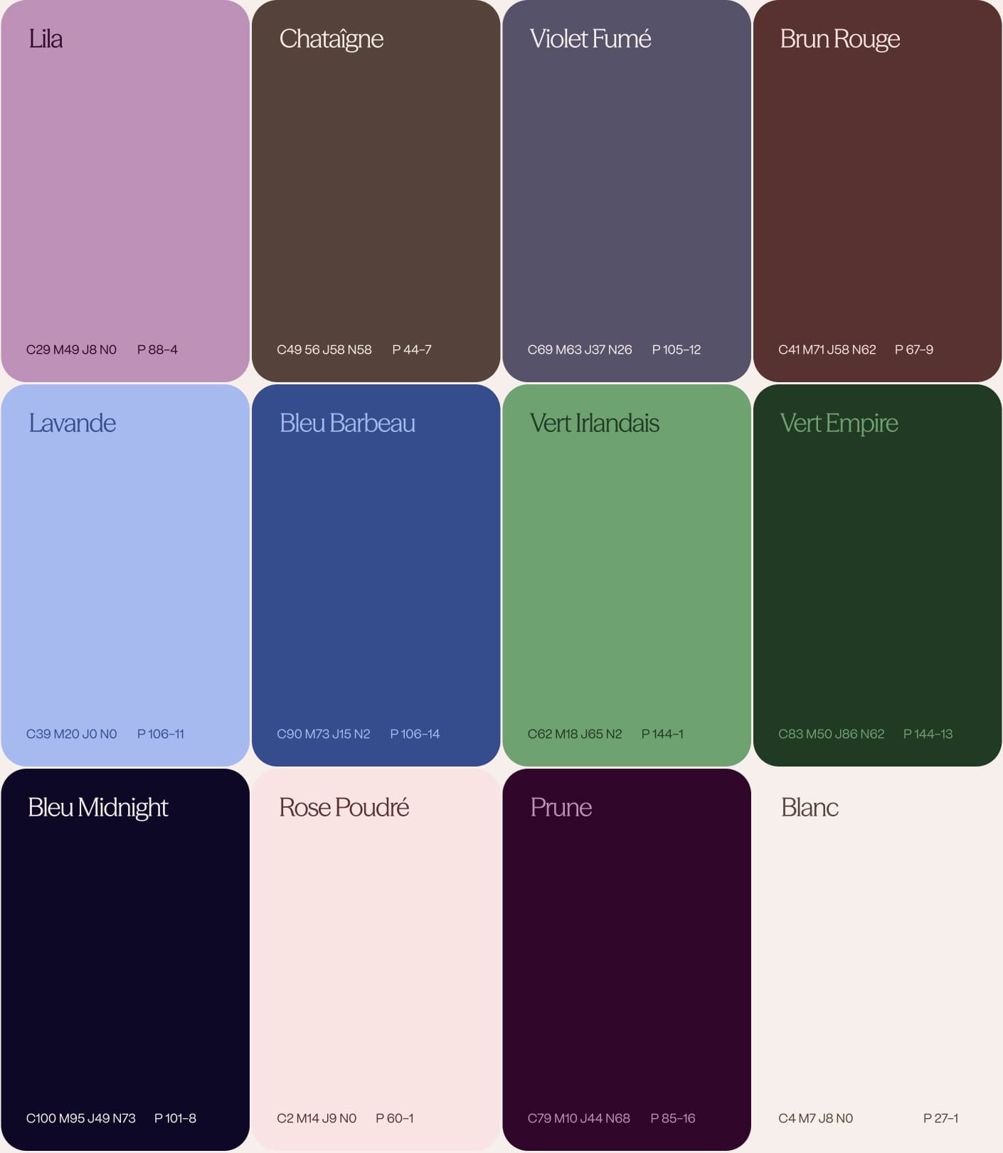
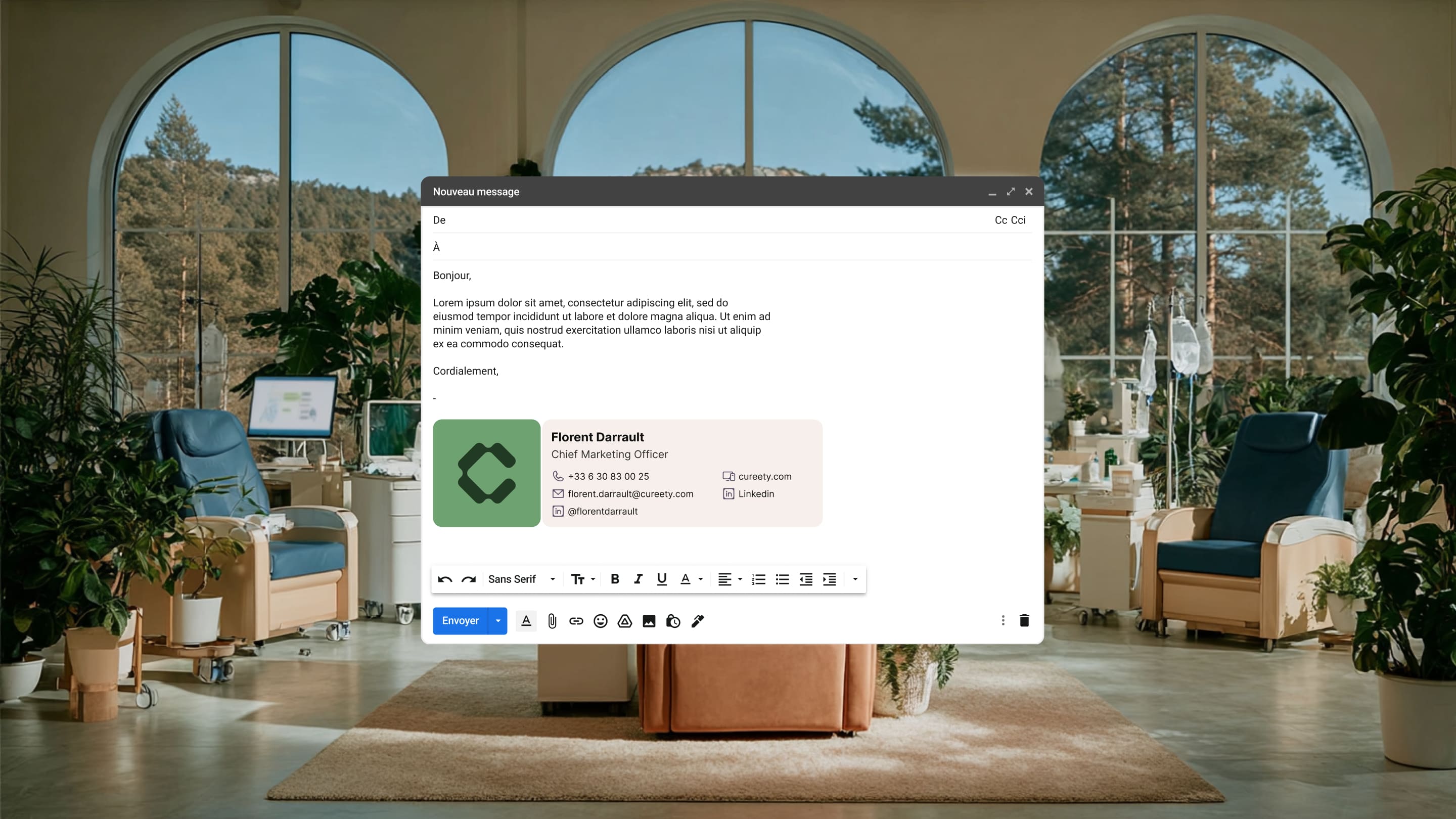
The art direction reflects Cureety’s positioning: professional but accessible, expert but human. The interfaces combine visual rigor that builds trust — structured layouts, clear typographic hierarchy, a restrained palette — with human touches that remind you there’s a patient behind every data point.

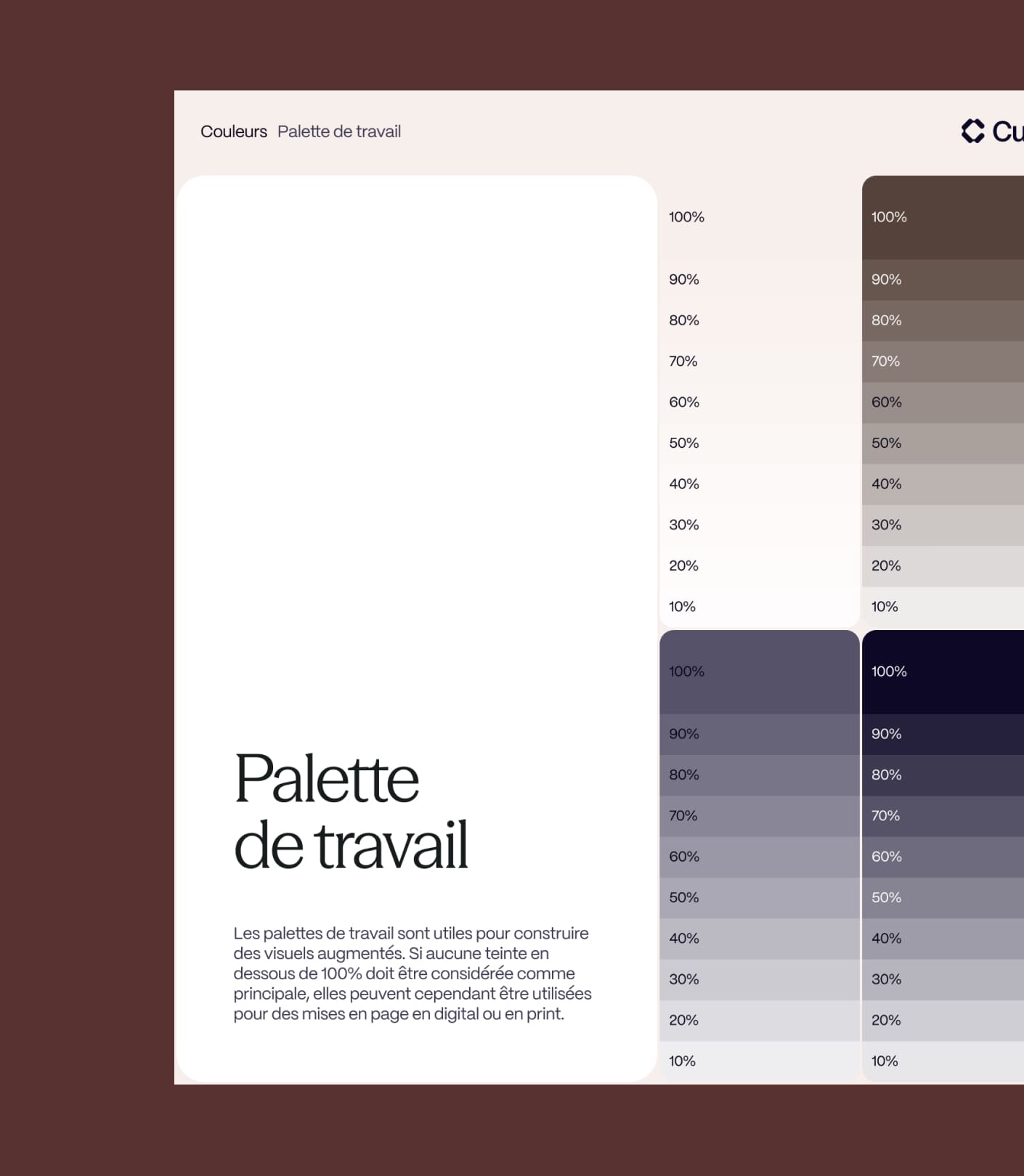
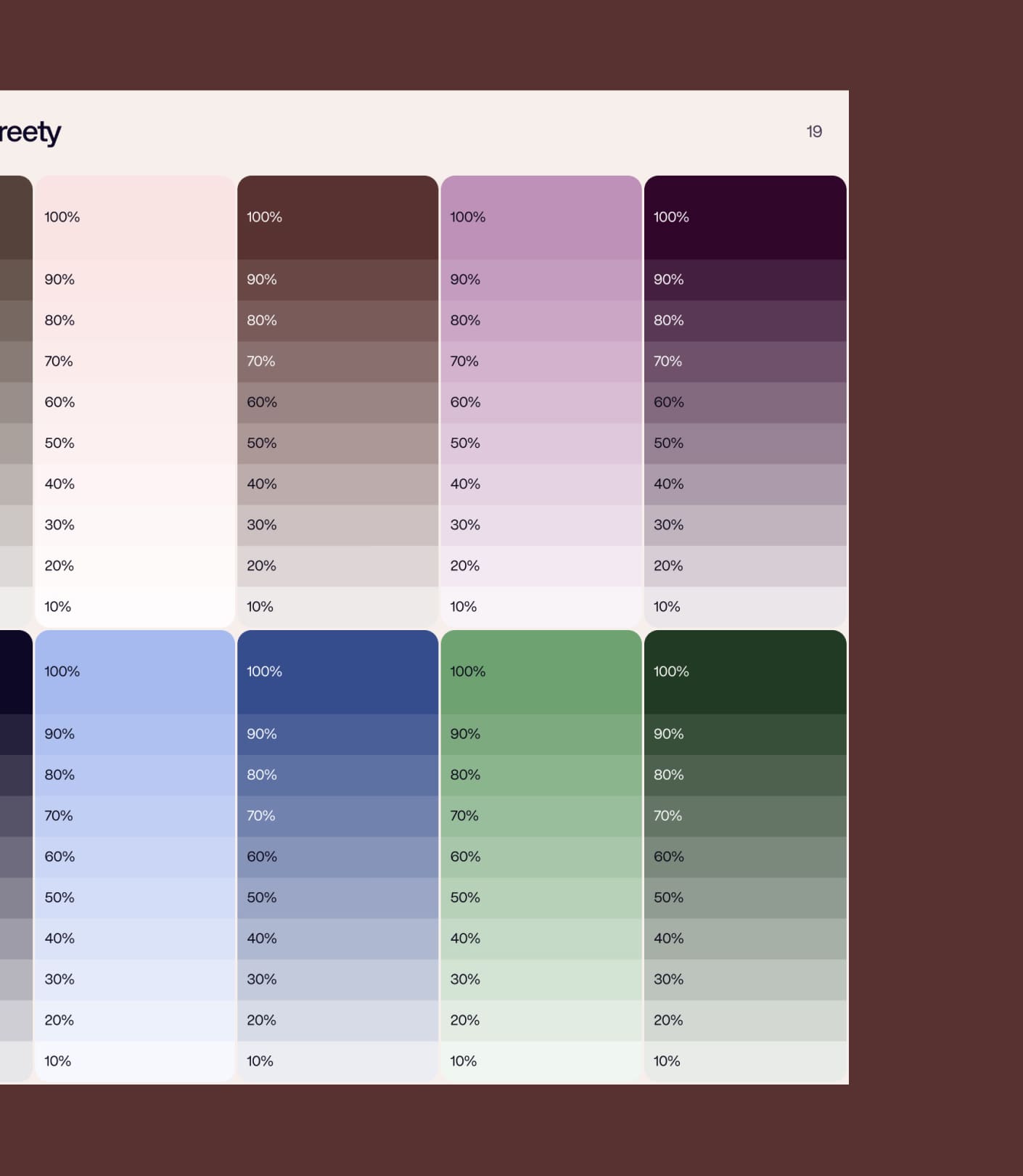
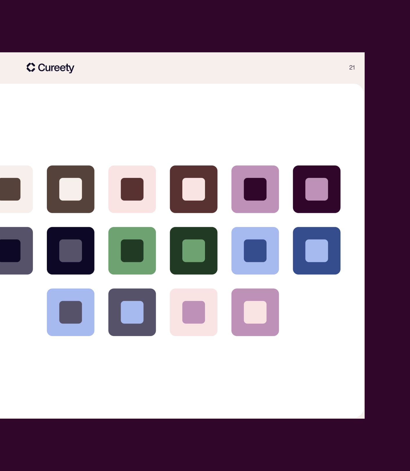
A full design system was built in Figma, covering every interface component: forms, dashboards, alerts, scheduling modules, and tracking tools. This system keeps everything consistent as the platform grows and makes life easier for the development team when it’s time to ship future product updates.

Summary

Thanks to the whole team, always going the extra mile to push the boundaries!

Florent Darrault

CMO @Cureety

A
A
A

Webflow Build for the Corporate Website

Cureety’s corporate website was built in Webflow, with a sharp focus on showcasing the platform’s different modules and features. The site had to win over care providers, facility directors, and financial decision-makers alike — audiences with very different expectations, but one shared demand: flawless professionalism.

The build followed the design team’s handoff to the letter, with close attention to technical performance. For a medical platform, every performance detail mattered — optimized images, minified scripts, Core Web Vitals. All of it was handled with care.

Architecture Built for International Growth

With operations in France, Italy, and Portugal, the site structure was designed to support future international expansion. The Webflow architecture was set up to make localized versions easy to launch, with content management that keeps updates centralized while still giving the flexibility needed to adapt messaging for each market.

Summary

Thanks to the whole team, always going the extra mile to push the boundaries!

Florent Darrault

CMO @Cureety

A
A
A

SEO in a Regulated Medical Sector

Cureety’s SEO sits in a very specific context: a CE-certified medical device subject to strict communication rules. The SEO strategy was built to maximize visibility among healthcare professionals while staying within the regulatory constraints that govern digital health communication.

Keyword research surfaced the priority queries in the oncology remote monitoring space: “oncology remote monitoring,” “remote cancer patient follow-up,” “oncology platform,” plus institutional queries aimed at hospital decision-makers. These keywords bring moderate search volume, but high commercial value, given the long sales cycle and the financial stakes of hospital contracts.

Content and Domain Authority

The content strategy was built to establish Cureety’s authority on the sector’s core topics: Real World Evidence, remote monitoring algorithms, clinical specificity, and oncology care pathways. This editorial approach supports both SEO and the brand’s expert positioning among professionals looking for trusted reference material on these subjects.

Technical optimizations — URL structure, schema markup, and institutional page management — were implemented to maximize search engine readability in a sector where trust and authority signals matter even more than usual.

Summary

Thanks to the whole team, always going the extra mile to push the boundaries!

Florent Darrault

CMO @Cureety

OUR latest projects

+240 companies
supported

Websites designed and developed with 

Let’s f*****G GO !!

Ready to launch
Your business?

Alexandre

Max

Enora

Bryan

Cannelle

Tiphaine

You'll :heart: our collaboration...