Projects
 Our Offers
 Dedicated team
 Blog
 Academy
 About Us
Care Care x Gemeos
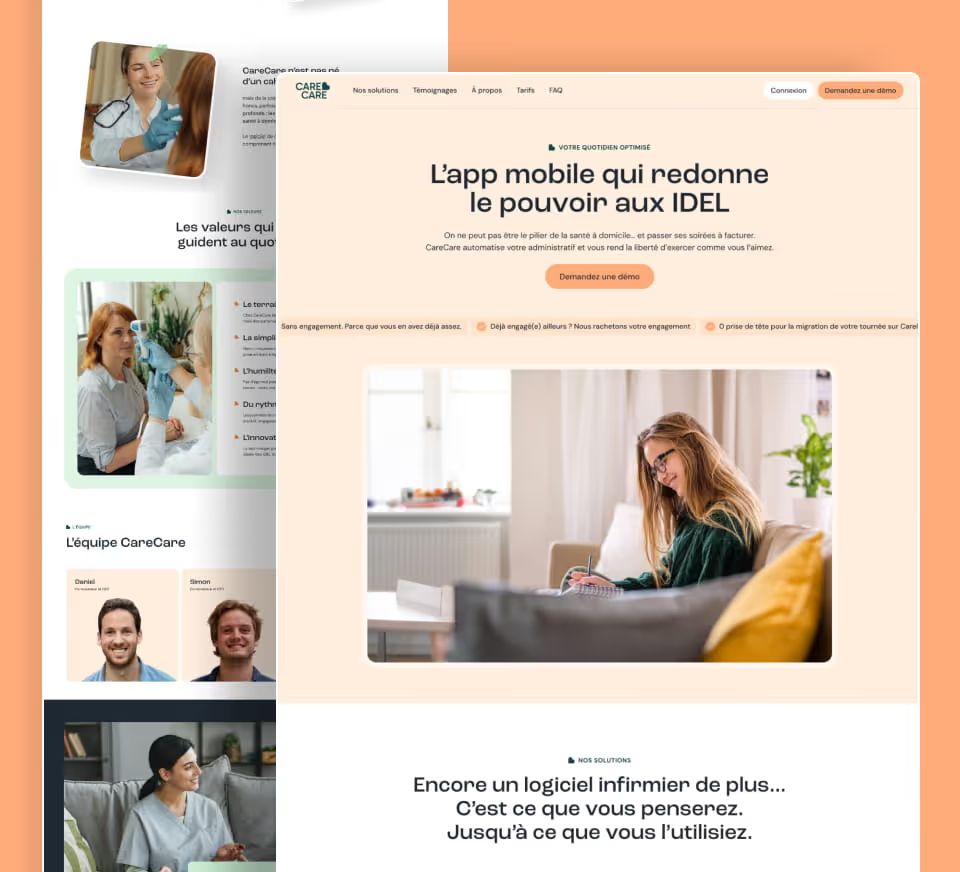
Care care is a B2B platform dedicated to employee health and well-being. In a market where strong visual codes make all the difference, Gemeos delivered an accessible, human, and distinctive digital identity, from art direction to SEO.
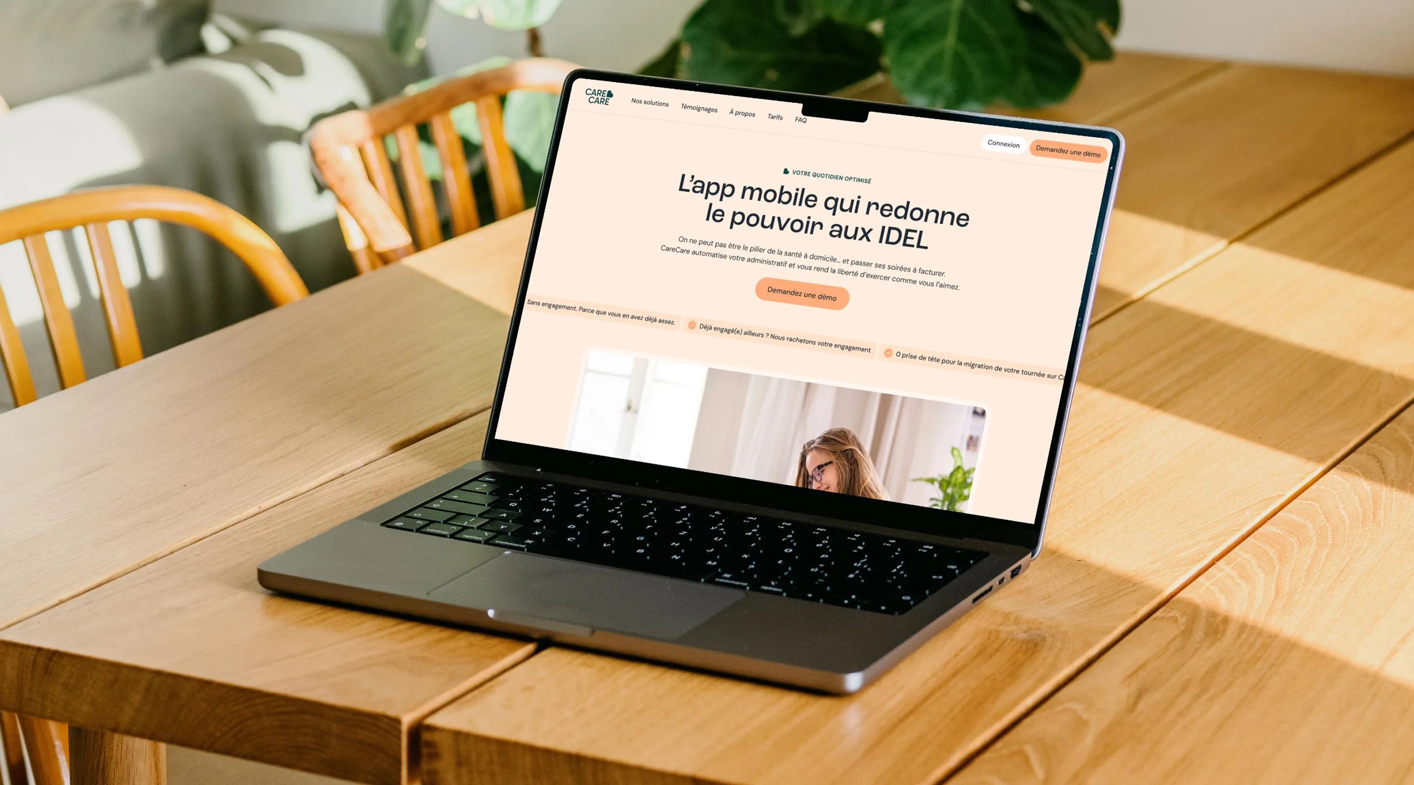
Reinventing Workplace Health with Style
Care care is a B2B platform dedicated to employee health and well-being. In a market where players like Alan set a strong visual standard, Care care needed a digital identity that felt accessible, human, and distinct, one that could win over HR decision-makers.
Gemeos handled the entire project, art direction, UX/UI design, Webflow build, and SEO, turning Care care’s site into a real conversion machine.
- Industry
- Healthcare
- Services
- Artistic Direction
- UX/UI Design
- Development
- SEO
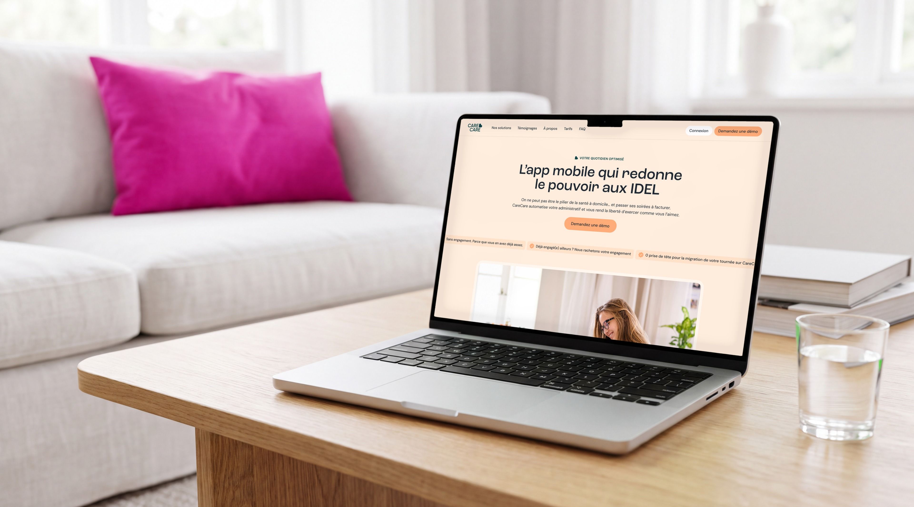
Care care’s art direction started from a simple insight: in healthtech, brands tend to swing between overly clinical and overly generic. Gemeos set out to carve out a distinct space for Care care, warm, professional, and subtly playful.
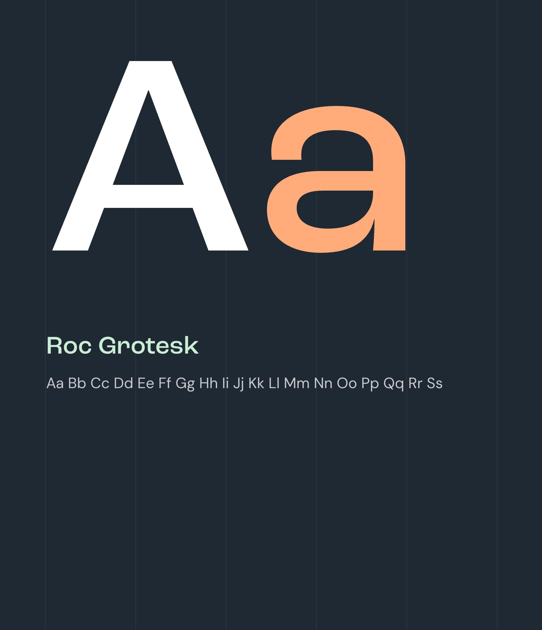
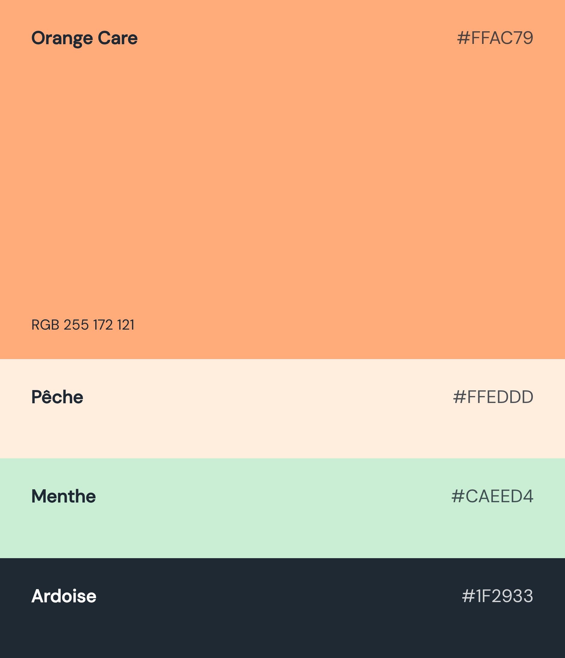
Using the full brand briefing completed by the Care care team, and drawing inspiration from brands like Alan, which use color and motion to break industry conventions, Gemeos defined an art direction that embraces softer typography, a palette that balances seriousness with energy, and handwritten decorative elements (like tape overlays on photos) to reinforce the human, hands-on feel.
The result: a visual identity that builds trust with HR leaders while channeling the energy of a startup that truly believes in what it’s building.

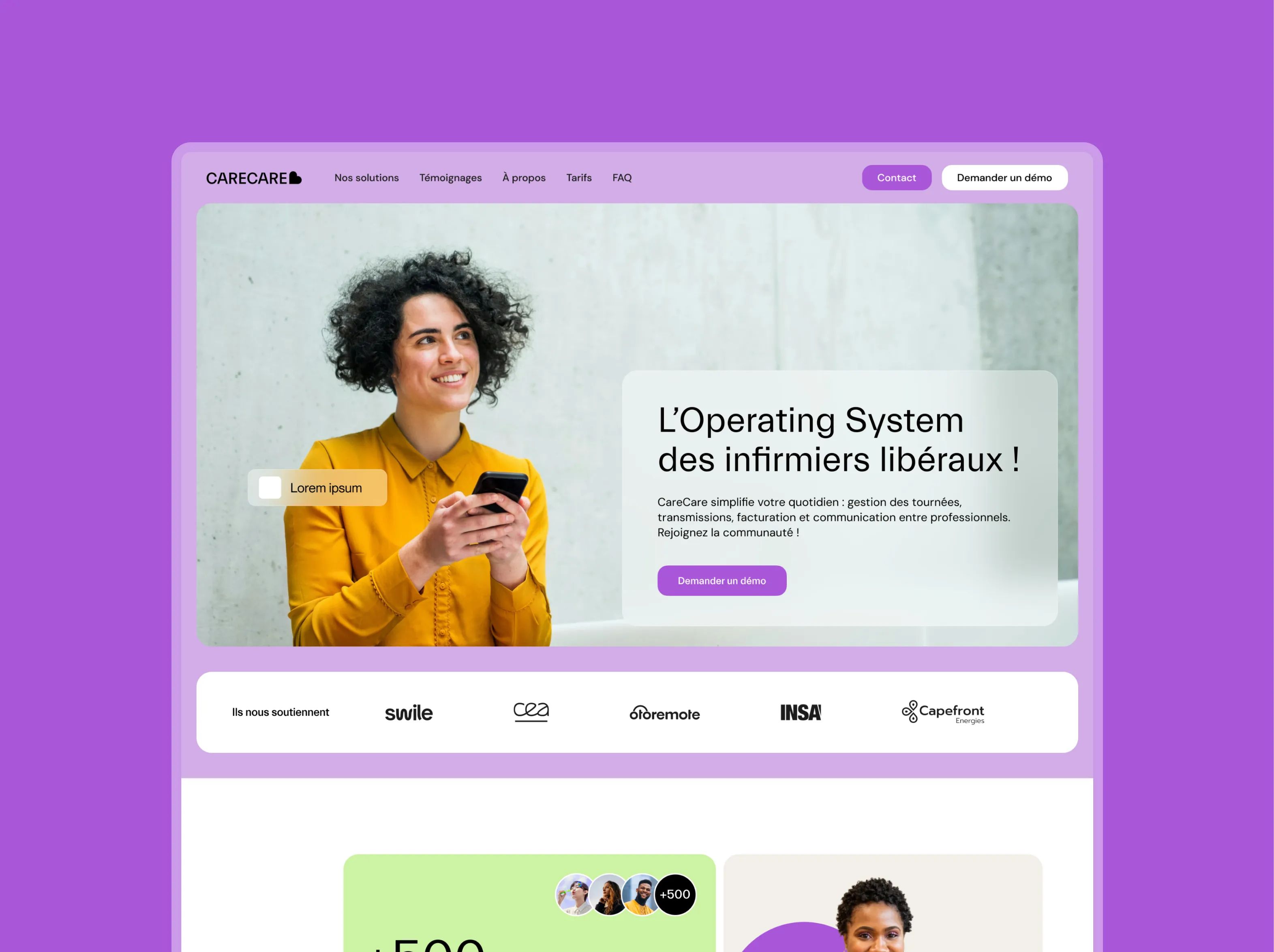
Vibrant & Community-Driven
An energetic design driven by bold color blocks, green, purple, yellow, that create a strong, memorable visual identity. The split photo/text hero instantly builds a human connection to the nursing profession. Key metrics take center stage in a colorful grid that grabs attention and reinforces traction. A warm, dynamic direction that stands worlds apart from the cold codes of medical software.
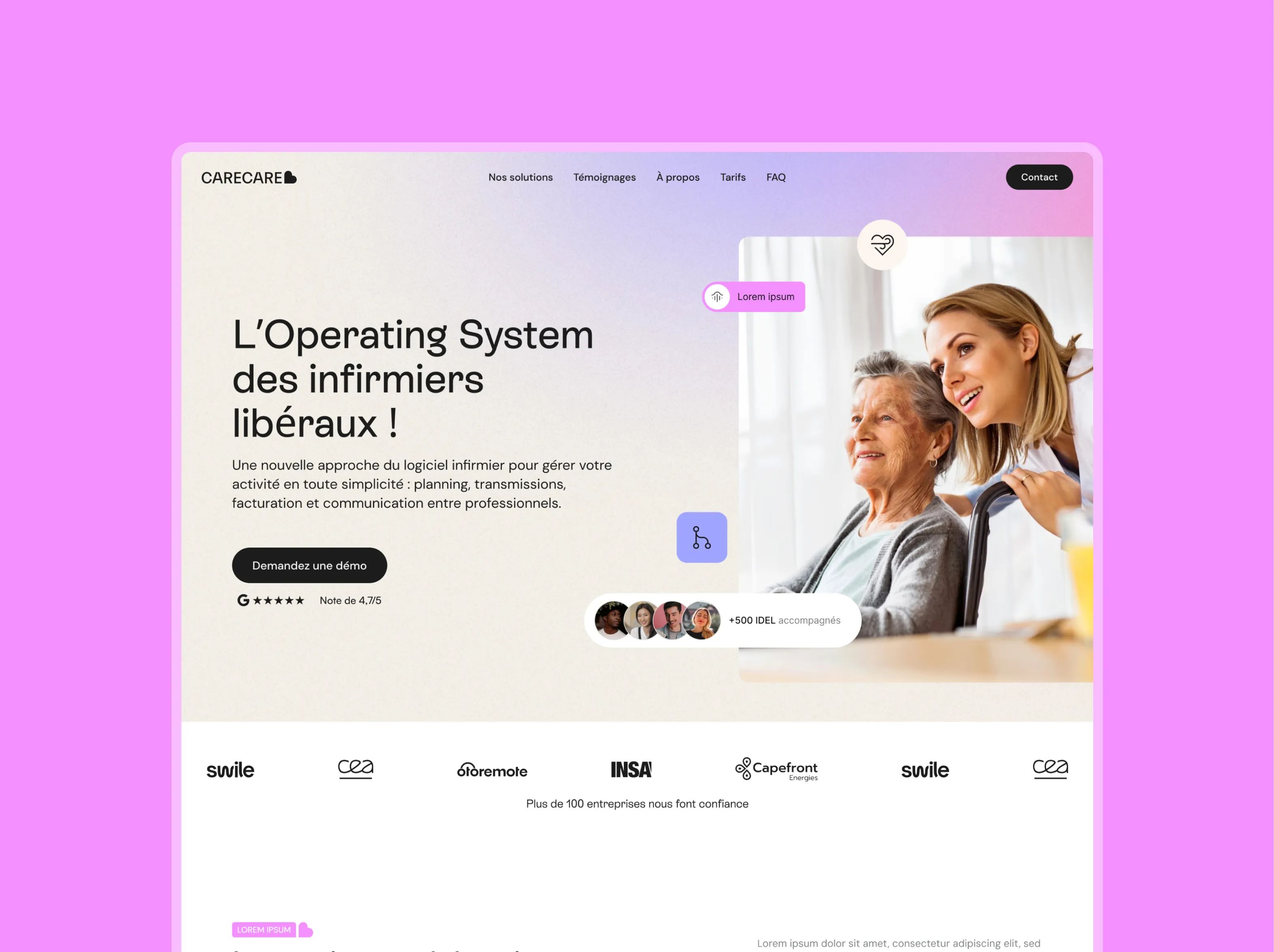
Clean & Feature-First
A clean, structured white design that puts the product front and center. The hero gives the human photography room to breathe against a light background, with a direct value proposition. The feature grid uses understated cards to present the offer clearly and comprehensively. The violet gradient in the footer adds a touch of color without overwhelming the page. A more classic, reassuring direction, built to win over pragmatic users who want to understand the product first and foremost.
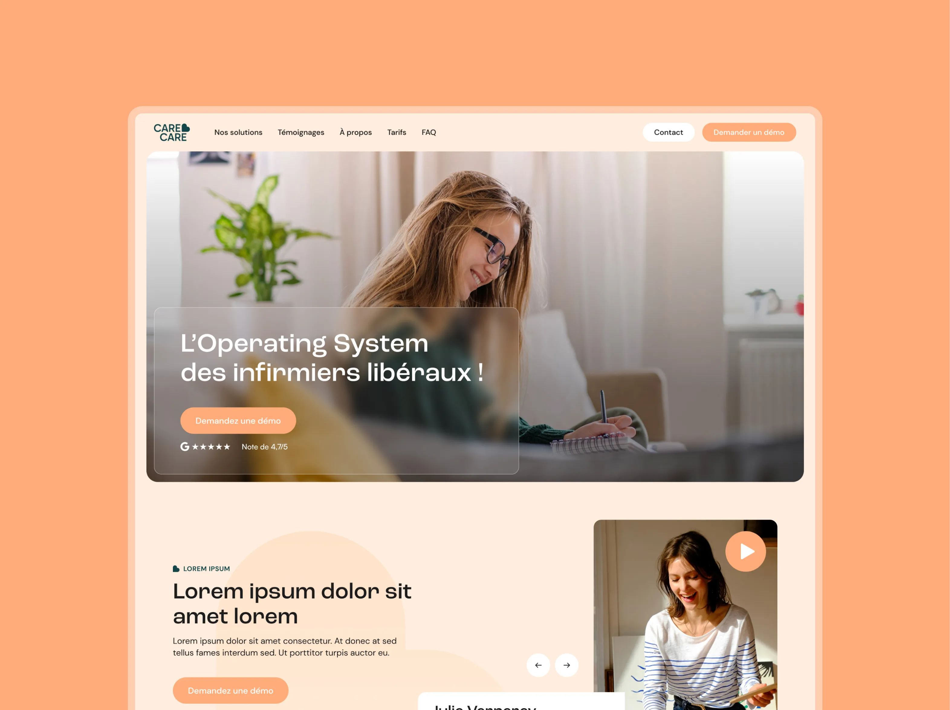
Warm & Conversion-Focused
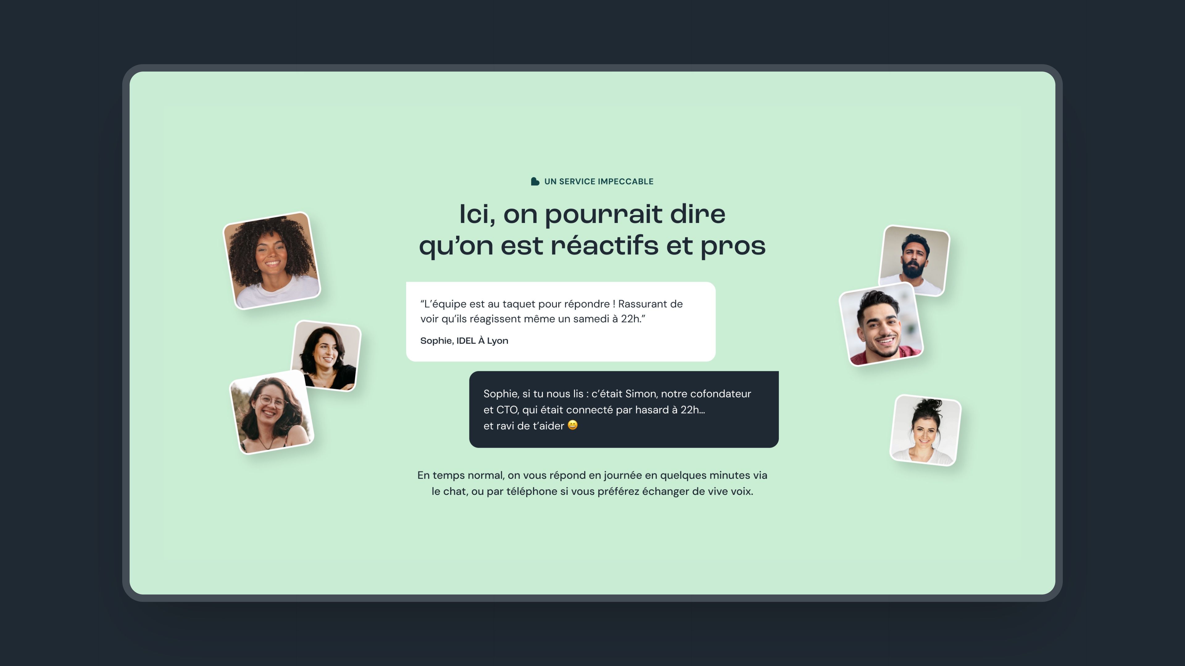
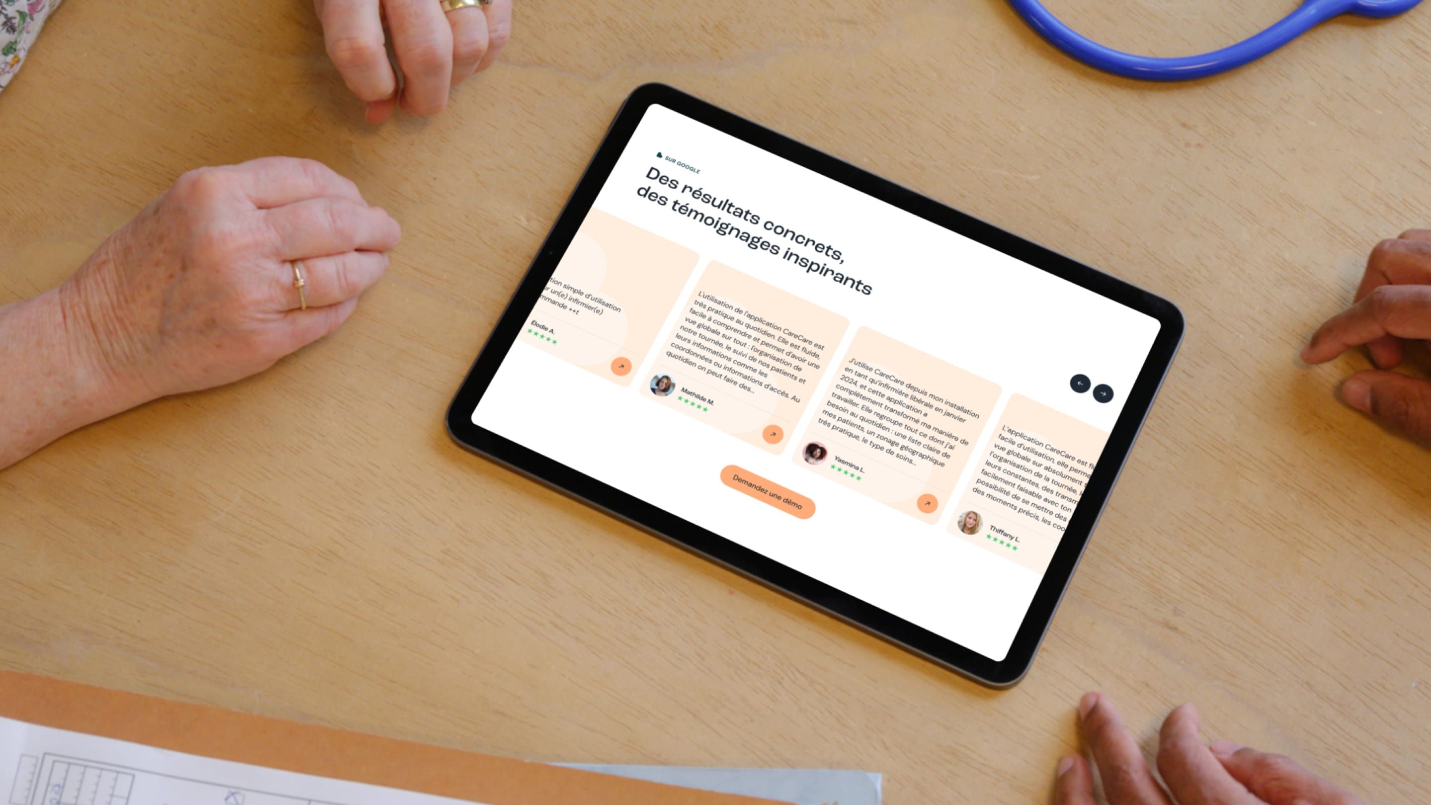
A successful blend of the two previous directions. The full-screen photographic hero with text overlay creates immediate impact. Peach and sage green tones bring warmth and softness without sacrificing readability. A testimonial video block with a floating avatar humanizes the message and strengthens social proof. The key metrics reuse the colorful V1 grid in a more open, airy layout. The most conversion-focused direction of the three.
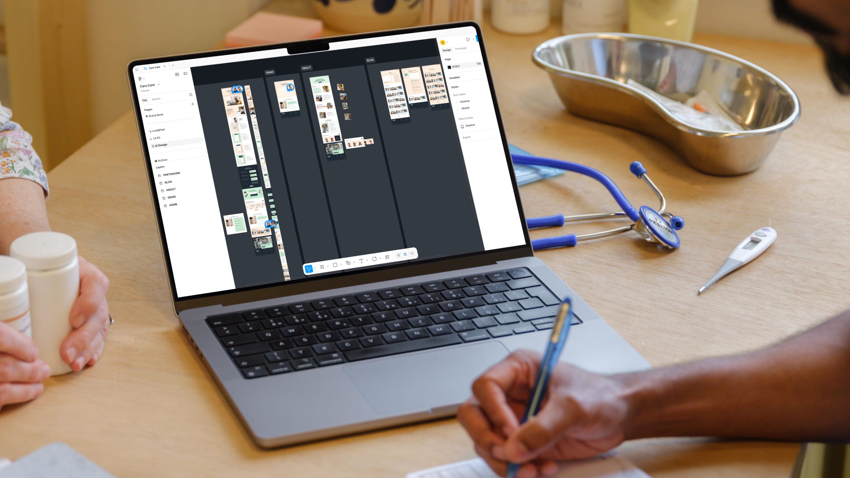
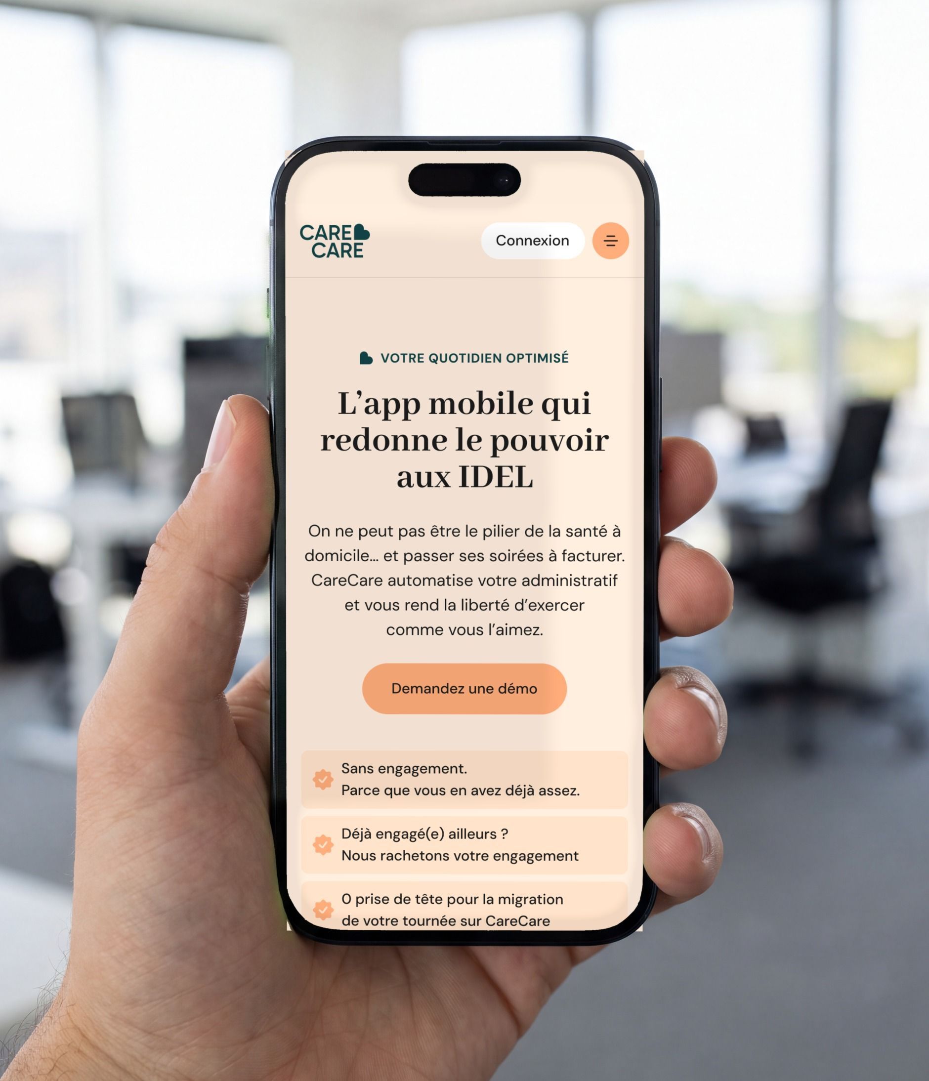
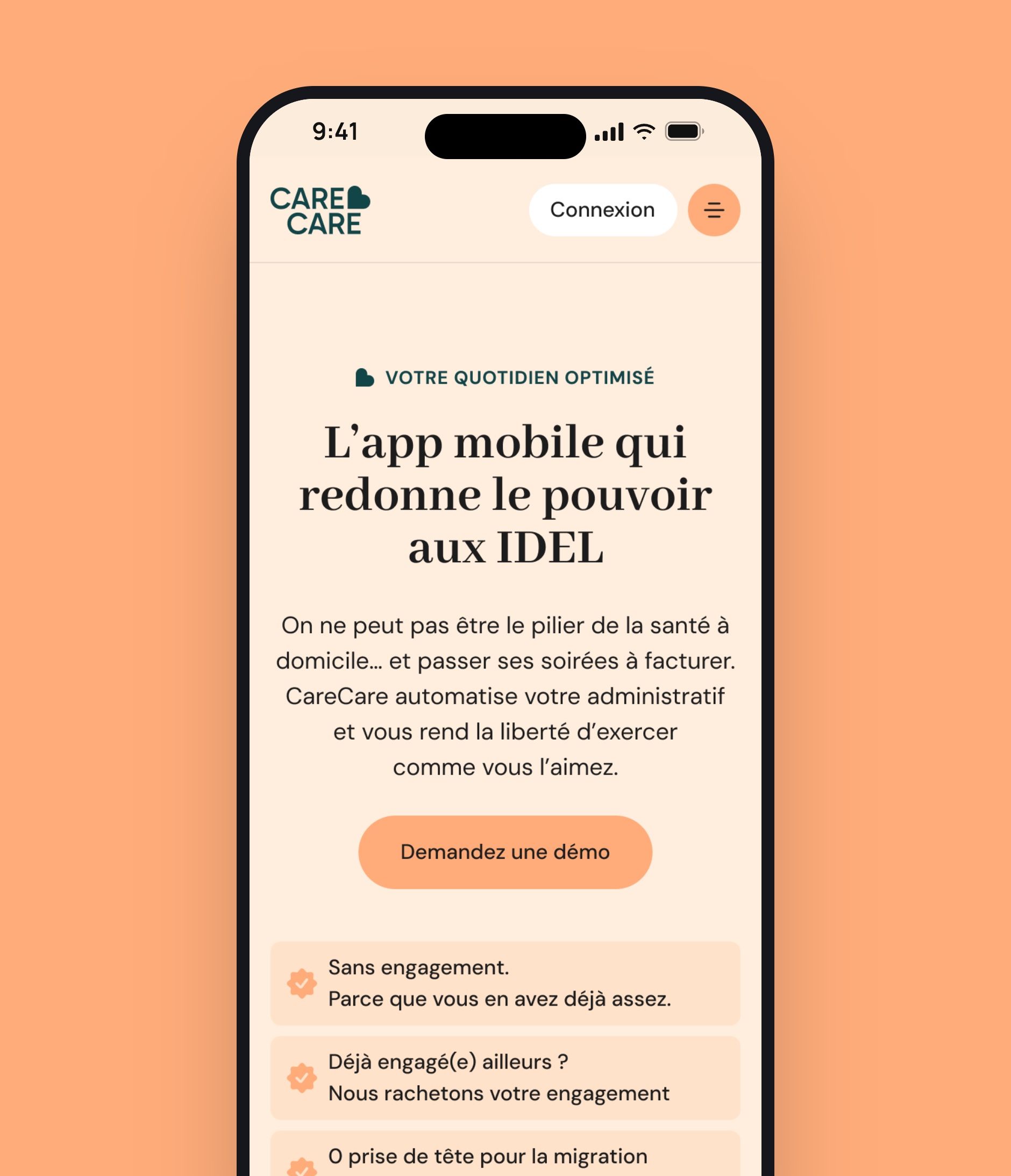
Care care’s UX/UI was designed to naturally guide visitors, mainly HR decision-makers and executives, toward booking a demo. The work started with a full UX map in FlowMapp before moving into the design phase in Figma.
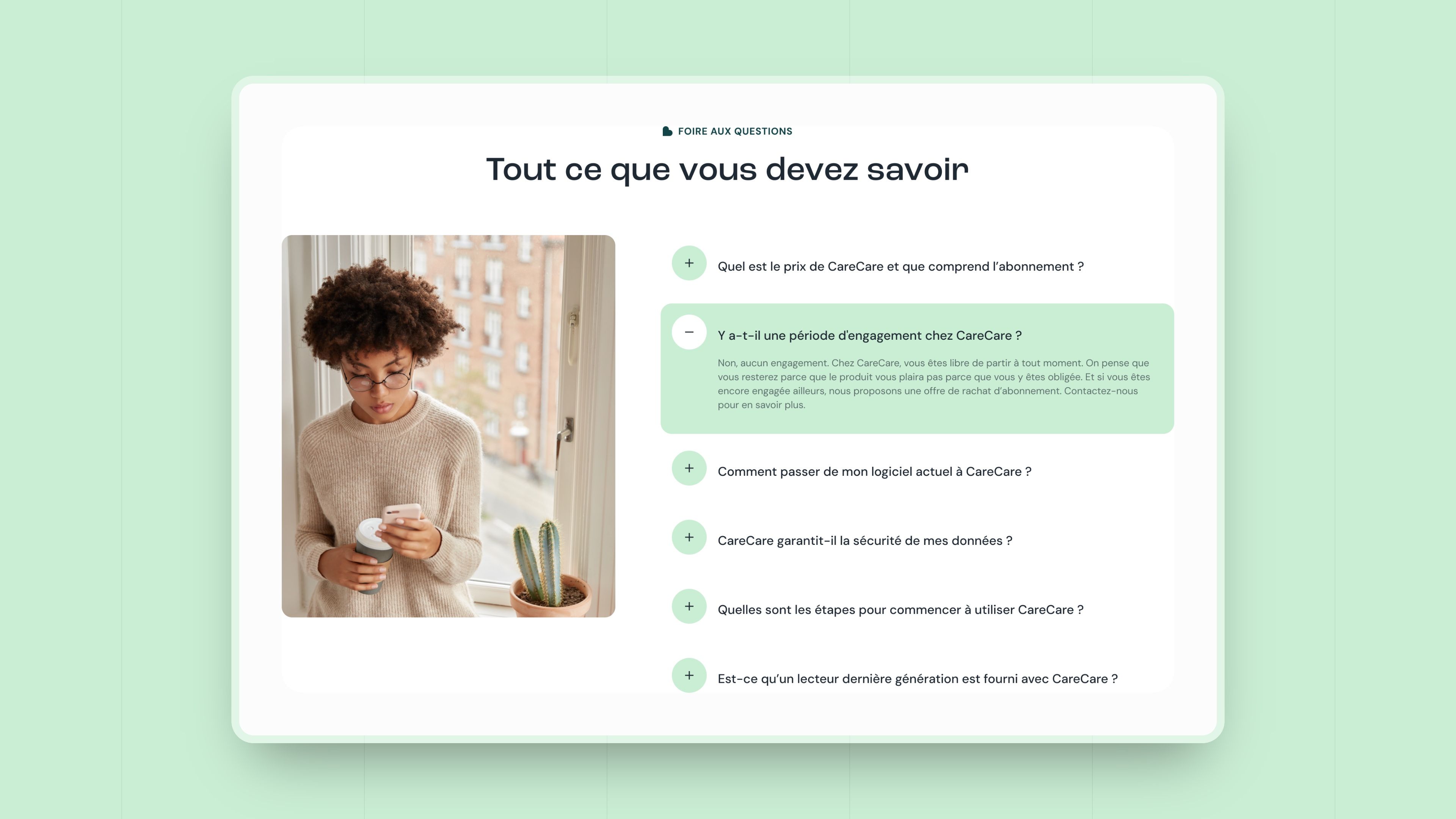
Every key page went through careful iterations with the client. The “About Us” page, especially strategic for a company that also sells its vision, was designed as a smooth storytelling experience, with a simple structure and light visual transitions. Decorative elements, tape on photos, graphic compositions, reinforce a sense of closeness without hurting readability.
Each Figma prototype was shared with the client through structured feedback sessions, making it possible to refine the concept until it was fully approved before moving into development.
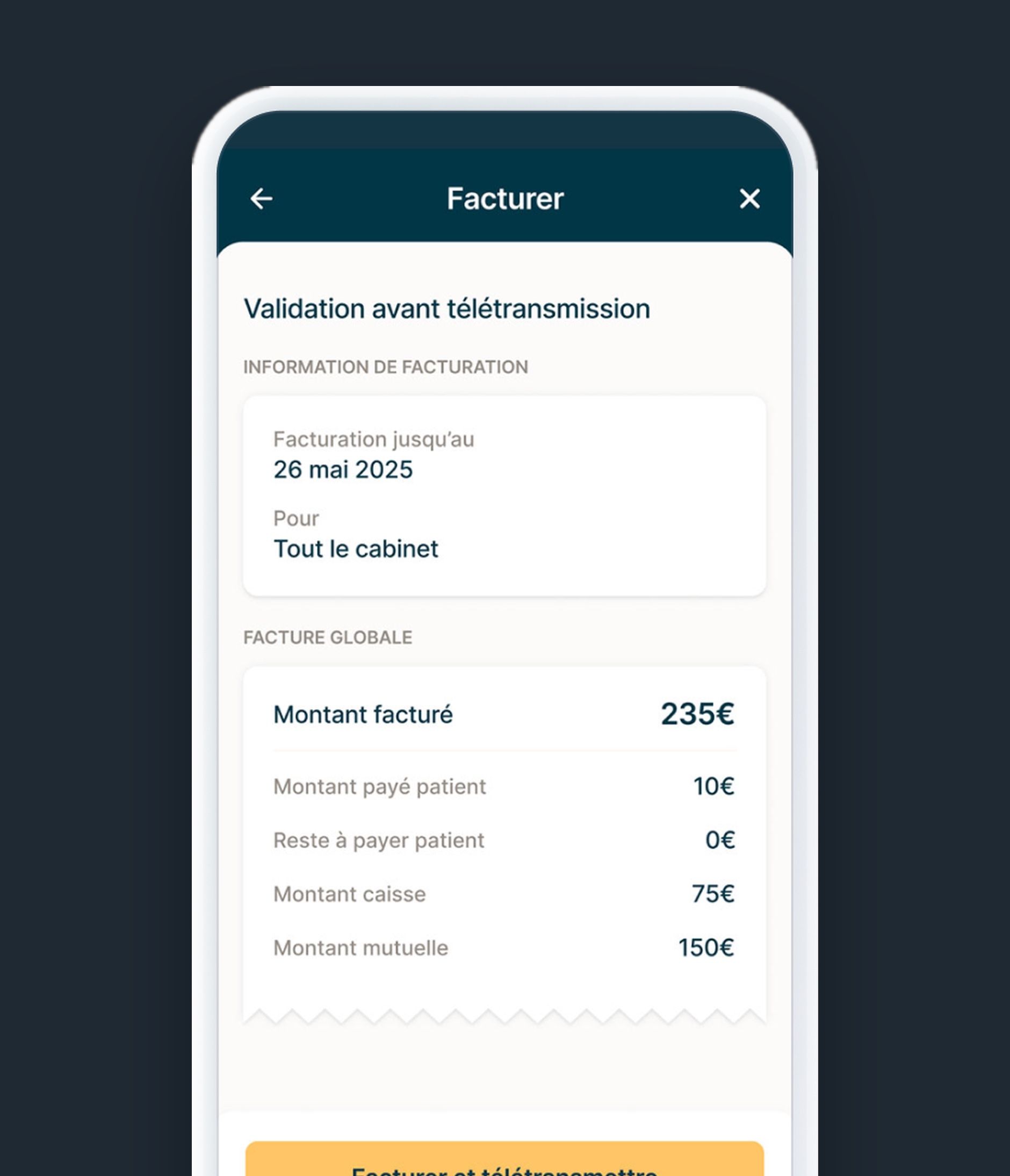
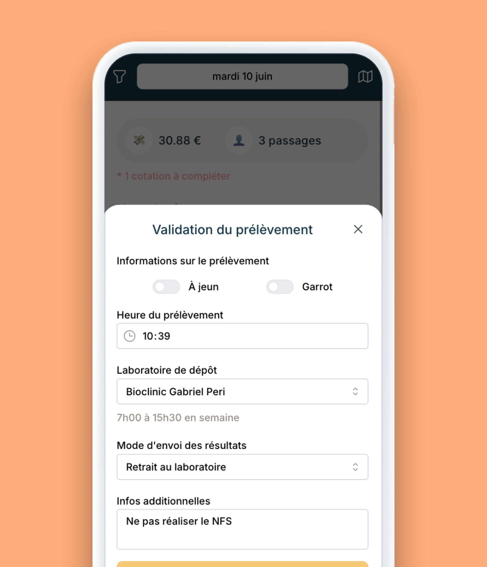
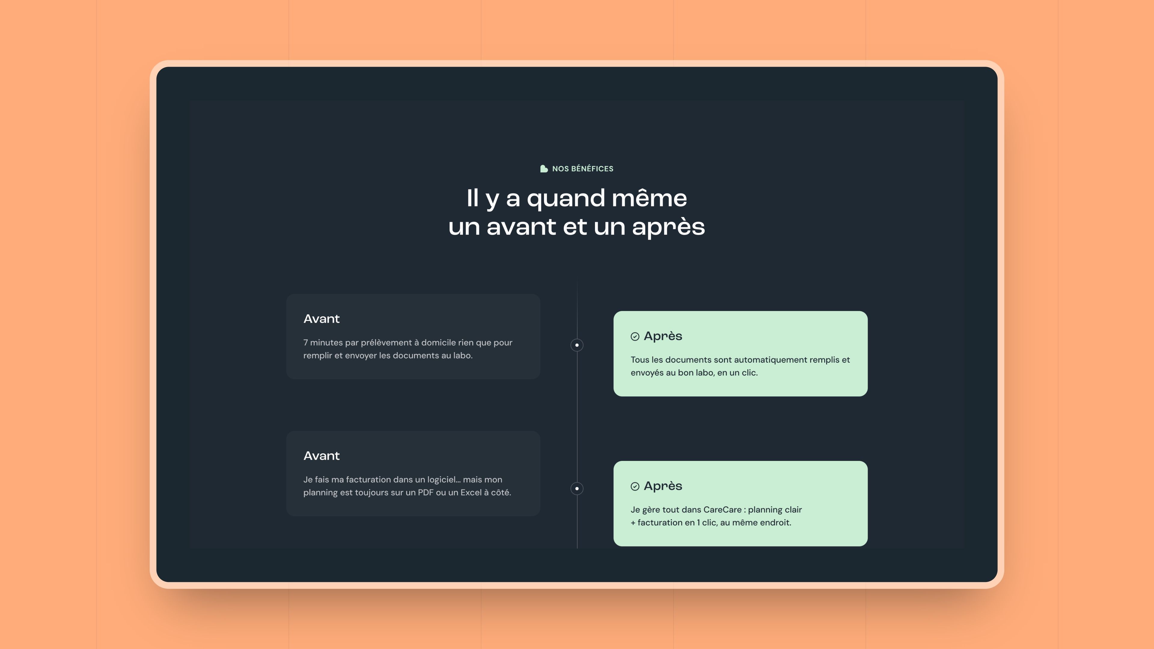
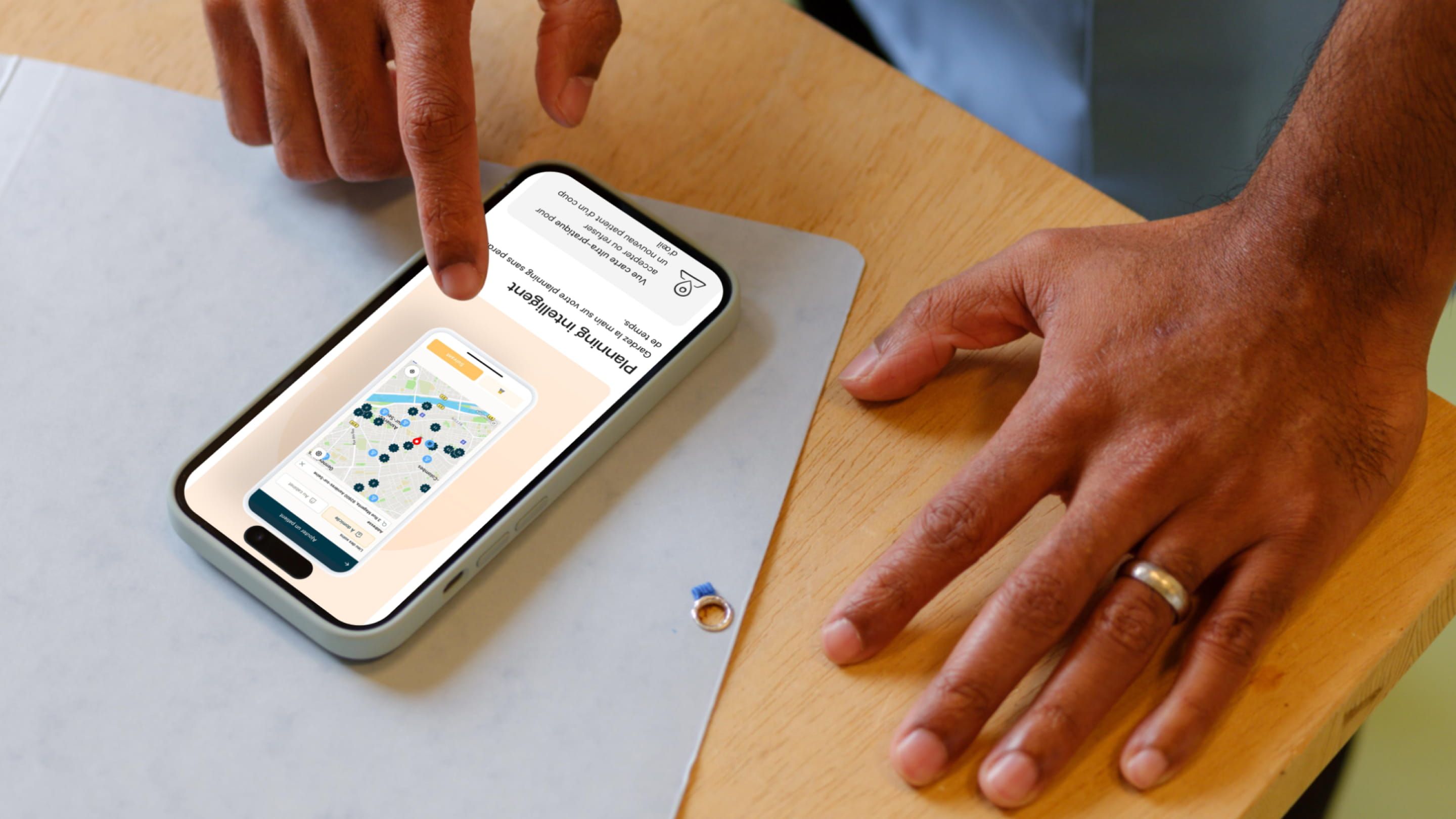
Building the Care care site in Webflow required a sharp focus on performance and technical UX. Beyond faithfully recreating the Figma designs, we also handled several third-party integrations:
iClosed (demo booking), Replaced Calendly with iClosed for demo scheduling, delivering faster load times and capturing incomplete leads, name, email, or phone number even if the booking isn’t completed.
Axeptio (cookie consent), integrated and configured the consent banner, with custom handling to prevent conflicts between the iClosed and Axeptio scripts on contact pages.
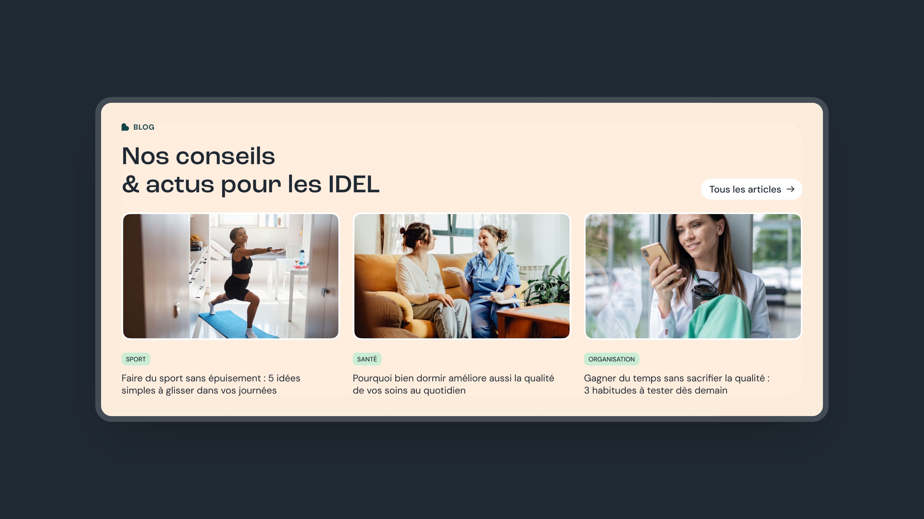
Webflow Blog, built the full blog section, giving the Care care team full ownership to publish and manage content through the Webflow CMS.
Key Pages, Home, Contact, About Us, and every service page, integrated pixel-perfect from Figma with smooth animations and polished responsive design.
Care care’s SEO strategy fits into a B2B content play: attract HR decision-makers and executives looking for employee health solutions before they even know Care care exists.
The blog built by Gemeos is the core of that content strategy. Structured so the team can update it on their own with ease, it makes it simple to publish regular articles on HR and workplace health topics that match the search intent of the target audience.
| SEO Lever | Execution |
|---|---|
| Webflow CMS Blog | Built and delivered (Prio 3, Completed) |
| Content Architecture | SEO-structured service pages + blog |
| Technical Integrations | High-performance site (iClosed vs Calendly) |
| Editorial Content | Health & HR topics for companies |


Our latest projects
+250 companies
supported
Websites designed and developed with








You're going to working with us, guaranteed
Ready to launch
your business?
Let’s f*****G GO !!