Projects
 Our Offers
 Dedicated team
 Blog
 Academy
 About Us
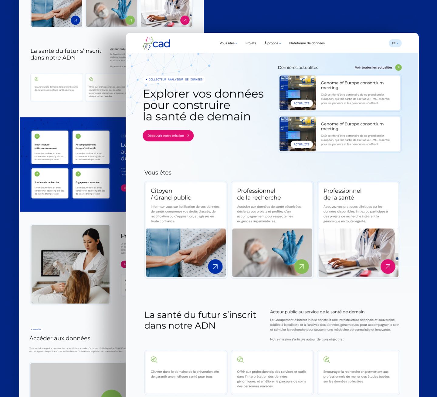
CAD: art direction and website design for France's national genomic data infrastructure
The CAD (Collecteur Analyseur de Données) is a public interest group born from the France Genomic Medicine 2025 Plan. It is building a national, sovereign infrastructure dedicated to collecting, storing and analysing genomic data, to support care and research towards personalised medicine.
Gemeos, a web agency for healthcare, designed the look & feel and the design of its website, which was then developed by NoCode Factory from the mockups.
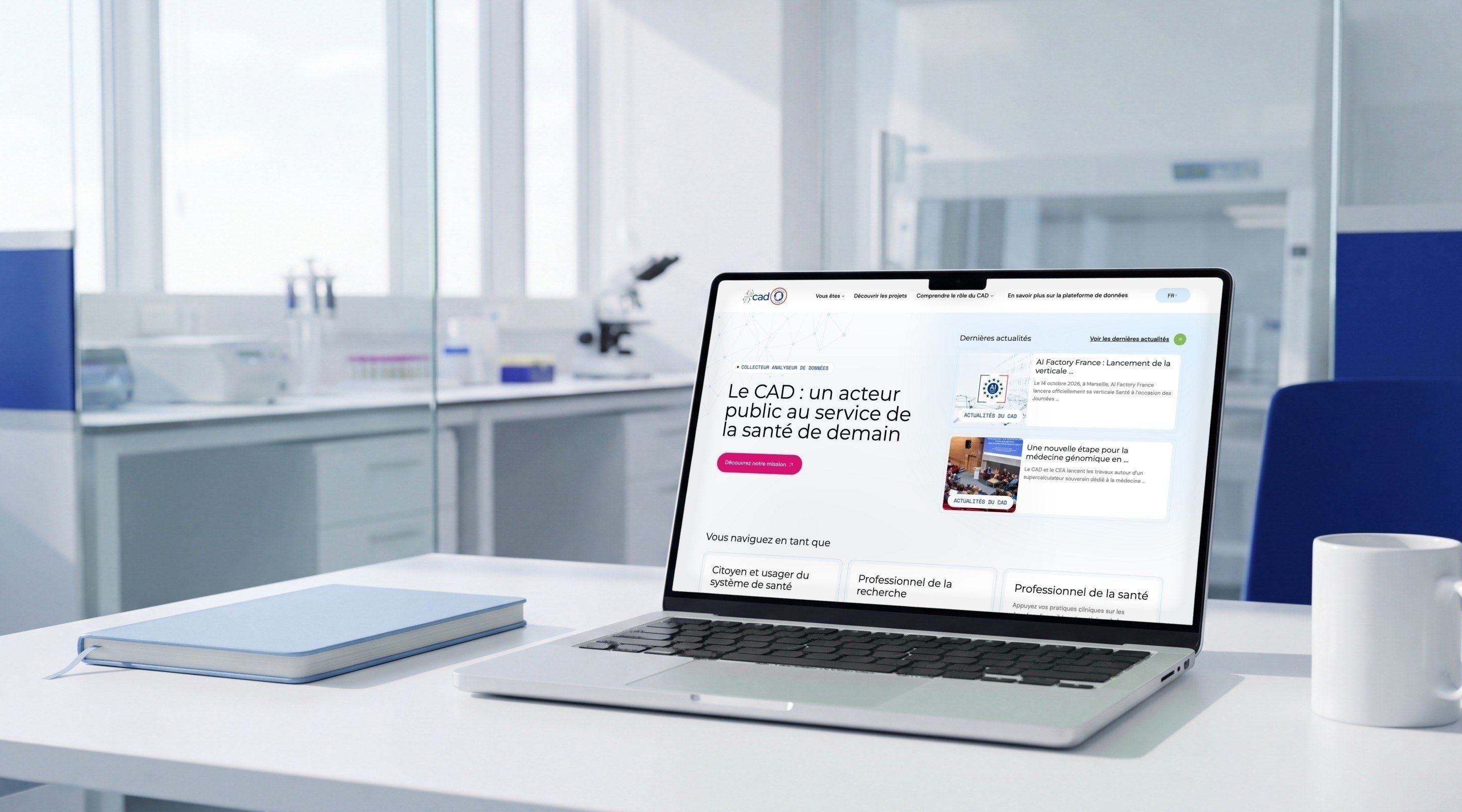
Talking about genomic data to a patient, a researcher and a doctor
The CAD website speaks to three audiences who expect different things: citizens whose data is collected and who want to understand their rights, researchers who want to submit a project and access the data, and healthcare professionals bringing genomics into their practice. The subject is sensitive, communication is tightly framed, and the CAD is a public body: the site had to fit within the ecosystem of health agencies, restrained and institutional, without feeling bureaucratic.
Gemeos explored three art directions, tested them against feedback from the CAD's management and stakeholders, then designed every page and a complete UI kit. Each mockup was reviewed with the development team before being presented, so that the technical and security constraints of a site about health data were built in from the design stage.
- Industry
- Healthcare
- Saas
- Services
- Artistic Direction
- UX/UI Design
Look & Feel
Institutional, but not bureaucratic
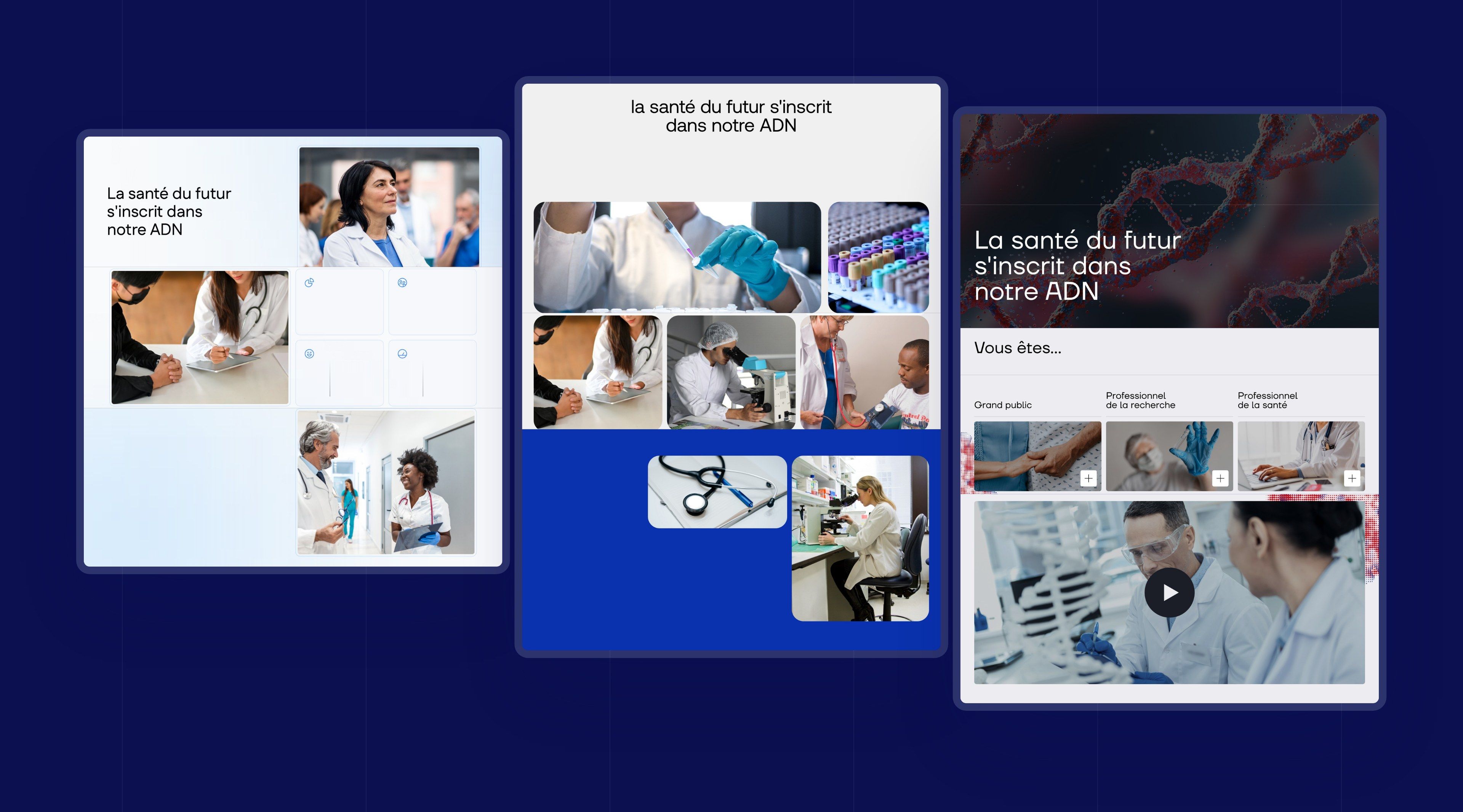
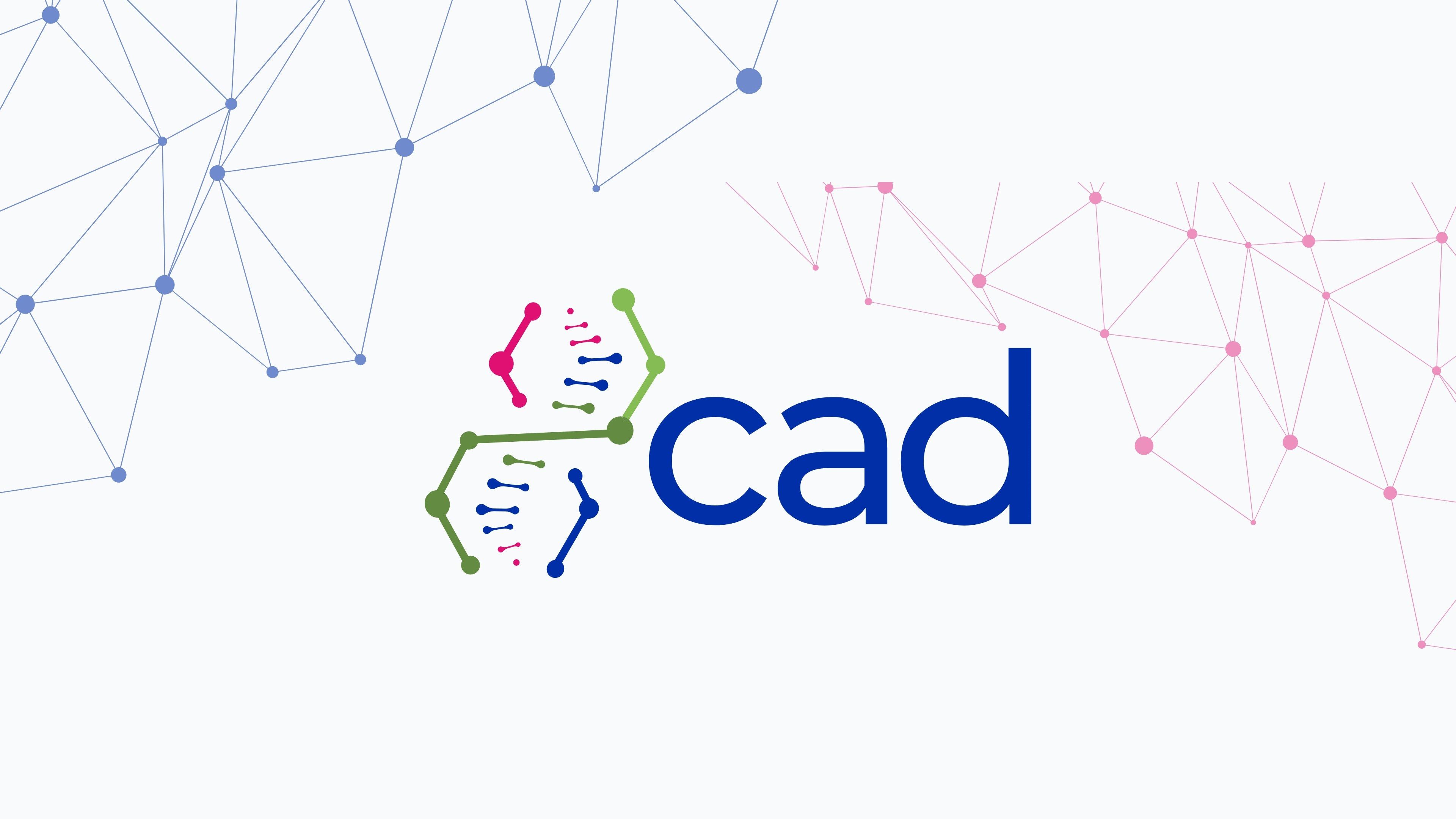
The CAD already had its logo: the word cad and a double helix symbol, made of nodes and links connected like a network. The look & feel starts from this figure. Three directions were explored for the home page, all built around the same line, “The health of the future is written in our DNA”: a bright, light direction carried by photography, a more editorial direction in bold pink, and a dark direction built on an image of DNA.
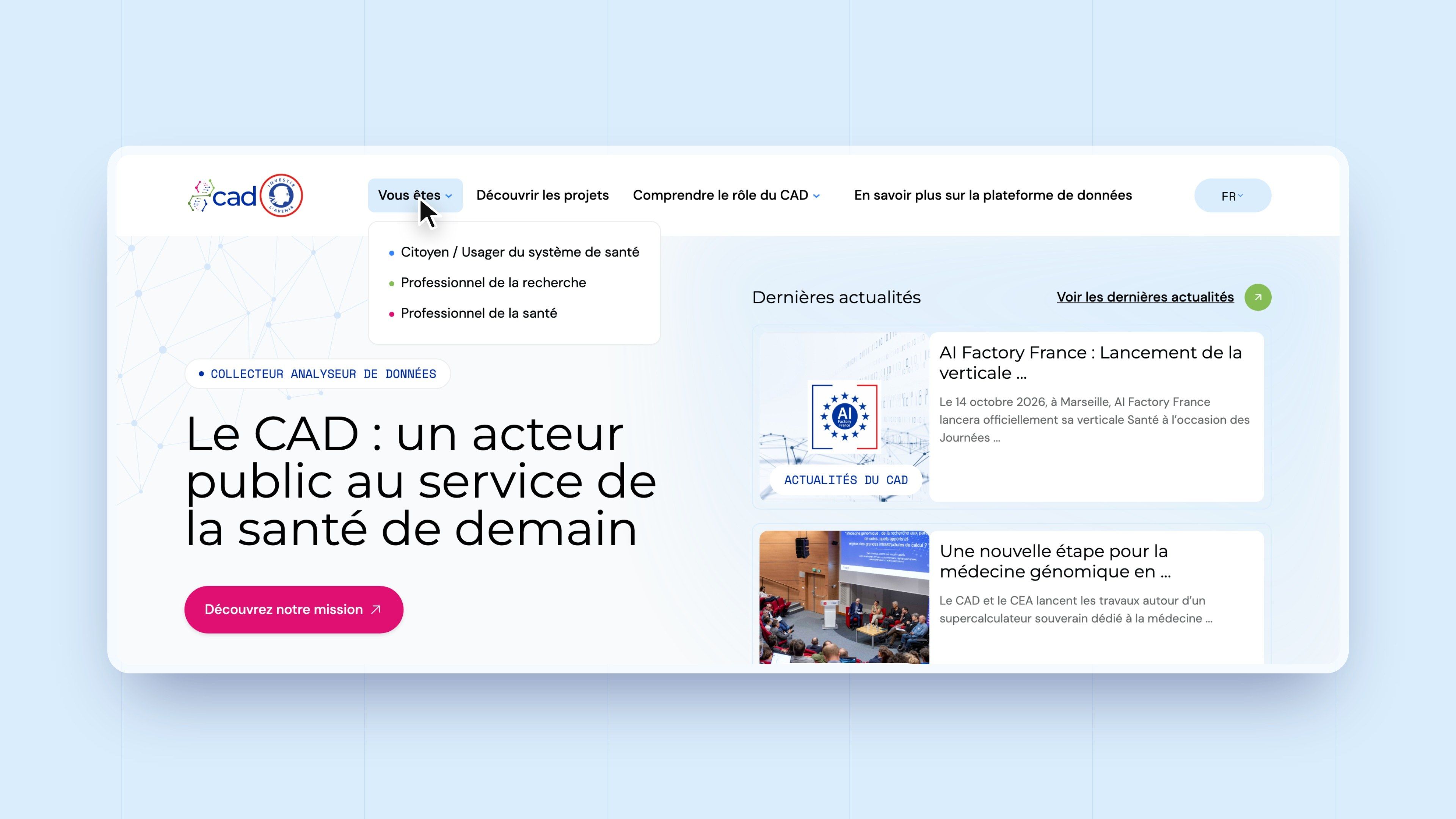
Feedback from the CAD's management set the course: a public body has to fit within the ecosystem of health agencies. The chosen direction is therefore more restrained, with fewer images and smaller visuals, a logo and menu given more prominence, and the three audience journeys brought up to the home page. The nodes and links of the symbol extend into a discreet network in the background of the sections.
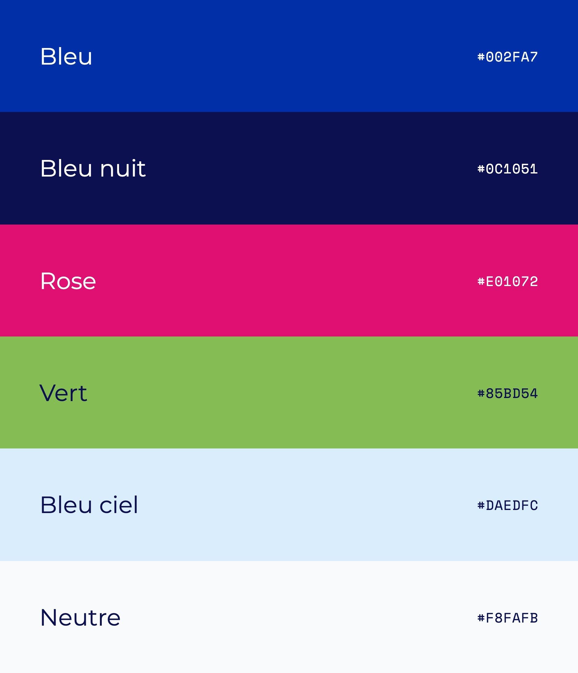
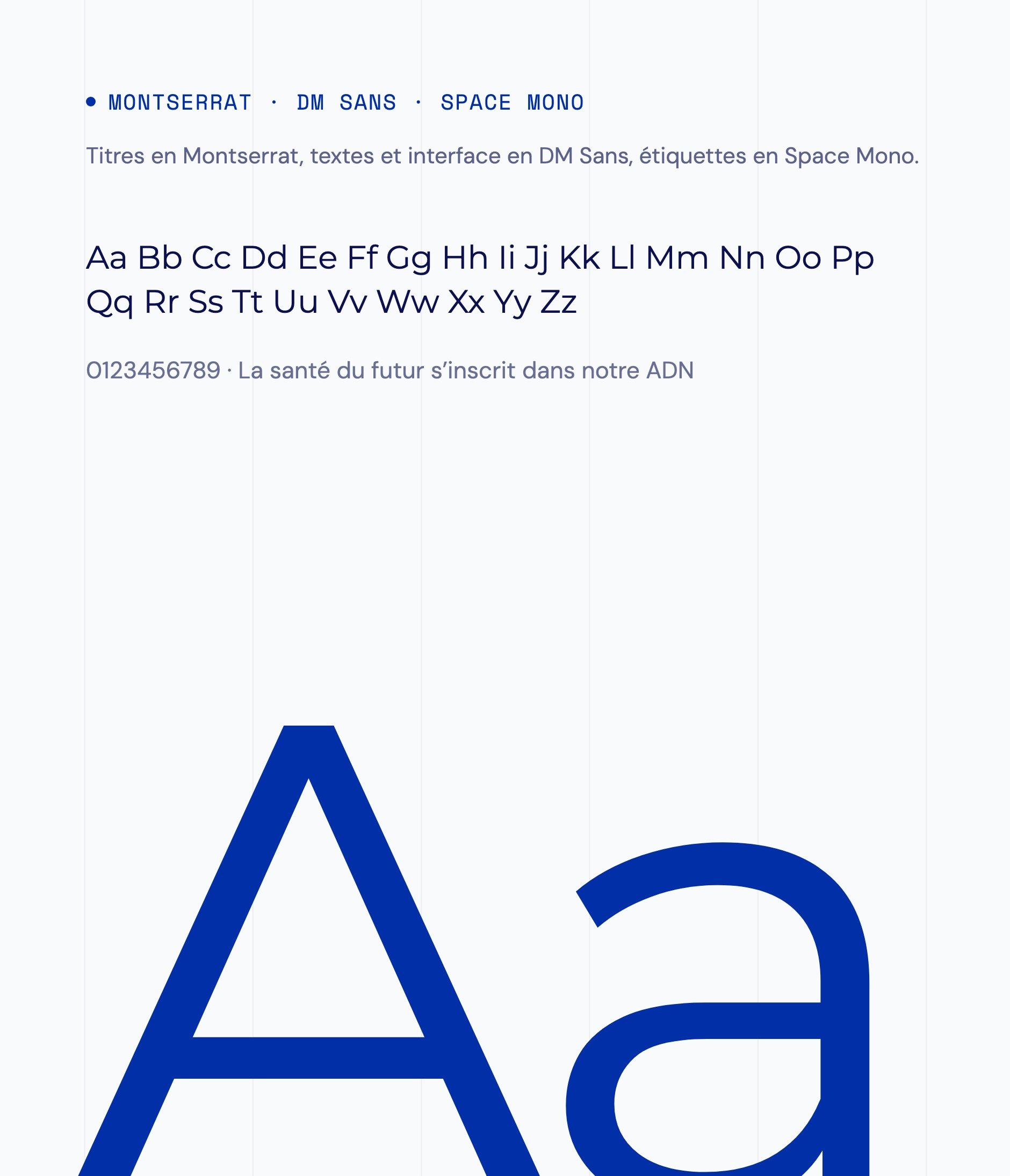
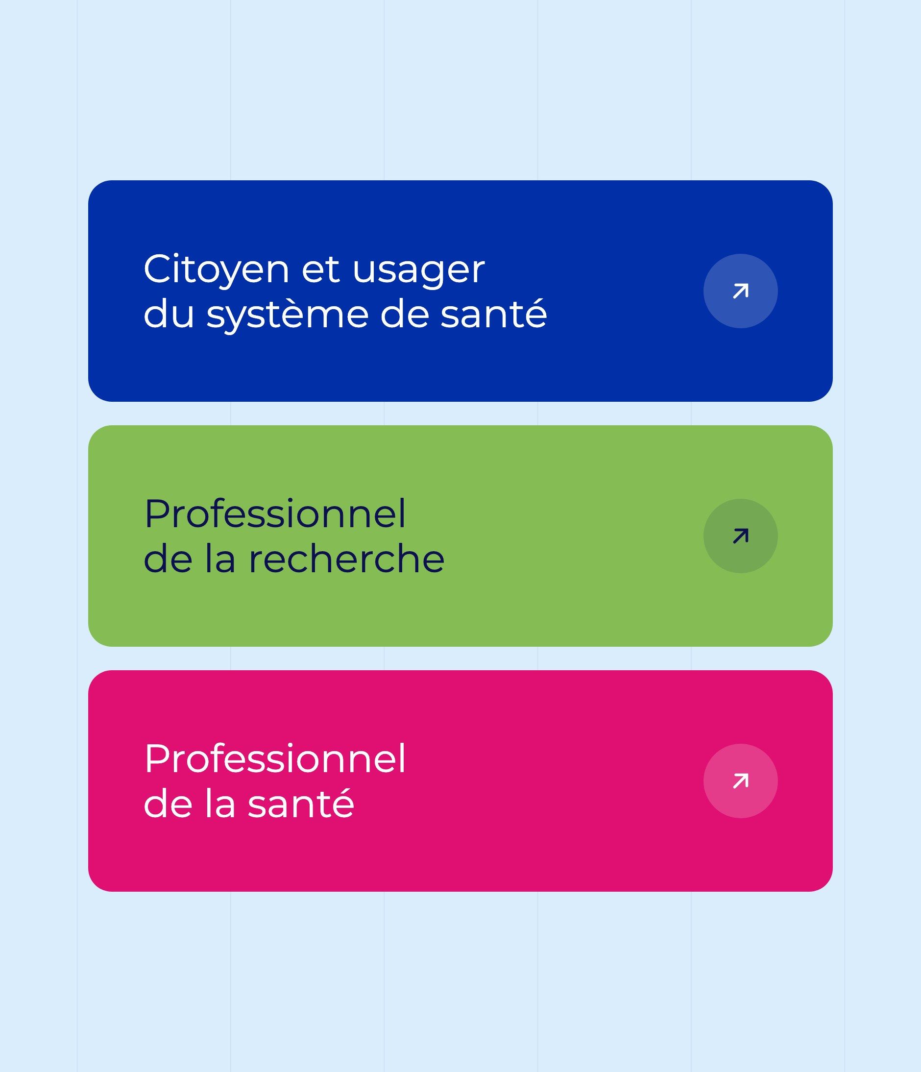
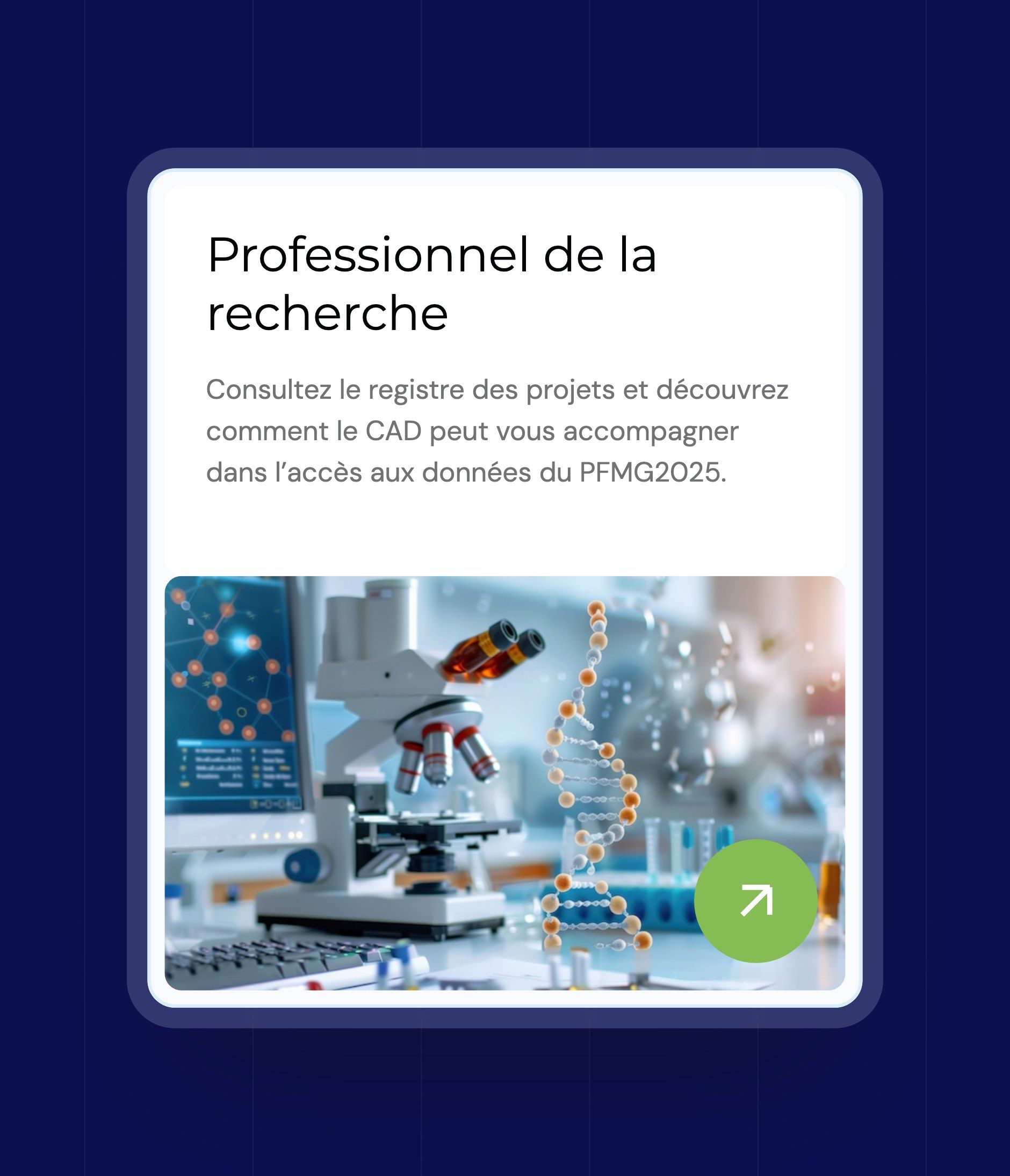
The palette takes up the colours of the logo: a blue (#002FA7), a midnight blue (#0C1051), a pink (#E01072) and a green (#85BD54), extended into shades in the UI kit along with a range of neutrals. Each audience has its colour, from the menu to cards and buttons: blue for citizens, green for research, pink for healthcare professionals. Headings are set in Montserrat, body text and interface in DM Sans, labels in Space Mono.
Direction 1 - Light
A very light blue gradient, photographs of caregivers in rounded frames, pill buttons and finely bordered cards. Intended perception: accessible and reassuring, focused on the patient.
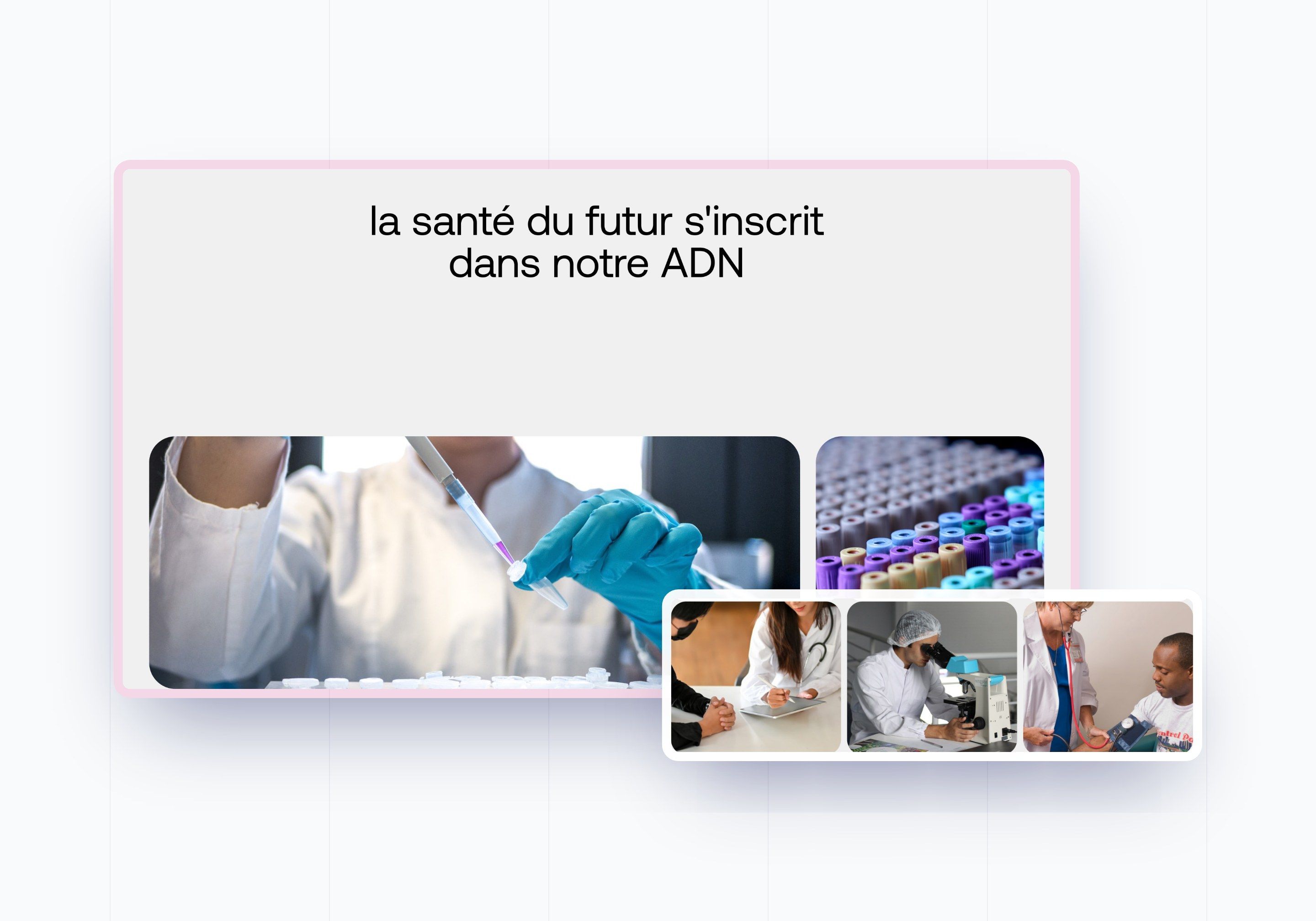
Direction 2 - Editorial
A centred headline, large laboratory photographs, the logo's pink for actions and solid blue sections. Intended perception: scientific and committed, with a real brand presence.
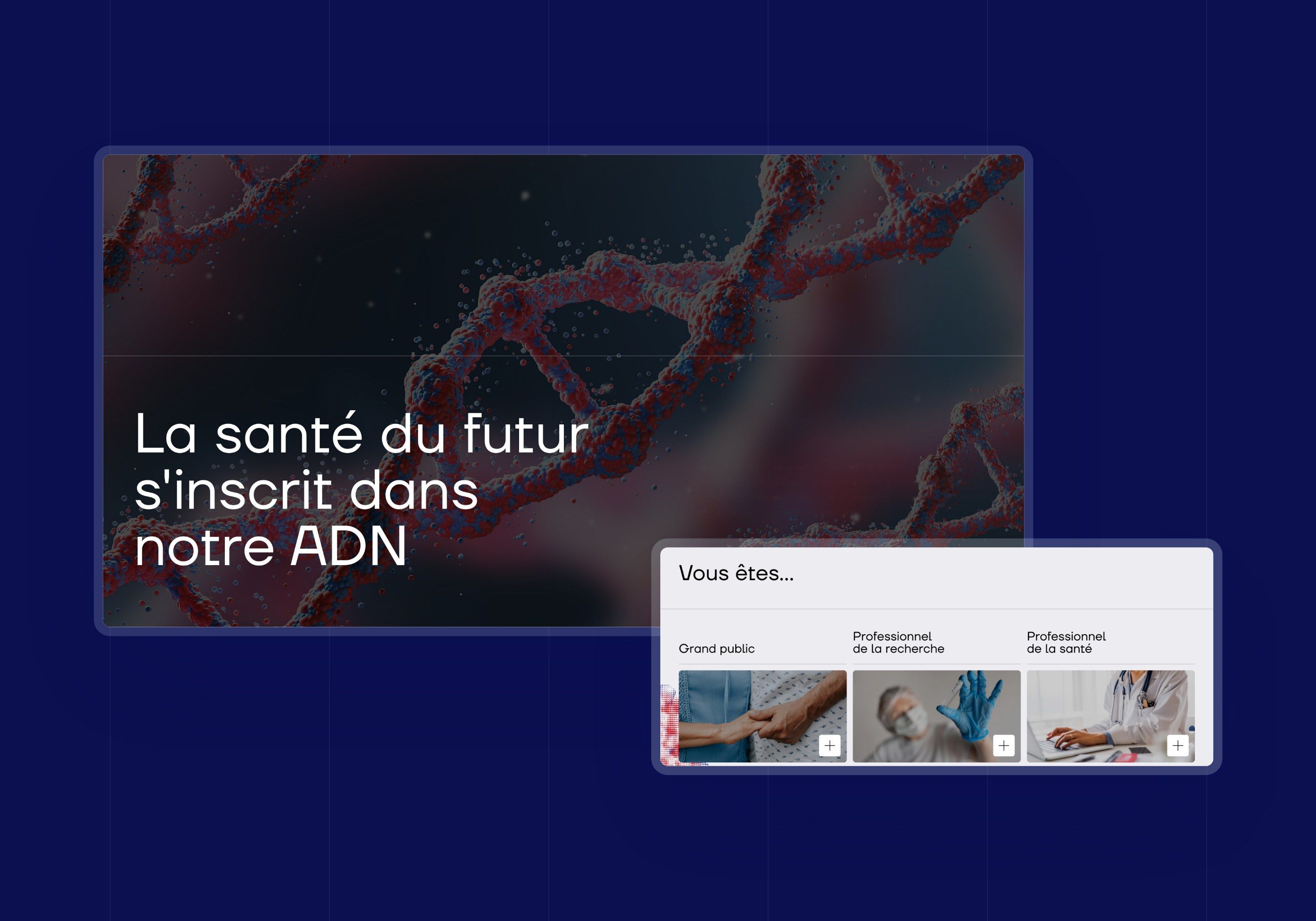
Direction 3 - DNA
A dark hero on an image of DNA, a visible grid and the entry points for each audience right below the hero. The structure of this direction was retained, then lightened and enriched with sections from the first to move towards the restrained, institutional tone of the live site.


Web Design
Three audiences, three paths, the same rigour
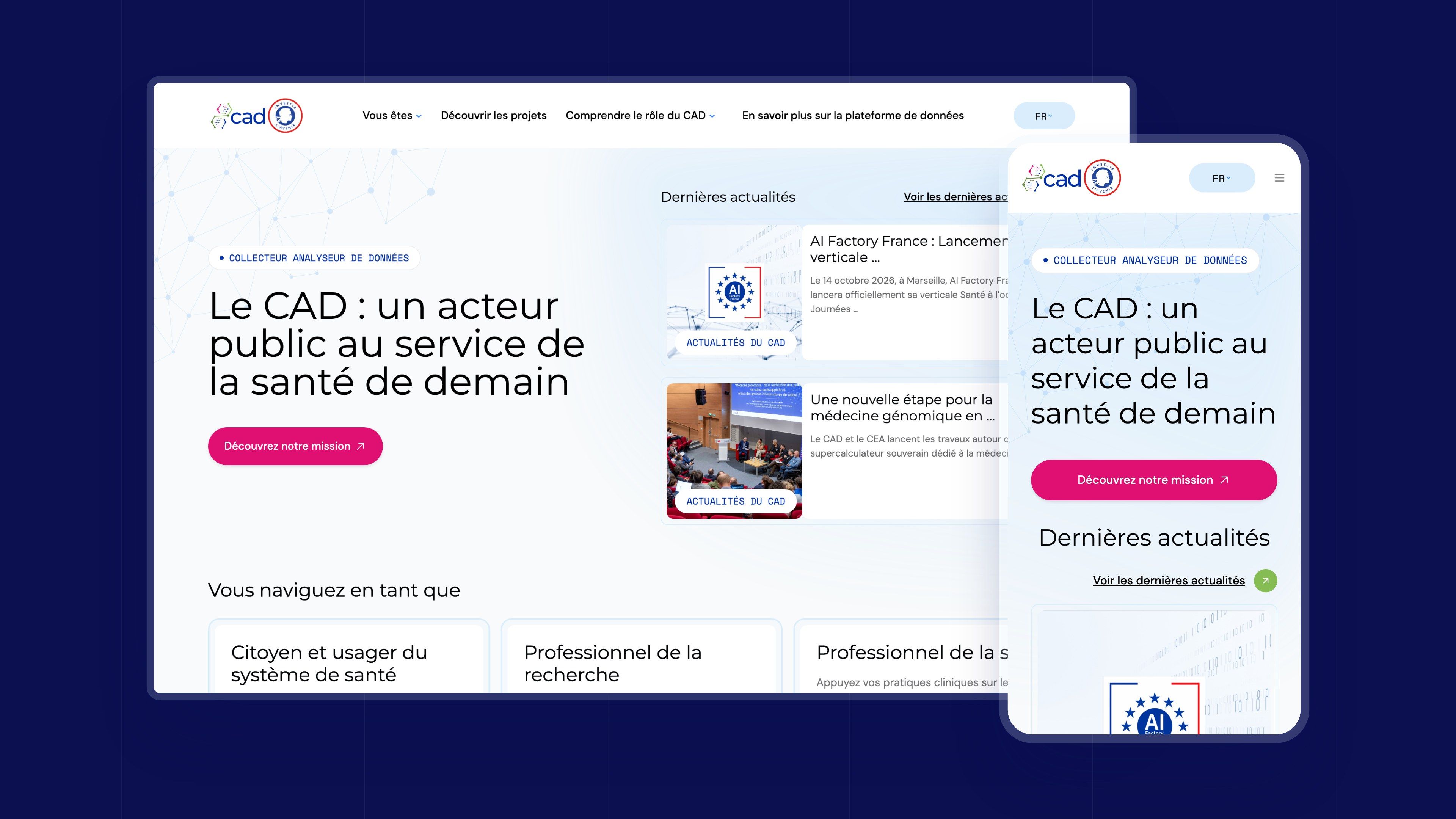
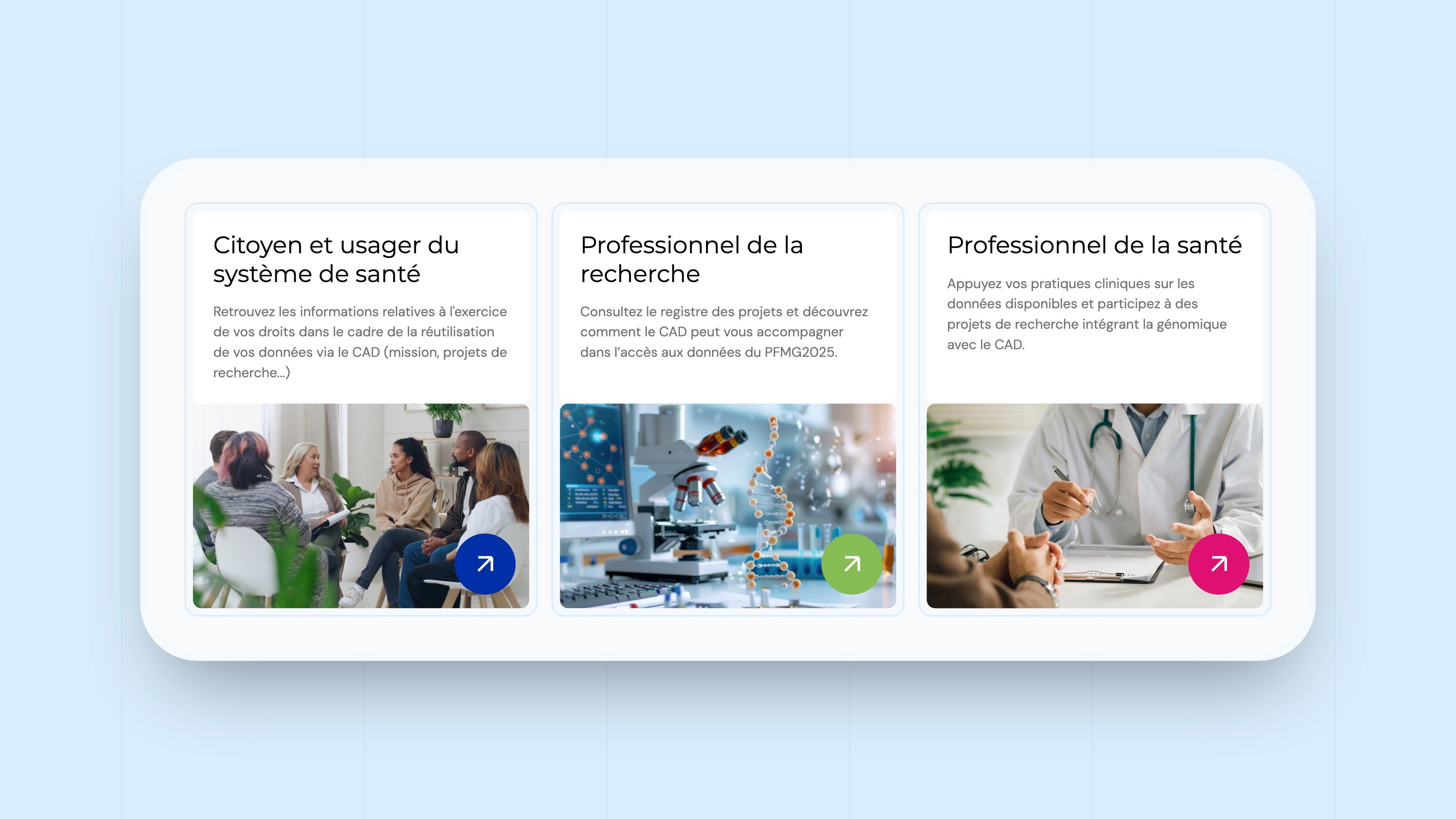
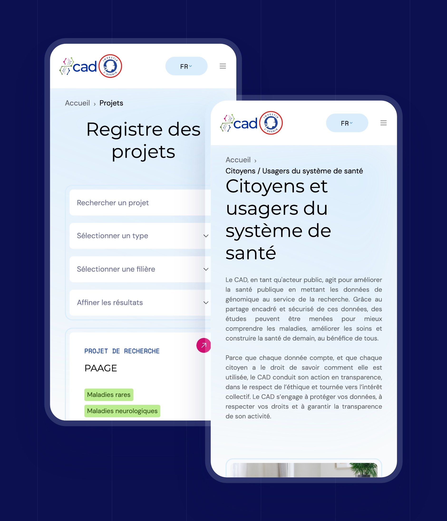
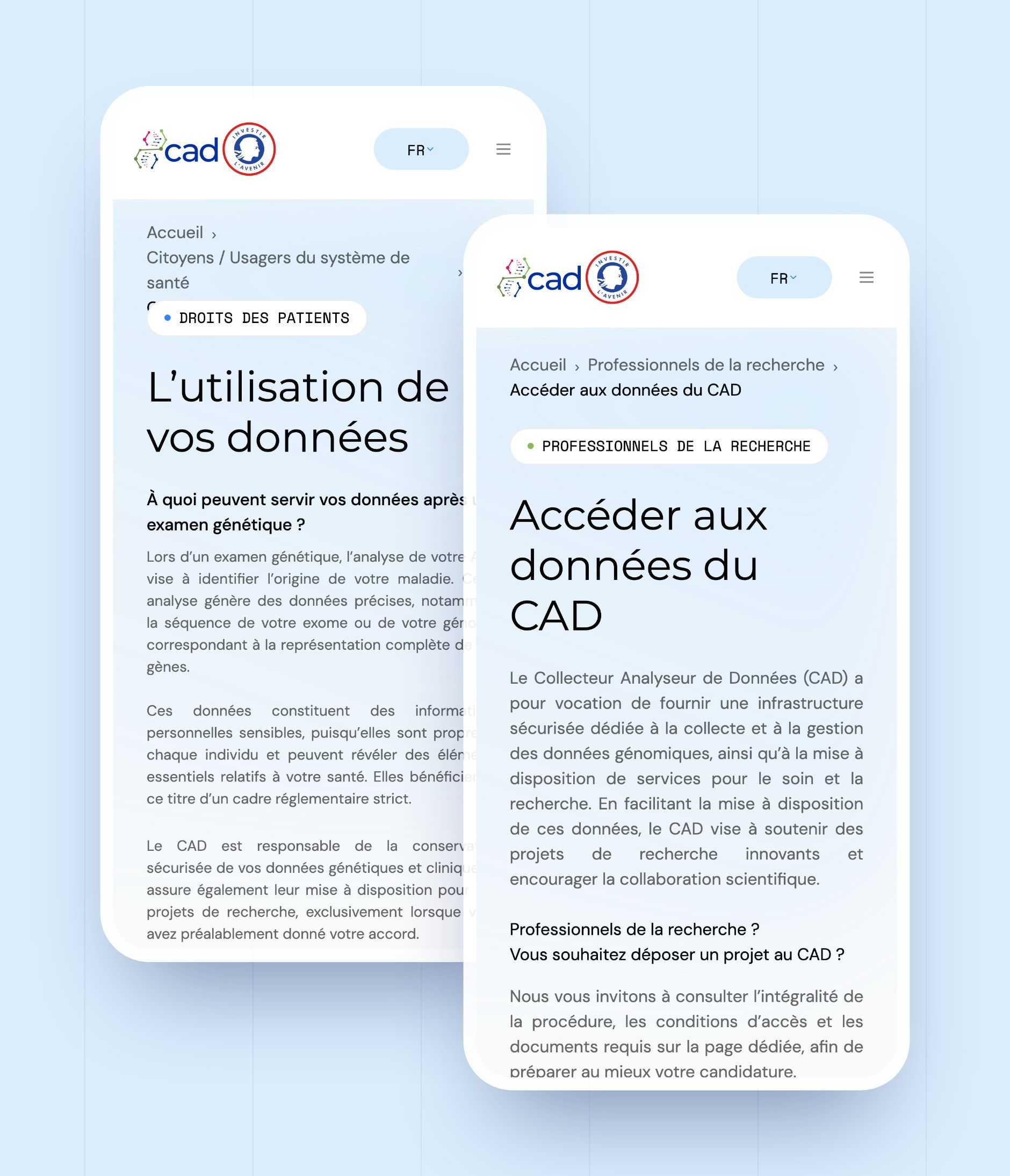
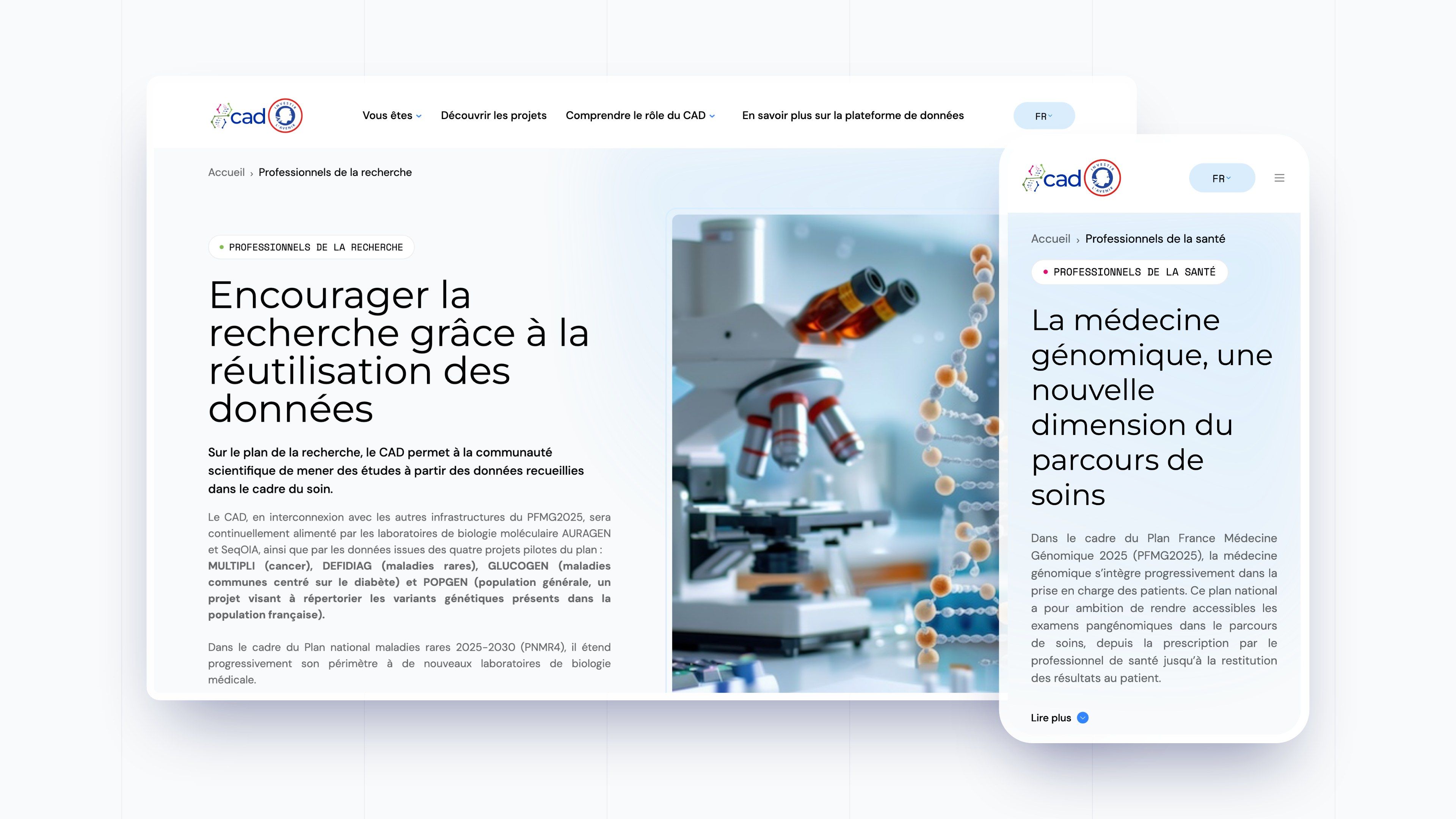
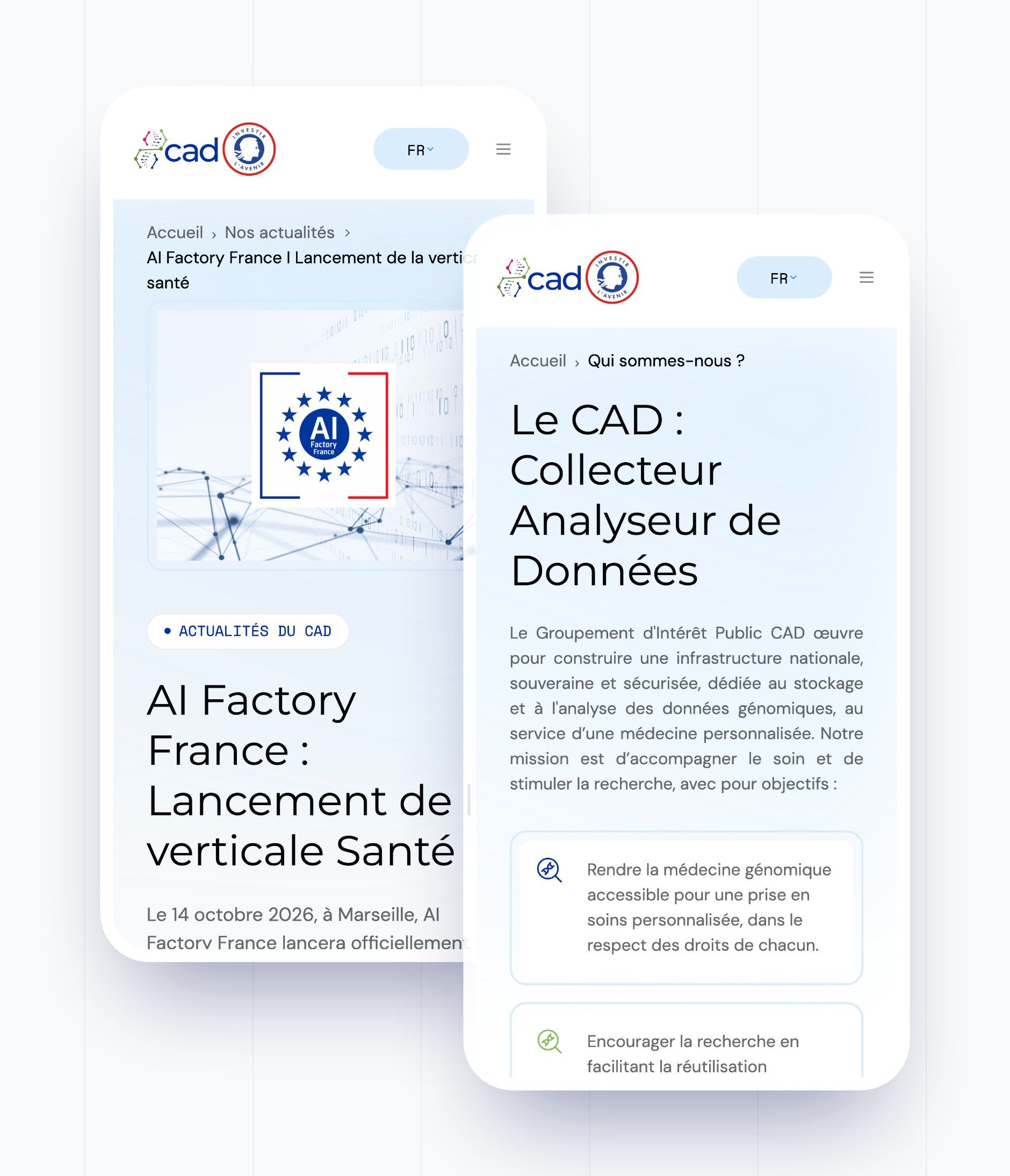
From the home page, visitors choose their profile: citizen and user of the health system, research professional or healthcare professional. Each journey has its own page, colour and content, and leads to the pages that serve everyone: the project registry, understanding your data and the access procedure.
| Page | What it does for the visitor |
|---|---|
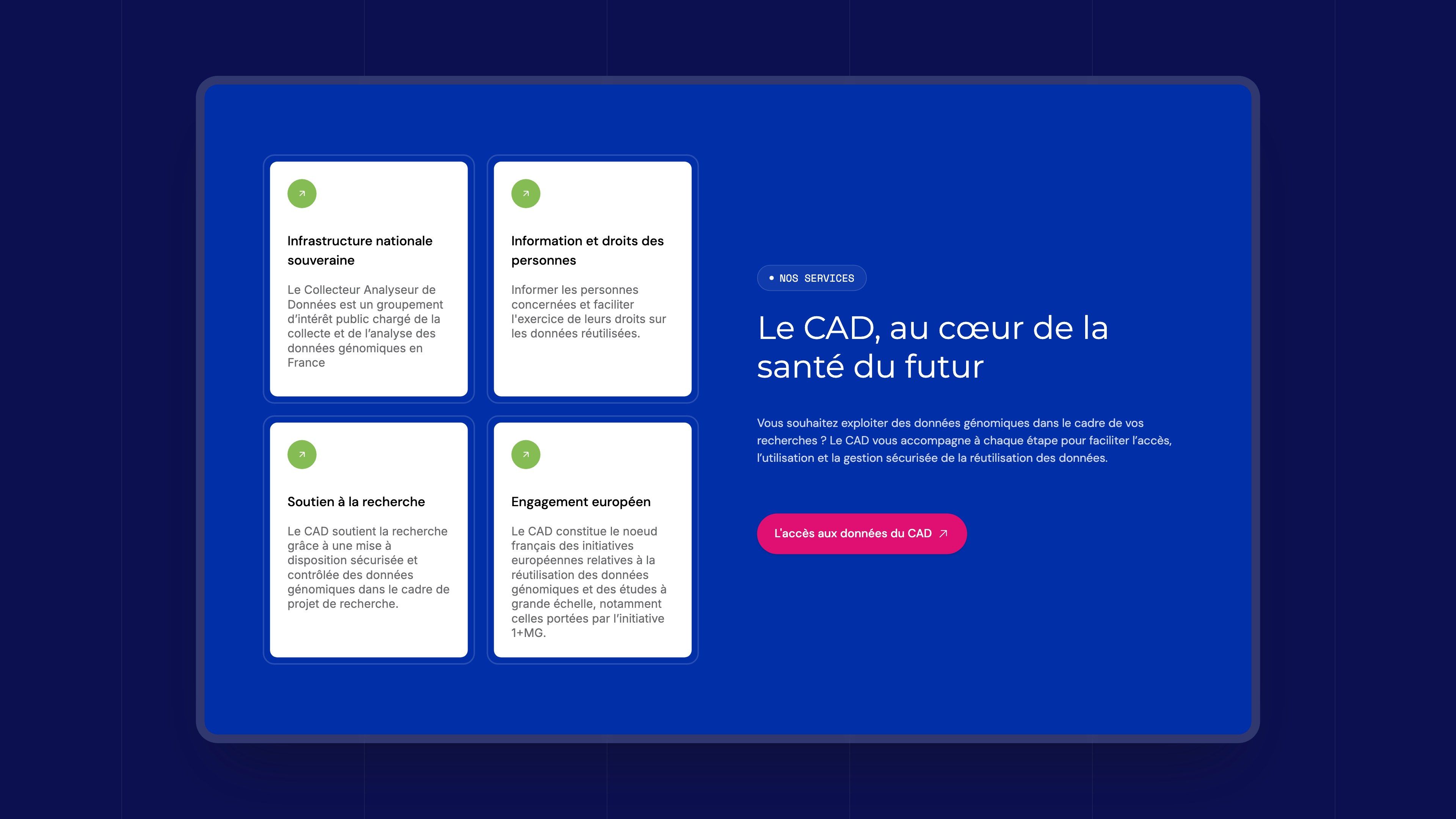
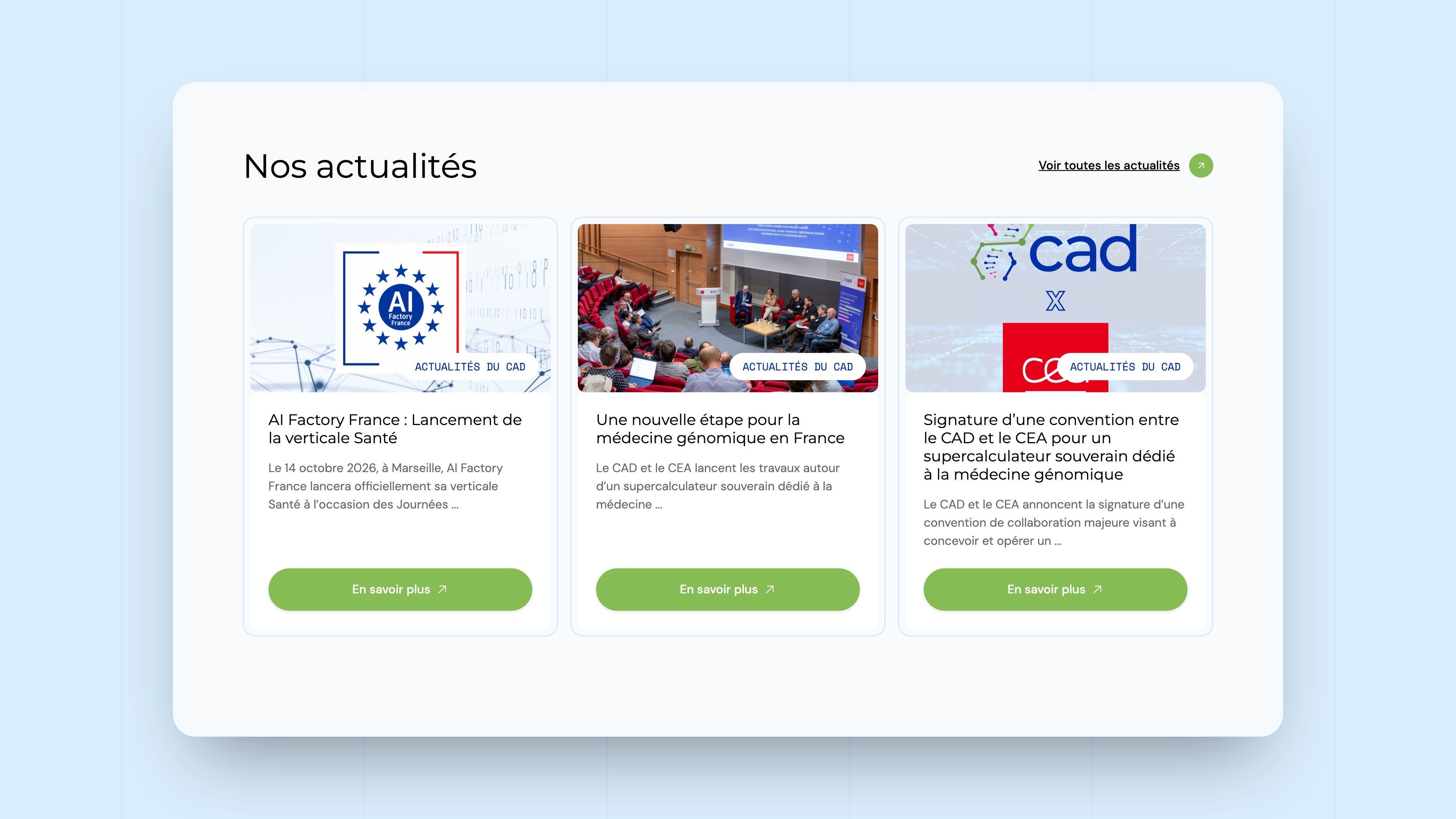
| Home | “The CAD: a public body serving tomorrow's healthcare”, the latest news, the three entry points by audience, the mission, the services and the partners |
| Audience pages | Citizens and users, research professionals, healthcare professionals: what the CAD does for each of them and the procedures that concern them |
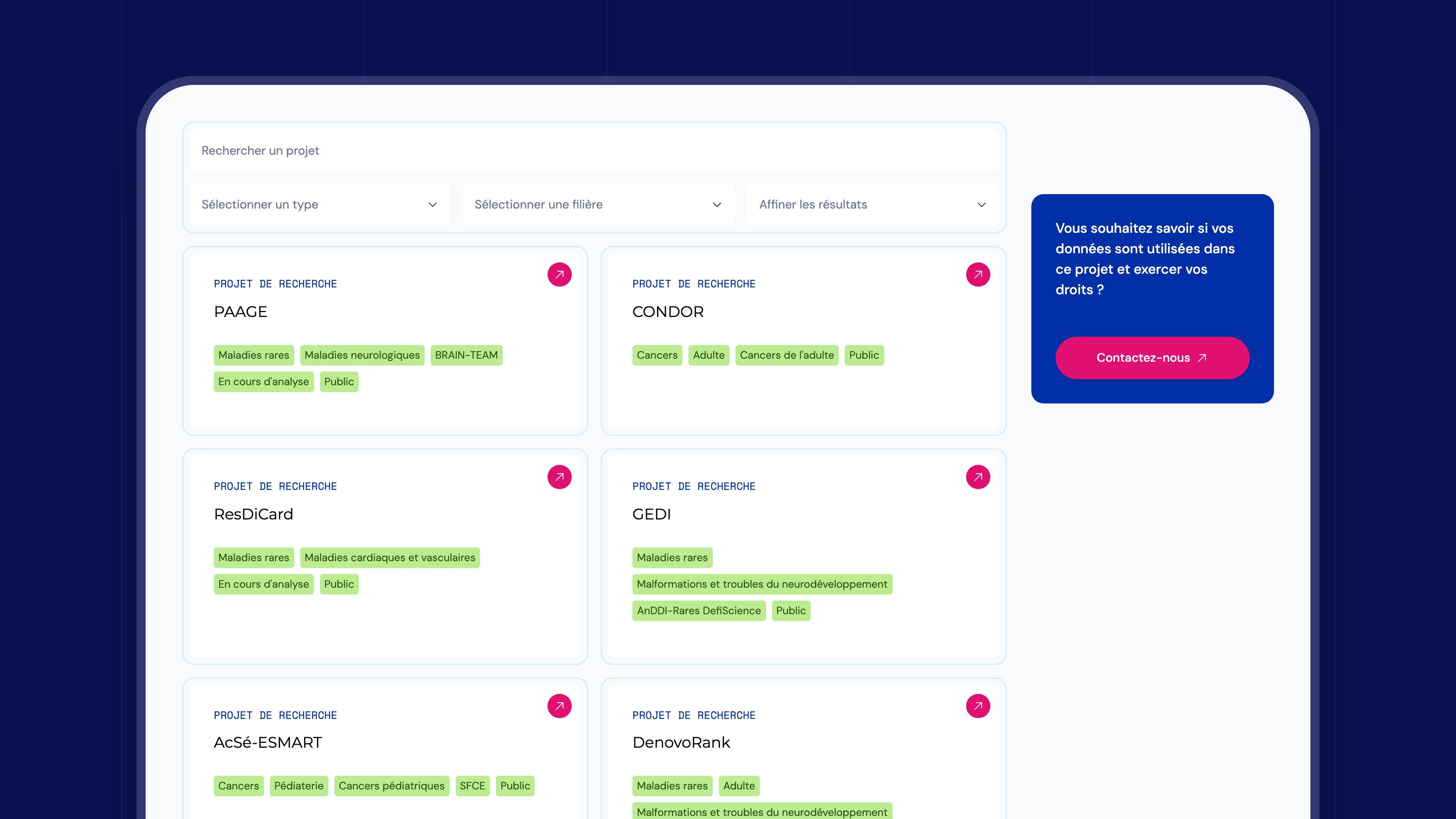
| Project registry | The research projects that reuse the data, with search, filters by type and by field, and a page for each project |
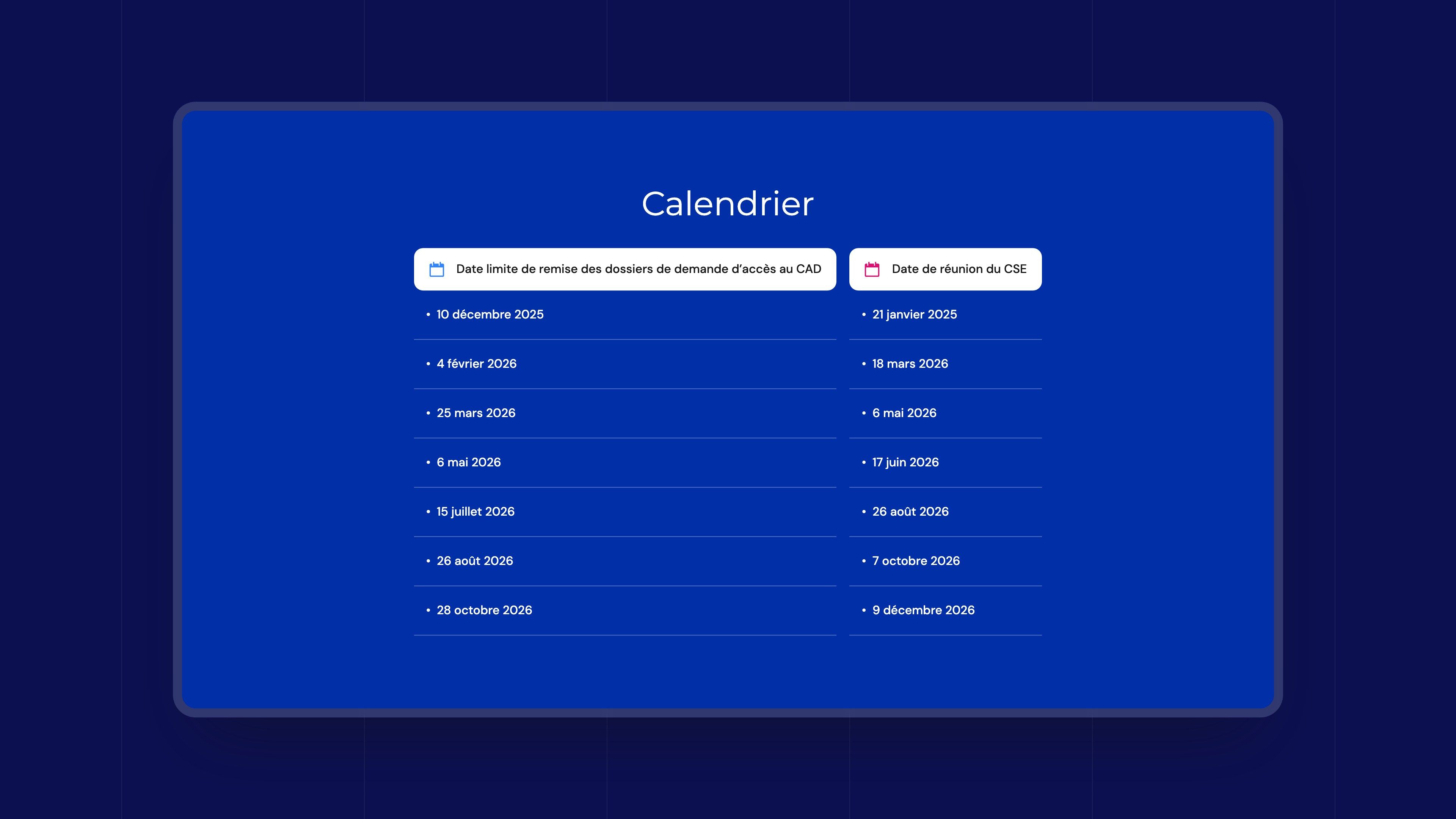
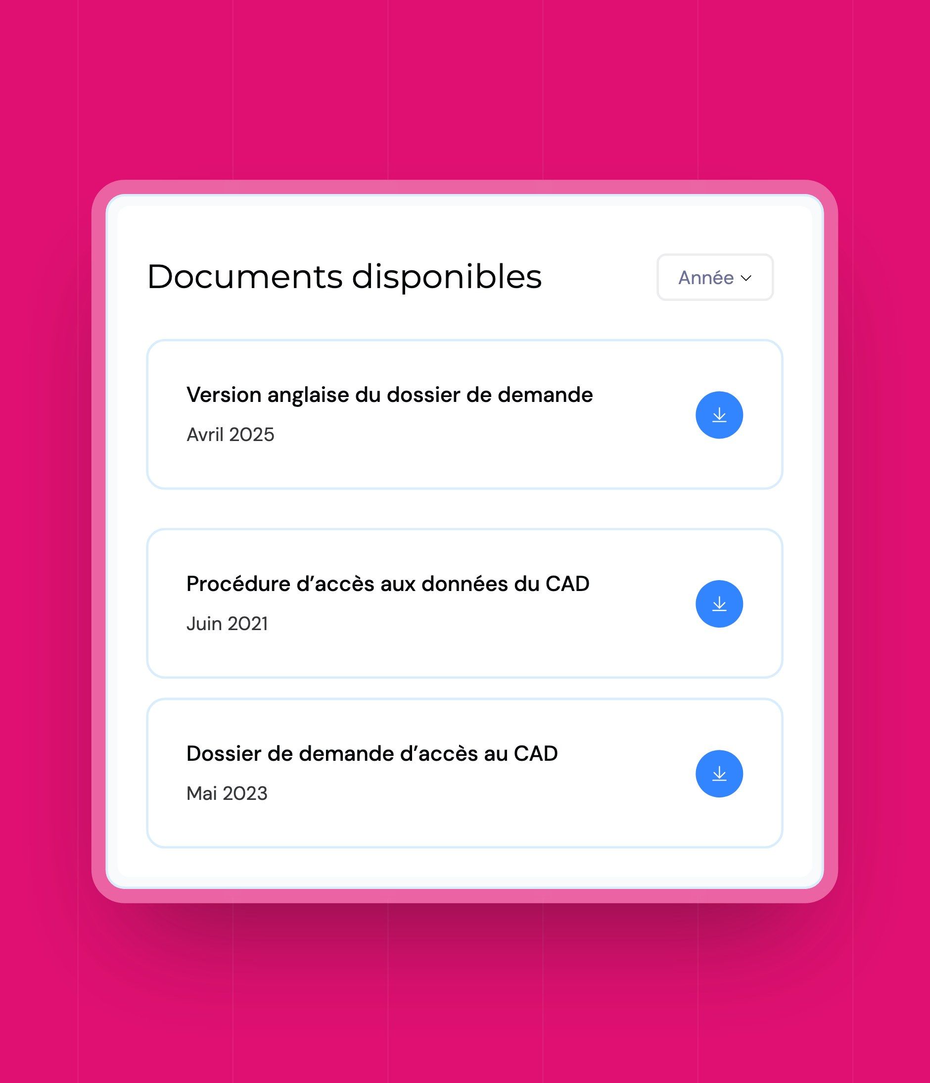
| Accessing the data | The project submission procedure step by step, the calendar of submissions and committee meetings, and the documents to download |
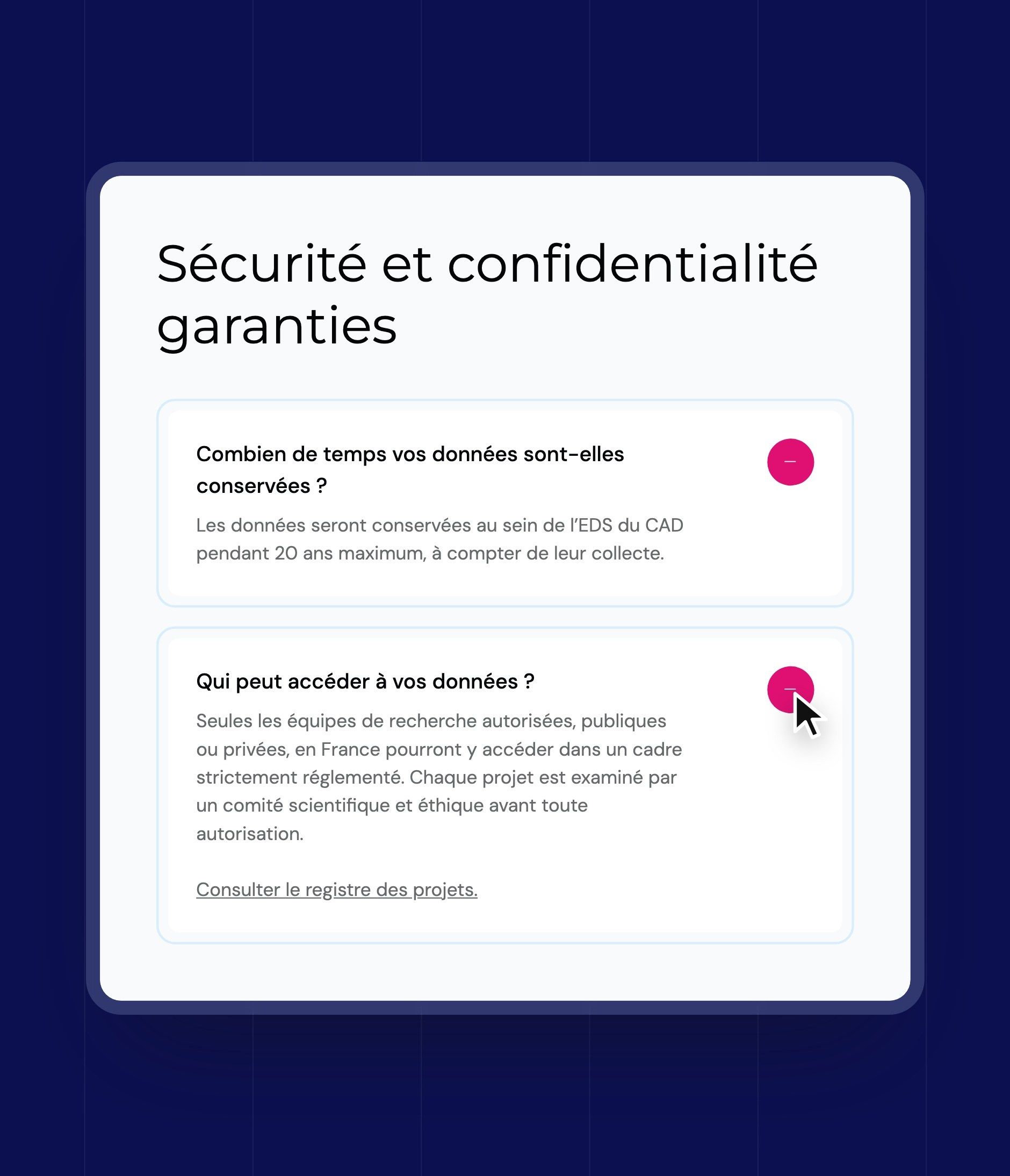
| Understanding your data | What the data is used for, where it is stored, how it is protected, and answers to the questions of the people concerned |
| The CAD | About us, the governing bodies and the scientific and ethics committee, public tenders and job offers |
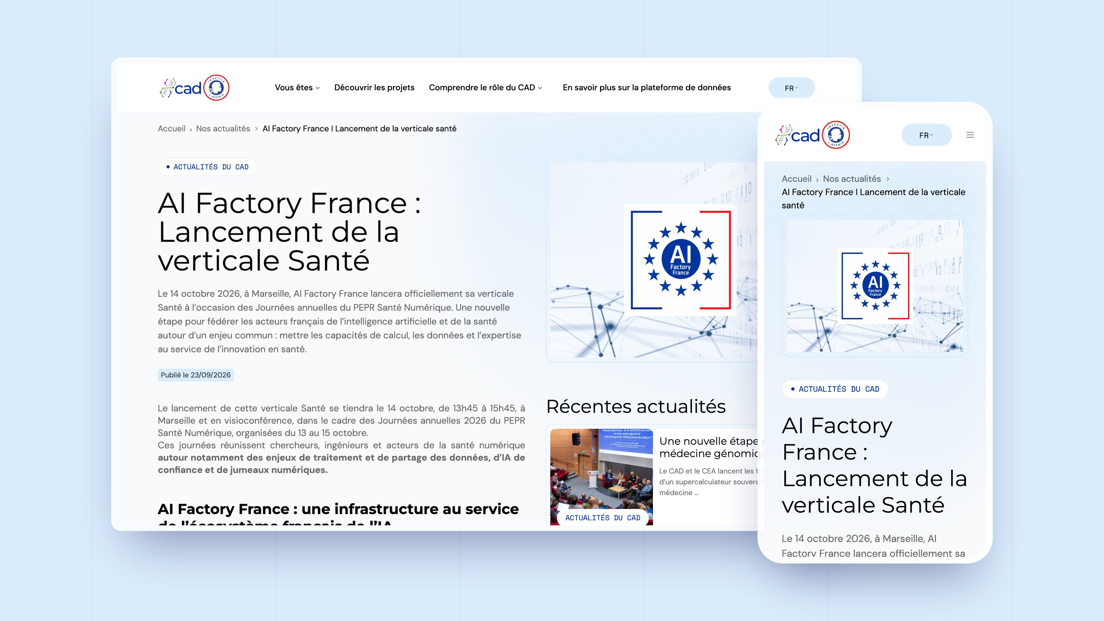
| News | The CAD's announcements and events, one page per news item |
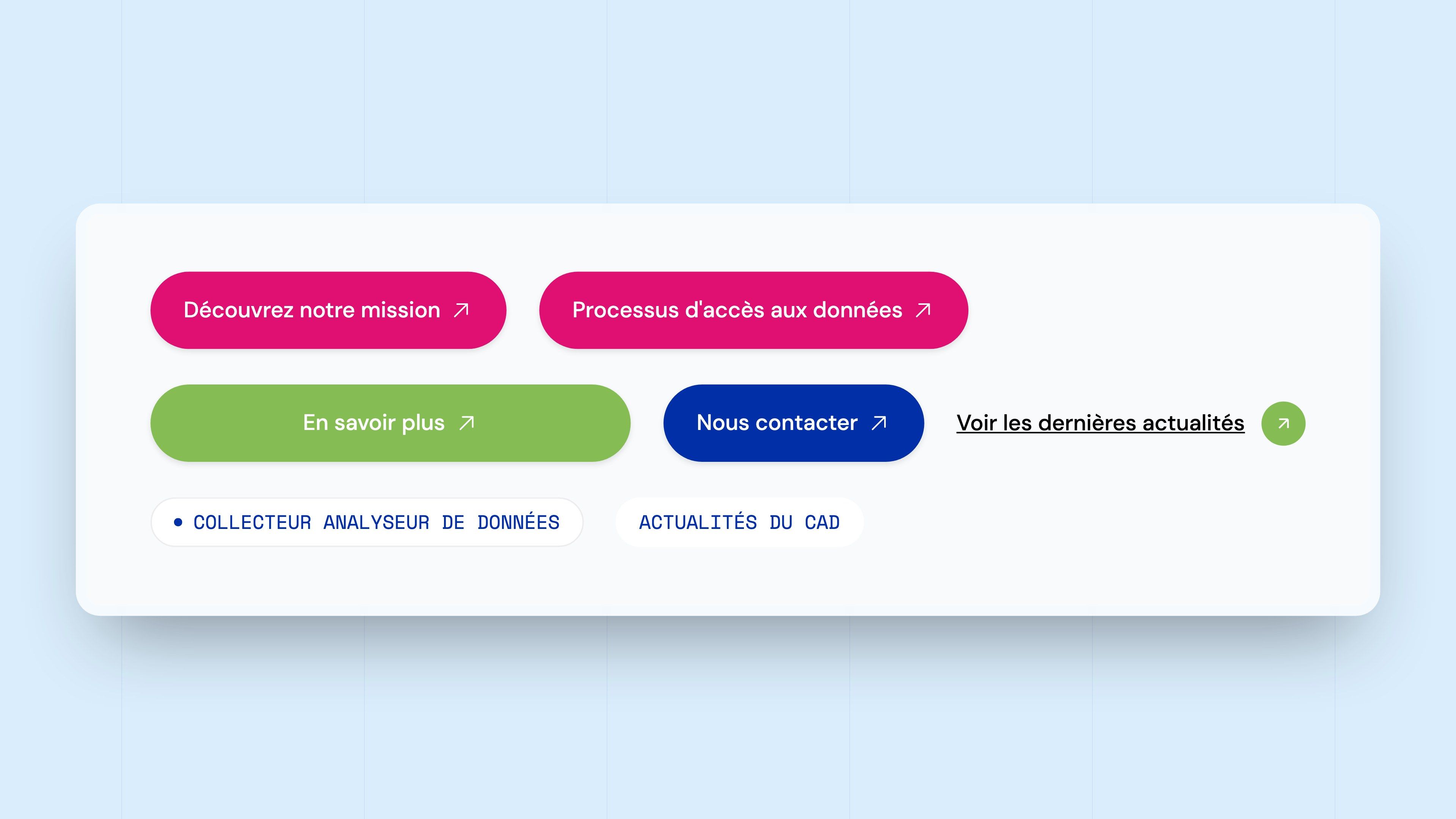
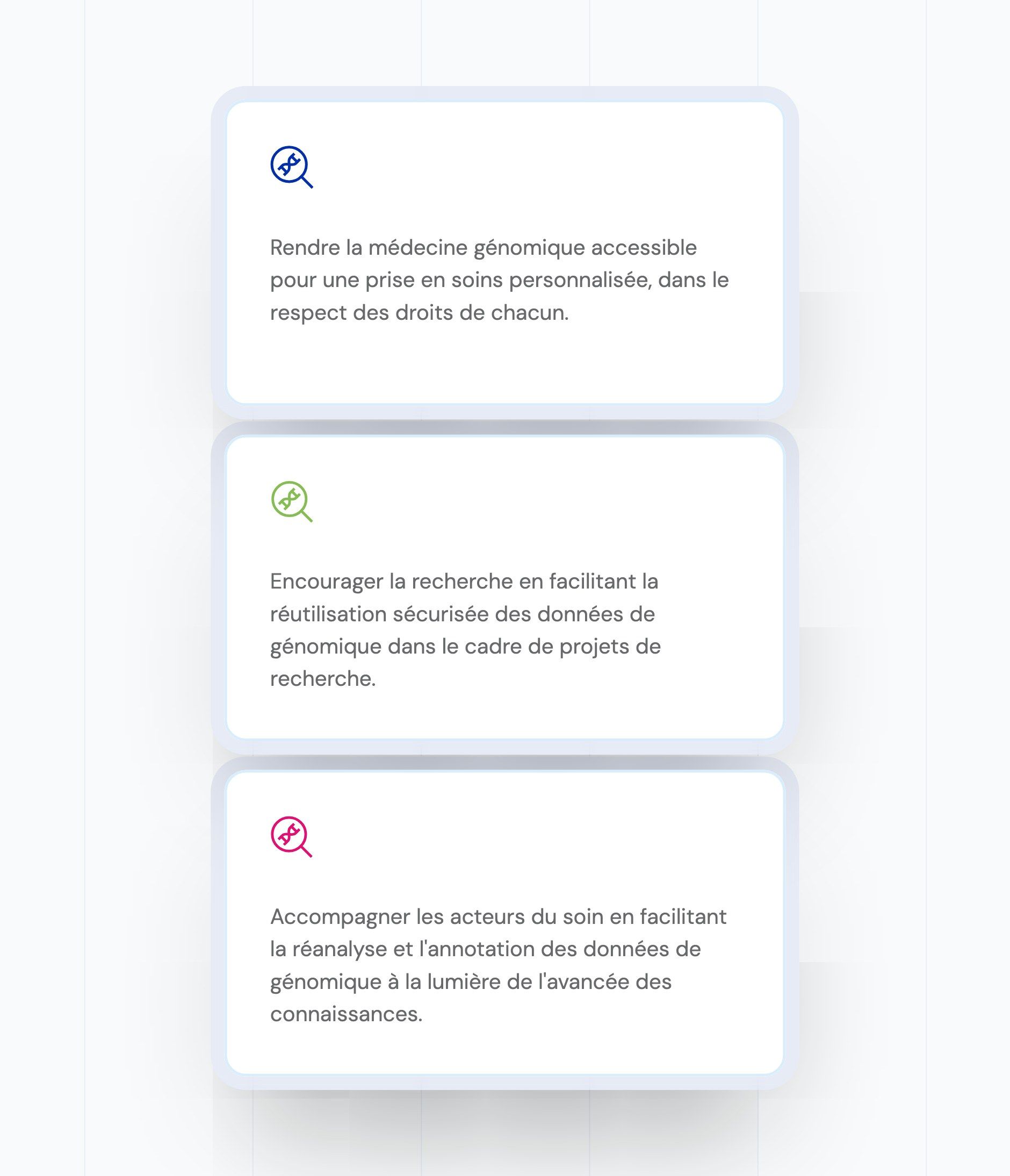
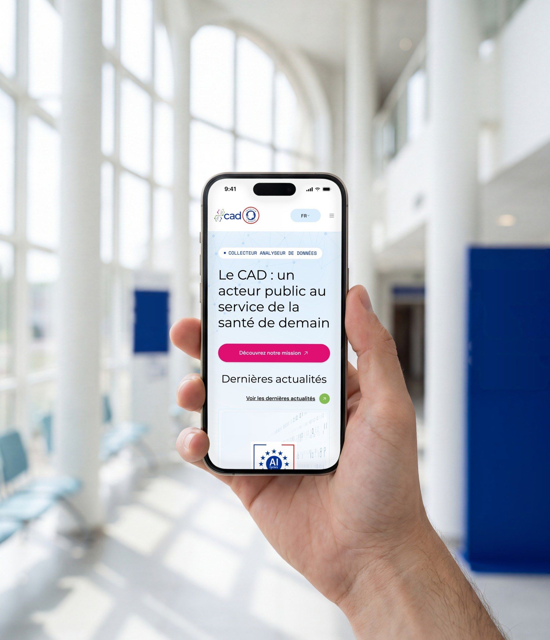
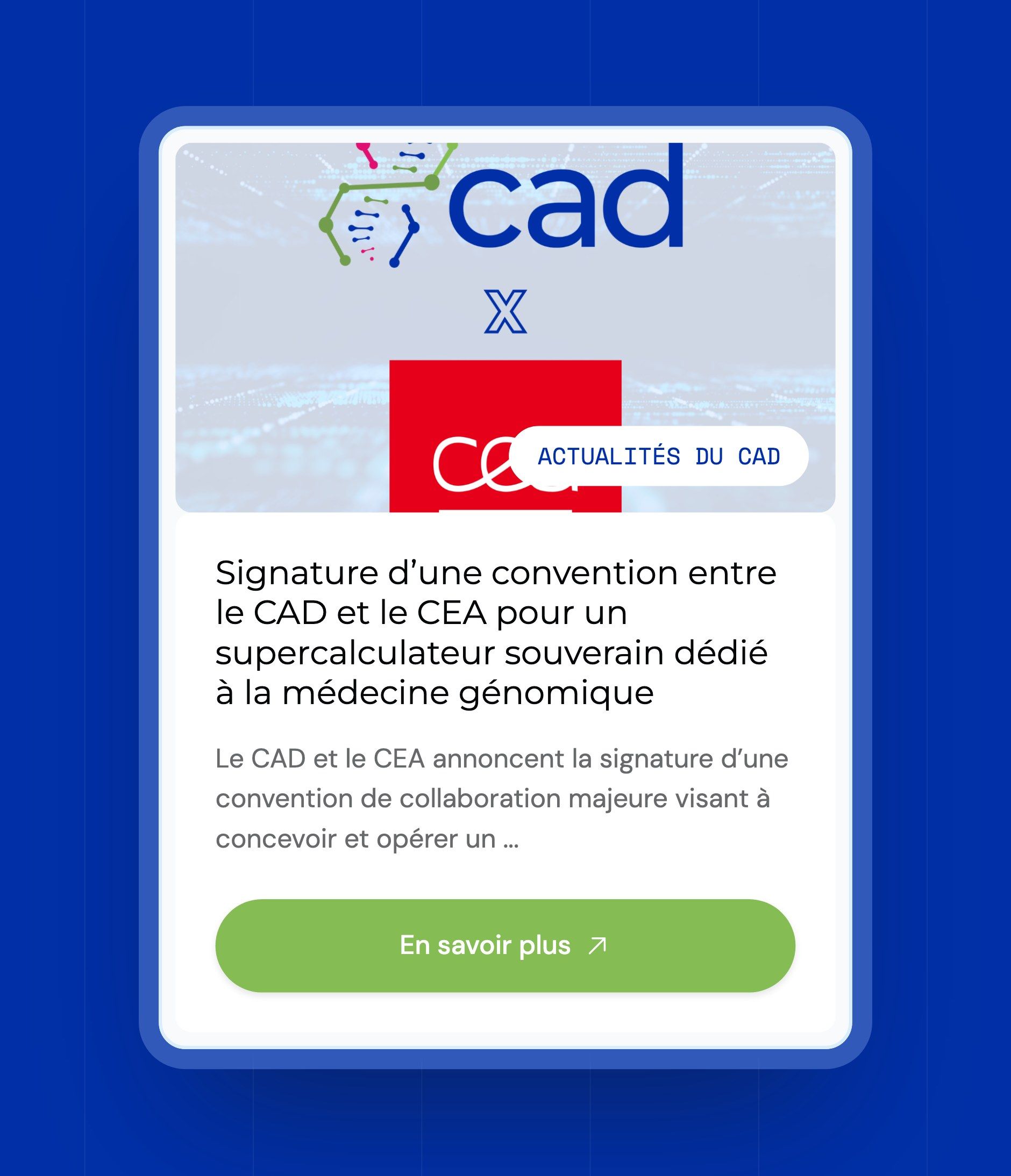
The same building blocks recur on every page: cards with a fine outline, labels in Space Mono, pill buttons, accordions for questions, and solid blue or pink banners for calls to action. The design was delivered with a complete UI kit (colours, desktop and mobile typography, labels, controls, buttons in their three colours and states, header and footer) so that the NoCode Factory team could build it without reinterpreting it.



Our latest projects
+250 companies
supported
Websites designed and developed with








You're going to working with us, guaranteed
Ready to launch
your business?
Let’s f*****G GO !!