Good to know

Heading

Lorem ipsum dolor sit amet, consectetur adipiscing elit. Suspendisse varius enim in eros elementum tristique. Duis cursus, mi quis viverra ornare, eros dolor interdum nulla, ut commodo diam libero vitae erat. Aenean faucibus nibh et justo cursus id rutrum lorem imperdiet. Nunc ut sem vitae risus tristique posuere.

Lorem ipsum dolor sit amet consectetur.

Lorem ipsum dolor sit amet consectetur. Aliquam orci sagittis dignissim sapien praesent donec.

Lorem ipsum

Lorem ipsum dolor sit amet, consectetur adipiscing elit, sed do eiusmod tempor incididunt ut labore et dolore magna aliqua. Ut enim ad minim veniam, quis nostrud exercitation ullamco laboris nisi ut aliquip ex ea commodo consequat. Duis aute irure dolor in reprehenderit in voluptate velit esse cillum dolore eu fugiat nulla pariatur.

Add

Lorem ipsum

Lorem ipsum

Rewind x Gemeos

Rewind is an AI SaaS platform that helps museums, tourism boards, hotels, and transport operators create cultural and travel content in a fraction of the usual time. In 8 weeks, Gemeos delivered the art direction, UX/UI mockups, Webflow build, and SEO strategy.

A
A
A

80% less time spent creating content

Rewind is an AI SaaS platform that helps museums, tourism boards, hotels, and transport providers create cultural and travel content in a fraction of the usual time.

In 8 weeks, Gemeos delivered the art direction, UX/UI mockups, Webflow build, and SEO strategy for rewindstories.com/fr.

Industry

Services

A
A
A

Art Direction

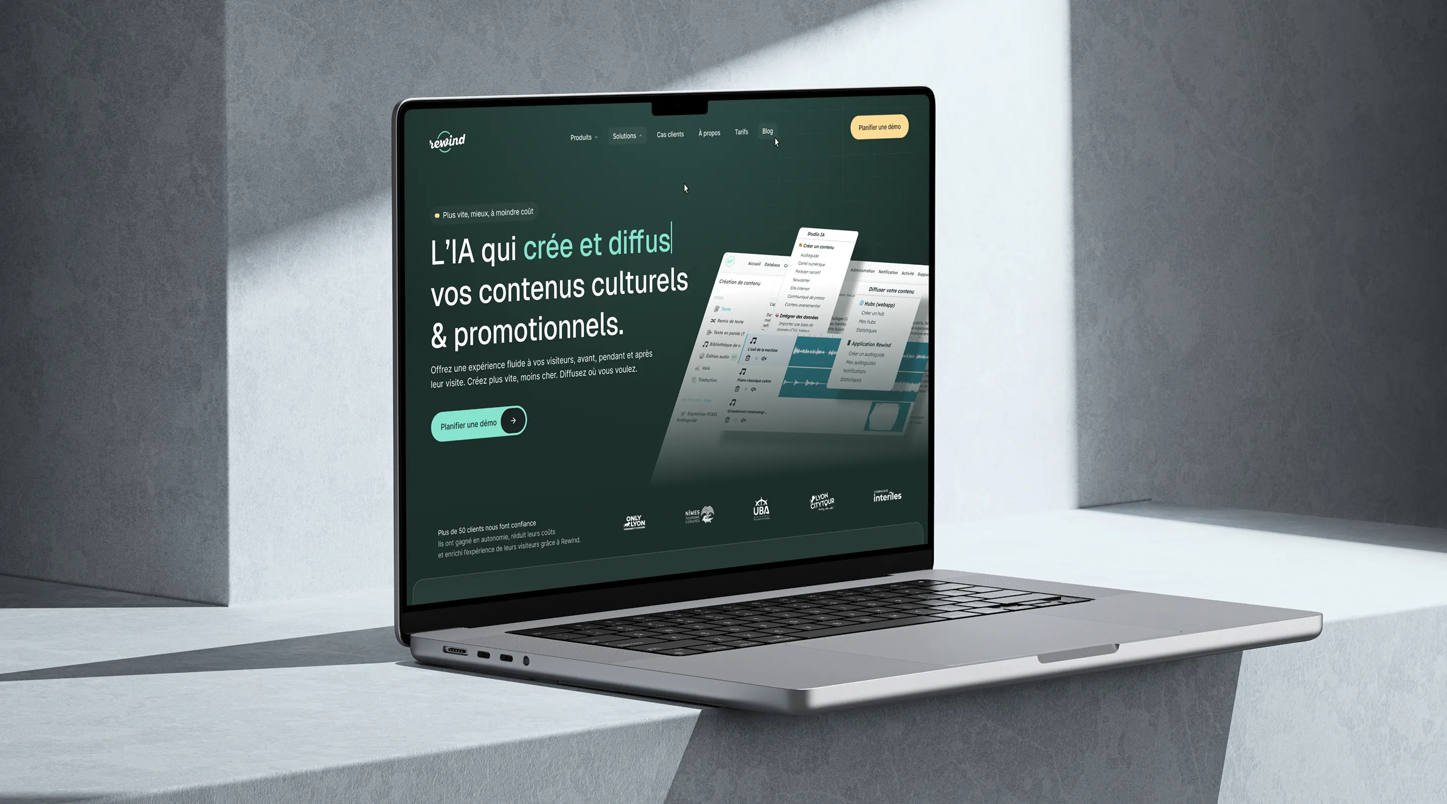
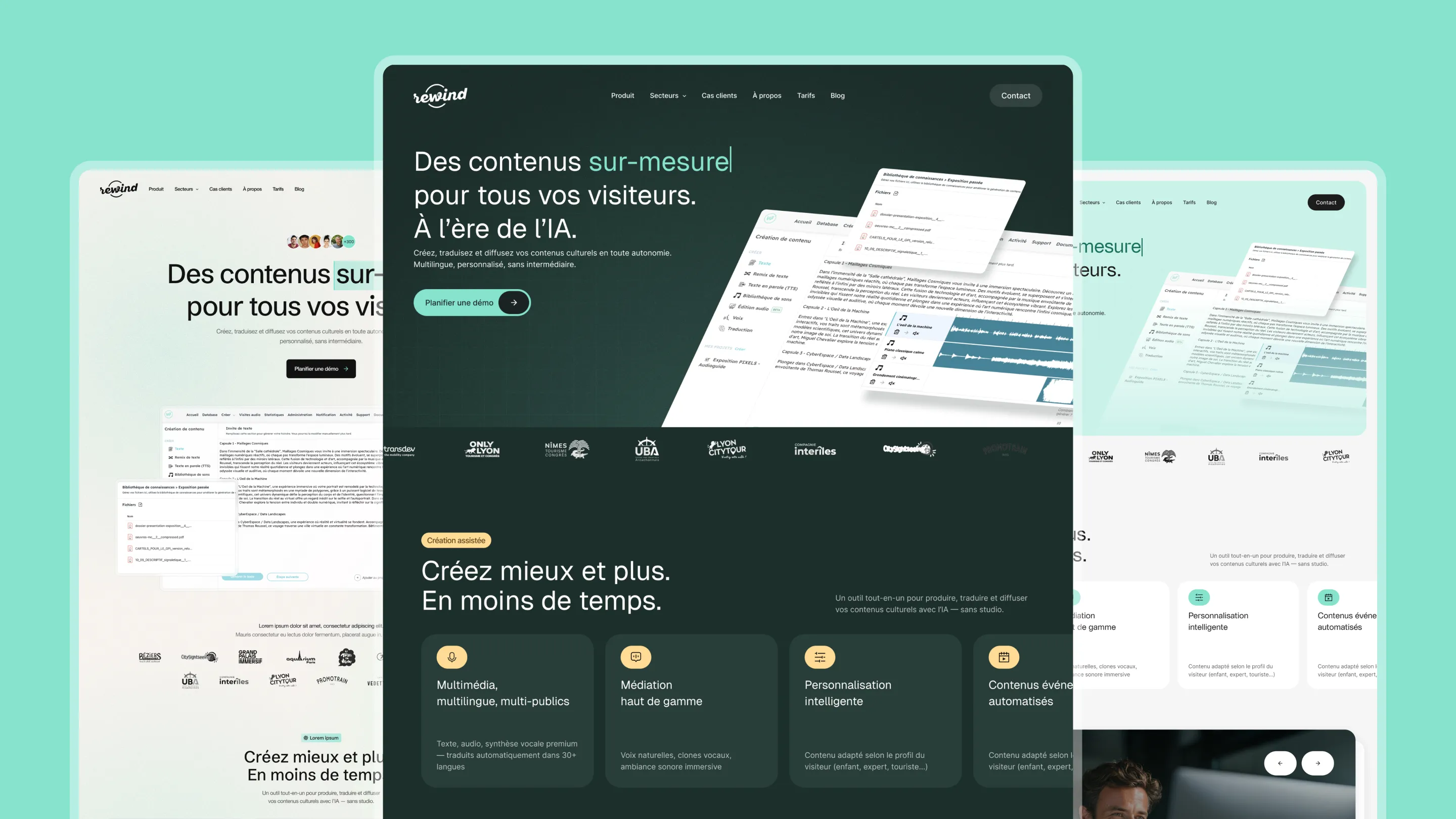
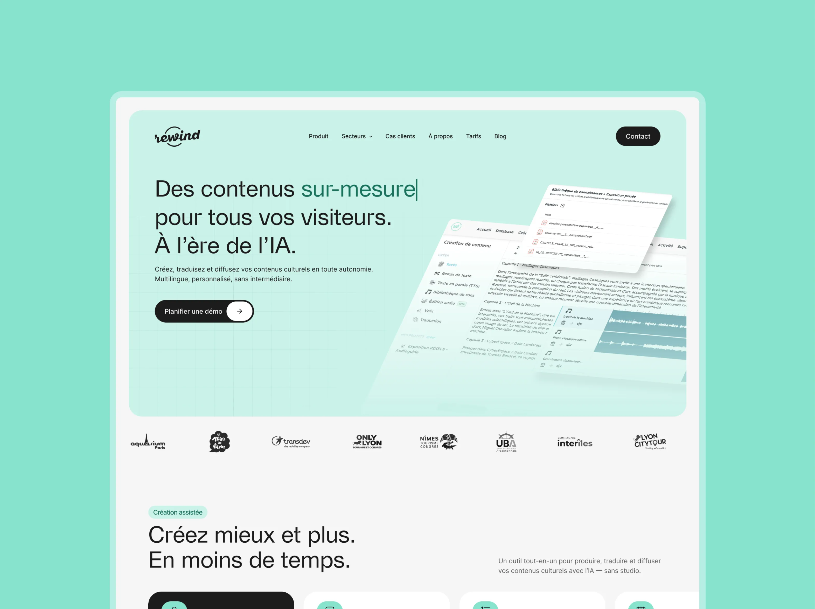
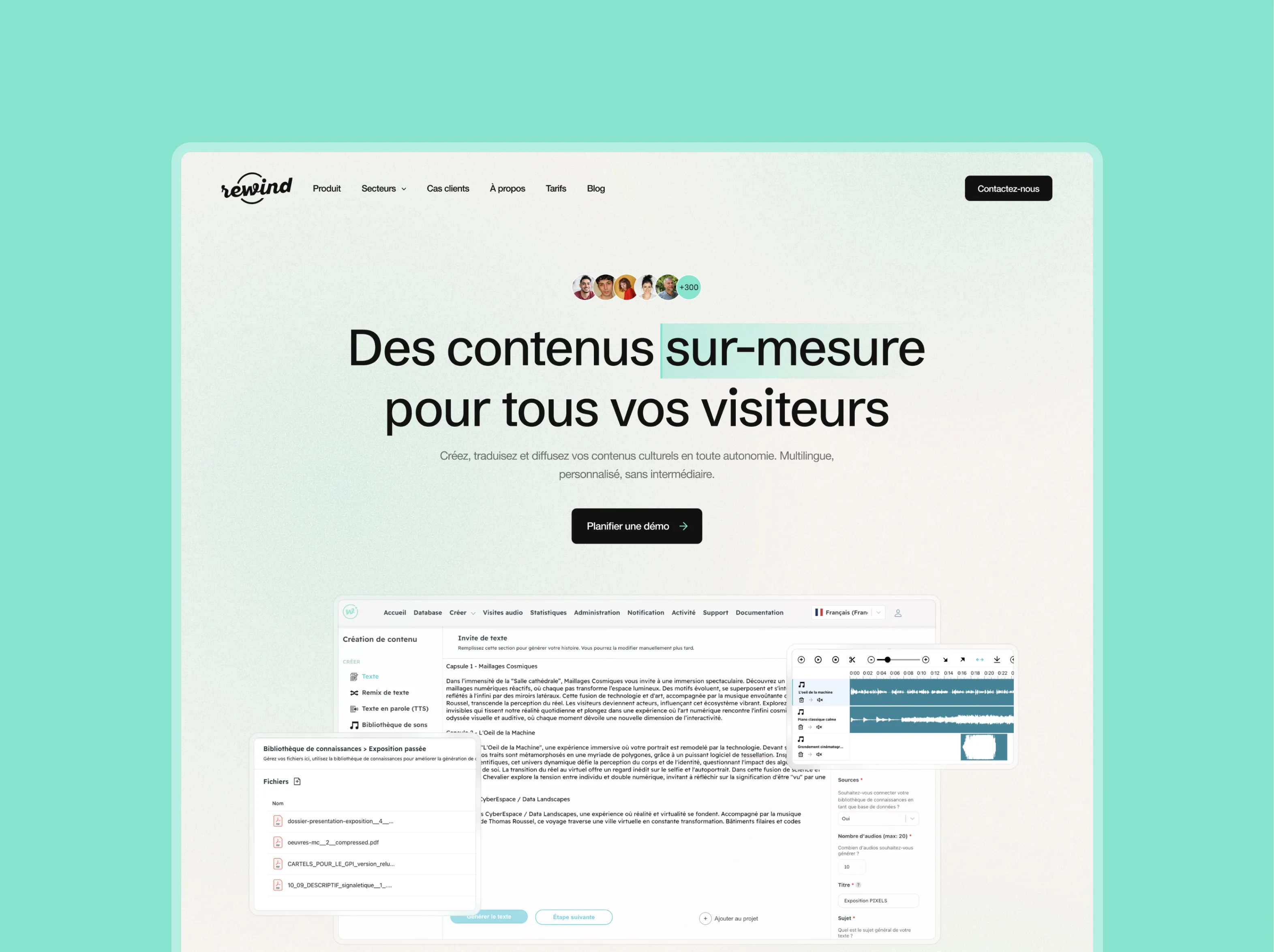
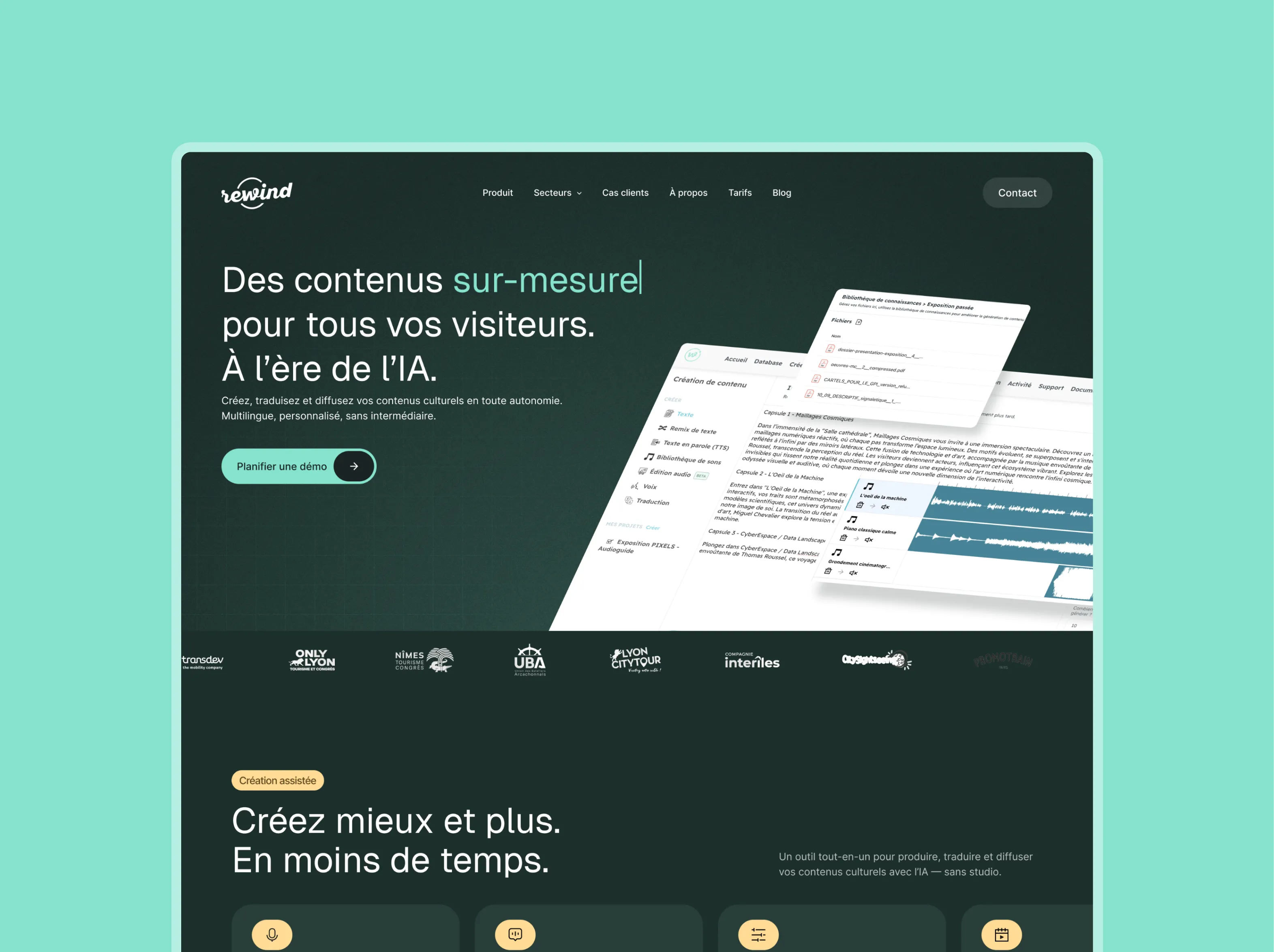
Rewind is an AI SaaS platform dedicated to cultural and tourism content creation. Founded by Julien Wouters (HEC, 34), the startup pivoted in 2024 from an audio guide app to a true content creation platform for museums, tourism boards, hotels, and transport operators.

The goal: become the "global standard for cultural and tourism content creation". The art direction had to capture that unique mix of cultural heritage and technological innovation.

Visual Identity

Vincent built the identity around a premium, minimal, and tech-forward palette. The brand color — blue #86E3CE — stayed in place as a distinctive accent and a clear link to the existing identity. It adds a fresh, original touch against both dark and light backgrounds, depending on the context.

The design references — tomorro.com (top 1), join-stories.com, dust.tt, tryriot.com, zeliq.com — guided the direction toward a modern SaaS look: generous spacing, bold typography, subtle motion.

Competitive Positioning

Against Vox, Orphéo, Smartify, and Ask Mona, Rewind positions itself around content creation, not just content distribution. The art direction reflects that difference: less museum-like, more tech startup. The projected image is a creative partner, not a technical tool.

Concept 1 — Green & Clean

A clean design on a soft mint green background that instantly establishes a fresh, distinctive identity. The hero combines bold typography with an underlined accent keyword and floating document visuals that show the product in context. The black-and-green feature cards give the offer structure and impact. The dark testimonial block with full-bleed photography creates a strong, memorable visual break. A clean, modern direction that stands out in the cultural and museum content space.

Concept 2 — White & Product-First

A clean design on an off-white background puts the product interface front and center from the second fold. The full-width platform screenshot shows off the tool’s depth and functionality without any fluff. The feature cards alternate text and human photography to balance product proof with a sense of closeness. The double-row client logo wall reinforces institutional credibility. The overall direction feels transparent and educational, built for prospects who want to evaluate the tool in depth before they commit.

Concept 3 — Dark & Premium

A dark hero with a slate background repositions Rewind in a premium, serious tech space. The underlined keyword in green keeps the colorful signature, but in a more sophisticated context. The feature cards on a dark background, paired with colorful icons, create a strong visual contrast. The savings block on a dark background, anchored by immersive photography, closes the page with impact. This direction speaks to enterprise accounts and cultural institutions looking for an ambitious, reliable technology partner.

Look&Feel
A
A
A

UX/UI Design

Rewind’s UX had to serve two audiences at once: cultural decision-makers — museum directors and tourism leads evaluating the investment — and the content teams using the platform every day.

Platform Architecture

Vincent structured the experience around the core promise: 80% time saved on content production. The interface highlights AI-assisted creation flows — text generation, multilingual adaptation, journey-based personalization — with a clear path from draft to publish.

Marketing Site

The rewindstories.com/fr site uses a narrative structure. The name “Rembobiner” (rewind) evokes a return to the source, heritage memory, and full immersion in history. Navigation guides visitors through the use cases — audio guides, themed journeys, event content — before converting them into a demo or free trial.

Design Planning

PhaseWeeksDeliverable
Look & Feel1-2Approved art direction
Mockups3-4High-fidelity key pages
Iterations5Approved final versions
A
A
A

Webflow Build

The Rewind build took 8 weeks, from July to early September 2025. Special attention went into animations and performance — two must-haves for a site that needs to impress demanding cultural decision-makers.

Stack and Approach

Webflow was the right choice for its design flexibility and its ability to deliver visually rich experiences without sacrificing SEO performance. The animations — scroll-triggered, hover states, page transitions — were designed to amplify the product’s storytelling without slowing down load times.

CMS and Multilingual

The CMS structure gives the Rewind team full ownership of case studies, resources, and the blog. The French version (rewindstories.com/fr) was prioritized for launch, with an architecture ready for international expansion.

A
A
A

SEO

Rewind’s SEO strategy was built around one specific challenge: the startup operates in a niche market (cultural content creation software) with low search volume but highly qualified purchase intent.

Semantic Strategy

The approach we chose: prioritize transactional and comparison queries in the sector ("digital audioguide", "museum content creation", "tourism office software") over generic informational searches. Every use case page was optimized to capture a specific intent.

SEO Architecture

The URL structure (rewindstories.com/fr/...) includes the language prefix from day one to make future multilingual indexing easier. The industry pages (museums, tourism offices, hotels, transport providers) act as standalone SEO landing pages with their own metadata and optimized content.

Tags and Structured Data

Individual title tags and meta descriptions for each page, Organization and SoftwareApplication schema markup, structured breadcrumbs. The goal: rank for the key queries before Julien Wouters’ next fundraising round.

OUR latest projects

+240 companies
supported

Websites designed and developed with 

Let’s f*****G GO !!

Ready to launch
Your business?

Alexandre

Max

Enora

Bryan

Cannelle

Tiphaine

You'll :heart: our collaboration...