Art Direction
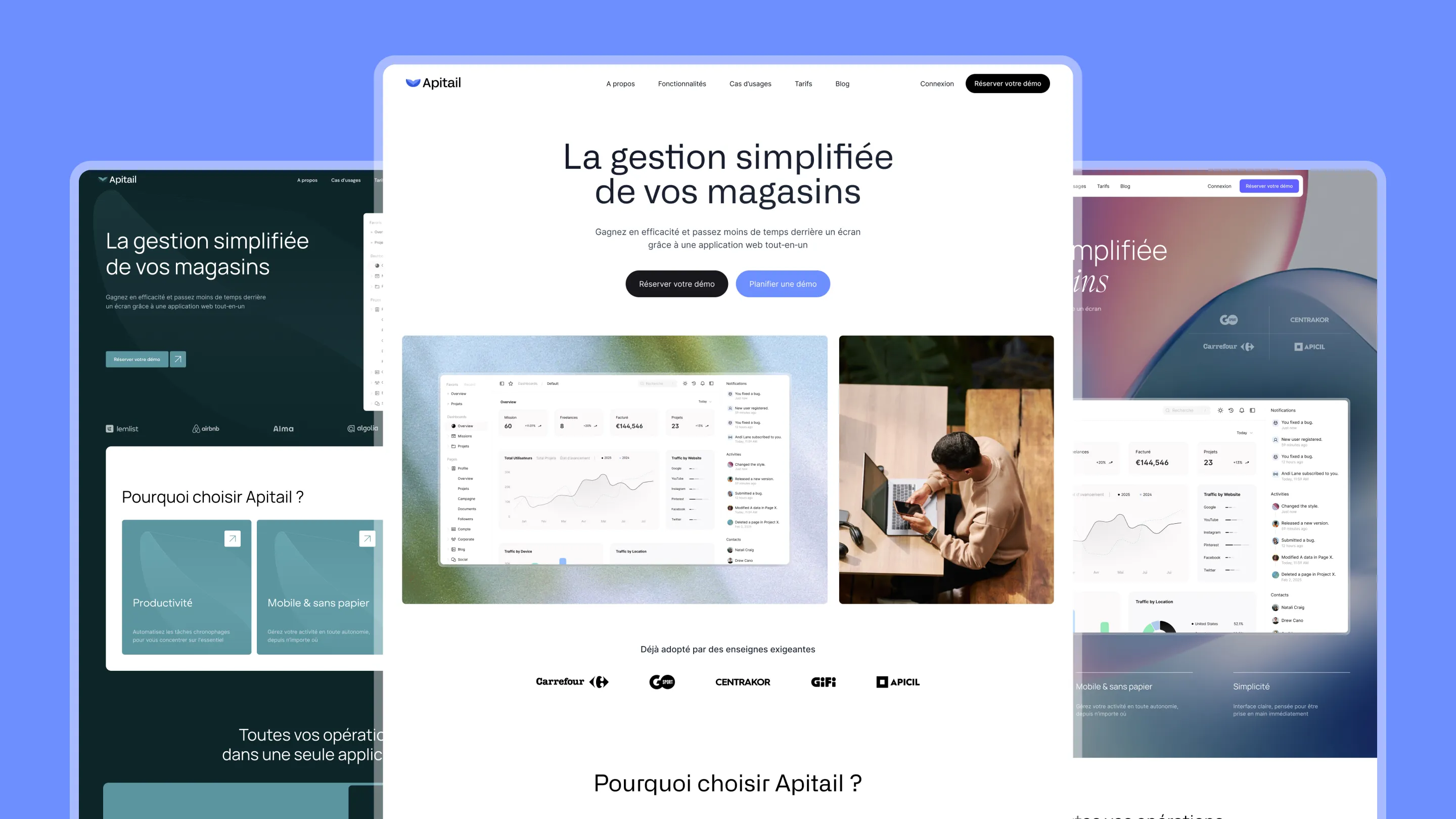
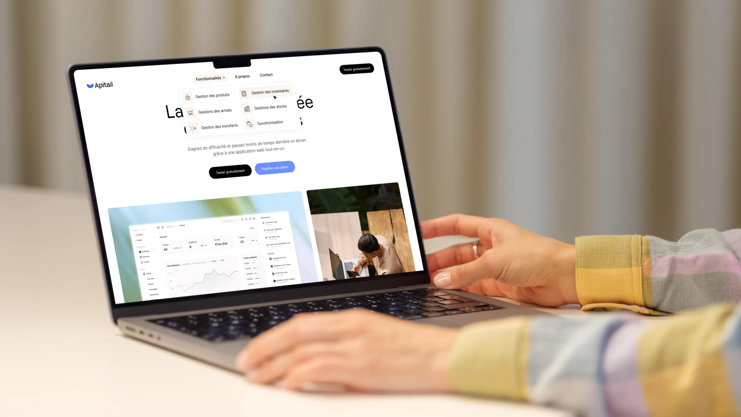
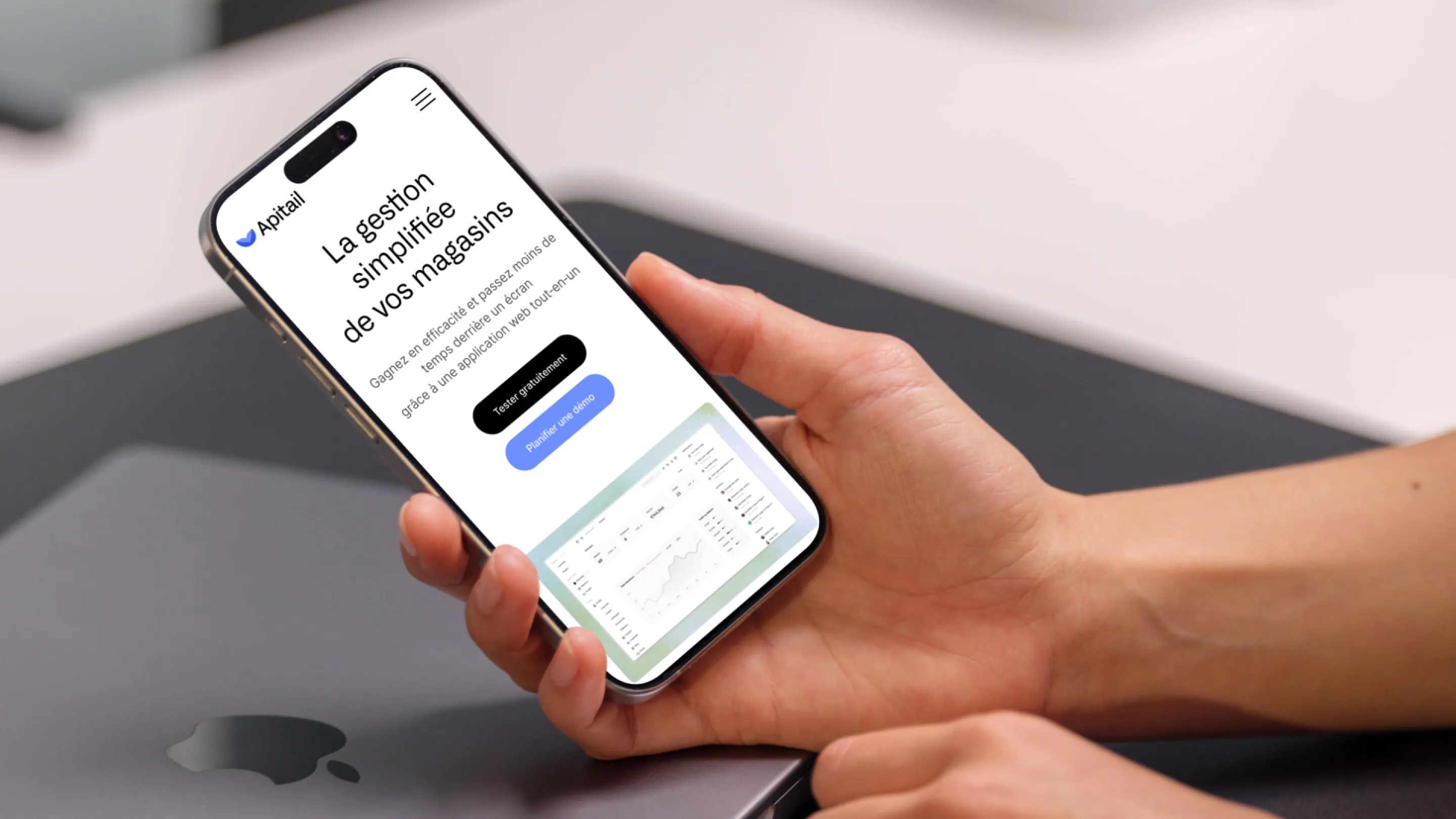
Apitail is a SaaS platform built for multi-store operators in the fashion and footwear industries. The art direction brief aimed to embody the product’s three core values: Simple, Complete, Effective.
The name itself is a play on words: API for retail — a technical solution that still needs to feel accessible and human. The visual identity had to reflect that tension between operational rigor and a calming user experience.
Visual Identity
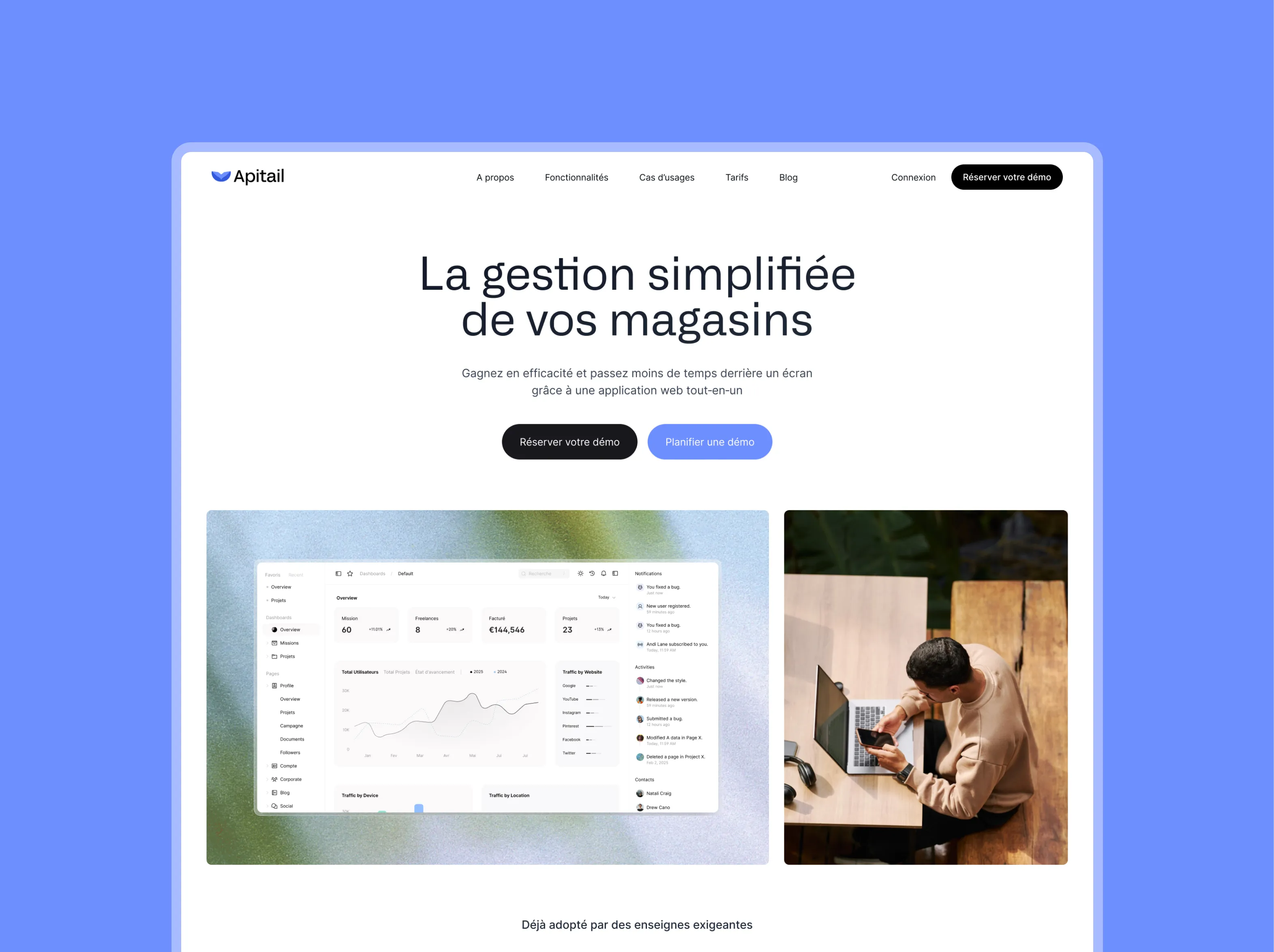
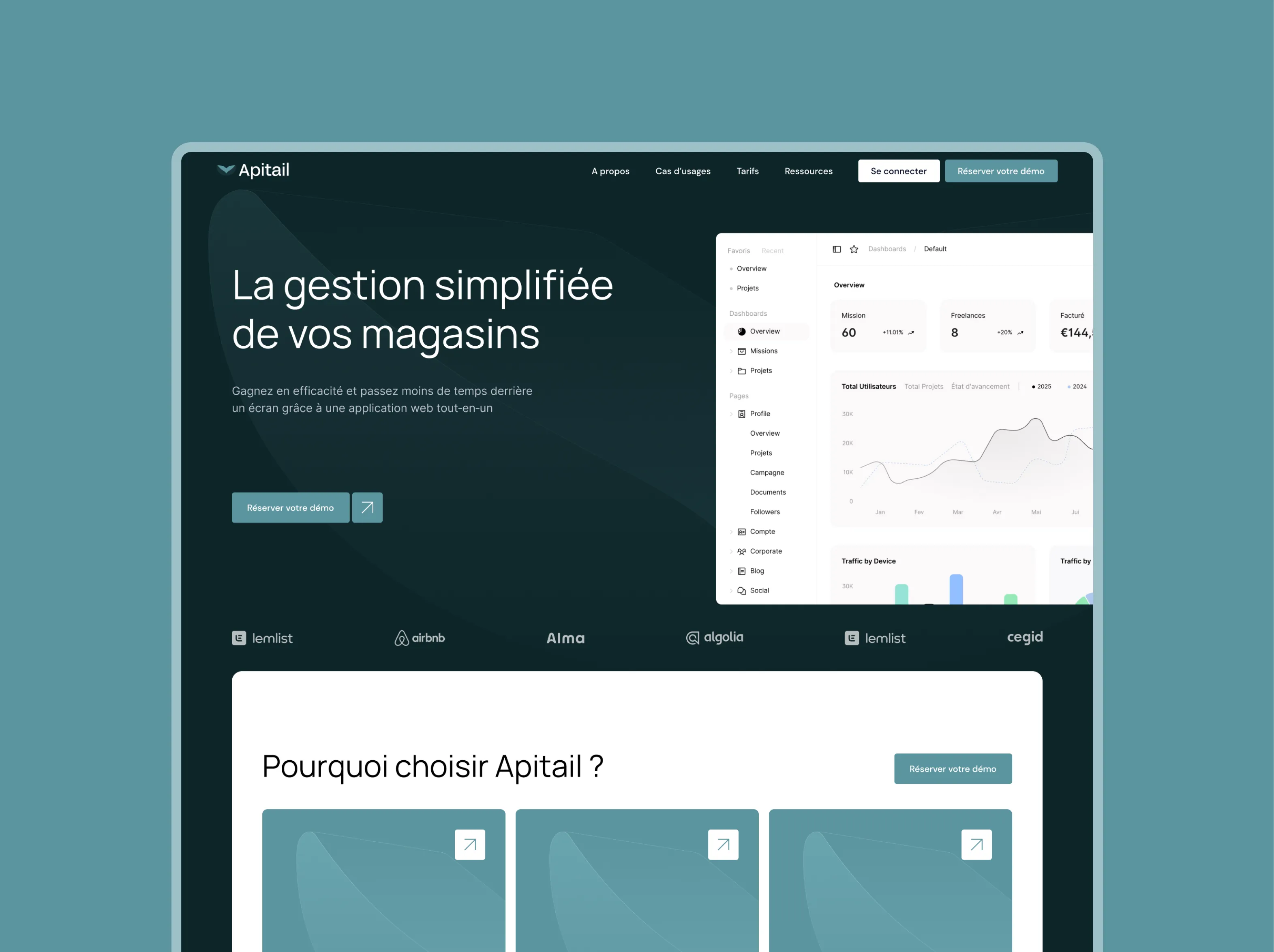
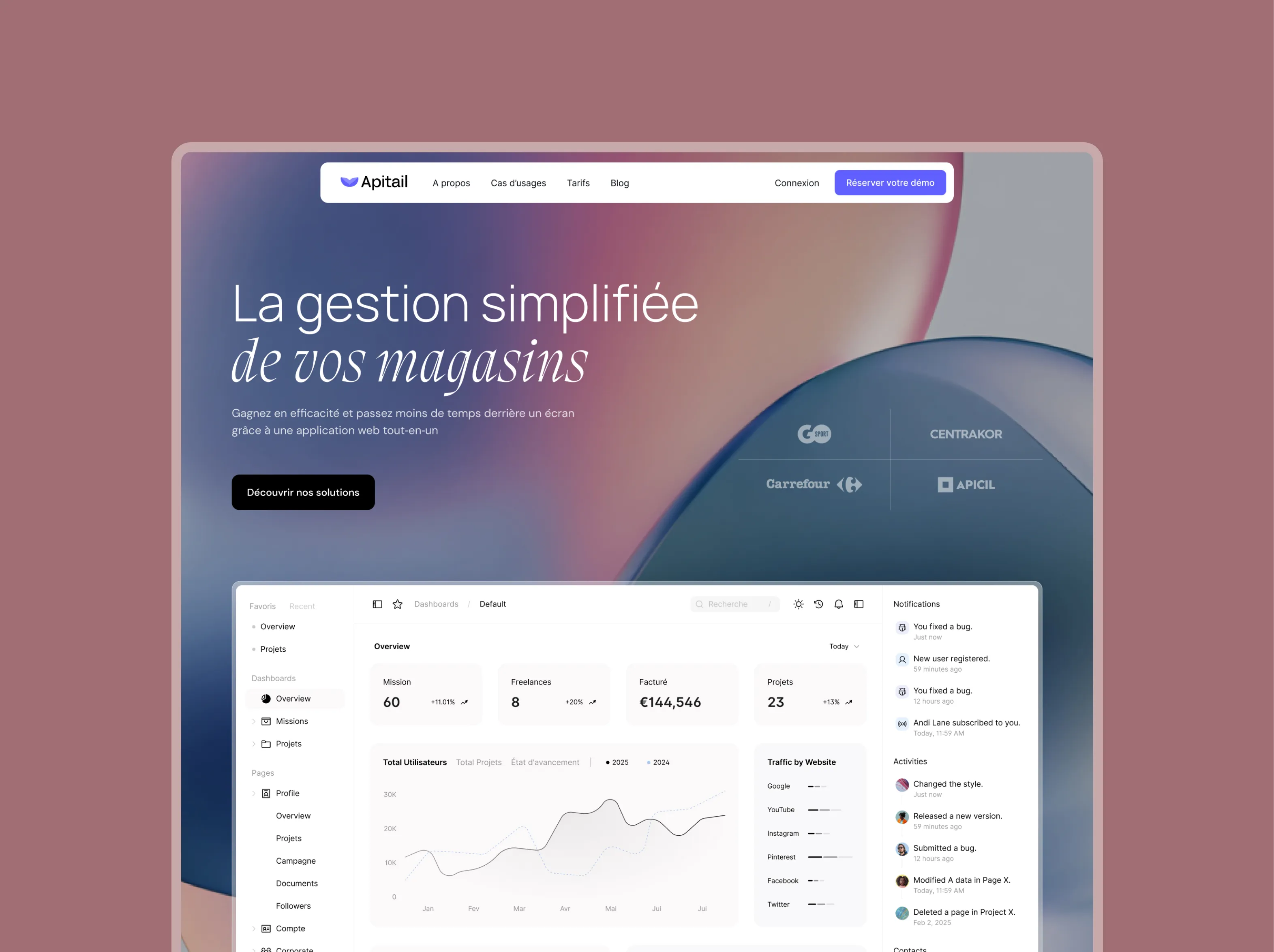
The chosen palette — warm beige background, dark blue text, neon yellow accents — creates a distinct identity in a market dominated by cold corporate blues. Beige brings warmth and accessibility, dark blue anchors technical credibility, and neon yellow acts as an energy boost for CTAs and interactive elements.
The design references (mipler.com) guided the typography and layout choices toward a balance between information clarity and SaaS modernity.
Competitive Positioning
Against established players like Cegid, Odoo, Fastmag, and Polaris, Apitail positions itself as the market’s agile solution: lighter than an ERP, more powerful than a basic point-of-sale tool. The art direction had to express that promise visually — professional, without the institutional weight.


%25201.webp)