Projects
 Our Offers
 Dedicated team
 Blog
 Academy
 About Us
Synapse x Gemeos
Full redesign of Synapse’s marketing site, the SaaS that centralizes and analyzes data for industrial SMBs with AI.
Gemeos drew on its experience as a web agency for the industrial sector to handle the project's art direction, UX/UI journeys, and Webflow build.
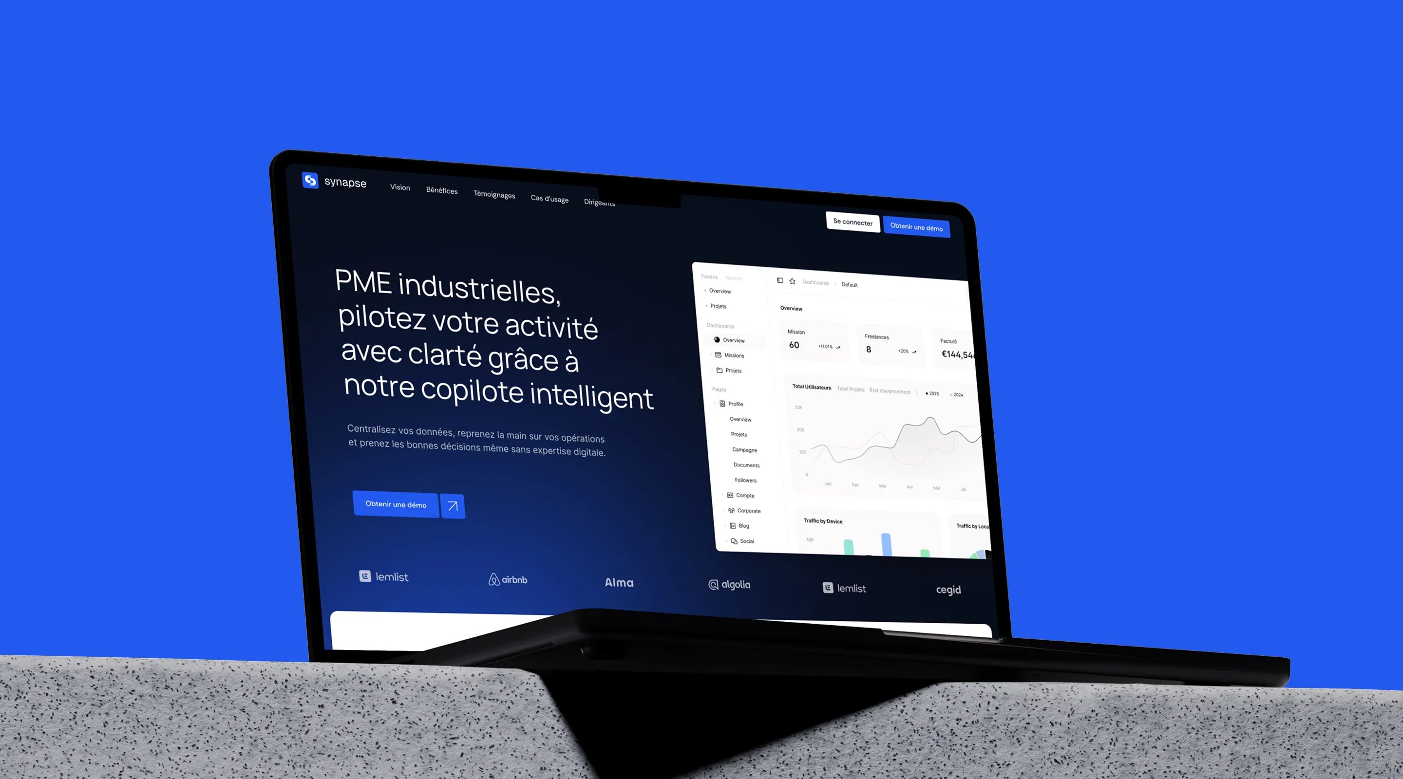
Digitizing the AI Copilot for French Industry
Synapse was born from a simple insight: French industry lacks smart tools to centralize its data and turn it into actionable insights. The SaaS Synapse tackles that challenge with an AI copilot built for industrial SMEs, especially in metalworking.
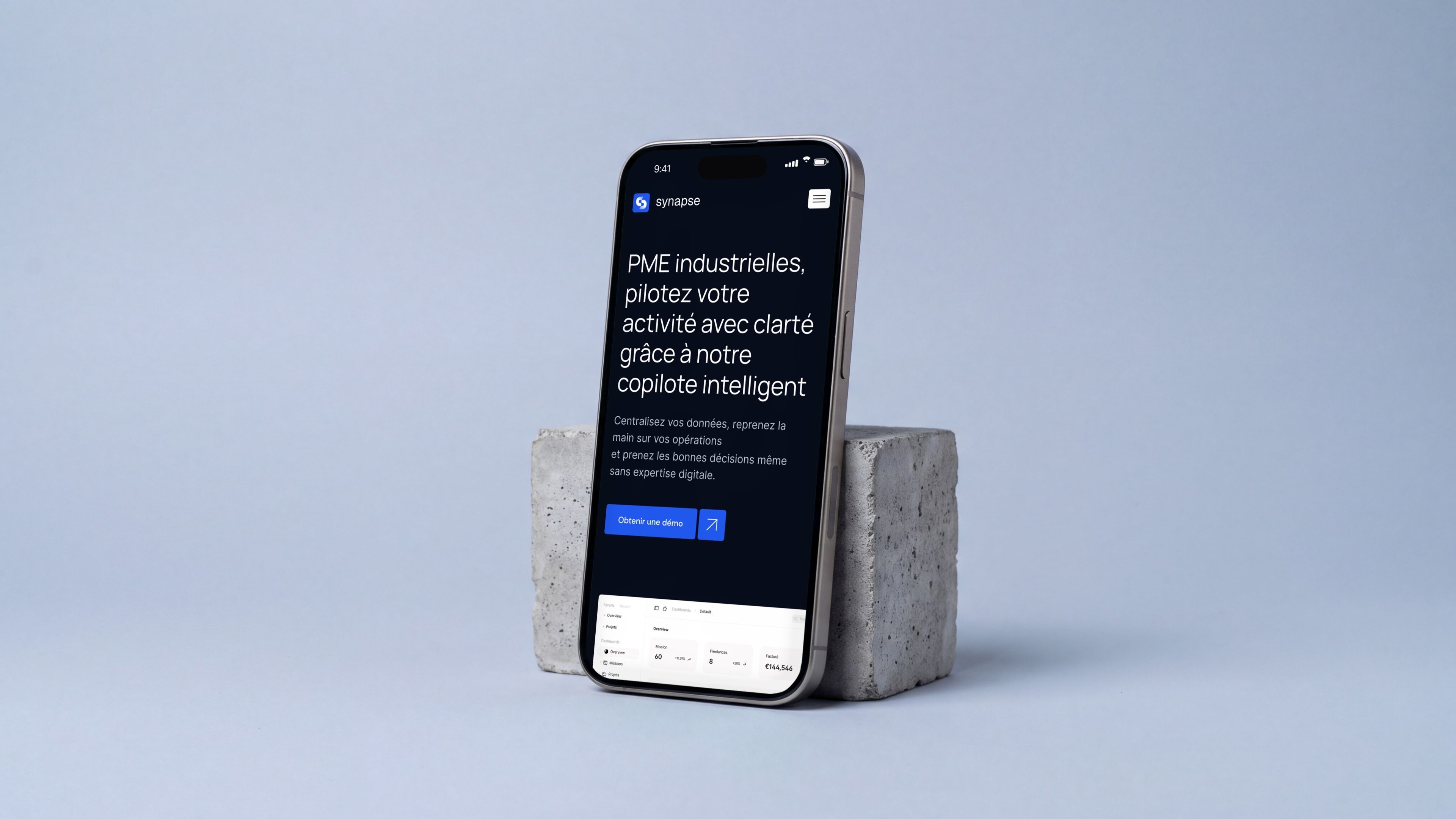
Gemeos supported Synapse on the art direction, UX/UI design, and Webflow build of their site, creating a digital presence that matches their tech vision and ambition to transform the French industry.
- Industry
- Saas
- Industry
- Services
- Artistic Direction
- UX/UI Design
- Development
Art Direction
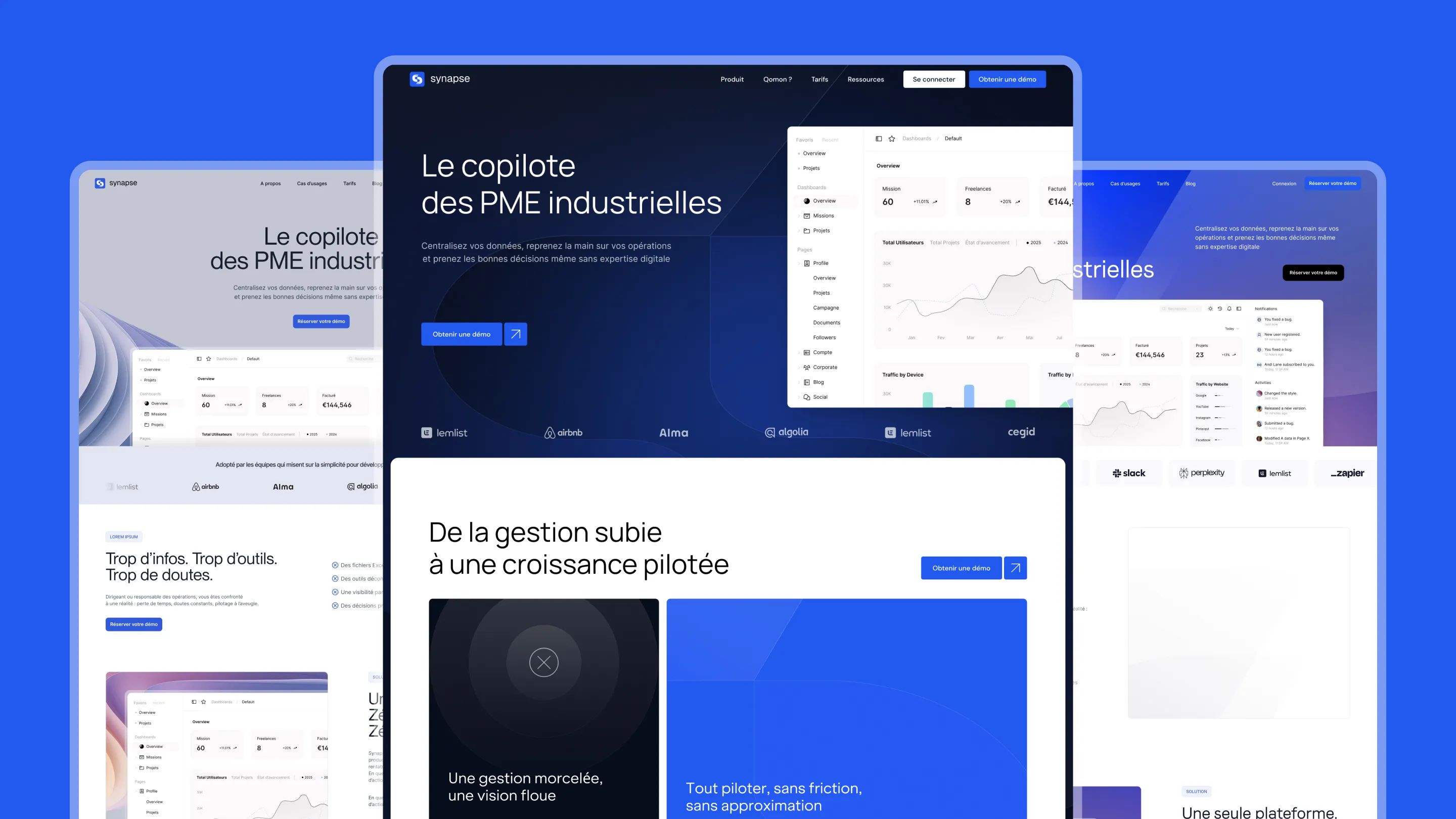
Synapse sits at the intersection of industrial manufacturing and AI tech. The art direction had to reflect that dual identity: the rigor and credibility of industry, paired with the innovation and fluidity of a modern SaaS product.
A visual identity that blends tech & industry
Synapse’s visual system, built around blue tones and gradients, became the starting point for an art direction inspired by the best B2B SaaS references (Stripe, Airtable, Typeform): precise typography, data visualizations, and elements that evoke connections and centralized information flows.
The logo at the heart of the design
The Synapse logo, with its two symmetrical shapes evoking a neural branch, the letter S, and the idea of connection, was woven in as the guiding thread of the art direction. Its codes, symmetry, flow, connection, show up throughout the site’s graphic patterns, illustrations, and animations.
| Art Direction Pillar | Creative Choice | Message Delivered |
|---|---|---|
| Colors | Gradient blue, premium tech | Innovation & trust |
| Typography | Precise, readable sans-serif | Expertise & clarity |
| Visuals | Connections, data flows, AI | Intelligence & performance |
| References | Stripe, Airtable, Typeform | Premium B2B SaaS |
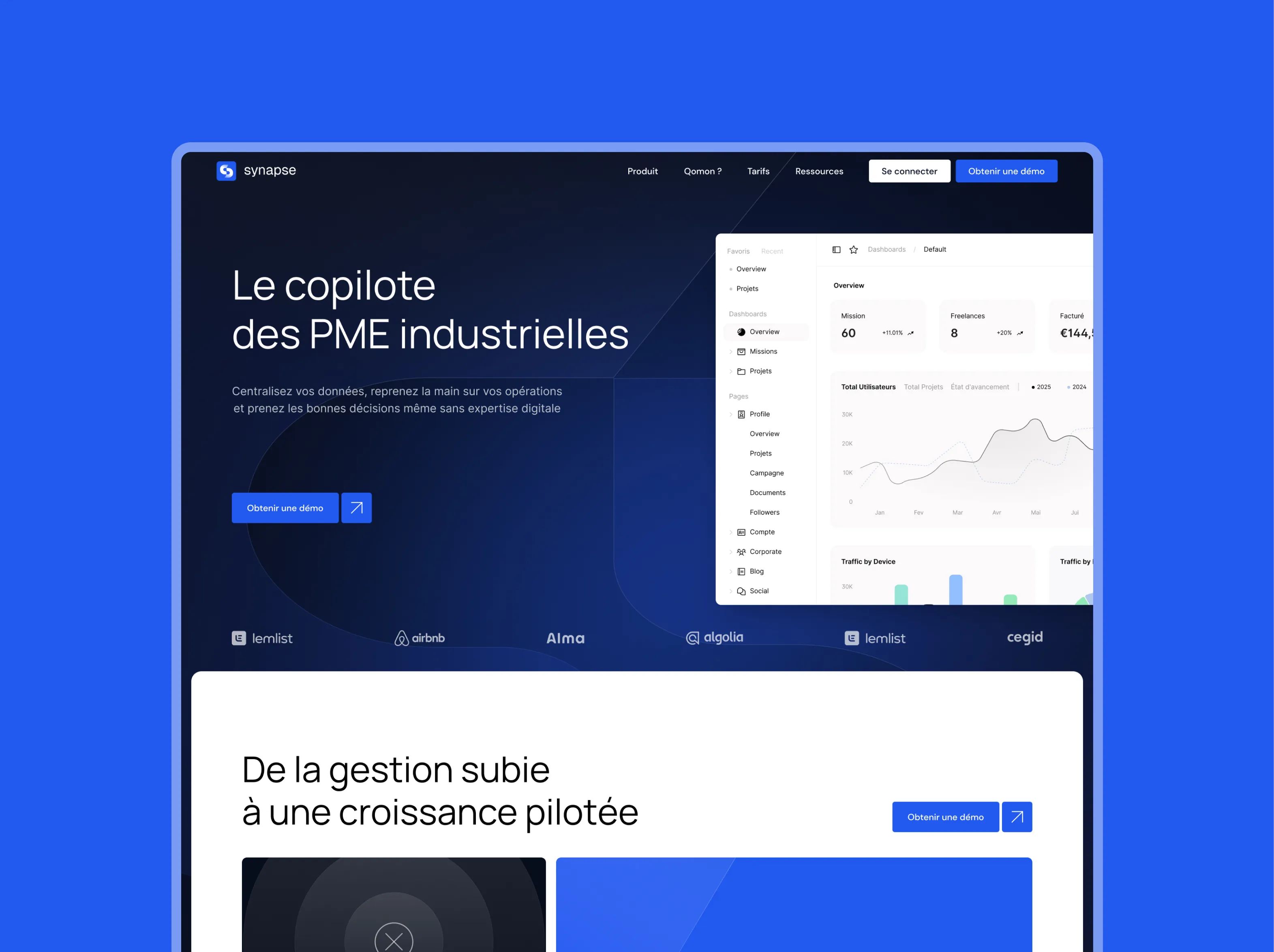
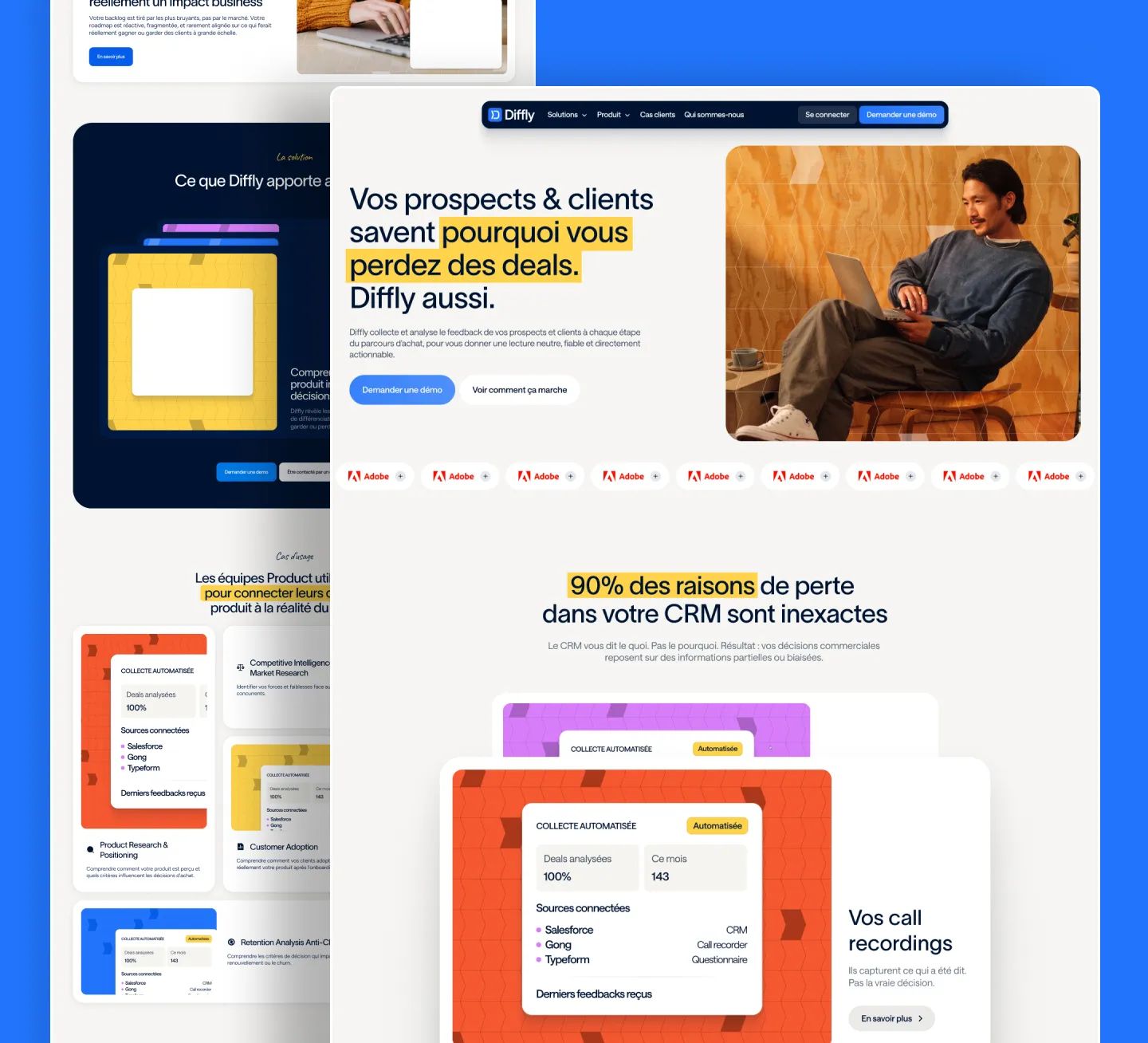
Concept 1: Dark & Structured
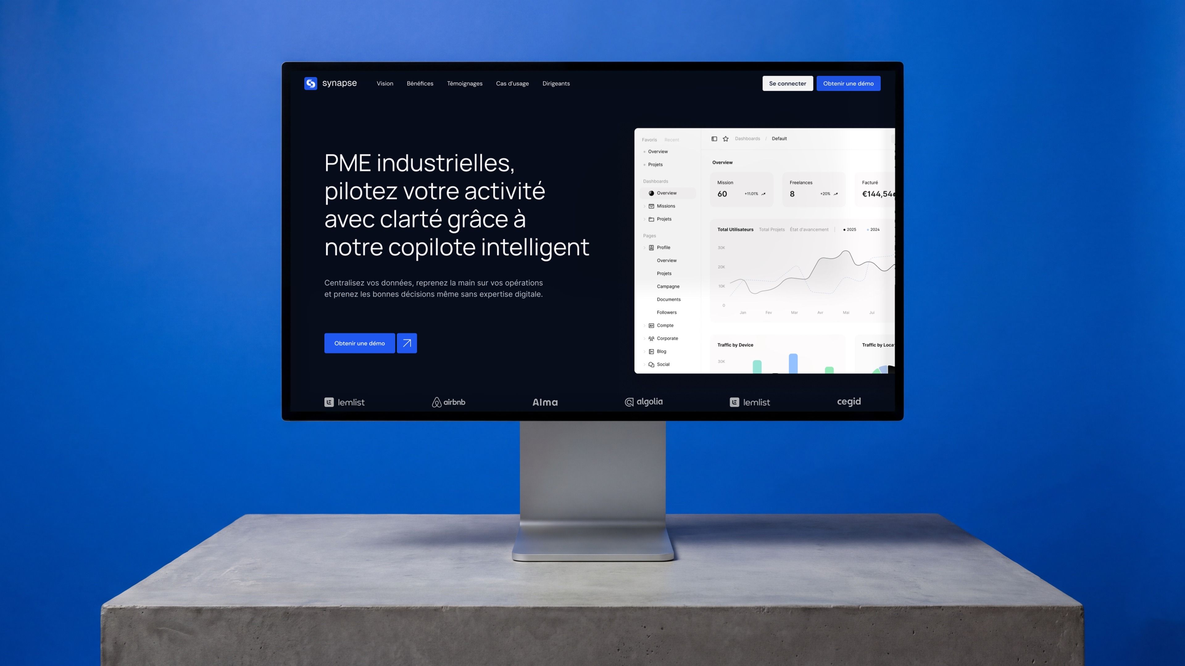
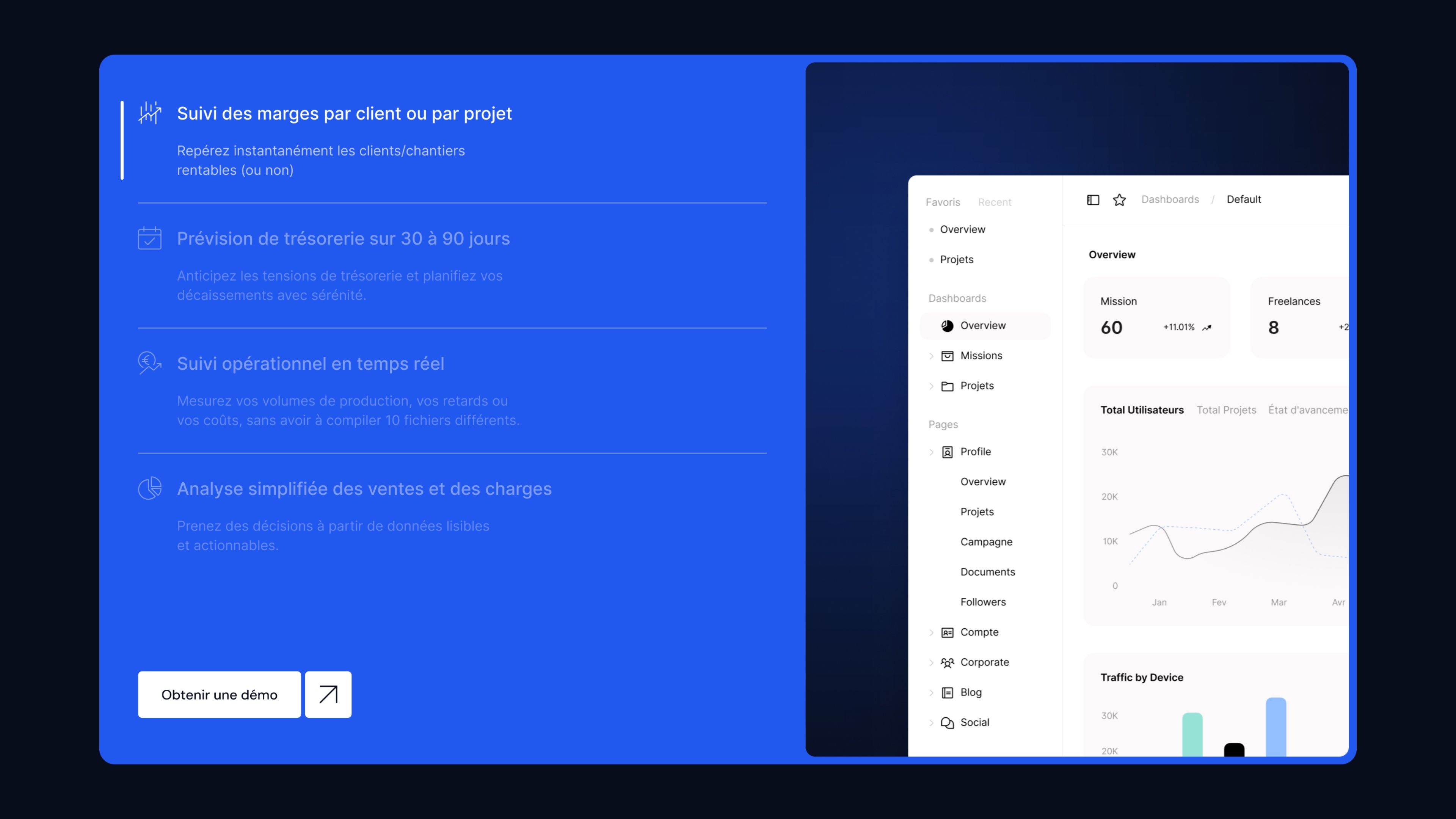
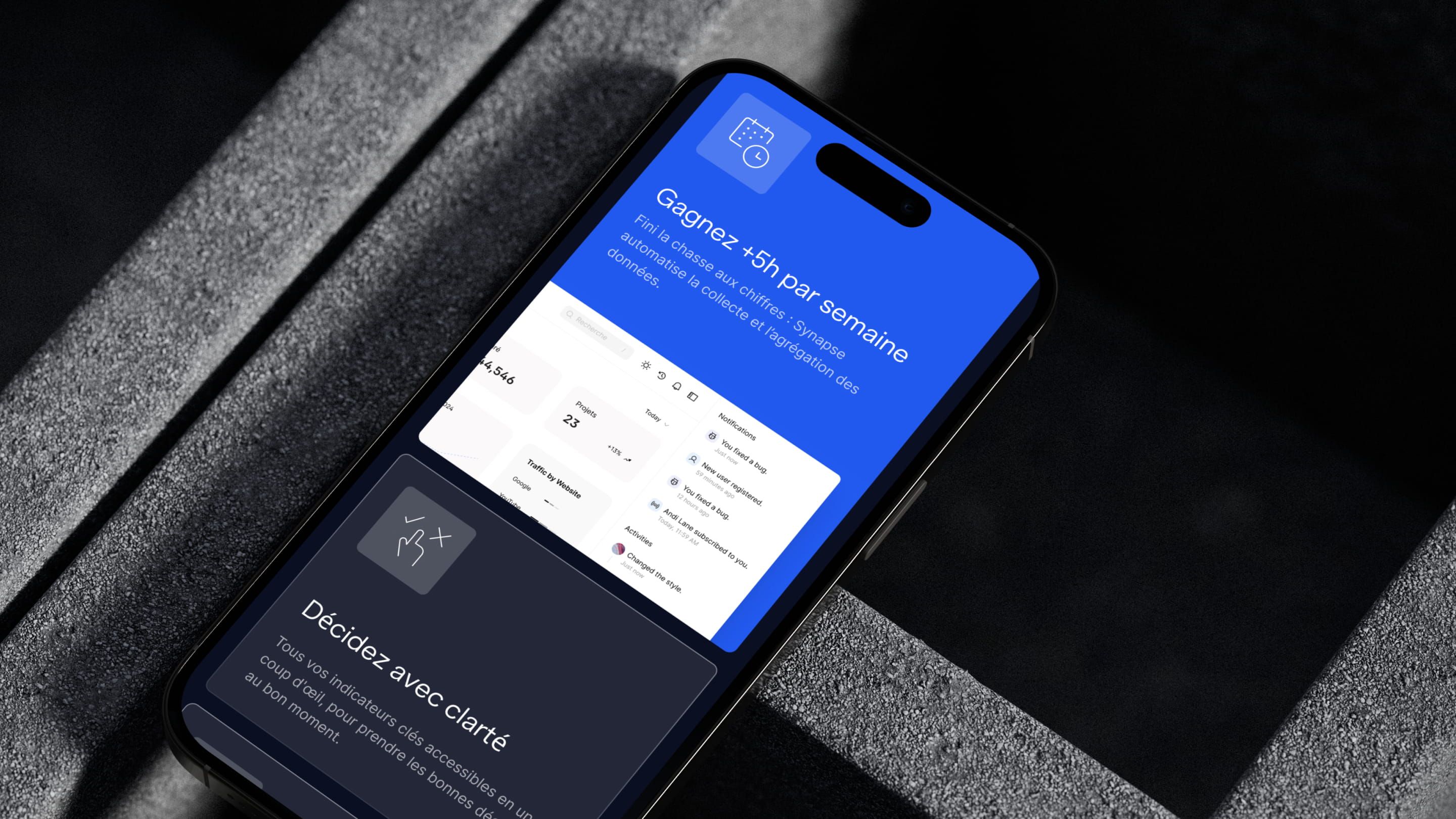
A dark visual world set against a midnight blue backdrop positions Synapse as a serious, ambitious tech tool. The split text/interface hero shows the product from the very first fold. The “problem vs. solution” section uses two contrasting cards, fragmented management in dark tones vs. frictionless control in bright blue, to visually bring the promised transformation to life. The next feature sections break down use cases in a list on a dark background, paired with product screenshots. A premium, punchy direction for demanding leaders at industrial SMEs.
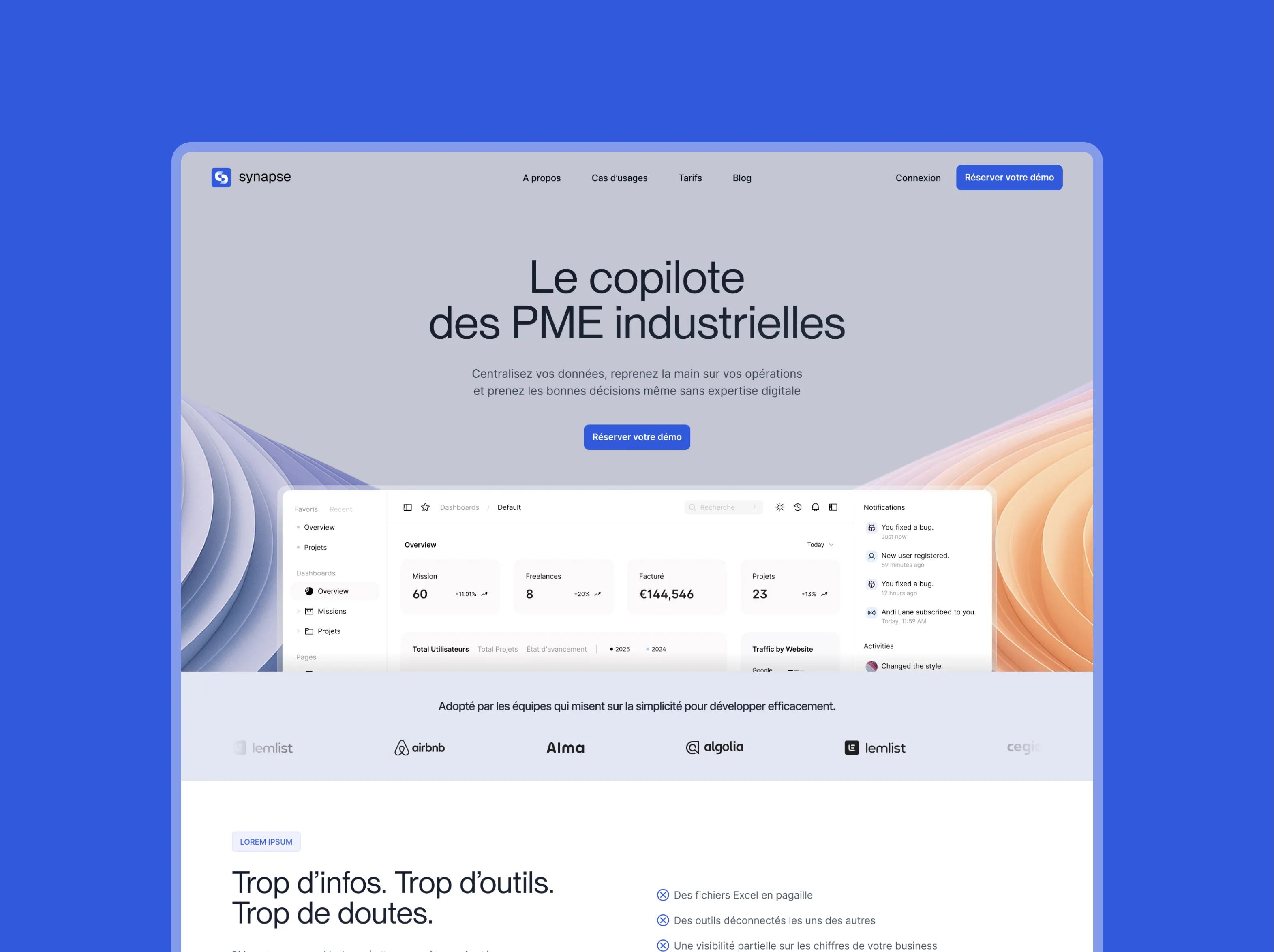
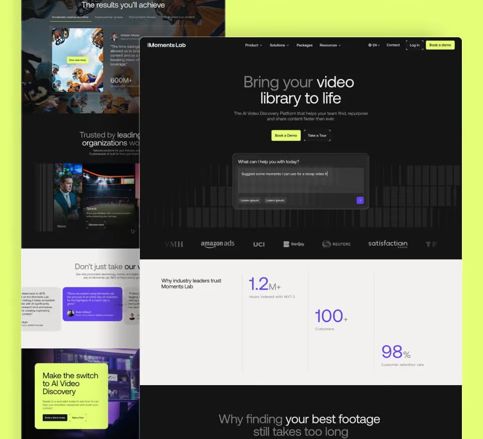
Concept 2: Clean & Minimal
A clean, airy design that puts readability and message clarity first. The centered hero, with an organic shape and warm gradient in the background, adds softness and modernity without feeling heavy. The “problem / solution” structure comes through in direct, punchy copy, “Too much info. Too many tools. Too many doubts.”, before introducing the platform. The product screenshots on a white background breathe and create a smooth, progressive reading flow. The most accessible and educational direction of the three.
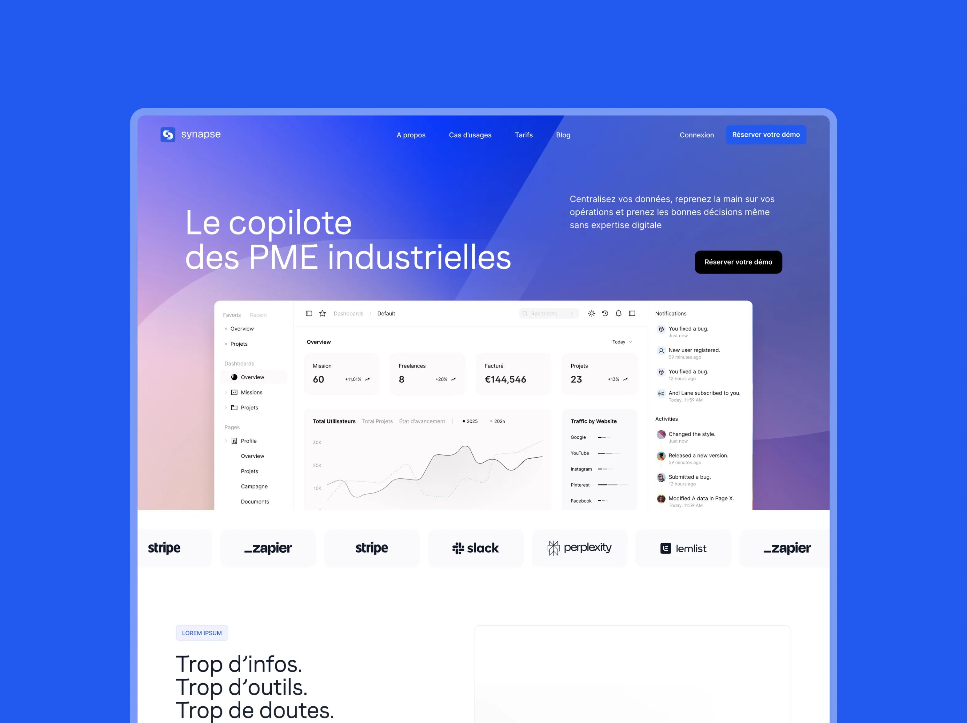
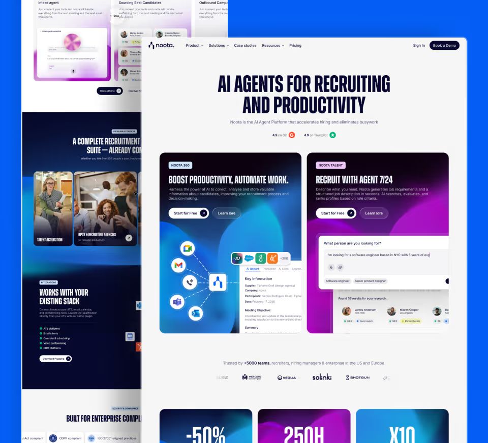
Concept 3: Gradient & Tech
A blue-violet gradient hero sets a premium tech mood without falling into the dark-mode cliché. The product interface floats through this bright environment with elegance. The integrations strip, Stripe, Zapier, Slack, Perplexity, instantly signals the platform’s connected, open ecosystem. Sections alternate between white backgrounds and violet blocks to keep the flow moving. A modern, distinctive direction that positions Synapse as the control center for the next generation of industrial SMBs.
UX/UI Design
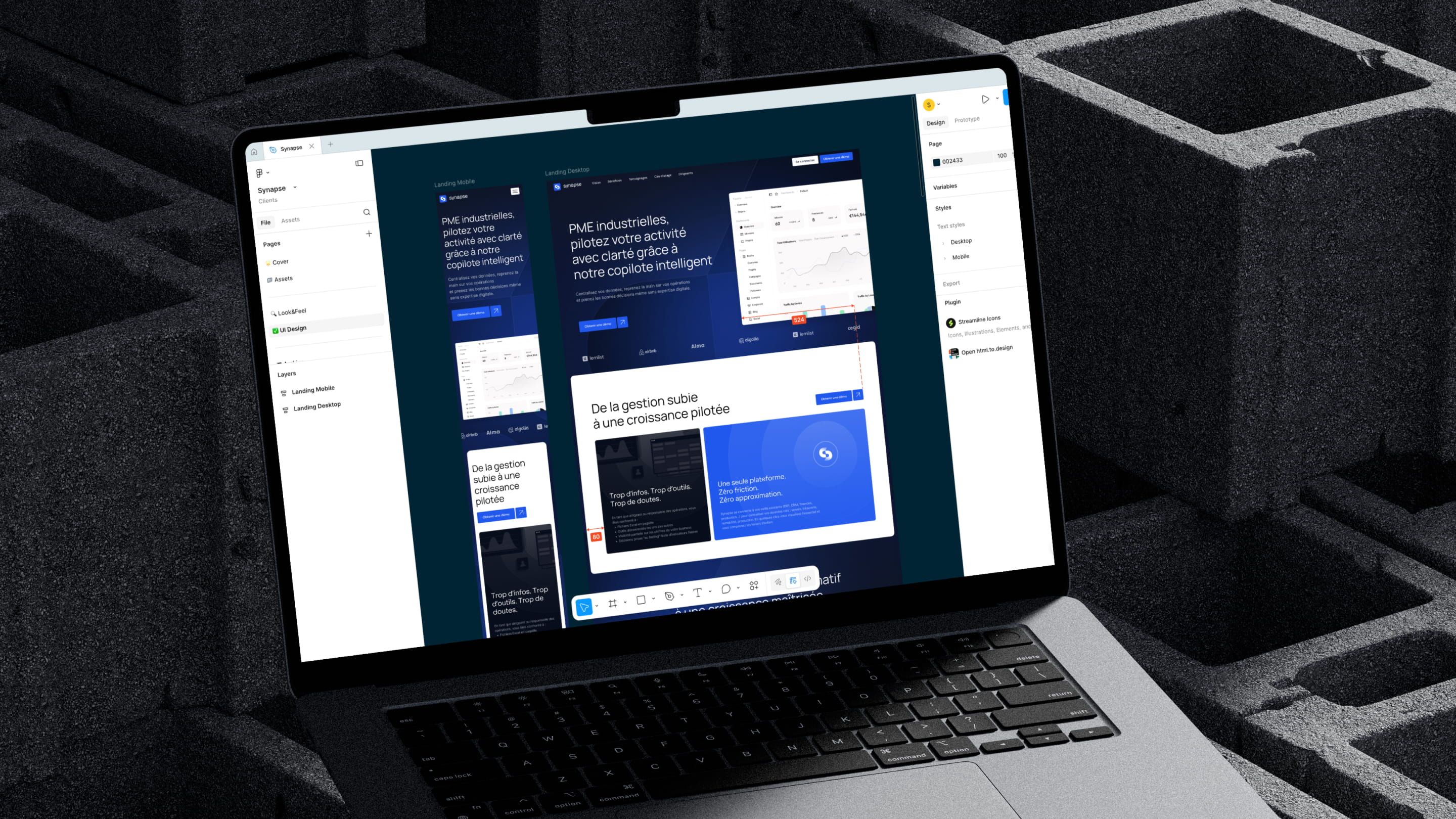
Synapse’s landing page had to convince business leaders and operations directors at industrial SMEs, people who often aren’t familiar with modern SaaS tools, that Synapse was the simplest, smartest solution, built for the realities on the ground.
Simplifying the value proposition
We structured the page architecture to spotlight Synapse’s two key differentiators: easy setup, without disrupting the existing organization, and the power of AI to turn company data into actionable insights.
Design built for the industrial sector
Unlike mainstream B2C SaaS products, Synapse speaks to pragmatic, hands-on decision-makers. The design was tuned to build trust and credibility fast, with concrete visuals, clear use cases, and a professional, direct tone.
B2B conversion & lead gen
The calls to action were designed for a B2B sales process: demo request, contact form, and trial access. The UX naturally guides visitors toward engagement, with reassurance sections, testimonials and key metrics, placed where they matter most.
Webflow Build
The Synapse Webflow build put fidelity to the design, polished animations, and performance front and center, all essential for a B2B SaaS whose website is the main acquisition engine.
Pixel-Perfect Build
The landing page was built in Webflow with obsessive attention to detail: pixel-perfect execution of the mockups, scroll animations, micro-interactions, and smooth transitions inspired by premium SaaS benchmarks like Stripe and Airtable.
Performance & CMS
We chose a lightweight Webflow architecture to keep load times fast, critical for SEO and conversion, with a structure that lets the Synapse team update content on their own (use cases, testimonials, features) without technical help.
| Criterion | Solution | Impact |
|---|---|---|
| Performance | Optimized assets, clean code | Fast loading |
| Animations | Webflow Interactions IX2 | Premium experience |
| CMS | Editable sections with full ownership | Team flexibility |
| Responsive | Mobile-first, 5 breakpoints | Multi-device UX |


Our latest projects
+250 companies
supported
Websites designed and developed with










You're going to working with us, guaranteed
Ready to launch
your business?
Let’s f*****G GO !!