Projects
 Our Offers
 Dedicated team
 Blog
 Academy
 About Us
Giva x Gemeos
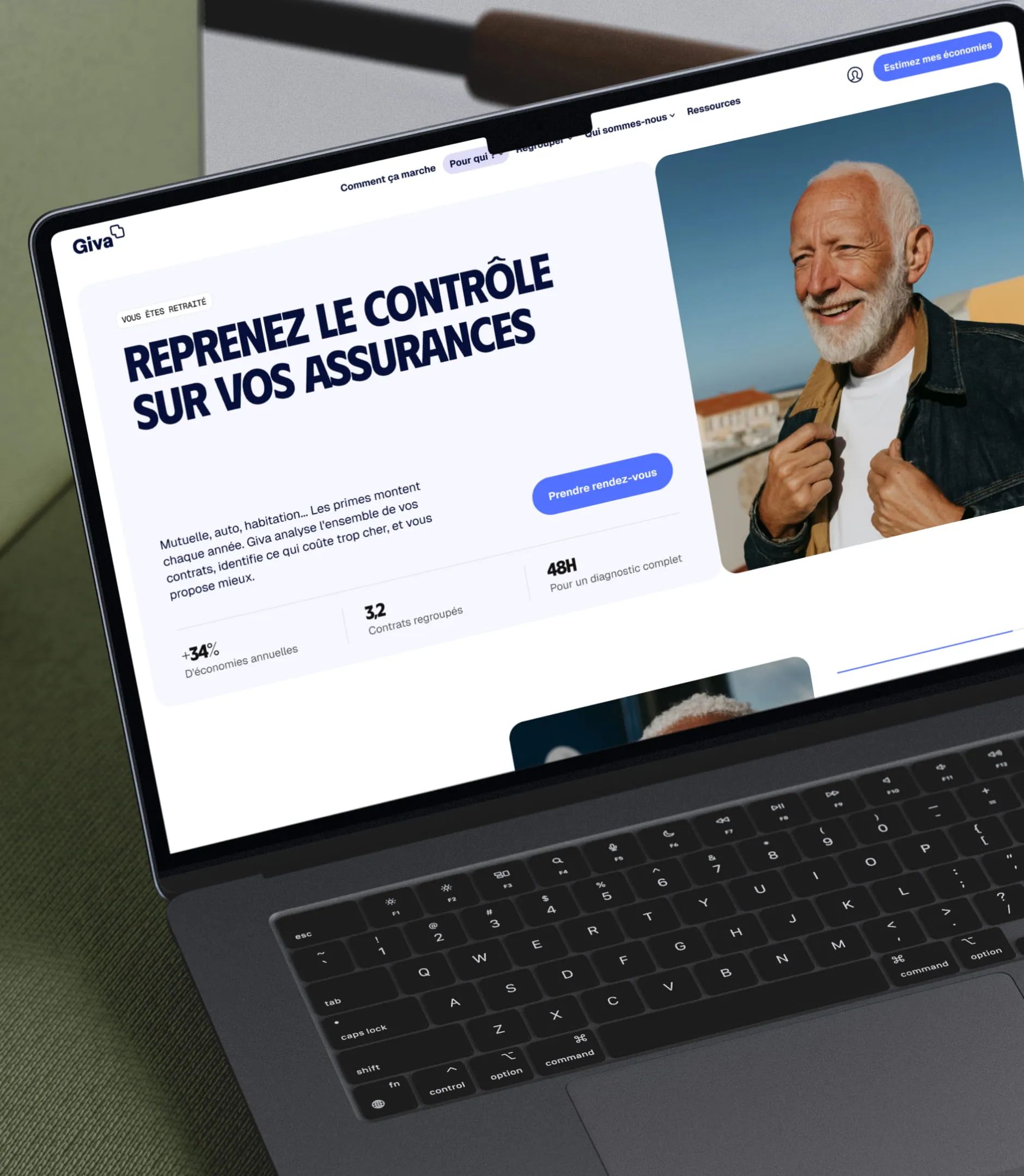
Giva was completely rethinking its positioning and needed a site that matched the ambition: clear, reassuring, and built to convert prospects who’d never heard of insurance bundling.
Giva chose our web agency specialized in insurance for the UX/UI, the Webflow site, and SEO.
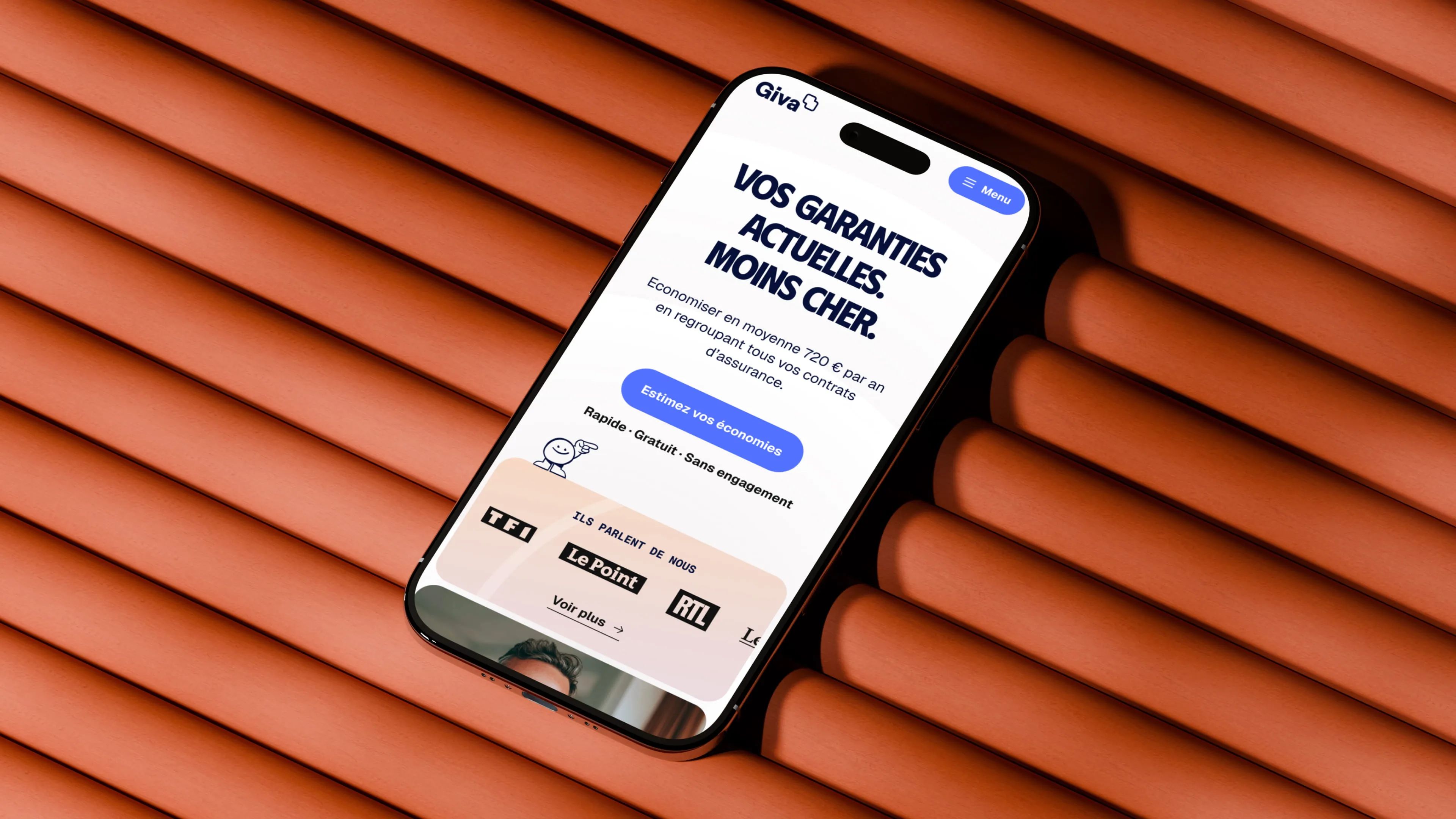
A website for an insurance platform built on trust
Giva is an insurance consolidation platform positioned as a neutral trusted third party, not a broker, not a comparison site, and not an insurer. Giva reviews each client’s full portfolio of policies and connects them with the general agent best suited to their situation.
Gemeos handled Giva’s UX/UI design, Webflow build, and SEO strategy, with one clear goal: turn a demanding positioning into a visual experience built on transparency, neutrality, and trust in an industry where conflicts of interest are the norm.
- Industry
- Finance
- Services
- UX/UI Design
- Development
- SEO
Art Direction
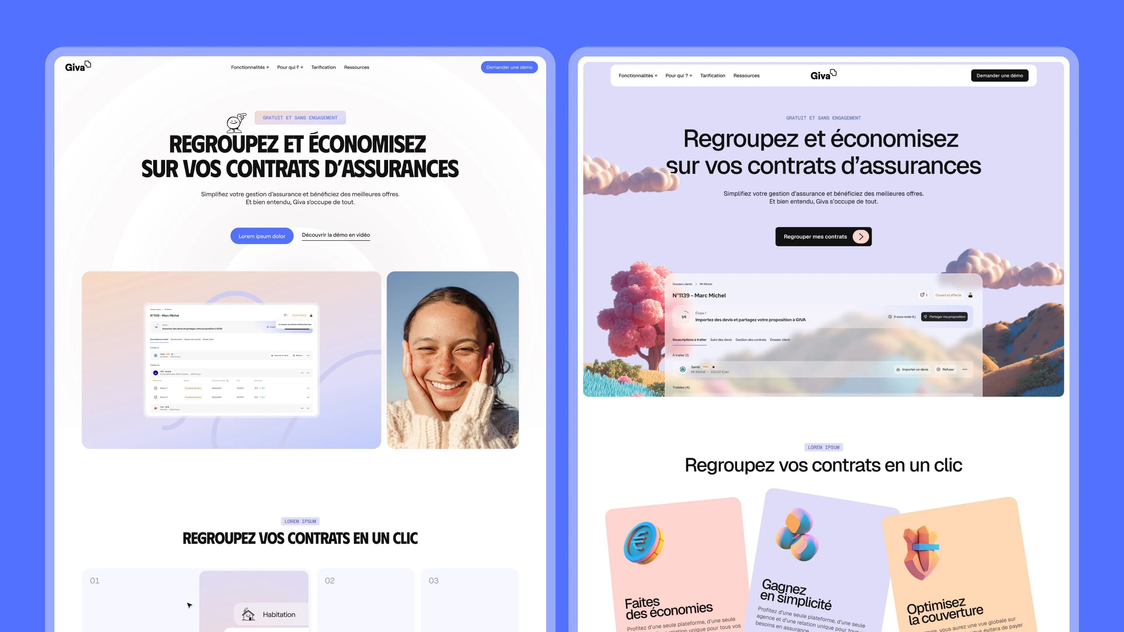
The creative direction revolves around one central question: how do you make insurance desirable? Two directions were explored.
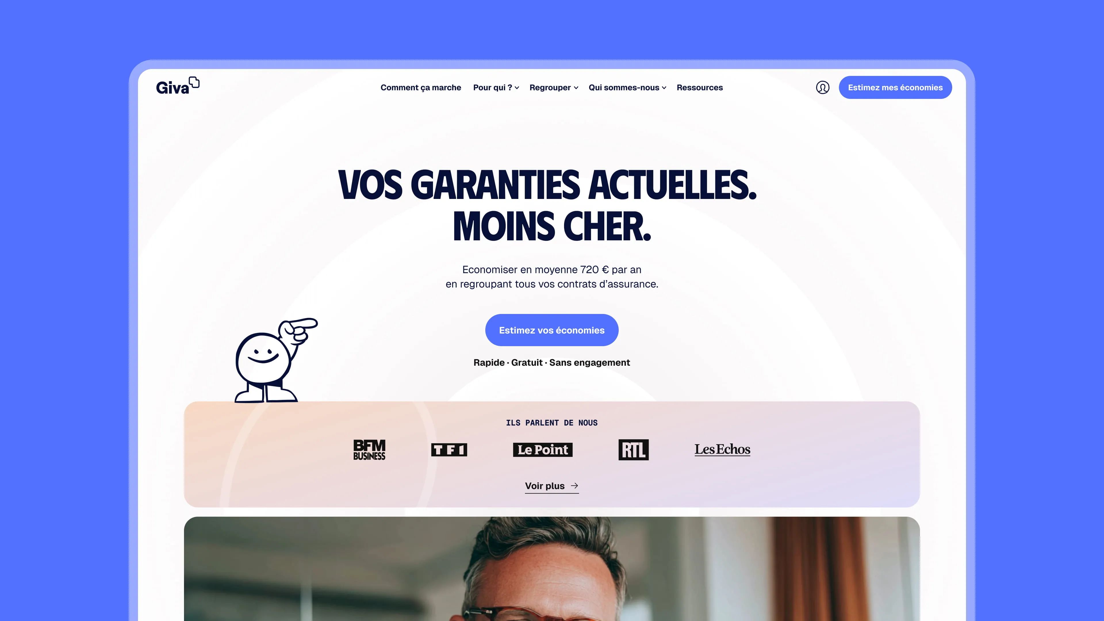
The first leans into clarity and humanity, direct typography, authentic photography, visual education.
The second breaks from industry conventions with an organic 3D world and soft colors that turn an experience people see as complex into something accessible and almost enjoyable.
In both cases, the goal stays the same: make Giva a brand people instinctively trust.
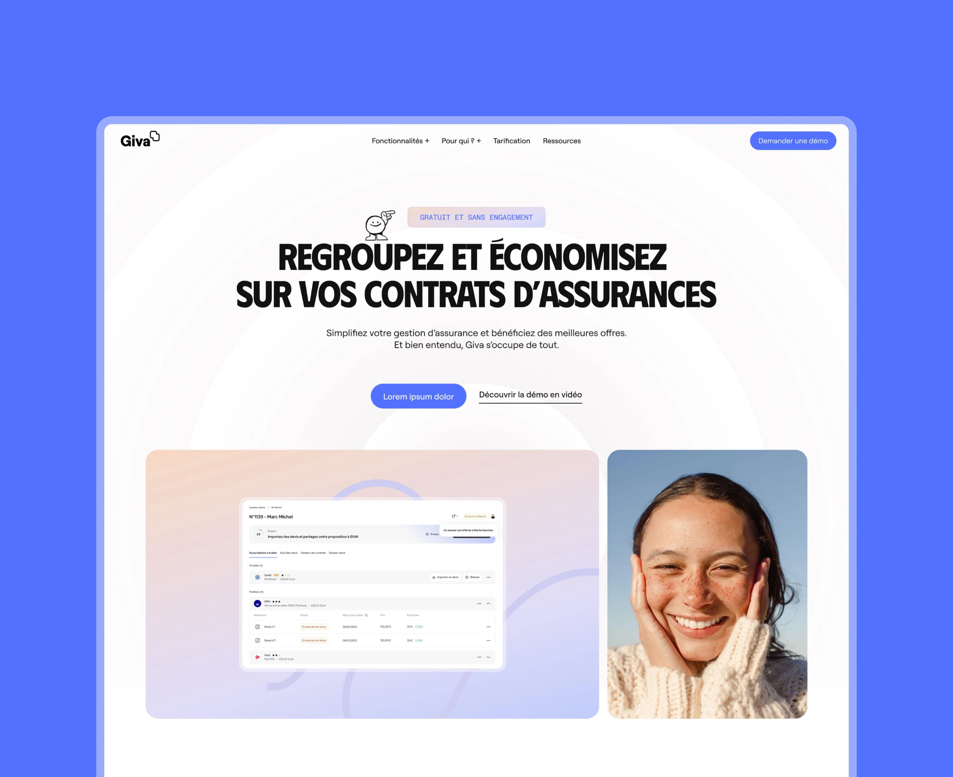
Human & Direct
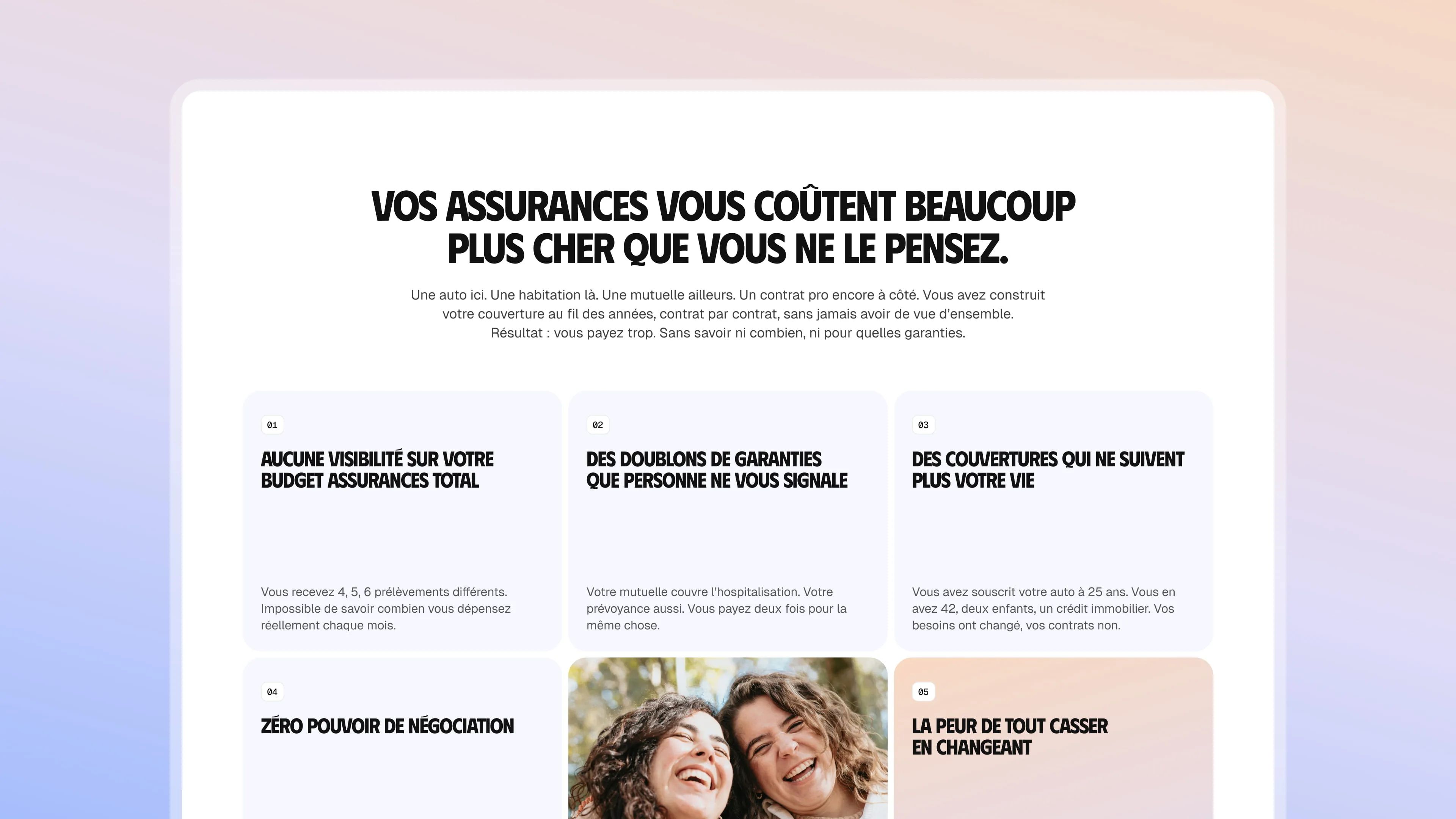
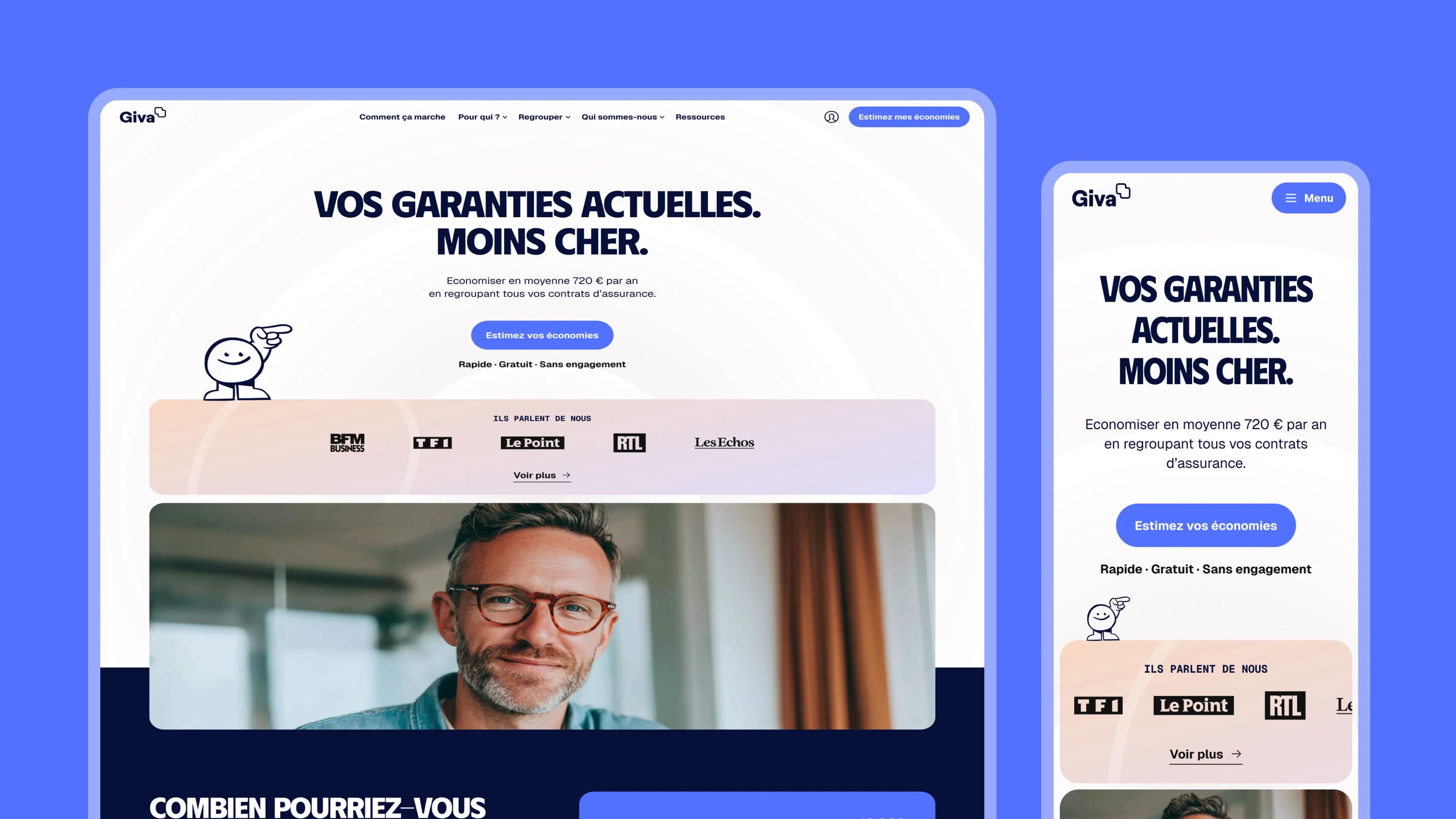
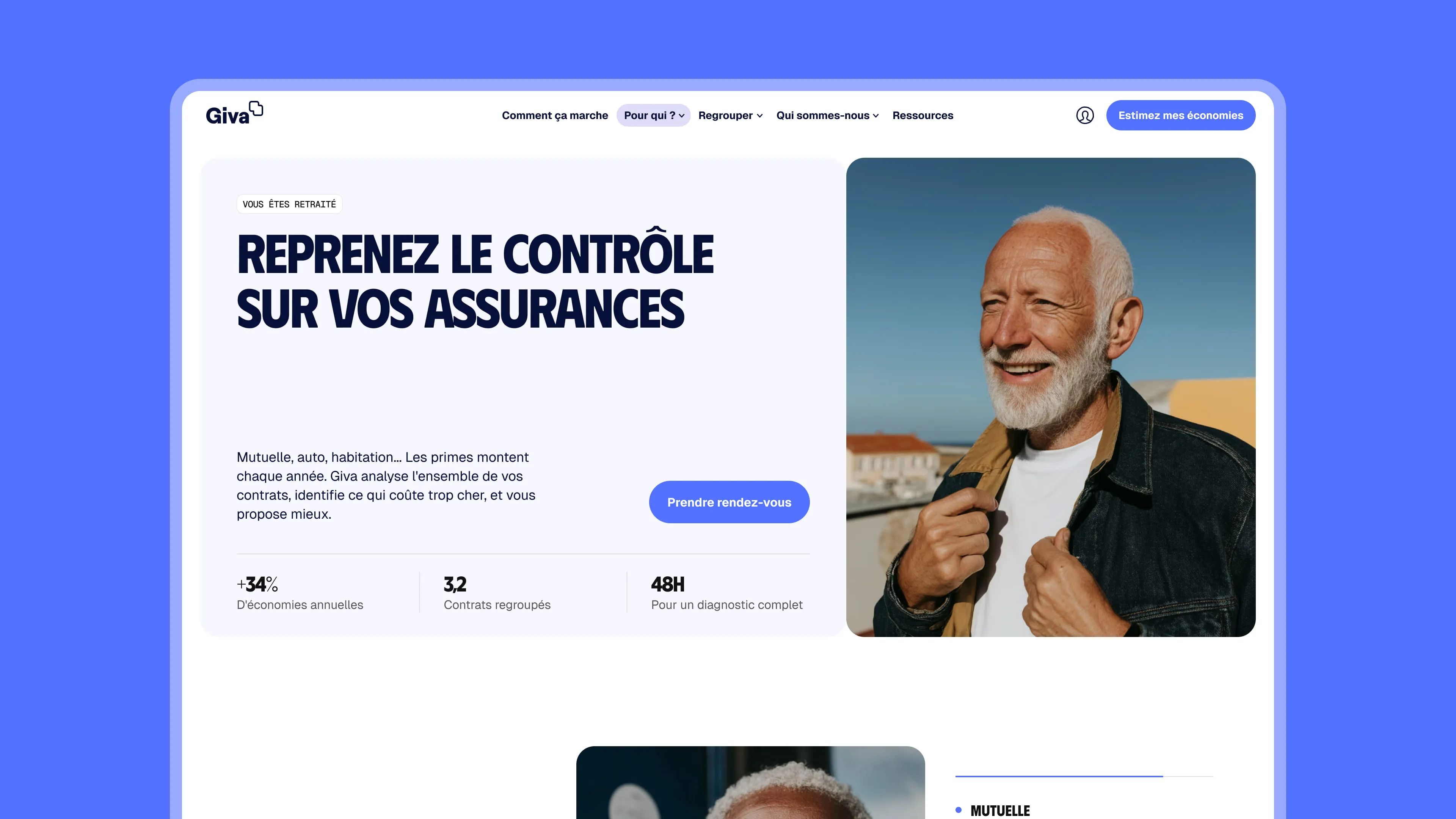
A clean design grounded in reality, with people front and center. White background, bold all-caps typography for the headlines, direct and unambiguous. The hero leans into a product-plus-smiling-face duality, creating an immediate emotional connection. Lavender tones in the background add softness without diluting the seriousness of the offer. The features section uses a numbered progression that feels clear, educational, and reassuring. The whole thing speaks to someone who wants to understand fast and feel confident.
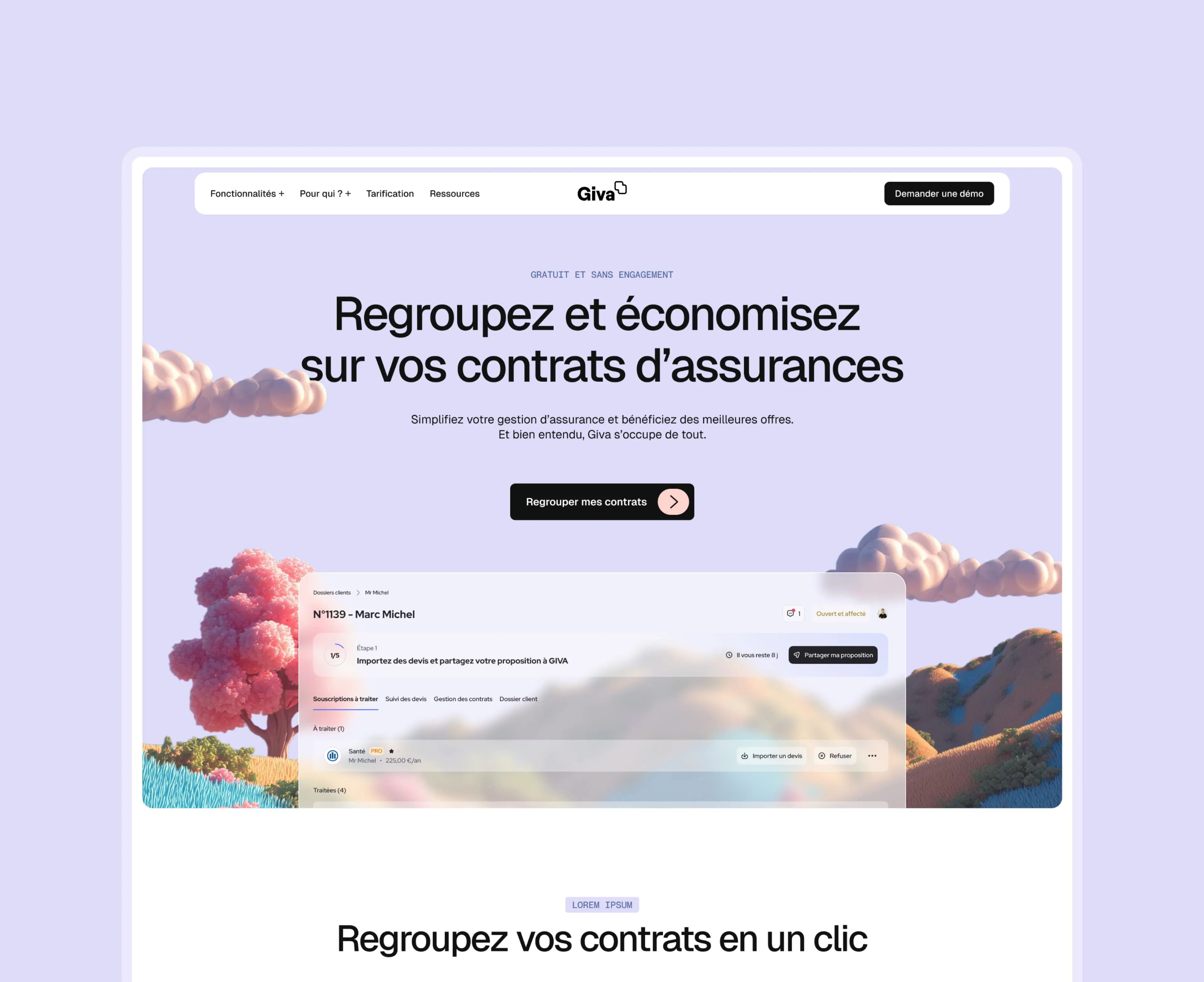
3D & Soft
A more poetic, more distinctive direction, driven by an organic 3D world, pink trees, rounded shapes, and vibrant colors, that breaks away from the cold codes of insurance. The lavender background ties everything together in a soft, calming atmosphere. Typography shifts to elegant lowercase, making the brand feel more approachable and less confrontational. Warm pastel feature cards, pink, mauve, peach, paired with expressive 3D icons strengthen the visual identity. This direction positions Giva as a modern player reinventing the insurance experience: simple, reassuring, almost enjoyable.
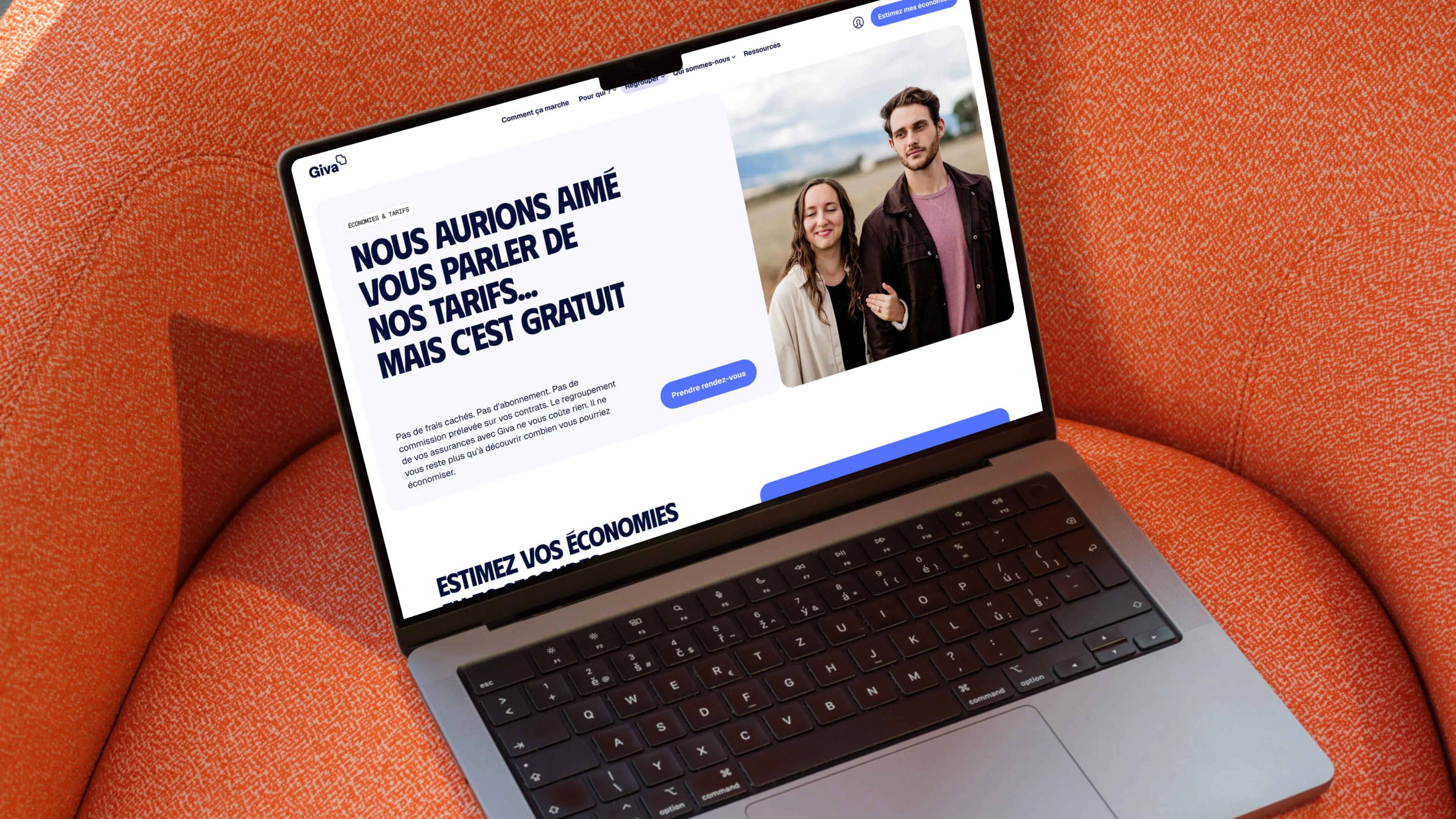
Designing Trust Into the Interface
Giva operates in insurance, a space where trust is the biggest conversion driver and where clear messaging can make the difference between a visitor bouncing and a qualified lead. Enora, senior designer at Gemeos, led the Figma mockups with a sharp UX-first approach.
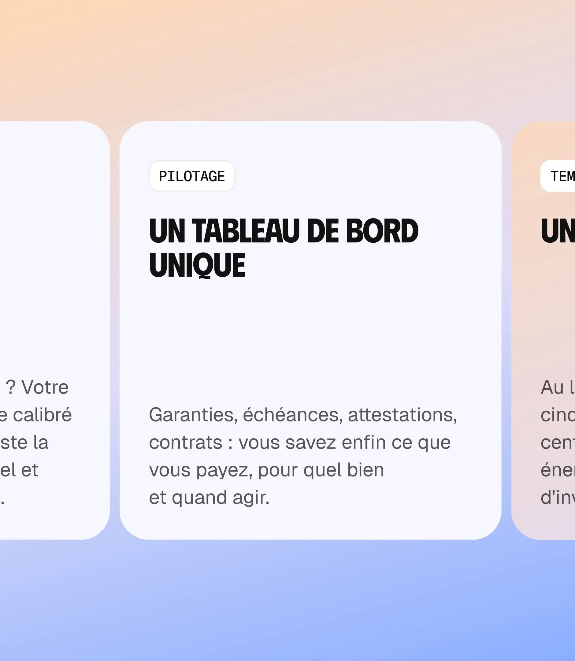
The site’s information architecture was built around one question every visitor asks the moment they land: "Why Giva instead of a broker or a comparison tool?" Each section of the homepage chips away at objections and builds the case for Giva’s neutrality, same commission no matter the agent, no conflicts of interest, free for the client.
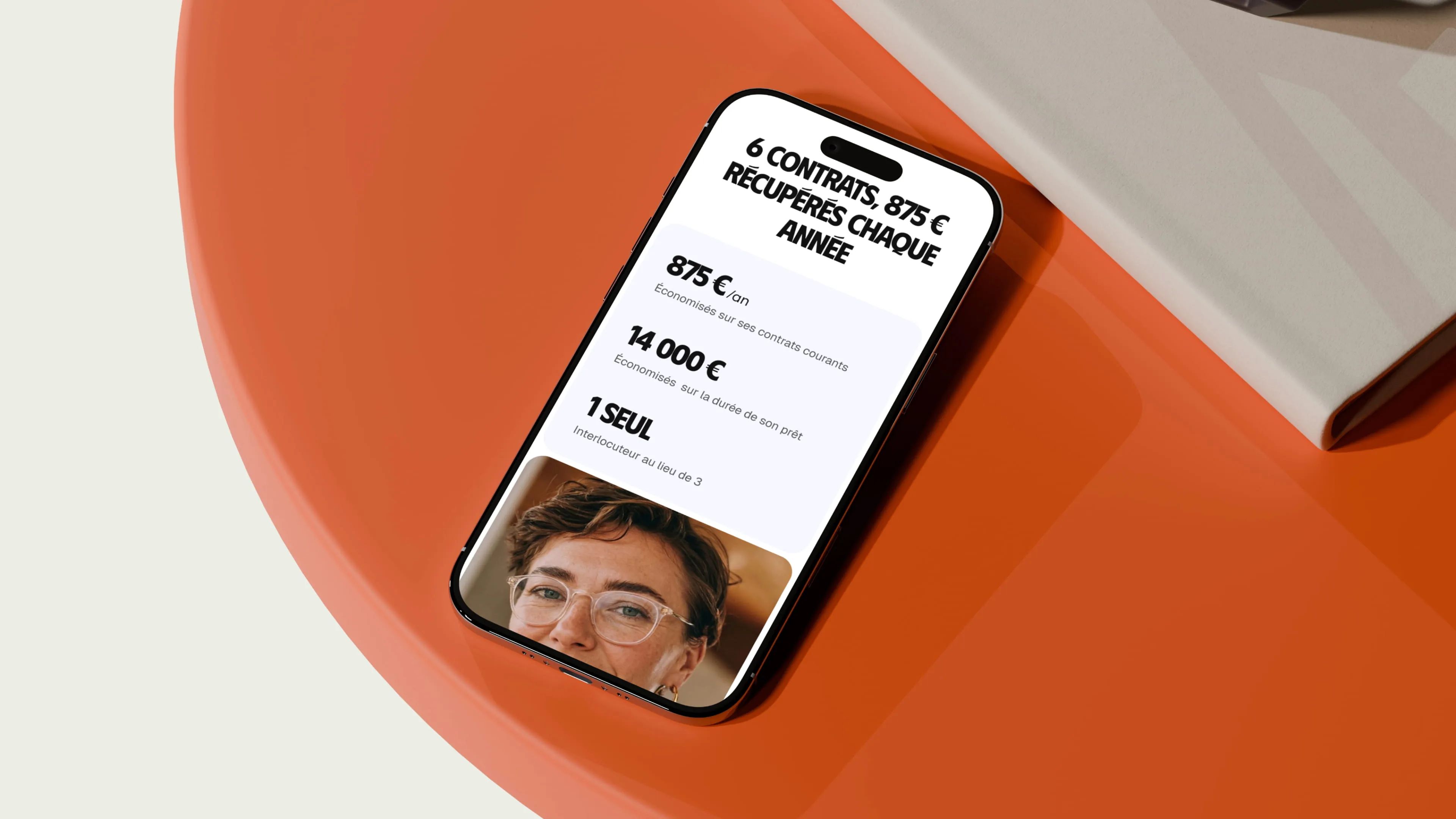
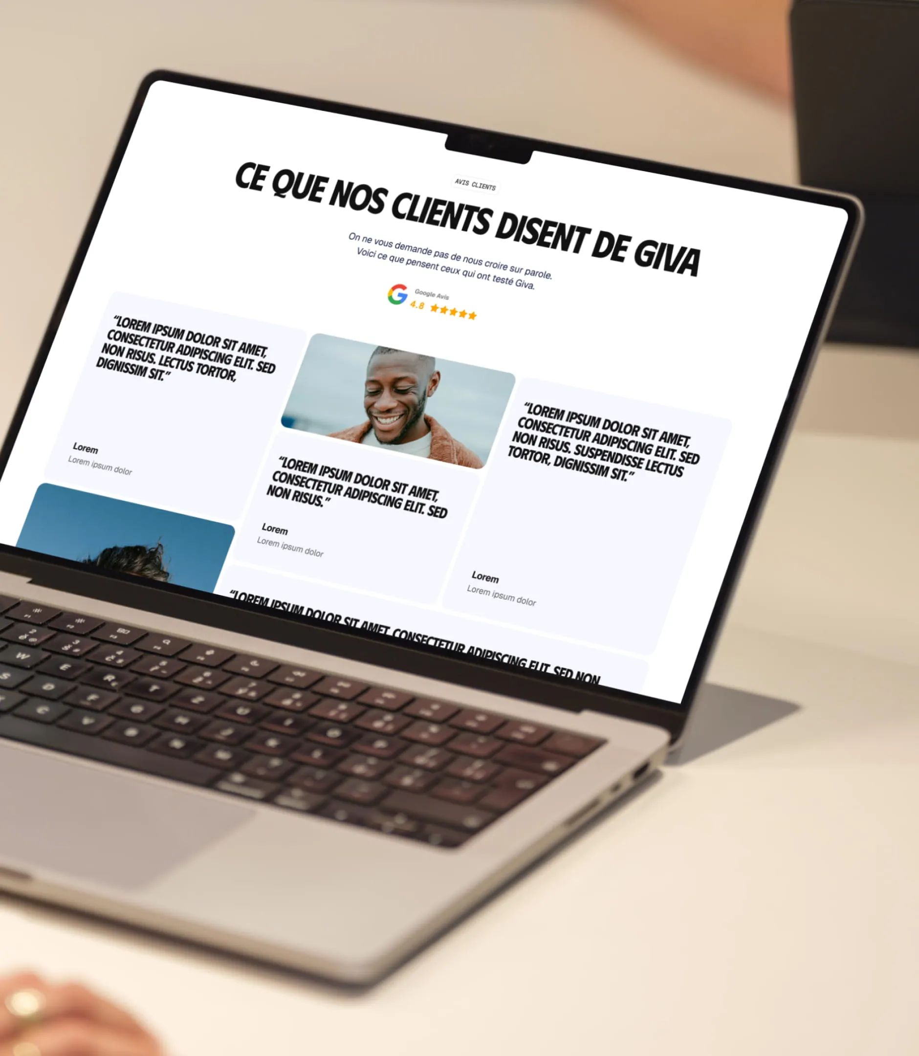
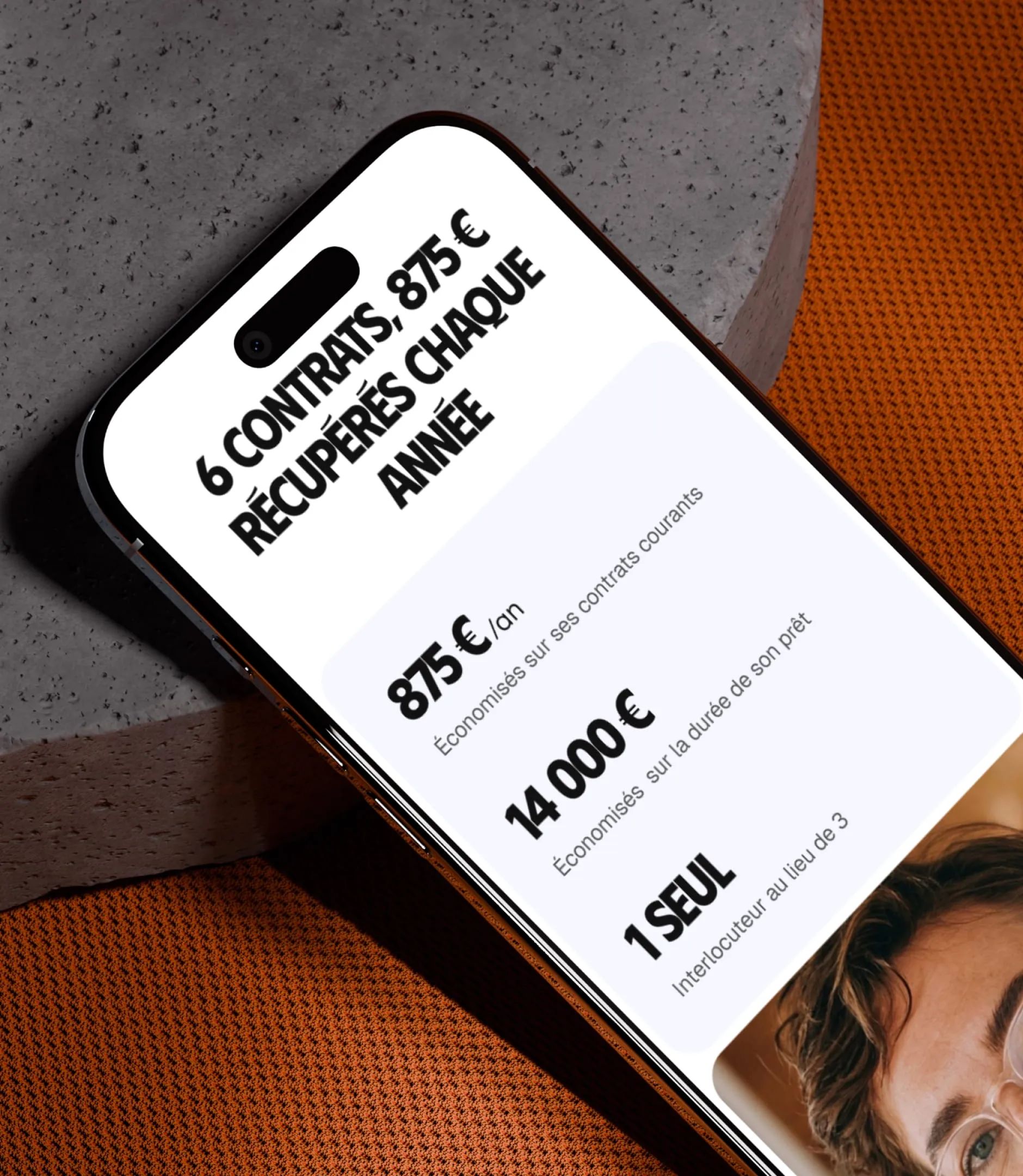
The design system we put in place prioritizes readability and a clear visual hierarchy, with reusable components for testimonials, comparisons, and CTAs. The mobile experience was crafted with the same rigor as desktop, since insurance users are mostly on the move when handling their requests.
| Key Page | UX Goal |
|---|---|
| Home | Explain Giva’s positioning in 3 sections, estimator CTA |
| How It Works | Break down the process into clear, reassuring steps |
| Why Giva | Address objections vs. broker, comparison tool, insurer |
| Network Agents | Build credibility for a network of 200+ general agents |
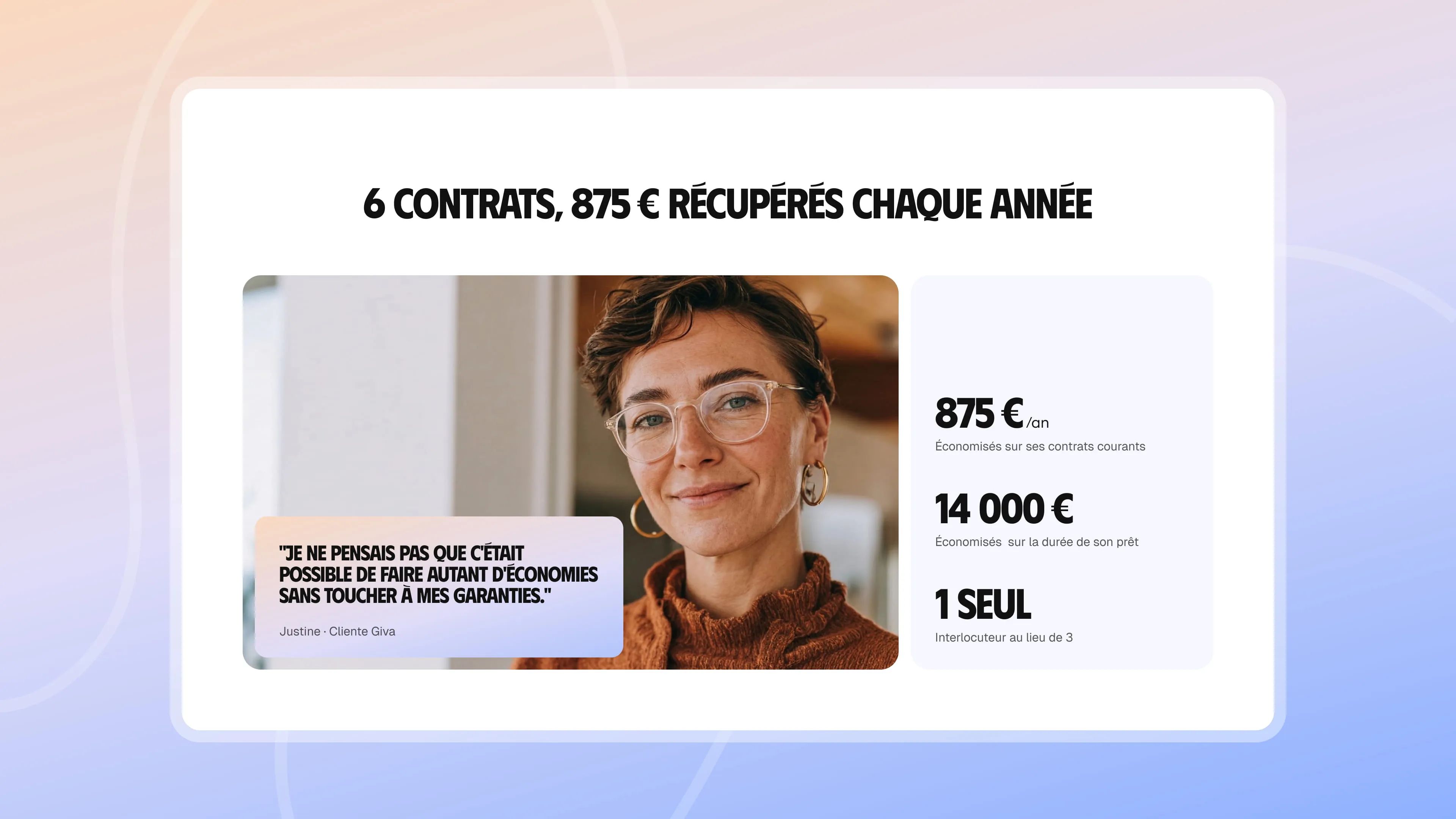
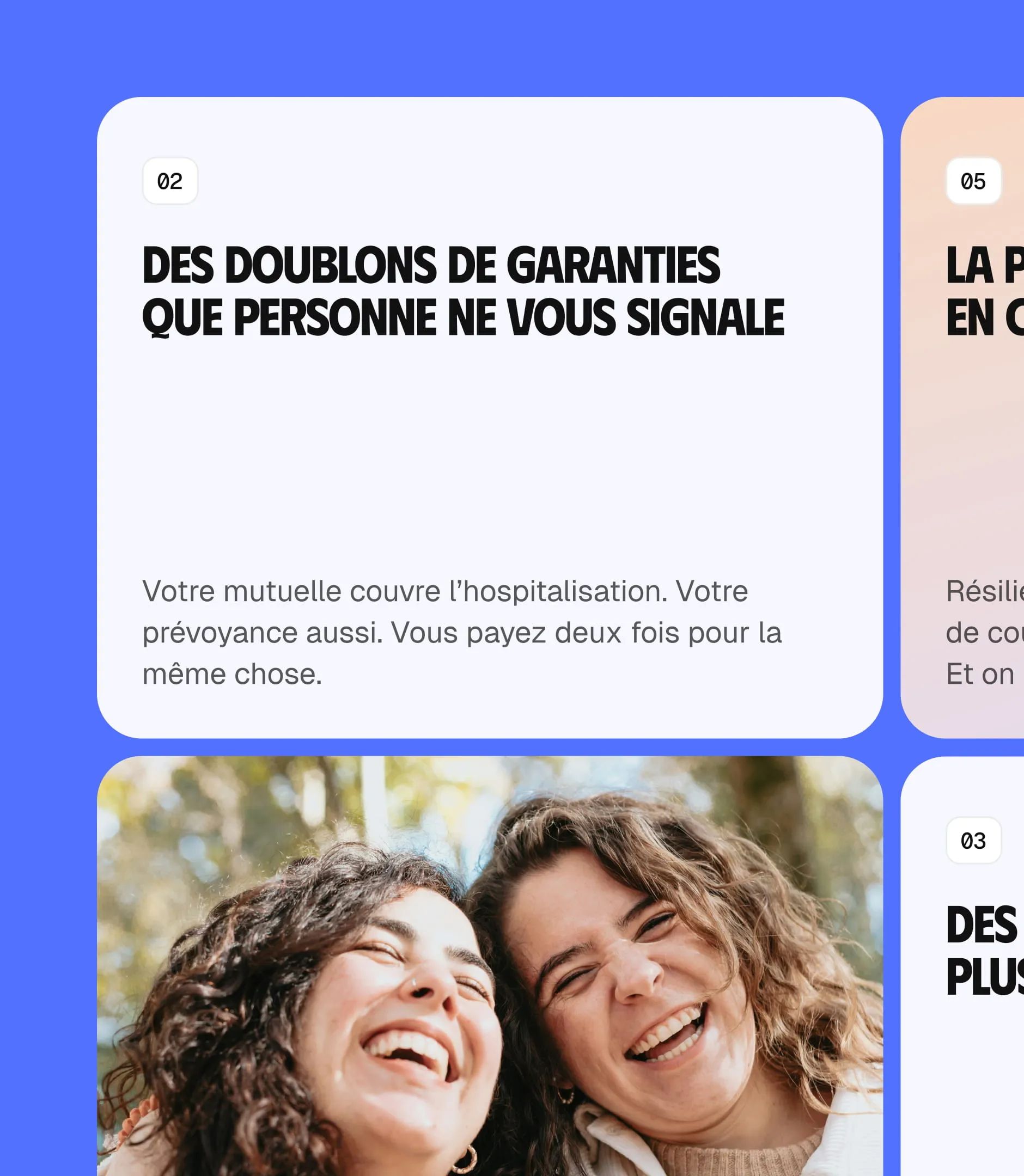
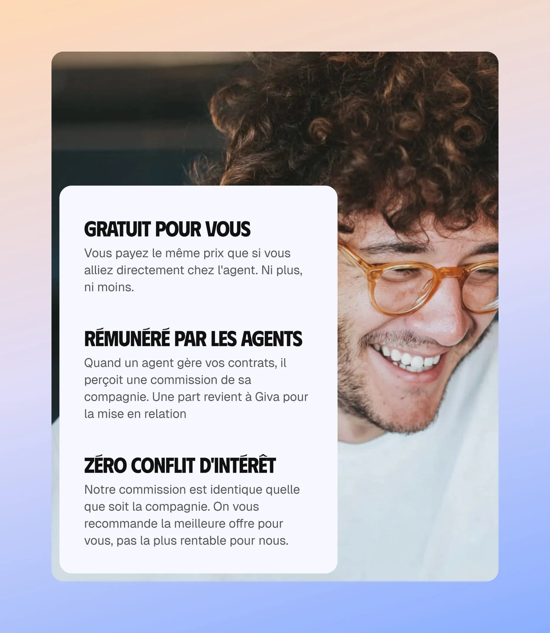
High-Performance Webflow Build for a Lead-Gen Platform
The Webflow build for Giva put the platform’s advanced features to work to faithfully recreate the designs while keeping performance sharp. The site was built with a reusable component architecture, making content updates fast and easy, no technical help needed.
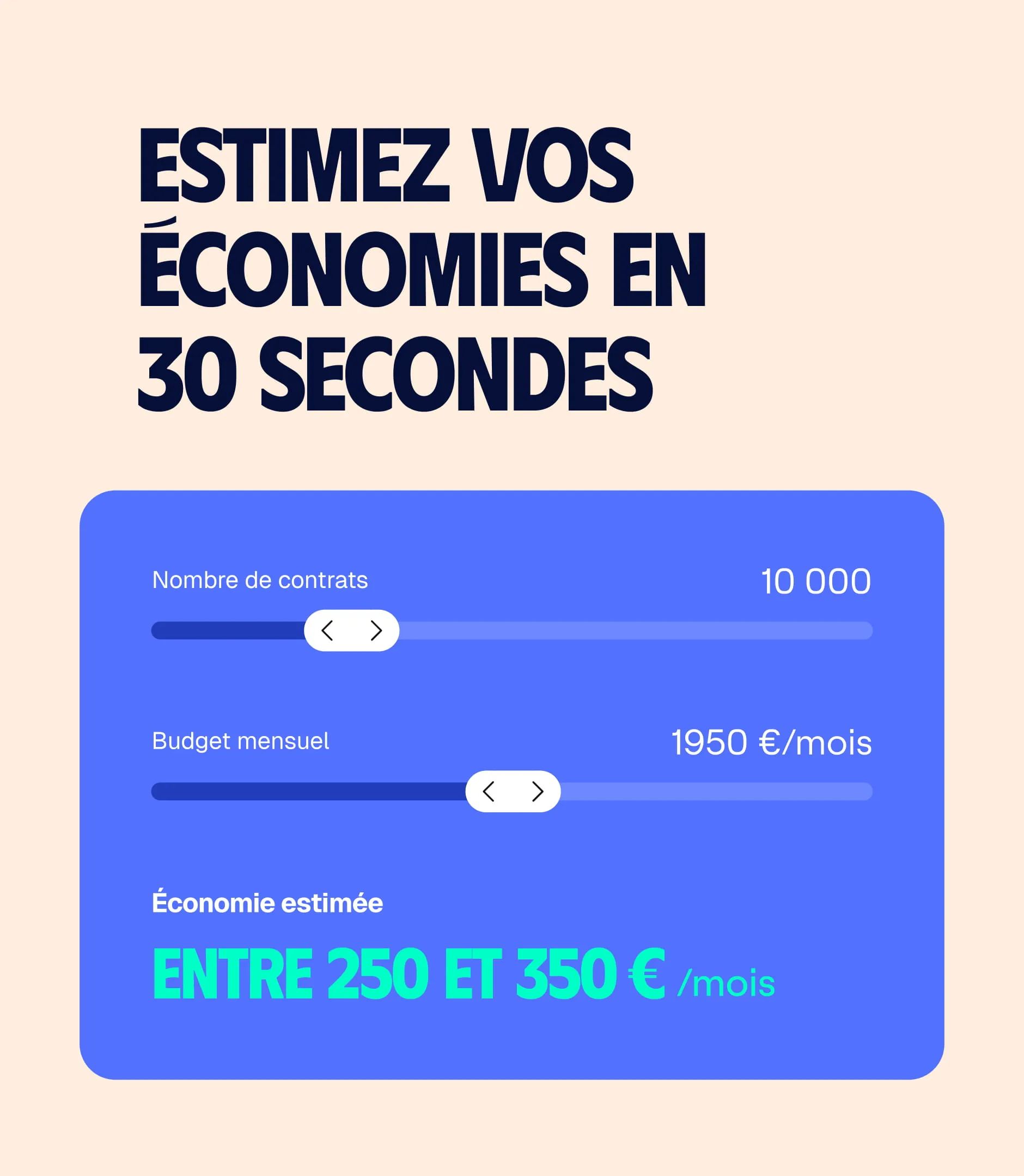
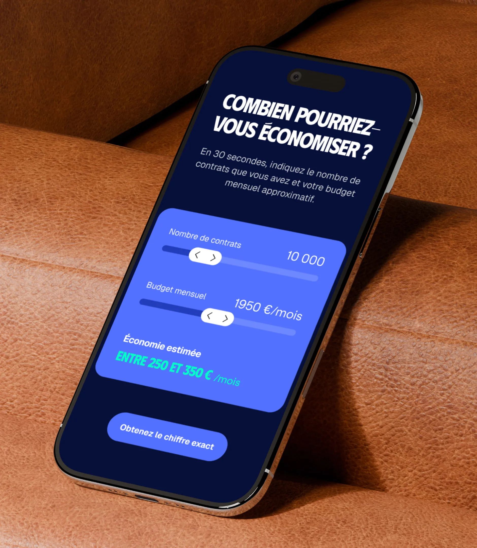
Special care went into integrating the estimate form, the savings calculator at the heart of Giva’s conversion funnel. Webflow animations and interactions were tuned to add smoothness without slowing load times, a critical factor for SEO and bounce rate.
The Webflow training delivered at launch gives the Giva team full ownership of new agent listings, customer testimonials, and blog updates, key pieces of a long-term SEO content strategy.
SEO to Win in a Hyper-Competitive Insurance Market
The insurance market is one of the toughest SEO battlegrounds in French search, with players like Meilleurtaux, LeLynx, and Assurland dominating page one for years. Gemeos took a niche SEO approach: target queries around insurance bundling and the role of the general agent, high-intent positions with lower relative competition.
The technical audit covered every blocking issue: URL structure, SEO markup, structured data (FAQ schema, LocalBusiness), and Core Web Vitals. The content strategy built on the copy already developed by Giva, rich in semantic depth, to optimize every page around keywords with strong conversion potential.
Alex (SEO at Gemeos) delivered a clear internal linking plan and an SEO editorial calendar centered on user questions ("how to bundle your insurance," "difference between broker and general agent"), queries aligned with Giva’s educational positioning.


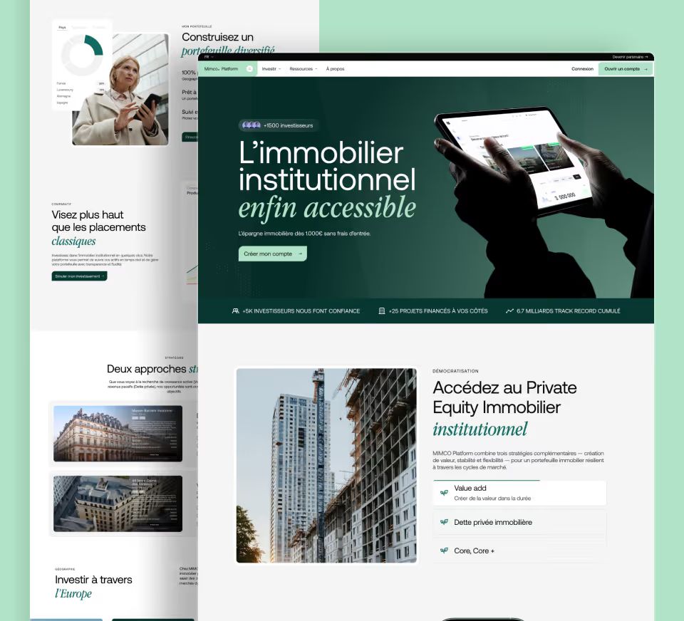
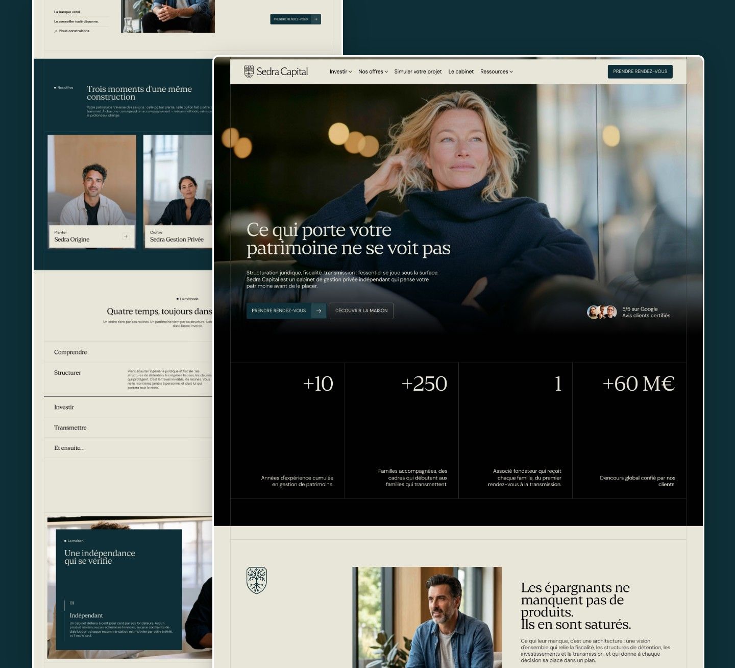
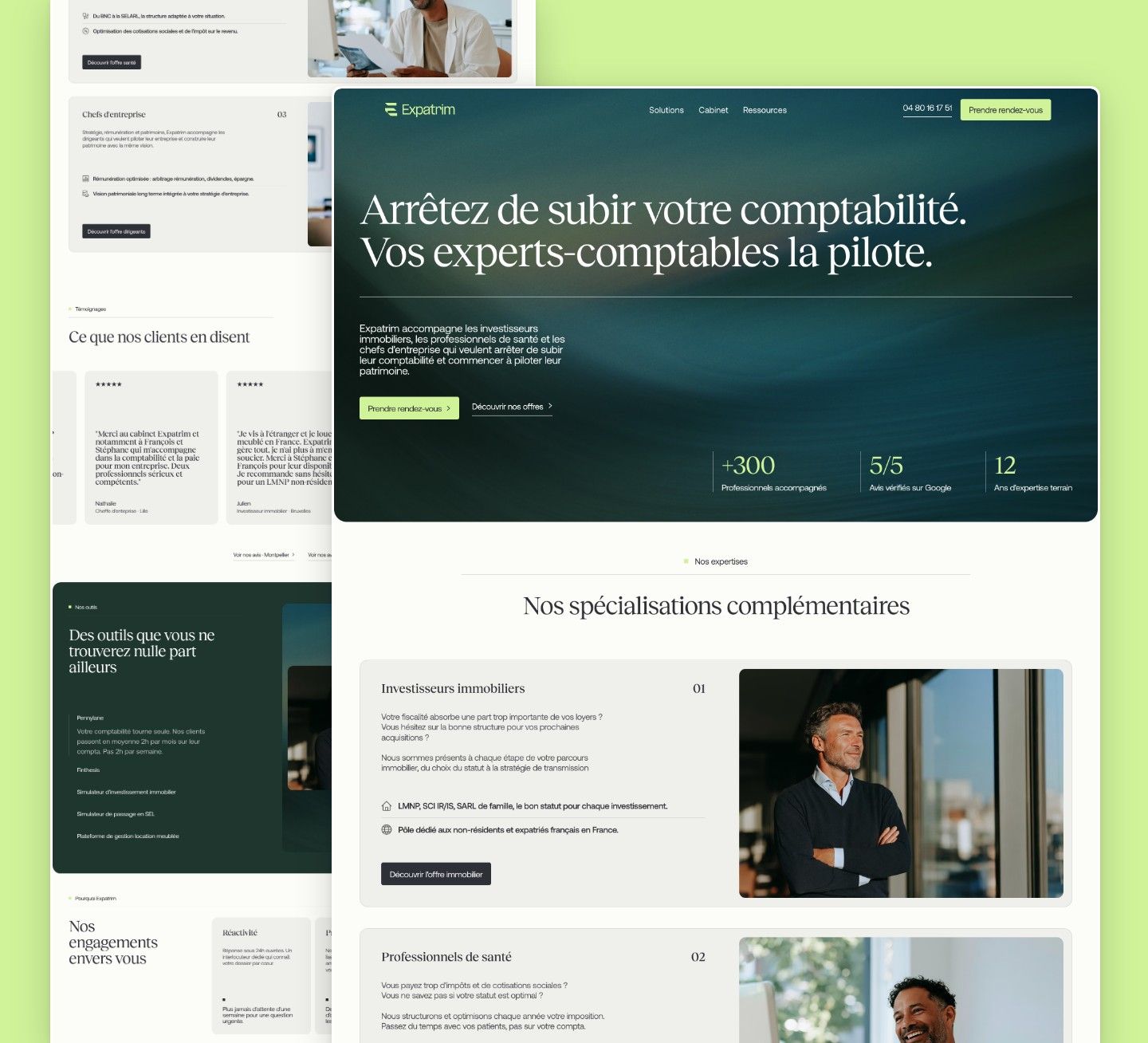
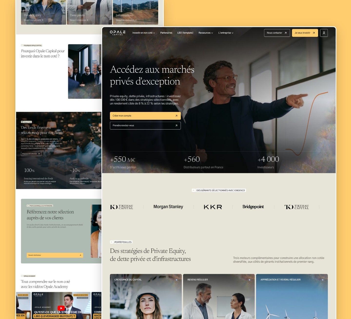
Our latest projects
+250 companies
supported
Websites designed and developed with









You're going to working with us, guaranteed
Ready to launch
your business?
Let’s f*****G GO !!