Projects
 Our Offers
 Dedicated team
 Blog
 Academy
 About Us
Design7 min read
Which Font Should You Choose for Your Brand?
To choose a font, start with your brand's personality, then check its readability across your actual materials and its usage terms. A serif can set an editorial or institutional tone, while a sans-serif can feel more direct and contemporary. These are not hard rules, though. On a website, the quality of the design, the size, the contrast, the spacing, and the performance matter just as much as the typeface family.
Why Choosing a Font Is Never a Minor Detail
Typography organizes reading before the content is even understood. It creates a hierarchy between headlines, subheadings, buttons, captions, and paragraphs. It also shapes a page's visual density and the overall perception of an identity.
A brand can therefore have a great logo and still lose consistency if its materials use different fonts with no clear rule. Conversely, a well-defined typographic system makes life easier for marketing and product teams. It becomes part of the work a branding agency handles, just like colors, iconography, or the grid.
What Typography Communicates Before the Message Itself
Serifs, letter width, contrast, curves, and spacing all create a visual impression. A high-contrast serif can feel editorial or sophisticated. A geometric sans-serif can convey a sense of rigor. A more irregular grotesque can bring more character.
These associations shouldn't be turned into universal rules. A font doesn't automatically mean "luxury," "tech," or "trust." Its effect depends on the logo, the colors, the images, the layout, and the cultural context.
The Common Mistake: Choosing a Font You "Like"
A font that looks appealing on a mood board can become tiring in an 800-word paragraph or too plain in a website hero section. The right question isn't "do I like this font?" but "does it properly fulfill its role in our brand system?"
At Gemeos, typography choices are part of the brand's artistic direction: we judge a font in interfaces, headlines, CTAs, presentations, and real content — not just on an isolated alphabet sample.
The Criteria for Choosing a Brand Typeface
A rigorous selection combines four dimensions: personality, readability, consistency, and technical constraints. If a font falls short on any one of them, its aesthetic appeal isn't enough.
The Brand Personality to Express
Start with three to five genuinely distinctive attributes. "Modern" or "professional" are too generic. "Technical yet approachable," "premium without luxury clichés," or "institutional yet warm" give the search much more direction.
Then compare several typeface families using the same content. Use the brand name, an H1, a paragraph, a button, and a few numbers. This comparison keeps you from choosing a font simply because its sales demo looks appealing.
Readability Across Every Medium
A font intended for body text needs to stay comfortable at small sizes. Pay particular attention to x-height, the openness of the letterforms, how well similar characters are distinguished, and the quality of the intermediate weights.
On the web, the font is only one part of readability. The WCAG guidelines set a minimum contrast of 4.5:1 for body text and require content to stay usable when a user increases certain spacing settings. A very thin or highly decorative typeface can therefore work well in a headline while being unsuitable for body copy.
Consistency with the Logo and Visual Identity
The editorial font doesn't need to match the logo's typeface. What matters most is that it creates a coherent dialogue with it. A highly expressive logotype can benefit from being paired with a calmer content typeface. Conversely, a minimalist symbol leaves more room for a distinctive editorial typeface.
If your visual system still needs to be structured, a visual identity design project can define typefaces, palette, iconography, components, and usage rules all together.
Licenses, Languages, and Available Variants
Before settling on a font, check its usage rights for the web, sales documents, social media, and the applications involved. Also check for language-specific accents, numerals, currency symbols, and the characters needed for your international markets.
Finally, check the available weights and italics. A family limited to Regular and Bold may be enough for a very simple identity, but can become restrictive for a rich interface or a SaaS product.
The Major Font Families and Their Personality
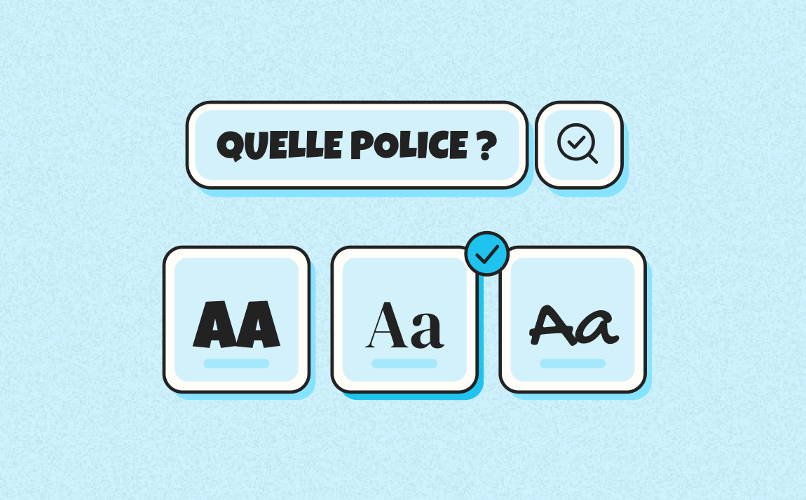
Adobe notably distinguishes between serif, sans-serif, script, and monospace fonts. These categories are useful for guiding a search, but they don't replace evaluating the precise design of each family.
Serif: An Editorial, Expressive Structure
Serif fonts have small strokes at the ends of their letters. They span very different styles, from understated editorial text to high-contrast display characters. They can work well for a brand seeking an editorial, heritage, or premium presence, but nothing stops them from being used in tech.
Sans-Serif: Versatility and Clarity
Sans-serif fonts have no strokes at the letter ends. Their diversity is huge: humanist, geometric, grotesque, or neo-grotesque. They're very common in interfaces because they can offer clean reading and an extensive weight system. Their popularity, however, creates a risk of everything looking the same.
Script and Handwritten Fonts: Use with Precision
Script fonts imitate handwriting or calligraphy to varying degrees. They can bring a strong signature feel, but quickly become hard to read in long sentences. Generally reserve them for short headlines, signatures, or specific brand elements.
Monospace and Display: Full of Character, but a Targeted Role
In a monospace font, every character occupies the same width. This mechanic often evokes code, terminals, or certain technical worlds. Display fonts are designed to grab attention at large sizes. These families work better as an accent than as an all-purpose font when their design is highly distinctive.
| Family | Perceived Personality | Recommended Use | Example Context |
|---|---|---|---|
| Serif | Editorial, institutional, or expressive depending on the design | Headlines, editorial content, body text if the family is readable | Consulting, media, premium brands, or differentiated tech |
| Sans-serif | Direct, contemporary, or neutral depending on the design | Interfaces, body text, versatile brand systems | SaaS, B2B services, digital products |
| Script | Personal, expressive, artisanal | Short accents, signatures, campaigns | Creative brands or founder signatures |
| Monospace / display | Technical, distinctive, or attention-grabbing | Headlines, labels, brand accents | Tech, data, events, experimental worlds |
Web Fonts vs. Print Fonts: Should You Choose Differently?
The same family can work both on screen and on paper, but the constraints aren't identical. On screen, the typography has to hold up across different sizes, pixel densities, viewport widths, and user settings. In print, control over the medium, size, and layout is more stable.
What Changes on Screen
Test the font on an actual phone, not just in a desktop mockup. Check paragraphs, menus, forms, and buttons. A font that works well at 48px in a headline can lose a lot of clarity at 16px.
On the web, file size matters too. Loading many weights and italics increases the typographic resources you're loading. A variable font can combine several axes into a single system, but whether it's worth it should be evaluated project by project.
What Print Allows
Print allows finer control over composition and can accommodate subtle details that lose their effectiveness on screen. This doesn't mean a serif is "made for paper" and a sans-serif is "made for the web." Tahoma, for example, was designed with strong attention to readability at small sizes on screen.
How Many Fonts Should You Use in a Brand Identity?
There's no universal number. For many brands, a single family with a rich range of weights can cover headlines, body text, and interface. A second family can be added when it serves a clear function: editorial contrast, a campaign accent, or a distinction between product and communications.
Adding more fonts increases the trade-offs, the licensing, and the risk of inconsistency. The right system is the one your teams can actually apply without reinterpreting the rules for every new medium.
The Gemeos Method for Choosing Your Font in 5 Steps
The choice becomes more reliable when it's treated as a system test rather than an aesthetic selection.
Step 1: Define the Personality Before Opening a Font Library
Formalize your brand attributes, audiences, the expected level of maturity, and the market conventions you want to embrace or break. This step quickly narrows down the number of relevant directions.
Step 2: Test Readability on Real Content
Create a board with a long headline, a paragraph, a list, a button, a price, a date, and a form. Test it on mobile and desktop. For a strongly print-oriented brand, add an A4 page and a sales document.
Step 3: Build a Simple Hierarchy
Assign a precise role to each family and each weight. For example: Medium for headlines, Regular for body text, Semibold for buttons. If two fonts serve exactly the same function, one of them is probably unnecessary.
Step 4: Check the Technical Deployment
Check the license, the available web formats, the characters, the languages, and the file size. If the brand operates internationally, test the alphabets and diacritics you'll actually need before final approval.
Step 5: Validate the Typography Within the Artistic Direction
Place the font in the materials that matter for the business: homepage, landing page, sales deck, LinkedIn post, product interface, or brochure. An artistic direction design project can then document the rules and apply them everywhere without losing that initial consistency.
How Do You Decide Between Two Fonts That Both Work?
When two candidates both seem relevant, avoid voting based on personal taste. Build a scoring grid with five criteria: fit with the brand personality, readability, range of the family, ease of deployment, and distinctiveness within your market.
Then have both options tested using the same content and the same layout. This isolates the effect of the typography itself. For a website, add an accessibility and performance check. For an international brand, add language coverage. For a self-sufficient marketing team, also check availability in the tools they actually use.
Choosing a font ultimately comes down to building a usable system, not finding the most original character design. A good decision holds up moving from logo to website, from mobile to print, and from the design team to the marketing teams.
FAQ
What Is the Most Readable Font on Screen?
There's no single font that's universally the most readable. Readability depends on the design, the size, the contrast, the spacing, and the context of use. Families designed for screens, like Tahoma, show how important open letterforms and easily distinguishable characters really are.
Should a Website Use a Serif or Sans-Serif Font?
Both can work. A sans-serif isn't automatically more readable, and a serif isn't reserved for print. Choose based on the quality of the family, its readability at the sizes you'll use, how well it contrasts with the identity, and its loading performance.
How Many Fonts Should You Use for a Brand Identity?
A single complete family can be enough. Two families make sense when they have distinct roles, for example a headline font and a body text font. Beyond that, complexity rises quickly and needs to be justified by a richer brand system.
What Font Should You Choose for a Professional Logo?
A logo can use an existing font, a modified typographic base, or custom lettering. The choice depends on the personality you're going for and its ability to stay identifiable across different formats. For a complete project, a logo design agency also needs to plan the versions, spacing, and usage rules.
Are Google Fonts Enough for a Brand?
Yes, they can be enough if a family matches your positioning, covers your languages, and offers the variants you need. Their accessibility, however, doesn't guarantee a distinctive identity. Differentiation also comes from composition, hierarchy, colors, the logo, and the artistic direction.