Projects
 Our Offers
 Dedicated team
 Blog
 Academy
 About Us
E-investing: art direction, design and Webflow website for a financial education academy
e-Investing is a financial education academy founded by Nicolas Domnesques and Darius C. Shirazi, two HEC Paris alumni with a background in banking. It teaches individuals to build and manage their own savings: online training, one-to-one coaching, masterclasses and a private community, with a stated goal of making everyone independent rather than reliant on an adviser.
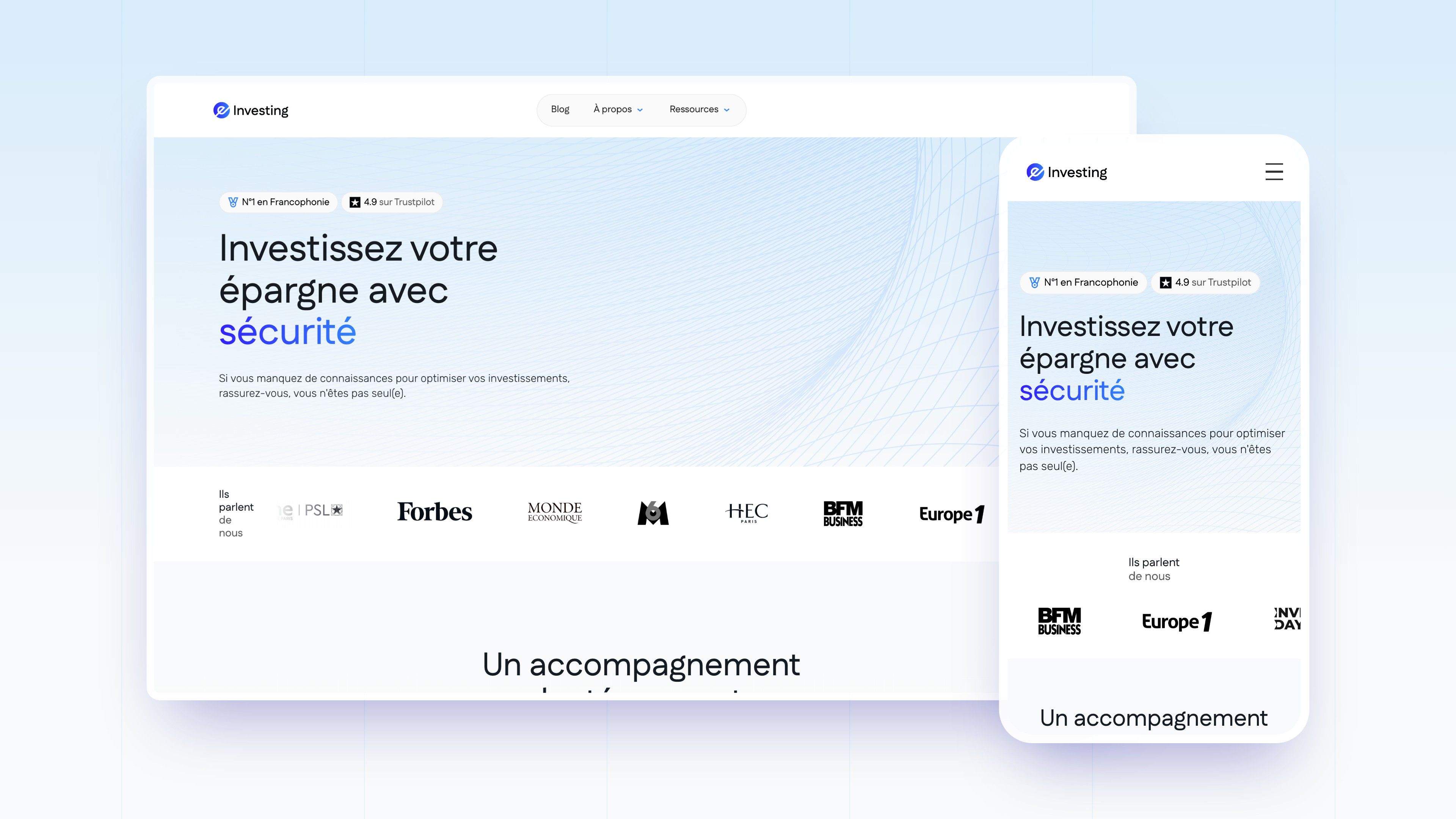
e-Investing entrusted Gemeos, a web agency for finance, with the new art direction of its brand, the design and Webflow development of its website, and its SEO.
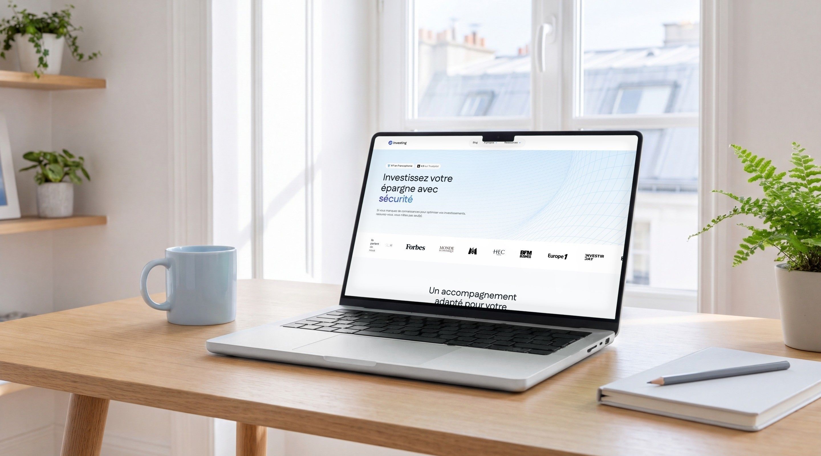
Making investing easy to understand, with no jargon and no promises
e-Investing grew out of videos posted on social media, then calls with followers: an audience that is often new to investing and wants to understand before committing. The old site, a blue banner and a long presentation page, said nothing about the Academy, the team or the wealth of free content produced since. On a subject where distrust is the norm, the brand had to build trust through clarity, not hype.
Gemeos explored several look & feel directions around the existing logo, set a UI kit (colours, typography, buttons, components), then designed and built the site on Webflow: home page, Academy, team, testimonials, partners, FAQ, appointment booking, and a resource library designed for SEO.
- Industry
- Finance
- Education
- Services
- Artistic Direction
- UX/UI Design
- Development
- SEO
Art Direction
An “e” in three arcs, and a single colour for investing
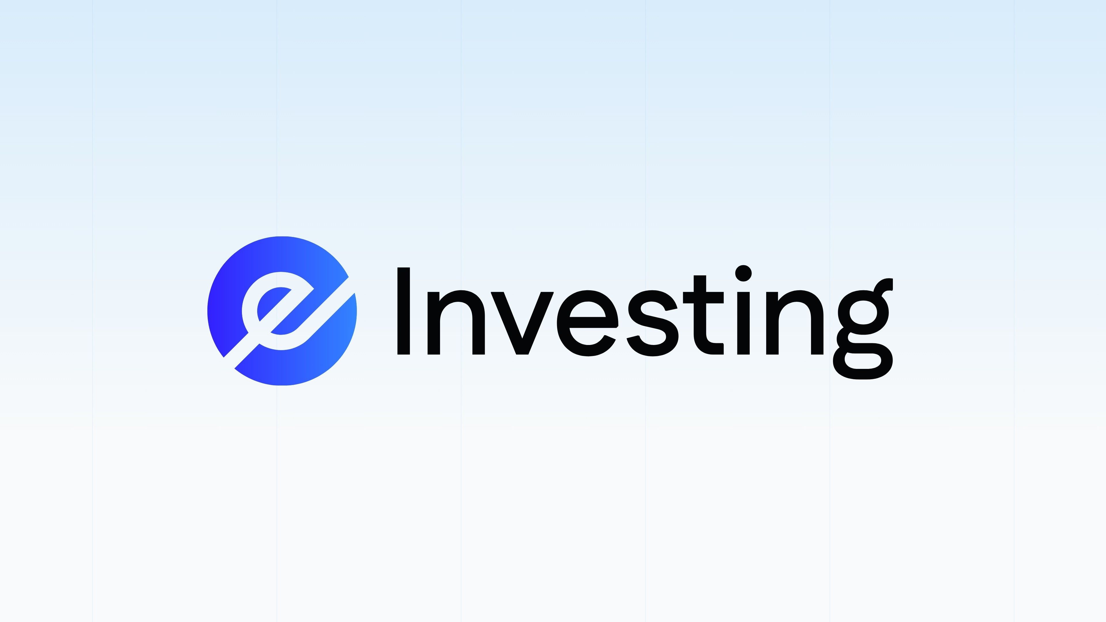
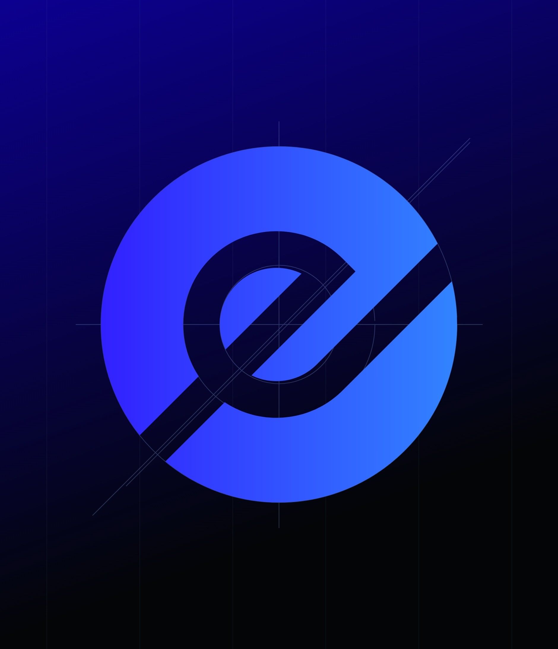
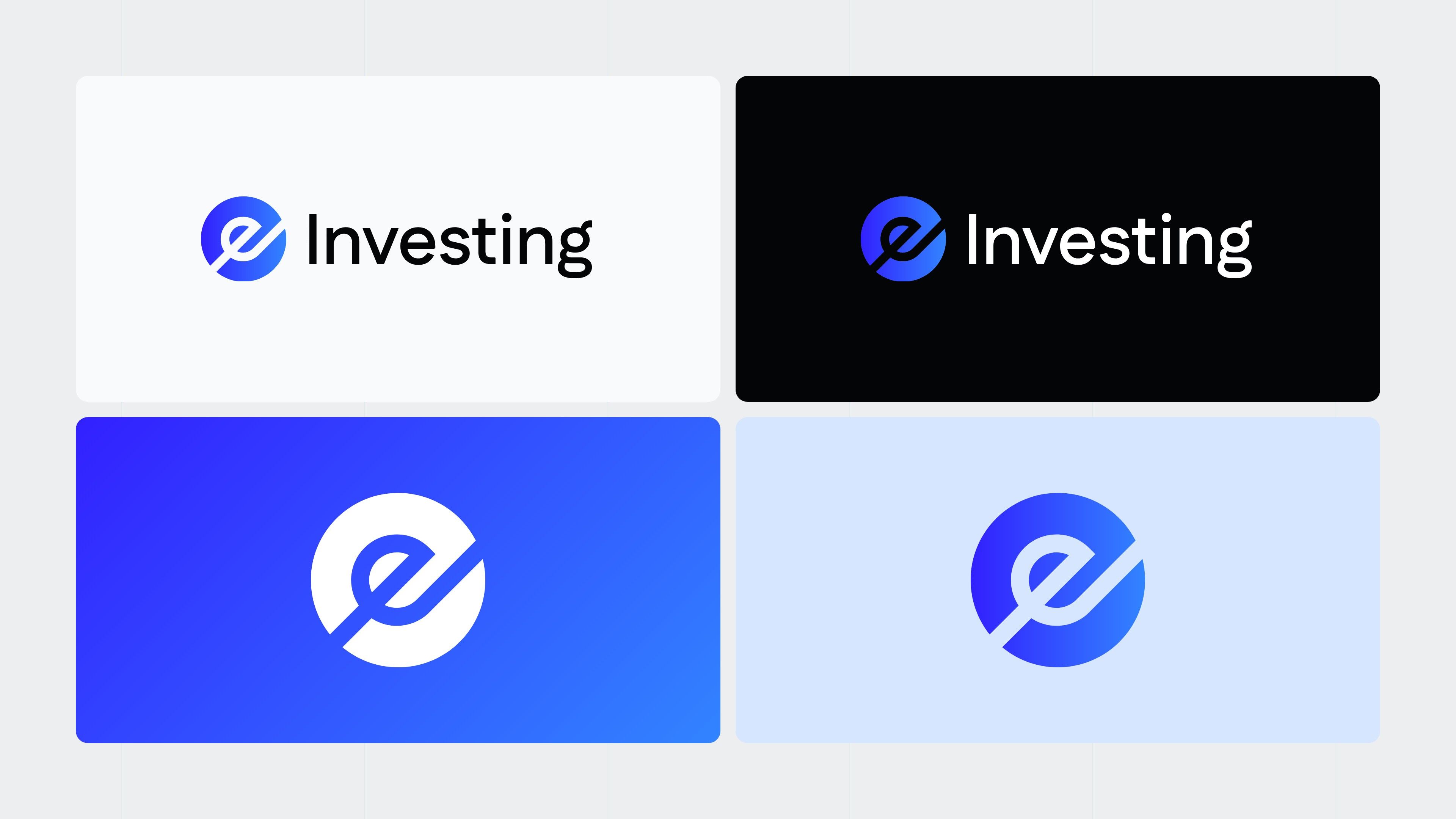
The logo already existed: an “e” drawn with three arcs of a circle, in a blue gradient, and the word Investing. The work focused on everything around it. Several versions of the home page were explored, from an all-caps manifesto to a night background by way of a softer sky blue, to compare the universes with the same content: colour, typography, the place given to the team and to proof.
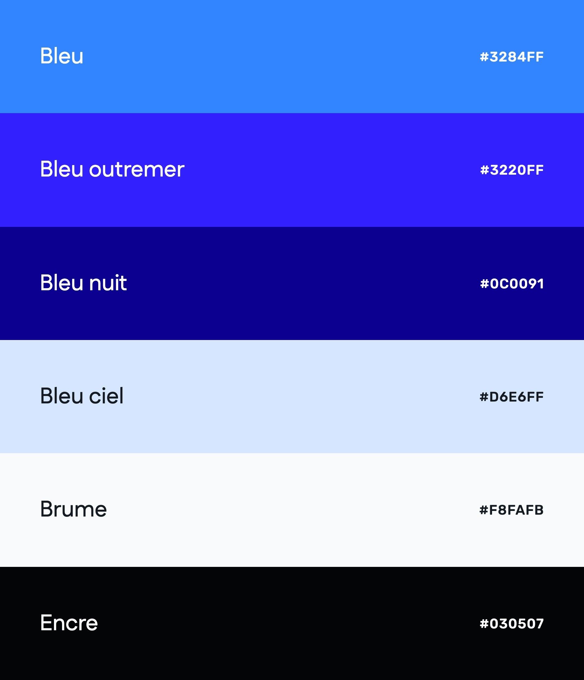
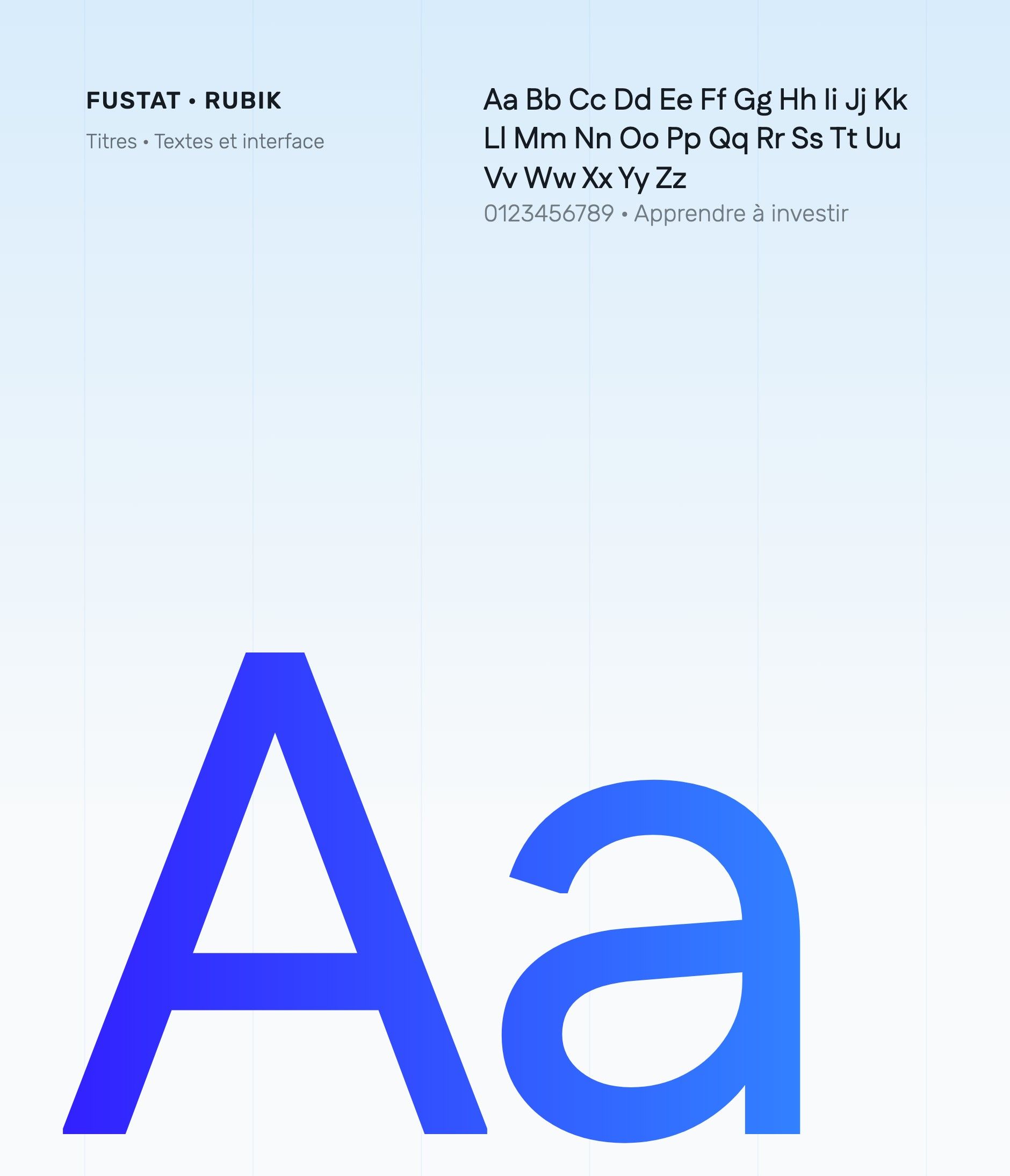
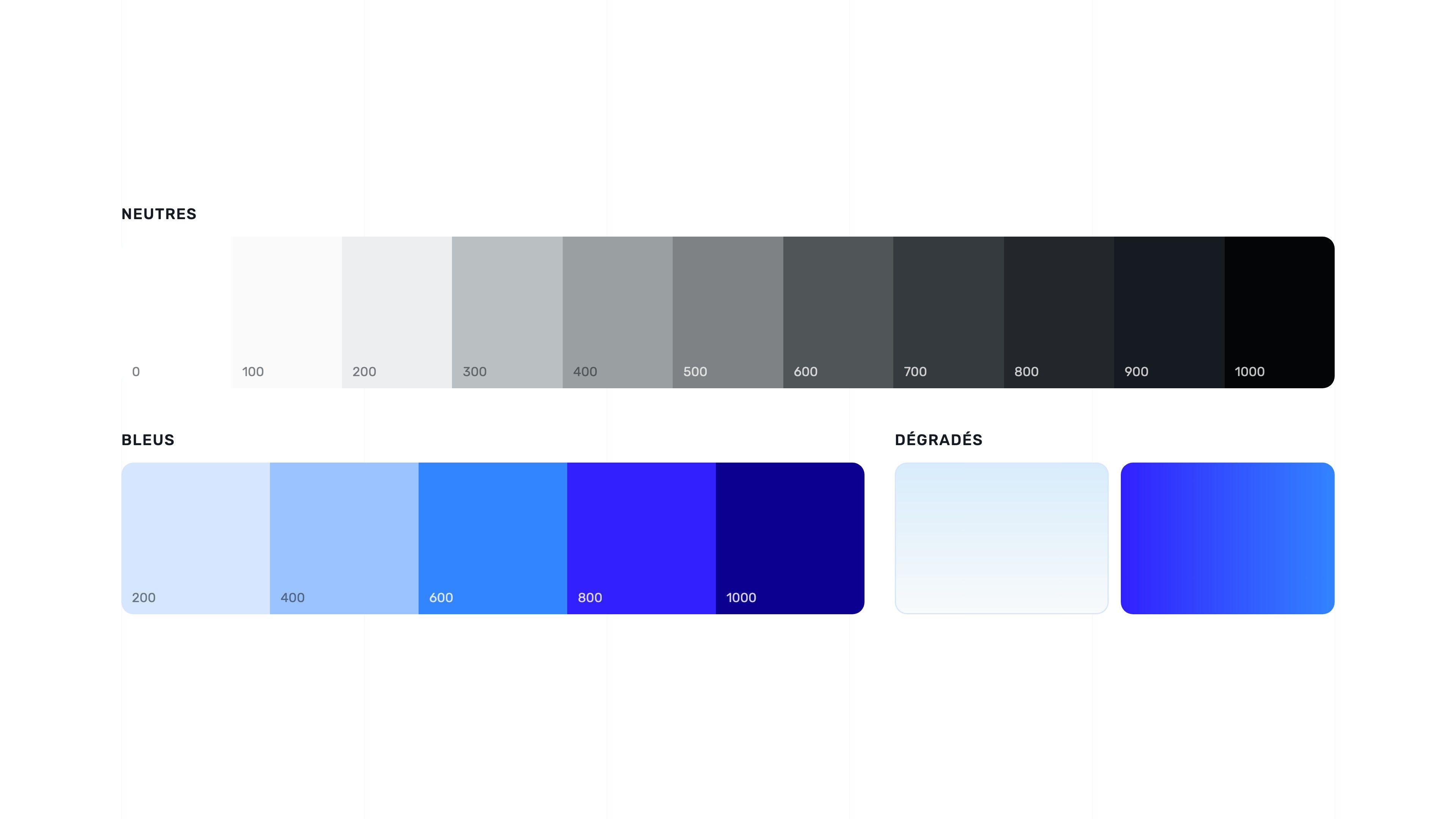
The chosen direction is bright and airy: a strong blue (#3284FF) extended in five shades down to a midnight blue (#0C0091), a gradient from ultramarine to blue for buttons and keywords, glacier blue gradient backgrounds and a pattern of fine wavy lines behind the headings. Headings are set in Fustat, body text in Rubik; the footer switches to ink (#030507) to carry the regulatory notices.
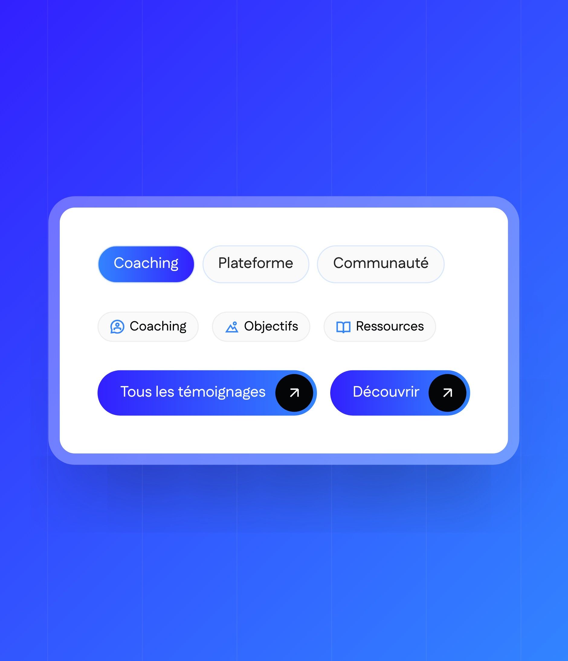
The UI kit sets it all out: eleven neutrals, five blues, two gradients, heading and text styles for desktop and mobile, icon buttons, labels and page components (header, footer, calls to action).
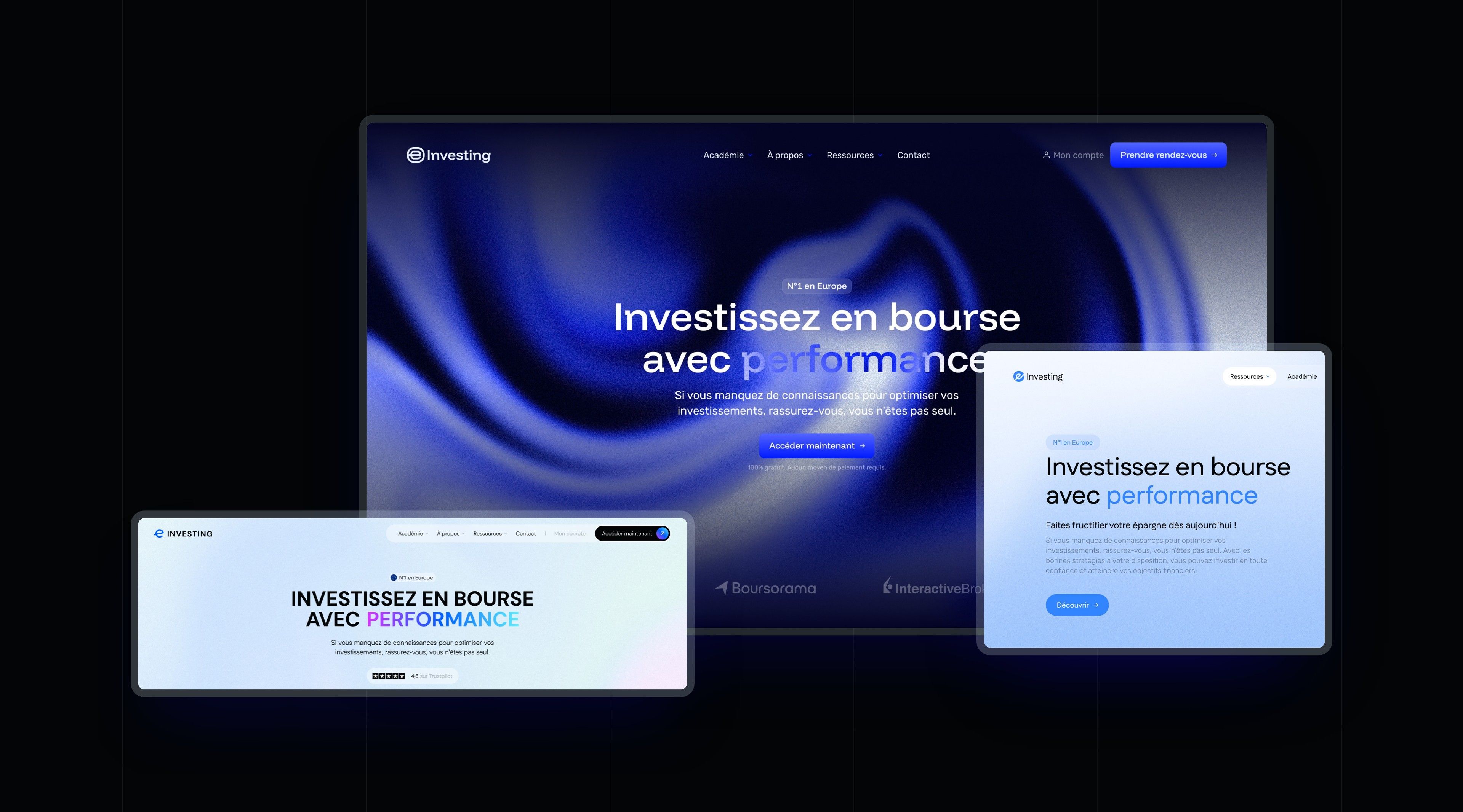
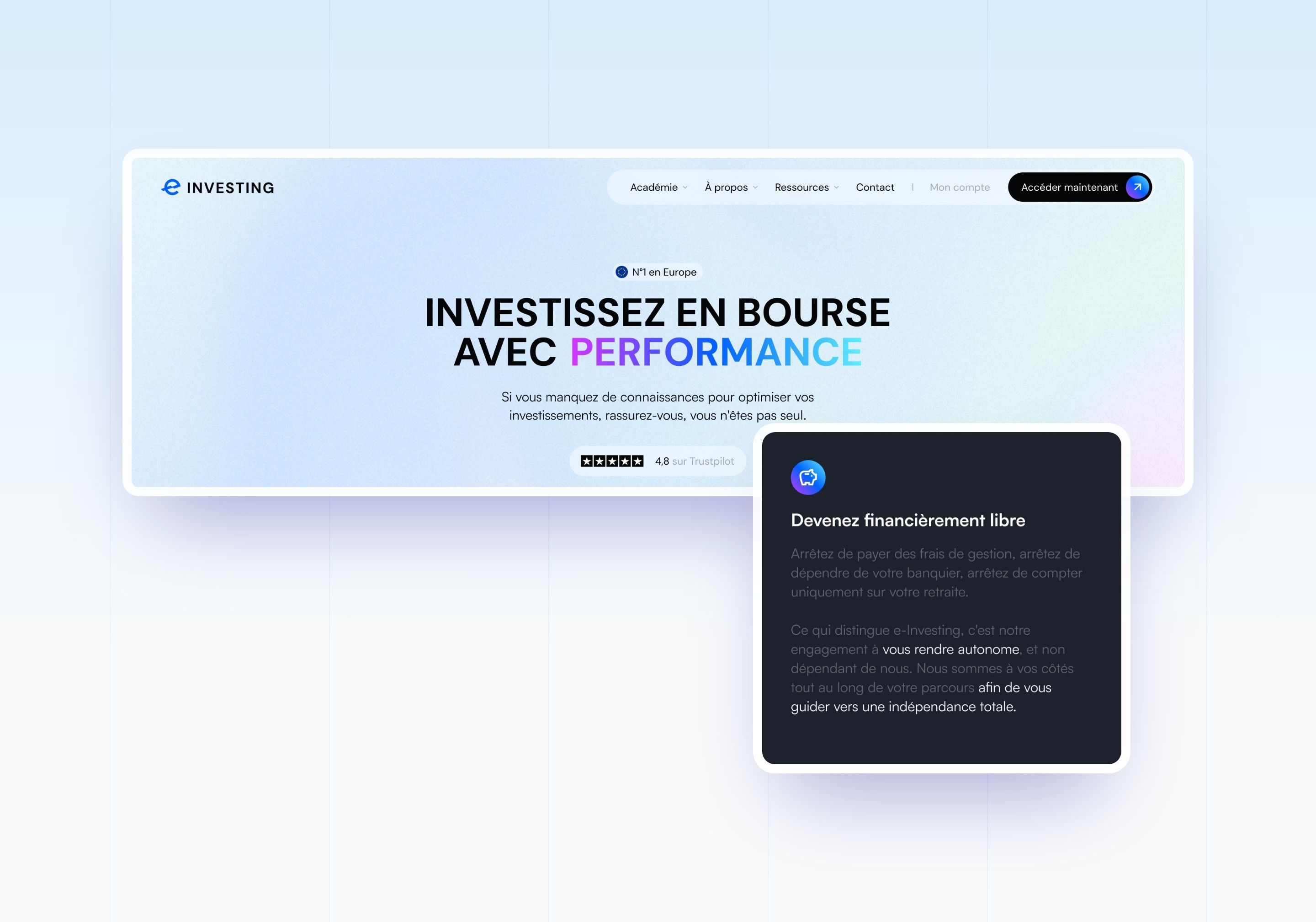
Direction 1 - The manifesto
A centred all-caps headline, with the word “performance” in a purple-to-blue gradient on a pastel background, then a dark section with smoked-glass cards. Intended perception: direct and energetic, in the tone of the brand's videos.
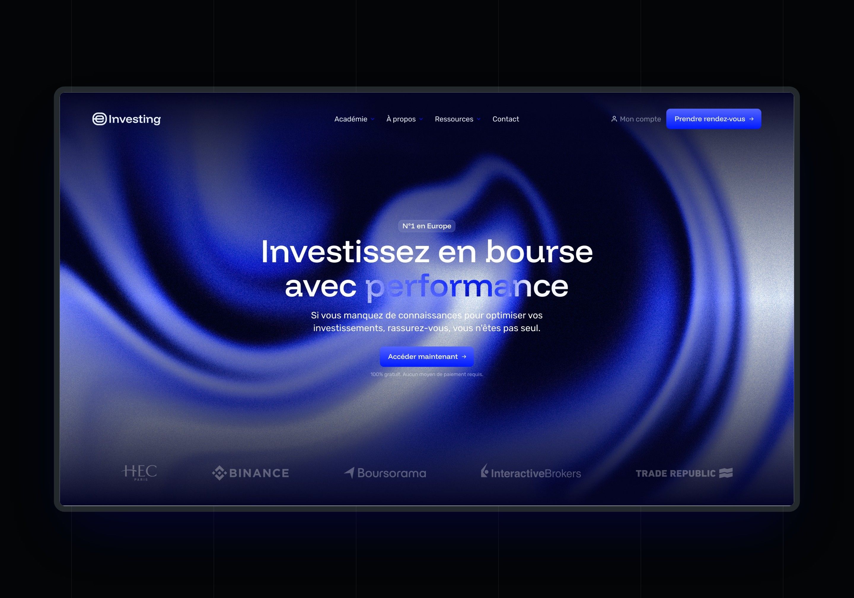
Direction 2 - The wave
A midnight blue background crossed by a wave of light, the headline centred in white and the partner bar in transparency. Intended perception: premium and nocturnal, closer to the world of financial markets.
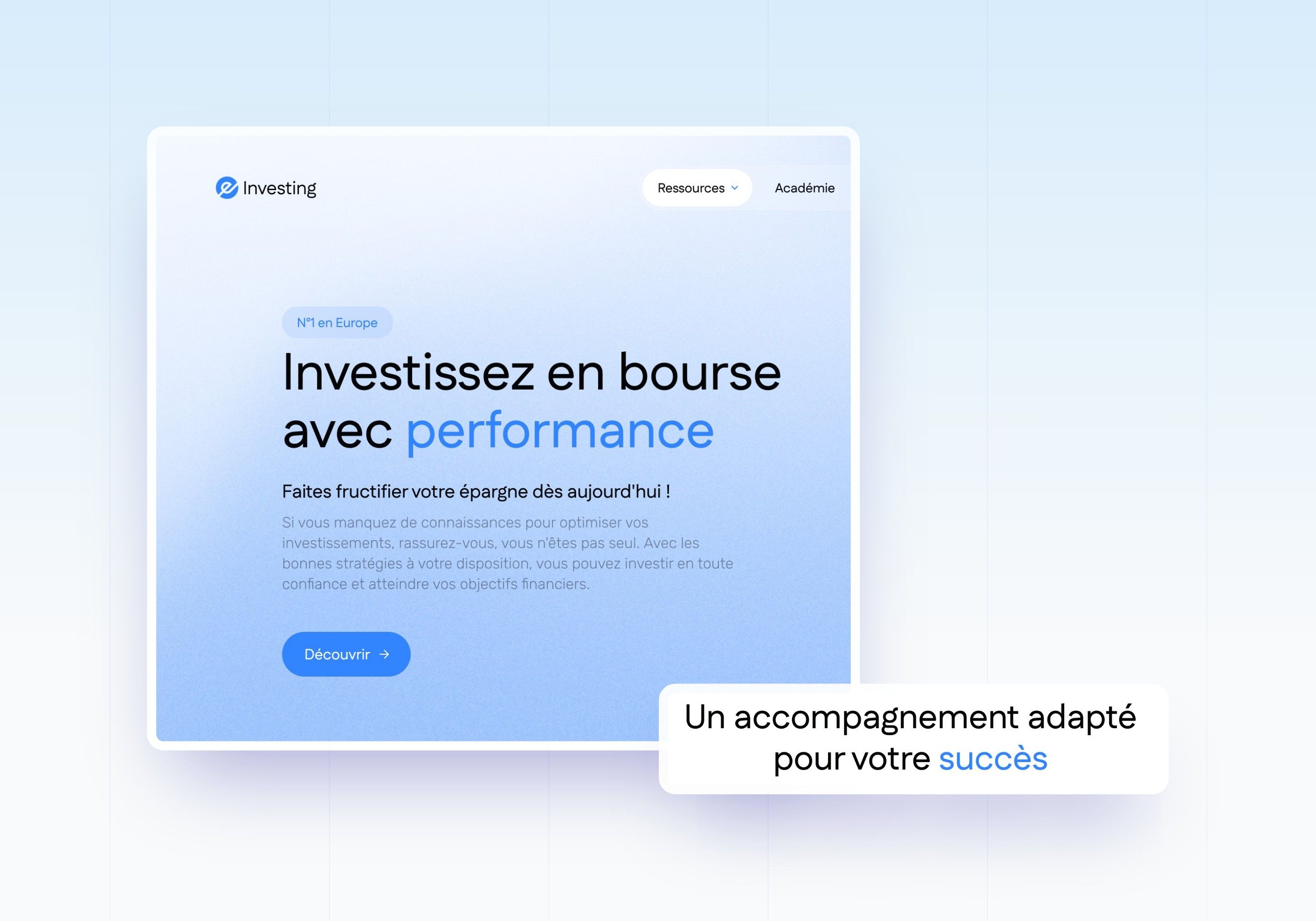
Direction 3 - The sky
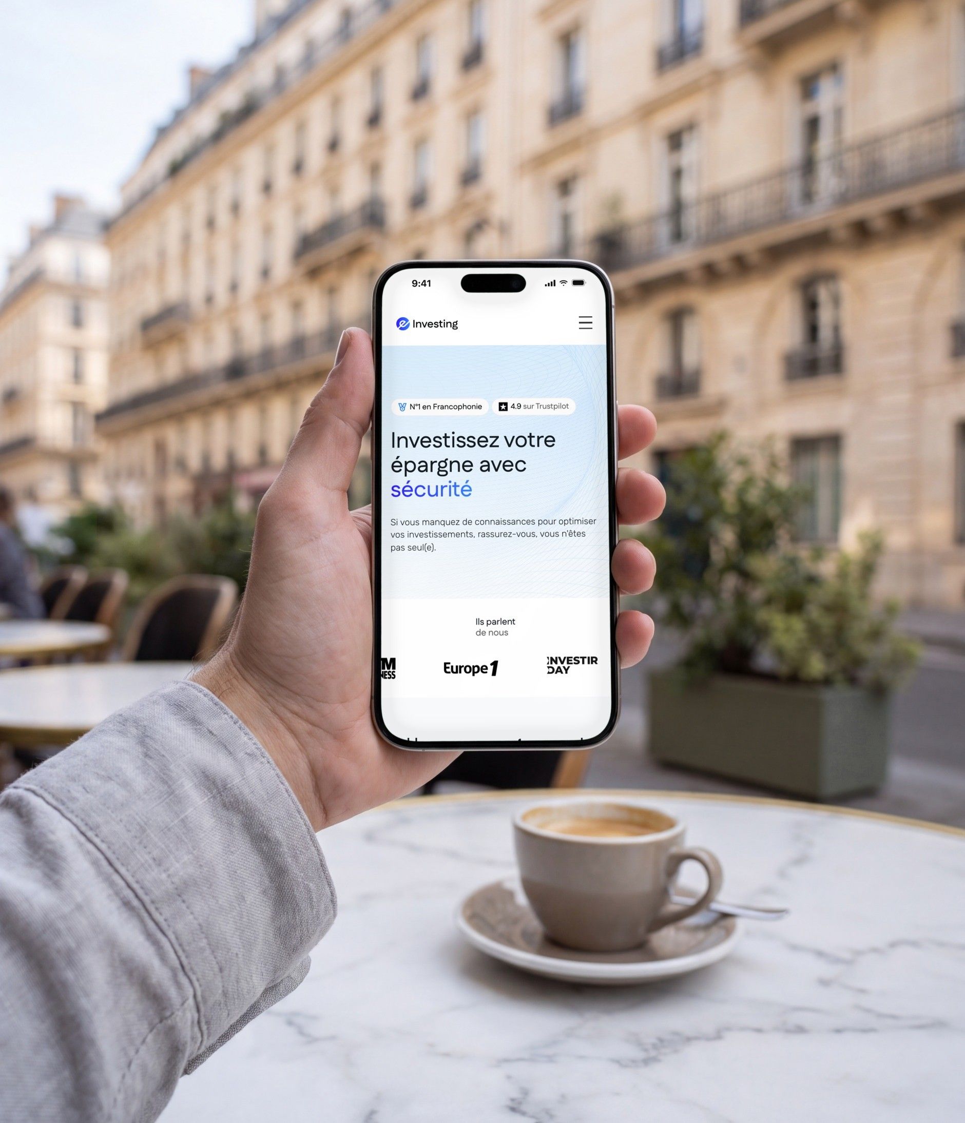
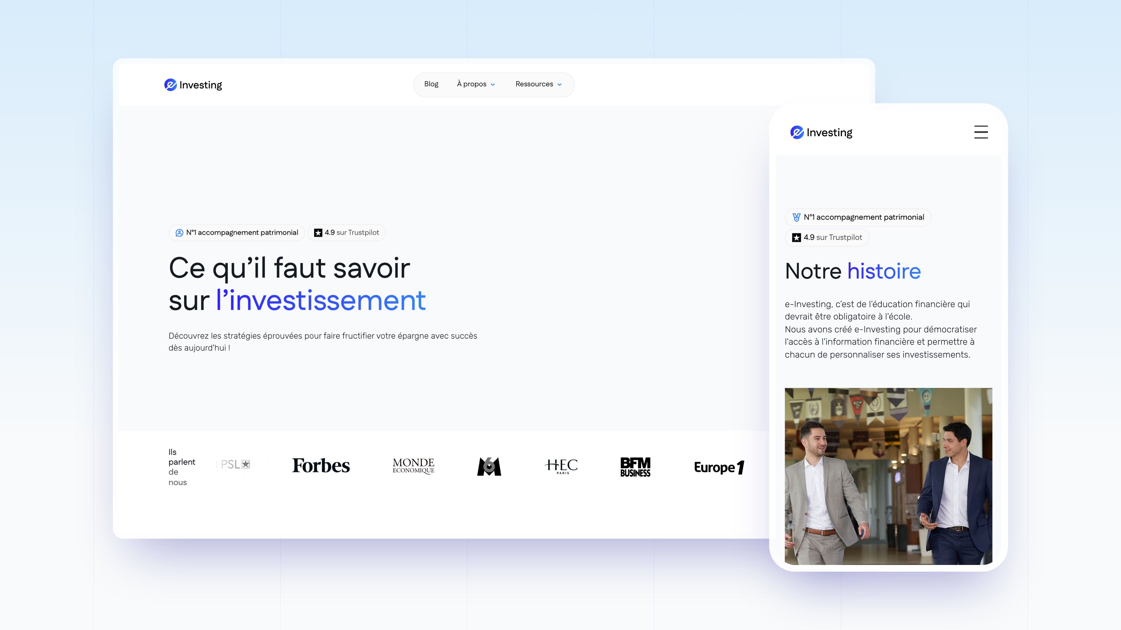
A sky blue gradient, the headline aligned left and the promise “Grow your savings” as a subheading. Intended perception: calm and reassuring. It is this bright path, later pushed towards the pattern of fine lines, that the live site follows.

Web Design
Showing the Academy, the team and the students before asking for anything
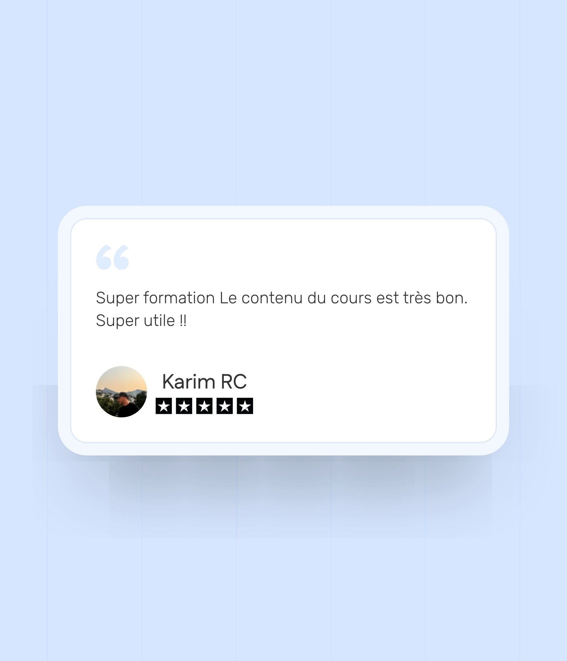
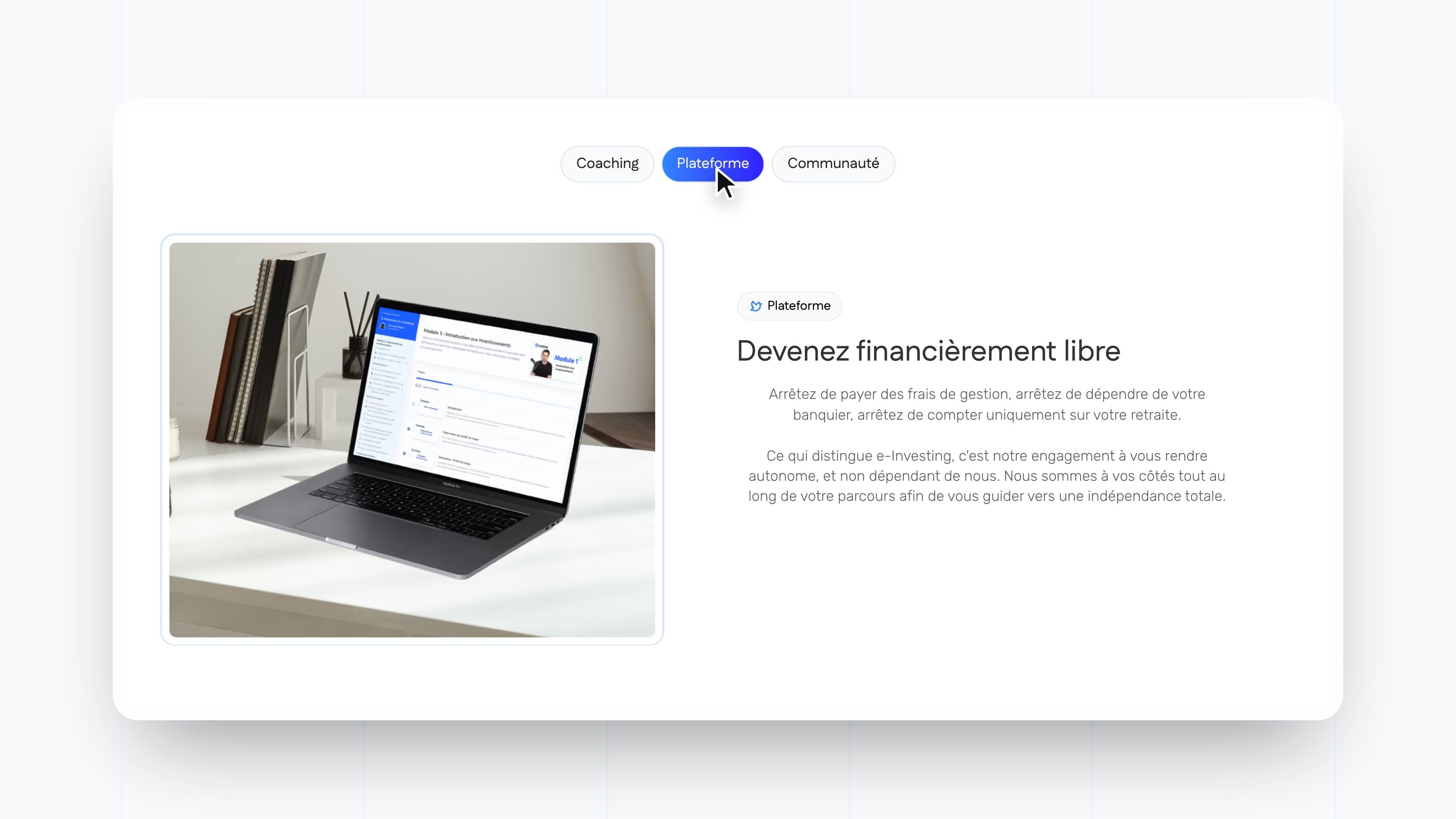
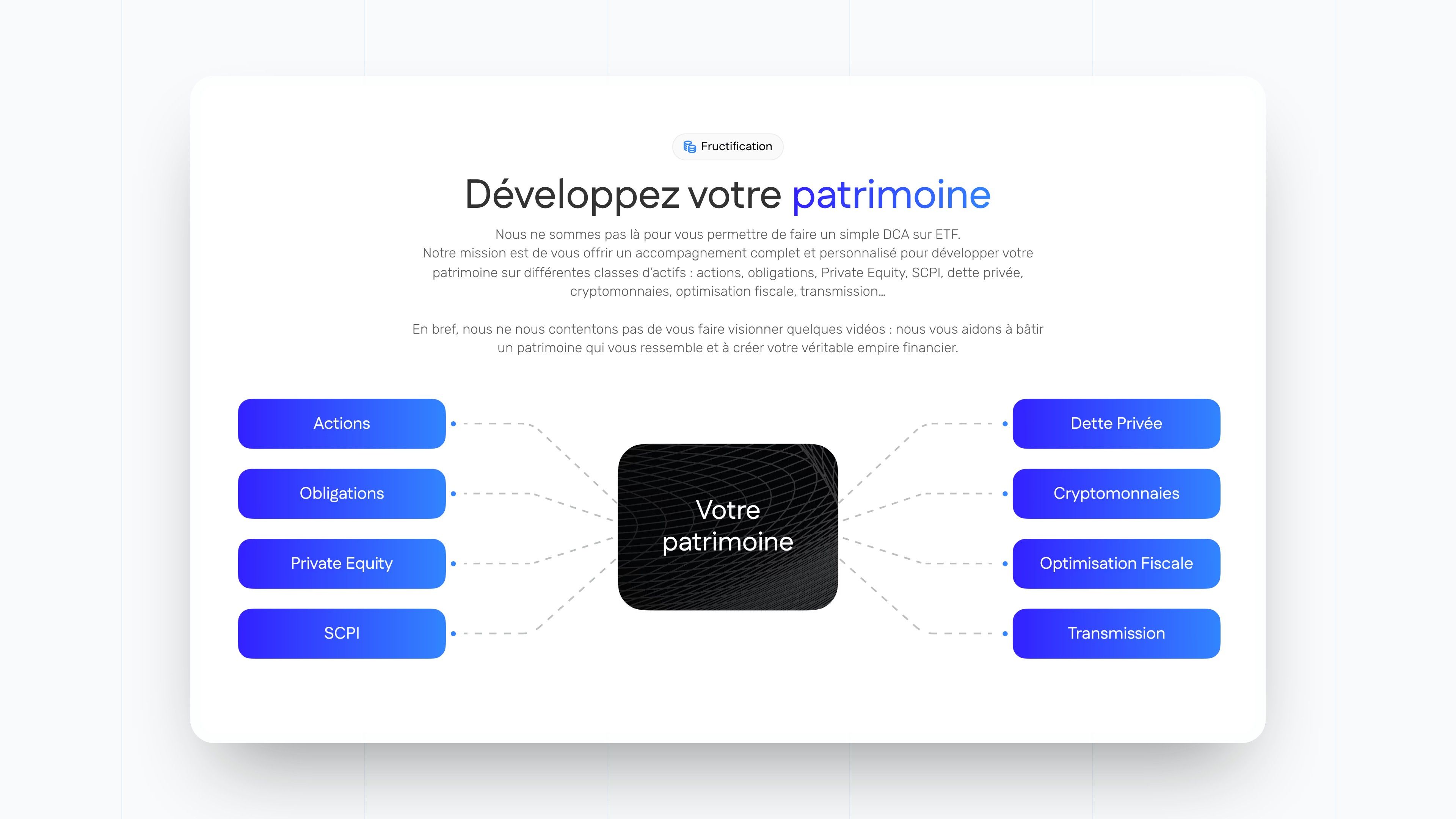
The typical visitor arrives from a video with a simple question: is this serious, and who is it for? The site answers in order. The home page presents the programme in three parts (coaching, platform, community), then video and written testimonials, the goals of the method and the free resources.
| Page | What it does for the visitor |
|---|---|
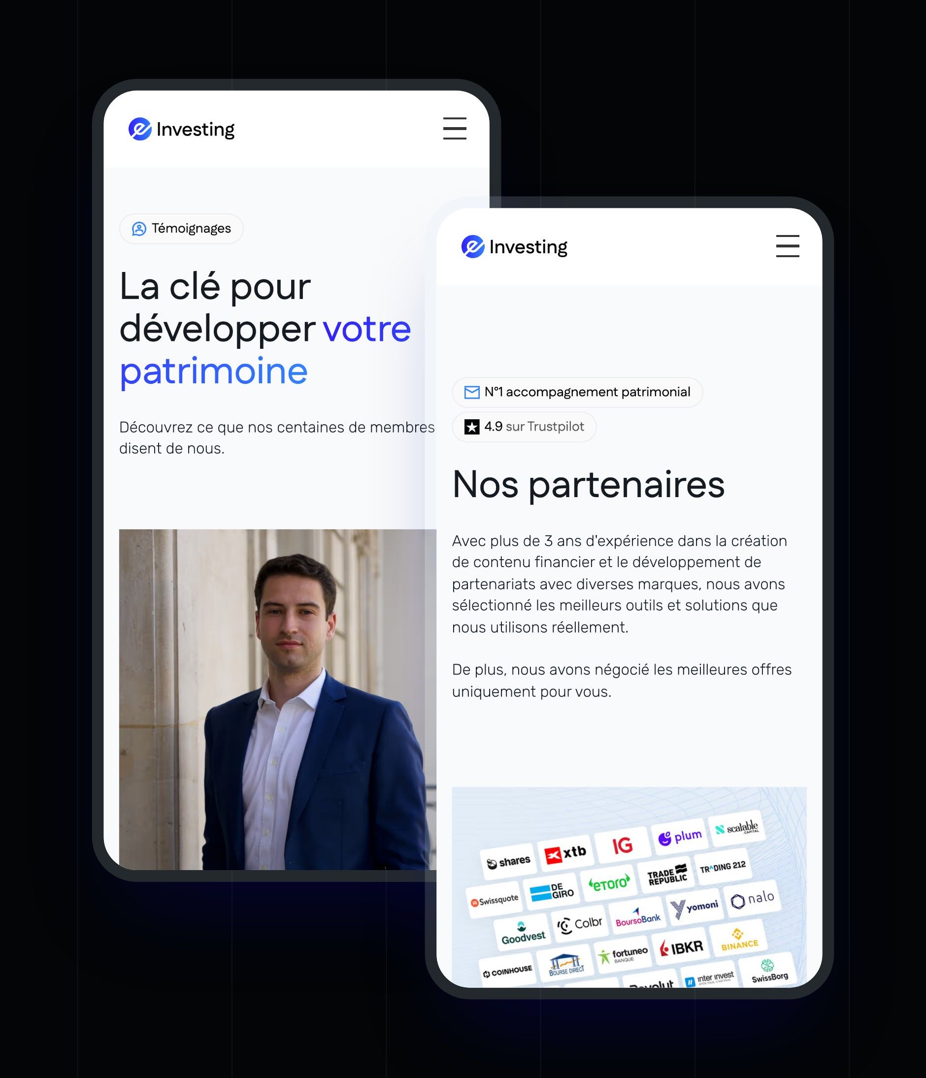
| Home | The promise, the three parts of the programme in tabs, testimonials, the goals of the method and access to resources |
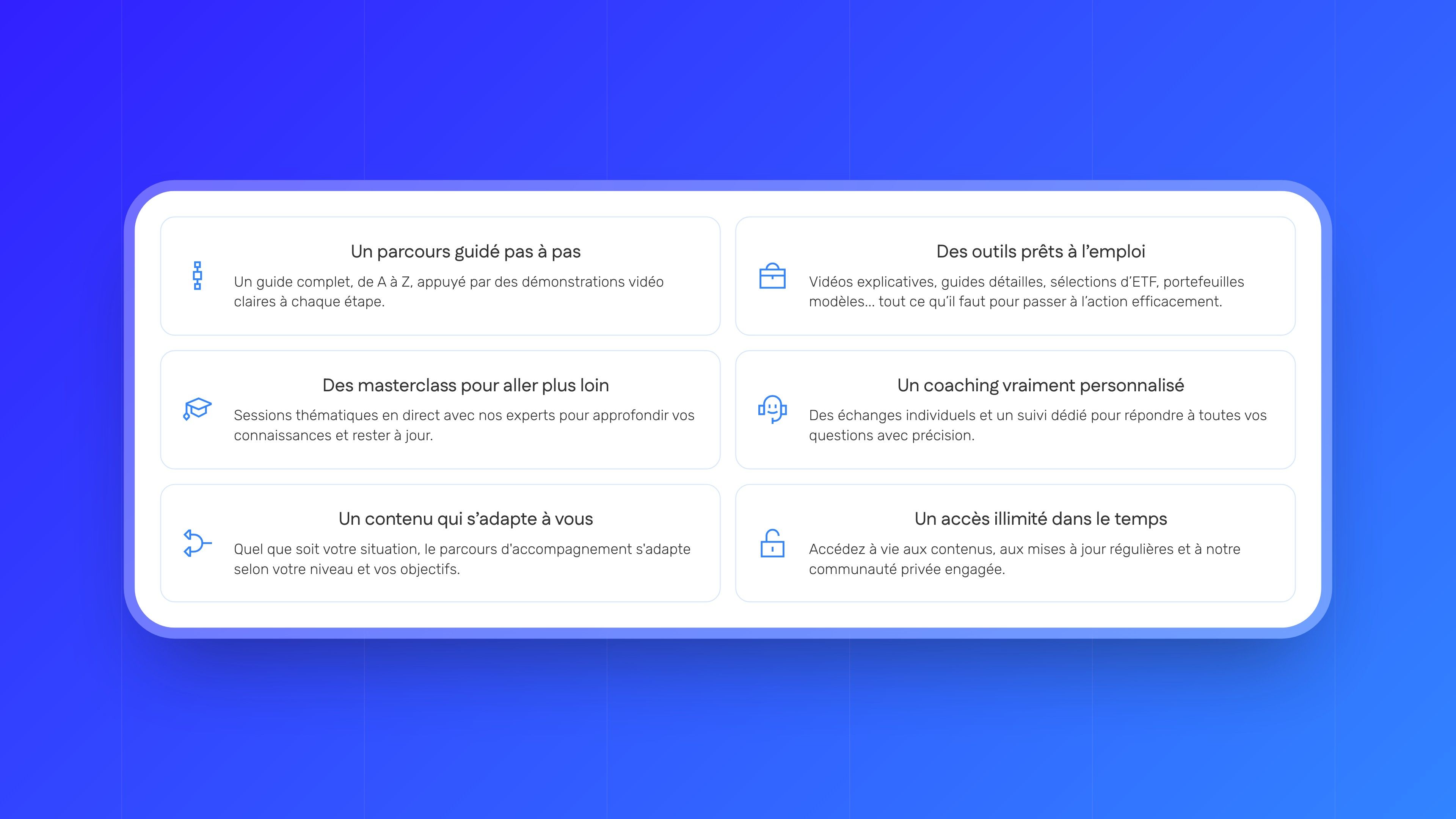
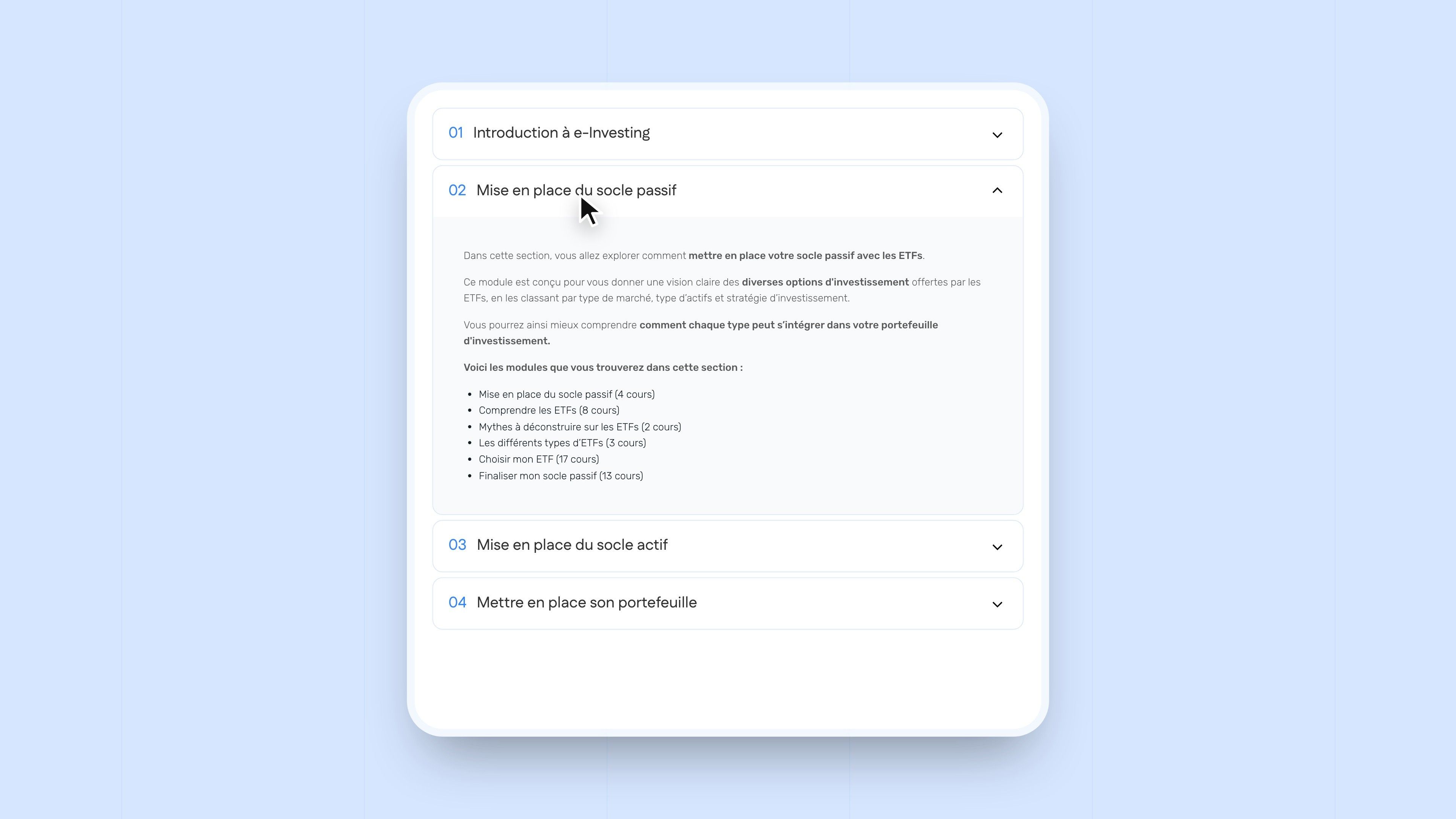
| Academy | The action plan, the asset classes covered, the method in two pillars (passive and active), the curriculum module by module, the community and the masterclasses |
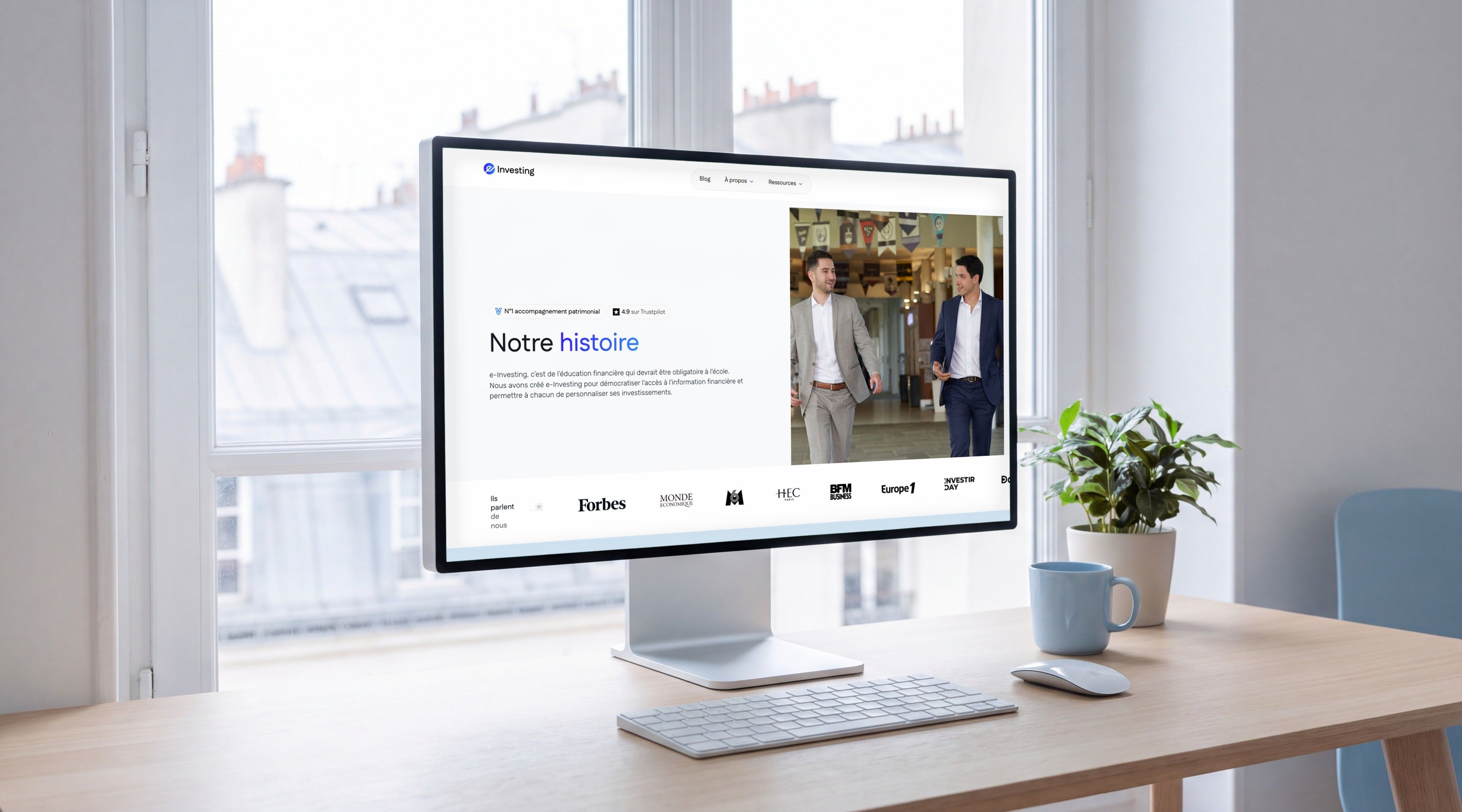
| About | The story of the two founders, their backgrounds, the team of associated experts and the company's values |
| Testimonials | Members' reviews, in video and in writing |
| Partners | The platforms tested by the team, sorted by account type: securities account, PEA, life insurance, crypto, real estate and SCPIs |
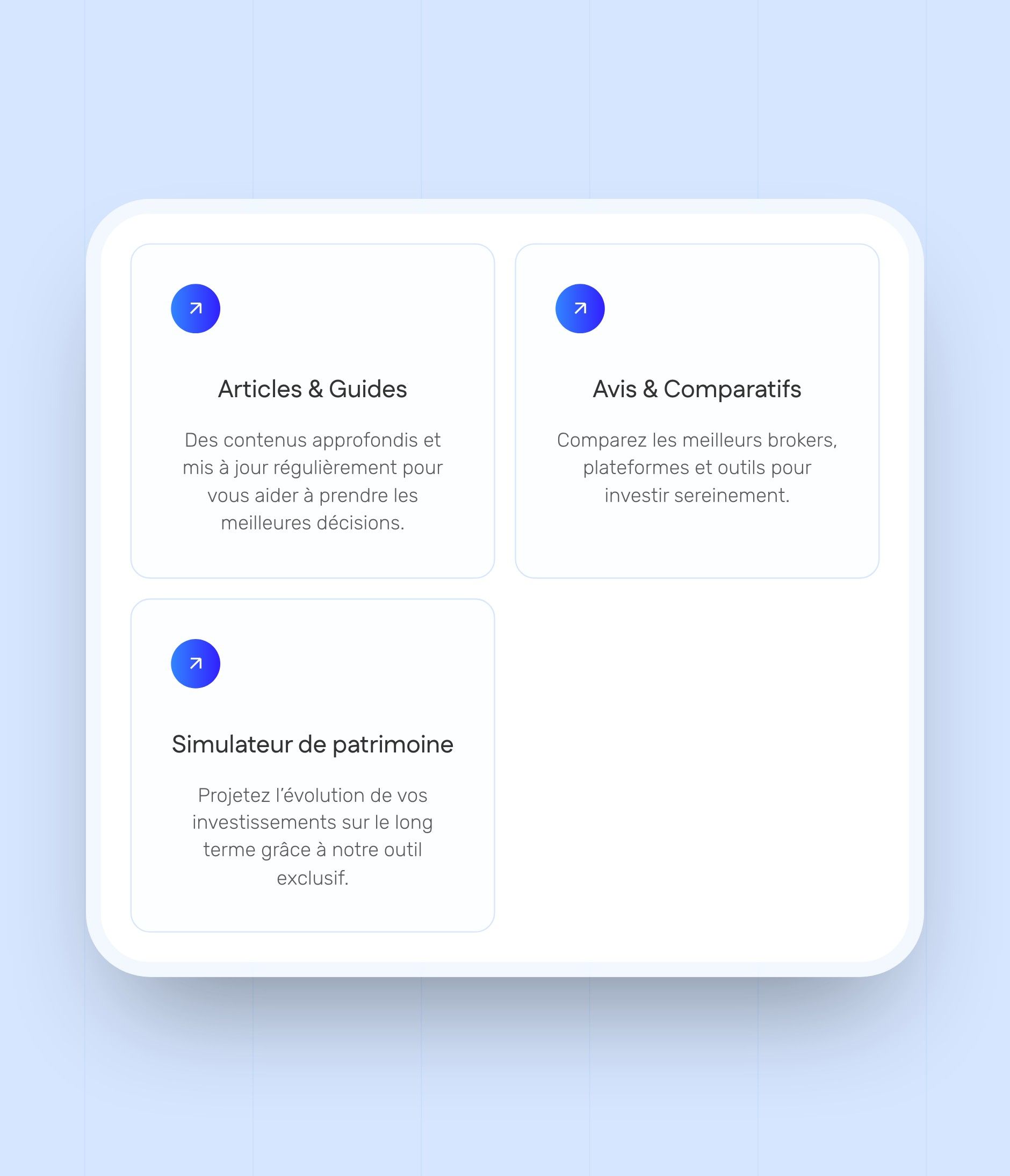
| Resources | Articles and guides, reviews and comparisons, books and a wealth simulator |
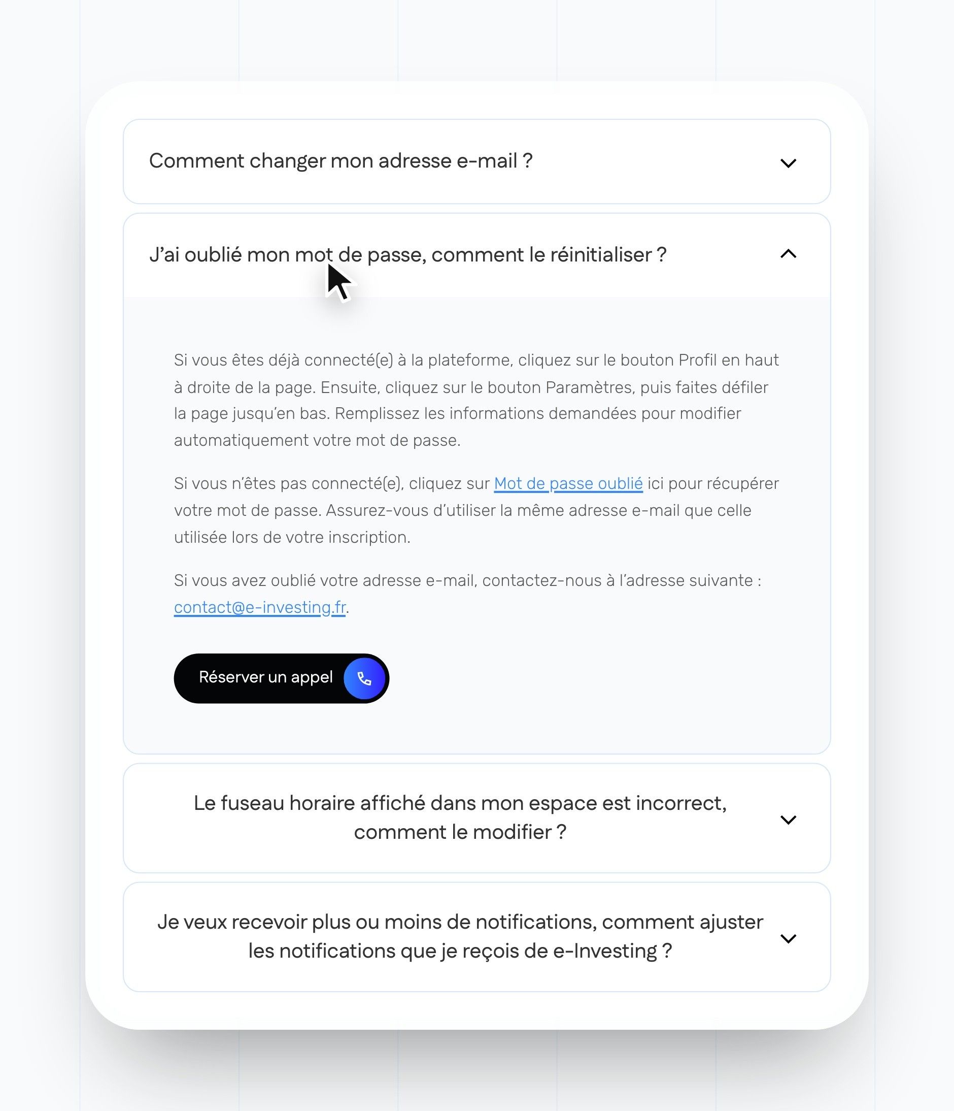
| FAQ and appointments | Questions about the Academy, the member area and billing, then booking a call |
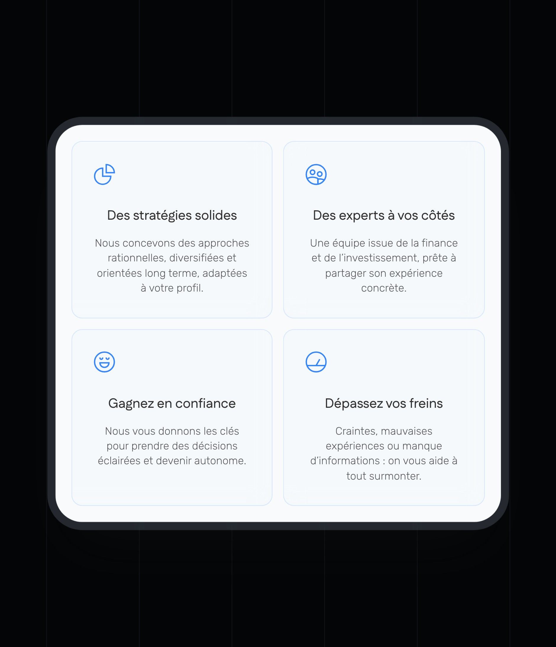
The pages share the same building blocks: a header with labels, a media strip, sky-blue-bordered cards rounded at 16 px, accordions, testimonial carousels and calls to action in the footer. Backgrounds alternate between white and the glacier blue gradient, and the ink footer brings together the links, the registration numbers and the investment risk warning.
Webflow Development
A site the e-Investing team updates on its own, article after article
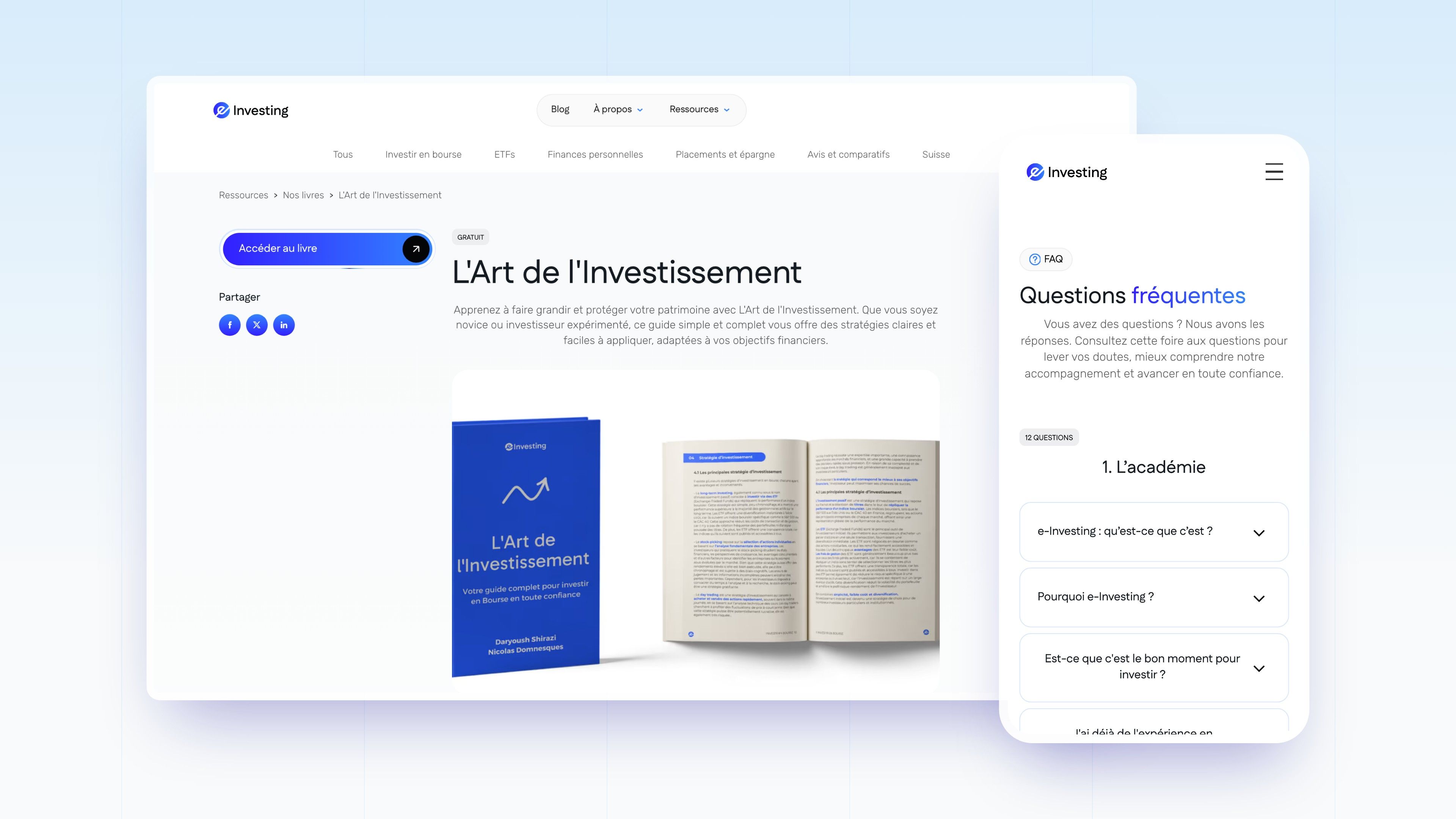
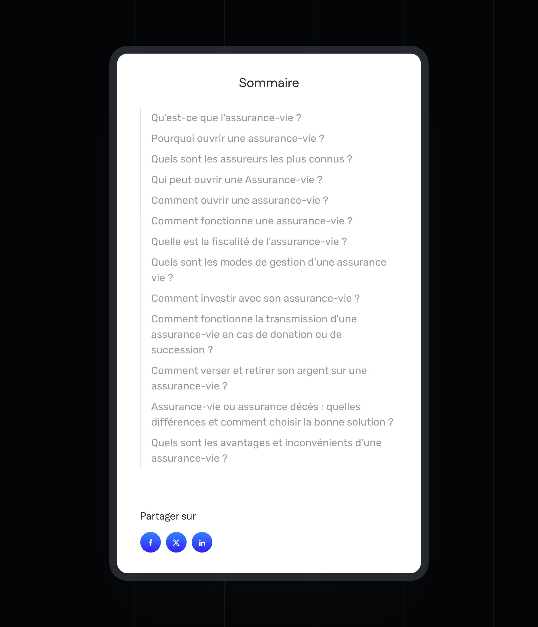
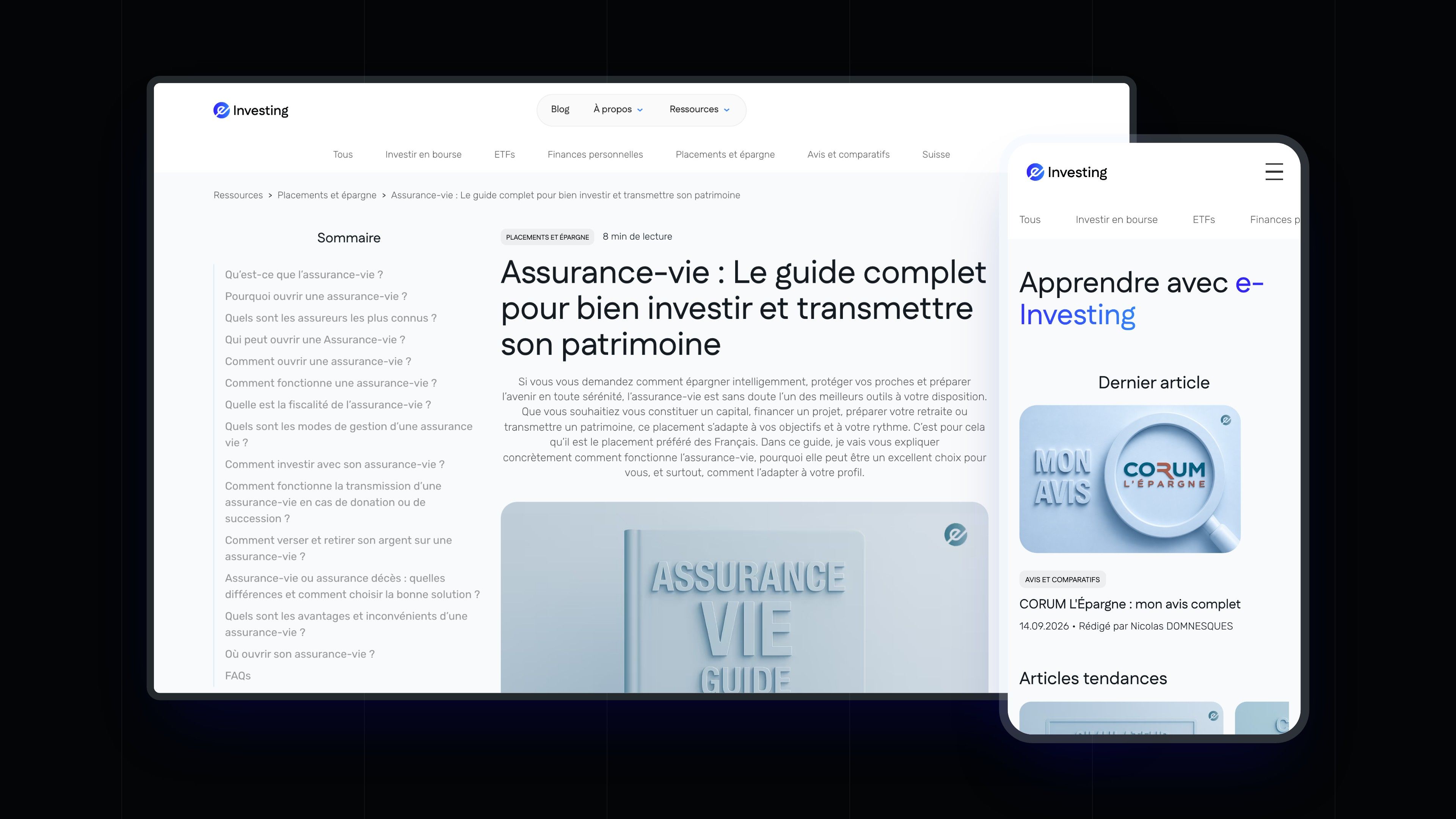
The site is built on Webflow. Articles, their topics, authors, books, partners and testimonials live in CMS collections, each served by a single template: publishing a guide, adding a partner platform or a member video takes no layout work. Each article displays its clickable table of contents, its breadcrumb and its share image.
The components are light and accessible: the FAQ and curriculum accordions open without a script, using a checkbox and an expanding grid, testimonial carousels loop continuously and the home page headings type themselves out letter by letter. The Contact page offers a form, the Appointment page a booking for a call with the team.

SEO
Answering savers' questions, one by one
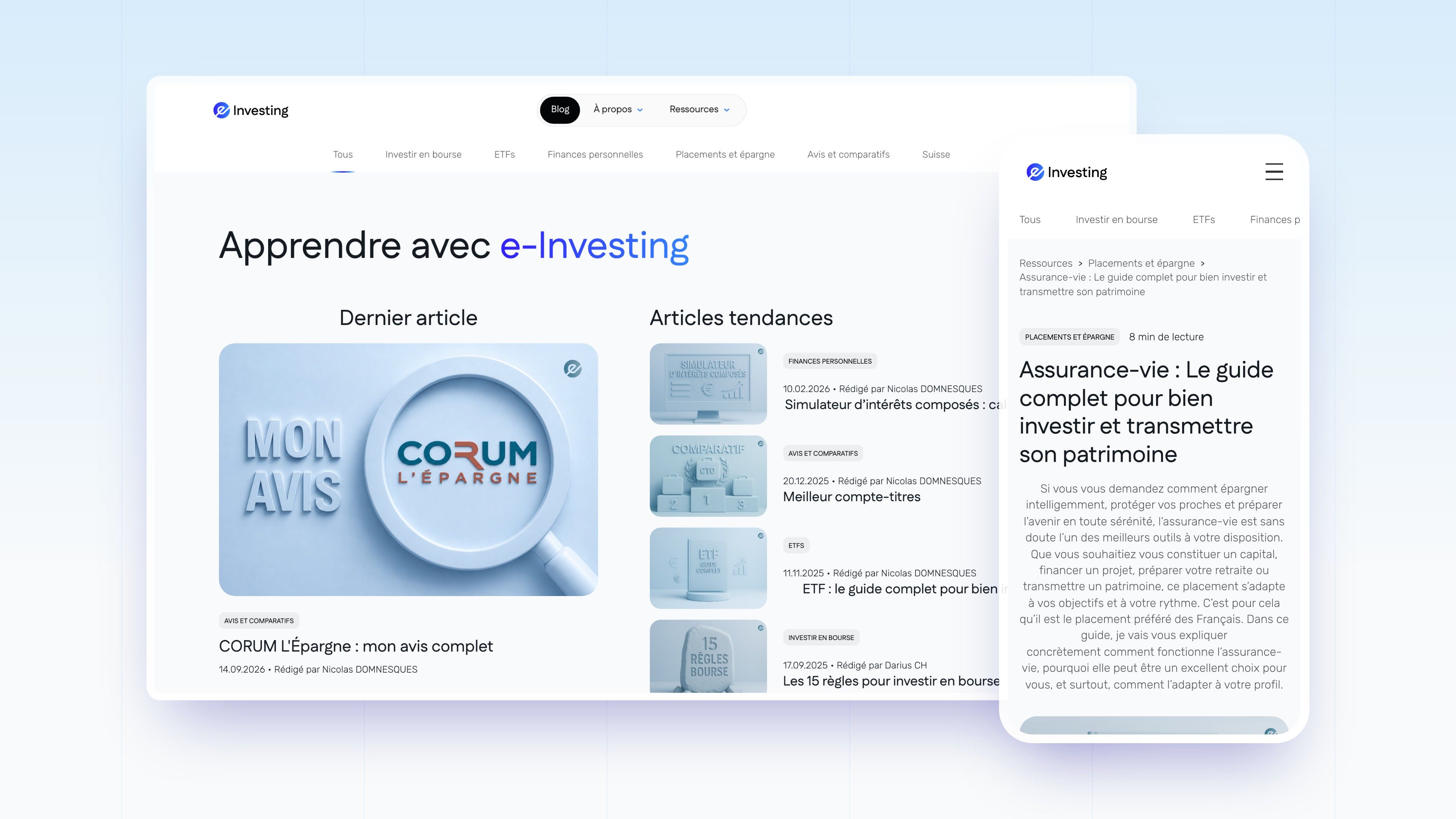
Before looking for a course, a saver types “assurance-vie” (life insurance), “choisir un ETF” (choosing an ETF) or “meilleur compte-titres” (best securities account). The site owns these searches with a resource library organised by topic, platform reviews and long-form guides, each with its table of contents, author and date.
| Workstream | Detail |
|---|---|
| Content | 124 articles and guides in French, organised into 6 topics (stock market investing, ETFs, investments and savings, personal finance, reviews and comparisons, Switzerland), and 3 books |
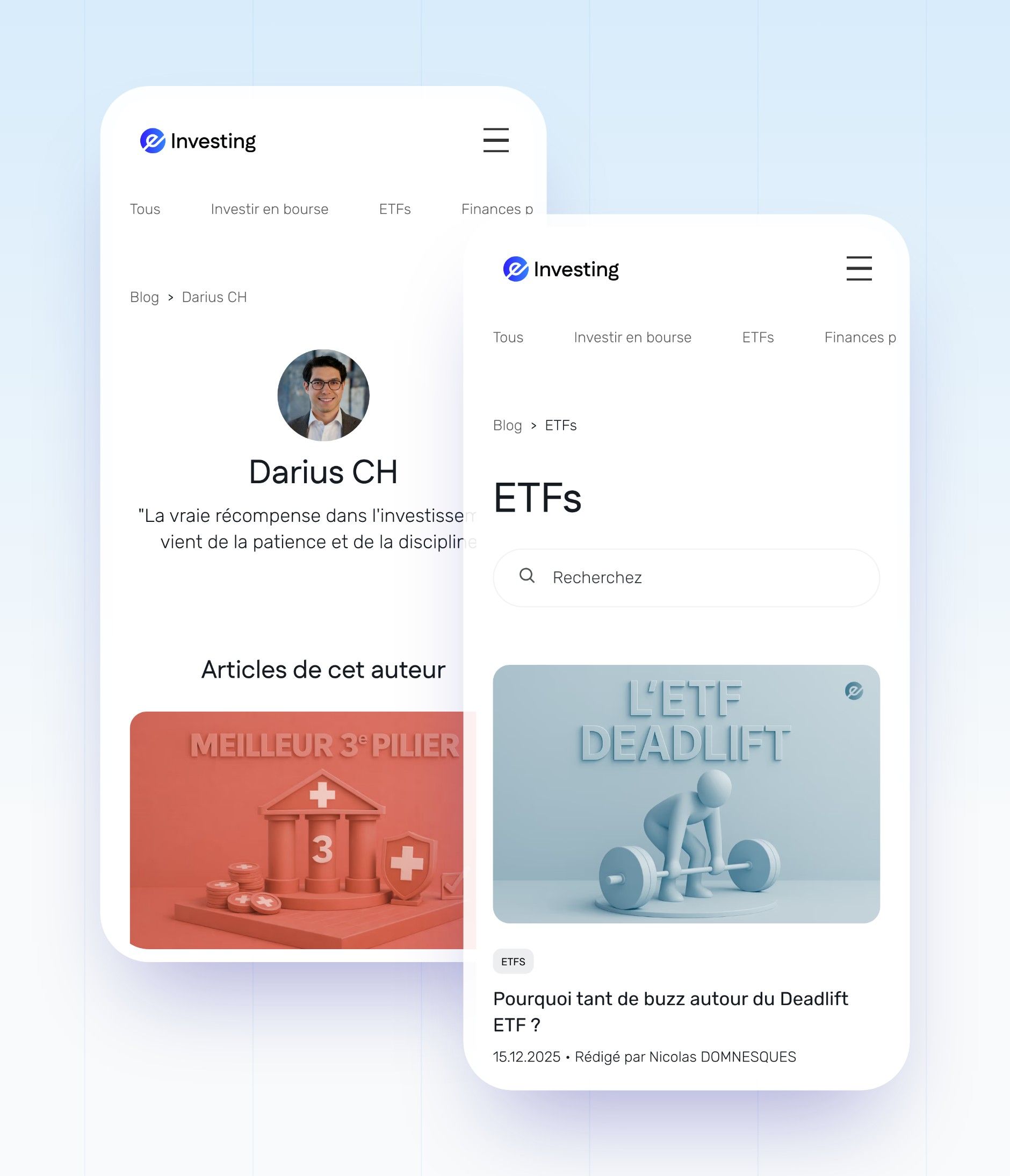
| Authors | One page per author, with their articles, for the two founders |
| Tags & metadata | Title and meta description written page by page, for articles as well as main pages, share images on articles and books |
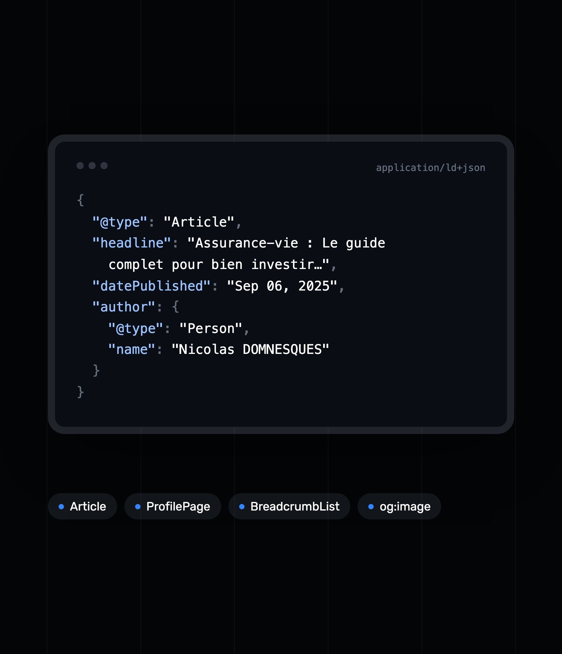
| Structured data | Article on every article, ProfilePage on author pages, breadcrumb (BreadcrumbList) on articles, topics, authors and books |
| Crawling | A 153-URL sitemap; pagination pages are excluded from crawling in robots.txt |
Readable by search engines and AI assistants alike
The guides open with a table of contents made of questions (“What is life insurance?”, “How do you open a life insurance policy?”), followed by short, structured answers. Signed by one of the founders, dated and linked to its author page through its structured data, each guide gives search engines and AI assistants attributed answers that are easy to cite.


Our latest projects
+250 companies
supported
Websites designed and developed with









You're going to working with us, guaranteed
Ready to launch
your business?
Let’s f*****G GO !!